
10 Multimodality
Did you know that in the early days of the internet, there weren’t online videos or even pictures? Communication was almost entirely text-based, and even the text wasn’t formatted like it is now in a variety of fonts, colors, sizes, and spacing options (Murphy). Can you imagine? You’d land on a web page and be confronted with a wall of text that you had to sift through in order to find the information that you were looking for. By today’s standards, that would be considered a terrible website, and most people would quickly bounce off the page due to boredom or frustration.
Fortunately, the internet evolved rapidly to provide the capabilities for web pages to be thoughtfully designed, pulling together a variety of visual and even auditory elements that engage visitors and help them quickly and easily find the information that they need. In fact, digital communication is increasingly complex if you consider the types of “texts” that can be produced using video editing software, animation tools, live stream capabilities, and web applications that make it easy to incorporate a variety of media on a single web page without requiring HTML expertise. Understanding how to effectively combine these design elements to enhance the meaning of a message is not simply a nice skill to have; it’s crucial to effective digital communication. In fact, composition courses are increasingly expanding instruction to go beyond text-based writing and include multimodal writing strategies that integrate visual and aural elements as well. This further develops literacy skills across multiple platforms and allows the writer to think more deeply and creatively about how to best convey information to the intended audience.
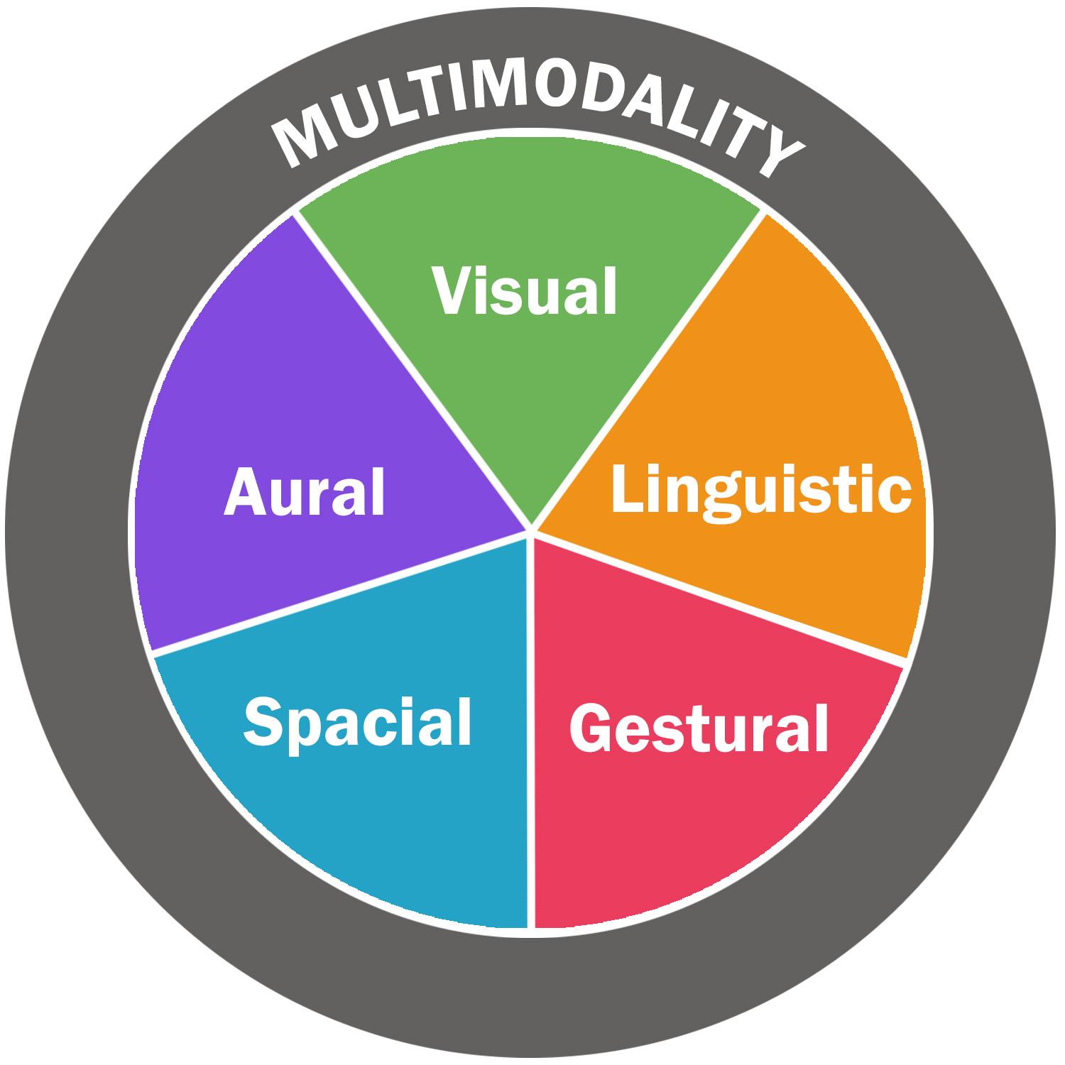
This chapter focuses on multimodality and the effects of layering different modes together in a single message. The term multimodality literally means more than one “mode” or method to communicate meaning (University of Illinois Springfield). A message often has words, for instance, and that is one mode. However, a written message will also include things like font choice, font size, font color, and other formatting effects, such as bold or italic font. These are also methods of communicating, and they have a significant effect on the way that someone reads and interprets the meaning of the words, which is why it’s so important to consider your communication goals and how different modes—beyond word choice—can influence your effectiveness. In this chapter, we’ll study the different modes that make up multimodality—linguistic, visual, gestural, spatial, and aural. We’ll also talk about a range of tools within each mode as well as strategies for making a message cohesive, engaging, and easy for readers to understand.
Learning Objectives
- Know what multimodality is and what the different modes are.
- Be able to discern various examples of a particular mode.
- Understand how multimodality can enhance the meaning and persuasiveness of a message.
- Consider the creative possibilities for a given message and the ways that modes can be layered in countless ways to engage an audience and provide subtle nuances.
- Understand the rhetorical nature of multimodality and how modes can be used to target specific audiences for a particular purpose.
- Learn important rhetorical considerations that will guide your choices regarding multimodal messages.
Understanding the Different Modes
The point of multimodality is to combine elements that will enhance the effectiveness of a message with the intended audience, which means that you have to be thoughtful about the way that you put a message together. That’s one important reason that this textbook includes a unit on rhetorical literacy in addition to practical literacy. Knowing how (the practical aspect of digital writing) is a different, more surface-level skill than knowing why or to what effect (the rhetorical aspect). For instance, most people know how to make text bold, create a bar graph, paste an image into a document, or even embed a video. Certainly, there are a wide range of platforms available that require a great deal of training and experimentation to understand how to do something specific. For instance, learning how to use iMovie or WordPress or Moovly and understanding the range of tools available would take some time and probably some additional instruction. However, just because you can do something doesn’t mean that you should. (This is why we focus so heavily on critical and rhetorical literacy before diving into the functional aspect—to provide a framework that will guide your decisions.) There are hundreds of websites out there that do a terrible job of combining imagery and text and color—often trying to emphasize too many things with the end result that nothing stands out. Visitors are quickly overwhelmed or frustrated because it’s difficult to find the information that they are looking for. On the other hand, websites and other types of messaging that fail to utilize various tools, focusing instead on large blocks of text, also fail to engage readers’ attention or compel action. In other words, it’s crucial to think about multimodality from an audience’s perspective, combining elements in such a way as to capture readers’ attention, help them understand key ideas, build a sense of trust and connectedness, and elicit a response that is consistent with your underlying communication goals.
Obviously, these objectives are more easily said than done. As we’ve already discussed, in a digital era full of clickbait and pop-up advertising, it can be difficult just to capture a reader’s attention, let alone to facilitate the deeper engagement required to read the entire message and respond to the call to action. However, being creative and intentional about how various modes are combined in a single message will significantly increase your chances of success. This section discusses all five modes, providing examples of each one and a deeper discussion of how it might be used effectively. Of course, each message provides an opportunity to be creative—to combine elements in different ways. There isn’t one “right” way, but there are certainly some strategies that go against best practices. We’ll talk about those as well.
Linguistic
Let’s start with the most obvious mode of communication—written and spoken words. In chapter 8, we discussed the symbolic nature of words. They represent objects as well as more complex ideas, concepts, and processes. In our daily communication, these words are our primary tools to express our meaning to others—in conversation, in text messages, in emails, in letters, in blog posts, and so on. Within this category, there are several elements that can either clarify meaning or, if not done well, can create confusion (Fillmore):
- Word choice. As the Writing Center at the University of North Carolina Chapel Hill points out, “Writing is a series of choices.” Different words carry different connotations. For instance, calling someone “stubborn” has a more negative meaning, implying that the person is hard-headed and not easy to get along with. On the other hand, if you called that person “tenacious,” suddenly those same qualities have a more positive connotation, implying determination and self-confidence. Additionally, in some cases, words and phrases can come across as vague to your audience so that they don’t have the same depth of meaning as they might have with more precise wording. As a simple example, if you send a friend to the store with a shopping list with the word “vegetables” on it, who knows what you might get. That word can mean a lot of things. But if you write “carrots” or, more specifically, “baby carrots,” you’re much more likely to get the item you want because the wording is much more precise. You’d also be sure in specific situations to select vocabulary that matches your audience’s understanding. Using big words and jargon that others might not understand or using vocabulary that is too simplistic or immature for a given audience can hinder communication as well as the ethos of the speaker. Word choice is significant in the way that others interpret meaning.
- Grammar. Grammar dictates the way that words are structured within sentences to create complete thoughts. We can’t put words in just any order, especially when it comes to more complex ideas and sentences. Following grammatical rules allows others to process information more easily, focusing more on the content of a message instead of the structure. Certainly, there are grammar rules that are more common and important than others. Subject-verb agreement and complete sentences are examples of grammar rules that help another person understand the meaning of a message. However, the rule that says you shouldn’t end a sentence with a preposition isn’t usually that important, especially in more informal contexts. Audience members will still understand the meaning and probably not think twice about the preposition. In other words, using effective grammar is contextual, depending on the audience, the occasion, and the method of communication. While verbal communication might naturally flow with starts and stops and incomplete sentences, some forms of written communication (especially emails or longer articles) tend to stick to the grammar rules. However, more informal messaging, such as text messaging or social media posts, breaks grammar rules intentionally to engage readers or communicate a specific tone. The same can be said of punctuation. While correct punctuation can be very effective and important in clarifying the meaning of written communication, occasionally rules are broken on purpose to enhance meaning. Importantly, though digital writing has expanded to include hashtags, emojis, and “texty” language, correct grammar still matters (Banner).
- Sentence structure. Sentence structure does relate to grammar and many of the considerations mentioned above. It’s separated here because different types of sentences exist that are grammatically correct but that come across differently to audiences. You might already know that a lot of short, simple sentences create messages that seem choppy and disjointed, whereas long, complex sentences can be difficult to follow, especially when there are several strung together. Once again, the “right” sentence structure is somewhat contextual. For younger audiences or for topics that are more complex or unfamiliar, it might be better to use shorter sentences (or even bulleted lists) to make it easier to understand. When you’re writing a formal paper or communicating casually about general topics, it’s more common to use a variety of sentence structures—both simple and complex—to create fluidity.
- Organization of sentences and paragraphs. Especially for longer messages, such as essays, articles, and speeches, the organization of information requires careful consideration so that one idea builds on the next in a way that is logical and easy for audiences to follow. For instance, the reason that academic essays have a thesis statement and topic sentences is that it makes the essay more cohesive and easier for readers to follow. They are given the main point in the thesis, and (hopefully) each topic sentence relates directly to that main idea. Similarly, blog articles might not have a formal “thesis,” but they do still have an introduction and a sentence or two that gives the main idea, often called a nut graph (Bethune). They also have paragraphs, often grouped together under various headings that expand on that one main idea. Even in shorter or more informal communication, organization is key. An email, for instance, wouldn’t start out with a list of bullet points. Readers would be confused right away. Instead, it would begin with a short introduction clarifying the subject of the email and contextualizing the purpose of the bulleted list.
While the linguistic mode is an important—often the most important—tool for communicating meaning, it doesn’t stand alone. Other modes of communication are used alongside the linguistic mode to enhance meaning. What’s more, the linguistic mode isn’t always the most important. Consider, for example, the climactic scene of a movie. Would you understand that scene more fully—and be more emotionally connected—if someone else described that scene to you or if you watched it for yourself? Or maybe think about a class lecture that will last for a full hour. Would you find it easy to pay attention and follow along with the topic if the instructor spoke in a monotone voice the whole time? Probably not. The tone and inflection in their voice paired with appropriate pauses, gestures, facial expressions, and maybe even a few visual aids with text and images would make that same lecture much more engaging and easy to understand. In the next few sections, we turn to other modes that go beyond linguistics to communicate meaning.
Visual
Another important communication method relates to the visual mode—the things that people see that help them interpret the meaning of a message. This can refer to simple visual cues as well as more complex images and videos. As mentioned above, these visual cues can greatly enhance a message to make it more engaging and readable. Here are some examples:
- Font. Beyond the meaning of the words in a written message, there are always visual elements to be interpreted. For instance, there is always a font choice, even if it’s a very basic font like Arial or Times New Roman, it’s a visual element that coincides with the linguistic mode, and it might suggest a message that is more academic or serious. There are countless font choices, and each one carries a certain “personality” that may or may not be appropriate for a given message. For instance, a script font like Edwardian is more formal and sophisticated, and it would be very appropriate for a wedding invitation. It wouldn’t be as appropriate for an academic essay or the banner at a kid’s birthday party. Something playful and fun like Curlz might be better suited for a birthday party, but it would send the wrong message on a funeral bulletin or a political ad. In addition to font choice, there are other font strategies that you might use to emphasize parts of a message: larger font, bold, italics, underlined words. These visual font elements demonstrate the importance of certain words or ideas when used appropriately. Similarly, larger bold font can be used for headings in a blog post or essay to help readers follow the larger structure of a text and easily find main ideas.
- Formatting. Another subtle visual cue relates to the formatting of a message. The simple act of breaking up a large block of text into separate paragraphs—with a space between text blocks and/or a tab at the beginning of a new idea—is extremely helpful in making a text more readable and easier to follow. Formatting also refers to things like line spacing (i.e., leading), alignment, the horizontal spacing between letters (i.e., kerning), line breaks, inset text, and hanging indents. These are pretty basic formatting cues that we tend to take for granted because they seem so obvious, but when they are ignored, a message becomes much harder to read. An article that is right aligned, for instance, is harder to read and would likely frustrate readers. On the other hand, when you are intentional in your choices—even formatting choices that go against standard conventions—it can grab readers’ attention and complement a message. An ad with right-aligned text, for instance, might be very helpful in balancing the elements on a page or in creating a sense of unbalance or tension with the audience.
- Color. Not only are colors effective in catching people’s attention and enhancing the aesthetic of a message, but they are often used in symbolic ways to evoke certain emotions or moods (Incredible Art Department). Black and white or sepia, for instance, are sometimes used to evoke a sense of nostalgia or timelessness. Bright, vibrant colors can imply energy and positivity. What’s more, color can be used strategically to draw the audience’s attention to a particular text or part of an image. In Schindler’s List, for instance, the film is in black and white except for the red coat that one of the Jewish girls is wearing, which forces audiences to pay attention to that one object and consider the significance. In a similar way, color can be used in text-based documents to draw readers’ attention to headings or titles. Similarly, readers generally know that blue, underlined text contains a hyperlink that they can click on for more information. Finally, colors are also strategically used by organizations as a branding tool. They select a color palette that corresponds with their logo, and then they integrate those colors into their website and other marketing materials as a subtle way to reinforce their image.
- Images. Pictures and other graphics can significantly enhance a message. If a friend tells you about a trip that they took to the Grand Canyon, you’d probably understand their story based on the descriptions that they use, but it would be much easier and more effective to show you pictures from the trip so that you can see the rocks and canyons for yourself. Similarly, instruction manuals often come with pictures of the various parts so that you can better visualize how the pieces go together. Once more, the use of imagery in a message has several purposes. It helps audiences understand a particular scene or idea or process, but it also engages their attention and can be effective in evoking an emotional response. A good example is the SPCA (Society for the Prevention of Cruelty to Animals) commercial with Sarah McLachlan. It blends several modes together, including sound (the song), text on the screen, and imagery to evoke feelings of sympathy and compassion in the audience. All of these elements work together to meet that purpose, but an important element in that commercial is the imagery—the pictures of animals in cages, some of them who have clearly been abused—that evokes the strongest reaction. This pathos appeal using imagery isn’t always about sympathy. An amusement park will use photos of people having fun on rides. A hotel will feature photos of clean, luxurious rooms and swimming pools. The purpose is to create a sense of desire in the viewer, who feels compelled to participate.
- Videos and GIFs. Like still photos, videos, GIFs, and animations have a variety of purposes. They can be extremely helpful in conveying information. How many times have you gone to YouTube to find a video that provides a step-by-step demonstration of how to do something? Particularly when paired with verbal descriptions and instructions, a video provides richer details of an event or a process. Consider, for instance, football games on television that provide instant replays, zooming in on particular areas and using slow motion to carefully examine the details of a play. That video, along with the commentators’ discussion and telestration capabilities, helps viewers understand exactly what happened. Also like still photos, videos are extremely effective in engaging an audience. Consider how popular YouTube and TikTok videos are in capturing viewers’ attention. They also can be used to create emotional connections—perhaps even more so than still photos—because they depict detailed scenes and allow viewers to hear people’s voices and other sounds, providing the sense that they are right there in the moment (Slice).
- Charts and graphs. In many instances, a bar graph, pie chart, or some sort of illustration can go a long way to clarify an idea or process. Particularly when it comes to numerical data, a graph or chart with colored lines is much easier for viewers to process than verbal or written text filled with a string of numbers. The same is true of tables, flow charts, figures, and illustrations. Audiences are much more likely to make sense of data when they are organized in a visual format like this.
Gestural
Like the name implies, the gestural mode allows meaning to be interpreted based on the speaker’s gestures—body movements and facial expressions. This is an aspect of communication that is missing in written text and phone conversations. You don’t get to see the physical gestures of the person speaking, which give you a much clearer sense of that person’s attitude toward the subject as well as their implied meaning. In many instances, the gestures and facial expressions are crucial in helping you understand the meaning of a message. Consider, for instance, sign language, in which the entirety of a person’s message is encoded using physical signs. Similarly, the game of charades is based on our ability to communicate through body language and signals. In other instances, physical cues might not embody the entire message, but they can help you interpret another person’s mood and even gauge how your own message might (or might not) resonate with them. This mode might include the following:
- Hand gestures. Simple cues like pointing a person in the right direction or giving a thumbs-up to let someone know that you are OK can go a long way in communicating information. Scuba divers, for instance, have a series of hand gestures that they use to communicate with each other underwater. In that case, the thumbs-up signal means that the person needs to go to the surface, whereas a flat hand across the throat signifies that the person is out of air—an incredibly important message that they would need their partner to understand. Hand gestures are also used in sign language to communicate a variety of ideas. In fact, just like written language, sign language has its own grammar, and it can vary significantly from one region to the next (National Institute on Deafness and Other Communication Disorders).
- Facial expressions. Another important gestural cue—whether in an online conversation, in a video, or in person—is facial expression. Sometimes a person’s face says it all in terms of their attitude or mood. It can communicate information to others. A wink, for instance, might signal that a comment should be taken as a joke. A raised eyebrow might indicate surprise or suspicion. At the same time, it’s probably important to keep in mind that facial expressions can be—and often are—misread (Cimons). Someone’s frown might be misunderstood for anger or sadness when they are really just daydreaming or concentrating. Another thing to consider is the effect that facial expressions can have on other people, often evoking similar emotions and facial expressions in the audience (Dimberg et al.).
- Body language. Body language can also be a form of communication. Your posture, stance, proximity to other people, and other body movements are all signals to other people about your attitude, feelings, and reactions. Think about the perspective of a teacher, standing in front of a classroom full of students. Maybe there are several students right up front, taking notes, raising their hands with questions, nodding along to the lesson. These are clear signals about the students’ attitudes toward the teacher and the class. So too are the signals of students who are sitting at the very back of the classroom, arms folded across their chests, eyes fixed on their phones. This distinction might not seem important, but consider how much easier it is to communicate openly with someone who seems to be receptive to your message and has a positive attitude toward you versus someone who doesn’t. In many instances, your body language will be the first thing that makes an impression on other people, and it can go a long way to build your image in a positive way—or not.
Spatial
The fourth mode is spatial, related to the spacing and overall layout of a document and the connections this implies to readers. Even the most basic black text on a white document has an arrangement that influences the order in which readers take in information, and as other elements are placed on the page, that placement determines the way that readers understand the message. The primary elements included in the spatial mode are the following:
- Arrangement. In some instances, the arrangement of elements on a page might be obvious. The title of a document should go at the top. Different sections or chapters in a longer document are usually separated by space to show the separation. In other instances, it might not be so clear, especially as more elements are added. When pictures or charts accompany the text, for instance, what’s the most appropriate placement so that the visual elements effectively complement the text? What about a large web page that includes several different sections of text, photos, banner graphics, social media icons, and maybe even a video or two? The choices that you make to arrange these items on the page can aid in the viewers’ ability to easily find and process information, or it can make it much more difficult. Of course, there are several design options to choose from (Babich), depending on the purpose of the website and the types of elements that you have to work with. Further, many websites are “responsive,” meaning that the layout shifts for mobile users so that the information is still easy to read on a smaller screen.
- Proximity. In addition to the arrangements of objects and design elements on a page, proximity also influences the way that readers interpret a message. It’s probably obvious that elements that go together should be close to each other. A caption that goes along with a photo, for instance, is usually directly underneath that photo. Similarly, groups of similar things tend to be grouped together. For example, items in a list, perhaps across the top of a website as a navigation menu or in bullets within the text, will likely be close together to signify that they go together. In contrast, additional white space can be used to separate items that don’t go together, to signify a transition or distinction.
- Contrast. Using contrasting elements can be an extremely effective way of drawing a viewer’s attention to a particular focal point, perhaps through opposing colors, sizes, shapes, textures, or even white space. While this might seem like a simple task, knowing how and when to create contrast can be tricky. The main idea is to use contrast effectively to set elements apart or to highlight key takeaways while still maintaining an overall aesthetic that is pleasing to the eye and consistent (see repetition below).
- Repetition. Repetition refers to the use of the same element over and over in a composition. For instance, most designs have a specific color palette, often using two to five colors that work well together and can be used in certain instances to create contrast. However, the composition sticks to these basic colors to create a sense of uniformity. If too many colors are used, then it creates a sense of chaos, and nothing is emphasized effectively. The same principle applies to other elements like shapes and textures. Importantly, this type of repetition is often seen across a family of publications by the same organization, which helps to establish branding and familiarity with the audience.
Aural
The final mode is aural, referring to the many different sounds that can bring meaning to a message. We’ll talk in the next section about the fact that all messages are multimodal, including verbal messages. There are the actual words (linguistic) and then a range of other aural cues that allow the audience to interpret the meaning of the words more fully:
- Volume. For one thing, the volume with which someone speaks can significantly impact the way the message is interpreted. A louder volume implies a sense of urgency and importance, suggesting that the words demand your immediate attention. Similarly, if someone is yelling, it’s obvious that they are excited in some way, perhaps angry, scared, or happy. On the other hand, someone speaking in a low whisper might be sharing something personal or secretive, which might also influence the way that you react to the information.
- Tone. A person’s tone is also important. Most of us are familiar with sarcasm, in which a person really means the opposite of what they say. If someone says, “Well, that’s fantastic” in a sarcastic tone, you know that they aren’t really very happy. In the same way, a person’s tone of voice can tell you a lot about their attitude toward the information—if they are joking, excited, somber, or serious.
- Pitch. As the pitch of our voice goes up and down, certain ideas within our sentences are emphasized in a way that gives meaning to our words. According to the University of Minnesota Libraries Publishing, “Pitch refers to how high or low a speaker’s voice is.…Each person has the capability to intentionally change their pitch across a range large enough to engage an audience.” The chapter goes on to discuss the ways pitch can be used to emphasize certain ideas, communicate emotion, or signal to the audience that a transition is coming.
- Rhythm. In poetry and in music, rhythm is the speed at which a speaker moves through the text, and as you probably know, it can be extremely effective in engaging an audience, who find themselves moving to the beat. It’s the pattern of stressed and unstressed syllables that creates rhythm. A faster rhythm is more energetic and tends to be happier, whereas a slower rhythm is often more sad, soothing, or sentimental. Not only can rhythm evoke an emotional response in an audience, but it can also be used to emphasize certain words and ideas, especially when the pattern is disrupted.
- Music. Have you noticed that the climactic scene of most movies has a song playing in the background? It might be an upbeat song as the good guy triumphs over evil, or it might be a slower, crescendoing song that matches the intensity of feeling as two lovers reunite. Similarly, the SPCA commercial with Sarah McLachlan is so emotionally moving partly because of the song “Angel” that plays while pictures of dogs and cats are displayed, which reinforces the feelings of sadness a viewer feels and further compels them to take action. You probably already know that music can have a significant effect on a person’s mood and emotional reactions (Heshmat). Upbeat music can energize and spark a more positive mood while a slower song can spark feelings of sadness or nostalgia. That’s why pairing an appropriate song to fit an occasion or the underlying purpose of a message can have such a powerful effect.
- Sound effects. Many digital tools used for editing videos or even putting together a slideshow come with standard sound effects and allow you to upload others that you created on your own or purchased somewhere else. While some sound effects might be a bit hokey (think of the “bing,” “bang,” “pow,” “boing” that a lot of kids’ cartoons include to draw a laugh), they can also be used in other ways to intensify a scene and sway the emotional reaction of the audience. A simple example are the laugh tracks that used to accompany popular sitcoms, signaling to viewers that a scene was meant to be funny and compelling them to join in. Movies and plays also use sound effects—train whistles, footsteps, door slams, gunshots—to add clarity to a scene and further engage the audience into the plot.
- Pauses. Sometimes just as powerful as the words and sound effects are the pauses in dialogue and other sounds. Consider the long silence that might follow the sound of a gunshot and all of the thoughts and emotions that might occur during that pause. Strategic pauses can also be used during a conversation or a speech to engage attention. A pause automatically builds suspense as the audience waits to see what the speaker might say or do next.
Activity 10.1
Find an example of an online video, ad, or website that utilizes a number of modes. Review the content and come up with a list of all of the multimodal elements that are used. This includes not just the mode (e.g., visual) but also the specific tool (e.g., photo or color).
After you’ve created your list, consider how these elements work together in this message. How do the multimodal tools help engage the audience or clarify the meaning of the message? What kinds of feelings or emotions might they invoke that work toward a particular purpose?
Keep in mind that not all messages are effective. It might be that the message you selected is ineffective in some way, maybe because some of the tools seem to contradict the larger meaning of the text or because there are too many elements vying for the audience’s attention. Perhaps there aren’t enough modes utilized to the fullest potential, and the message comes across as boring or vague. Consider how multimodal tools might have been used more effectively.
The Power of Multimodality
All messaging is inherently multimodal, requiring audiences to pay attention to multiple features in order to gain a clear understanding of the speaker’s intention. For example, text-based messages include not only the linguistic mode but also visual elements related to font, color, and formatting. Similarly, verbal messages (over the phone, for instance) also include the linguistic mode along with aural elements, such as volume, pitch, tone, and meaningful pauses. Even a simple wave from a friend accompanies other visual elements like the speed of the gesture and the context of their surroundings. In other words, the categories provided above can be a helpful framework, but it’s also a bit deceiving, as a single message will automatically span across different modes, bringing with it a variety of subtle nuances. It’s also important to point out that multimodality isn’t limited to the digital realm, which is a common misconception. Hopefully it’s clear by now that in-person conversations as well as printed materials are also multimodal.
Given the importance of multimodal communication, it’s no wonder that most people prefer to have important conversations in person. With a range of linguistic, audiovisual, and gestural cues, it becomes easier and quicker for an audience to interpret the meaning of a message more fully because there are more cues present (Drijvers and Holler). It’s also easier for a conversation to flow more naturally because visual and gestural cues help signal when one person’s turn is over and another person’s begins. Certainly, there are digital tools that make it possible to have synchronous conversations with other people using a range of audiovisual cues. Zoom and Google Meet, for instance, simulate face-to-face conversions so that we get a better sense of the communicator’s meaning through facial expressions and gestures. Screen sharing features make it possible to show pictures, text, and videos while on a video call, which further expands the range of modes available. However, there are still some significant limitations to video conferencing, including the fact that participants aren’t in a shared space, they can’t fully see each other, and there are often problems with sound or video quality that can significantly interfere with the conversation (Karl et al.). The minor lag that occurs in video conferencing makes it more difficult to read the other person’s signals, which disrupts the normal flow of a conversation. What’s more, following the COVID-19 pandemic, many people complained of Zoom fatigue, related to the fact that their facial expressions seemed to be under constant focus, and they have to rely more on exaggerated gestures to get their meaning across (Drijvers and Holler).
However, while all messages automatically rely on a range of modes to create meaning, the benefit of understanding multimodality is that you can be intentional about the ways that you combine modes to engage audiences, clarify meaning, and compel action. This is particularly true given the range of digital tools that allow you to quickly and easily edit a video, create voice overs, and add music or snippets of text to a video or animation. More than ever before, professional tools are available to the masses to plan, create, edit, and disseminate multimodal messages, but what sets apart an effective message from one that gets “swiped” could be the way that multimodal elements are layered to create one coherent message that works toward a clear purpose.
Multimodality as a Rhetorical Tool
The best way to think about multimodality is with a focus on rhetoric—the intended audience for a particular message and the underlying purpose(s) of that message. What is it that you hope an audience will do or think as a result of your message? What tools are available in a given situation—whether in person or online—and which ones would be most effective in enhancing your message or might be a distraction or deterrence? As you’ve probably already figured out, combining modes into a single, coherent message requires quite a bit of strategy, focusing on the audience’s expectations and predicting their questions and reactions. Layering as many modes on top of one another as possible isn’t a strategy. It would overwhelm an audience and make it difficult for them to attend to all of the different signals available. Pflaeging and Stöckl call this “multimodal rhetoric,” defined as “functions and structures realized by and constructed in the strategic conjunction of several semiotic modes, which ultimately carry rhetorical action.”
While there aren’t any set rules on how to combine multimodal elements to create an effective message, there are some important rhetorical considerations:
- Who is the audience? What type of modes will be most effective in engaging their attention and helping them understand the message? It’s also important to consider what particular element will be most effective. For instance, you might decide that a photo is appropriate for this audience, but not just any photo will engage their interest and persuade them to act. Considering the target audience and your message, you’d have to determine what type of picture will resonate with their experiences, values, and perspectives.
- What are the genre conventions? Each genre has its own set of standards that align with the audience’s expectations. A TikTok viewer, for instance, is expecting a short video while someone on Instagram is likely to expect vivid and interesting photos.
- What modes align most with your goals? For more complex content that might be harder for an audience to understand, pairing spoken words with bulleted text, charts, and other images can help them understand the information. If the main goal is persuasion, think about the types of content—whether it’s a well-developed argument or a photo or a bar graph (or maybe all three)—that will be the most compelling.
- How can you leverage various modes to invoke different appeals? Do you remember the different rhetorical appeals of logos, ethos, and pathos? As you integrate different types of content using various modes, you can strengthen the persuasive effect of your message in powerful ways. Depending on the content, the genre, and the audience, one type of appeal might be more appropriate than another. What’s more, different modes work better with certain types of appeals. For instance, written and spoken words often work well with logos appeals while images and music are often more effective as pathos appeals.
- Which modes are readily available on the platform you are using? Sometimes the affordances and constraints of a particular application will dictate some of the choices you will make.
- What type of resources do you have available? Do you have high-resolution photos or quality footage that would be effective? Do you have the means to obtain or create these media? Obviously, you can only work with what you have, and it’s always better to use high-quality, original materials than stock photos or something low-quality.
The main idea is to think creatively and about how different modes might be combined to convey a message, to persuade your target audience, and to compel action. Truly effective digital communication utilizes a variety of communication tools, requiring a deeper understanding of the rhetorical situation and the most appropriate means of persuasion.
Activity 10.2
For each of the following scenarios, consider the best method of communication (in-person, text, email, social media post, etc.) and why. What modes are available to you in a given method that would allow you to communicate more clearly and effectively?
- You missed an important assignment in one of your classes, and you want to talk to the professor about how you can make up for that assignment.
- You want to invite some of your friends to your birthday party, which is at a location they might not be familiar with.
- You need more information about how to put together the new entertainment center you ordered.
- You just got back from an amazing vacation in the Bahamas, and you want to encourage others to do something similar.
Discussion Questions
- What is multimodality, and why is it an important consideration when it comes to in-person or virtual communication?
- What are the five modes of communication? How are these categories limited in terms of the multimodal nature of communication? Can you give examples?
- How can the different modes be used to build an emotional connection with the audience? Give at least one example.
- For each mode, give at least one example tool (or strategy). Explain how that specific tool can be used to convey meaning. How might it be paired with other tools—either within that same mode or in another mode—to reinforce a message?
- What is multimodal rhetoric? What are some rhetorical considerations that would help you make effective choices when crafting a message?
- Why is the audience so important when you’re considering your choices for a multimodal text? What types of things might you consider?
- How can the various modes be used to develop rhetorical appeals? Give some examples from the chapter as well as some of your own.
- In what ways has digital communication enhanced the opportunity to create multimodal text?
- Do you think digital communication can in some circumstances be more effective than in-person communication? Why or why not? In what ways is in-person communication limited in terms of the modes that are available? How is digital communication limited?
- Why do you think people tend to conflate multimodality with digital communication?
Sources
Babich, Nick. “Top Website Layouts That Never Grow Old.” Adobe, 8 Nov. 2019, https://xd.adobe.com/ideas/principles/web-design/11-website-layouts-that-made-content-shine-in-2019/.
Banner, Matt. “Why Grammar Still Matters in Today’s Digital Age.” Grammarly blog, 14 Jan. 2021, https://www.grammarly.com/blog/why-grammar-still-matters-in-todays-digital-age/?gclid=CjwKCAiAwomeBhBWEiwAM43YIL9zn6M3VPVDwUw1d2DnOGNeX5P8ozwRfi_PZ9zi9hseALC263DuIBoCdsgQAvD_BwE&gclsrc=aw.ds.
Bethune, John. “Improve Your Blog Posts with Nut Graphs.” B2BMemes, 2 Dec. 2010, https://www.b2bmemes.com/2010/12/02/improve-your-blog-posts-with-nut-graphs/.
Cimons, Marlene. “Facial Expressions May Be an Unreliable Way to Read Emotions.” The Washington Post, 16 Dec. 2022, https://www.washingtonpost.com/wellness/2022/12/16/facial-expressions-emotions/.
Dimberg, Ulf, et al. “Unconscious Facial Reactions to Emotional Facial Expressions.” Psychological Science, vol. 11, no. 1,6 May 2016, https://doi.org/10.1111/1467-9280.00221.
Drijvers, Linda, and Judith Holler. “The Multimodal Facilitation Effect in Human Communication.” Psychonomic Bulletin & Review, 22 Sept. 2022, https://link.springer.com/article/10.3758/s13423-022-02178-x.
Fillmore, Ann, and Johnny Cook. “Multimodal Communication.” In Critical Reading, Critical Writing: A Handbook to Understanding College Composition, Edited by English Faculty at Howard Community College, n.d., Pressbooks. https://pressbooks.howardcc.edu/criticalreadingcriticalwriting/chapter/232/.
Heshmat, Shahram. “How Listening to Music Affects Your Mood.” Psychology Today, 8 Nov. 2022, https://www.psychologytoday.com/us/blog/science-choice/202211/how-listening-music-affects-your-mood.
Incredible Art Department. “Color Symbolism and Culture.” n.d., https://www.incredibleart.org/lessons/middle/color2.htm.
Karl, Katherine A., et al. “Virtual Work Meetings During COVID-19 Pandemic: The Good, Bad, and Ugly.” Small Group Res., vol. 53, no. 3, 343–365, June 2022, https://www.ncbi.nlm.nih.gov/pmc/articles/PMC8165498/.
Murphy, Mike. “From Dial-Up to 5G: A Complete Guide to Logging onto the Internet.” Quartz, 29 Oct. 2019, https://qz.com/1705375/a-complete-guide-to-the-evolution-of-the-internet.
National Institute on Deafness and Other Communication Disorders. “American Sign Language.” NIDCD, 29 Oct. 2021, https://www.nidcd.nih.gov/health/american-sign-language#:~:text=American%20Sign%20Language%20(ASL)%20is,grammar%20that%20differs%20from%20English.
Pflaeging, Jana, and Hartmut Stöckl. “The Rhetoric of Multimodal Communication.” Visual Communication, vol. 20, no. 3, 319–326, 19 June 2021, https://doi.org/10.1177/14703572211010200.
Ramachandran, Vignesh. “Standford Researchers Identify Four Causes of ‘Zoom Fatigue’ and Their Simple Fixes.” Stanford News, 23 Feb. 2021, https://news.stanford.edu/2021/02/23/four-causes-zoom-fatigue-solutions/.
“Sarah McLachlan SPCA Commercial.” YouTube, n.d., https://www.youtube.com/watch?v=IO9d2PpP7tQ.
Slice. “This is Why Video is the Most Engaging Type of Content.” Medium, 25 Aug. 2017, https://medium.com/@slicevideo/this-is-why-video-is-the-most-engaging-type-of-content-e5ca46d5cef1.
University of Minnesota Libraries Publishing. Communication in the Real World: An Introduction to Communication Studies. Lumen Learning, 2016, https://courses.lumenlearning.com/suny-realworldcomm/chapter/10-3-vocal-delivery/.
University of Illinois Springfield. “What is Multimodal?” n.d., https://www.uis.edu/learning-hub/writing-resources/handouts/learning-hub/what-is-multimodal.
University of North Carolina at Chapel Hill. “Word Choice.” University of North Carolina at Chapel Hill, n.d., https://writingcenter.unc.edu/tips-and-tools/word-choice/.
