
14 Basic Design Principles
An important concept in the world of digital writing is the user experience (UX), which the Nielsen Norman Group defines as “all aspects of the end user’s interaction with the company, its services, and its products” (Norman and Nielsen). This is obviously a broad area that extends beyond content writing. It includes things like market research, product design, price structures, customer service, and even the larger organizational structure in place to optimize workflow and attend to specific customer needs. However, as we’ve discussed in previous chapters, the user experience usually begins online when someone in the target market first lands on the organization’s website. There are lots of things that have attracted them to the site—a social media ad, a flier they received the mail, a meta description on their search engine results page (SERP). Whatever it might have been, it sparked an interest, probably related to some sort of problem or desire that this person wants to address. And as we’ve also discussed previously, once they are on the website, it takes only a few seconds for them to judge whether or not the potential reward is worth their effort. (See System 1 and System 2 discussion in chapter 12). And while this snap decision happens quickly, it’s actually a pretty nuanced decision-making process based on a number of visual cues—colors, pictures, navigation menu, page layout and readability, and so on. Several design elements come together to create an impression in the user’s mind about the company itself, about how relevant their offerings are to the user’s needs, and about how easy or difficult it will be to get the information they are looking for.
All of this relates to design—how things are organized to enhance the user experience and create a positive impression, which in turn increases their chances of staying on the page longer, navigating through other pages of the website, and progressing through the various stages of the customer journey. (Hopefully, you are making the connection back to our unit on rhetoric: purpose, audience, message.) Not every person who lands on a web page will fit into the target audience, primarily because the service, product, or experience being offered doesn’t match their needs; but for those who are in the target audience, engaging their attention is directly related to rhetorical strategy. Yes, this is about word choice and organization of written content, but it’s also so much more. In fact, the concept of “design” could be taken a couple of different ways. On the one hand, web design encompasses the organizational structure and functionality of a website—how pages are organized in similar groupings on the navigation menu, how easy it is to navigate from one page to the next, how hyperlinks and buttons are used to direct users to specific information. It also relates to the usability of the website so that pages load quickly and so that structures are in place to aid users in specific tasks, whether that be filling out a form or making a purchase. Effective web design makes these processes intuitive for users and provides useful feedback along the way, maybe to show what they have in their shopping cart or to generate a receipt and tracking number for their purchase. Obviously, this type of web design is complex, and it extends outside the scope of this textbook on digital writing; nevertheless, it’s an important topic that directly relates to the overall success of a website. Content writers and web designers often work very closely together to create effective messaging, and it’s helpful for writers to have a sense of this bigger picture. This web design guide from Adobe (Babich) is a good place to start, as is this LinkedIn article by Andy Crestodina.
On the other hand, design can also include visual elements and page layout. While this is certainly relevant to the aesthetics of a page, these design considerations go beyond the simple purpose of making something look good. When done well, the visual design of a page adds to the readability of the content, creates emotional connections with the audience, builds trust, and has a significant impact on the user experience. Consider the difference between a simple web page with black font on a white background and a page that has color, bold headings, pictures, buttons, and graphics. Even if the written content were exactly the same, users would be much more likely to engage with the page that has more dynamic design elements because it’s more interesting and readable, and it comes across as more professional.
This chapter focuses on these visual elements of design that enhance digital writing and facilitate a more positive user experience. In particular, we will look at principles of design that should guide some of your choices when it comes to the overall layout of a page and the way specific visual elements work together to focus the user’s attention and hold their interest. The goal is to be able to apply these principles to your digital writing projects, ranging from the simple structure of an email or social media post to something more advanced like a blog or web page.
Learning Objectives
- Understand how design choices influence the user experience.
- Relate the concept of page design to foundational concepts of rhetoric.
- Identify the foundational principles of web design and be able to apply them effectively across a number of digital genres.
- Consider the importance of page design from the user perspective, considering how certain design strategies will help them process information and easily navigate a web page.
- Understand the basics of several other prominent design theories, including Gestalt design principles, color theory, and typography.
- Take a closer look at design considerations and strategies that are unique to digital writing.
From Content Strategy to Page Design
As always, it’s important to keep in mind two critical aspects of your message as you begin designing the layout: your audience and your purpose. These two things should be at the forefront of your mind as you make design choices. Specifically, what do you want your audience to know after reading this page? What do you want them to do? A successful designer will think carefully about these rhetorical purposes and use basic design principles to engage the audience’s attention, to draw their eyes to certain parts of the page, and to create a sense of order and direction that helps the reader process the information and follow the steps you’ve outlined for them. In this section, we’ll look at the fundamental principles of design and the different ways they might be applied to a web page, blog post, or social media ad. Then in the next sections, we’ll drill down to consider some of the design strategies that are particular to digital writing.
Page Structure
Often the first design decision relates to the bigger picture of the overall page structure—which different elements (or modes, if you think back to our chapter on multimodality) will be placed on the page and where they will go. While the layout of a page is partially about aesthetics and creating a positive first impression, it’s also about usability. Your job is to direct the reader’s attention to the most important items on the page and help guide their process for taking in information and responding appropriately to key prompts. Remember that design principles are based on the user experience—how people perceive the meaning of a message based on the selection and arrangement of design elements. In this Elementor blog post, Alina Khazanova reminds us that design principles are based on research in the areas of psychology and behavioral science (among others), which provide insight into the cognitive process of a user and the design strategies that will increase their likelihood of engaging with your message. With that in mind, there are several design principles that should inform the way that you structure elements on a page:
- Limit the amount of information on the page. Too much information becomes overwhelming for readers and limits their ability to respond appropriately. Think about the key purpose of the page, and highlight the most important information related to that purpose. If there are several pieces of information on the page, then consider how they might be “chunked” together to help readers more easily process the information.
- Emphasize the most important information. This goes hand in hand with the principle of visual hierarchy, discussed below. It’s important to draw readers’ attention to key ideas and action items. Readers are more likely to pay attention to things that are higher up on the page, bigger, and set apart from other information through spacing or color contrast.
- Stick with what readers know. Khazanova suggests using “familiar scenarios and logic” that will make a page more intuitive for readers, who are used to certain page structures and design elements. This allows them to focus less on trying to understand how your web page works and more on the information you’ve provided. For instance, most users would expect the navigation menu to be at the top of the page and to be the same from one page to the next. They’d expect appropriate spacing and sizing of information, so it’s easy to tell how things are connected. They’d expect the call to action to be prominent and clearly stated.
- Create a page that has balance. According to Steven Bradley in this Smashing Magazine article, “Balancing a composition involves arranging both positive elements and negative space [white space] in such a way that no one area of the design overwhelms other areas.” The elements work together to create a page that is visually pleasing and “stable.” While some items on the page might have more “weight” because of their size and visual appeal, a balanced page arranges elements on the page so that, if there were a vertical line down the center of the page, both sides have equal weight, perhaps with several smaller elements on one side to balance a larger element on the other side. Bradley’s article gives examples of both symmetrical and asymmetrical balance, along with some examples.
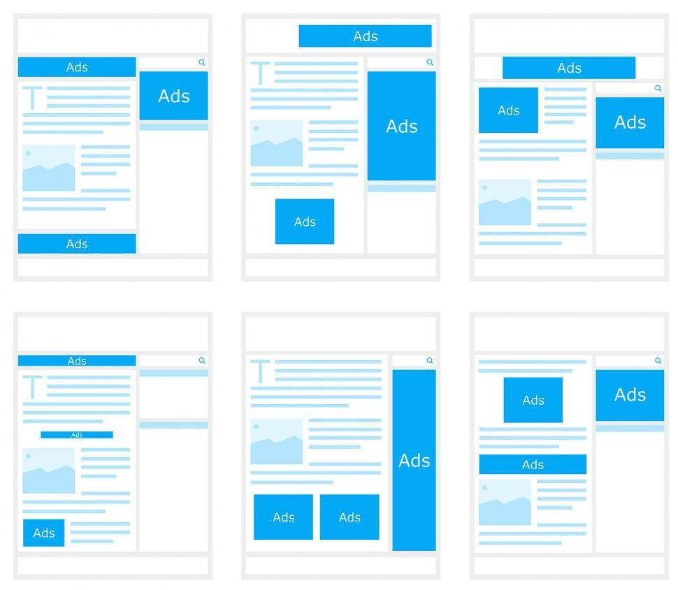
Designers use several different techniques to plan out the overall layout of a page. For instance, Paul Boag says that all websites operate on a grid system, with evenly spaced columns and rows. This grid system helps with the alignment of items on the page, which helps with balance and makes it easy to plan your layout. Similarly, designers also use wireframes to plan out the elements on the page (Technology Transformation Services). This typically uses boxes (to represent images) and dummy text to plan the placement of various elements on the page and to get an overall impression of the layout before you invest time in putting it together.
For some examples of different types of page layouts, take another look at Paul Boag’s article on WebsiteSetup.org. It not only provides layout options, but it explains how the different options fit with different types of content and purposes.
Visual Hierarchy
The visual hierarchy and overall structure of a design go hand in hand. While an effective page structure creates visual appeal and makes the information easier to navigate, visual hierarchy directs readers’ attention to the most important elements on the page, often because of their placement as well as their size. This is why article titles are at the top of the page and the font is much bigger, often set off in bold, colored lettering. Readers will see it first, and it helps frame their perception of everything else on the page. Another thing that will draw readers’ attention to specific elements is contrast—setting an item apart visually using color and negative space. For instance, call-to-action buttons are often set apart from the rest of the text so they are easier to see, often using a button icon in black or some other bright color that stands out against the background.
Setting up a page with a clear visual hierarchy also improves readability because it guides readers through the content, providing cues for what to pay attention to first, second, and so forth, which improves their ability to quickly scan the page. Once again, having a visual hierarchy that draws on familiar patterns will help readers more quickly move through the information. Babich identifies the F-shaped pattern and the Z-shaped pattern as two very common ways to organize information on a page that fits with readers’ “natural scanning patterns.”

Grouping Similar Items
Several of the Gestalt principles of design relate to the way people will naturally group items together based on visual cues, which once again helps them understand how items relate to each other and engage with the content of a page more quickly. Let’s look at some of those principles and how they affect the reader’s perception of content:
- Proximity. According to the Gestalt principle of proximity, readers will naturally group items together if they are close to each other. Take, for instance, a photo caption, which is usually placed directly underneath the photo, close enough to it so that readers will naturally perceive it as being connected with the photo.
- Common region. Similar to proximity, the principle of common region is about the way that items are grouped together because of the way they are set apart in a particular area—often in an enclosed box or with a background that is a different color than the rest of the page. The navigation menu for most websites is usually at the top, and the items are set apart in a different background color. Also many web pages are set up so that as users scroll, they can quickly identify different content areas, which are set apart with different background colors.
- Similarity. Finally, items will be perceived as similar if they have similar design features, perhaps with the same border, color scheme, and font. They would also be the same size so that readers perceive them as having equal weight.
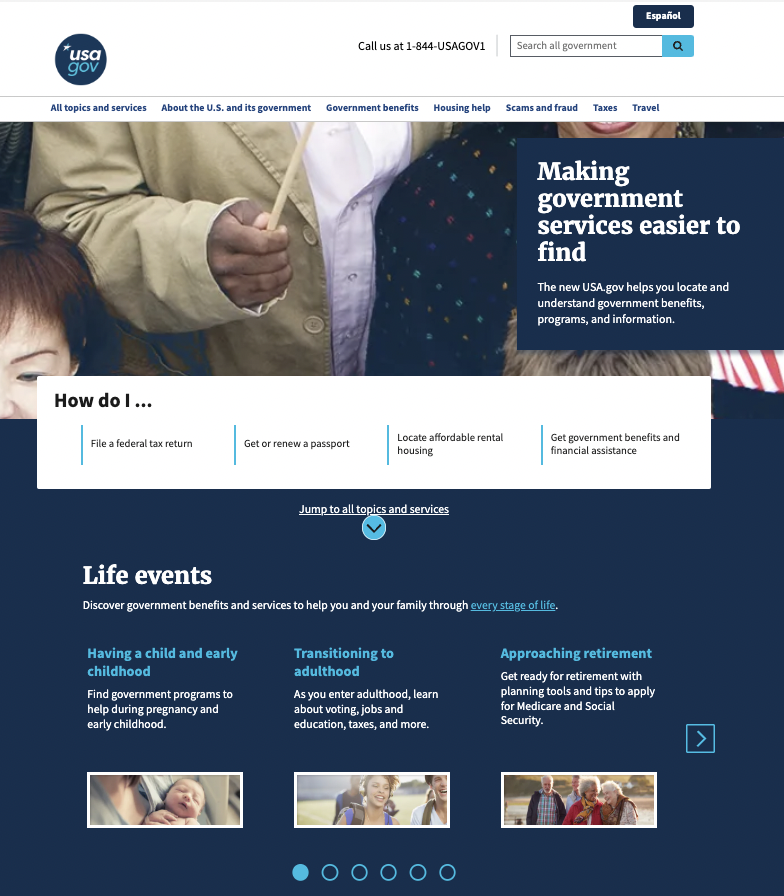
An example of how similar items might be grouped together might be helpful. The USA.gov home page uses all of the elements discussed above to make it immediately clear to readers how items relate to one another. The navigation menu at the top is set apart in a white background, separated from the banner graphic below. And because each of the menu items is close together and in the same basic black font, it’s clear right away what their purpose is and how they relate to one another. Similarly, as you scroll down the page, different content items are grouped together, and they are easy to spot because of the background shading (the white box with “How do I…” for instance). Also, items within each grouping use similar design elements, using the same font style and size as well as color choices. The content section below, for instance, uses three pictures that are all the same size, evenly spaced, and directly below the text that describes what each link is about. This, in tandem with the “Life Events” heading that would naturally draw readers’ attention first, helps readers to clearly see the relationship between the photos, which underscore the different ways the organization helps the community.
Consistency
Many of the design principles we’ve already discussed relate to consistency (also known as repetition) so that readers know what to expect and can easily read and interpret the content provided. This relates to a lot of different choices, from organizational structure to smaller design considerations like color, spacing, and font. Perhaps the best way to think about the importance of consistency is to imagine a page that isn’t consistent—that uses different font shapes and sizes and lots of different colors throughout. Not only would it be unattractive and difficult to determine what to look at first, but it would be harder to understand the relationship between elements, as discussed above, because the similar features that connect elements would be missing. Consistency also relates to the branding of an organization. The website should be strategically designed using a color scheme and design patterns that align with the overall image the organization is trying to create, and using these same structures consistently within a page and from one page to the next helps develop that brand. Below are a few specific ways to develop consistency:
- Page structure and organization. As discussed above, you can create consistency by utilizing organizational patterns that readers are already familiar with, which will make your site more intuitive for users. Once you’ve decided on a structure, then you’d try to be consistent with that structure throughout. For instance, the navigation menu should be the same from one page to the next. If you have a blog with different articles, each article would be laid out in similar patterns.
- Color scheme. Often the color scheme is consistent with other branding elements like the logo and other marketing materials so that everything looks like it goes together. Color is also an important element that can evoke readers’ emotional responses, so it should be used appropriately to build the brand. A kids’ laser tag facility would obviously use bright, electric colors to create a feeling of excitement in the audience. In contrast, a funeral home would obviously use more subtle, soft colors.
- Font. Because readers group similar items together based on design choices, it’s important to be consistent with font—page titles, headings, second-level headings. These would probably all be the same font style and color. Headings of equal importance would be the same font size with the same amount of spacing between.
- Other design elements. Whatever treatment you give to one element, you should apply it to all similar elements. If, for instance, one of your call-to-action buttons is a black rectangle with sharp corners, they should all look like that so they are easier to spot. If one callout box has a drop shadow, they should all have drop shadows.
While not everything on every page has to be exactly the same (see below about variety), creating consistency between key elements makes the overall design seem more unified, and it creates a more even and intuitive experience for the user.
Variety
An effective design uses a variety of design elements to engage readers as well as to clarify information. Chapter 10 in this textbook discussed multimodal messages and the power that various modes—images, text, color, video, sound—have to help clarify and enhance the meaning of a message. For that reason, and because it’s more visually appealing and interesting, you should think about how to use a variety of elements to draw readers’ attention.
Importantly, you can still be consistent while drawing on a variety of design elements. Take color, for instance: a web page would be boring and more difficult to read if it were just one color throughout. However, if you use the same two or three colors consistently—across various types of texts and content areas—then you have a variety of colors that direct readers’ attention without being overwhelming. Another way to use variety is through imagery, breaking up text blocks with photos and other graphics elements (icons, pie charts, tables, cartoons) that are relevant to the overall message and that help inform the readers’ interpretation of the message.
Once again, it’s important not to go overboard. When too many things are happening on a page, it’s overwhelming for readers. Nothing is emphasized because there are too many elements to look at. Being strategic about the elements that should go on a page and how to utilize variety with a couple of different modes of communication will go a long way.
Quality
It should probably go without saying that the elements that you do include on a page should be high quality, creating a professional look and feel. This relates to all of the design principles we’ve discussed up to this point, but here let’s focus specifically on pictures and videos. A quality photo, for instance, is one that is in focus and is a high enough resolution so that it isn’t pixelated or blurry. It has a clear focal point with the image positioned appropriately, so that it fits comfortably into the frame. There wouldn’t be anything in the foreground or in the background that would create a distraction. If you’ve taken very many candid photos, you know that this is easier said than done. We often take photos that are slightly out of focus or where the lighting is off, so there isn’t a good view of a person’s face. Fortunately, there are photo editing tools that can help with some of these issues, but it’s better to start with a high-quality image. The main point is to only include the best photos on your website or digital design.
The same thing can be said for videos, which are an increasingly common way to engage visitors either on a website or through social media. Videos can be an excellent tool because they provide clear visuals that can help viewers see a particular process, event, or product. They can also create emotional connections as viewers see people’s faces and hear their voices. However, there’s a lot that goes into creating an effective video that reduces background noise, that creates interesting and dynamic scenes, that avoids “dead air” or transitions that are too slow as well as camera movements that are too fast or wobbly, that uses effective voice overs and sound effects, that has the appropriate lighting, that effectively integrates text and other visual elements, and so on. Once again, video editing tools have evolved significantly in the last few years, which makes it possible for anyone to enhance the quality of the videos they put online. There are also plenty of YouTube videos—for video editing as well as photo editing techniques.
Activity 14.1
Let’s put some of the design principles listed above into action. Review the FedEx home page—or any other website of your choosing. You should go through the design principles listed above and consider how they are applied on the page. Which ones strike you as being the most effective in both engaging readers (both visually and emotionally) and helping them easily navigate the information on the page.
Now reverse engineer the page by creating your own wireframe of the page structure. You can do this with a pencil and paper and really basic boxes and text blocks to represent the various elements.
Now consider how the page might have been structured differently. Create a new wireframe that organizes the elements in a different way. Consider how you could utilize some of the other design principles listed above to engage readers in this new page design.
Other Design Theories
While this chapter isn’t intended to be an exhaustive resource on visual design, it would probably be helpful to at least mention some of the other design theories that could be useful in your decision-making process as you put together the visual elements of a web page, blog post, or digital ad. The principles listed above are the most basic and also the most foundational design principles that can be immediately applied to your digital writing and design projects. This section will mention other prominent design theories that may provide a deeper understanding of the audience perception and some of the nuances in your design choices that can have a significant impact.
Gestalt Design Principles
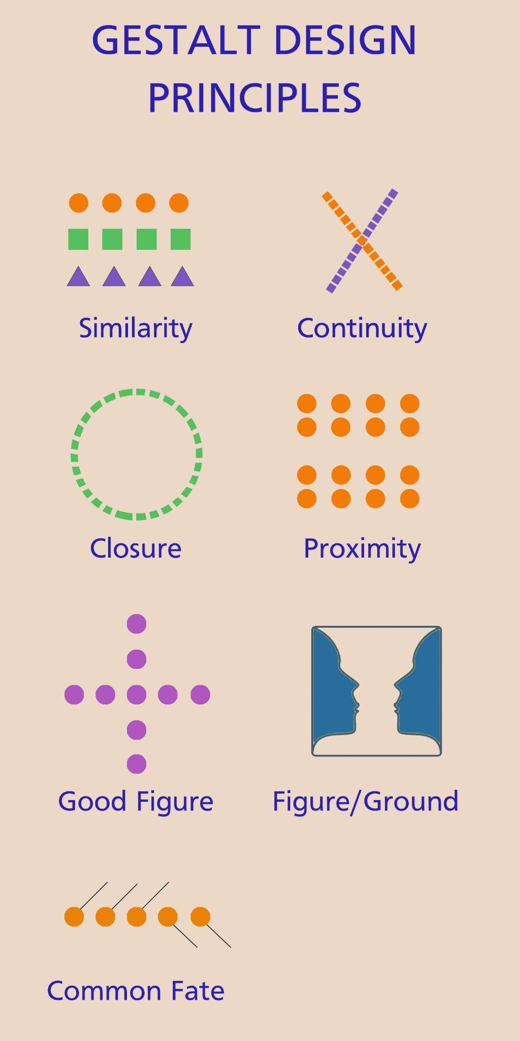
Many of the principles identified above draw from Gestalt psychology, which is the study of how people perceive design elements on a page to create meaning (Encyclopedia Britannica). Gestalt theory looks at the entire layout of a design and considers the way that elements work together to create meaning. Thus, elements aren’t viewed in “isolation” but as contributors toward the entire message. There are seven classic Gestalt principles, some of which we’ve already mentioned (ManyPixels), but they are listed briefly again here so they can be viewed all together:
- Similarity. As already discussed, the principle of similarity helps readers group items together that have similar features. However, it can be used to make certain items stand apart from the group in some way.
- Good figure of simplicity. Viewers will always reduce a complex design to its simplest form because it’s easier to process. The ManyPixels blog uses the example of the Olympics logo, which most people will perceive as five overlapping circles as opposed to something more complex. This relates directly to the principles discussed above about limiting the amount of information and visual elements on the page. Simpler designs are much easier for readers to process and to remember.
- Proximity. Viewers are more likely to group items together when they are near each other. This is a good way to demonstrate a relationship between these elements and also to make other elements—spaced further away—stand out.
- Continuity. Our minds have the tendency to connect items if they follow the same line or curve. According to this principle, simply lining information up in a line from left to right or top to bottom, sometimes using actual lines or arrows to connect them, will help readers group items together and sequence how they process information.
- Closure. For shapes and images that are disconnected in some way, viewers will automatically fill in the gaps so they can perceive the entire image. A classic example is a circle that is formed along a dotted line. Despite the fact that it isn’t a closed circle, a viewer will automatically close the gaps to see the circle shape, instead of seeing a smattering of random dots.
- Figure/ground. When looking at a picture or other page layout, we will immediately try to discern what is in the foreground (the figure or focal point of the picture) and what is in the background. Obviously, the more important items that you want viewers to pay attention to should be in the foreground, contrasted in some way from the background.
- Common fate. This principle states that people will tend to group items together that seem to be moving in or pointing in the same direction. A simple example might be italicized text that is all pointing in the same direction. We’d be more likely to see that text as connected together because of the common angle of the font.
Color Theory
There are lots of different ways to talk about color and the effect it can have on the audience. For starters, there is a difference between hue (what we normally think of as the color of something—e.g., green or blue) and other visual qualities, such as shade (light or dark) and saturation (how pale or bright the color appears). Obviously, colors that are more vibrant—a brighter, more saturated color—will have more visual weight and be more likely to draw the viewer’s attention.
Color theory also relates to the emotions that different colors evoke in the audience. You probably already know that there are “warmer” colors like red, orange, and yellow and “cooler” colors like blue, purple, and green. These colors can be used strategically to enhance a message or the overall tone of a design. Similarly, different colors are often associated with different meanings (Bowman). Red is often associated with love, anger, or warmth. Yellow is often connected with happiness and excitement. And so forth. Color choice can have a significant impact on how a message is interpreted and the feelings that the audience associates with that message.
Finally, color theory focuses on the ways that colors work together to create an overall visual impression or experience (Interaction Design Foundation). The only way that one element would be emphasized using color is if other items were de-emphasized with contrasting colors that were less vibrant. There are also the dynamics of how different color combinations pair together to create complementary (opposing) or analogous (similar) effects. The main goal is to use a consistent color palette that has a variety of colors that work well together and to use color strategically throughout the design to create emphasis. As always, color choice is one key element in a much larger strategy to convey a particular message, build your brand, engage viewers, and evoke particular responses.
Typography
As the name suggests, the study of typography relates to the way that text is designed so that a message is both readable and interesting. While the particulars of typography—the different classifications of fonts and the different parts of a letter—can be quite detailed and specific (Bowers), here we will focus on the primary considerations of typography, assuming that you will be making font selections instead of creating your own.
The main consideration when it comes to typography is readability. Obviously, the text comprises an important part of the overall message, and you want readers to be able to easily read it, from the largest headings and titles down to the smaller text blocks. There are a few basic strategies that will make the font easier to read:
- Size. Obviously, the bigger the font, the easier it is to read. As previously mentioned, your titles and headings will be larger than some of the other text blocks and will therefore naturally pull readers’ attention, but they should also be able to read the “smaller” print of an article or web page. A good rule of thumb for digital writing is to use 11-point font or larger. Of course, the size will vary depending on the context. If the text is going on a digital screen in an area where readers will be reading it from a distance, the font size will be significantly larger.
- Font choice. As we’ll discuss below, different fonts have different personalities that might enhance the emotional quality of your message, so it’s probably okay to play around with different font styles for titles and ad copy where only a few words are selected and the font is relatively large. However, for larger blocks of text that require more sustained readability, it’s much better to stick with a standard sans serif font, meaning that it doesn’t have additional strokes and projections at the ends of a letter. For example, look at the two F’s below. The one on the left is in a sans serif font, and the one on the right is in a serif font.
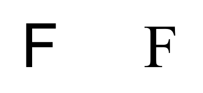
As you can see, the serif font on the right has extra marks at the base and at the ends. While this might create a more formal look, it is harder to read, particularly for large text blocks in a smaller font. And obviously, the more pronounced and ornate the serfs become, utilizing lots of different swirls and other elements, the more difficult it would be to read.
- Contrast. The final consideration with readability is about contrast, so that the lettering is set apart from the background enough so that it is easy to read. One of the biggest mistakes novice designers make is to use a font color that doesn’t have enough contrast with the background—a light gray font on a white background, for instance, or red font on a black background. There has to be enough contrast so that the text easily stands out. You’d especially want to keep this in mind for text that goes over the top of an image. Once again, without the right contrast, it can be extremely difficult to read the text over an image. That’s why many designers use the negative space of a picture, create drop shadows around the text, or use text boxes—all of which can be used to increase the contrast so that the text stands out.
The other consideration with typography is about the overall emotional quality personality of various font styles and how they might be used to enhance your message. Again, readability is key, so you wouldn’t use different font treatments for larger chunks of text, but for a title or a short line of ad copy, a unique font can have a significant effect on the audience’s interpretation. It might help if you first consider the overall purpose and tone of the message, the impression that you are trying to create in the mind of the reader, and that will likely guide your font choices. Is the tone of the message serious? In that case, it might make sense to go with a more traditional sans serif font. Are you trying to demonstrate the elegance of a particular product or event? In that case, a more formal script font like Edwardian would be more appropriate. On the other hand, if you want to invite a bunch of children to a kid’s birthday party, then you’d want a font that seems playful and fun—Curlz, for instance. While there are lots of different fonts to choose from that might create the right impression in your audience, there are definitely fonts that would be the wrong choice. Consider, for instance, a wedding invitation that is created in Curlz font. Instead of sending the message that the event would be formal and sophisticated, the invitation would probably create some confusion and maybe even some anxiety about what to expect.
Activity 14.2
Consider the list of messages below. What type of font do you think would be most appropriate for each one? Give an example for each one:
- Job résumé
- Yard sale sign
- Graduation open house
- Funeral bulletin
- Ad for a neighborhood block party
- Public service announcement about suicide awareness
- Course syllabus
- Divorce papers
- “Closeout” sale
- Feel free to come up with your own
Special Considerations for Digital Design
As you put together designs that will be viewed on digital devices, there are a few special considerations that enhance usability:
- File sizes. We’ve already discussed the fact that you should only use quality images and videos to engage viewers, but the other side of that is that higher-resolution images and high-quality videos are usually really big files that take up precious storage space and often result in longer loading times, which can quickly frustrate impatient users. Fortunately, web graphics don’t need to be as high-resolution as print graphics (72 dpi compared to 300 dpi), which means the files will be significantly smaller. Further, saving the file as a .jpg or .png results in a smaller file than a .tif or a .psd file. For videos, there are online applications you can use to compress video files into something smaller. Alternatively, you might consider uploading video files to YouTube and then embedding the video link on your website, which means that the video will still play on your web page, but the video itself isn’t housed there.
- Cascading style sheets. With so many WYSIWYG (What You See Is What You Get) platforms, it’s no longer necessary for you to know how to code a website in HTML to create one. Cascading style sheets describe a way of coding the elements on a web page so that they are consistent across different pages—so that the title of each page, for instance, has the same font style, font size, color choice, and spacing. Most web platforms have these types of choices built in so that you can make selections that will be consistent across different pages of your website without having to know the HTML code. Utilizing these options will help you more easily create consistency and unity.
- Hyperlinks and buttons. Here’s where your design choices can leverage concepts that your audience is familiar with, and since your hyperlinks and buttons usually accompany your call to action—inviting readers to take some sort of step toward your desired goal—it’s important that they recognize these elements. It’s pretty simple, really. A hyperlink is usually in blue font, underlined. This is the universal signal that the text is a hyperlink to a relevant page, and following this convention will make it much more likely that readers will recognize the hyperlink and click it. Usually, pages are structured so that internal links open in the same screen, whereas external links will open up a new window, making it possible for readers to return to the original page. In that case, it’s helpful to set up your hyperlinks so that they change colors once they have been clicked (maybe from blue to purple) so that readers can visually see where they’ve already been. Similarly, buttons are more often used as the overall call to action—to “read more,” to “apply now,” to “subscribe,” and so on. While some of the more subtle style choices might vary, it would be to your benefit to make your buttons look similar—not only from one page to the next but also in comparison to other websites.
- Mobile responsiveness. A mobile-responsive website is one that reformats for maximum readability and usability depending on the user’s device (Constant Contact). So instead of displaying the same, shrunken-down version of the home page on your cell phone, the overall format changes so that key items are bigger and formatted vertically, so it’s easier to scroll through and click on the items that you want. This is helpful not only when going from a laptop to a cell phone but also when switching from one screen size to the next or one type of browser to the next. It ensures that the items are reformatted appropriately. Once again, many web platforms are mobile responsive and make it possible for you to toggle back and forth between multiple views as you put a page together.
- Testing. One great thing about digital design is that it’s relatively easy to change. Content strategists and web developers are constantly “testing” the effectiveness of their pages, not just through form feedback but also through various metrics that show how long viewers stayed on a specific page, how many people clicked on the CTA, and so on. Playing around with different versions and monitoring the results lets you gauge how your design choices are landing with your audience and to make improvements along the way.
There is a lot to consider when it comes to the design of your digital projects, and sometimes having so many options can be overwhelming. The good news is that there are lots of online resources that you can draw from as well as successful (and unsuccessful) websites where you can draw inspiration and remind yourself of various pitfalls.
Discussion Questions
- What is the user experience (UX) and how does the overall “design” of a website influence the user experience? Consider the different types of “design” discussed in the introduction.
- How does the design of a message relate to rhetoric? Be specific about how it relates to some of the terms we’ve already discussed: purpose, audience, genre, persuasive appeals, and so on.
- The design principles identified in this chapter are based on research in the area of psychology and behavioral sciences that look closely at how people process and respond to information. Explain this reciprocal relationship between audience perspective and design.
- The chapter lists six foundational principles of web design. Identify each one, and give a brief overview of what each one means and how it might be applied.
- What is a wireframe and how might it be used to help you plan your design?
- Many of the foundational web design principles identified near the beginning of the chapter overlap in some ways. For instance, the principles of page structure and visual hierarchy both relate to the arrangement of elements on the page and strategies to emphasize important ideas. What other ideas overlap across some of the design strategies discussed in this chapter?
- Explain how a digital design can have both variety and consistency.
- What are the Gestalt design principles? How do they relate to some of the principles discussed in the first part of the chapter?
- In what ways do the sections on color theory and typography build on the design principles already discussed?
- Explain some of the special design considerations that are unique to digital writing. Can you think of any others that aren’t specifically mentioned in the chapter?
Sources
Babich, Nick. “Web Page Design: A Comprehensive Guide.” Adobe.com, 24 Nov. 2020, https://xd.adobe.com/ideas/principles/web-design/web-page-design/.
Boag, Paul. “10 Good Website Layout Ideas (with Examples).” WebsiteSetup.org, 11 Dec. 2022, https://websitesetup.org/website-layouts/.
Bowers, Micah. “Dissecting the Intricacies of Typography Anatomy (with Infographic).” Toptal.com, n.d., https://www.toptal.com/designers/typography/typography-anatomy-infographic.
Bowman, Amanda. “How to Choose Brand Colors and What Color Says about Your Business.” CrowdSpring.com, 4 May 2022, https://www.crowdspring.com/blog/small-business-branding-color/.
Bradley, Steven. “Design Principles: Compositional, Symmetrical, and Asymmetrical Balance.” SmashingMagazine.com, 10 Mar 2017, https://www.smashingmagazine.com/2015/06/design-principles-compositional-balance-symmetry-asymmetry/.
Constant Contact. “Mobile-Friendly vs. Mobile-Responsive.” ConstantContact.com, 22 Dec. 2022, https://www.constantcontact.com/blog/website-mobile-friendly-vs-mobile-responsive/#:~:text=Mobile%2Dresponsive%20%E2%80%93%20Websites%20that%20are,pictures%20are%20resized%20and%20reformatted.
Crestodina, Andy. “Web Design Standards vs. Website Best Practices: Our Review of 500 Sites [New Research].” LinkedIn.com, 27 Apr. 2022, https://www.linkedin.com/pulse/web-design-standards-vs-website-best-practices-our-500-crestodina/.
Encyclopedia Britannica. “Gestalt Psychology.” Britannica.com, 2 Dec. 2022, https://www.britannica.com/science/Gestalt-psychology.
Interaction Design Foundation. “What Is Color Theory?” Interaction-design.org, n.d., https://www.interaction-design.org/literature/topics/color-theory.
Khazanova, Alina. “20 Principles of Website Design Every Web Professional Should Know.” Elementor.com, 23 Jan 2022, https://elementor.com/blog/principles-of-website-design/.
ManyPixels. “Gestalt Principles in Graphic Design.” ManyPixels.com, 9 June 2022, https://www.manypixels.co/blog/post/gestalt-principles-in-graphic-design.
Norman, Don, and Jakob Nielsen. “The Definition of User Experience (UX).” Nielsen Norman Group, 2023, https://www.nngroup.com/articles/definition-user-experience/#:~:text=Summary%3A%20%22User%20experience%22%20encompasses,its%20services%2C%20and%20its%20products.
Technology Transformation Services. “Wireframing.” Usability.gov, 14 Mar 2023, https://www.usability.gov/how-to-and-tools/methods/wireframing.html#:~:text=A%20wireframe%20is%20a%20two,styling%2C%20color%2C%20or%20graphics.
USA.gov. “Making Government Sources Easier to Find.” USA.gov, n.d., https://www.usa.gov/.
