
Chapter 3: Infographics
By the end of this chapter, you should be able to:
- Design new content for current courses. (LO2)
- Investigate new forms of media to engage students. (LO3)
Infographics are essentially: info (text) + graphics (pictures/cartoons/basic shapes, etc.). Typically, infographics are one page, but sizes do vary. There are probably endless versions of what an infographic can look like, so let the ideas fly free and start creating! There are also many ways to build an infographic. The following steps are meant as a springboard for your creative process to be developed as you start building your own materials. This process can be applicable to an instructor making materials or for a student creating an infographic in a course. But first, a quick video about different types of infographics.
Step 1: Content
When building anything, it is much easier to have the content prepared already. If possible, complete your research ahead of time. Depending on the content area, around three resources is probably enough in order to build a graphic that has enough content, but not too much. If you have too many resources, it may be difficult to pare down the content. You may need extra pages, maybe even a book! Keep track of your references as well, so you can cite them in your graphic.
Worthwhile to consider may be AI. AI can generate content for you with directed prompts. Just make sure to review the content to verify accuracy.
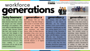
Below is a sample infographic, that demonstrates how one looks with more text than graphics. What, if anything would you change about this graphic?
Step 2: Design
After most, if not all of your content is collected, select a design platform that suits you. The Microsoft Office Suite offers some ability to create infographics, but it’s not user friendly sometimes. Other platforms that are recommended are:
Both of these platforms offer free design options, including free accounts where you can store your projects. Both platforms offer templates, resources, and other forms of assistance as you begin your design journey. Canva is my preference, but I know both platforms are established and relatively easy to use. If you are new to designing, perusing the templates that either platform has to offer will probably encourage ideas for you to use with the selected content. Below is a quick tutorial for how to use Canva.
Step 3: Formatting & Accessibility
Once you have decided on a design, whether one that is provided or one in your mind, it’s time to add the design and your content together. If you are using a template, it is easy to plug in your information in the respective areas. You can also play with the coloration of the graphics so they meet your branding requirements or to be more accessible. Be sure to think about accessibility in terms of fonts, sizes, coloration, how you will present the graphic to an audience. Answers to those questions may affect your final design.
When all of your content, including references, are in the platform, take a break. Seriously. The never ending barrage of design can overwork your mind; taking a break will help you refresh for the next step! Below are some items to consider regarding accessibility, that have been covered in Open Engagement, but are worth repeating.
Step 4: Edits
Did you take a break? I hope so. Editing can be very tedious, even when it’s just text. But add in all of the design components and there’s so much more to consider. Below are some of the criteria to consider when reviewing an infographic (note to instructors: evaluating infographics based on aesthetics may not be helpful if the class is not focused on design):
- Content: Content demonstrates a complete mastery of ideas. There is an in-depth analysis and originality of thought. The infographic topic and purpose were clear and concise. There is a significant presence of both images and text.
- Data: The data in the infographic was accurate and relevant to the topic.
- Organization and Format: The infographic has an attractive and easy to understand layout. There are applicable graphics that aid in understanding, but the infographic does not seem cluttered.
- Style: The infographic has an original style that consistently uses multiple colors. The font is legible, and the color scheme enhanced the infographic.
- References: Citations for the infographic sources were included in the appropriate APA format.
Step 5: Peer Review
After you have built and edited your wonderful infographic, it is important to have at least one other person review it. Peer review is helpful because it offers a new perspective on content that you’ve been working on for hours. It offers a fresh set of eyes to check for spelling and grammatical errors. Peer review may also notice some elements you missed in the content or find a graphic that may be better suited for the content. Peer review is essential when creating new things, it fuels the learning process and continuous improvement of the learning materials.
Now, you can celebrate because you have completed all five steps to making an infographic!
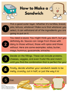
Check out this sample infographic below as needed.
References:
Venngage. (2018, July 19). The 9 types of infographics [Video]. YouTube. https://www.youtube.com/watch?v=tN8_85gKOTc&t=2s
Ziovo (2020, March 20). How to use Canva for beginners [Video]. YouTube. https://www.youtube.com/watch?v=zJSgUx5K6V0
