
5 Unemployment
The outstanding faults of the economic society in which we live are its failure to provide for full employment and its arbitrary and inequitable distribution of wealth and incomes.
John Maynard Keynes
5.1 Unemployment via the FRED Excel Add-In
FRED, the Federal Reserve Economic Data archive, compiles information from many sources. It is freely available online at fred.stlouisfed.org/, but we will access it through the FRED Excel add-in. This saves a lot of time and effort in getting the data in Excel for further analysis.
The latest FRED Add-In for Microsoft Excel is available from fred.stlouisfed.org/fred-
STEP Download FRED.xlam from dub.sh/addins. Use the Add-ins Manager (keyboard shortcut Alt, t, i) to install it.
We will use the FRED add-in to get and work with unemployment data, but an important goal is to demonstrate the remarkable power of this open-access software. It opens the door to a huge trove of data.
To set the stage for our work on unemployment, recall that an economy’s long-run performance is measured by the growth rate of real GDP per person. The magic number for rich countries is 2% per year. This gives a doubling of output per person roughly every generation.
When we focus on the short run, or the business cycle, we cannot use GDP because it takes too long to compile the data and publish the results. GDP is computed quarterly with a few months of lag and is often revised after initial release.
We need something at this moment that tells us how the economy is doing right now. New work is being done on this problem using internet activity, but the traditional approach to measuring the current state of the economy relies on a monthly labor market survey.
Each month, the Bureau of Labor Statistics (BLS) releases the results of its Current Population Survey (CPS). Tens of thousands of households around the United States are interviewed, and people are asked about their jobs, earnings, and other details.
In the third week of each month, the BLS releases a report on the number of workers, jobs, and perhaps most importantly, the unemployment rate for the previous month. You can see that we are already a month behind in our quest to read the economy, but this is much better than GDP.
The unemployment rate is a key indicator of short-run economic performance. When it is high, the economy is doing poorly, and when it is low (but not too low), the economy is doing well. The magic number for the overall unemployment rate is around 4% to 5%.
STEP Use your favorite browser to search for the “current unemployment rate.”
You interpret the unemployment rate by seeing if it is around 4% and by its change from the previous month.
Our goal is to understand how the unemployment rate is computed and what it tells us. We proceed by explaining how unemployment is defined and measured. Along the way, we will learn about other labor statistics and seasonal adjustment. In the next section, we examine subgroups of people—unemployment is not the same for everyone. We will see that the overall unemployment rate masks substantial variation across demographic groups and geographic areas.
Defining and Measuring Unemployment
Labor market statistics are based on a series of mutually exclusive categories. We place people in groups, or buckets, and then compute ratios. We begin with the total population.
STEP Open a blank Excel workbook and save as Unemployment.xlsx. Enter pop (or POP, as case does not matter) in cell A1, click on the FRED tab in the Ribbon, and click the Get FRED Data button in the top-left corner.
You just used Excel to connect to the St. Louis Fed and downloaded the total population in the United States from the FRED website! Notice the blue link in cell A5. If you click it, you go to the FRED web page for this variable, and it has more documentation.
As you just saw, the FRED Excel add-in is easy to use, but you do need to know how it works. You control what you get by providing four inputs:
- Series ID
- Data manipulation (can be blank)
- Frequency (can be blank)
- Start Date (can be blank)
The FRED add-in works by taking the information you input in the first four rows of a spreadsheet and then outputting the results in two columns starting in row 5. The only thing required is the Series ID; it fills in default choices if the other three items are not given.
STEP Change cell A3 from M to A (it can be lowercase a) and click the Get FRED Data button. You can also use the Frequency Aggregation button in the FRED menu, but typing the letter a is easier.
You now have the total population in the United States on an annual (yearly) basis. Taking into account the units of the variable in cell B1, we can see the US population was about 335 million people in 2023.
Notice that cell B3 continues to display “Monthly” because that is the original frequency of the variable. By entering an A, you directed FRED to report the variable on a yearly basis.
To get to the unemployment rate, we walk through a series of separations, as depicted in Figure 5.1. Each step down splits the category above into two mutually exclusive parts.
From a total population of 335 million people, we remove everyone who is in the military, a prison, or a hospital. There are several million people in this category. The United States has one of the highest incarceration rates in the category. The United States has one of the highest incarceration rates in the world (see www.sentencingproject.org/research) and a large standing army, so the civilian, noninstitutional population is about 330 million people.
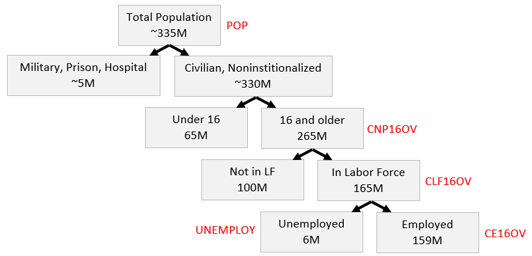
Next, we split the civilian, noninstitutional population into children, those under 16 years old, and working-age people, those 16 and over. The United States today, like most rich countries, is rather old, with only about a fifth of the population under 16 years old.
The next step is crucial. We separate the 265 million working-age people into two groups: those who want to work and those who do not. Those who work or want to work are said to be in the labor force. Those who do not (for example, they are in school, retired, or taking care of children) are out of the labor force.
Finally, the last split in Figure 5.1 separates the labor force into two parts: those with a job (employed) and those without a job (unemployed). In August 2023, the number of unemployed people was quite low relative to the total number of people in the labor force.
The numbers in Figure 5.1 are much more volatile at the bottom than at the top. The number of unemployed people fluctuates quite a bit, while the population numbers at the top change much more slowly and predictably.
Figure 5.1 also reveals that not having a job does not guarantee that you are unemployed. After all, you might not have a job, but you might not want one. Then you are not unemployed but out of the labor force. To be defined as unemployed, you must not have a job and want to work.
Now that we have the major labor market categories, we can compute two important labor statistics:
• [latex]Unemployment Rate = \frac{Unemployed}{Labor Force}[/latex]
• [latex]Labor Force Participation Rate (LFPR) = \frac{Labor Force}{CivNonInstPop16+}[/latex]
The unemployment rate is the percentage of the labor force that is unemployed. The LFPR is the percentage of the civilian, noninstitutional, working-age population that is in the labor force.
Unemployment Data
We can apply the framework in Figure 5.1 to practice our FRED skills, confirm the numbers in each category, and replicate the unemployment rate and LFPR statistics reported by the BLS.
STEP In cell C1, enter CNP16OV (civilian, noninstitutional population aged 16 and over, so the penultimate character is the uppercase letter O, not the number 0). Click the Get FRED Data button.
Notice that the dates are not aligned. We need to fix that.
STEP Enter 1/1/1952 (the latest of the dates for the two series) in cells A4 and C4. Click the Get FRED Data button.
We can make a chart of the two series with FRED’s built-in graphing tool.
STEP Click the Build Graph button and select Create Multiple Series Graph. Click Series 1 and select pop. Click Series 2 and select CNP16OV. Click the Build Graph button in the bottom left corner.
You created a chart in the signature FRED style, with a blue border and source information at the bottom. Multiple series charts do not include titles. You can add a title and other enhancements via the usual chart options—it is an Excel chart that can be edited and manipulated like any Excel chart.
We continue on our whirlwind tour of labor market statistics and FRED by confirming that the labor force is the sum of employed and unemployed people and showing how the unemployment rate and LFPR are computed.
STEP Insert a new sheet in your workbook. Using the Series IDs in Figure 5.1, get data on the civilian, noninstitutional population 16 and over, in the labor force, employed, and unemployed from 1/1/1952. See the appendix if you have trouble.
Notice that in row 5, with the clickable link that takes you to the FRED website, the word Level is used. This is standard macroeconomics terminology for the value of a variable or indicator at a point in time. Often, we take the levels and perform other computations, such as the percentage change.
The number of employed in January 1952 is 60,460 (in cell F8). Does this mean there were 60,460 people working in the United States at that time? No, that is simply too small a number. Cell F2 tells us that the data are in thousands, so the employment level was 60,460,000 at that time.
STEP In cell I7, enter the label Emp+Unemp=LF Check. In cell I8, enter a formula to confirm that this is true. See the appendix if you need help.
Having confirmed that the labor force is the number of people working plus the number of people unemployed, we can use the data to compute the unemployment rate and LFPR.
STEP In cell J7, enter the label UNRATE. In cell J8, enter a formula that computes the unemployment rate. Format the unemployment rate as a percentage with one decimal point. See the appendix if you need help.
How can we check our work? That is easy. We use the FRED add-in to download the unemployment rate and see if we got the same numbers.
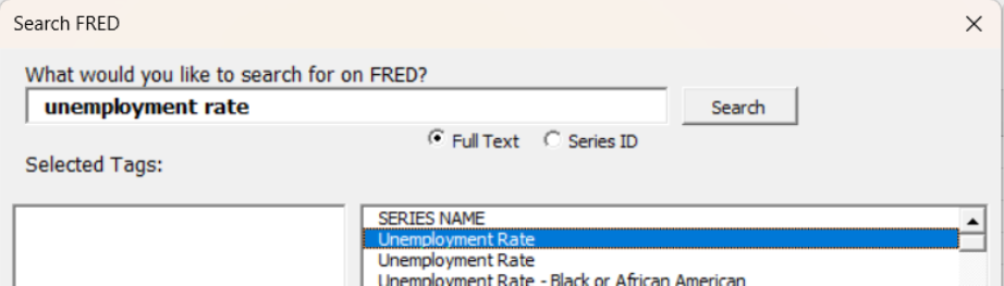
But we have a problem—we do not know the Series ID for the unemployment rate. Fortunately, FRED has a search tool that we can use to find the Series ID.
STEP Click the Data Search button (with the magnifying glass) in the FRED menu. Enter the search text unemployment rate and click the Search button.
FRED displays a lot of hits, but the top two look promising. If you scroll right in the search window, you will see the Series IDs and other information. The only difference between the two is that one is SA and the other is NSA. This means seasonally adjusted and not seasonally adjusted.
We seasonally adjust variables that vary systematically over the year. For example, construction employment falls in the winter and rises in the summer. Seasonal adjustment would tweak the construction employment numbers higher in the winter and lower in the summer so we can remove the seasonal component and make a better comparison across months.
STEP Click the SA (topmost) unemployment rate to select it as shown in Figure 5.2. Click the Add Series ID button at the bottom of the search window and click Close.
Source: Screenshot of Excel interface, © Microsoft Corporation. Add-in by Federal Reserve Bank of St. Louis (FRED).
FRED places information in cells I1:I4. We need to move it so that FRED does not download data on top of our work in columns I and J.
STEP Move cell range I1:I4 to cells K1:K4. Replace the start date with 1/1/1952. Click the Get FRED Data button.
It is immediately obvious that our computed version of the unemployment rate matches the Series ID UNRATE.
STEP Replicate Figure 5.3 by clicking the Build Graph button and selecting Create Graph(s). Select the UNRATE series and check the option Include U.S. Recession Shading. Finally, click the Build Graph(s) button.
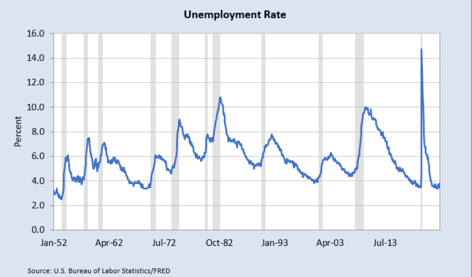
Source: USBLS via FRED, Public Domain Data / FRED Terms.
The gray bars mean the economy was in a recession. Increases in the unemployment rate are strongly associated with recessionary periods.
The most recent spike was during the COVID-19 pandemic. The data in your spreadsheet show the highest unemployment rate was 14.7% in April 2020 (cell L827). Fortunately, it rapidly came back down.
STEP Apply the same steps used for the unemployment rate to the LFPR. Find the Series ID, download the data, and compare it to your own computed version to confirm they are the same. Create a chart of the LFPR with recession shading to replicate Figure 5.4. See the appendix if you need help.
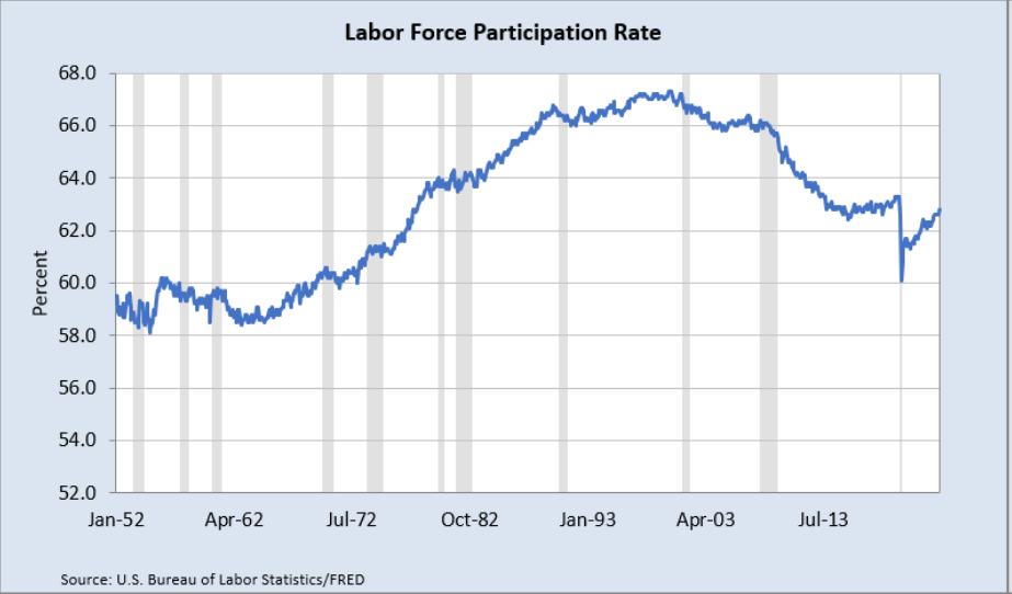
Source: USBLS via FRED, Public Domain Data / FRED Terms.
Unlike the unemployment rate, which bounces around a lot, the LFPR saw a steady increase until the early 2000s, when the labor force was about two-thirds of the civilian, noninstitutional population 16 and older.
The LFPR fell dramatically during the COVID-19 pandemic, down to about 60% before recovering a bit. As of this writing in 2025, it was still lower than its peak. This means working-age people are not as interested in working as they used to be before the pandemic.
Takeaways
The FRED Excel add-in is a powerful tool that instantly downloads data from FRED into Excel.
It works by taking input from the first four rows of a sheet. Only the first row, with the Series ID, is required.
If you do not know the Series ID, search for it with the Data Search tool.
The charts created by the FRED add-in have a signature blue border and source information. FRED uses Excel’s Line chart type, and this requires the same dates for all series.
Unemployment statistics are generated by the results from the monthly Current Population Survey.
The questions are designed to create mutually exclusive categories, such as younger than 16 years old or 16 and over.
To be unemployed, you have to be without a job but want to work. If you do not want to work (you are in school or retired or any other reason), you are out of the labor force. See Figure 5.1.
The unemployment rate is the ratio of the number of people unemployed to the number of people in the labor force.
The magic number (like batting .300) for the unemployment rate is 4% to 5%. In the long run, we want real GDP per person growth of 2% per year, and the higher the better. High unemployment is bad, of course, but the UNRATE can be so low that the economy overheats and prices rise too fast.
Because the unemployment rate is estimated every month, it is used as a predictor of short-run economic performance.
The LFPR (labor force participation rate) is another important labor market statistic. It is the ratio of the number of people in the labor force to the number of civilians 16 and over who are not institutionalized (in prison or a medical facility).
References
The epigraph is from the opening sentence of the last chapter of Keynes, J. M. (1936). The General Theory of Employment, Interest and Money. Full text online at http://www.marxists.org/reference/subject/economics/keynes/general-theory. This book led to the reorganization of economics into micro- and macroeconomics. It also radically changed the way economists thought about the role of government. Instead of passive onlookers, after Keynes, the Fed and other government actors saw themselves as responsible for actively managing the economy.
U.S. Bureau of Labor Statistics, Labor Force Participation Rate [CIVPART], retrieved from FRED, Federal Reserve Bank of St. Louis; https://fred.stlouisfed.org/series/CIVPART.
U.S. Bureau of Labor Statistics, Unemployment Rate [UNRATE], retrieved from FRED, Federal Reserve Bank of St. Louis; https://fred.stlouisfed.org/series/UNRATE.
Appendix
Download Four Series
To download the civilian, noninstitutional population 16 and over, labor force, employed, and unemployed from 1/1/1952, enter the Series IDs in row 1: CNP16OV in cell A1, CLF16OV in cell C1, CE16OV in cell E1, and UNEMPLOY in cell G1.
In row 4 of columns A, C, E, and G, enter 1/1/1952.
Click the Get FRED Data button from the FRED menu.
In a few moments (depending on the speed of your internet connection and how much data it needs to download), the spreadsheet fills with data for the four variables you requested, beginning with labels in row 7, followed by numbers.
Emp+Unemp=LF Check
In cell I8, enter the formula =D8-F8-H8 and fill it down.
The many zeroes confirm that the sum of Employed and Unemployed equals the Labor Force. The few ones are rounding errors. It is definitely true that the labor force is the number of people 16 and over who have or want a job.
Compute UNRATE
In cell J8, enter the formula =H8/D8. Click the % (Percent Style) button in the Home tab in the Ribbon and add a decimal place (using the Increase Decimal button near the % button). Fill it down.
LFPR
The first hit in a search of labor force participation rate is CIVPART. Selecting it and clicking the Add Series ID button puts the information on the sheet, but you have to move it to cell M1:N4.
Do not forget to change the date to 1/1/1952. If you do forget, then change the date and download the data again.
With CIVPART downloaded in columns M and N, enter the label LFPR in cell O7 and the formula =D8/B8 in cell O8. Format it as % with one decimal place. Fill it down.
It is easy to see that your LFPR in column O replicates CIVPART in column N.
To make the chart, simply click the Build Graph button and select CIVPART.
5.2 Unemployment by Subgroups
The headline unemployment rate number (with FRED Series ID UNRATE) is widely reported and discussed. Every month, the CPS asks about 60,000 households a series of questions, and their answers are used to take the pulse of the economy.
We are pleased when we hear the unemployment rate is around 4% or that it has fallen from the previous month if it is above 4%.
We know, however, that a single number cannot possibly tell us everything about something as complicated as an entire economy. The overall unemployment rate is an aggregate, high-level view of the economy. By zooming in and breaking it into its constituent parts, we can learn more about how the economy is really doing.
Male and Female
As of this writing, the CPS gives people the option of answering that they are either male or female. We can download unemployment rates for these two groups and compare them to the overall unemployment rate.
There is a better way to get the needed Series IDs than searching for them, but you need the older, more stable version of the FRED Excel add-in available at dub.sh/addins. If you installed it in the previous section, it should be available, but use the Add-in Manager (Alt, t, i) to access it if needed.
STEP Insert a sheet in your Unemployment.xlsx workbook and click the FRED tab on the Ribbon. Click Browse Popular Data Releases and select Household Survey. Move your cursor over Unemployment Rate (16yrs+) and select it, as shown in Figure 5.5.
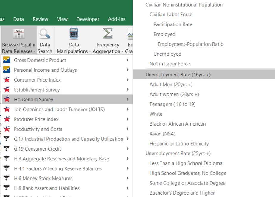
Source: Screenshot of Excel interface, © Microsoft Corporation. Add-in by Federal Reserve Bank of St. Louis (FRED).
FRED puts UNRATE in cell A1. This is certainly a fast and easy way to get a Series ID! Of course, it only works for variables that are popular and often downloaded.
We repeat this process to get male and female unemployment rates. As you do it, be sure to look at the other variables available in the household survey (which is the CPS). Notice how some of them are indented, capturing the logic of the survey.
STEP Click Browse Popular Data Releases and select Household Survey again, but this time select Adult Men (20yrs +). Repeat this one more time, but select Adult Women (20yrs +).
FRED places the Series IDs for male and female unemployment rates in cells C1 and E1. With this information, we are ready to download the data.
STEP Click Get FRED Data.
With the data downloaded, we can proceed to create a chart that compares male and female unemployment.
STEP Click Build Graph and select Create Multiple Series Graph. Select both LNS series.
FRED creates the chart, but it is not ready for prime time. The legend needs work, and it has no title.
STEP Copy and paste the chart. In the pasted chart, make the legend display Male (20yrs +) and Female (20yrs +) by directly editing the SERIES formula. Move the legend text box so that it does not obscure the plotted data. Add a title. See the appendix if you need help.
Your finished chart should look like Figure 5.6. Notice that the female unemployment rate used to be higher than the male rate from the 1950s to the mid-1980s. Since then, they are roughly similar except for the Great Recession of 2008. Surprisingly, the male unemployment rate was much higher than the female rate during that time period.
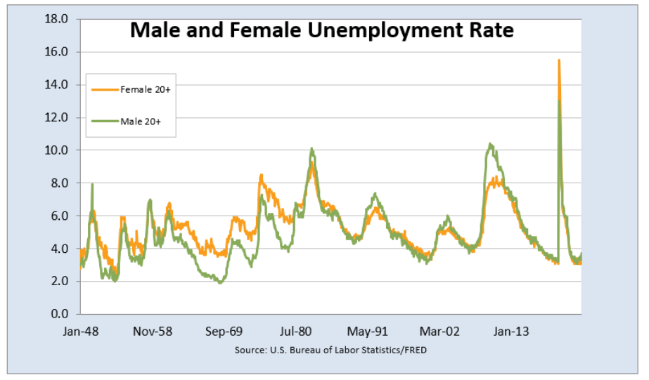
Source: USBLS via FRED, Public Domain Data / FRED Terms.
Teenage Unemployment
STEP Insert a new sheet in your workbook and download the overall unemployment rate and the teenage unemployment rate. Create a chart of these two series with a descriptive legend and title. Follow the same steps as before.
Figure 5.7 shows that the teenage unemployment rate is always much higher than the overall unemployment rate. The reason is not simply because many teenagers do not work. Remember, many teenagers in high school or college will say they are not looking for work, so they are not counted as unemployed.
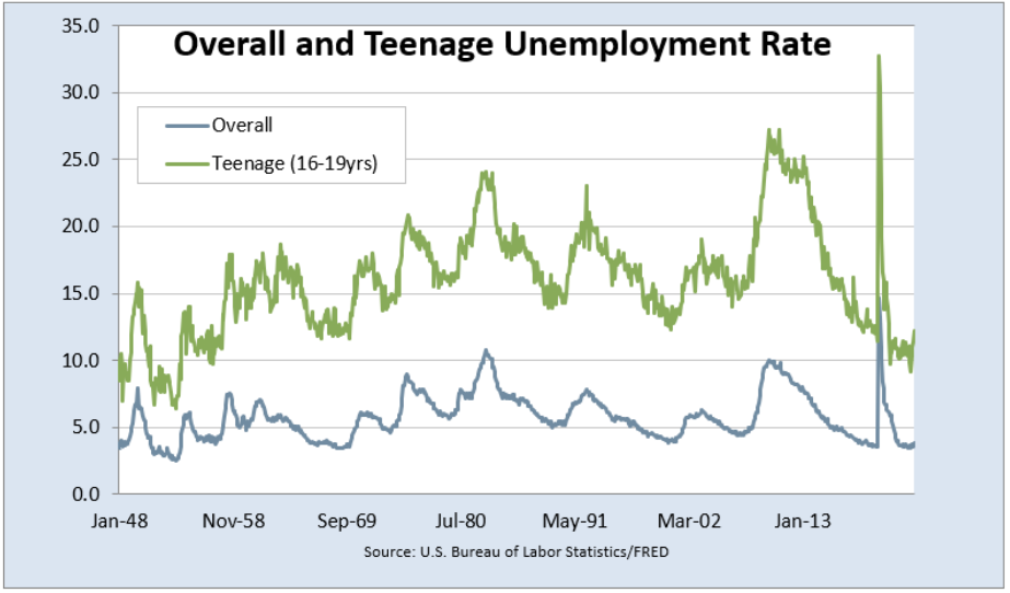
Source: USBLS via FRED, Public Domain Data / FRED Terms.
Teenage unemployment is always so high because teenagers who are looking for work are unskilled and have relatively few potential job opportunities. Thus, teenagers who want to work have a difficult time finding a job.
Teenagers are especially vulnerable during recessions, when their already high unemployment rate goes even higher. Figure 5.7 shows that the pandemic was especially hard on teenagers, as their unemployment rate was over 30%.
Unemployment by Race and Ethnicity
We can use Browse Popular Data Releases to select the unemployment rate for the available racial and ethnic groups. We download data for the overall, White, Black, Asian, and Hispanic groups, with Series IDs of UNRATE, LNS14000003, LNS14000006, LNS14032183, and LNS14000009, respectively. Then we make a chart using the Scatter type as described below. Figure 5.8 shows the result of this work.
Figure 5.8 can lead to confusion and misunderstanding. The differences observed between these groups are not necessarily indicative of their abilities but rather a consequence of complicated historical and societal forces.
The main message of Figure 5.8 is the tremendous variability across these groups. Black unemployment rates are the highest, with Hispanic unemployment also higher than overall. The Asian unemployment rate is the lowest.
The Asian, White, and overall unemployment rates are pretty tightly clumped together, but the Hispanic rate is often several percentage points higher. The Black unemployment rate is sometimes 10 percentage points higher—a truly staggering difference.
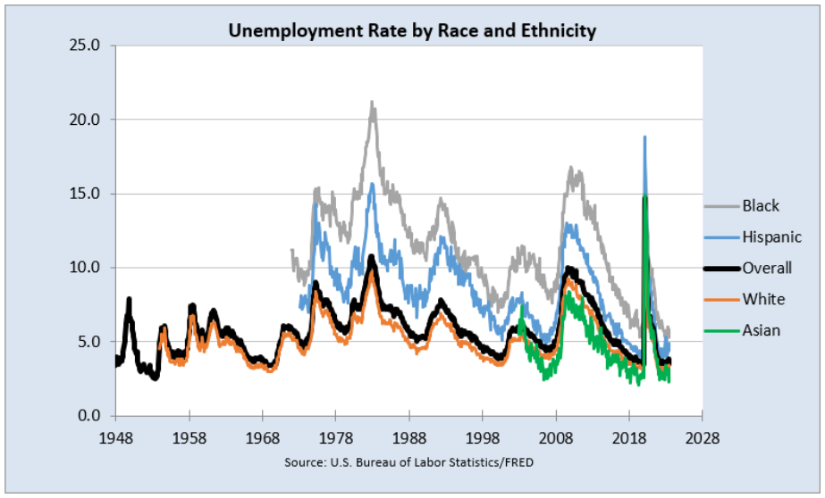
Source: USBLS via FRED, Public Domain Data / FRED Terms.
While FRED’s Build Graph tool allows selection of only three series, we created Figure 5.8 by adding more series by copying and pasting the SERIES formula and editing it.
We also had to change the chart type from Line to Scatter to get around the fact that the variables have different start dates.
Excel stores dates as a number, the number of days since January 1, 1900. Confusingly, Mac Excel 2008 and earlier used a date system based on 1/1/1904. Many mistakes were made when a workbook was shared across Windows and Mac Excel, but today’s workbooks avoid this complication.
STEP Select cell A8 and click the down arrow on the Format button in the Home tab. Select the Format Cells option at the bottom of the list, then select General as shown in Figure 5.9 and click OK.
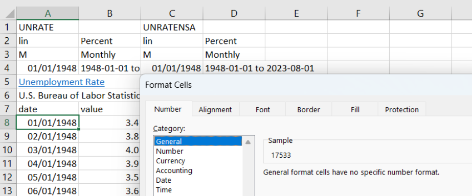
Source: Screenshot of Excel interface, © Microsoft Corporation.
Excel shows 17533 in cell A8. This is the number Excel has for that cell. If you format it as a date, it can be displayed in a variety of date formats.
EXCEL TIP Dates in Excel are numbers. This means they can be manipulated by mathematical operations like addition and multiplication. The exact same date value can be displayed in many ways, such as 3/14, 14-Mar, and so on.
To make sure you truly understand how dates are handled in Excel, try this quick example.
STEP Enter the dates 1/1/1899, 1/1/1900, and 1/1/1901 in three separate cells. Format the cells as General.
Excel displays 1/1/1900 as 1 and 1/1/1901 as 367 (1900 was a leap year, so it had 366 days). Nothing, however, happens to 1/1/1899 because it is not a number; it is text (notice the left-justification). You can subtract 1/1/1900 from 1/1/1901 and get 366, but you cannot use 1/1/1899 (or any date before 1/1/1900) in an arithmetic operation. This is worth remembering if you ever work with dates older than 1/1/1900.
Now that you really understand that dates are numbers, it is easy to see that we can make a Scatter chart using dates as the x-axis variable.
STEP Create a chart of the UNRATE series alone using the Build Graph tool. Click on the chart, and in the Design tab, click the Change Chart Type button and change the type from Line to (X Y) Scatter and select Scatter with Straight Lines. Click OK.
The horizontal axis now starts from zero, and there are so many labels that it looks like a thick black line under the horizontal axis. We need to fix this.
STEP Double-click the x-axis and change the minimum value to 17533 (which is the date 1/1/1948) and change the Major units to 3650 (so every 10 years). Enter yyyy in the Type field in the Number options at the bottom.
Although FRED’s Build Graph tool allows a maximum of three series on a chart, you can add more variables to an existing chart by copying, pasting, and editing the SERIES formula. Your final goal is a chart like Figure 5.8.
Figure 5.8 also has several enhancements that improve its readability:
- The series are ordered with Black as 1 and Asian as 5 so that they are listed in the legend in that order. This makes it easier for the reader to understand that Black unemployment is highest and Asian is lowest.
- The dates on the x-axis are formatted in years.
- The overall series is thicker and colored black to help it stand out.
The legend text order can be difficult to control. Microsoft support says, “Under Chart Tools, on the Design tab, in the Data group, click Select Data. In the Select Data Source dialog box, in the Legend Entries (Series) box, click the data series that you want to change the order of. Click the Move Up or Move Down arrows to move the data series to the position that you want.”
Unemployment by Education
The final set of subgroups available in the Browse Popular Data Releases is education. Like race and ethnic groups, there is great variation in unemployment rates by education level.
STEP Click Browse Popular Data Releases and get the unemployment rate for people aged 25 years and older, along with the four subgroups below it. Create a chart that clearly displays the unemployment rate of these groups.
Takeaways
The Browse Popular Data Releases button is another way to use FRED. While we focused on the household survey (CPS) and unemployment rates, it is easy to see that there are many other popular data series that are a click away.
While UNRATE, the overall unemployment rate for the United States, is undoubtedly the main indicator of economic performance, it is also true that it suppresses a great deal of variability.
Different subgroups experience wildly different levels of unemployment. Especially during recessions, teenagers, Black and Hispanic people, and less-educated people suffer disproportionately higher unemployment.
Disaggregating the unemployment rate to reveal differences among subgroups is an example of a general strategy. Like an average hides dispersion in a list of numbers, UNRATE never tells the whole story.
References
U.S. Bureau of Labor Statistics, Unemployment Rate – Asian [LNS14032183], retrieved from FRED, Federal Reserve Bank of St. Louis; https://fred.stlouisfed.org/series/LNS14032183.
U.S. Bureau of Labor Statistics, Unemployment Rate – Black or African American [LNS14000006], retrieved from FRED, Federal Reserve Bank of St. Louis; https://fred.stlouisfed.org/series/LNS14000006.
U.S. Bureau of Labor Statistics, Unemployment Rate – Hispanic or Latino [LNS14000009], retrieved from FRED, Federal Reserve Bank of St. Louis; https://fred.stlouisfed.org/series/LNS14000009.
U.S. Bureau of Labor Statistics, Unemployment Rate – Men [LNS14000001],retrieved from FRED, Federal Reserve Bank of St. Louis; https://fred.stlouisfed.org/series/LNS14000001.
U.S. Bureau of Labor Statistics, Unemployment Rate – White [LNS14000003], retrieved from FRED, Federal Reserve Bank of St. Louis; https://fred.stlouisfed.org/series/LNS14000003.
U.S. Bureau of Labor Statistics, Unemployment Rate – Women [LNS14000002], retrieved from FRED, Federal Reserve Bank of St. Louis; https://fred.stlouisfed.org/series/LNS14000002.
U.S. Bureau of Labor Statistics, Unemployment Rate for Teenagers in the United States (DISCONTINUED) [USAURTNAA], retrieved from FRED, Federal Reserve Bank of St. Louis; https://fred.stlouisfed.org/series/USAURTNAA
Appendix: Editing the Legend Text
5.3 Seasonal Adjustment
Data are smoothed when they exhibit a strong seasonal pattern. Seasonal adjustment enables better comparison by removing the seasonal trend.
Many statistics are routinely seasonally adjusted. We use the unemployment rate as an example of what seasonal adjustment does and how it works.
We use a powerful Excel tool called a PivotTable (notice that Microsoft does not use a space between the two words). Introduced in 1994 in Excel 5.0, Microsoft’s Help says that PivotTables are “an interactive way to quickly summarize large amounts of data.”
An Example
We begin by getting seasonally adjusted (SA) and not seasonally adjusted (NSA) versions of the unemployment rate.
STEP In a blank sheet, search FRED for unemployment rate and select the two top hits. Click Add Series ID and close the search box.
Excel enters UNRATE and UNRATENSA in the top row of your spreadsheet. These are both measures of the unemployment rate, but one is seasonally adjusted, and the other is not. How do they compare?
STEP Download data for both series and make two separate charts.
It is easy to see that the UNRATENSA chart is much more jagged than the UNRATE chart. The raw, unadjusted unemployment rate is always higher in the winter and summer and falls quite a bit in the last quarter as retail sales increase.
We can see this seasonal pattern more clearly by looking at the unemployment rate for each month. To do this, we need to prepare the data and then make a PivotTable.
Our strategy is to use Excel’s TEXT function to extract the month from each date. Recall from the previous section that Excel stores dates as numbers. You see 1/1/1948, but Excel has 17533 (the number of days since January 1, 1900) in its memory. We can apply many different date formats to display this number as a date, such as just the year (yyyy) or the month-year (mmm-yy).
Excel’s TEXT function converts numbers to text, and this allows us to display the month in each date value. We use mmm as the format code.
STEP In cell E7, enter the label Month, and in cell E8, enter the formula =TEXT(A8, “mmm”). Fill it down.
Excel displays the months for each date value in column A. Notice that it does this to cell A8 also, which is in its raw number form.
We use the same strategy to extract the year.
STEP In cell F7, enter the label Year, and in cell F8, enter the formula =TEXT(A8, “yyyy”). Fill it down.
Similar to the previous step, Excel displays the year for each date value in column A. As before, it does this to the number in cell A8 also.
STEP Change cell B7 to SA and D7 to NSA.
We are now ready to compute the average unemployment rate for each month. We could use formulas to do this, but a PivotTable does it in seconds.
STEP Go to the Insert tab in the Ribbon. Click the PivotTable button in the top left.
Excel displays the Create PivotTable dialog box. It may have prepopulated the Table/Range field, but this is probably wrong.
STEP In the Table/Range field, select the cell range from A7 to column F and the bottom row of your downloaded data. The range should look like this: Sheet1!$A$7:$F$915 (although your bottom row may be bigger).
STEP Click the New Worksheet radio button and click OK.
Excel inserts a new sheet in your workbook. On the right is a context-sensitive area that pops up whenever you are in a PivotTable and an empty PivotTable in columns A, B, and C.
Different versions of Excel have different PivotTable interfaces, so you may need to adjust the instructions that follow. Do not be passive—search the internet or use generative AI (such as ChatGPT) to figure out how to work with PivotTables on your version of Excel.
STEP You may be able to just click the Month variable listed on the right of your screen, or you may have to click and drag down to the Rows area below the listed variables.
Excel adds the Month variable to the PivotTable, creating a list of months in column A.
STEP Click NSA or click and drag NSA into the Values area.
Excel adds the NSA variable, but we do not want the sum (which is the default). We want the average for each month.
STEP Click on the Sum of NSA in the Values area (bottom left of your screen) and select Value Field Settings. In the dialog box that pops up, select the Average (instead of the default Sum) and click OK.
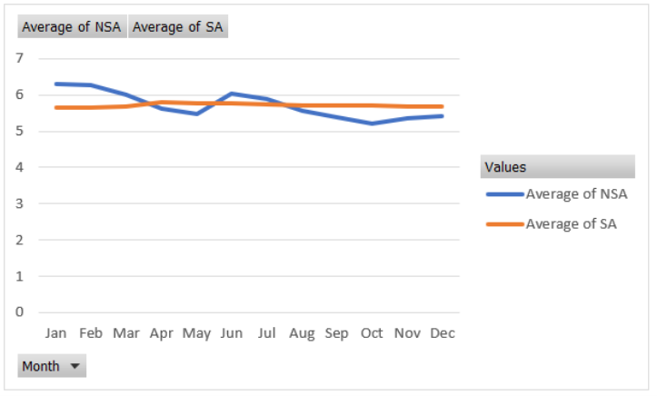
The average unadjusted unemployment rate (UNRATENSA) for each month is now displayed. This is a one-dimensional cross tabulation (crosstab).
Notice that the values are higher in the winter months, they fall, then they go up again in June and July before falling again at the end of the year. This is happening because of seasonality in the unemployment rate.
STEP Repeat this procedure for SA. In other words, add SA to the table and then change it from Sum to Average via the Value Field Settings.
Notice that the SA column (the seasonally adjusted unemployment rate) is much more stable across the months. It has had the seasonal component removed, and the data are smoothed.
A chart will make this crystal clear.
STEP Select the PivotTable data and insert a Line chart (since the x-axis is text, this is an appropriate chart) to reproduce Figure 5.10.
The nearly horizontal line shows how the unemployment rate has been smoothed. The squiggly line shows the persistent pattern inherent in the raw, unadjusted data. The unemployment rate is usually high in the winter, then falls, then pops up again in the summer before falling again the rest of the year.
Source: Source: USBLS via FRED, Public Domain Data / FRED Terms.
The Meaning of Seasonal Adjustment
Suppose we used the unadjusted unemployment rate, and it was 6.2%, but the month was unknown. We would have a problem correctly interpreting this number. If it was for January, then it seems typical, but if it was for October, we would conclude the economy was struggling because it is higher than usual for October.
Seasonal adjustment solves this problem. If the unemployment rate is seasonally adjusted, we can use it to make a decision for any month. A 6.2% seasonally adjusted rate is not good, no matter the month.
Another way to understand what seasonal adjustment does is to look at the data and compare the two series.
STEP Return to your data sheet and go to row 785. Look at the Oct, Nov, and Dec values in column B versus D.
The BLS has literally inflated (revised upward) the values in column D to create the values in column B for those months. This is because historically, unemployment is lower in the fall months when retail sales spike and consumer spending increases.
The raw unemployment rate of 7.5% (which is high) in October 2012 is interpreted as actually even worse than that because it is being artificially lowered by the fact that it is October. The BLS corrects for this and bumps it up.
STEP Look a few rows down at Jan 2013.
This time, the BLS lowered the unemployment rate. It was 8.5% unadjusted (which is pretty bad), but the BLS and media report it as 8.0%. This is because January unemployment is always higher than usual, so we want to remove that component.
Using adjusted data enables us to make a better comparison of any two months. We do not have to worry about the seasonal pattern baked into the data.
Loose Ends
The overall average unemployment rate for the United States since 1948 is around 7.1%, and this is much higher than the 4% to 5% magic number for the unemployment rate. What is going on here?
The answer is that the economy is much more likely to be in recession or even depression with high unemployment than it is to be overheated with extremely low unemployment rates.
It is also true that the few times the unemployment rate is too low, it can only go down a few percentage points below 4%. On the other hand, when the economy crashes, the unemployment rate can and has soared into the double-digit territory.
Another issue that you might be wondering about is exactly how the BLS does the seasonal adjustment. This is an advanced topic beyond the scope of this book. The procedure involves a complicated model. The BLS is transparent about the methodology, which it calls the X-13ARIMA-SEATS Seasonal Adjustment Method, on its website at bls.gov. It would be a challenging and perhaps fun project to replicate the reported adjusted values.
There are many ways to seasonally adjust, and different statistical agencies do different things. They are all looking to remove seasonality from data collected at intervals throughout the year.
Discovery
Along with the unemployment rate, labor market experts closely follow the labor force participation rate. Seasonal adjustment is also routinely applied to the LFPR, but do you think it operates the same way? Let’s find out.
STEP Your task is to apply the same steps used for the unemployment example described above to the LFPR to make a chart like Figure 5.10. You will download both the SA and NSA versions of the LFPR, extract the month (using Excel’s TEXT function), and make a PivotTable of the average LFPR for each month (for both SA and NSA). Finally, you will make a Line chart of the two series.
What did you discover—is the seasonal adjustment for LFPR the same as or different from the unemployment rate? In what specific ways are they the same or different?
Takeaways
We seasonally adjust variables that vary systematically over the year. For example, construction employment falls in the winter and rises in the summer. Seasonal adjustment would tweak the construction employment numbers higher in the winter and lower in the summer so that we can remove the seasonal component and make a better comparison across months.
Seasonal adjustment involves removing the cyclical component of a variable, so we get a better reading of what is really going on.
When you hear an unemployment rate in the media, it is almost certainly a seasonally adjusted unemployment rate.
Using seasonally adjusted variables enables better comparison and interpretation.
An Excel PivotTable is a powerful summary tool that enables data exploration and display of relationships in the data.
PivotTables can produce static cross tabs, but they are also a great way to dynamically visualize data. Moving variables around can quickly provide different views of the data.
