
3 Monte Carlo Simulation
Anyone who considers arithmetical methods of producing random digits is, of course, in a state of sin.
John von Neumann
3.1 Free Throw Shooting with MCSim
You are the new kid on the block, and it is time to choose teams at the rec center. You think you are pretty good, so you say, “I’m a 90% free throw shooter.” This is quite impressive. Someone hands you a basketball and says, “Prove it.”
You shoot 100 free throws, but it does not go as well as you hoped. You make only 75. Someone says, “You are not a 90% free throw shooter.” You insist, however, that you really are. “It was just bad luck. Honestly,” you say, “I really am a 90% free throw shooter.”
The question is, Should we believe you? Anyone who has ever shot free throws knows there is luck involved. We would not expect you to make 9 out of every 10 shots like clockwork. So it could be that by chance, you missed a few more than expected. Another way to ask the question is, Can randomness explain this poor outcome? Or, in yet other words, how uncommon is missing this many free throws for a 90% shooter?
We would not be having this conversation if you had made 89 or even 88 out of 100. Then it would be easy to believe you are actually a 90% shooter and it was just bad luck. But how do we handle the fact that you missed 15 more than expected? That seems like a lot, but how rare is that?
There is a way to answer this question analytically—that is, with mathematics. We will not go that route. Instead, we will use the method of simulation.
Monte Carlo simulation simply means the repeated running of a chance process and then direct examination of the results. It can be used in frontier research work, but we will use it just like we used numerical methods to solve optimization problems—simulation enables us to understand complicated concepts without advanced mathematics.
Monte Carlo simulation is based on brute force—repeat the chance process and examine the results. It requires no imagination or mathematics at all. It will be our go-to method for understanding randomness and answering questions like, “Do we believe you are a 90% free throw shooter if you make only 75 out of 100?”
Gauss and Two Approaches
Carl Friedrich Gauss (1777–1855) was perhaps the greatest mathematician of all time. Before the euro, Germany’s 10 deutsche mark note featured him along with a graph of the normal curve (which he made famous, called the Gaussian distribution). Look carefully in Figure 3.1 and you can see that it even displays the equation of the normal distribution.

Source: YavarPS on Wikimedia / CC BY-SA 4.0.
There is a story, probably apocryphal, of how he amazed his kindergarten teacher. Apparently, the children were especially unruly one day, so the teacher assigned a dreary problem as punishment. He told them to add all the numbers from 1 to 1,000. This starts easily but gets tedious and painful pretty quickly. 1 + 2 = 3, 3 + 3 = 6, 4 + 6 = 10, and 5 + 10 = 15. It will take a long time to get to 1,000.
Gauss waited a minute, then stood up and announced the answer: 500,500. The stunned teacher asked him where he got that number, which is correct, and Gauss said he noticed a pattern. Remember, he was five years old.
If you make a list of the numbers, then create a second list, but flipped, the pairs always add up to 1,001: 1 goes with 1,000, 2 with 999, 3 with 998, and so on until the end, when 998 is with 3, 999 with 2, and 1 with 1,000.
The rest is easy (well, maybe not for the usual five-year-old, but this is Gauss). Multiply 1,001 by 1,000 (since there are 1,000 pairs) and divide by 2 to get 500,500. As they say, QED.
This is clever, remarkable, and beautiful. It is like Michelangelo and the Sistine Chapel. Is Monte Carlo simulation like this? No.
Monte Carlo simulation is a different approach to problems that uses little creativity or subtlety. It is a direct attack on a question.
Monte Carlo simulation is like solving the teacher’s tedious problem by using a spreadsheet to add the numbers.
STEP Make a list from 1 to 1000 in cells A1:A1000 (using fill down, of course), and then, in cell B1, enter the formula =SUM(A1:A1000).
Excel displays 500,500. This is nowhere as magnificent as what Gauss did, but it does give the answer.
Monte Carlo simulation was developed during World War II by physicists working on the Manhattan Project. Nicholas Metropolis coined the term because his colleague, Stanislaw Ulam, was an avid poker player. They were simulating how radiation propagates and incorporating randomness. The connection to chance and gambling is why Metropolis named the method after the famous Monte Carlo casino in Monaco.
So Monte Carlo simulation, or “simulation” for short, is an alternative to the analytical approach. Instead of using equations and algebraic manipulations, simulation uses computers to repeat the chance process many times and then directly observe the outcomes.
You can think of simulation as the much younger sibling of analytical methods. Let’s apply it to free throw shooting to show how it works.
Are You Really a 90% Shooter?
Our solution strategy will be simulation, but make no mistake: Gauss would not have needed simulation. He would have immediately rejected your claim. He knows a formula can be used, [latex]\sqrt{n}\sigma[/latex], that answers the question quickly. The formula is the product of sophisticated mathematics and can be called beautiful, but most people find it extremely difficult to understand and cannot use it to answer the question.
All Monte Carlo simulations use a random number generator (RNG). Excel’s RNG function is RAND(). This draws uniformly distributed random numbers in the interval from zero to one.
STEP Insert a sheet in your Excel workbook and, in cell A1, enter the formula =RAND().
You see a number with several decimal places displayed that is between zero and one. The number is actually much longer.
STEP Widen the column and add decimal places to see this. Keep adding decimal places (widening column A as needed) until you start seeing zeroes.
As you learned when we explained Solver’s false precision, most modern spreadsheets use 64-bit double-precision floating point format. If you count carefully, you will see that RAND() has a zero, then a decimal point, and then 15 decimal places with values from zero to nine. After that, they are all zero, so we have reached the maximum precision. It is important to understand that our spreadsheet’s random number is finite but also that it has many more decimal digits than what was originally displayed.
STEP Repeatedly press F9 (you may have to hold down the fn key on your keyboard). F9 is the keyboard shortcut to recalculate the sheet.
The number in cell A1 changes each time you recalculate the sheet. This is the beating heart of the simulation.
The bouncing numbers show that although RAND() is finite, it has a massive set of numbers to choose from. If it had only one decimal place, RAND() would have 10 possible numbers (from 0.0, 0.1, 0.2, and so on until 0.9). Six decimal places would give it 1 million different numbers. Twelve gives a trillion numbers. Fifteen is a quadrillion!
So you can think of RAND() as plucking a number from a humongous box with a quadrillion numbers in it.
Full disclosure: This is not exactly right because RAND() is using an algorithm to produce the next number. This is why computer-generated random numbers are called pseudorandom, where the prefix pseudo means “false.”
To model a 90% free throw shooter, we use an IF statement.
STEP In cell B1, enter the formula =IF(A1<0.9, 1, 0).
The IF function has three arguments (or inputs) separated by commas. The first argument is the test, the second is what happens if the test is true (or yes), and the third is what happens if it is false (or no). If the random number in cell A1 is less than 90%, then cell B1 shows a one, which means the free throw was made; otherwise, it shows a zero, which means it was missed.
Some students (usually really smart, careful ones) obsess about whether A3 should be less than (<) or less than or equal to (≤) 90%. This does not matter because RAND() has so many random numbers available to it. The chances of drawing exactly 0.900000000000000 are ridiculously small.
When the IF function evaluates to 1, the free throw is made, and when it is 0, it is missed. This is a binomial random variable, since it can only take on two values, 0 or 1.
We do not need to actually see the random number generated, so we can embed RAND() directly in the IF statement.
STEP In cell B2, enter the formula =IF(RAND()<0.9,1,0). Fill down this formula to cell B100. Press F9 a few times to see the 0 and 1 values bouncing around.
We have implemented the data generation process (DGP) in Excel. The DGP tells us how our data are produced.
STEP Rename the sheet (double-click on the sheet tab) DGP and save the workbook as FreeThrowSim.
As you scroll back up to the top row, you will see many ones and a few zeroes. With a 90% success rate, roughly 1 in 10 cells will have a random number greater than 0.9 and, therefore, show a 0.
The fact that each cell in column B stands alone and does not depend on or influence other cells means we are assuming independence. In our model, a miss or make does not affect the chances of hitting the next shot.
If you believe in the hot hand (Cohen, 2020), this implementation of the chance process is wrong. If making the previous shot increases the chances of making the current shot, there is autocorrelation, and we cannot use 0.9 as the threshold value for every shot. We assume independence from one shot to the next.
How many shots out of 100 will a 90% shooter make?
STEP Enter the formula =SUM(B1:B100) in cell C1 and the label Number made in cell D1.
You will see a number around 90 in cell C1. Each press of F9 gives you the result of a new outcome from 100 attempted free throws.
The number of made free throws from the virtual shooter you have constructed in Excel is not always exactly 90 because you incorporated RAND() in each shot.
STEP Use your keyboard shortcut, F9, to recalculate the sheet a few times to get a sense of the variability in the number of made shots from 100 free throws.
There is no doubt that the number of made shots is a random variable, since it is bouncing around when you recalculate the sheet. It makes common sense that adding 100 bouncing numbers will produce a random outcome.
A statistic is a recipe for the data. Cell C1 is a sample statistic because the recipe is to add up the results from a sample of 100 shots. We are interested in the distribution of the sum of 100 free throws from a 90% free throw shooter, including its central tendency, dispersion, and shape of a histogram of outcomes. With this, we can decide if a result of 75 made shots is merely unlikely or so rare that we reject the claim that you are a 90% shooter.
Simulation is simply repeating the experiment many times so we can approximate the center, dispersion, and distribution of the outcomes. Since we are working with a sample statistic, the distribution of the sum of 100 free throws is called a sampling distribution.
To process the many outcomes, we need software. A free Excel add-in that does Monte Carlo simulation is available here: dub.sh/addins.
STEP Download the MCSim.xla file from the link above and use the Add-ins Manager (File → Options → Add-ins → Go) to install it. Click the Add-ins tab and click MCSim.
EXCEL TIP The keyboard shortcut to call the Add-ins Manager is Alt, t, i (press these keys in order without holding any of them down).
Figure 3.2 shows the MCSim add-in dialog box. On the left are three required choices. You must select a cell to track (C1 in our example), the number of repetitions (the default is 1,000), and the random number generator to use. The MCSim add-in comes with its own RNG, RANDOM. Selecting it will replace all RAND in the sheet with RANDOM. The default is no changes.
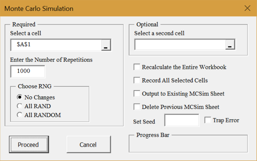
Source: Screenshot of Excel interface, © Microsoft Corporation. Add-in by H. Barreto.
On the right are some advanced options. Some of these will be used in future work. The Set Seed option forces the RNG to begin from the same initial position, which allows for replication of results.
STEP Click in the Select a cell box, clear it, and click cell A1 (displaying RAND()). Click in the Set Seed box and enter 123. Click Proceed.
A new sheet is inserted in the workbook. It shows the first 100 outcomes in column B, summary statistics, and a histogram. It is roughly, but not exactly, a rectangle. If you ran more repetitions, it would be less jagged.
STEP Return to the DGP sheet and repeat the simulation of cell A1.
The results are exactly the same as before because the Set Seed option started the RNG from the same initial value.
STEP Return to the DGP sheet and click the MCSim button in the Add-ins tab. Select cell C1 (the sum of made free throws) and clear the Set Seed box. Click Proceed.
Figure 3.3 shows the results. Yours will be different because we cleared the Set Seed box. However, your results will be quite close in the sense that your average is near 90 and the standard deviation (SD) is around 3.
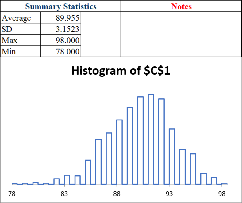
The average and SD are approximations of their true exact analogues, the expected value (EV) is exactly 90, and the standard error (SE) is exactly 3. The EV is the center of the sampling distribution, while the SE is the typical deviation, or bounce, in the statistic.
We would say that we expect a 90% free throw shooter to make 90 out of 100 attempts, plus or minus 3 free throws. The plus or minus is critical because it tells us the variability in the number of made free throws.
The sim also shows the maximum and minimum shots made from 100 free throws in 1,000 repetitions. In Figure 3.3, the max is 98 and the min is 78.
This gives an answer to our question. In 1,000 repetitions, the worst a 90% shooter did was 78. It certainly looks like you are not a 90% free throw shooter.
What if we did more repetitions?
STEP Run a simulation of 10,000 sets of 100 free throws.
Once again, you are unlikely to see 75 or fewer. It seems the bad luck defense is not going to work. While it is possible that you really are a 90% free throw shooter and had an incredibly unlikely run of bad luck, such an outcome is incredibly rare—so rare, in fact, that we do not believe your claim to be a 90% free throw shooter.
The average and SD values changed a little with the second simulation. This shows that simulation always gives an approximate answer with some variability. Simulation can never give us an exact answer because we cannot run an infinity of repetitions. As the number of repetitions increases, the approximation gets better, but it is never exact.
By the way, as mentioned earlier, Gauss and statisticians using his work would have answered this question differently. A simple formula would lead immediately to the rejection of your claim.
The procedure begins by computing the SE with the formula [latex]\sqrt{n}\sigma=\sqrt{100}\times0.3=3[/latex]. Next, express the observed from the expected difference in standard units: [latex]\frac{75-90}{3}=-5[/latex]. This is so far in the tail of the normal (Gaussian) curve that the claim is rejected.
In other words, 75 out of 100 when 90 was claimed is 5 standard units away from what we expected to see, and this is ridiculously unlikely, so, sorry, we do not believe that you are a 90% free throw shooter who had some bad luck.
In fact, neither analytical methods nor simulation can ever give a definitive, guaranteed answer. Both agree that, given the evidence, 75 out of 100 means we do not believe the claim that you are a 90% shooter. Since chance is involved, it is possible that you are a 90% shooter and missed every shot. We are not interested in what is possible. We want to know how to use the evidence to decide whether or not we believe a claim.
If you have taken a statistics course, you might recognize that we are doing hypothesis testing without explicitly saying so. The null is that you are a 90% shooter, and the alternative hypothesis is that you are not. Seventy-five out of 100 produces a test statistic far from the expected 90, so the p-value is really small. Thus, we reject the null.
Max Streak
A second example of simulation involves streaks, also known as runs. A streak in this case is a consecutive set of made shots.
STEP Return to the DGP sheet. Starting from cell B1, find the first 1 (it could be cell B1), and then count how many 1s in a row you see before you encounter a miss. Write that number down and count the next streak. Continue until you reach the 100th shot attempt. The longest streak is the max streak.
The question is, What is the length of the typical max streak in a set of 100 free throws from a 90% free throw shooter?
This is an exceedingly difficult question. It is asking not to count the streaks (also a hard question) but to find the biggest streak in 100 shots. You do not simply add up the number made; you have to find the length of all the streaks and then identify the longest one.
Unlike how many free throws in 100 attempts a 90% shooter will make, you have no easy way to guess the typical max streak. It could be 20, 40, or maybe 50. Who knows? How can we answer this question?
The analytical approach is a bit of a dead end. There are formulas that approximate a solution (Feller, 1968, p. 325), but the math is somewhat complicated. No exact analytical solution has been found.
Simulation can be used if we can figure out a way to ask the question in Excel so that a cell displays the answer. This means simulation requires some ingenuity. We need a cell that computes the max streak so we can use the MCSim add-in. We do this in two steps: first we figure out how to report the current streak, then we use the MAX function to find the longest streak.
STEP In cell E1, enter the formula =B1. In cell E2, enter the formula =IF(B2=1,E1+1,0). Fill it down a few cells.
Now you can see what the formula is doing. If the shot is made, we add it to the previous running sum, but if it is missed, it resets the running sum to 0. The B2=1 part of the formula tests if the current shot is made, and E1 + 1 increases the current streak length by one. The zero means you missed and the streak is now zero.
STEP Fill the formula down to E100 and look at the values as you scroll back up.
You should see several streaks in a set of 100 free throws. We want the longest streak. That is the second step in our implementation of the question in Excel, and it is easy.
STEP In cell F1, enter the formula =MAX(E1:E100) and enter the label max streak in cell G1. Press F9 a few times.
Cell F1 displays the max streak from each set of 100 free throws. Max streak is a statistic, just like the sum, because it is a recipe—albeit much more complicated than the sum.
It has an expected value, standard error, and sampling distribution. We can approximate all of these with simulation.
STEP Run a simulation, with 10,000 repetitions, of cell F1.
Figure 3.4 shows the results. Yours will be a little different. The average is an approximate answer to our question: The max streak is about 27 or so. The exact answer is the expected value, but we have no way of computing it.
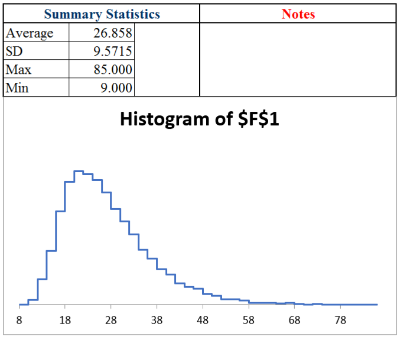
The histogram is an approximation to the exact sampling distribution (which no one has figured out how to exactly derive). The graph tells us which values are unlikely: roughly 10 or fewer and 50 or more.
Notice that the sampling distribution of the max streak statistic, unlike the sum, does not appear to follow the normal curve. The max streak has a long right tail and is not symmetric.
Takeaways
Sometimes a function or problem is deterministic, but other times we are faced with stochastic data—the numbers depend on chance, luck, and randomness. The values we observe are produced by a DGP, and they are volatile.
Monte Carlo simulation is a brute-force approach to answering questions involving stochastic data. A much older alternative, the analytical approach, relies on brainpower to derive formulas.
To run a simulation, the problem must be implemented in Excel (or some software that can generate random numbers). Of course, one can manually flip a coin many times in the real world, but this is tedious. Simulation did not become a powerful tool until modern computers were invented and enabled a great many repetitions in a short period of time.
Simulation is always only an approximation. By running more repetitions, the approximation improves, but it can never give an exact answer because it would have to run forever.
Often, we are searching for the sampling distribution of a statistic. This tells us the chances of each outcome, the typical result (called the expected value), and the dispersion in values (called the standard error, or SE).
The MCSim add-in always produces summary statistics and a histogram. If the cell that is tracked is a statistic, then the average is the approximate expected value and the SD is the approximate SE.
In case you think streaks are a waste of time, look at this headline to an article in The Wall Street Journal on July 27, 2023, on page B1:
Dow Sets Longest Winning Streak Since 87
The Dow’s streak of 13 consecutive sessions with gains ended the next day. The longest streak ever (as of this writing) is 14, back in 1897.
References
The epigraph is a famous quote from 1951, when computer science was taking off. In “Various Techniques Used in Connection with Random Digits” (freely available at https://mcnp.lanl.gov/pdf_files/InBook_Computing_1961_Neumann_JohnVonNeumannCollectedWorks_VariousTechniquesUsedinConnectionwithRandomDigits.pdf), von Neumann supported the use of pseudorandom number generation but warned against misinterpreting what these numbers meant. There are many algorithms for random number generation, some are better and others worse. Excel’s RAND() is not great.
Cohen, B. (2020). The Hot Hand: The Mystery and Science of Streaks (Custom House). Russ Roberts interviews Cohen in an August 10, 2020, episode of EconTalk, available at www.econtalk.org/ben-cohen-on-the-hot-hand.
Feller, W. (1968, 3rd ed.). An Introduction to Probability Theory and Its Applications (John Wiley & Sons), archive.org/details/introductiontopr0001fell.
3.2 Simulating Parrondo’s Paradox
A paradox is something (such as a situation) with opposing elements that seems impossible but is actually true.
An optical illusion is related to a paradox in that you see something that is not easily explained or can seem impossible. Figure 3.5 is an example. Do you see the old woman, or the young lady, or both? Your age affects what you see in this drawing—older people are more likely to see the old lady (Nicholls et al., 2018).

Source: My Wife and My Mother-In-Law, by the cartoonist W. E. Hill, 1915 / Public domain.
Juan Parrondo is a physicist who discovered the paradox named after him in 1996. Parrondo’s Paradox occurs when two losing games are combined and they produce a winning game. That is puzzling and counterintuitive.
Almost always, game outcomes are additive, so a losing game plus a losing game equals a losing game just like adding two negative numbers gives an even more negative number. Parrondo found what can be described as a black hole in the parameter space where adding two losers yields a winner.
The paradoxical nature of the result will become apparent when we implement the games in Excel and directly examine the outcomes. Our goal is to show how simulation makes Parrondo’s Paradox crystal clear.
Losing Game A
Game A is a coin flip with a slightly negatively biased coin. Heads earns you +1 monetary units (M) and tails −1. The coin is flipped 100 times, and we keep a running sum after each flip. On average, at the end of the game, the result is negative, so we say Game A is a losing game.
STEP In cell A1, enter the label Game A. In cell A3, enter the label epsilon; and in cell B3, enter the number 0.005. In cell A4, enter the label p(H); this is the probability of flipping a head. In cell B4, enter the formula =0.5-B3.
With a probability of heads less than 50%, we will flip heads less often than tails. This is why this game is a loser.
STEP In cell A6, enter the label Flip # and create a series from 1 to 100 in cells A7:A106. In cell B6, enter the label Result, and in cell B7, enter the formula =IF(RAND()<$B$4,1,0). Fill it down to cell B106.
Column B has our simulated coin flips. We know RAND() is uniformly distributed on the interval [0,1]. It will produce tails slightly more frequently than heads because cell B4<0.5.
We track the money in column C with an IF statement.
STEP In cell C6, enter the label End M, and in cell C7, enter the formula =IF(B7=1,1,-1).
The formula for the next cell is different because we have to track how much money we had at the end of the previous flip. Thus, we add the cell above.
STEP In cell C8, enter the formula =IF(B8=1,1,-1)+C7. Fill it down to cell C106. Select C6:C106 and make a Scatter chart. Press F9 a few times.
The chart shows the entire game, and cell C106 tells us the outcome of Game A. If it is positive, the game was won; if negative, it was lost. The number tells us how much we won or lost.
We can use the MCSim Excel add-in to examine the sampling distribution of C106. If needed, download and install MCSim from dub.sh/addins.
STEP Select cell range C7:C106 and click MCSim (in the Add-ins tab). Check the Record All Selected Cells option and click Proceed. The simulation is fast, but Excel may take some time to display the results.
Excel inserts two sheets in the workbook. The MCSim sheet has the result for C7 (the first coin flip), but the MCRaw sheet has 1,000 rows and 100 columns of numbers (which is why Excel took so long to display the results).
We can process these numbers to understand Game A. Each row is a game with 100 flips running left to right. Each flip number (column) is called an ensemble, and the average of each flip number is called the ensemble average.
STEP In cell A1003 of the MCRaw sheet, enter the formula =AVERAGE(A2:A1001).
This value will agree exactly with the average in J5 of the MCSim sheet. This value is the average M after one flip. It is slightly negative.
STEP Select cell A1003 in the MCRaw sheet and fill it right to the 100th column (CV). With these cells selected, make a chart by clicking Insert and choosing Scatter with lines and no markers. Title the chart “Flip #” (since the title is right above the x-axis, it labels the axis).
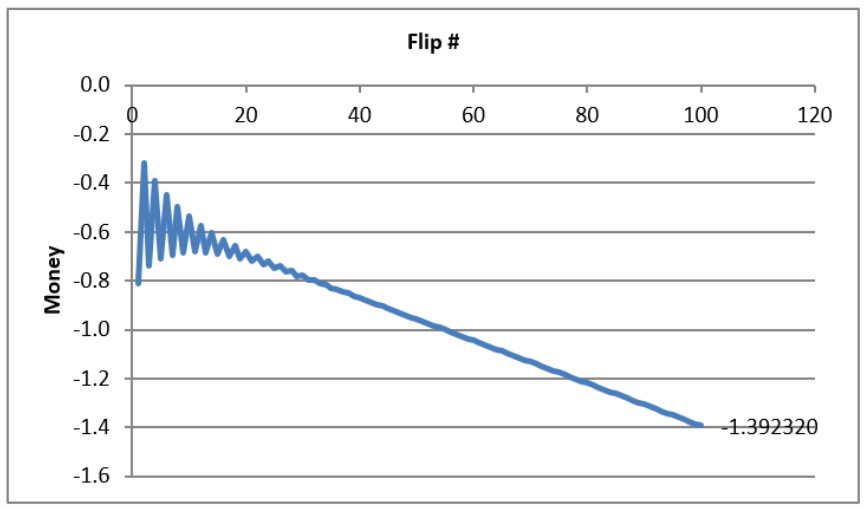
Your chart is an approximation to the exact ensemble average in Figure 3.6. Simulation produces random deviation from the exact object. We could improve the approximation by increasing the number of repetitions. The squiggly graph in the simulation would converge to the line in Figure 3.6.
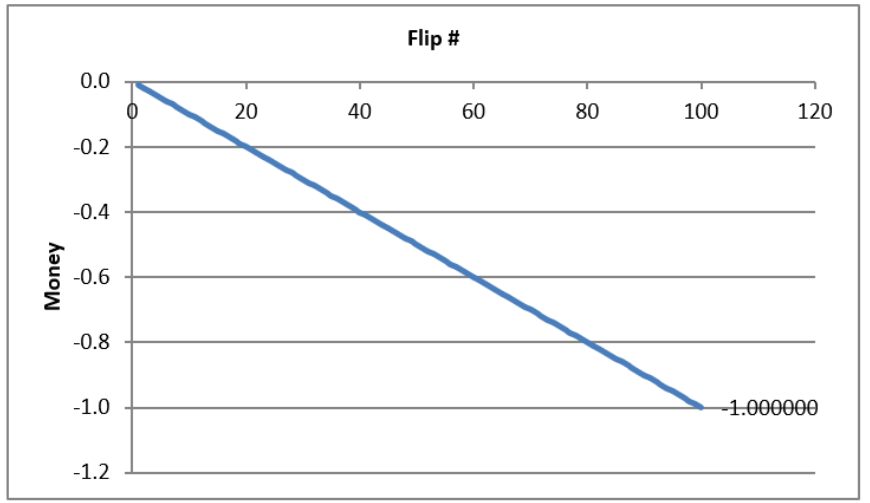
Your simulation and Figure 3.6 make clear that Game A is a loser. From the first flip, it gets steadily worse, and by the last flip, you can expect to lose 1 monetary unit.
Of course, not every single game is a loser. Column CV in the MCRaw sheet shows many cells that are positive. On average, however, we can expect to lose playing Game A.
Losing Game B
Game B is also a loser, but it is more complicated than Game A. Game B is based on two coins, and you use Coin 1 if your current monetary holding is divisible by 3; otherwise, you use Coin 2. The MOD function enables us to determine which coin to use.
STEP Return to the sheet with Game A, and in cell E1, enter the formula =MOD(13,12).
The cell displays 1 because it is doing modulo arithmetic. Converting military time to a.m./p.m. time uses the modulo operator: 1300 is 1 p.m. because you divide by 12 and the remainder is the answer.
Game B follows the flow chart in Figure 3.7. We will use the MOD function to divide any number by 3, and if the result is 0, we know it is evenly divisible, and we flip Coin 1. If not, we flip Coin 2.
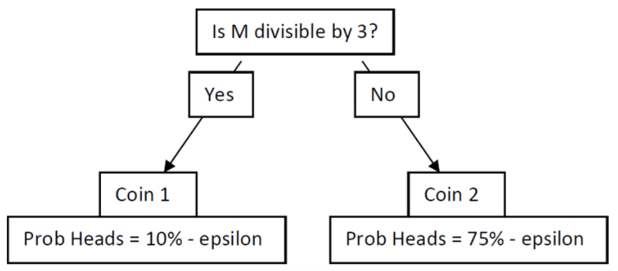
STEP In cell G1, enter the label Game B. In cells G3 and G4, enter the labels “Coin 1” and “p(H).” In cell H4, enter the formula =0.1-B3. In cells J3 and J4, enter the labels “Coin 2” and “p(H).” In cell K4, enter the formula =0.75-B3.
Obviously, we would rather flip Coin 2. It comes up heads almost 75% of the time, so we win 1 monetary unit. Coin 1 is the opposite. It is strongly biased against heads, so we lose often with Coin 1.
STEP Copy cells A6:A107 and paste in cell G6. In cell H6, enter the label Start M, and in cell H7, enter a 0. In cell I6, enter the label MOD(M,3), and in cell I7, enter the formula =MOD(H7,3). In cell J6, enter the label Coin, and in cell J7, enter the formula =IF(I7=0,1,2).
You start with 0 monetary units. That is evenly divisible by 3, so we will use Coin 1, but we need a more general formula to determine what happens if it is Coin 1 or Coin 2. An IF statement can handle this.
STEP In cell K6, enter the label Result, and in cell K7, enter the formula =IF(J7=1,IF(RAND()<$H$4,1,0),IF(RAND()<$K$4,1,0)).
Next, we report our money position.
STEP In cell L6, enter the label End M, and in cell L7, enter the formula =IF(K7=1,1,-1).
In the next row, we walk through the cells in order.
STEP In cell H8, enter the formula =L7 and fill it down. Select cell range I7:K7 and fill it down. In cell L8, enter the formula =IF(K8=1,L7+1,L7–1). Fill it down. Select L6:L106 and make a Scatter chart.
This completes Game B. Cell L106 gives the final result of the game, but as we did before, we can track every flip of the game to better understand it.
STEP Select cell range L7:L106 and click MCSim (in the Add-ins tab). Check (if needed) Record All Selected Cells and click Proceed.
As before, two sheets are inserted, and we will process the data in the MCRaw sheet to show how Game B works.
STEP Return to the MCRaw3 sheet and copy row 1003. Go to the MCRaw5 sheet, select cell A1003, and paste. Make a chart of row 1003.
Your results are surprising. In the first few flips of the ensemble average, it jaggedly oscillates and then settles down to a downward-sloping relationship.
The exact ensemble average is given by Figure 3.8. The simulation is correct in that there is an oscillation in the expected value in the first few flips before convergence to a single line that heads downward.
Your simulation results and Figure 3.8 show that Game B is a loser and a bigger loser than Game A. We can expect to lose about 1.4 monetary units playing Game B.
Mixing Two Losing Games
Having set up and run Games A and B separately, we are now ready to mix these two losing games. This will demonstrate Parrondo’s Paradox because, somehow, mixing the losing games results in a winning game. In fact, there is an optimal mixing strategy, but we will randomly mix the two games by flipping a fair coin.
STEP In cell N1, enter the label Random Mixing. Copy cell range A6:A106, select cell N6, and paste. In cell O6, enter the label Game, and in cell O7, enter the formula =IF(RAND()<0.5,“A”,“B”). Fill it down.
Column O tells us which game we will play at each coin flip. It is easy to see by pressing F9 repeatedly that the letters A and B are bouncing around, indicating that we are mixing the games randomly.
We need to input Game B again (we cannot just use Game B in columns G:L) because it depends on the value of M to decide which coin to play.
STEP In cell P5, enter the label If Game B is chosen. Copy cell range H6:K7, select cell P6, and paste.
We need an IF statement to display the actual outcome of this game based on whether we play Game A or Game B. We take Game A from column B, since it does not depend on the amount of M we have, but we take Game B from column S.
STEP In cell T6, enter the label Actual Result, and in cell T7, enter the formula =IF(O7=“A,”B7,S7).
Next, we determine our monetary position.
STEP In cell U6, enter the label End M, and in cell U7, enter the formula =IF(T7=1,1,-1).
We process the second flip and fill down to complete the implementation.
STEP In cell P8, enter the formula =U7. Fill it down. Select cell range Q7:T7 and fill it down. In cell U8, enter the formula =IF(T8=1,U7+1,U7-1). Fill it down. Select cell range U6:U106 and make a Scatter chart.
This completes the random mixing of two losing games. Cell U106 gives the final result of the game. Pressing F9 does not reveal much. We need to run a simulation.
STEP Select cell range U7:U106 and click MCSim (in the Add-ins tab). Confirm that the Record All Selected Cells option is still checked and click Proceed.
We have the data to demonstrate Parrondo’s Paradox, but we need to create an ensemble average chart.
STEP Return to the MCRaw5 sheet and copy row 1003. Go to the MCRaw7 sheet, select cell A1003, and paste. Make a chart of row 1003.
The results are absolutely stunning. Unlike our two previous charts, this one points upward, and the final value is positive! This is a winning game! Figure 3.9 shows the exact evolution of the randomly mixed games. The expected value of playing a random combination of Games A and B keeps rising the more you play. That is mind-boggling.
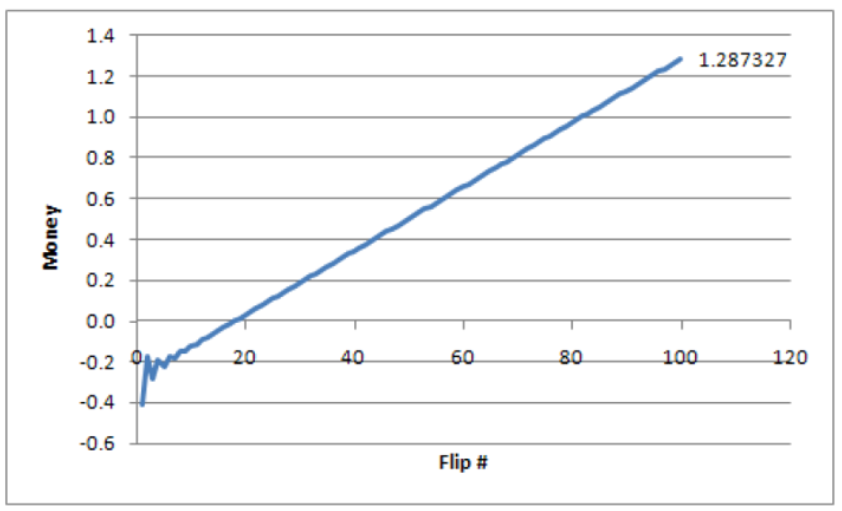
By randomly mixing individually losing Games A and B, we can expect to win about 1.3 monetary units playing 100 times. This is Parrondo’s Paradox.
What Is Going on Here?
Does this work show that you can walk into a casino and take turns playing blackjack and roulette and come out a winner? No.
Does it mean that you can combine two losing stocks and somehow make money? No.
Does it mean that I can take something poisonous and then drink another poison and the two will combine to heal me? No.
Parrondo’s Paradox does not say that mixing any two losing games produces a winner. The two games and epsilon value were chosen carefully. Parrondo found a parameter value that generated the anomalous result. Think of a Cartesian plane with a coordinate that is like a black hole—all the other coordinates behave as expected, but this particular point is really weird. Parrondo found such a point by carefully picking the bias (epsilon) in Games A and B.
Applying this paradox to the real world is a challenge. Explaining the inspiration for Parrondo’s discovery of the paradox will help us understand how the paradox emerges.
Parrondo is a physicist, and his discovery of an epsilon value that produced the paradox was influenced by something called the flashing Brownian ratchet. This is a process that alternates between two regimes in a sawtooth fashion.
STEP Watch this two-minute video to see the ratchet in action and how it applies to Parrondo’s Paradox: vimeo.com/econexcel/parrondo. You can control the ratchet yourself here: dub.sh/ratchet.
It is true that Parrondo’s Paradox requires a specific, and we might add rare, type of losing game to be mixed. The paradox would never emerge if the two losing games were like Game A. Mixing two Game As would produce a bigger negative outcome.
Game B, with its two coins, one of which is biased in our favor, holds the key to the paradox. Figure 3.8 tells us that for the first few flips, the expected value of Game B alternates. Mixing takes advantage of the positive parts of Game B in those first few flips.
Takeaways
Optical illusions and paradoxes are mind-bending. They violate what we expect to happen and force us to deal with something unbelievable.
STEP Watch a classic two-minute video of an optical illusion with an explanation of how it works: dub.sh/faceillusion.
Like an optical illusion, Parrondo’s Paradox produces a shocking result: Loser plus loser equals winner. That should not happen.
At a magic show, we know a trick is involved, so the person was not really cut in half or made to disappear. There is a logical reason—we just do not know what it is unless it is explained to us.
Similarly, Parrondo’s Paradox can be explained. The key lies in the ratchet, which trends down but in a sawtooth, herky-jerky motion. The video (dub.sh/ratchet) shows how it catches the ball at just the right time and pushes it upward, even as it is heading downward, producing an overall upward movement.
Parrondo’s Paradox requires specific values for epsilon, the bias in coins being flipped, and Game B is actually a combination of two coins that are used based on whether the player’s total amount of money is evenly divisible by 3.
It is Game B that has the ratchet that explains the paradox. Figure 3.8 shows that it is a losing game (heading downward), but look carefully at the beginning—the oscillations during the first few flips contain the explanation to the paradox.
STEP Listen to this 10-minute podcast at dub.sh/parrondo.
This podcast was generated by NotebookLM (a Google AI experiment in October of 2024 freely available at https://notebooklm.google.com/). In October of 2024, I was shocked by what this AI could do, and 18 months later, I remain quite impressed by NotebookLM!
We used simulation to explain Parrondo’s Paradox, but it is not an integral part of the paradox. An analytical solution using Markov chains provides exact results. The analytical solution was used to create the exact evolution charts (Barreto, 2009).
Usually, we use simulation to represent a real-world process. We do not have to make it a perfect representation, but it must capture the essential elements.
We can go, however, in the other direction, from an artificial environment to the real world. Parrondo found something paradoxical, and now we are asking, “Is there something like this in reality?” Could it ever make sense to combine stocks or medicines or anything else in a way that reverses the negative result? The search is on.
Finally, random mixing produces a winning game with an expected value of about 1.3 monetary units at the 100th flip, but there is an optimal mix. Playing AB, then ABBABBABB repeatedly, produces an expected value of a little over 6 monetary units. Barreto (2009) explains the analytical solution and optimal mixing with Excel.
References
Barreto, H. (2009). “A Microsoft Excel Version of Parrondo’s Paradox.” SSRN Working Paper. Available at SSRN: https://ssrn.com/abstract=1431958 or http://dx.doi.org/10.2139/ssrn.1431958
Barreto, H. (2018, Sept. 28). Ratchet effect. [Video]. Vimeo. vimeo.com/econexcel/parrondo
Nicholls, E., Churches, O., and Loetscher, T. (2018). “Perception of an Ambiguous Figure Is Affected by Own-Age Social Biases.” Scientific Reports 8, no. 12661. Open access: www.nature.com/articles/s41598-018-31129-7.
RayOman. (2009, August 17). Charlie Chaplin Optic Illusion [Video]. YouTube. https://www.youtube.com/watch?v=QbKw0_v2clo.
A Mathematica version: demonstrations.wolfram.com/TheParrondoParadox/.
A YouTube demonstration: www.youtube.com/watch?v=PpvboBJEozM.
For an entertaining read on paradoxes, try Perplexing Paradoxes by George Szpiro (2024).
3.3 Pooled Testing via Simulation
Those who lived through the COVID-19 pandemic are certain to remember it for a long time: masks, mandates, social distancing, vaccines, virtual meetings, and for many of us, losing loved ones. We will also remember testing for coronavirus with nasal swabs and at-home kits.
It never caught on in the United States during the COVID-19 pandemic, but pooled testing was considered because it could reduce the number of tests needed and save time (Mandavilli, 2020). Pooled testing was used successfully by the United States military during World War II to test men for syphilis (Dorfman, 1943).
The logic of pooled testing is straightforward. A university, for example, could take saliva or nasal swab samples from each student and test them individually, or it could combine a part of each sample from several people into a single group and test the pooled sample. If it is negative, then all the individuals in the combined pool are negative, and we have saved on testing every person in that group. If the pooled sample is positive, then individual tests would be performed on the reserved parts of each individual’s sample to determine exactly who is infected.
This leads to a crucial question: What is the optimal group size? The bigger the group, the lower the number of groups tested but the higher the chances a group is positive, and then everyone in the group has to be tested (we ignore the possibility of subgroup testing, false positives or negatives, and other complications).
We solve this optimization problem by constructing an Excel spreadsheet and using Monte Carlo simulation. We proceed step by step and reveal Excel functions and tools as we create our model of pooled testing.
The Data Generation Process
The first thing we need to do is implement the random process by which some people get infected and others do not. We do this by drawing a random number and comparing it to a threshold value, so we get either a 0 (not infected) or a 1 (infected).
We make the simplifying assumption that everyone has the same likelihood of catching the virus—say, 5%. This is an exogenous variable (also called a parameter) in our model and it will serve as our threshold value for determining whether someone is infected.
STEP Enter 5% in cell A1 of a blank spreadsheet and label it as “infection rate” in cell B1. Save the Excel file (PooledTesting.xlsx is a good name).
Cell A1 displays 5%, which is the same as 0.05 in decimal notation. The number 0.05 is what the spreadsheet stores in its internal memory. It is worth remembering that what is displayed may be different from what is stored.
EXCEL TIP Name cells, especially if you have many or complicated formulas. We have been using cell addresses, and we can, of course, refer to cell A1 in a formula, but cell addresses can be difficult to read. It is good practice to name a cell or a cell range so that formulas can use natural language to reference cells.
STEP Name cell A1 InfectionRate because this will make our future formulas easier to understand. If needed, search Excel’s Help for “names in formulas.”
Next, we incorporate randomness. As you know, Excel draws uniformly distributed random numbers in the interval from 0 to 1 with the RAND() function.
STEP In cell A3, enter the formula =RAND().
Just like the free throw shooting and coin-flipping examples, we use Excel’s random number generator to determine whether or not a person gets COVID-19. We use an IF statement to group the RAND-generated values into two categories, 0 and 1.
STEP In cell A4, enter the formula =IF(A3<InfectionRate, 1, 0).
You probably see a 0 displayed in cell A4; if not, press F9 (you may have to use the fn key). Zero means the person is not infected.
STEP Press F9 repeatedly to recalculate the sheet until you see a 1 in cell A4. The chances are only 1 in 20, so be patient.
As you recalculated, cell A3 constantly changed, but cell A4 changed only if A3 switched from being above or below the infection rate. Cell A4 is a binomial random variable because it can take only the values 0 or 1.
Now that we know how to implement a random process that outputs whether or not an individual is infected, we can create an entire population of people, some who get infected with the virus and others who do not.
STEP In cell C1, enter the formula =IF(RAND()<InfectionRate,1,0).
Notice how we directly embedded the RAND() function in the cell formula. We do not know which random number was drawn, but we do know if it was less than 5% because then cell C1 would display “1.”
STEP Fill down this formula all the way to cell C1000.
As you scroll back up to the top row, you will see a sprinkling of ones among many zeroes. With a 5% infection rate, roughly 1 in 20 cells will have random number draws less than 5% and therefore show the number one.
The fact that each cell in column C stands alone and does not depend on or influence other cells means we are assuming independence. In our model, one person with the virus does not affect the chances of anyone else being infected. This condition is surely violated in the real world. To improve our analysis, we should make the chances of infection depend on whether people with whom they come in contact have the virus.
However, since our focus here is on showing how pooled testing works, we will not model infection as dependent on people nearby. This would be a fun project where you would create clusters of cells, and if one got sick, the nearby cells would have a much higher chance of infection.
How many people in our population of 1,000 are infected?
STEP Enter the formula =SUM(C1:C1000) in cell D1 and the label Number infected in cell E1.
You will see a number around 50 in cell D1. The number of infected people is not always exactly 50 because chance is involved in who gets infected.
STEP Recalculate by pressing F9 a few times to get a sense of the variability in the number of infected people.
The total number of infected people can be less than 40 or more than 60, but that is not common. Usually, there are around 45 to 55 infected. There is no doubt that the number of infected people is a random number, since it is bouncing around when you recalculate the sheet. It makes common sense that adding binomial random variables will produce a random outcome.
We can make it easier to identify who is infected with a spreadsheet’s conditional formatting capability. This offers the viewer visual cues that make data easier to understand.
STEP Select the entire column C and apply a formatting rule that highlights, with color, cells with a value of 1. Choose font and fill colors that you think emphasize being infected. If needed, search Excel’s Help for “conditional formatting.”
Now when you scroll down, it is easy to see who is infected. Recalculation changes who is infected—it is as if we rewound and replayed the world with each press of F9.
Having implemented the chance process for being infected or not, we turn to pooled testing. Instead of testing each person, we can group individuals and test their combined sample. If the pooled sample tests positive, then we know at least one person is infected; if not, we know no one is infected, and we do not have to test each individual in the group.
Instead of directly choosing the number of groups, it is more convenient to make group size the choice variable. Choosing group size determines how many groups we have, since:
[latex]\text{Number} \text{of} \text{Groups} = \frac{\text{Population}}{\text{Group} \text{Size}}[/latex]
With our population of 1,000 people, a group size of 100 means we will have 10 groups. Intuitively, with an infection rate of 5%, 100 people in a group means that at least 1 person will be infected, and the group is probably going to test positive. We can make our intuition more convincing by computing the exact chances.
STEP Begin by entering 100 in cell D3 and the label Group Size next to it in cell E3. Enter the formula =1000/D3 in cell D4 and the label Number of Groups in cell E4.
An infection rate of 5% means each person has a 95% chance of not being infected. If there are 2 people (assuming the chances of infection are independent), then there is a 0.95 × 0.95 = 0.952 = 0.9025, or 90.25%, chance that neither is infected. This means there is a 100% − 90.25% = 9.75% chance that at least 1 of the 2 people is infected.
What are the chances that at least 1 person is infected in a group of 100 people? Remember, if even 1 person is infected in a group, we have to test everyone in the group to find out who is infected.
STEP In cell D6, enter the formula =(1–InfectionRate)ˆD3 and label prob no one in the group infected in cell E6. Format D6 as a percentage so that it displays 0.59%.
Next, we compute 100% minus the probability that no one in the group is infected to find the probability that at least 1 person is infected.
STEP In cell D7, enter the formula =1–D6 and label prob at least one in the group infected in cell E7. Format D7 as a percentage (if needed).
With an infection rate of 5%, doing pooled testing with a group size of 100 is wasteful. After all, it seems overwhelmingly likely (over 99%) that we will have to test everyone in each of the 10 groups, so we would end up doing 1,010 tests.
Can we make our spreadsheet show how many people are infected in each group and confirm the computations we just made? We can, but the approach we adopt uses a function that may be unfamiliar and advanced—the OFFSET reference function. Thus, we proceed slowly.
STEP In cell G1, enter the formula =OFFSET(E1,3,0).
Cell G1 computes the number of groups because the OFFSET function went to cell E1 (the first argument in the function), then went three rows down (the second argument). The third argument is 0, so it stayed in column E. If the movement arguments are a positive integer, we move down or right; negative integers move us up or left.
STEP Change the formula in cell G1 to =SUM(OFFSET(D1,0,0,3,1)).
Why does G1 display D1 plus 100? The two zeroes mean it did not move from the reference cell D1, but the fourth and fifth arguments control the height and width, respectively, of the cell range. Therefore, the formula says to add up the values in cells D1, D2 (which is blank), and D3 (100).
We want to add up the values in column C into 10 separate groups of 100 each. We can modify our OFFSET function to do the first group of 100.
STEP Change the formula in cell G1 to =SUM(OFFSET(C1,0,0,100,1)). To be clear, change the D1 to C1 and the 3 to 100.
The value reported in cell G1 is the sum of the first 100 people in the population. How can we get the second group of 100 people?
STEP Change the formula in cell G1 to =SUM(OFFSET($C$1,0,0,100,1)) and fill it down to cell G2.
Adding the dollar signs made C1 an absolute reference, so we kept our C1 starting point in cell G2, but we need to change the formula so it adds up the number of infected people in the second set of 100. We do that by changing the second argument because it controls how many rows to move from the reference cell.
STEP Change the formula in cell G2 to =SUM(OFFSET($C$1,100,0,100,1)).
EXCEL TIP Cell G2 reports how many people are infected in the second group of 100. We could fill down eight more cells and then change the second argument manually to 200, 300, and so on, but this is poor spreadsheet practice. Never manually repeat the same entry or an ordered sequence (e.g., numbers or dates). In addition, you want to maximize flexibility. Hard-coding numbers, like 100, in formulas is poor practice because you might want to change that number in the future.
In this case, we want our groupings to respond to changes in cell D3. If, for example, we have a group size of 50, we would then have 20 groups. We want the spreadsheet to automatically show how many people are infected in each of the 20 groups.
This task requires that we modify the second and fourth arguments. The fourth argument is the group size, which is simply cell D3. The second argument is more complicated. It is 0 for the first group, then increases by D3 for each group. One way to do this is to use the ROW function, which returns the row number of a cell.
STEP Replace the formula in cell G2 with =ROW(D6).
Cell G2 displays 6, the row number of cell D6. What happens if the ROW function does not have an argument?
STEP Change the formula in cell G2 to =ROW() and fill it down to G10.
Without an argument, the ROW function returns the row number of the cell that contains ROW() in the formula. We can use this to create a series that starts at 0 and increases by the amount in cell D3.
STEP Change the formula in cell G2 to =(ROW()–1)*$D$3 and fill it down to G10.
We can use our ROW function strategy in the OFFSET function’s second argument to create a formula that gives us the number of infected people for any group size from 2 to 500 entered in D3. A “group” of 1 is simply individual testing, and with 1,000 people, a group size of 2 yields 500 groups. Choosing a group size of 500 gives us 2 groups.
We start with G1 (notice that ROW()-1 is zero for G1 so the second argument evaluates to zero) and fill down to G500 (since 500 is the maximum number of groups we can have).
STEP Change the formula in cell G1 to =SUM(OFFSET($C$1,(ROW()–1)*$D$3,0,$D$3,1)) and fill it down to G500.
Cells G1 to G10 now display the number of infected people in each of the 10 groups of 100 people.
STEP Click the letter C in column C to select the entire column, and then click the Format Painter button (in the Home tab in the Ribbon, or top menu). Now click the letter G in column G.
You applied the formatting in column C, including your conditional formatting to highlight the infected people, to column G. It (probably) shows all the groups highlighted, but it will soon come in handy when we lower the group size so that some groups have no infected people.
EXCEL TIP It is good practice to include checks in your spreadsheets. In this case, an easy check is to see if the sum of infected people in the 10 groups equals the total number of infected people in the population in column C.
STEP In cell H1, enter the formula =SUM(G1:G500) and the label check in cell I1, then recalculate the sheet a few times.
It is easy to see that cells D1 and H1 are the same. If not, something is wrong, and you will have to go back to each step to find and fix the mistake.
STEP Change cell D3 to 200 and recalculate the sheet a few times.
Now only five cells in column G have nonzero values, representing the number of infected people in each of the five groups.
Group sizes of 100 and 200 are way too big to be the optimal size because we are extremely unlikely to get a group where everyone tests negative, so we almost always have to test everyone in the group. We need to try much smaller group sizes.
STEP Change cell D3 to 20 and recalculate the sheet a few times.
Now we are really getting somewhere. Column G is showing the number of infected people in each of 50 groups. You can see values of 0, 1, 2, 3, and less frequently, higher numbers. We love to see zeroes because they mean we do not have to test anyone in that group, so we saved 20 tests.
How many tests will we have to run in total? The COUNTIF function allows us to count the number of cells in a range that meet a specific condition.
STEP In cell H2, enter the formula =COUNTIF(G1:G500,“> 0”) and the label number of groups to test in I2.
The COUNTIF function reports the number of cells in the range G1:G500 that have a value greater than zero. If we multiply this by the group size, we know how many individual tests we have to run. This is added to the number of group tests to give us our total number of tests.
STEP In cell H3, enter the formula =H2*D3 and the label tests from infected groups in I3. In cell H4, enter the formula =D4+H3 and the label total tests in I4.
Notice that once again, we did not hard-code numbers (like 20 for group size) into the formula. We want our spreadsheet to respond to changes in group size (cell D3) automatically.
Cell H4 is certainly giving us good news. “Total tests” is a random variable that is almost certainly less than 1,000. You are likely to see numbers around 690 tests, give or take 70 or so. This is about a 30% decrease in the number of tests from the 1,000 required by individual testing.
Finding the Optimal Group Size
In our spreadsheet, we have implemented a stochastic (or chance) process of getting infected and demonstrated the power of pooled testing. Grouping allows us to save on testing because when groups have no infected people, we do not have to test those individual samples.
Our spreadsheet shows that a group size of 20 is better than individual testing, but we do not want to do merely better than 1,000 tests. We want to perform the fewest number of tests. Our fundamental question is, What is the optimal group size?
There is a complication that we have to confront to answer our question: “Total tests” is a random variable. We cannot just look at a single outcome because we know there is chance involved. Suppose two dice are on a table, each showing 1, and I asked you to guess the sum of the next roll. You would not guess 2 because you know that is really unlikely.
We deal with the fact that “Total tests” is a random variable by focusing on the expected value of total tests. This is what we would typically observe. The best guess for the sum of two dice rolls is 7, the expected value. We need to find the expected value of total tests for a given group size so we can figure out which group size minimizes it.
There are mathematical rules for computing the expected value, but we will use Monte Carlo simulation. This approach is based on the idea that we can simply run the chance process (throwing two dice or hitting F9) many times and directly examine the results. We can compute the average of many repetitions (like rolling dice many times) to give us an approximation to the expected value.
So we seek the group size that minimizes the expected value of total tests, which we will approximate by simulation. We will run many repetitions (recalculating the sheet repeatedly) and keep track of the total number of tests to see how many total tests we can expect to run as we vary the group size.
While there are many simulation add-ins available for Excel, we can easily run a simulation using Excel’s Data Table tool. It was designed not to run a simulation but to display multiple outcomes as inputs vary. To do this, it recalculates the sheet, which enables us to perform Monte Carlo analysis.
STEP In cell L1, enter the number 1, and enter 2 in cell L2. Select both cells and fill down to row 400 so that you have a series from 1 to 400 in column L.
Next, we provide the cell that we wish to track: total tests.
STEP In cell M1, enter the formula =H4.
We are now ready to create the Data Table.
STEP Select the cell range L1:M400, click the Data tab in the Ribbon, click What-If Analysis in the Forecast group, and select Data Table . . . A keyboard shortcut is Alt-a-w-t.
Excel pops up the Data Table input box.
STEP Click in the column input cell field, click on cell K1, and click OK.
Clicking on an empty cell would be meaningless if we were using the Data Table tool for its intended purpose, which is to show how an input cell affects a formula in another cell. All we want, however, is for Excel to recalculate the sheet and show us the total tests for that newly recalculated population in column C.
The display in column M shows 400 repetitions of hitting F9 and keeping track of total tests. This is exactly what we want because now we can take the average of the total tests’ values to approximate the expected number of total tests when the group size is 20.
But before we do this, let’s be clear about what a Data Table is actually doing. Be aware in the next step, however, that if you double-click on a cell in column M or click in the formula bar, you might get trapped in a cell. If you get stuck, press the Esc (escape) key to get out.
STEP Click on a few cells from M2 to M400 to see that they have an array formula: { =TABLE(,K1)}.
Excel has a friendly front end via Data: What-If Analysis: Data Table . . . to create an array formula (indicated by the curly brackets, {}) that can display multiple outputs. You cannot change or delete an individual cell in the range M2:M400. They are, in a sense, a single unit sharing the same formula.
You might also notice that the sheet is much slower as we enter formulas or press F9. This is due to the Data Table. Excel now has many more cells to recalculate and evaluate. We could do many more repetitions (usually simulations have tens of thousands of repetitions), but the delay in recalculation is not worth it. With 400 repetitions, the approximation is good enough for our purposes.
STEP In cell N1, enter the formula =AVERAGE(M1:M400) and the label approximate expected value of total tests in cell O1.
Cell N1 is our simulation’s approximation to what we want to minimize. It gives us a handle on the center of the sampling distribution of the statistic “Total tests.” A statistic is a recipe for what to do with observations (in this case, given by the formula in cell H4). If we make a histogram of the data in column M, we get an approximation to the sampling distribution of total tests.
Excel 2016 or greater is needed to make the histogram chart. This is not the Histogram option in the Data Analysis add-in (from the Analysis Tool-Pak). The histogram chart allows for dynamic updating and is a marked improvement over the histogram in the Data Analysis add-in.
STEP Select cell range M1:M400, click the Insert tab in the Ribbon, and select Histogram from the Charts group. It is in the Statistic chart group and, of course, in the collection of all charts (available by clicking the bottom-right corner square in the Charts group).
The default bin widths are a little too big, but they are easy to adjust.
STEP Double-click the chart’s x-axis, and in the Axis Options, set the Bin Width to 20. Make the title “Approximate Sampling Distribution of Total Tests.”
The chart is an approximation because it is based on only 400 repetitions. The exact sampling distribution of total tests would require an infinite number of repetitions. We can never get the exact sampling distribution or the exact expected value via simulation, but the more repetitions we do, the better the approximation.
Even with just 400 realizations of total tests, the graph looks a lot like the classic bell-shaped distribution of the normal (or Gaussian) curve. The center is the expected value of the total tests we will have with a group size of 20, and the dispersion in total tests is measured by its standard error.
STEP In cell N2, enter the formula =STDEV.P(M1:M400) and the label approximate standard error of total tests in cell O2.
The standard error of total tests tells us the variability in total tests. It is a measure of the size of the typical bounce in total tests.
STEP Press F9 a few times and watch cell H4.
Cell H4 is bouncing. It is centered around 690 and jumps by roughly plus or minus 70 total tests as you hit F9. You can also scroll up and down column M to see that the “Total tests” numbers are around 690 ± 70.
Simulation cannot give us the exact standard error, but the standard deviation of our 400 realizations of total tests is a good approximation of the standard error.
There are many ways to be confused here. One of them is to fixate on the computation of the standard deviation. We used STDEV.P (for population) instead of STDEV.S (for sample) because we are not using the standard deviation to estimate the population standard deviation, so we do not need to make a correction for degrees of freedom. Although the population standard deviation is correct, this makes almost no difference with 400 numbers.
STEP In cell N3, enter the formula =STDEV.S(M1:M400) and compare the result to cell N2.
The emphasis on population versus sample standard deviation in many Statistics courses is only relevant for small sample sizes—say, fewer than 30 observations. As the number of observations rises, the two grow ever closer.
To summarize, cells N1 and N2 tell us that we can expect to perform about 690 total tests, give or take roughly 70 tests. These are the numbers reported at the end of the previous section. This is for a group size of 20. Can we do better? We get to choose the group size, so we should explore how the expected number of total tests responds as we vary the group size.
STEP Change the group size (in cell D3) to 10 and press F9 a few times. Which specific cell should you focus on, and what do you conclude?
The cell we care about the most is cell N1 because it tells us (approximately) the expected number of tests we will have to run. Cell N1 is reporting good news. We can expect to perform about 500 ± 50 total tests. That beats the group size of 20 by almost 200 tests, on average, and is a large savings of a half versus 1,000 individual tests.
Why does a group size of 10 do better than 20? In various cells of the spreadsheet, there is evidence of what is happening. Lowering the group size from 20 to 10 increased the number of group tests from 50 to 100 (see cell D4), but the number of infected groups only went up a little bit (from roughly 32 to 40), and the groups are now much smaller. This is where the big savings are—instead of 32 × 20 = 640 tests, we only have to run, on average, 40 × 10 = 400 tests with a group size of 10.
STEP Confirm the claims about group size in the paragraph above by switching back and forth from 10 to 20 in cell D3. Notice how the other cells (especially H4) and the chart react to D3.
Spreadsheets are powerful because they can display a lot of information and dynamically update when you make changes. Your job is to make comparisons and process the information.
Can we do even better than a group size of 10?
STEP Change the group size (in cell D3) to 5.
Amazing! The number in cell N1 fell again. The expected number of total tests is now about 425 (426.22 is a more exact answer, found by analytical methods), give or take roughly 30 tests. That is a gain of almost 60% versus individual testing. Pooled testing saves a lot of tests compared to individual testing.
As before, the number of groups we have to test has risen (this time to 200), but many groups are found to be uninfected. Cell D6 reports a 77.4% chance that no one in a 5-person group will be infected. Thus, even though we test more groups, we more than make up for this because many groups test negative, saving us the need to test 5 people in the group.
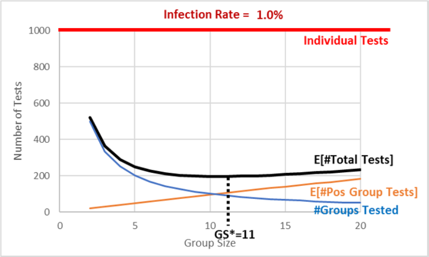
The group size of 5 is, in fact, the optimal solution and answer to our question. Figure 3.10 reveals that we traveled down the expected number of total tests curve as we changed the group size from 20 to 10 and finally 5.
Figure 3.10 makes it easy to see that a group size of 5 is the minimum for the expected number of total tests curve, but it also reveals the trade-off involved. The two curves are added up to produce the top, total curve. At 10, we test 100 groups (the bottom curve) and we add that to 400 (the expected number of tests from positive groups), and this gives us 500 (the top curve).
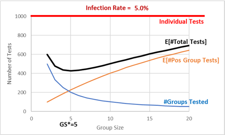
When we moved from 10 to 5, we added 100 tests (the bottom curve) but saved about 175 tests (the middle curve), lowering our expected total tests from 500 to 425. We cannot do any better than 425 total tests. Further reductions in group size will increase total tests.
Comparative Statics Analysis
We can ask another question that again shows off the power of spreadsheets: What happens if the infection rate changes—say, to 1%? What would be the optimal group size?
This kind of question is called comparative statics analysis because we want to know how our solution responds to a shock. We want to compare our initial optimal group size of five when the infection rate was 5%, to the new solution when the infection rate is 1%. This comparison reveals how the shock (changing the infection rate) affects the optimal response (group size).
STEP Change cell A1 to 1%, then use the spreadsheet to find the optimal group size. What group size would you recommend? Why?
You may have struggled with this because it turns out that the total tests curve is rather flat at its minimum. Thus, a simulation with 400 repetitions does not have the resolution to distinguish between group sizes in the range from 8 to 14 or so. Figure 3.11 makes this clear.
The exact answer for the optimal group size is, in fact, 11 groups. It has an expected number of total tests of 195.57 (again, using analytical methods). Choosing group sizes of 10 or 12 leads to a slightly higher number of total tests—although it is impossible to see this in Figure 3.11.
An infection rate of 1% shows simulation may not be an effective solution strategy for every problem. Of course, you could create a Data Table with more repetitions, but using simulation to distinguish between group sizes of 10 and 11 requires a Data Table so large that Excel would be unresponsive.
As mentioned earlier, there are many Excel Monte Carlo simulation add-ins, and they can do millions of repetitions. We used MCSim in earlier work in section 3.2.. Even if we ran enough repetitions to see that 11 is the optimal solution, you should remember that simulation will never give you an exact result because it can never do an infinity of repetitions.
The good news is that any group size around 10 is going to be a little under 200, which is an 80% improvement over individual testing. There is no doubt about it—pooled testing can be a smart, effective way to reduce the number of total tests performed.
Our comparative statics analysis tells us that the lower the infection rate (from 5% to 1%), the bigger the optimal group size (from 5 to 11) and the greater the savings from pooled testing versus individual testing (from about 675 to 800 tests).
Finally, if you carefully compare Figures 3.10 and 3.11, you will see that the #Groups Tested curve (a rectangular hyperbola, since the numerator is constant at 1,000) stays the same in both graphs. Changing the infection rate shifts down the E[#Pos Group Tests] relationship, and this brings down and alters the shape of the E[#Total Tests] curve.
Comparative statics analysis shows that pooled testing is more effective when the infection rate falls. A lower infection rate means we can have bigger groups, yet they may still have no infected individuals in them.
Takeaways
Pooled testing means you combine individual samples. A negative test of the pooled sample saves on testing because you know all the individuals in the group are not infected.
There is an optimization problem here: Too big a group size means someone will be infected, so you have to test everyone in the group, but too small a group size means too many group tests. The sweet spot minimizes the total number of tests.
The optimal group size depends on the infection rate. The smaller the rate, the bigger the optimal group size.
By creating this spreadsheet, you have improved your Excel skills and confidence in using spreadsheets. You have added to your stock of knowledge that will help you next time you work with a spreadsheet.
The OFFSET function is really powerful, but it is difficult to understand and apply.
The Data Table is meant for what-if analysis, but it can be used as a simple Monte Carlo simulation tool. Each press of F9 recalculates the sheet and the Data Table.
You also learned or reinforced a great deal of statistical and economics concepts. Economics has a toolkit that gets used over and over again—look for similar concepts in future models and courses. Try to spot the patterns and repeated logic. Although it may not be explicitly stated, getting you to think like an economist is a fundamental goal of almost every Econ course.
Reference was made several times to the analytical solution. This was not shown because the math is somewhat advanced. To see it, download the PooledTesting.xlsx file from dub.sh/gbae and go to the Analytical sheet.
One methodology issue that is easy to forget but crucial is that we made many simplifying assumptions in our implementation of the data generation process. There may be other factors at play in the spread of COVID-19 or how tests actually work that affect the efficacy of pooling. Spatial connection was mentioned as something that would violate the independence assumed in our implementation. Another complication is that “a positive specimen can only get diluted so much before the coronavirus becomes undetectable. That means pooling will miss some people who harbor very low amounts of the virus” (Wu, 2020).
Our results apply to an imaginary, perfect world, not the real world. We need to be careful in moving from theory to reality. This requires both art and science.
The introduction cited Robert Dorfman as writing a paper on pooled testing back in 1943. It is a clever idea that you now understand can be used to greatly reduce the number of tests, which saves a lot of resources. Perhaps you will not be surprised to hear that Robert Dorfman was an economist.
References
Dorfman, R. (1943). “The Detection of Defective Members of Large Populations.” Ann. Math. Statist. 14, no. 4, pp. 436–440, projecteuclid.org/euclid.aoms/1177731363.
Mandavilli, A. (2020). “Federal Officials Turn to a New Testing Strategy as Infections Surge.” The New York Times, July 1, 2020, www.nytimes.com/2020/07/01/health/coronavirus-pooled-testing.html.
Wu, K. (2020). “Why Pooled Testing for the Coronavirus Isn’t Working in America.” The New York Times, August 18, 2020, www.nytimes.com/2020/08/18/health/coronavirus-pool-testing.html.
3.4 Search Theory Simulation
You want to buy something that many stores sell, but they charge different prices. Suppose that you cannot just google it to find the lowest price. Maybe you are at a huge farmer’s market, and there are lots of vendors selling green beans. They are all the same, but the prices are different. How do you decide where to buy?
Believe it or not, this problem has been extensively studied. It is part of search theory and has produced several Nobel Prize winners in Economics. It also has a long history in mathematics, where it is known as an optimal stopping problem.
There are many different search scenarios and models. For example, you could be deciding which job to take. Once you pass on an offer, you cannot go back (this is called sequential search). Or you could be involved in some complicated game with asymmetric information, where one agent—say, the seller of a house—has more knowledge about the house than the potential buyers.
Fortunately, your green bean search problem is straightforward. The green beans are homogeneous (exactly alike), and you can gather as many prices as you want, then choose the cheapest one. The catch is that it is costly to search—search is just another way of saying “gather prices,” but there are search costs.
If searches were costless, then the problem would be trivial—simply get all the prices and buy the cheapest one. The problem becomes interesting when collecting price information takes effort and time. In that case, you can search too little (so you would have found a much lower price with more searching) or search too much (so the slightly lower price you found was not worth it). You are facing an optimization problem!
We will set up and solve this optimization problem in Excel. We will use the Monte Carlo simulation add-in to explore how our total cost changes as we vary the amount we search. We will then do comparative statics analysis to see how the optimal solution responds when we shock the model.
Setting Up the Problem
First, we create a population of prices.
STEP Open a blank Excel workbook and name it Search.xlsx. Name the sheet DGP (for data generation process). In cell A1, enter the label Price. In cell A2, enter the formula =RAND(). Fill down to cell A101.
You now have 100 prices on your spreadsheet ranging from zero to one. Our target is the lowest price. We can easily find it with the MIN function.
STEP Enter the label Minimum in cell B1 and the formula =MIN(A2:A101) in cell B2. Scroll down until you find that lowest price. Press F9 to get a new set of prices and a new minimum. Each time you press F9, it is like a new day at the farmers market and the vendors have all changed their prices.
The cheapest price is close to zero (since RAND goes from zero to one), and it can be anywhere in the list of 100 numbers. As a buyer, you will not, however, do what you just did and simply enter a formula that yields the minimum price, because we assume that you cannot see the prices until you visit the store. You have to search to reveal each price.
Let’s suppose that each search will cost you 0.04 monetary units. This is an exogenous variable. The 100 prices are also outside of your control. Your endogenous, or choice, variable is how many prices to reveal.
Your goal is to minimize the total cost of purchase, composed of the price you pay plus the search costs. The more you search, the lower the price you pay the vendor but the higher the costs of the search. You have to balance these two opposing forces.
Your spreadsheet is like a card game. Pressing F9 is like shuffling 100 cards. You want the lowest-numbered card in the deck. A search is like flipping a card over, but it costs you 0.04 for each card you reveal. What is the best number of cards to flip over? To answer this key question, we proceed slowly.
Suppose you decide to search just once. This has the advantage of the lowest search costs possible but the disadvantage that you will only get one price. How will you do if you adopt this strategy?
STEP In cell C1, enter a 1 (this represents how many prices you gather), and in cell C2, enter the formula =A2. In cell C3, enter 0.04 (this is the cost of your single search). In cell C4, we add the two cells above it together, so enter the formula =C2+C3. Press F9 a few times.
Each time you press F9, you get a new price in cell C2 (because the prices all change) and a new total cost in cell C4. Sometimes you do pretty well, close to 0, but sometimes you end up near 1, which is not good. But how can we know how you will usually do? How you do on average, not just in a single outcome, is how we evaluate the results of chance processes.
Monte Carlo simulation can tell us the typical result. We will use the MCSim add-in to run our simulation in Excel. If needed, download and install MCSim from dub.sh/addins.
STEP Run a simulation that tracks cell C4 with 10,000 repetitions by clicking MCSim in the Add-ins tab, entering C4 in the Select a cell input box, adding a 0 to the default 1,000 repetitions, and clicking Proceed.
Your results show an average around 0.54. This is what you can expect to usually pay, in total, for your green beans. This makes sense, since the average of RAND is 0.5 and you have to pay 0.04 for one search. Notice that the simulation values are not normally distributed, with a bell shape. Instead, you are equally likely to do really well (low total cost), badly (around 1), or somewhere in the middle (around 0.5).
The expected value of 0.54 is the number we use to convey the performance of the search-and-buy-at-one-store strategy. Of course, it does not matter if you pick the first store (in cell A2). You could pick any one of the 100 stores and get the same simulation results because each press of F9 puts up new random prices for all the stores, just like reshuffling a deck of cards.
STEP It is easy to confirm this by changing the formula in cell C2 to =A20 or =A54 or any other cell from A3 to A101 and tracking cell C4 in a new simulation. Your results are substantially (but not exactly) the same as the simulation with =A2 in cell C2.
Finding the Optimal Number of Searches
What happens to your total cost of buying green beans if we search more than once? Let’s try 5 searches.
STEP In cell D1, enter a 5 (this represents gathering prices from 5 vendors), and in cell D2, enter the formula =MIN(A2:A6). This formula shows the lowest price in your sample from 5 stores, which is the one we would buy. As mentioned, you could pick any set of 5 stores, and you would get the same result. In cell D3, enter the formula =0.04*5 (0.2 is the cost of 5 searches). In cell D4, we add the two cells above it together, so enter the formula =D2+D3. Press F9 a few times.
Each press of F9 gives a single outcome, or realization, of the chance process. Sometimes you get lucky and get a low price, other times not. Notice that the total cost (in cell D4) is the sum of the lowest price and 0.2 (the cost of searching).
Do you think 5 searches are better than 1? We cannot answer this question by looking at cells C4 and D4 because they show just one realization. We need to compare the typical result of these two strategies. We know the expected value of the total cost of 1 search is 0.54. What is the typical result of 5 searches?
STEP Use the MCSim add-in to track cell D4. What do your results show?
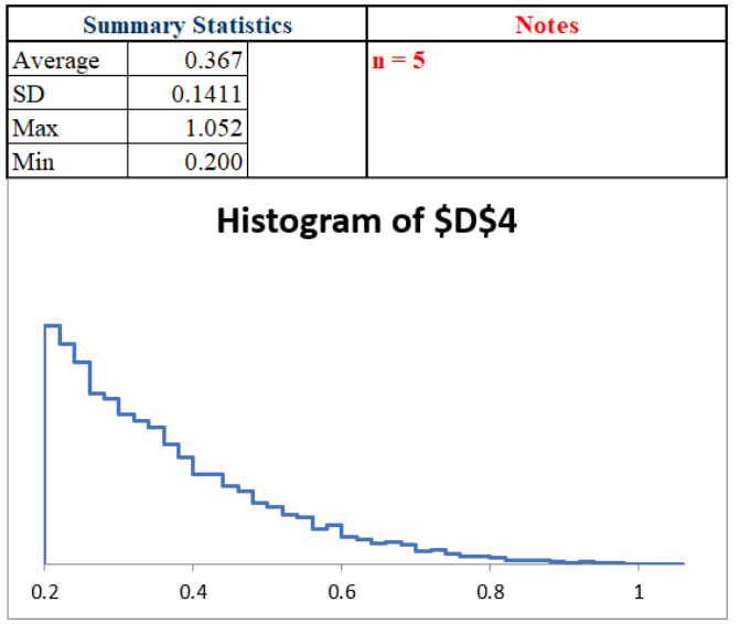
Your results should be similar to Figure 3.12. These simulation results tell us that n = 5 is better than n = 1 because the typical result for 5 searches (approximated by the average of 10,000 repetitions) is around 0.37, which is much less than 0.54 (a roughly 30% decrease).
Maybe more searches are even better? How do 10 searches compare to 5?
STEP Run a simulation of 10 searches by setting up a 10-search scenario on the spreadsheet (in column E) and running a simulation. Try to figure it out first, but check the appendix, if needed, for more detailed help.
Your work shows that n = 10 is much worse than n = 5. How about n = 4?
STEP In cell F1, enter a 4, and in cell F2, enter the formula =MIN(A2:A5). In cell F3, enter the formula =0.04*4 (0.16 is the cost of 4 searches). In cell F4, we add the two cells above it together, so enter =F2+F3. Use the MCSim add-in to directly compare cells D4 and F4 by putting D4 in the Select a cell input box and F4 in the Select a second cell input box, then click Proceed.
Your results should show a close race. In fact, it is so close that we need to improve the resolution of the sim by increasing the number of repetitions.
STEP Track cells D4 and F4 again, but this time with 100,000 repetitions. This will take 10 times longer than the last sim.
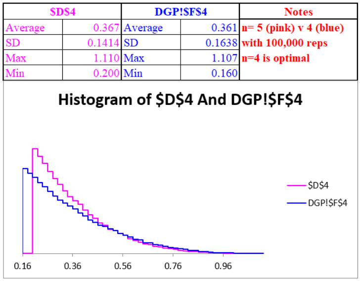
It is still quite close, but as shown in Figure 3.13, you will get a slightly lower sim average of 0.361 or so with n = 4 than the sim average of about 0.367 with n = 5. In fact, it can be shown with analytical methods that n = 4 is the optimal solution. To see the math involved, download Search.xlsx from dub.sh/gbae.
Let’s step back and think about what you have done. It took some work, but you used simulation to explore the U-shaped curve in Figure 3.14. It plots the exact expected value as the search increases from 1 to 10. The minimum, the answer to what you should do, is found at n = 4.
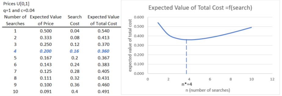
Notice that 1 and 10 searches both yield high total costs, but for different reasons. With n = 1, you only pay 0.04 to search, but your usual purchase price is around 0.5. By searching 10 times, you lower the purchase price a lot (you are likely to find a seller with a low price, typically around 0.091), but you have to pay 0.4 in search costs.
Comparative Statics
An interesting shock to this model involves the cost of searching. What if something happened, like the internet, that lowered search costs? Instead of having to visit each store to find out the price, you can go to their web page and see the price. This makes searching much easier and cheaper. How would your search behavior respond to this shock?
Suppose the per-unit cost of searching fell from 0.04 to 0.01. What effect would that have on the optimal number of searches?
STEP Copy the DGP sheet and rename it DGPLowerCost. Change row 4 in columns C to F to reflect the new c = 0.01. Use the MCSim add-in to find the new optimal number of searches. You can check your work (or get a few hints) using the discussion that follows, but try to do it yourself first.
The first thing to realize when search costs fall from 0.04 to 0.01 is that total costs are going to be lower for all search values. Instead of 0.54 for one search, the expected value of total costs is 0.51 when c = 0.01. For n = 4, the expected total cost falls from 0.36 to 0.24. Notice that costs fall by more the more you search.
If you actually tried to run simulations for different values of n, you might be confused by how close the results ended up being. Because of this, simulation is going to have trouble finding the exact answer. Figure 3.15 explains what is going on.
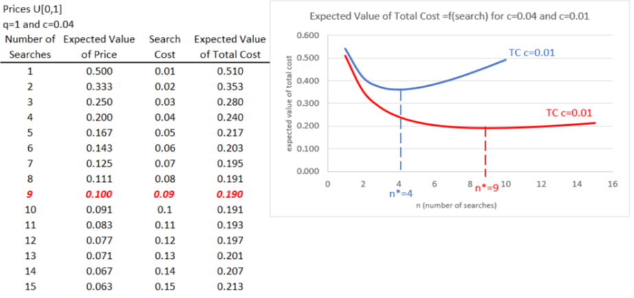
With c = 0.01, the expected value of the total cost curve has a minimum at n = 9, so this is the exactly correct answer, but notice how flat the curve is around that minimum. If your answer was 8 or 10, you missed by only 0.001.
Simulation struggles to get an exact answer because the total cost function is so shallow. You would have to run millions of repetitions to identify the exact minimum solution at n = 9.
However, simulation does give you the correct answer in the sense that the number of searches goes up as the cost of searching falls. This key result makes sense, since you will take advantage of cheaper search costs by searching more.
Simulation Versus Analytical Methods
Figures 3.14 and 3.15 show the exact expected value of the total cost. As mentioned earlier, if you are interested, you can download Search.xlsx from dub.sh/gbae to see how these analytical results were derived.
You might wonder why we used simulation when analytical methods give us an exact answer. There are two reasons. First, by implementing the problem in Excel, we get a deep, clear understanding of the role of randomness in this problem. It is one thing to say that prices are random, but seeing them bounce on the screen really conveys the data generation process.
Simulation is often helpful in understanding a problem because it requires building a model that reflects core components of a real-world scenario. This often enables a richer, fuller grasp of the forces at play.
The second reason for using simulation is that we have another independent method that is confirming the analytical solution. The averages in Figures 3.12 and 3.13 are very close to their expected values. We can be sure that we have found the right answer when both methods agree. And if they do not agree, we are alerted to a potential error in one of the methods.
Neither approach is foolproof. Simulation’s main drawback is that it cannot give an exact answer. In addition, sometimes so many repetitions are needed to obtain a clear result that it is impractical.
But analytical methods using equations, algebra, and calculus are not perfect either. Sometimes, there is no way to derive the answer, and simulation is all we can do. Other times, the analytical method fails disastrously and gives us an incorrect answer. Simulation helps us avoid that trap.
Takeaways
Economists believe in the law of one price, the idea that competition makes prices converge. But this only applies in a frictionless world of perfect information. In our model, if c = 0, you simply get all the prices and pick the lowest one. In such a world, there would be no price dispersion, since everyone would go to the cheapest vendor, so all the sellers would have to match that price. The law of one price would hold.
In the real world, there are all sorts of frictions. An important one is incomplete information, so buyers do not know all the prices (and qualities) of goods and services. The real world has many different prices (just think of all the prices you see at gas stations as you are driving down the road), and buyers have to search to find low prices. Economists say that search is price discovery, which emphasizes how searching is a productive activity.
Consumers face a search optimization problem. The more they search, the lower the price they are likely to pay, but they have to spend resources—time and effort—to search. You can definitely oversearch, which means that the gain from the lower price you found was not worth the extra cost of searching. On the other hand, you cannot search enough—you saved on search costs, but you did not take advantage of the lower prices you would have found by searching more.
Consumers optimize and search an optimal amount like Goldilocks: not too little and not too much but just right. The fact that buyers will not choose to find every price explains why price dispersion exists. This is a key result. As Stigler (1961) famously said, “Price dispersion is a manifestation—and, indeed, it is the measure—of ignorance in the market.”
We also showed that lowering search costs would increase the optimal number of searches, but we can point out a few interesting real-world implications of this result. For example, not all consumers face the same search costs. Suppose you are in a hurry (perhaps you have an important deadline at work), your search costs are high, and therefore it is optimal for you to search less. Different people in different situations have different optimal solutions.
Our comparative statics result that lower c leads to higher optimal n points to the fact that lower search costs reduce price dispersion. If the internet allows you to quickly scan gas stations in an area and go to the cheapest one, prices are going to come closer together. They will not all be exactly the same (as the law of one price says) because the search is not free, but they will not be as spread out.
Noneconomists sometimes demonize advertising. They see consumers as dupes, easily fooled and tricked by ads to buy things they do not need or want. But search theory shows advertising in a different light. It is a way to lower search costs. Sellers are trying to be noticed in a noisy, chaotic marketplace, so they provide consumers with information about prices and product characteristics.
Since we introduced the internet as a shock that lowered search costs, we close by pointing out that new online technologies have radically affected search theory. You know that every click is tracked, and the prices you see are personalized just for you. Optimal online searching is the subject of intense research today. Both buyers and sellers are faced with complicated, intertwined optimization problems.
References
Stigler, G. (1961). “The Economics of Information.” Journal of Political Economy 69, no. 3, pp. 213–225, www.jstor.org/stable/1829263. This paper is recognized as the beginning of the economics of search. Stigler was recognized as the founder of information economics when he was awarded the Nobel Prize in Economics in 1982.
Appendix
For 10 searches, repeat the same procedure as for 5 searches, slightly changing the formula for the minimum price and costs of searching to account for 10, instead of 5, searches. It goes like this: In cell E1, enter a 10 (this represents gathering prices from 10 vendors), and in cell E2, enter the formula =MIN(A2:A11). This formula shows the lowest price in your sample from 10 stores, which is the one we would buy. In cell E3, enter the formula =0.04*10 (0.4 is the cost of 10 searches). In cell E4, we add the two cells above it together, so enter the formula =E2+E3. You are now ready to track cell E4 in a simulation to see the typical result for this search strategy.
You should find that 10 searches have an approximate expected value of around 0.49. This is higher than 5 searches and therefore is clearly not an optimal solution.
