
4 Growth
The most powerful force in the universe is compound interest.
Attributed to Albert Einstein
4.1 Growth Math
The learning objective is straightforward to state but difficult to accomplish: a deep appreciation of the power of compounding. You want to go beyond the simple mechanics of growth and truly grasp the nature of the force unleashed by exponential growth.
In addition, there are two subgoals:
-
- Measuring growth via the CAGR, the compound annual growth rate
- Understanding and using the Rule of 70
A Race
We are going to pit an arithmetic sequence against a geometric sequence (or progression). This is not a mystery, so we will reveal right now that the geometric sequence will win. Be on the lookout, however, for some surprising results.
An arithmetic sequence is a list of numbers with a common difference between each term. The sequence 4, 9, 14, 19, 24 is an arithmetic sequence with 5 as the difference.
Instead of a constant additive increase, a geometric sequence progresses by applying a multiplicative constant to each term. So 4, 8, 16, 32 is a geometric sequence with 2 as the multiplier. Notice that doubling is a 100% increase.
Starting from 4, it is easy to see that doubling beats adding 5 pretty quickly—by the third term. But what if we made it really uneven in choosing the additive and multiplicative constants?
Starting with $1, what if you got $1,000,000 more every day versus a 10% per day increase? We will use Excel to run this race.
Let’s agree that the arithmetic sequence is going to jump out to a big lead. After two days, it has $2,000,001, while the geometric sequence will have $1.21. But what happens as time goes by?
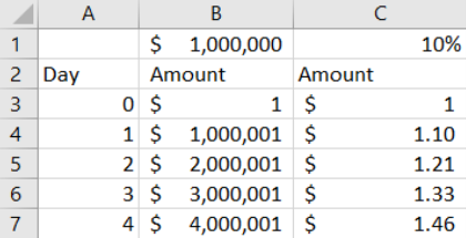
STEP Save a blank Excel workbook as Growth.xlsx and enter the labels in row 2 as shown in Figure 4.1. In cells B1 and C1, enter the values $1000000 and 10% (including the $ and %) and name the cells x and i (for interest rate). Use Excel’s Help or the web if needed to name the cells, and widen column B until the value is visible.
EXCEL TIP Naming cells improves presentation and makes your implementation easier to follow. Using natural language text in formulas instead of cell addresses requires more setup time, but the improvement in readability of formulas is well worth the effort.
STEP Enter 0 and 1 in cells A3 and A4, respectively, then select both cells, click the bottom-right corner of cell A4, and drag down to cell A50. In cell B3, enter $1, and in cell B4, enter the formula =B3+x. Select cell B4 and double-click at the bottom-right corner to fill it down. Enter $1 in cell C3 and the formula =(1+i)*C3 in cell C4. Fill it down.
The formula in column C is produced by this algebraic simplification of the way the next term is produced in a geometric sequence:
[latex]x_{t+1} = x_t + i x_t[/latex]
[latex]x_{t+1} = (1 + i)\,x_t[/latex]
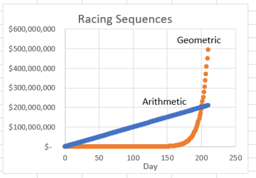
STEP Widen columns B and C to make sure the numbers are visible in row 50. It is obvious that $1M per day is way ahead of 10% per day, but let’s make a chart to show how far ahead the arithmetic sequence is: Select cell range A2:C50 and insert a Scatter chart. Give it a title (you can use Racing Sequences), label the x-axis (Day would work), and insert text boxes without fills or outlines to label the two series.
Your chart has a line with a slope of $1M and what appears to be another line (the geometric sequence) on the x-axis. The values of the geometric sequence are so small, you cannot tell that they actually form a curve. What happens if we extend the sequence?
STEP Select cells A50:C50, click the bottom-right corner of cell C50, and drag down to row 153. Widen column C to see the values, and decrease the decimal places so only integer dollar values are displayed to make it easier to compare columns B and C.
After 150 days, the arithmetic sequence is still way ahead, roughly $150M to $1.6M, but we can see that the geometric sequence is starting to really gather momentum.
STEP Extend the sequences to row 253.
After 250 days, the geometric sequence is almost 100 times bigger—almost $25 billion compared to $250 million. When did the geometric sequence pass the arithmetic sequence?
STEP Scroll back up to the top of the sheet and enter the label Difference in cell D2 and the formula =C3–B3 in cell D3. Double-click the bottom-right corner of cell D3 to fill it down. Scroll down and widen column D as needed as you scroll.
You will see that the parentheses (indicating negative numbers) stop on day 201. That is the day the geometric sequence won the race, and its lead will grow wider, ever faster, from then on.
STEP Scroll back up and edit the SERIES formulas in the chart. Change the row numbers to 213 so that the formula for SERIES 1 looks like this: =SERIES(Sheet1!$B$2,Sheet1!$A$3:$A$213,Sheet1!$B$3:$B$213,1). Do the same for the second series.
Figure 4.2 shows what your chart should look like. Do not be misled into thinking that the geometric sequence was not growing at first and then started growing really fast around day 150. In fact, it grew at the same rate, 10%, every single day. Another mistake is to see every curve as having constant growth—do not fall into this trap.
One quick way to check if a curve is growing at a constant rate is to make the y-axis a log scale.
STEP Click on the y-axis (the $ values) and check the Logarithmic scale box in the Axis Options on the right of your screen.
The chart dramatically changes. The curve becomes a line and the line a curve. The fact that a log scale linearizes the curve means the curve is growing at a constant rate.
Now, you might think that we are at the surprising result mentioned at the beginning. After all, it is pretty impressive that 10% per day, after starting so incredibly far behind and falling even farther behind, overtakes $1M per day, but no, that is not it.
The big surprise is actually that no matter what (positive) numbers you pick for the constant difference and multiplicative factor, the geometric will always eventually beat the arithmetic sequence.
Let’s be clear about this. You can make the constant difference as big as you want and the multiplicative factor as little as you want (as long as it is positive), and the geometric progression will eventually win the race. That is shocking and reveals the force embedded in compounding.
You could argue that this is expected because multiplication is more powerful than addition, and that is a true statement, but Figure 4.2 hints at another way to remember why geometric progressions are so powerful—they are curves instead of lines. Eventually, if they start from the same point and are both increasing, a curve will always pass a line.
You have undoubtedly heard about the power of compounding, and it is true that compounding is an incredibly important concept in business. You want, however, to have a deep appreciation of the idea that compounding over long periods of time will produce remarkable results.
STEP Just to be sure and to give you another wow moment, reduce the multiplicative constant in cell C1 to 1%. Will growing at 1% per day catch up and beat $1,000,000 per day? Amazingly, yes, you know it will, but when? Find the day the geometric sequence beats the arithmetic one. The answer is in the appendix.
CAGR
We can measure the rate of growth between any two points by using a formula called the compound annual growth rate (CAGR). The word annual is used because it is often applied to yearly data, but we can apply the CAGR to the daily frequency in the race we just ran. Instead of just stating the formula, it is worth seeing where it comes from.
We know that a geometric sequence is generated by adding a constant multiplicative factor (i) times the previous amount. Here are the first few terms, where x0 is the initial value, x1 is the next value, and so on.
[latex]x_{1} = x_{0} + i x_{0} = (1 + i) x_{0}[/latex]
[latex]x_{2} = x_{1} + i x_{1} = (1 + i )x_{1}[/latex]
[latex]x_{3} = x_{2} + i x_{2} = (1 + i )x_{2}[/latex]
The subscript tells us the time period, with 0 meaning right now. The last equation above says the value of x in time period 3 equals the previous value of x plus the rate of growth times the previous value. The value of x in time period 3 also can be expressed as (1 + i) times the value in time period 2.
We can rewrite x2 by substituting in the formula for x1 like this:
[latex]x_{2} = (1 + i) x_{1} = (1 + i )(1 + i )x_{0} = \left( 1 + i \right)^{2} x_{0}[/latex]
We can do the same for x3:
[latex]x_{3} = (1 + i )x_{2} = (1 + i)( 1 + i)(1 + i )x_{0} = \left( 1 + i \right)^{3} x_{0}[/latex]
In fact, we could do this for any value in the sequence after the initial value:
[latex]x_{t} = (1 + i) x_{t - 1} = \left( 1 + i \right)^{t} x_{0}[/latex]
The equation above says that starting from an initial value, x0, the value of x at time t, xt, will be (1 + i)t times the initial value. We do not have to know the previous value to get the next value. All we need is the initial value, the rate of growth, i, and the number of time periods.
Since this equation expresses where every point will be in the sequence, we can solve for i like this:
[latex]x_{t} \mathrel{=} (1 + i)^{t} x_{0}[/latex]
[latex]\frac{x_{t}}{x_{0}} \mathrel{=} (1 + i)^{t}[/latex]
[latex]\left[\frac{x_{t}}{x_{0}}\right]^{1/t} \mathrel{=} 1 + i[/latex]
[latex]\left[\frac{x_{t}}{x_{0}}\right]^{1/t} - 1 \mathrel{=} i[/latex]
[latex]i \mathrel{=} \left[\frac{x_{t}}{x_{0}}\right]^{1/t} - 1[/latex]
The last equation is the CAGR. We can write it in a more user-friendly way:
[latex]i \mathrel{=} \left(\frac{x_{t}}{x_{0}}\right)^{1/t} - 1[/latex]
[latex]\mathit{CAGR} \mathrel{=} \left(\frac{\text{Final Value}}{\text{Initial Value}}\right)^{1/\text{Number of Time Periods}} - 1[/latex]
Given any two numbers and the number of time periods, the CAGR tells us what the rate of growth must be if the numbers are part of a geometric sequence. Let’s put this formula to work.
STEP Label cell E1 as CAGR and enter the formula =(C9/C3)ˆ(1/6)-1 in cell E2.
You calculated the rate of growth from the initial value of $1 at t = 0 to the value in the sixth time period, and this will equal the rate of growth in cell C1.
Be careful with the number of time periods in the CAGR formula. From t = 0 to t = 6 and from cells C3 to C9, there are seven numbers, not six. The number of periods is always one less than the number of values in the sequence. The number of time periods, t, is the amount of time that has elapsed since the start. For a length of one unit of time, you need two numbers, the beginning and end.
STEP Modify your formula in cell E2 to compute the CAGR from time period 5 to 10. You will know you have it right if cell E2 equals cell C1.
Of course, we constructed the geometric sequence in column C, so we know the rate of growth. What if we did not know the rate of growth and had only beginning and ending values?
STEP Click on an empty cell and compute the CAGR from an initial value of 11.7 in t = 0 to 23.1652 in t = 14.
The correct formula is =(23.1652/11.7)ˆ(1/14)-1, and Excel should be displaying 0.05. Notice that we do not need to know the numbers in the intervening time periods. If it is a geometric sequence—that is, growing at a constant rate—then we could compute the value at any time period using the generating equation, xt = (1 + i)tx0.
Let’s show that values between initial and final are irrelevant and introduce another measure of growth, the average annual percentage change (AAPC).
STEP Insert a new sheet and enter the formula =RAND()*1 in cell A1, =RAND()*2 in cell A2, and =RAND() times 3, 4, and 5 in cells A3, A4, and A5. Make a graph by selecting range A1:A5 and inserting a Scatter chart. Press F9 (you may have to use the fn key on your keyboard) a few times to recalculate the sheet.
Even though the values do not grow at a constant rate, we can compute the CAGR from A1 to A5.
STEP Label cell A6 CAGR, and in cell A7, enter the formula to compute it from A1 to A5.
The formula you entered (to be sure: =(A5/A1)ˆ(1/4)-1) ignores the three points in between the first and last points. The CAGR assumes that a constant growth curve connects the first and last points.
There is another common measure of growth that does use all the points, the average annual percent change.
STEP In cell B2, enter the formula =(A2-A1)/A1 and fill it down.
Column B has the percentage changes from one year to the next. The average annual percent change takes the average of the percentage changes.
STEP Label cell B6 AAPC and enter the formula =AVERAGE(B2:B5) in cell B7. Press F9 a few times.
It is clear that the two measures are different. The CAGR answers a specific question: What is the constant rate of growth that would need to be applied to the initial value so that we end up at the final value? Unlike the CAGR, applying the AAPC growth rate to the first value will not produce the final value (unless the numbers are a geometric sequence). The AAPC is just an average of the annual percentage changes.
In fact, there are many more ways to measure growth than CAGR and AAPC, but these are the two most common ones. And there are many more averages than the usual one. There is one called the geometric mean (mean and average are synonyms). Instead of adding the values and dividing by n (the number of values), you multiply them and then take the [latex]\frac{1}{n}th[/latex] root.
STEP Enter the formula =A2/A1 in cell E2. Fill it down to E5. In cell E6, enter the formula =(E2*E3*E4*E5)ˆ(1/4).
This is the geometric mean of the ratios in cells E2:E5. There is an easier way: Use Excel’s GEOMEAN function.
STEP In cell E7, enter the formula =GEOMEAN(E2:E5). Confirm cells E6 and E7 are equal.
You probably have not noticed, but an important discovery is at hand.
STEP In cell E8, subtract 1 from the geometric mean in cell E6 or E7 (since they are the same).
Do you see it? Look carefully at cells A7 and E8—the CAGR and geometric mean of the ratios minus 1 are the same! That is striking.
The geometric mean has applications when the data generated come from a geometric sequence. For example, if an investment is growing at a constant percentage, we might use the geometric mean because, like the CAGR, applying the geometric mean growth rate to the first value will produce the last value.
The Rule of 70
The growth rate of a geometric sequence can be used to determine the time needed to double. We use the generating equation, but this time we know we want the initial value to double, and we want to solve for t:
[latex]x_{t} \mathrel{=} (1 + i)^{t} x_{0}[/latex]
[latex]2x_{0} \mathrel{=} (1 + i)^{t} x_{0}[/latex]
[latex]2 \mathrel{=} (1 + i)^{t}[/latex]
With t as an exponent, we face a challenge in solving for t. The path forward involves the logarithm, which is the inverse of exponentiation. We can take the natural log, ln, of both sides to solve for t:
[latex]2 \mathrel{=} \left( 1 + i \right)^{t}[/latex]
[latex]ln(2) \mathrel{=} t ln(1 + i)[/latex]
[latex]\frac{ln(2)}{ln(1 + i)} \mathrel{=} t[/latex]
[latex]t \mathrel{=} \frac{ln(2)}{ln(1 + i)}[/latex]
We can use this formula to find the exact time it will take a geometric sequence to double. If the growth rate is 10% per time period, we plug that into the formula and compute it.
STEP Return to Sheet1 (where you raced the sequences) and set cell C1 to 10%. In cell G1, enter the label Exact Time to Double. In cell G2, enter the formula =LN(2)/LN(1+i).
You used Excel’s natural log function, LN(), to compute that it will take a little over 7.2725 time periods for a geometric sequence growing at 10% to double.
Since the exact answer cannot be easily computed, an approximation is often used. It relies on the fact that ln(1 + x) ≈ x.
STEP In cell G3, enter the formula =LN(1+i).
With i = 10%, ln(1 + i) is almost 0.1, confirming the fact. In addition, ln(2) is roughly 0.693 or, rounded to two decimal places, 0.70. This means we can approximate the exact answer like this:
[latex]t \mathrel{=} \frac{ln(2)}{ln(1 + i)}[/latex]
[latex]t \approx \frac{0.7}{i}[/latex]
We have derived the Rule of 70, an approximation we can write in a more friendly way like this:
[latex]\text{Time to Double} \;=\; \frac{70}{\text{Growth Rate (in Percentage)}}[/latex]
If the growth rate is 10% per day, the Rule of 70 says it will take 70 divided by 10, or 7, time periods to double. This is not exactly true. The exact time to double is displayed by cell G2, but it is reasonably close.
STEP With cell C1 at 10%, notice that the initial value of $1 almost doubles by the 7th day and almost doubles again (to $4) by the 14th day.
We can try a different growth rate to see if the Rule of 70 works again. At 2% per day, the Rule of 70 says it will take about 35 days to double. Is this true?
STEP Change cell C1 to 2%. Did the Rule of 70 work?
Yes, cell G2 shows it will take just a little longer than 35 days to double at 2%. Also, the value in column C is $2 at t = 35, and if you scroll down, you will see that it is $4 at t = 70. It really does double almost every 35 days with a 2% per day growth rate.
STEP Set cell C1 to 70% and look at the values in column C.
The Rule of 70 is not doing well here. It is not true that we get doubling every year. This shows that the Rule of 70 works for “small” growth rates, and the smaller the growth rate, the better the approximation.
There is also the Rule of 72, which is a slightly worse approximation to ln(2) ≈ 0.693 but has more divisors than the Rule of 70.
Growth Numeracy
Today’s world population is roughly 8 billion, but humans started with small numbers and expanded. Galor (2022, p. 46) says,
At the eve of the Neolithic Revolution [the birth of agriculture], in the year 10,000 BCE, an estimated 2.4 million human beings roamed the earth. Yet, by the year 1 CE, as the Roman Empire and the Mayan civilization approached their height, the world’s population had multiplied seventy-eight fold and soared to 188 million.
Generative AI exploded in the public’s consciousness in November 2022 when OpenAI released its latest version of ChatGPT. This was followed by many competitors. As part of my exploration and interaction with these new tools, I repeatedly tried to get various AIs to compute the CAGR for the increase in human population from 2.4 to 188 million over 10,000 years. Figure 4.3 shows one answer from ChatGPT 3.5 (free version) on June 7, 2023.
What is the growth rate for 2.4 to 188 for 10,000 years?
To calculate the growth rate from 2.4 to 188 over 10,000 years, we can use the compound annual growth rate (CAGR) formula. The CAGR formula is given by:
CAGR = (Ending Value / Beginning Value)^(1 / Number of Periods) – 1
In this case:
Beginning Value (BV) = 2.4
Ending Value (EV) = 188
Number of Periods (N) = 10,000 years
Let’s calculate the growth rate:
CAGR = (188 / 2.4)^(1 / 10,000) – 1
Calculating this using a calculator or a spreadsheet, the growth rate (CAGR) from 2.4 to 188 over 10,000 years is approximately 3.23%.
Figure 4.3 – ChatGPT 3.5 computing CAGR.
The AIs always do a good job of explaining how to do the problem but sometimes give ridiculous answers. For example, the steps in Figure 4.3 are correct, but the final answer is nonsensical. At 3% per year, the Rule of 70 says there will be doubling around every 25 years. That would be 16 times in 100 years. We pass 78-fold before 200 years.
A moment’s reflection shows that a 3% growth rate over such a long period of time is going to produce a huge number. How huge? Excel says 1.03 to the 10,000th power is 2 × 10128. Today’s world population of 8 billion is 8 × 10⁹, so ChatGPT’s answer is not in the ballpark.
STEP Use Excel to compute the CAGR for Galor’s numbers: an initial value of 2.4 and a final value of 188 over 10,000 years. You can use ChatGPT’s CAGR formula in Figure 4.3, since it did get that right.
In fact, the CAGR is tiny, about 0.000436. Rounding roughly to 0.0005, that is 0.05%, and the Rule of 70 would give doubling every 1,400 years. Now that CAGR makes sense.
Lesson: Never trust generative AI with a mathematical computation. More broadly, never trust any fact produced by an AI. Always check its claims.
ChatGPT 4 (the paid version in 2023) with a Mathematica plugin gets the CAGR computation right. But I still check every number it produces. AI will undoubtedly get better, but I will remain skeptical of any factual claim it makes. You should also.
As a final example, Poundstone (2016, p. 211) asked this survey question: Suppose you put $1,000 in a tax-free account that earns 7% per year on this investment. How many years will it take to double your original investment to $2,000?
- Between 0 and 5 years
- Between 5 and 15 years
- Between 15 and 45 years
- More than 45 years
Only 59% got it right. The Rule of 70 gives 10 years, so the correct answer is between 5 and 15 years. It cannot be 0 to 5, since 7% of $1,000 is $70. So it would be $1,070 next year and $1,147 in year 2, and there’s no way it reaches $2,000 in 5 years. Likewise, 15 to 45 and more than 45 are obviously wrong, since $70 per year (ignoring compounding) times 30 years is over $2,000.
More importantly, those getting the correct answer “reported $32,000 more personal annual income, more than twice as much in savings, and rated themselves 15 percent happier” (Poundstone, 2016, p. 212). Maybe being numerate has its advantages.
Takeaways
In everyday English, exponential means “really fast.” In math, it means an exponent is involved. Geometric sequences are exponential because they can be written with a generating equation like this: xt = (1 + i)tx0.
Geometric sequences are much more powerful than arithmetic sequences, especially over a long time period. It is hard to believe, but true that a geometric sequence will always surpass an arithmetic sequence, no matter the positive constants used.
Mathematicians usually stress the multiplicative nature of geometric sequences to explain their power, but it is also true that starting from the same place and pointing up, a curve will always eventually pass a line.
We compute the compound annual growth rate with this formula:
[latex]CAGR \;=\; \left[\frac{\text{Final Value}}{\text{Initial Value}}\right]^{1/\text{Number of Time Periods}} - 1[/latex]
The geometric mean (Excel function GEOMEAN()) is another way to compute the CAGR.
The Rule of 70 is mental math. You can quickly roughly compute how long it will take to double by dividing 70 by the growth rate. You can use the Rule of 70 to check a computed growth rate for reasonableness.
The mathematics of how things grow, CAGR, geometric mean, and the Rule of 70 are all part of being numerate. We apply these ideas to economic growth in the next section.
References
Searching the web reveals that it is pretty clear that he never said it, but the quote in the epigraph attributed to Albert Einstein certainly rings true. He is also supposed to have said something like “Compound interest is the Eighth Wonder of the World,” but this is also doubtful. A good quote that the person actually said is from Charlie Munger (Warren Buffett’s partner): “The first rule of compounding is to never interrupt it unnecessarily.”
Galor, O. (2022). The Journey of Humanity (Dutton).
Poundstone, W. (2016). Head in the Cloud (Little Brown and Company), archive.org/details/headincloudwhykn0000poun.
Appendix
A geometric sequence with a growth rate of 1% per day will pass an arithmetic sequence with a constant difference of $1M on day 2,161. Yes, that is roughly 10 times longer than it takes the geometric progression growing at 10% per day. And, yes, if you tried 0.1%, it would take 10 times longer. But no matter how small you make the growth rate or how big you make the constant difference, eventually, the geometric sequence wins!
4.2 Growth Data
We apply the CAGR and the Rule of 70 to long-run output data. The goal is to understand basic facts about economic growth around the world and over time.
Amazingly, economic growth is brand new. It is a mystery and the focus of intense research. Perhaps the biggest open problem in economics is why some countries grow and others do not. One result of uneven growth is that economic inequality across countries keeps getting bigger and bigger.
Data Source and Description
The data come from an economic historian named Angus Maddison. He spent his working life compiling and estimating a variety of economic and demographic variables around the world over very long periods of time. Briefly, Maddison’s data are high quality, but they are noisier the farther back you go (Barreto, 2016). Visit www.theworldeconomy.org if you want to know more.
Annual gross domestic product (GDP) is the value of all final goods and services produced in a year. GDP is where we begin when we measure economic performance. There are three key adjustments that must be made to GDP when it is used to compare countries over time.
- Inflation: GDP uses current prices to compute the value of output. If prices double but the number of units produced stays the same, nominal GDP doubles. That is not what we want. Our measure of economic performance needs to reflect only changes in output, not prices. Thus, we use real GDP because it holds prices constant over time and gives us a better measure of economic performance.
- Population: If two countries have the same GDP but one has more people, we would say the smaller country is more productive in terms of output per person. We divide real GDP by the number of people to get real GDP per person (or per capita) to measure economic performance.
- Purchasing Power Parity: To compare the GDP of countries with different monetary units, we need to convert currencies. For complicated reasons, the best way to do this involves a hypothetical “international Geary-Khamis dollar” (for more detail and an explanation, see www.google.com/search?q=geary-khamis). Adjusting real GDP for purchasing power parity by using international Geary-Khamis dollars gives us a better comparison of GDP across countries.
Real GDP per person adjusted for purchasing power parity is the key variable used to measure economic performance across countries over time. A lot of preparation and statistical adjustment is needed before we begin analyzing the data. Fortunately, Maddison has done this heavy lifting for us.
It is undoubtedly true that real GDP per person is a cornerstone of economic analysis, but it is far from perfect. Its biggest failing is that it says nothing about the distribution of output. We can divide an economy’s GDP by the number of people, but it is not true that each person in that economy gets the same share of output. Measures of inequality in the distribution of output are an important aspect of economic performance that we will review later.
Accessing the Excel Workbook
STEP Go to dub.sh/gbae and click the Excel Workbooks link (top right). Click LongRunGrowth.xlsm to download it. Move the file from your download folder to a folder on your computer or network.
Notice that the file has an .xlsm extension. Regular Excel workbooks have an xls or xlsx extension. The m stands for macro. LongRunGrowth.xlsm is a macro-enabled Excel workbook. When you open it, you must enable macros to get full functionality from the file.
STEP Open LongRunGrowth.xlsm, read the Intro sheet, and be sure to click the Click to Test button. You may have to adjust your security settings as described in the Intro sheet.
Basic Geography
The workbook contains several sheets. The IncomeGroups sheet has World Bank classification of 217 countries and administrative regions by income. There are low-, lower-middle-, upper-middle-, and high-income groups.
STEP Go to the IncomeGroups sheet and scroll down to see the countries in each group. Look at a few rows and think about what you know about those four countries.
For example, row 25 has Niger, Ghana, Dominica, and Switzerland. You probably knew Switzerland is a rich country, but did you know Ghana is lower income but not as poor as Niger?
The countries are sorted alphabetically, so we cannot say anything about their order within a group. This sheet tells us nothing about Niger versus Somalia or Uganda other than they are all in the lowest income group.
The map in the sheet looks different from the usual world map. This is because it is doing an equal area projection. Unlike the usual Mercator map, which shows Greenland as huge, this map accurately reflects geographic size. It really is true that Africa is three times bigger than the United States.
The colors correspond to the income categories, as shown in the legend. While the map in the Excel workbook is informative, the online version is even better.
STEP Click on the map or copy and paste the link below it in a browser to explore the interactive version online. It displays name and category information as you hover over the country.
Data Sheets
Maddison provides three sets of numbers, organized in three sheets. The first is Population, the second GDP, and PerCapita GDP is the third.
STEP Click in each of the three sheets to see how the data are presented. Scroll down to see all the countries in column A (down to row 198).
The countries are organized by a combination of geography and cultural connection. Western Europe is followed by Western Offshoots: Australia, New Zealand, Canada, and the United States. Maddison also gives us groupings such as Latin America and East Asia.
As you scroll down, you will see labels that indicate how country borders have changed over time. For example, “Former Yugoslavia” includes the countries above it in the list (as of 2010, when these data were compiled), and row 65 has the label Total former USSR, with its countries above it.
Notice how the placement of the countries is the same in the three sheets. Maddison estimates population, then real GDP in 1990 Geary-Khamis (GK) dollars for each country or group.
The values in the PerCapita GDP sheet are simply real GDP divided by the number of people. We focus on the data in the PerCapita GDP sheet because this is real GDP per person adjusted for purchasing power parity—this is our measure of economic performance.
The OnlyCountries sheet removes all groups and headings from the PerCapita GDP sheet and displays an alphabetic listing of the countries. Sorting by real GDP per person in 2008 compares the economies of these countries at that time.
EXCEL TIP Sorting is one of the most dangerous things you can do in a spreadsheet. It is remarkably easy to destroy a dataset by sorting only part of it. When you sort, be very, very careful.
STEP Select cell range A3:GR165 in the OnlyCountries sheet. The easiest way to do this is to click on cell A3, hold down the Shift key, and click on cell GR165. Click the Data tab in the Ribbon and click Filter (in the Sort and Filter group).
Excel has added downward-pointing arrows in the cells in row 3. Clicking one of these arrows pops up a menu and enables easy sorting of the data. You can remove the arrows by clicking the Filter button again.
STEP Click the down arrow in column GR and select Sort Largest to Smallest.
Excel obliges and now shows Hong Kong in row 4. It is the richest country in the Maddison dataset in 2008, the last available year. Today, Hong Kong is not a country but a special administrative region of China. It is still rich, but lists of richest countries today, using real GDP per person adjusted for purchasing power parity, usually show Luxembourg, Singapore, and Ireland as the richest countries.
STEP Scroll down slowly and look at the countries as they go by.
Switzerland is near the top, clearly in the high-income group. Dominica (not the Dominican Republic) is not included in Maddison’s dataset (it is in the group of 21 small Caribbean countries). As you get near the bottom, you see Ghana (row 124), which is lower-middle income according to the World Bank. Niger, which is in the low-income group, is third from the bottom.
The data show that Ghana’s real GDP per person of roughly GK$1,500 is 3× (three times) bigger than Niger. That is a lot, but it is nothing compared to the 50× difference between Switzerland and Niger. This staggering difference is evidence of an important lesson that we will explore again:
Lesson 1: Country real GDP per person is wildly uneven.
We can see the massive dispersion in economic performance by noting that the range in real GDP per person goes from a few hundred GK dollars in the poorest countries to 30,000 GK dollars in the richest countries. We can display this in a histogram.
STEP Select cell range GR3:GR165, click the Insert menu item in the Ribbon, and click the Histogram chart type. Click the x-axis and change the number of bins to 30.
Your histogram shows a tall rectangle at the left, indicating many poor countries, then a spread-out distribution gradually getting smaller and smaller as you go right (these are the richest countries).
Another way to see the big disparity in economic outcomes is by computing the standard deviation of real GDP per person for these countries.
STEP Enter the formula =STDEV.P(GR4:GR165) in cell GR2.
The SD displayed in cell GR2 says that the typical amount of dispersion around the average is about GK$8,000. That is a lot of dispersion, since the average is also around GK$8,000.
It has not always been this way. We will see when we start looking at long-run growth that countries used to be much closer in terms of economic performance, but we can also find evidence for this lesson in the short run.
STEP Copy cell GR2 and paste it in cell GJ2. Paste again in cell FZ2.
The earliest we can compute the SD for this set of countries is 1990 because the Soviet Union collapsed in 1989, and many countries in the set were part of the USSR. Even for this short period of time, the numbers are striking. The SD falls from GK$8,000 in 2008, to under GK$7,000 in 2000, and to GK$5,400 in 1990. This is evidence for the second lesson:
Lesson 2: The disparity in country real GDP per person is rising.
In fact, this part of the story is complicated. With free-flowing information and technology, we should see convergence in real GDP per person. There is some evidence that a subset of countries does converge (so the SD of real GDP per person would get smaller). Overall, however, as Maddison’s set of countries shows, the spread in real GDP per person has been growing.
Growth over the Long Run
Now that we know how Maddison created and organized the data, we are ready to use the data to examine the historical record to learn about economic growth. Begin with a screencast that introduces the Compare sheet and emphasizes this lesson:
Lesson 3: Economic growth is brand new.
STEP Watch the video titled “Long Run Growth” at vimeo.com/econexcel/longrungrowth.
The screencast says that for millennia, every country was poor. Yes, there were a few rich individuals, mostly monarchs and rulers, but everyone else was living at a subsistence level. It is only in the last few hundred years that some countries have broken out of the poverty trap.
Why did growth suddenly (on a time scale of millennia) explode on the scene? Why did only some countries grow? Believe it or not, we do not actually know the specific mechanisms involved. It was not simply money or trading, since both have been around for a lot longer than the last few hundred years.
Economists point to the market system as the driver of growth. This loosely defined concept involves private property rights, rule of law, entrepreneurship, widespread individual striving for wealth, and celebration of financial success. This complicated, poorly understood cocktail of institutions and cultural norms has many names, such as capitalism and free enterprise.
We do not know exactly why, but growth emerged in Europe roughly a few hundred years ago, and then it evolved unevenly. Some countries grew and others did not. Some grew fast and others slowly. The Compare sheet can be used to display examples of this, as shown at the end of the “Long Run Growth” screencast.
STEP Use the Compare sheet from 1950 to 2008 to see if Maddison’s data agree with the World Bank classification of Sudan as low income and Egypt as lower-middle income.
Your chart shows that these two countries, which share a border, were roughly equal in 1960 but are no longer so. Egypt has done much better than Sudan and now has double the real GDP per person.
STEP Choose an upper-middle-income country from the IncomeGroups sheet and add it to the chart.
Adding an upper-middle-income country changes the scale of the y-axis and places another series above Egypt and Sudan.
STEP Add a rich country from Europe to your chart.
The y-axis scale changes again, and the spread of the four countries is quite large. Sudan is pushed close to the x-axis, with Egypt slightly above it. Notice that the gap between the rich European country you added and your upper-middle-income country is big.
So far, we have been tracking the level of real GDP per person, but we are also interested in the growth rate of real GDP per person. The next screencast, “CAGR and AAPC for Norway,” shows how we can use the Maddison dataset and Compare sheet to find the growth rate, and it makes this point:
Lesson 4: The magic growth number is 2% per year in real GDP per person.
STEP Watch the video titled “CAGR and AAPC for Norway” at vimeo.com/econexcel/cagr.
Joseph Schumpeter is well known for his theory of the entrepreneur as innovator, perhaps best captured in the oxymoron creative destruction. Schumpeter, like many others who have studied economic growth, was awed by the productive powers of the market system.
In Capitalism, Socialism, and Democracy, published in 1942, Schumpeter used data to describe the historical success of capitalism before pronouncing that it could not survive. The heroic entrepreneur would become obsolete as rational scientific thinking took hold. The demise of capitalism has not happened (yet).
Using noisy, imperfect measures of real GDP per person, Schumpeter found that the United States had enjoyed a spectacular run from after the Civil War to the Great Depression. He concluded that if this performance was repeated another 50 years, “this would do away with anything that according to present standards could be called poverty” (Schumpeter, 1942, p. 66).
Let’s see if Maddison’s data agree with Schumpeter as we explore the historical economic performance of the US economy.
STEP Use the Data Vertical button to get real GDP per person in the United States in a vertical column (as shown in the “CAGR and AAPC for Norway” screencast). Compute the CAGR in the United States from 1870 to 1929 and from 1950 to 2008 (as shown in the screencast). What would Schumpeter have said had he lived to see how the United States economy performed until 2008?
The United States actually did even better in the second half of the 20th century (2.06% per year) than during the Civil War to the Great Depression (1.77% per year). Schumpeter would have been shocked by this performance.
STEP Go to the Compare sheet and display US real GDP per person from 1870 to 2008. Click the Show Ann % button.
Your chart is a snapshot of US economic history. There are three periods:
- Before the Civil War, the United States was underdeveloped, rural, and quite poor.
- After the Civil War, Reconstruction and Western development created a truly national economy that grew rapidly.
- The Great Depression was traumatic, as was World War II, but the US economy has done extremely well since the 1950s.
CAGRs of 1.86% per year from 1870 to 2008 and 2.06% per year since 1950 are excellent analytics for the US economy. The Rule of 70 tells us we will see doubling in real GDP per person every generation. But can we really count on this going forward? No, the fifth growth lesson says we cannot:
Lesson 5: Growth is not assured.
STEP Watch the video titled “Growth is not given” at vimeo.com/econexcel/growthnotassured.
There are many individual countries that could be used to support the lesson that growth is not assured, but perhaps Japan is the most surprising example.
STEP From the Compare sheet, display Japan’s real GDP per person from 1950 to 2008. Click the Log button.
The log scale linearizes exponential curves and clearly shows the remarkable reversal in the Japanese economy. From 1950 to 1973, the Japanese economy grew at an incredible 8% per year. That is doubling every nine years!
But your chart shows that it suddenly leveled off in 1973. From 1973 to 1991, it grew at 3.3% per year. This is still excellent, and everyone thought Japan would take over the world (much like China is feared today).
And then suddenly, it all came to a screeching halt. From 1991 to 2008, Japanese CAGR fell to 1% per year. Look carefully at your log-scale chart to see how flat the line is starting around 1990.
Why did this happen? We do not know. Standard macroeconomic policies to stimulate the economy have not worked. Japan is an aging society with a rapidly falling birth rate, and it does not especially welcome immigrants, so demographic explanations abound. But this is typical of how economists study growth—we come up with stories after the fact. No one predicted the sudden reversal in economic performance in Japan.
Remember, however, the difference between levels and growth. Japan remains a rich country. If you visit, you will see all the markers of wealth, such as shopping malls and fancy restaurants. The Japanese enjoy long life expectancy and high education levels. The lack of growth, however, is a serious problem for the future.
Source: World Inequality Database / CC BY-NC-SA 4.0.
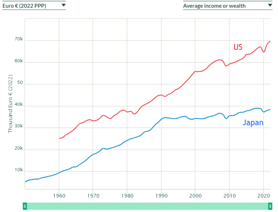
Maddison’s data only go to 2008. What has happened to the United States and Japan since then? While there are many websites to choose from for country comparisons, an excellent one is wid.world. Figure 4.4 shows that Japan was growing incredibly fast until the early 1970s. It slowed down but did well until 1990. Since then, it has gone sideways. An economic juggernaut from 1950 to 1990 but suddenly stagnant the last few decades, Japan is a good example of the lesson that growth is not assured.
We conclude our whirlwind tour of economic growth across time and around the world with a final lesson:
Lesson 6: Seemingly small differences in CAGRs produce huge gaps in levels.
It is easy to think that there is little difference between percentage point changes in growth rates. After all, 0.01, 0.02, and 0.03 are all “small” numbers. So are they basically the same? No. Compounding is a powerful force, and this is why we need to be careful when we compare CAGRs.
STEP Return to the OnlyCountries sheet and copy it. Add a filter if needed and sort by 1900, largest to smallest. Delete all countries (rows) without data for 1900.
You should have a sample of 39 countries with real GDP per person values in 1900. The UK is the richest and China is the poorest when sorted by 1900 values.
STEP In cell GS3 enter the label CAGR since 1900, and in cell GS4, enter the formula for the CAGR, =(GR4/CN4)ˆ(1/108)-1. Fill it down. Delete the columns from 1901 to 2007 so that 1900 and 2008 are side by side to enable easy comparison.
Compare New Zealand and the United States, in second and third place in 1900 in real GDP per person. From that time to 2008, the US growth rate is about half a percentage point (0.005) higher. This seemingly small difference produces a huge gap by 2008: 31,178 to 18,653 in 1990 GK dollars. A picture is worth a thousand words.
STEP In the Compare sheet, display the United States and New Zealand from 1900 to 2008.
That is astounding. Starting from essentially the same place, the “small” 0.5% point difference generates a huge gap by 2008.
Scroll down and look at Portugal and Sri Lanka. Again, they are essentially even in 1900 (and both poor), but in 2008 Portugal is three times richer. Why? Because it grew 1% point faster than Sri Lanka.
STEP Return to the Compare sheet and display Portugal and Sri Lanka from 1900 to 2008.
Again, the picture is striking. That seemingly small percentage point difference causes a huge difference after 108 years of geometric progression.
A mathematician would not be surprised. They might point out that the difference between 1% and 2% CAGR is a “small” one percentage point, but it is a “big” 100% difference. We have doubled the CAGR when we go from 1 to 2 percent per year.
This lesson applies to personal finance. An expense ratio for an Exchange Traded Fund (ETF) or mutual fund that is a “small” 0.5% will end up seriously decreasing the value of the investment over time. This is worth remembering.
Summary
There are many business applications of CAGR and the Rule of 70, but applying these tools to real GDP per person across countries is a great way to learn data analytics and the amazing story of economic growth.
Robert Lucas won a Nobel Prize in Economics, and he expressed the deep frustration of those who study development when he said,
Is there some action a government of India could take that would lead the Indian economy to grow like Indonesia’s or Egypt’s? If so, what exactly? If not, what is it about the “nature of India” that makes it so? The consequences for human welfare involved in questions like these are simply staggering: once one starts to think about them, it is hard to think about anything else. (Lucas, 1988, p. 5)
The data show that economic growth exploded on the world stage just a few hundred years ago with the advent of the market system and simultaneous revolutions in science and industry. As a result, billions of people live healthier, richer lives. It is, of course, also true that billions remain poor, and we need to figure out exactly what it is about the market system that enables growth and development.
Solving the puzzle of economic growth is the biggest open problem in economics. The puzzle is incredibly challenging, and it is critically important that we figure it out.
If you do not believe this, consider Haiti and the Dominican Republic. Go to the Compare sheet and display real GDP per person for these two countries from 1950 to 2008.
It will only take a few seconds to do this (that is what is so powerful about this workbook), and the resulting chart is guaranteed to absolutely blow you away.
In “The Underlying Tragedy,” an editorial in the October 15, 2010, edition of The New York Times, David Brooks communicates the frustration generated by our ignorance:
Why is Haiti so poor? Well, it has a history of oppression, slavery and colonialism. But so does Barbados, and Barbados is doing pretty well. Haiti has endured ruthless dictators, corruption and foreign invasions. But so has the Dominican Republic, and the D.R. is in much better shape. Haiti and the Dominican Republic share the same island and the same basic environment, yet the border between the two societies offers one of the starkest contrasts on earth—with trees and progress on one side, and deforestation and poverty and early death on the other.
Lucas was right; once you start thinking about economic growth and are aware of the tremendous variability in outcomes, it is hard to think about anything else.
Adam Smith’s An Inquiry into the Nature and Causes of the Wealth of Nations was first published in 1776, at the dawn of the British Industrial Revolution. Smith had no data on real GDP per person, but he knew something really weird was going on. He asked a fundamental and enduring question, “Why are some countries rich and others poor?”
We still do not know the answer.
Takeaways
Angus Maddison spent his life compiling estimates of output per person stretching all the way back to AD 1. Maddison’s data enable us to see long-run economic growth.
A generation is roughly 30 years, so growth of a little over 2% per year will produce doubling every generation. That is considered really good for rich countries.
Poor countries often grow faster than 2% when they first adopt the market system. This is called catch-up growth.
It is easy to fall into the trap of thinking that real GDP per person is a perfect measure. It is not. It has several weaknesses, but perhaps its biggest problem is that it says nothing about the distribution of output.
Here are the six lessons in one place:
Lesson 1: Country real GDP per person is wildly uneven.
Lesson 2: The disparity in country real GDP per person is rising.
Lesson 3: Economic growth is brand new.
Lesson 4: The magic growth number is 2% per year in real GDP per person.
Lesson 5: Growth is not assured.
Lesson 6: Seemingly small differences in CAGRs produce huge gaps in levels.
References
Barreto, H. (2023, August 11). CAGR and AAPC for Norway [Video]. Vimeo. vimeo.com/econexcel/cagr.
Barreto, H. (2023, August 12). Long run growth [Video]. Vimeo. vimeo.com/econexcel/longrungrowth.
Barreto, H. (2023, August 12). Growth is not given [Video]. Vimeo. vimeo.com/econexcel/growthnotassured.
Lucas, R. (1988). “On the Mechanics of Economic Development.” Journal of Monetary Economics 22, pp. 3–42.
Schumpeter, J. (1942). Capitalism, Socialism, and Democracy (George Allen & Unwin Ltd.).
4.3 PV and IRR
You are teaching a child about money. You lay out three US nickels, worth 5 cents each, in a row and then two dimes, each worth 10 cents, below the nickels, as in Figure 4.5.

You ask the child if the nickels or the dimes are worth more. The child says the nickels because there are more of them. Yes, more is better, you say, but nickels and dimes are not equivalent. How would you explain that two dimes are worth more than three nickels?
You could replace each dime with two nickels, and now you have four nickels in the bottom row. With everything in nickels, we would easily see that the bottom row has more nickels, and so it is worth more.
Or if you have a bunch of pennies lying around, you could replace each nickel with a stack of five pennies and each dime with a stack of 10 pennies. With everything in pennies, we can use the child’s “more is better” logic: 20 pennies is more than 15 pennies.
Both approaches rely on standardizing the two options so that we are comparing apples to apples. You have no problem knowing that two dimes are worth more than three nickels because you are instantly converting the coins to cents. You are standardizing without even knowing it.
If you think this is obvious, then you will have no problem with present value. It does the same thing, translating money in the future to money now so that we can correctly determine worth. Let’s see how it works.
Present Value (PV)
Whenever you are faced with a decision involving money over time, there is a complication because of the fact that money has a time dimension. The confusing part is that we often ignore the time unit on money, but it is definitely there.
Everyone knows that $1,000 right now is worth way more than $1,000 fifty years from now. Both are denominated in dollars, but both also have a differing time unit, so they are not equivalent.
Just like you cannot treat nickels and dimes as equivalent coins, you cannot directly compare numerical values of money at different points in time. You also would not say “I have 3 cars and 4 pencils, so I have 7 carpencils” because cars and pencils are different things, and “carpencils” is meaningless. The same is true of money at different points in time.
If you had a portfolio of $1,000 in cash and a promise (that you could rely on with certainty) of $1,000 fifty years from now, you could not say that this portfolio is worth $2,000. Although less obvious, this is the same as saying “I have 7 carpencils.”
There is, however, a way to value your portfolio—convert the future money into present value. This is exactly the same as the strategy we used for the nickels and dimes problem in Figure 4.5.
The common time period chosen is usually the present, and this is why it is called present value. Alternatively, future value uses a common time period in the future. We often use present-value as a verb. For example, we present-valued $1,000 two years from now at 10%, and it is $826.45.
Suppose we want to know the present value of $10,000 five years from now with a 9% discount rate (dr). We are looking for the number that, if allowed to grow at 9%, would be $10,000 five years from now.
STEP Open a blank Excel workbook and save it as PVIRR.xlsx. Enter the text You get in cell A1, and in cell B1, enter $10000 (using the $ automatically formats the cell as $). In cell C1, enter the text in year and enter the 5 in cell D1. In cell E1, enter the text and dr is and 9% in cell F1 (again, using % correctly formats the cell). Name cell F1 dr (the easiest way is by selecting cell F1 and then clicking in the Name Box and entering dr).
To be clear, present value is the amount needed right now (the present) so that it will grow into a given target value (in the future). Present value answers the question, “How much is a future amount of money worth today?”
STEP In cell A2, enter the label Year, and in cell B2, enter the label Value. In cell A3, enter the number 5, followed by 4 in cell A4, 3 in cell A5, and so on down to 0 in cell A8. Enter the formula =B1 in cell B3.
Now, what is the formula in cell B4? In previous work, we saw that the next number (t + 1) in a geometric sequence was given by:
[latex]x_{t+1} \mathrel{=} x_t + i x_t[/latex]
[latex]x_{t+1} \mathrel{=} (1 + i)\, x_t[/latex]
Here we are doing the reverse of that. Instead of the next number (which we know), we want the previous number that produced it:
[latex]x_{t+1} \mathrel{=} (1 + i)\, x_t[/latex]
[latex]x_t \mathrel{=} \frac{x_{t+1}}{1 + i}[/latex]
Instead of i, by convention, we use the phrase discount rate (dr) for the constant growth rate when we compute present value. We are discounting, or lowering, the number when we compute its present value. The % growth rate used is also sometimes abbreviated with the letter r. No matter what symbol you use, what you are doing is computing what the previous number in the sequence would be if it grew at that constant growth rate.
STEP In cell B4, enter the formula =B3/(1+dr), assuming you named cell F1 dr. Format cell B4 as $.
Excel shows $9,174.31. If you had that amount of money, it would grow to $10,000 in a year with a growth rate of 9% per year.
STEP Select cell B4 and fill it down to cell B8.
You are showing the present value of $10,000 five years from now with a 9% discount rate. In other words, if you had $6,499.31 right now, in five years it would become $10K by growing at 9% per year.
There is, of course, a faster way. We can bring a number for any future time period, t, back to the present, t = 0, with the Present Value Equation:
[latex]x_{0} = \frac{x_{t}}{\left( 1 + d r \right)^{t}}[/latex]
The present value, x0, depends on three inputs:
-
- The amount in the future
- The discount rate (which is the growth rate)
- The number of time periods in the future
STEP In cell C8, enter the formula =B1/(1+dr)ˆ5.
The equivalence of cells B8 and C8 confirms that the one-step version of the present value computation works.
The Present Value Equation makes clear that the farther in the future, the lower the present value, since you would divide by a bigger number as t rises. Similarly, the higher the discount rate, the lower the present value.
STEP Change the discount rate in cell F1 to values higher and lower than 9% and keep track of the PV in cells B8 and C8.
If you set the discount rate to zero, then the present value is the same as the future amount. Without any growth rate, to reach the target future amount, you have to start with that future amount.
The Lottery Decision
The biggest lottery jackpot as of this writing was on November 8, 2022, to one Powerball ticket in California for $2.08 billion! Lotteries always advertise their jackpot as the total payout even though it is distributed over time.
As usual, the winner took the immediate cash alternative, which was $997.6 million—a little less than half of what they would have received in 30 payments over 29 years. There are many ways to think about how to decide between taking a single amount now versus a stream of payments. One way is to compute the present value of the stream of payments and compare it to the cash alternative.
Real-world lotteries have complicated payout schemes with rising amounts over time, so we will consider a simple hypothetical lottery with a constant payout. Let’s suppose that the jackpot is $1.5 million, which is paid out in 30 payments of $50,000 each year. The immediate cash alternative is $750,000.
So which one would you take and why? We agree that saying, “Give me the $1.5 million because it is more than $750,000” is exactly equivalent to the child saying, “I like 3 nickels more than 2 dimes because there are more of them.” We have to do the present value math. If you are leaning toward the lump sum now, present-valuing might change your mind.
STEP Insert a new sheet in your PVIRR.xlsx workbook. Enter the label Year in cell A1 and the label Amount in cell B1. In cell A2, enter a 0 followed by a 1 in cell A3. Select cells A2 and A3 and then fill down to cell A31. It should show a value of 29. Enter $50000 in cell B2 and the formula =B2 in cell B3. Fill it down. This way we can easily change the payment stream. Finally, sum the $50,000 payments in cell B32.
Of course, cell B32 should show $1.5 million. Less obvious is the fact that in a real sense, this is an illegal sum. The payments of $50,000 come at different times, so they are not equivalent. Excel (and the lottery people) do not care about the time dimension of money, but ignoring the time unit does not make it go away.
We can compute the sum correctly if we present-value all of the payments. That way, we will be adding dollars that have the same time unit—the present.
STEP In cell C1, enter the label PV, and in cell D1, enter 5%. Name cell D1 IRR (explained in the following section). In cell C2, enter the formula =B2/(1+IRR)ˆA2 and fill it down.
Cell C2 is the same as B2 because the present value of any amount right now is that amount. The zero in the exponent for time makes the denominator 1. But look at the other values in column C. They are getting smaller and smaller as you look down. That is because it takes less money now (present value) to grow to $50,000 the farther in the future we get the $50,000.
STEP Copy cell B32 and paste it in cell C32.
You are looking at the correct way to sum the stream of payments. We have a single number, $807,054, to represent its value. The “simple” addition of the 30 payments of $50,000 is a gross misrepresentation of the true value of the stream of payments. It is amazing to people who understand the time value of money that lottery jackpots are allowed to be advertised as the sum of payments over time.
We would never compare the $1.5 million to the immediate cash payout, but we can directly compare the present value to the immediate cash payout. With 5% per year, the present value of the stream of payments is greater than the immediate payout, so we would take the stream of payments.
There is one problem, however; the present value depends on the discount rate used.
STEP Change cell D1 to 10%, and scroll down to see the present value of the stream of payments.
The future amounts are all smaller (since the growth rate is bigger), and the sum of the present values for each payment is $518,480. Since this is less than the immediate cash payout of $750,000, we should take the cash amount in this case.
This shows that there is no one-size-fits-all answer to deciding the question of cash or a stream of payments. It depends on the discount rate used. If you had the ability to invest the immediate cash payout at 10% per year, the cash payout is worth more to you. If, however, the best you can do is 5% per year, then you would take the stream of payments.
Internal Rate of Return (IRR)
We can use the fact that the present value depends on the discount rate to explain the internal rate of return. We begin by computing the IRR (also known as the ROR, or rate of return) for our hypothetical lottery question of how to take our winnings.
STEP In cell F1, enter the label Amount, and in cell F2, enter $750000. Enter $0 in cell F3 and then fill it down to cell F31.
Columns B and F now have two alternative streams. One is $50,000 from now until year 29, and the other is $750,000 now and nothing until year 29. We subtract column F from B to create a single series that captures two streams.
STEP In cell H1, enter the label Net Amount, and in cell H2, enter the formula =B2-F2. Fill it down to cell H31.
Column H makes clear that we can frame the question of how to take our lottery winnings as an investment project. Cell H2 shows negative $700,000 (the parentheses and red text signal that the dollar amount is less than zero), so this is what we are committing to this project. In return, we get the stream of $50,000 payments in the future.
We need to present-value the amounts in column H in order to make them have the same time unit, the present.
STEP In cell I1, enter the label NPV, and in cell I2, enter the formula =H2/(1+IRR)ˆA2. Fill it down to I31. Copy cell C32 and paste it in cell I32.
Cell I32 shows the net present value for a given discount rate. If this number is positive, then the investment project ($50,000 over 29 years) is worthwhile; if it is negative, it is not. At 5%, the project is worthwhile (take the stream of payments); at 10% it is not (take the immediate cash payout).
This work leads us to an interesting question: What is the break-even discount rate? In other words, what is the percentage growth rate that would make the net present value zero?
STEP In cell K1, enter the label IRR, and in cell K2, enter the formula =IRR(H2:H31). You do not need to provide a guess parameter.
The Excel function IRR computes the internal rate of return, which is the 5.72% displayed in cell K2. The IRR function is solving for the value of IRR in this equation:
[latex]0 = \frac{x_{0}}{\left( 1 + I R R \right)^{0}} + \frac{x 1}{\left( 1 + I R R \right)^{1}} + \frac{x_{2}}{\left( 1 + I R R \right)^{2}} + \ldots + \frac{x_{29}}{\left( 1 + I R R \right)^{29}}[/latex]
There is no analytical solution for finding the value of IRR in the equation above, so Excel uses an iterative algorithm. The guess parameter helps the function find a solution in more complicated investment projects. In fact, for really complicated projects with costs and returns appearing over time, the IRR method can fail. Such projects require use of the NPV method.
STEP Copy cell K2, select cell D1, click the down arrow on the Paste item in the Ribbon (in the Home tab), and paste Values.
Cell I32 is now displaying a value that is almost zero. “E-10” means 10 to the minus 10 power, so it has 10 zeroes after the decimal point. This demonstrates that Excel’s IRR function correctly computed the IRR, the value of the discount rate that sets the net present value to zero.
The IRR tells us the quality of the investment project. The higher the IRR, the better the project.
We can compare the IRR of different projects. Suppose you have an investment opportunity that earns you 10%. Then you would take the immediate cash payout. However, if your best investment option yields only 5%, then the IRR of this project is higher, and you would take the stream of payments.
Notice that we get the same answer to which option to take if we use the discount rate to compute the present value of the stream or compare that same discount rate to the IRR.
Takeaways
Suppose someone asked you if you’d prefer 100 US dollars or 840 Tajikistani somoni (yes, that is the currency of Tajikistan). Which would you choose? You certainly would not say, “840 is more than 100, so I will take the somoni.”
You cannot answer until you use the exchange rate to convert the 840 somoni to dollars or 100 dollars to somoni. Once they are in the same units, you can compare the values.
Just as you need an exchange rate to compare money denominated in different currencies, you need to convert money paid or received at different points in time to a common denominator so that you can make the right comparison.
We say “The present value is $100” to express the value of a future amount today.
We also use present-value as a verb: “to present-value” means to do the computation of dividing the future amount by (1 + dr)t.
The Present Value Equation is
[latex]x_{0} = \frac{x_{t}}{\left( 1 + d r \right)^{t}}[/latex]
Choosing the discount rate can be complicated and is beyond the scope of this book. It depends on the riskiness of the investment and other factors.
Especially for projects with long time horizons, present value can be extremely sensitive to the chosen discount rate.
Inflation affects present value, but the concept of present value does not depend on rising price levels. Even with zero inflation (constant prices), we would see positive discount rates and, therefore, discounting of money in the future. It is true, however, that higher inflation leads to higher interest rates and, therefore, lowers present value.
The IRR is the discount rate that sets the NPV = 0.
The IRR is a number that can be used to judge an investment project. If IRR > hurdlerate (the market interest rate or cost of funds), then the project is worth pursuing.
The IRR only works for simple investment projects with upfront costs and future returns. For more complicated projects, the NPV method should be used.
The NPV method uses the decision-maker’s discount rate (the market interest rate or cost of funds) to present-value the net stream. If NPV > 0, then the project is worth pursuing.
The NPV and IRR methods will give the same answer. Thus, using both methods is a good check on the computations and final decision.
Lottery jackpots are misleading because they do not advertise the immediate cash option. They announce total dollars over time, which is like saying that the winner gets 7 carpencils.
There is no way a lottery would be allowed to state the jackpot as the sum of dollars over time if it was a financial product. Lotteries, however, are run by state agencies and are exempt from truth-in-advertising laws.
Lotteries falsely advertise the jackpot because eye-popping numbers are great for the lottery business. More people are attracted to buy tickets as the jackpot rises, and huge sums can trigger lottery mania, where many new customers buy tickets.
Most winners choose the immediate cash payout, but this decision should include consideration of the time value of money. Even without considering the tax implications, the lump sum option is usually the wrong decision on strictly financial terms.
4.4 College IRR
Almost everyone thinks a college education today is expensive, but they still underestimate how much it really costs. The tuition, fees, and books are tens of thousands of dollars, but that is just the out-of-pocket cost.
Even more costly is foregone income. Instead of going to college, you could be working and earning money. Adding opportunity cost to out-of-pocket cost yields a total cost of hundreds of thousands of dollars over four years.
There is no doubt about it—college is really expensive!
If it is so expensive, why do people go to college? Because there is a strong positive relationship between education and earnings—the more educated you are, the more money you make on average.
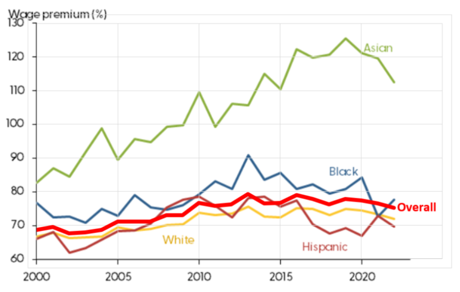
But exactly how much more do college grads earn? Figure 4.6 shows the college wage premium (as a percentage over high school wage) is about 75%.
Notice that Figure 4.6 shows a great deal of variation in the college wage premium for different demographic groups. Asians have the highest excess returns for college.
Figure 4.6 also shows that after the COVID-19 pandemic, the college wage premium has fallen. This is due to higher wages for workers without a college degree after the pandemic.
One thing the chart does not show is the college wage premium by major. College graduates with degrees in quantitative fields such as business analytics earn higher incomes, on average, than nonquant majors.
Source: Bengali et. al, 2023 / Used with permission.
The college wage premium chart is focused solely on the higher incomes earned by college graduates. It does not capture any of the other benefits of a college education: access to more and better jobs, lower unemployment and poverty rates, longer and healthier lives, higher savings rates for retirement, and better-educated children.
We will ignore these other benefits and consider only the higher incomes earned by college graduates. This is weighed against the cost of college, which we know is high and has been rising rapidly. So is college still worth it? We will compute the college IRR to answer this question.
Visualizing the College Decision
Figure 4.7 is a stylized graph (it accurately represents a relationship without actual data) that displays the costs and benefits of college. It shows that college grads make more over their lifetimes. It also captures that both paths grow, but college grows faster.
The three letters in Figure 4.7 label three areas in the chart. A represents the tuition, books, and fees a college student pays. Notice how the college student starts out in the negative because of these expenses.
B represents the income the college student does not earn while they are in college. As mentioned above, this foregone income is even greater than the schooling payments.
Finally, C represents the gains from college in terms of higher income over a person’s lifetime. This adds up to hundreds of thousands of dollars, but remember that these are future dollars.
A person deciding whether or not to go to college needs to weigh the out-of-pocket (-A) and opportunity (-B) costs versus the excess returns (+C) from going to college instead of working right out of high school.
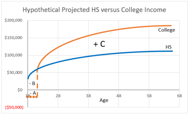
Figure 4.7 also makes clear that time is an important part of the problem. You cannot simply look at the graph and conclude that the area of the excess returns (C) is much bigger than the costs (A and B), so college is a good investment. The excess returns are in the future, so we cannot directly compare them to the costs. In fact, every year on the Age axis is a dollar amount with different units.
To solve this problem correctly, we have to apply the concepts of present value and internal rate of return. We do so with a simplified version of the problem.
A Toy Model
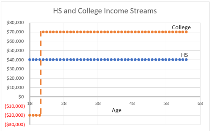
STEP Insert a sheet in your PVIRR.xlsx workbook. Enter the labels Age, HS, and College in cells A1, B1, and C1, respectively. In cell A2, enter 18, and in cell A3, enter 19. Select the cells and fill down to age 64 (row 48). In cell B2, enter $40000, and in cell B3, enter the formula =B2. Fill it down. In cell C2, enter -$20000 (this is the out-of-pocket cost), and in cell C3, enter the formula =C2. Fill it down to cell C5 (representing four years of college). In cell C6, enter $70,000, and in cell C7, enter the formula =C6. Fill it down.
You have created a simplified version of the decision to attend college. Figure 4.8 is a chart of the data in columns A, B, and C. It does not display the subtlety of increasing income over time, but it does have the essential nature of the decision—the college path has an investment up front and starts out in the negative, but you are compensated for this by higher future earnings.
Notice also that our simplified problem’s college income of $70,000 per year is 75% more than the high school graduate’s $40,000—this reflects the real-world college wage premium of 75%.
But how can we determine if the investment in a college education is actually worth it?
STEP Enter the label College Project in cell E1 followed by the formula =C2-B2 in cell E2. Fill it down to cell E48.
Now we clearly see the nature of the investment project. You invest $60,000 each year for four years ($20,000 out of pocket and $40,000 in opportunity costs), and in return you get $30,000 each year until you retire.
How can we determine the quality of this project? That is easy with Excel.
STEP Enter the label IRR in cell G1, and in cell G2, enter the formula =IRR(E2:E48).
A rate of return of 10.5% per year is pretty good. It is likely that you cannot do better than this with another project, so you would make the human capital investment and go to college.
The problem can also be solved by computing the net present value. Using any discount rate less than the IRR will give a positive NPV and result in the same decision to go to college.
STEP Enter the label dr in cell I1 and the value 6% in cell I2. Enter the labels PV HS and PV College in cells J1 and K1, respectively. In cell J2, enter the formula =B2/(1+$I$2)ˆ(A2-18) and fill it down to cell J48. In cell K2, enter the formula =C2/(1+$I$2)ˆ(A2-18) and fill it down to cell K48.
The dollars in columns J and K can be added because they all have the same time dimension—age 18 dollars.
STEP Enter the label sum of PV HS in cell L1 and compute the sum of the present-valued high school dollars in cell L2. Enter the label sum of PV College in cell M1 and compute the sum of the present-valued college dollars in cell M2.
With a discount rate of 6%, the college income stream is worth 826,135 present value (age 18) dollars, which is more than the $660,975 produced by the high school option. Thus, you would go to college.
Figure 4.9 offers a good way of understanding and remembering what present value is all about. Present value operates like scrunching an accordion, compacting the x-axis values back to the origin. Present value brings the dollars at different ages back to age 18 so that they can be compared.
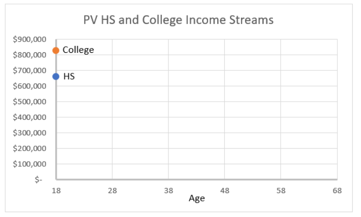
Unlike Figures 4.7 and 4.8, which show dollar values over time, Figure 4.9 removes the time element from the graph. It adds up the present value at each year and shows the sum as a single dot at Age=18.
Notice how the PV and IRR methods agree. With a discount rate of 6%, both green-light college: PV because the PV of the college stream at 6% is greater than the PV of the high school stream and IRR because 10.5% is greater than 6%.
STEP Change the discount rate in cell I2 to 11.5%. What is the optimal decision now?
PV says not to go to college because the present value of the college stream is less than the high school stream. IRR is also flashing a red light, since the IRR of 10.5% is less than the discount rate of 11.5%.
STEP Enter the formula =G2 in cell I2. What happens?
You just showed that Excel’s IRR function is working as advertised. The sum of the present values of the two streams is identical when the discount rate is 10.5%, so this is the IRR. PV says it is an absolute tie, so flip a coin on going to college, and IRR says the same thing because IRR = discount rate.
Did you notice that we never added the dollars in columns B and C? That would be a silly thing to do, right?
Loose Ends
There have been many, many estimates of the rate of return to college. Usually, college IRR estimates are pretty high. Even though college costs are rising fast all around the world, the demand for skilled labor is such that college remains a good investment for most people.
While college is still a good investment for most people, rising costs definitely lower the college IRR.
Just like the college wage premium has substantial variation when disaggregated into groups (as shown in Figure 4.6), college IRRs vary across groups. For example, male college IRR is usually lower than female IRR because male opportunity cost is often higher. Young, unskilled men have greater access to construction and farm jobs. Not surprisingly, a greater percentage of women than men go to college.
One critical aspect of the college IRR is that you have to finish. The absolutely worst possible move is to go to college for several years, pay tens of thousands of dollars in out-of-pocket and opportunity costs, and not graduate. Now you have made an investment (and perhaps have student debt), and the return is really low because college only pays off with higher wages if you have a college degree.
The risk of going to college and not graduating is a serious issue. Correctly modeling the college IRR to include the riskiness of the investment in college is the focus of much research.
Takeaways
People with college degrees earn more, on average, than those without. This makes sense because very few people would go to college if they did not get a return on their investment.
College is an investment, it is called human capital, and it has an IRR. In fact, it is usually quite high, and going to college for many people is a sound financial decision.
PV and IRR are two ways to make a decision about an investment with costs and returns over time. They yield the same answer.
The present value method brings all the expenses and returns over time to the present. If the net present value is greater than zero, the investment is a winner at that given discount rate. Choosing the discount rate can be complicated.
The internal rate of return is the discount rate that sets the NPV = 0. The IRR is a measure of the quality of an investment. If the IRR is greater than the discount rate, the investment is a winner.
Everything said here about college also applies to graduate school. Getting an MBA, law or medical training, or any graduate degree has a rate of return. Finishing a graduate program is as critical as completing your college education.
References
Bengali, L., Sander, M., Valleta, R., and Zhao, C. (2023). “Falling College Wage Premiums by Race and Ethnicity.” FRBSF Economic Letter 2023-22 (August 28), www.frbsf.org/research-and-insights/publications/economic-letter/2023/08/falling-college-wage-premiums-by-race-and-ethnicity/. The opinions expressed in this article do not necessarily reflect the views of the Federal Reserve Bank of San Francisco or the Federal Reserve System.
