
6 Constrained Optimization
Edgeworth’s simplification was this assumption: every man [person] is a pleasure machine.
Robert Heilbroner
6.1 Maximizing Utility

Source: Stable Diffusion, 2023/ License.
Figure 6.1 shows two things, cigars and brandies, that we will pretend that you enjoy. Economists model the satisfaction and happiness provided by consumption of goods and services by using a utility function.
Your utility function is given by this equation:
[latex]U = 18B − 3B^2 + 20C − C^2[/latex].
Your job is to choose the number of brandies (B) and cigars (C) that maximize your utility (U).
This optimization problem can be solved analytically, with calculus and algebra, but we will use Excel’s Solver instead. As you recall, Solver is a numerical approach to finding the optimal solution.
We need to recast the problem in a way that Excel can understand it, then run Solver to find the optimal values of B and C.
The work that follows assumes that you have done the lifeguard problem (in chapter 2) and remember some of it. If you have not or do not remember it, you can continue working, but you will learn more if you review the lifeguard problem before you begin this material.
Implementing the Problem in Excel
Optimization problems always have three parts:
- Goal (objective function)
- Endogenous variables
- Exogenous variables
We know we want to maximize the utility function, so that is our goal. It has to be a formula in a cell that depends on other cells in the spreadsheet.
Your endogenous, or choice, variables are B and C. We implement this part of the problem with cells that Solver will use for trial solutions. In the Solver dialog box, these are called the changing cells.
Finally, the exogenous variables are things the decision-maker cannot change. They are part of the environment. In this problem, your exogenous variables are the coefficients (18, −3, 20, and −1) and exponents in the utility function. We could set up cells for these exogenous variables, but we will keep things simple and just enter the utility function as is.
STEP Open a blank Excel workbook and save it as UtilityMax.xlsx. In cell A1, enter a 1, and in cell B1, enter the label Brandies. In cell A2, enter a 1, and in cell B2, enter the label Cigars. In cell A4, enter the formula =18*A1-3*A1ˆ2+20*A2-A2ˆ2 and press the Enter key.
Excel displays 34 in cell A4 because if you smoke one cigar and sip one brandy, your utility function says that you get 34 utils of satisfaction. Now, there is no such thing as a util, but we will ignore this inconvenient truth, and utils will be the units of measurement of satisfaction.
STEP Change cell A1 to 2.
Your utility rises to 43 utils. This is an improvement in your happiness, but you do not want to simply improve; you want to maximize utility. What are the best values of B and C, the ones that make utility the largest number possible?
Solving the Problem in Excel
Once we have implemented the problem in Excel, with a formula for the objective function that depends on other cells, we can utilize Solver. It will explore the objective function, trying many solutions. It follows an algorithm, or recipe, when deciding where to move next.
There are many different optimization algorithms. Sometimes, one fails, but another works. Some are good for several different kinds of problems and others are only useful for specific applications. There is no single algorithm that is better than the others.
STEP Open the Solver dialog box by clicking the Data tab and clicking Solver. If it is not there, use the keyboard shortcut Alt, t, i to bring up the Add-ins Manager and install it. Click in the objective function field, click on cell A4, click in the Changing Variable Cells field, and select both A1 and A2. Click Solve. Click OK when Excel displays a dialog box reporting that it has found a solution.
Solver’s answer is really close to the exact solution, which is to drink 3 brandies and smoke 10 cigars. This yields a utility of 127. You may not believe it, but you will see that it is impossible to get utility higher than 127.
Remember that Solver is hunting and pecking, plugging and chugging through many trial solutions. It changes direction when it does worse and continues forward when it is doing better. It stops when it does not improve by very much. Hence, it sometimes gets the exact right answer, but mostly it just gets very close.
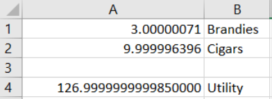
STEP Let’s make sure it is clear that Solver’s answer is not exactly right by widening column A and displaying more decimal points until you see a few zeroes (click the Increase decimal button repeatedly in the Number group in the Home tab).
Your screen should look similar to Figure 6.2. We would never report all those digits because they are meaningless and exhibit false precision. We interpret Solver’s answer as B* = 3 and C* = 10 and U* = 127, which is the correct answer.
Displaying the Optimal Solution
To visualize the optimal solution, we first use a 3D Surface chart. In the next section, we will create a 2D graph, since economists and mathematicians often use contour plots to display two-variable optimization problems.
To create a chart in Excel, we need data. The 3D chart requires a specific layout, with the x-axis in a row, the y-axis in a column, and the z-axis (vertical) in the interior of the table.
STEP In cells D2 to D12, enter 0 to 10 by 1. In cells, E1 to Y1, enter 0 to 20 by 1. These are the two horizontal axes in our 3D plot. In cell E2, enter the formula =18*$D2-3*$D2ˆ2+20*E$1-E$1ˆ2.
Notice how the $ is being used. We are going to fill this formula down and then right. When we fill it down, it will change the row number for the brandies and continue to use row 1 for the cigars part of the utility function.
STEP Fill your formula in E2 down and then examine the formulas in cells E3 and E12 to confirm that the row number is changing for column D but stays constant at 1 for column E.
STEP Select cells E2 to E12, then fill right. Examine the formulas in cells Y3 and Y12 to confirm that column D stays constant but the cigars part of the utility function has changing columns.
Our clever use of the $ has enabled us to create a table that shows how utility varies with changing amounts of brandies (in column D) and cigars (in row 1). The interior of the table displays values of utility.
It is easy to see that the maximum utility value is in cell O5. It is surrounded by lower values. Solver reached the top of this hill by crawling up until it got to the top, at 3 brandies and 10 cigars.
STEP Select cell O5 and make its background color yellow by clicking the bucket icon in the Font group in the Home tab.
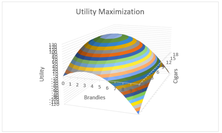
We are now ready to create a chart. As you know, there are three steps: (1) Select the data, (2) choose the desired chart type, and perhaps most important, (3) clean up the chart.
STEP Select range D1 (notice that this cell is empty, but you need to select it to get all the rows and columns in the table) to Y12. Click the Insert tab and click Recommended Charts. Click All Charts and click Surface. Click 3-D Surface and click OK.
Excel places a chart that looks like an elongated hill on your spreadsheet. It decided to put cigars (in row 1) on the x-axis because it has more cells, but this is not what we want. We need to clean up this chart.
The first thing to do is to put the brandies axis in the front and the cigars on the side.
STEP Click the Design tab (if needed) and click the Switch Row/Column button.
That looks much better, but we have more cleaning up to do.
STEP Remove the legend (select it and press the delete key) and add axes titles for each axis. Click the Add Chart Element button and select Axis Titles. Use Brandies for the Primary Horizontal title, Cigars for the Depth title, and Utility for the Primary Vertical title. Change the chart title field text to Utility Maximization.
It is now really looking like something we would be proud to put our name on, but we can do one final improvement: Add more color bands to clearly see that it is a hill.
STEP Double-click the Utility axis to bring up the Format Axis: Axis Options screen on the right. Change the Major Units field from 50 to 10.
Your chart now looks like Figure 6.3. The crowded numbers on the Utility axis are not great, but the extra color bands make it easy to see that there is a clear top to this surface.
Contour Plot
Although a 3D plot like Figure 6.3 is useful, solutions to optimization problems with two endogenous variables often use a 2D contour plot that highlights the choice variables.
A contour plot, also called a level curve, displays a 3-dimensional surface by graphing constant vertical slices of the surface, called contours, on a 2-dimensional chart. It is easier to see what it is than to describe it.
STEP Copy the 3D chart you just made and paste it. In the Design tab, click the Change Chart Type button. Click the Contour Plot type (with the shaded region that signals the use of color) and click OK.
Comparing the color bands on the two charts makes clear how they are related. The light blue at the top of the hill in the 3D plot is the light blue oval in the contour plot. The orange band is a little lower on the hill, and it is a bigger oval on the contour plot.
It is as if you flew on a plane and looked straight down at the hill. The vertical axis is suppressed on the contour plot, but we could put labels with numbers of the vertical height on each slice. This is exactly what a topographic map does.
STEP Use your favorite browser to search for “contour plot hiking map.” Click on a few hits to see how 2D maps can show elevation by displaying numbers on each contour. On a hiking map with concentric squiggly rings, if you stayed on a single ring (which is also known as a contour) as you walked, you would never go up or down.
Contour plots are also used on weather maps. Isobars are contour plots showing the same atmospheric pressure.
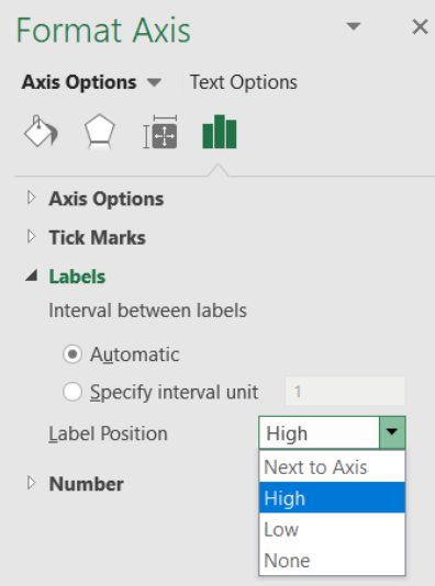
Let’s clean up Excel’s contour chart by improving the title and moving the y-axis from right to left.
STEP Click on the title and make it Utility Maximization: Contour Plot. Double-click the y-axis and change the Label Position to High as shown in Figure 6.4.
Source: Screenshot of Excel interface, © Microsoft Corporation.
A final enhancement involves placing a point on the optimal solution and labeling it with a callout box (in the Shapes collection in the Insert tab), as shown in Figure 6.5.
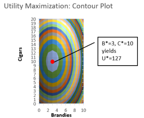
Comparing the 3D and 2D visualizations of this utility maximization problem reveals advantages of each. The 3D version makes clear that the surface is a hill with a maximum, but it is difficult to read the optimal number of brandies and cigars.
On the other hand, the 2D contour plot makes it really easy to see the max and the values of brandies and cigars that will maximize utility. The trick is that you have to know how to read a contour plot, and now you do.
Make It Stick
If we used Solver earlier when we did the lifeguard problem, why are we doing it again? Repeating material is a learning strategy that has been proven to work.
Suppose you want to improve your free throw shooting, and you really cared about this, so you decided to practice for one hour per day for two weeks. Most people would think that actually standing at the free throw line and shooting free throws would be the best use of your time, but this is wrong.
A much better use of your one hour per day is to shoot from all over the court—spending 10 minutes in one spot, then moving to another spot, varying distance from, say, 10 to 20 feet (a free throw is 15 feet from the basket). This is called interleaved practice, and it also works for learning!
By doing the lifeguard problem, then doing other things and returning to a slightly different optimization problem, you are burying deeper channels in your brain about Solver and optimization.
Every time you repeat something in Excel, especially in the context of a different situation, you get a little better at it. The novelty of the new problem is important so that you are not doing the exact same thing, but you are making connections and learning.
If you want to know more about the neuroscience behind how you learn and other optimal learning strategies, search for Brown et al.’s 2014 book Make It Stick.
STEP Watch dub.sh/howtostudy to see some of these ideas applied to optimal studying.
Takeaways
We revisited work we did earlier using Solver, Excel’s numerical optimization add-in.
Excel’s Solver easily found the optimal solution to a simple two-variable utility maximization problem.
Solver applies an iteration procedure and stops when it cannot improve by very much. This produces an answer that is not exactly correct, even though the many decimal places it reports seem like it is giving a really precise answer, a phenomenon common to numerical algorithms known as false precision.
Two Excel chart types were used to visualize the optimal solution: 3D surface and contour plot.
The 2D contour plot is the best-practice way to display the problem because it highlights the two endogenous variables (one on each axis) and makes it easy to see the numerical values of the optimal solution.
Learning also involves optimization, with better and worse ways to use your time. You definitely want to study and learn optimally.
References
The epigraph is from p. 173 of the 7th edition of Robert Heilbroner’s The Worldly Philosophers. First published in 1953, this classic tells the story of how economics was born and came to be the mathematical discipline that it is today. It is an easy read, and until Freakonomics (by Stephen J. Dubner and Steven Levitt) exploded on the scene in 2009, Heilbroner’s The Worldly Philosophers had the highest sales of any economics book.
Francis Edgeworth was a key player in the mathematization of economics. Mathematical Psychics, published in 1881, was an early application of optimization and comparative statics.
Brown, P., Roediger, H., III, and McDaniel, M. (2014). Make It Stick: The Science of Successful Learning (Belknap Press).
Memorize Academy. (2016, Dec. 15). How to Study Effectively for School or College – Top 6 Science‑Based Study Skills [Video]. YouTube. https://www.youtube.com/watch?v=CPxSzxylRCI.
6.2 Constrained Utility Maximization
Your doctor says that you are killing yourself by smoking too many cigars and drinking too much brandy. She restricts your consumption to a total of 5.
You can have 5 brandies and no cigars or 2, 3, or any other combination that adds up to 5 or fewer. You can choose fractional amounts like one-third of a brandy and four and two-thirds cigars or 1.5 and 3.5.
You cannot, however, maintain your current daily consumption of 3 and 10. That adds up to 13 and violates the constraint.
Your utility function remains the same:
[latex]U = 18B − 3B^2 + 20C − C^2[/latex].
But we need to add the constraint to properly state this optimization problem. Mathematically, the doctor said that B + C ≤ 5. Formally, we write the problem like this, where s.t. stands for “subject to”:
[latex]\underset{B , C}{max} U = 18 B - 3 B^{2} + 20 C - C^{2}[/latex]
[latex]\text{s} .\text{t} . B + C \leq 5[/latex]
You wonder how you are going to solve this problem. It can be done analytically, but you ask yourself if Solver can do it. Yes, of course it can.
As usual, we will have to implement the problem in Excel. Then we can run Solver to find the optimal solution.
Implementing the Problem in Excel
We have the unconstrained version of the problem already set up, so we start from there.
STEP Make a copy of the sheet in your UtilityMax.xlsx workbook by right-clicking the Sheet1 sheet tab in the bottom left, selecting Move or Copy . . ., checking Create a copy, and clicking OK. Rename the sheet ConOpt.
The new information that we have to implement is the constraint. It is convenient to rewrite the constraint as B + C − 5 ≤ 0. This way, violations of the constraint occur whenever B + C − 5 is positive.
STEP In cell A6, enter the formula =A1+A2-5. In cell B6, enter the label constraint.
Now we are ready to call Solver. Excel will include the choices you entered before in the Solver dialog box, but we have to add the constraint.
STEP In the Data tab, click Solver. Confirm that the objective function, max, and changing cells are correct, then click the Add button. From the Add Constraint dialog box, click on cell A6 for the Cell Reference field, choose le, and enter a 0 in the Constraint field. Click OK. Notice that Excel adds the constraint to the Solver dialog box. Click Solve. Excel announces success! Click OK.
We interpret Solver’s answer as B* = 1 and C* = 4 and U* = 79, which is the correct answer. To maximize utility subject to the constraint of no more than 5 combined units of cigars and brandies, the best combination is 1 brandy and 4 cigars. This yields a utility of 79 and cannot be beaten by any other combination of brandies and cigars that does not violate the constraint.
Notice that the constraint cell is not exactly zero, but it is very close to zero. Cell A6 shows something like 5.02825E-08. This is a number expressed in scientific notation, and it means 5.02825 × 10⁻⁸. This is a tiny number. You can make it exactly zero if you wish by changing cells A1 and A2 to 1 and 4, respectively.
Visualizing the Optimal Solution
Figure 6.6 displays a 3D surface and contour plot of the constrained utility maximization problem. On the 3D surface plot, the constraint is a barrier that blocks attainment of the unconstrained max at the top of the hill. On the contour plot, the constraint is a line, because if you looked straight down at the barrier from directly above, you would see just a line.
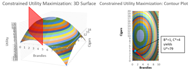
STEP Make two separate lists of things you like and do not like for the 3D surface plot and the contour plot. See the appendix if you need help, but do not immediately go there. Try to make the lists yourself before looking at the appendix.
One thing that is extremely important about the contour plot is that it clearly reveals the optimal solution. We can use Excel’s wireframe version of the contour plot to see this.
STEP Copy and paste your contour plot, then click Change Chart Type in the Design tab. Select the Wireframe Contour in the Surface group of charts.
It is now much easier to see the contour lines. Since there is a contour line for every value of utility, there is actually an infinity of contour lines. Your chart shows only a few of them.
STEP Carefully place a line (use the Line object in the Shapes collection) from the point 0, 5 to 5, 0 as shown in Figure 6.7.
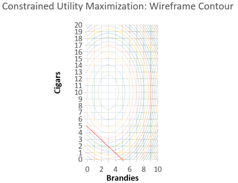
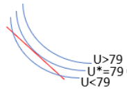
At the optimal solution (at 1, 4), there is a contour slightly above and another below. The curve above has a utility value greater than 79, and the one below is less than 79. There is a curve not shown in Figure 6.7 that is in between the two contours above and below point 1, 4. This contour just touches the constraint line, and it has a utility value of exactly 79. This contour is tangent to the diagonal constraint.
A point of tangency means that there is contact at a single point but no crossing. Figure 6.8 shows why tangency is a visualization of the optimal solution.
If the constraint line cuts or intersects a curve, we immediately know this is not the optimal solution. If we are cutting a contour, we can move along the constraint line to reach a higher contour.
In Figure 6.8, the highest curve (U > 79) is beyond our reach. The one that just touches the line is the best we can do. Tangency instantly reveals the solution and explains why the 2D contour plot is used to visualize constrained optimization.
Takeaways
Excel’s Solver add-in can handle constrained optimization. You provide a cell with the constraint and then add the constraint in Solver’s dialog box.
There is a conventional graph that is used to visualize constrained optimization problems. It relies on the point of tangency in a contour plot to instantly highlight the solution.
To read a contour plot, remember that it is a top-down view of a 3D surface.
Excel has several 3D surface and contour charts. The chart can be augmented with a variety of drawing objects and text boxes.
Appendix
Figure 6.9 shows a few pros and cons of the two charts. The only con for the contour plot is the prerequisite knowledge needed to read it.
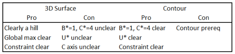
For those in the know, a 2D contour plot is preferred because of the way the tangency draws attention to the optimal solution. It is easy to see the values that solve the constrained optimization problem.
6.3 Comparative Statics with CSWiz
Your doctor is some kind of evil genius (or an economist), and she wants to explore your response to different values of the total allowed units of cigars and brandies.
This is formally known as comparative statics analysis. We change one exogenous variable, and we see what effect it has on the optimal solution.
There’s an Excel add-in for that—it is called the Comparative Statics Wizard (CSWiz). After explaining comparative statics in more detail, we will use the CSWiz add-in on the constrained optimization version of the cigars-and-brandies problem.
The Logic of Comparative Statics
We did comparative statics analysis earlier with the lifeguard problem (in chapter 2). We turned the lifeguard into a freakish combination of Michael Phelps and Usain Bolt. The optimal solution had us running more, since we were so much faster.
We also did comparative statics analysis when we changed the product price facing the farmer (in section 2.4). As the product price rises, the farmer responds by buying more seed.
There were two more comparative statics examples when we combined Monte Carlo simulation and optimization. The first involved pooled testing (in section 3.3). We lowered the infection rate from 5% to 1%, and this made the optimal group size bigger. The second explored how lowering the cost of searching led to more searches (in section 3.4).
All these examples worked the same way. We solved an optimization problem, then we changed a single exogenous variable and kept everything else the same. We focused on the effect the change had on the optimal solution.
Before we do another example, let’s repeat and make crystal clear the logic of comparative statics. It involves a four-step procedure:
- We set up the problem and find the initial solution.
- We change a single exogenous variable, called the shock, holding all other exogenous variables constant. We use a Latin phrase, ceteris paribus, as shorthand. This literally means “with other things held equal,” and we use the phrase to mean everything else held constant.
- We find the new optimal solution.
- Finally, we compare the new to the initial solution to see how the optimal solution responded to the shock.
Comparative statics is the fundamental methodology of economics. It gives a framework for interpreting observed behavior. This framework has been given many names, including the method of economics, the economic approach, the economic way of thinking, and economic reasoning.
As you know, comparative clearly points to the comparison between the new and initial solution, but the meaning of statics (not to be confused with statistics) is less obvious. It means that we are going to focus on optimal (or equilibrium) positions and not worry about the path of the solution as it moves from the initial to the new point.
We have several ways of comparing the new and initial solutions. A qualitative comparison focuses only on direction (up or down), while quantitative comparisons compute magnitudes of the change in response (as either a difference or a percentage change).
Another Example
We start with the initial constrained optimization problem, which can be formally written like this:
[latex]\underset{B , C}{max} U = 18 B - 3 B^{2} + 20 C - C^{2}[/latex]
[latex]\text{s} .\text{t} . B + C \leq 5[/latex]
We know that the initial solution is B* = 1 and C* = 4 and U* = 79.
Your doctor surprises you at your next appointment. She is happy with your latest test results and says that you can safely have one more brandy or cigar, so your total allowed amount is now 6. How will you respond to this new development?
STEP From your ConOpt sheet in your UtilityMax.xlsx workbook, change the 5 in cell A6 to 6. What happens?
The constraint cell is now negative. This means that you are below the constraint. The barrier has moved upward, so you have room to climb higher up the utility hill. But what exactly will you do?
STEP Run Solver. What happens?
With a total of 6 cigars and brandies allowed, your new optimal solution is B* = 1.25 and C* = 4.75, yielding a maximum utility of U* = 90.25.
This makes sense. You take advantage of the loosened constraint to sip a little more brandy and smoke more cigars. That is a qualitative or directional statement. It is like saying that when the price goes down, you buy more.
A quantitative or magnitude statement would be to compute how much more you drink and smoke. You went from 1 to 1.25 brandies as the total amount allowed went from 5 to 6, so that increase is 0.25 brandies. The delta (or difference) for cigars is 0.75, since you went from 4 to 4.75.
There is another way to make a quantitative statement using elasticity. The Comparative Statics Wizard and the results it generates will help us explain how to compute and interpret an elasticity.
The Comparative Statics Wizard
We use a free Excel add-in, CSWiz.xla, to do comparative statics analysis. It works with Solver to find the optimal solution given different values of an exogenous variable.
STEP Download the CSWiz.xla file from dub.sh/addins and use the Add-ins Manager (File → Options → Add-ins → Go or keyboard shortcut Alt, t, i) to install it. Once installed, click the Add-ins tab to see that it is under the Wizard group.
To use the CSWiz add-in, we need to modify our Excel implementation of the constrained optimization problem. Instead of hard-coding the total allowed amount of cigars and brandies, we need to make a cell for this exogenous variable.
STEP In cell B8 of your ConOpt sheet, enter the label Total. In cell A8, enter the number 5. Connect this total value to the constraint cell in A6 by changing the constraint formula to =A1+A2–A8.
We are now ready to run the Comparative Statics Wizard. We will provide information in a series of steps.
STEP Click the Add-ins tab, click Wizard, and then Comp Statics.
As you walk through the steps, be sure to read carefully and think about the information you are providing. The following is the input you need to give as you walk through the steps:
- Clicking the Input button produces an input box that asks for the objective function cell. Click on cell A4 and click OK. A second box asks for the endogenous variables. Select cells A1 and A2 (both of them) and click OK. The final input box asks for the exogenous variables. Click on cell A8 and click OK. Usually, there is more than one exogenous variable, so you would select all of them. When done, you return to the Wizard dialog box, but your inputs are displayed. Confirm that they are correct and click Next.
- Click the Run Solver button to call Solver and run it. Solver needs to successfully find the correct solution to continue. If not, we cannot do comparative statics analysis. When done, you return to the Wizard dialog box. Click Next.
- This step is like the first one in that you are asked three questions. Click the Input button. Click cell A8 because this is the cell that we want to vary to see how the optimal solution responds. Click OK. In the second input box, enter the number 1. This will change cell A8 by 1. Click OK. In the final input box, leave the default choice of 5. Click OK. You return to the Wizard, and the results of your input are displayed. Confirm that everything is correct and click Next.
- The Wizard now has all the information it needs. Clicking the Run Comparative Statics Analysis button will do just that. Excel will solve the problem for total values from 5 to 10 by 1. The Progress Bar will advance quickly because this problem is simple, and we only asked for 5 shocks. Click Next.
- Read the message on the final screen and click Finish.
You are taken to a new worksheet in your UtilityMax.xlsx workbook that displays the results of the comparative statics analysis that you just performed. We use these results to figure out and explain how changing the total allowed amount affects the optimal consumption of brandies and cigars.
STEP We did not name any cells, so the results show cell addresses. We can fix this by entering the names of the variables. Cells A5 and A8 are Total. Cells B8, C8, and D8 are Utility*, B*, and C*, respectively. Widen the columns if needed to display the results neatly.
The results confirm our work for Total = 5 and 6, but the results extend the comparative statics analysis to total allowed amounts of 7, 8, 9, and 10. Of course, Solver’s numbers suffer from false precision, but we know how to interpret them.
STEP Enter the text DB/DTotal in cell E8. In the formula bar, select the first D and change the font to Symbol (in the Home tab). Repeat for the second D.
EXCEL TIP Excel allows you to apply formatting to individual characters in a cell. This means you can use different fonts, colors, and sizes for different parts of a cell.
STEP In cell E10, enter the formula =(C10–C9)/(A10–A9) and fill it down.
That is interesting—every time you get an extra total amount allowed, you devote 0.25 of it to brandies (and 3/4 to cigars). In other words, the relationship between optimal brandies and the total amount allowed is linear. We can confirm this with a graph.
STEP Make a chart of B* as a function of Total.
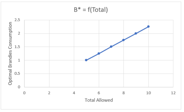
Your chart should look like Figure 6.10. Notice that we are not displaying an optimal solution. Instead, this chart is tracking how the optimal solution responds to changes in an exogenous variable. This is a common way to present the results of comparative statics analysis.
There is a similar chart of optimal cigars. The relationship is linear, but the slope is bigger, so the line is steeper. It would be good practice to compute the slope and make this chart.
Takeaways
People often think that economics is defined by its content. They think that if you study something like unemployment or money, then you are doing economics.
Actually, modern economics is defined by its methodology. Economists use optimization and comparative statics on anything involving choice. Economics can be applied to war, marriage, and many other “noneconomic” questions.
You can be sure that optimization and comparative statics will be applied if you ever see a title that begins with “An Economic Analysis of”—this means that whatever is being studied will be analyzed and seen as an optimization problem.
We use comparative statics to interpret changes in behavior (you sipped more brandy when the constraint loosened) and to predict responses (lowering the price will trigger an increase in quantity demanded).
The Comparative Statics Wizard is a numerical approach, as opposed to analytical approaches that use mathematics.
CSWiz.xla is an Excel add-in that takes advantage of Excel’s Solver add-in. The user provides information about the problem and which variable is to be shocked. CSWiz does the tedious work of solving the problem at different values of the exogenous variable and keeps track of the optimal solutions.
Once you have the results, further analysis can be performed. Often, we are interested in the relationship between variables, and we draw graphs to visualize how an endogenous variable responds to an exogenous shock.
6.4 Elasticity
You probably have heard of the price elasticity of demand, but you may not know what it means or how to use the concept.
Our goal is to truly understand elasticity and be comfortable using it. At its most fundamental level, it is simply a numerical measure of responsiveness.
In the initial version of the lifeguard problem, the lifeguard entered the water after running roughly 56 meters. When maximum running speed doubled to 10 m/sec, ceteris paribus, the optimal solution changed to running almost 80 meters. We can (and did) show this on a graph, but is there a faster way to summarize comparative statics analysis? Yes—in a word, elasticity.
We have been working on a constrained optimization problem where you sipped 1 brandy and smoked 4 cigars when the doctor set a limit of 5 total brandies and cigars. When that limit was relaxed and you were allowed a total of 6 units, you chose 1.25 brandies and 4.75 cigars. Again, we can (and did) show this on a graph, but elasticity captures the relationship between the amount consumed and the total allowed in a single number.
We proceed by reviewing a few general ideas about elasticity and what it is trying to convey. Then we move to actual computations and practice interpreting elasticity values.
The more examples you see, the more the concept will stick. Be sure to keep an eye out for the repeated pattern in the elasticity. We always have an optimal solution that is responding to a shock, and the elasticity measures if the response is weak or strong.
Elasticity Basics
Elasticity is a pure number (it has no units) that measures the sensitivity or responsiveness of one variable when another changes. Elasticity, responsiveness, and sensitivity are synonyms. An elasticity number expresses the impact one variable has on another. The closer the elasticity is to zero, the more insensitive or inelastic the relationship is between two variables.
Elasticity is often expressed as “the something elasticity of something,” like the price elasticity of demand. The first something, the price, is always the exogenous variable; the second something—in this case, demand (the amount purchased)—is the response or optimal value being tracked.
A less common, but perhaps clearer, way to express the cause and effect is to say, “The elasticity of something with respect to something.” The elasticity of demand with respect to price makes it clear that demand depends on and responds to the price.
Unlike the difference between the new and initial values, elasticity is computed as the ratio of percentage changes in the values. The endogenous or response variable always goes in the numerator, and the exogenous or shock variable is always in the denominator. Thus, the x elasticity of y is [latex]\frac{\%\Delta y}{\%\Delta x}[/latex].
The percentage change, [latex]\frac{new - initial}{initial}[/latex], is the change (or difference), new minus initial, divided by the initial value. This affects the units in the computation. The units in the numerator and denominator of the percentage change cancel, and we are left with a percent as the units. If we compute the percentage change in apples from 2 to 3 apples, we get a 50% increase. The change (or delta), however, is +1 apple.
If we divide one percentage change by another, as we do with an elasticity computation, [latex]\frac{\%\Delta y}{\%\Delta x}[/latex], the percentages cancel, and we get a unitless number. Thus, elasticity is a pure number with no units. So if the price elasticity of demand for apples is −1.2, there are no apples, dollars, percents, or any other units. It’s just −1.2.
The −1.2 can be used to compute the percentage change in apples if the price of apples increases by 10%. We simply multiply −1.2 by 10% to get −12%. Or if the price of apples falls by 20%, we know that the quantity demanded of apples will rise by 24% (−1.2 × −20%).
We can also use an elasticity to compute the exogenous shock needed to produce a given percentage change in the endogenous variable. If ApplesRUs Inc. knew that the price elasticity of demand for apples was −1.2 and they wanted to increase apples sold by 6%, then they would lower prices by 5% (6% divided by −1.2).
Elasticity is a ratio of percentage changes, so there are three numbers involved: the elasticity, the percentage change in the numerator, and the percentage change in the denominator. We are given and use two of the three to find the third one:
1. Given %Δx and %Δy, find the elasticity: [latex]\frac{\%\Delta y}{\%\Delta x}[/latex].
2. Given %Δx and elasticity, find the %Δy: elasticity × %Δx.
3. Given %Δy and elasticity, find the %Δx: [latex]\frac{\%\Delta y}{elasticity}[/latex].
The lack of units in an elasticity measure means we can compare wildly different things. No matter the underlying units of the variables, we can put the dimensionless elasticity number on a common yardstick and interpret it.
Figure 6.11 shows the possible values that an elasticity can take, along with the names we give particular values.
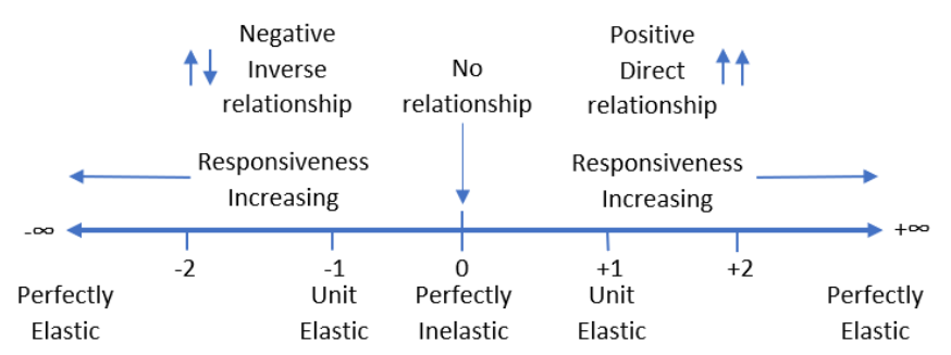
Empirically, elasticities are usually low numbers around 1 (in absolute value). An elasticity of +2 is extremely responsive or elastic because the response is twice the shock. It means that a 1% increase in the exogenous variable generates a 2% increase in the endogenous variable.
The sign of the elasticity indicates direction (a qualitative statement about the relationship between the two variables). Zero means that there is no relationship—that is, the exogenous variable does not influence the response variable at all. Thus, −2 is extremely responsive like +2, but the variables are inversely related, so a 1% increase in the exogenous variable leads to a 2% decrease in the endogenous variable.
One (both positive and negative) is an important marker on the elasticity number line because it tells you if the given percentage change in an exogenous variable results in a smaller percentage change (when the elasticity is less than 1), an equal percentage change (elasticity equal to 1), or greater percentage change (elasticity greater than 1) in the endogenous variable.
The adjective perfectly is used to identify two extreme cases. If the elasticity is 0, it is perfectly inelastic, and this means there is no response at all to a shock. This is rare; usually optimal values of endogenous variables adjust to changes in the environment.
“Perfectly elastic” means the elasticity measure is infinity (positive or negative). This means that the tiniest little change in an exogenous variable triggers a massive response in the endogenous variable. Again, this is a rare, limiting case for elasticity.
Elasticities can be confusing. There is a lot to remember. The following are six common misconceptions and issues surrounding elasticity. Reading these typical mistakes will help you better understand this fundamental but easily misinterpreted concept.
- Elasticity is about the relationship between two variables, not just the change in one variable. Thus, do not interpret a negative elasticity as meaning that the response variable must decrease. The negative means that the two variables move in opposite directions. So if the age elasticity of time playing sports is negative, that means that both time playing sports falls as age increases and time playing sports rises as age decreases.
- Elasticity is a local phenomenon. The elasticity will usually change if we analyze a different initial value of the exogenous variable. Thus, any one measure of elasticity is a local or point value that applies only to the change in the exogenous variable under consideration from that starting point. You should not think of a price elasticity of demand of −0.6 as applying to an entire demand curve. Instead, it is a statement about the movement in price from one value to another value close by—say, $3.00/unit to $3.01/unit. The price elasticity of demand from $4.00/unit to $4.01/unit may be different. There are constant elasticity functions, where the elasticity is the same all along the function, but they are a special case.
- Elasticity can be calculated for different size changes. To compute the x elasticity of y, we can go from one point to another, [latex]\frac{\%\Delta y}{\%\Delta x}[/latex], but the size of the change in x can vary. The computed elasticity will be different depending on the size of the shock if the relationship is nonlinear.
- Elasticity always puts the response variable in the numerator. Do not confuse the numerator and denominator in the computation. In the x elasticity of y, x is the exogenous or shock variable and y is the endogenous or response variable. Students will often compute the reciprocal of the correct elasticity. Avoid this common mistake by always checking to make sure that the variable in the numerator responds to or is driven by the variable in the denominator.
- Remember that elasticity is unitless. The x elasticity of y of 0.2 is not 20%. It is 0.2. It means that a 1% increase in x leads to a 0.2% increase in y.
- Perhaps the single most confusing thing about elasticity is its relationship to the slope: Do not confuse elasticity with slope. This is easy to forget and deserves careful consideration. Remember that elasticity is a percentage change calculation, [latex]\frac{\%\Delta y}{\%\Delta x}[/latex], while a slope is merely the rise over the run, [latex]\frac{\Delta y}{\Delta x}[/latex].
Economists, unlike chemists or physicists, often gloss over the units of variables and results. If we carefully consider the units involved, we can ensure that the difference between the slope and elasticity is crystal clear.
The slope is a quantitative measure in the units of the two variables being compared. If [latex]Q^* = \frac{P}{2}[/latex], then the slope [latex]\frac{\Delta Q^*}{\Delta P} = \frac{1}{2}[/latex]. This says that an increase in P of $1/unit will lead to an increase in Q* of 1/2 a unit. Thus, the slope would be measured in units squared per dollar (so that when multiplied by the price, we end up with just units of Q).
Elasticity, on the other hand, is a quantitative measure based on percentage changes and is therefore unitless. The P elasticity of Q* = 1 says that a 1% increase in P leads to a 1% increase in Q*. It does not say anything about the actual numerical $/unit increase in P, but it does speak of the percentage increase in P. Elasticity focuses on the percentage change in Q*, not the change in terms of number of units.
Thus, elasticity and slope are two different ways to measure the responsiveness of a variable as another variable changes. Elasticity uses percentage changes, [latex]\frac{\%\Delta y}{\%\Delta x}[/latex], while the slope does not, [latex]\frac{\Delta y}{\Delta x}[/latex]. They are two different ways to measure the effect of a shock, and confusing them is a common mistake.
Computing Elasticity
When the total allowed for B and C went from 5 to 6, you changed B* from 1 to 1.25 and C* from 4 to 4.75. We can compute two elasticities with these numbers.
The total allowed elasticity of brandies is
[latex]\frac{\% \Delta B^{*}}{\% \Delta T} = \frac{\frac{\Delta B^{*}}{B^{*}}}{\frac{\Delta T}{T}} = \frac{\frac{n e w B - i n i t i a l B}{i n i t i a l B}}{\frac{n e w T - i n i t i a l T}{i n i t i a l T}} = \frac{\frac{1.25 - 1}{1}}{\frac{6 - 5}{5}} = \frac{0.25}{0.2} = 1.25[/latex]
The total allowed elasticity of brandies is 1.25 because we had a 20% increase in T (from 5 to 6), and this led to a slightly bigger 25% increase in brandies (from 1 to 1.25). Thus, we say that the brandies response is elastic, or pretty responsive. Figure 6.11 shows that any elasticity greater than 1 in absolute value is said to be elastic.
The total allowed elasticity of cigars is
[latex]\frac{\% \Delta C^{*}}{\% \Delta T} = \frac{\frac{\Delta C^{*}}{C^{*}}}{\frac{\Delta T}{T}} = \frac{\frac{n e w C - i n i t i a l C}{i n i t i a l C}}{\frac{n e w T - i n i t i a l T}{i n i t i a l T}} = \frac{\frac{4.75 - 4}{4}}{\frac{6 - 5}{5}} = \frac{0.1875}{0.2} = 0.9375[/latex]
The total allowed elasticity of cigars is 0.9375 because we had a 20% increase in T (from 5 to 6), and this led to a slightly smaller 18.75% increase in cigars (from 4 to 4.75). Thus, we say that the cigars response is inelastic, or unresponsive. Figure 6.11 shows that any elasticity less than 1 in absolute value is said to be inelastic.
Since we know the slope of the optimal brandies as a function of total allowed is 0.25 and the total allowed elasticity of brandies is 1.25, that is conclusive proof that elasticity and slope are different. Another way we can show the difference is with a little algebra:
[latex]\frac{\% \Delta B^{*}}{\% \Delta T} = \frac{\frac{\Delta B^{*}}{B^{*}}}{\frac{\Delta T}{T}} = \frac{\Delta B^{*}}{B^{*}} \frac{T}{\Delta T} = \frac{\Delta B^{*}}{\Delta T} \frac{T}{B^{*}}[/latex]
The last term shows we can compute the elasticity by multiplying the slope by [latex]\frac{T}{B^*}[/latex]. This shows that elasticity is slope times the ratio of the exogenous to the endogenous variable values. In this example, 0.25 times 5/1 is 1.25.
We can also show that elasticity changes as you change the point from which it is measured.
STEP In your CS1 sheet, put the label %DB/%DT in cell F8 and then change the two Ds to Symbol font. In cell F10, enter the formula =((C10–C9)/C9)/((A10–A9)/A9) and fill it down.
Cell F10 reproduces the 1.25 elasticity we computed earlier, but notice how the elasticities get smaller as T rises. Again, this shows that elasticity is not slope, since the slope stays constant while the elasticity changes.
Elasticity Practice
Work on these elasticity computations and questions to improve your understanding. Answers are provided in the appendix (according to step number).
STEP 1. Compute the max run speed elasticity of distance on sand in the lifeguard problem as max run speed is increased from 5 m/sec to 10 m/sec. Interpret your result.
STEP 2. Compute the IR (infection rate) elasticity of group size as IR falls from 5% to 2%. Recall that optimal group size rose from 5 to 8. Interpret your result.
STEP 3. Compute the slope of C* = f(T) and use it to compute the total allowed elasticity of cigars at T = 5. Does your number agree with the 0.9375 value we found earlier?
STEP 4. Compute the slope of C* = f(T) and the total allowed elasticity of cigars from T = 9 to 10. Does the slope or elasticity change compared to the elasticity from T = 5 to 6? What does this show?
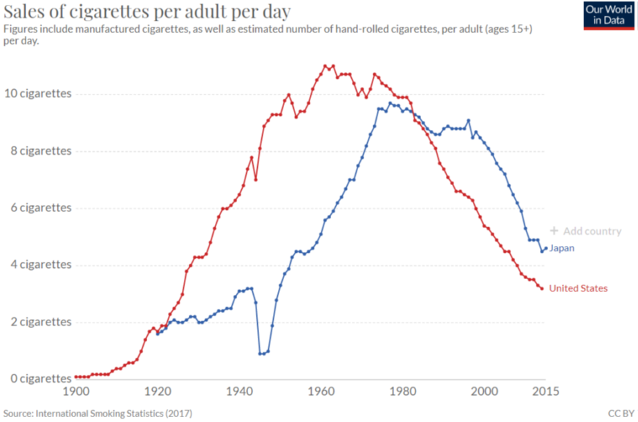
Source: Our World in Data / CC BY 4.0.
Cigarettes have been extensively studied. The average number of cigarettes sold per day in the United States and Japan since 1900 is shown in Figure 6.12.
Visit ourworldindata.org/smoking to see an interactive version of this chart and to add other countries. The pattern is the same around the world—rising smoking rates reach a peak, then they decline. Today, a little over 10% of American adults smoke, down from 40% at the peak.
Governments want to reduce cigarette consumption to improve public health. Banning advertising is common, as is taxing cigarettes. The idea is that increasing the total price consumers must pay (the price plus the tax) will reduce consumption. Whether this works depends on the price elasticity of demand (the quantity purchased).
STEP 5. To reduce cigarette consumption in response to a tax, what are governments hoping is true about the price elasticity of demand for cigarettes?
STEP 6. What do you think is a good guess for the price elasticity of demand for cigarettes? Explain your answer.
STEP 7. How do you think the price elasticity of demand for cigarettes compares between adult and teenage smokers? Explain your answer.
Takeaways
Comparative statics is how economists view the world, and elasticity is how they communicate comparative statics results.
You want to be able to interpret and compute it:
Interpret: The closer an elasticity is to zero, the less responsive the endogenous variable is to a particular shock.
Compute: The exogenous variable elasticity of the endogenous variable is always the percentage change in the endogenous variable divided by the percentage change in the exogenous variable.
There are other ways to compute elasticities. The ratio of percentage changes is the simplest, most basic approach.
References
The economics literature on cigarette smoking is vast: Sloan, F. A., Smith, V. K., and Taylor, D. H. (2002). “Information, Addiction, and Bad ‘Choices’: Lessons from a Century of Cigarettes.” Economics Letters 77, pp. 147–155, is an accessible, informative starting point.
For a broader, historical review, see Brandt, A. M. (2007). The Cigarette Century: The Rise, Fall, and Deadly Persistence of the Product That Defined America (Basic Books).
Appendix
- The max run speed elasticity of distance on sand is 0.43 and this is quite inelastic, or unresponsive. Max run speed was doubled (so a 100% increase), and distance on sand did increase, but only by 43%.
- The IR elasticity of group size is −1, and this is unit elastic. IR fell by 60% (from 5 to 2), and group size rose by 60% (from 5 to 8). The minus sign means the two variables are inversely related.
- The slope of C* = f(T) is 3/4, so multiplying this by 5/4 is 15/16, which does agree with the 0.9375 value in the text.
- The slope of C* = f(T) stays constant at 0.75, but the elasticity increases from 0.9375 to roughly 0.9643. This shows that elasticity is a local phenomenon that changes depending on the value of the exogenous variable at which it is computed.
- Governments hope that the cigarette demand is elastic, meaning that the price elasticity of demand is high. This way, small increases in taxes will produce big decreases in cigarette consumption.
- Many studies have produced a variety of results, but the price elasticity of demand for cigarettes is expected to be inelastic, so less than 1 in absolute value. A good guess would be −0.6.
- Teenage smokers are more price sensitive, since they are not as addicted yet and typically have lower incomes than adults. If adults are at −0.6, teenagers might be at −1.4.
6.5 Cost Minimization
You are on the factory floor of a manufacturing business. The CEO calls and says, “We need to make 300 units today.”
Your production function is simple: [latex]Q = \sqrt{L} + \sqrt{K}[/latex], where L is the amount of labor hours and K is the number of machines. You get to choose how much L and K to use, but you must produce 300 units.
You could, for example, use 90,000 hours of labor and no machines or 40,000 machines and 10,000 hours of labor. There are many other combinations of L and K that would meet the required quantity of output (Q).
You have to pay for the inputs. The wage rate (w) is $20 per hour, and the rental rate of machines (r) is $40 per machine.
Your goal is to find the L and K that minimize TC (total costs of production). Formally, your constrained optimization problem looks like this:
[latex]\underset{L , K}{min} T C = 20 L + 40 K[/latex]
[latex]\text{s.t.} \sqrt{L} + \sqrt{K} = 300[/latex]
Implementing the Problem in Excel
You know that optimization problems always have three parts:
- Goal (objective function) → min TC.
- Endogenous variables → L, K.
- Exogenous variables → w, r, q, and the function [latex]\sqrt{L} = \sqrt{K} = q[/latex].
We will organize our spreadsheet with these parts, but first we want to visualize the problem.
STEP In cell A1, enter the label L, and in cell B1, enter the label K. In cells A2 to A20, enter numbers 0 to 90000 by 5000. In cell B2, enter the formula =(300-SQRT(A2))ˆ2 and fill it down. Finally, make a Scatter chart of the data in cells A1:B20.
Your chart is displaying an isoquant. Since the prefix iso means equal (like an isosceles triangle), an isoquant shows all the combinations of L and K that make the same amount of output.
There are many isoquants, one for each level of output. Your chart shows the isoquant for 300 units of output. It is the constraint for this optimization problem. The solution is on the isoquant, but we do not know which combination of L and K is the least expensive.
STEP Add a point on the chart and a scroll bar on the sheet to visualize that you can choose any combination on the isoquant. See the appendix if you need help.
So how do we find the cheapest combination of L and K that produces 300 units of output? With Solver, of course, but first we have to implement the problem in the spreadsheet.
STEP Label cells N1 and N2 as L and K, respectively. Cells N4, N5, and N6 have labels w, r, and q, respectively. Cell N8 is TC and N10 is the constraint. In cells M4, M5, and M6, enter the exogenous variable values. In cells M8 and M10, enter formulas. See the appendix if you need help.
Now you are ready to run Solver.
STEP Properly configure Solver and run it to find the optimal solution. See the appendix if you need help.
Solver should find a solution close to the exact answer of L* = 40,000 and K* = 10, 000 with a TC* = $1,200,000. This solution makes sense, since L and K are equally productive, but capital is twice as expensive as labor.
We can see that this solution is correct by computing the total cost of the points on the isoquant in columns A and B.
STEP In cell C1, enter the label TC. In cell C2, enter the formula =20*A2+40*B2 and fill it down.
It is easy to see that the cheapest way to make 300 units of output is the 40,000 and 10,000 combination.
Visualizing the Optimal Solution
Recall that the cigars-and-brandies utility maximization problem was visualized with a tangency condition between the utility contours and the constraint. Does the same apply here? Yes, it does.
We first create 3D surface and 2D contour plots of the total cost function, then we can draw a graph of the optimal solution.
STEP Copy cells A2:A20, insert a new sheet in your workbook, select cell A2, and paste. Select cell B1 and paste transpose (click the Paste down arrow and select the Transpose icon as shown in Figure 6.13). Enter a formula that computes the total cost for the given labor in column A and capital in column B. See the appendix if you need help. Make 3D Surface and 2D contour plots.
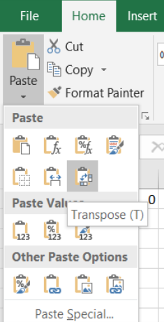
Source: Screenshot of Excel interface, © Microsoft Corporation.
The surface is like a sheet of paper, and the contours are straight lines. Each contour is called an isocost because it represents combinations of L and K with the same cost.
STEP Use Excel’s Shapes group of drawing objects to add straight lines to your isoquant chart. Your lines must have a slope of 0.5 because w/r is 20/40. The lowest feasible isocost is a line with K-intercept of 30,000 and L-intercept of 60,000. All your isocost lines must be parallel.
Figure 6.14 shows a visualization of the optimal solution. The curve is the constraint and the lines are isocosts. You want to be on the lowest isocost on the constraint.
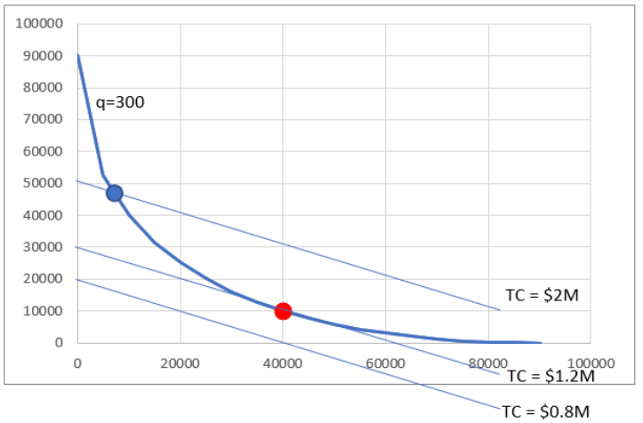
There are many more isocost lines than the three shown. The point on the isoquant and the highest isocost is feasible in that you could make 300 units with this combination of L and K, but you would not be minimizing costs. The lowest isocost has lower costs than the optimal solution (40,000 hours of labor and 10,000 machines), but since it is below the isoquant, it violates the constraint, and no combination of inputs on that isocost is an eligible solution.
STEP Return to your chart and make sure you have an isocost line that is tangent to the isoquant at the optimal solution. Add a red dot (use Excel’s Shapes objects again) at point L = 40,000 and K = 10,000 (as shown in Figure 6.14). Finally, improve Figure 6.14. What is it missing? See the appendix if needed.
Comparative Statics
We finish this problem by considering what would happen if the CEO called and changed the needed output level. We will compute the output elasticity of total cost.
STEP Use the Comparative Statics Wizard to explore how the optimal solution changes as you vary q from 300 to 400 by 10. Make a chart of the minimum total cost as a function of quantity.
You have made a graph of the cost function. This tells us how costs of production vary as output changes.
STEP Use your CSWiz results to compute the slope of the cost function and the output elasticity of total cost as q rises by 10.
The slope of the cost function is rising slowly as quantity increases, which agrees with the shape of your cost function (it is increasing at an increasing rate). The output elasticity of total cost is decreasing as quantity goes up, but very slightly. Of more importance is its value of a little over 2—this means that total cost is quite responsive to output in this example.
Takeaways
Input cost minimization is a constrained optimization problem where we are asked to find the cheapest way to produce a given output.
Solver can do this problem, and the Comparative Statics Wizard can be used to explore how the optimal solution changes as quantity changes.
The optimal solution is visualized as a tangency between the isoquant and isocost lines.
Notice how many other concepts and skills were repeated as you worked through this problem. Once you get the pattern, it is easier to understand other applications.
Appendix
To add controls to a spreadsheet, the Developer tab needs to be visible on the Ribbon. If it is not, click File, click Options, then click Customize Ribbon, and check the Developer item.
STEP Copy cell range A2:B2 and paste it below your chart. To add this one point to your chart, copying, pasting, and editing the SERIES formula is an easy way to do this. You need to replace the x– and y-axis arguments in the pasted SERIES formula with the cell that has the x-axis value and the cell that has the y-axis value.
Next, we add the Scroll Bar control, but it has a maximum value of 30,000. As a simple work-around, we can connect the scroll bar to a different cell—say, the cell below the 0 value (that you should have as the x-coordinate value)—and then the control can be connected to that cell.
Suppose your x-y coordinate pair is in cells F22 and G22. Change the 0 value in cell F22 to 10 times the cell below it by entering the formula =10*F22 in cell F23. Right-click the Scroll Bar control and make the cell link be F23 by entering F23 in the Cell link input box. Finally, the scroll bar maximum should be set to 9000.
Now when you set cell F23, for example, to 5,000, cell F22 is 50,000. Thus, the Scroll Bar control can range from 0 to 9,000 in cell F23, and this produces values from 0 to 90,000 in cell F22.
STEP Click the Developer tab on the Ribbon, click the down arrow in the Insert button, and select the scroll bar icon (in the top, form control group). Click and drag on the spreadsheet (roughly under the chart) to create the Scroll Bar control and link it to the appropriate cell on your spreadsheet.
Be careful to avoid selecting the Spinner control instead of the Scrollbar. When you click the down arrow on the Insert button, if you float the cursor over each control, Excel displays its name. This helps you choose the right control.
To use Solver to find the cost-minimizing combination of L and K, cells M4, M5, and M6 are 20, 40, and 300, respectively. Cell M8 has formula =M4*M1+M5*M2 and should be formatted as $. The constraint is in cell M10 with the formula =SQRT(M1)+SQRT(M2)-M6.
For Solver, the objective function is M8, the Min radio button should be checked, and the changing cells are M1 and M2. The constraint should be that M10 = 0.
The formula in cell B2 needed to make a 3D chart is =20*$A2+40*B$1. Format as $ with no decimals and fill down and right.
Figure 6.14 can be improved by adding an appropriate title and labeling the axes.
