
10 Demographics
If a series of nuclear explosions were to wipe out the material equipment of the world but the educated citizens survived, it need not be long before former standards were reconstituted; but if it destroyed the educated citizens, even though it left the buildings and machines intact, a period longer than the Dark Ages might elapse before the former position was restored.
Lionel Robbins
10.1 Visualization and Population Pyramids
Demography is the quantitative study of human populations. Demographers analyze vital statistics about people, including total number, births, deaths, and health. Vital means “of the utmost importance,” and it is true that the oldest and most fundamental statistics include counting the number of people in a place (called a census) and how many were born, died, got sick, or moved.
We will use a remarkable data visualization known as a population pyramid. By showing the number of people by age and sex, this graph not only conveys information about the current situation; it also predicts the future.
First, we will show how population pyramids are made and interpreted using hypothetical examples. Next, we will explore real-world population pyramids. Finally, we will take a close look at two key statistics: the male-female birth ratio and the dependency ratio.
Accessing the Excel Workbook
STEP Go to tiny.cc/busanalyticsexcel and click the Excel Workbooks link (top right). Click PopulationPyramid.xlsm to download it. Move the file from the downloads folder to a safe place on your computer or network.
The file’s .xlsm extension means it is a macro-enabled Excel workbook. When you open it, you must enable macros to get full functionality from the file.
STEP Open PopulationPyramid.xlsm, read the Intro sheet, and be sure to click the Click to Test button. You may have to adjust your security settings as described in the Intro sheet.
Population Propagation
STEP Click the Begin button at the bottom of the Intro sheet.
A new sheet is revealed called PlanetX. Here is the explanation for this puzzling name.
It is January 1 several centuries from now, and humans are once again populating a new world. A group of 600,000 adults have arrived on PlanetX. The chart and the data below it show that there are 20,000 people of each age from 15 to 44.
Not surprisingly, culture and language have changed a great deal. The people on PlanetX are androgynous—they wear the same clothes, and there is only one pronoun, himo (borrowed from Pulaar before it disappeared).
Although the Technological Revolution triggered by AI in the 21st century was breathtaking, science has been unable to grow humans outside a natural womb. What were called females are now productive (P) people. There are 10,000 nonproductive (NP) people and 10,000 P for each age cohort.
Over the course of a year, the population will change. The inhabitants will each age one year, and some of them will, sadly, pass away. On the other hand, new people (still called babies) will be born. This equation captures these events:
[latex]{Population_{t+1}} = {Population_t} + {Births_t }− {Deaths_t}[/latex].
How many births and deaths will occur during the year? That depends on the age-specific fertility rate (ASFR) and age-specific death rate (ASDR).
STEP Hover your mouse over cells E15 and F15 and read the definitions of ASFR and ASDR in the comments that pop up. You can also Show All Comments in the Review tab. Scroll down to see that the values for ASFR are all 0.1.
A constant ASFR of 0.1 is not at all close to our fertility rates today. Usually, the age-specific fertility rate rises as females mature, reaching a peak in their 20s and then falling again. Women can and do give birth past age 45, so the zeroes after age 44 are also unrealistic.
Unlike the completely fake ASFR, ASDR is roughly that experienced by the United States in the early 21st century. The 0.006 value in cell F16 is called the infant mortality rate. It expresses the chances that a baby born will not survive to their first birthday. There is some good news in that the US infant mortality rate is much lower than it used to be, and this is also true all around the world.
We could have made this hypothetical example more realistic by giving different ASDRs for NP and P people. In our current times, females outlive males by several years, on average. We will assume, however, that on PlanetX, NP and P people experience the same age-specific death rates.
Notice how the age-specific death rate declines after the first year and then starts to rise after the teenage years. The value of 0.049 in cell F96 means that an 80-year-old has a 4.9% chance of not surviving to the next year. At the bottom row (101), the value becomes unrealistic—unlike on Earth, everyone on PlanetX dies at age 85.
Before we continue, note that the cells in column B are minus 10,000. The minus enables those values to be plotted in the blue rectangle (to the left of zero) on the Clustered Bar chart above.
STEP In cell H3, enter the formula = -SUM(C16:C101) + SUM(D16:D101) to add up all of the people at the beginning of the year.
Cell H3 should display 600,000, which is the starting number of people on PlanetX. To compute the number of people born during the year, we use Excel’s SUMPRODUCT function.
STEP In cell H5, enter the formula =SUMPRODUCT(D31:D60,E31:E60).
SUMPRODUCT multiplies (hence the PRODUCT in the name) two or more arrays and then adds them up (hence the SUM). So it takes the value in cell D31 and multiplies it by E31. This is the number of children (1,000) produced by the 15-year-old Ps. Then it multiplies D32 by E32 and so on. Finally, it adds up the products—in this example, 30,000.
STEP In cell H6, use SUMPRODUCT to compute the number of deaths. You will need two SUMPRODUCT terms added together, and the NP term needs to have a minus sign in front of it. Unlike births, we use the entire range from row 16 to 101 because there could be deaths at every age.
STEP Check your work by clicking the Next button.
You are now in a new sheet called Propagate (which means, in general, “to spread out or expand” and, in biology, “the breeding of a plant or animal from parent stock”). The first few columns are the same—your computations for births and deaths are replicated (or you can see how to use SUMPRODUCT for deaths)—and we now see new data for Year 2.
Cell H7 applies the population propagation equation from above. It takes the starting population, adds births, and subtracts deaths.
The percentage change in the population of 4.89% in cell H8 is extremely high. The Rule of 70 tells us that we would get doubling in roughly 15 years (70/5 = 14, but we are a little below 5%). That is extremely fast for human population growth.
STEP Look carefully at the Year 2 chart. Do you see the thin red and blue strips at the base of the chart? Those are the 30,000 newly born babies.
We made another simplifying assumption in that half of babies are NPs and the other half are Ps. (Most people think there are equal chances of getting a boy or a girl, but this turns out to be incorrect.)
STEP You can also see the newborns in cells L16 and M16. Click on these cells to read the formulas used. By multiplying by 0.5, we split the babies into equal amounts of NPs and Ps.
Unlike the first year, the second year’s population numbers are all based on formulas.
STEP Click on cells L32 and M32 to see their formulas.
Because their ASDR is 0.0002, 2 of the 10,000 15-year-olds in Year 1 did not survive to Year 2. The formula uses (1 − ASDR) to compute the number surviving. The other values in columns L and M are computed the same way.
It is extremely difficult to see on the chart, but the adults no longer form a rectangle. We need more years to make this clear.
STEP Click the 1 Year button.
A new year appears with the previous year’s births, deaths, and net increase in population computed. A new layer has been added at the base of the chart, and last year’s babies have moved up. The adults are also all moving up.
STEP Click the 1 Year button again.
There are fewer babies than the previous year because some of the Ps died during the year. The data below the chart make this clear.
STEP We can speed up the propagation by using the ? Years button. Click it, read what it says, enter 20, and then press OK. Scroll right, looking at the data and charts as you scroll, until you reach the final year.
EXCEL TIP Because the sheet uses formulas to compute the surviving number of people at each age from the previous year, recalculating the sheet gets increasingly slower as we add more years. Closing other apps (especially browsers) may help.
In year 24, your chart looks like Figure 10.1. It is now easy to see the tapering of the rectangle at the top as more of the older original settlers do not survive until 85. Also, the children of the original settlers have started having children. The space in the middle reflects the fact that there were no children (ages 0 to 14) at Year 0.
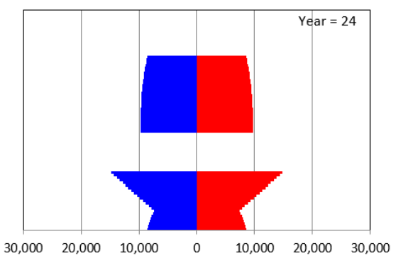
Figure 10.1 also shows a baby boom after human arrival on PlanetX. Births fell for a number of years, but then a second baby boomlet starts to appear. The dynamics of the pyramid can be quite complicated.
STEP From any year, click the Animate button.
You are taken to the beginning of the sheet, and the years from 0 to 24 are displayed, like a moving picture. It is clear that the chart has an upward motion built into it as time goes by. Each age cohort begins at the bottom and makes its way to the top, getting shorter as it moves up.
STEP Add enough years to your sheet (using the ? Years button) to get to 100. Excel may take a while to display all these years, so you may have to be patient. Scroll right to Year 100. Your chart should look like Figure 10.2.
At Year 100, it is clear why this chart is called a population pyramid. The pyramid (or triangular) shape of many human societies, with few old and many young people, was quite common when it was first introduced by Francis Amasa Walker, an economist who was the head of the US Census in 1870.
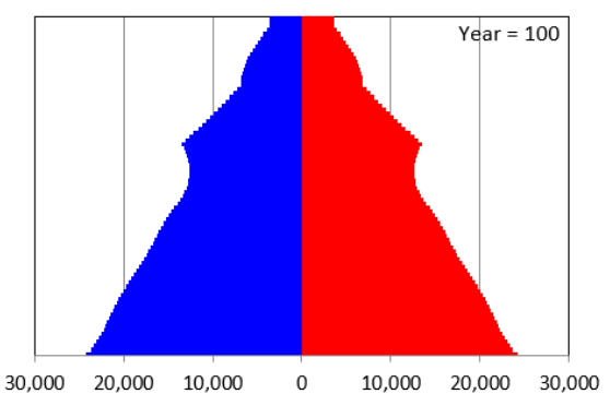
The chart is also known as an age-distribution graph or age pyramid, and even more technically, it is a bilateral histogram. But no matter what you call it, the amount of information it delivers is impressive. Not only does it give a static snapshot, but once you know that it will scroll up as time passes, it provides insight into the future population age distribution.
It is important to understand that the pyramid shape was produced by the ASFR and ASDR values. Keep propagating and the pyramid shape will get ever more pronounced, and the population will keep expanding.
But this is not the only possibility.
STEP Return to the beginning of the sheet and change the ASFR values from 0.1 to 0.05 by changing cell E31 to 0.05, entering the formula =E31 in cell E32, and filling it down to cell E60. Scroll right to Year 24. That chart is quite different from Figure 10.1. Scroll right to the end. What shocking result do you see?
So with ASFR = 0.1, population keeps increasing, and with ASFR = 0.05, it shrinks. Is it possible to get some kind of balanced result where it does not grow without bound or collapse completely? Yes. To see this, we need more years.
STEP Propagate for 200 years or, if your computer is too slow, click the Propagate 200 button.
We want to find the ASFR that produces a constant population; in other words, its percentage change is zero. This sounds like a job for Solver.
STEP Click Solver from the Data tab (use the Add-ins Manager shortcut Alt, t, i if you need to install it). The objective cell is the %ΔPop, cell BQN8 in the Propagate200 sheet. We want to make the objective cell equal to zero, so check the Value of radio button and make sure it is set to zero. The changing cell is ASFR in Year 1, cell E31. Click Solve.
Solver announces success, and you should see that the percentage change cell is displaying 0.00%, but what value of ASDR produced this outcome?
STEP Scroll back to the beginning to see the answer. For a revealing visual of what you have done, click the Time Chart button and select cell H3.
The button produces a chart of the beginning population each year (the values are in column BQN) and provides convincing evidence that we have indeed found a set of ASDR values that results in a population that is neither growing nor collapsing.
The dynamic properties of population pyramids are complicated. Depending on the values of the ASFRs and ASDRs, you can get steady-state (equilibrium), stable, exploding, or collapsing patterns. As we will now see, you can also get different shapes at particular points in time.
Real-World Population Pyramids
Now that we know what a population pyramid is and how to read it, we are ready to examine real-world data. Unlike PlanetX, today, babies are assigned a sex as male or female at birth. Most people identify as adults with their assigned sex, but some do not. The US Census Bureau’s Pulse Survey asks about sexual orientation and gender identity (visit www.census.gov/library/visualizations/interactive/sexual-orientation-and-gender-identity.html). The International Database population estimates provide only male and female categories.
STEP Click any PopPyr button.
A new sheet appears. You select the country and years, then Excel acts like a browser and gets the data from the US Census Bureau. They maintain an international database of past and predicted population age distributions. You can access their website via the link under the chart in the PopPyr sheet.
STEP Click Select a country in the listbox and select Afghanistan. With 2024 in the yellow-background cells K3 and K4, click the Get IDB Data button. Excel downloads the data in columns B, C, and D and displays them in the chart.
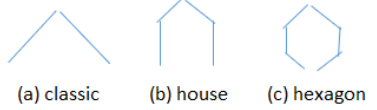
The result is striking. You are looking at a classic population pyramid. Most low-income countries have pyramids like this, with very few old and many young people.
STEP Copy the sheet. This enables comparison of different countries. Change the country to the United States and click the Get IDB Data button. In seconds, you have a new pyramid. Double-click the sheet tab and make the name US.
Unlike Afghanistan, this pyramid is triangular at the top, but the sides are more vertical, like a stick drawing of a house.
STEP Copy the sheet and get Japan’s population pyramid. Set the sheetname to Japan.
We get yet another new shape, like a hexagon (or benzene ring, if you know some chemistry). The three shapes are roughly drawn in Figure 10.3. The classic shape used to dominate, since most countries were poor, with high fertility and death rates. As countries became rich, they underwent what is now called the demographic transition, first with low death rates, followed by low birth rates.
Japan’s hexagon shape hints at big trouble in the future for its economy and society. The narrow base means there are few children to grow up to become workers to support their aging parents.
The United States might be in this same position were it not for immigration. Native-born Americans have much lower fertility rates than do immigrants.
In fact, fertility rates are collapsing all around the world. This has been a stunning and completely unexpected reversal coming on the heels of explosively fast population growth in the decades following World War II.
We can see what the Census Bureau predicts by downloading more years.
STEP Return to your US (PopPyr) sheet and set the years to 1950 in cell K3 and 2060 in cell K4. Click the Get IDB Data button. This might take a little time, since you are downloading a lot of data. Click OK if you get an error message saying some years are unavailable.
The earliest year of available data for the United States is 1980.
STEP Click the Pick a Year button and enter 1980. Click OK.
The baby boom generation was much more noticeable back then. We can animate the chart to see the boomers and everyone else march up the chart.
STEP Click the Play button.
The Census Bureau is projecting a relatively stable population pyramid for the United States up to mid-century. Immigration will continue to play an important role, but the most difficult thing to predict is the fertility rate. Death rates fall slowly but steadily, while fertility can change quite rapidly.
STEP Get data for Japan from 1990 (the earliest year) to 2060. What is the demographic outlook for Japan?
And if you think that is mind-blowing, take a look at China or Cuba. In fact, almost every country’s population pyramid has a story to tell. The gouges represent traumatic societal events (such as famines or revolutions), and you can get deep insight into economic and social issues from this chart.
Takeaways
A population pyramid is a clever chart that shows the age distribution of males and females.
Figure 10.4 shows original examples from Walker’s 1870 Census report. These were some of the earliest data visualizations and an instant hit.
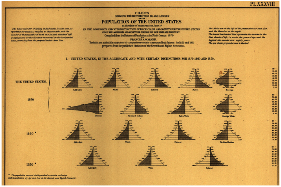
Source: 1870 Census: Statistical Atlas of the United States / Public domain.
High birth and death rates (which used to be common for poor, developing countries) produce lots of children and few old people, yielding a triangular shape with a wide bottom and pointed top, so that’s why it is called a population pyramid.
But there are other possible shapes. Many developed, rich countries have gone through a demographic transition, with death rates falling first, then fertility falling. At this time, they have roughly equal numbers of people at each age until finally tapering off for older folks, so it looks more like a house.
With really low fertility (and little immigration), we get a hexagon, a house with an added narrow base, like Japan. This has the potential to cause serious problems for the economy and society. Demographic headwinds help explain why Japan’s economy has stumbled so badly after flying high in the decades after World War II.
Population pyramids depict historical events and calamities. Baby booms are easily seen as bulges in the pyramid. Indentations or gouges reflect traumatic events such as famine or political upheaval (China is a good example).
Population pyramids have a dynamic aspect. The cohorts (horizontal bars) march up the graph as time goes by.
Since the rapid expansion of humanity in the 1700s, we have worried and obsessed about having too many people. Today, we are undergoing an incredibly sudden slowdown in population growth, triggered by collapsing fertility rates.
References
The epigraph is from p. 205 of Robbins, L. (1963). The Robbins Report: Higher Education Report of the Committee Appointed by the Prime Minister Under the Chairmanship of Lord Robbins 1961–1963 (London: Her Majesty’s Stationery Office), education-uk.org/documents/robbins/robbins1963.html.
On p. 16 of the second edition of An Essay on the Nature and Significance of Economic Science, Robbins gave a modern definition of economics as “the science which studies human behavior as a relationship between given ends and scarce means which have alternative uses.” This book was originally published in 1932, and the second edition is available online at www.mises.org/books/robbinsessay2.pdf.
Walker’s full report, published in 1874 by the US Congress, Statistical Atlas of the United States (1870), launched his career. He went on to a series of high-profile positions, including serving as president of MIT and the American Economics Association. Walker’s pathbreaking atlas is available online at www.census.gov/library/publications/1874/dec/1870d.html.
10.2 Demographic Analytics
The data in PopulationPyramid.xlsm can be used to compute the male-female (M/F) birth ratio and the dependency ratio.
M/F Birth Ratio
STEP Use PopulationPyramid.xlsm (visit tiny.cc/busanalyticsexcel to download the file, if needed) to get age-distribution data for the United States in 2024. In cell E4, enter the formula = -C3/D3 and press Enter.
The M/F birth ratio in the United States is around 1.045. If there were equal (50/50) chances of having a boy or girl, the M/F ratio would be 1.0. Thus, we see a bias toward more boys being born than girls.
In 2024, more than two million boys and two million girls were born, but there were about 4.5% more males born. Can chance explain that deviation from equal numbers of male and female births?
No. If it was 21 boys and 20 girls or even 210 to 200, luck could explain more males than females, but 2.1 million to 2 million would almost never happen by chance.
In fact, it took a while to figure out that the M/F birth ratio is not 1.0, and the story of how this was discovered takes us to the beginning of statistical theory.
John Arbuthnot (1667–1765) was a Scottish minister and Queen Anne’s doctor. He published a paper in 1710 (see references) proving, he thought, that Divine Providence, not chance, determined a baby’s sex.
Arbuthnot analyzed annual data on christenings from 1629 to 1710. In 1629, for example, there were 5,218 male and 4,683 female babies baptized. This kept happening—each year, there were always more boys than girls.
If sex determination was controlled by chance, Arbuthnot said, then having more males than females in a year would be 50/50 (like a coin flip). He used log tables to compute the chances of getting more males than females 82 years in a row. Arbuthnot argued that the ridiculously small number he came up with meant that something beyond chance was at work. Since boys are more likely to die, an uneven start was part of a Divine Plan that would ensure an equal number of men and women for marriage.
Arbuthnot defined chance as requiring an equal probability of males and females at birth, but randomness can operate with likelihoods other than 50% (like someone being a 90% free throw shooter). One thing, however, is sure: This was the world’s first statistical hypothesis test. Arbuthnot is important because he posed a question involving randomness and framed it as a claim that could be tested with data.
Arbuthnot’s work led to a key vital statistic: the male-female ratio at birth. The evidence soon mounted for a small but real bias in favor of boys. Today, we know that the birth of boys is about 5% more likely than that of girls, but there are places around the world that deviate substantially from 1.05.
STEP Use PopulationPyramid.xlsm to find India’s M/F birth ratio in 2024. This is easily done by downloading India’s age distribution for 2024 and computing the ratio of males to females at age zero.
The result is surprisingly high. What is going on? Indians (like many other cultures) have strong preferences for boys over girls. Low-cost ultrasound can easily determine sex before birth. Pregnancies with females are terminated, while males are born. After birth, boys are treated much better than girls. The result is an M/F birth ratio over 1.1.
In a 1990 article on missing women (see references), Amartya Sen, who would go on to win a Nobel Memorial Prize in Economic Sciences in 1998, pointed out that “a great many more than a hundred million women are simply not there because women are neglected compared with men.” Missing women remains as important a global public health issue today as when Sen first called attention to it.
Another country that we might suspect has a high M/F birth ratio is China. In 1980, responding to fears of a population explosion, the government instituted a one-child policy. As in India, ultrasound sex determination and selection for boys was quickly adopted, and this increased the M/F birth ratio. But by how much?
STEP Use PopulationPyramid.xlsm to find China’s M/F birth ratio in 2010.
It is one thing to know that China’s one-child policy led to more boys than girls being born, but the actual statistic, 1.17, is staggering.
There are, of course, serious social consequences for these kinds of imbalances in the population of males and females. In 2016, China rescinded its one-child policy, and more recently, it is actively encouraging fertility. The problem is no longer too many people but too few young people.
STEP Set the start year to 1950 and the end year to 2060 to download all available years. Get the data and click the Ratios button (under the chart). Make a chart of the M/F birth ratio.
Your chart shows that the US Census Bureau does not expect China’s M/F birth ratio to remain abnormally high.
Dependency Ratio
Another demographic statistic that gives insight into societal and economic issues is the dependency ratio. It can be computed in different ways, but a common method is young plus old divided by working-age adults:
The idea is that children (defined as under 15 years old) and retired people (65 years and older) do not work and depend on the labor of adults ages 15 to 64. Obviously, this is a rough measure, since many people continue to work past age 65, and not all 15- to 64-year-olds work. The ratio tries to capture the number of dependents per working-age person.
STEP If needed, download data on the United States from 1980 to 2060. Click the Ratios button.
The sheet displays M/F and dependency ratios along with the components needed to compute these ratios for each year. Instead of simply plotting the dependency ratio, we will split the data into two parts, historical and projected.
STEP Make a Scatter with Straight Lines chart of the dependency ratio from 1980 to the present year. Copy the SERIES formula, paste it, and change the cell addresses to future years. Title the chart and label the y-axis.
Your chart should look like Figure 10.5. The dependency ratio is expected to increase in the United States from its previously stable level of 0.5 to over 0.6 in the coming decades.
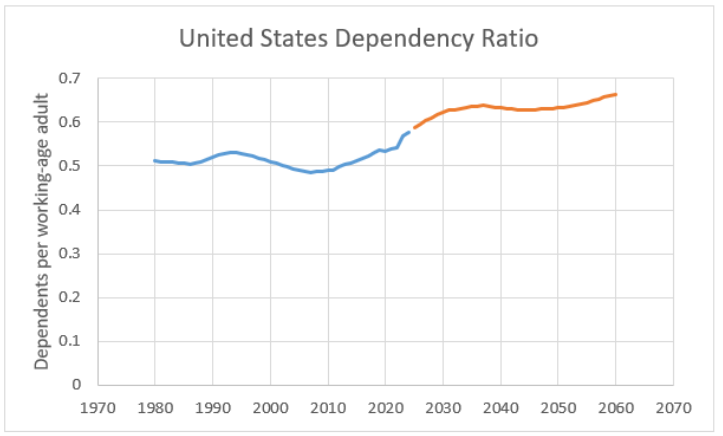
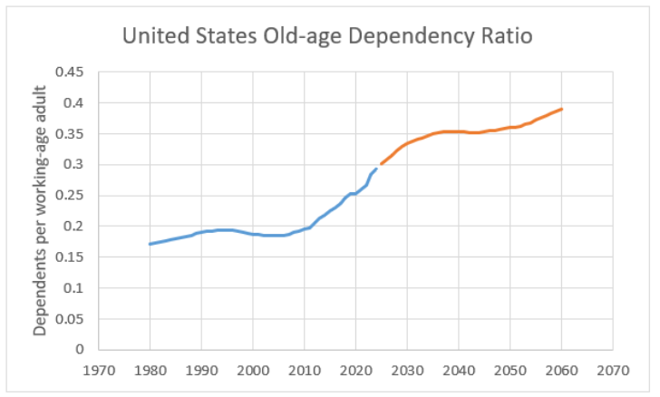
The dependency ratio is a function of the age distribution of the population and is affected by two opposing forces: Fertility is falling, but life expectancy is rising. We can focus on the share of elderly people by computing the old–age dependency ratio:
STEP Enter the label Old-age dependency ratio in cell O33. Enter the formula = M34/L34, in cell O34 and fill it down. Copy the chart, paste it, and edit the SERIES formula so it displays the old-age dependency ratio.
Figure 10.6 shows that the old-age dependency ratio in the United States is projected to reach 0.4 by 2060. Many other (typically rich) countries also face rapidly rising old-age dependency ratios, but none as extreme as Japan.
STEP Download data and create dependency and old-age dependency ratio charts for Japan for all available years. What do you find?
Countries with traditional population pyramids can have high dependency ratios because there are many children, but no country has ever seen this statistic near 1.0 with low fertility. Japan’s old-age dependency ratio above 0.7 in 2050 is simply staggering to contemplate.
Every country has a dependency ratio story, and some can be astounding. Cuba, for instance, faces strong demographic headwinds, with shockingly low fertility and an aging population. Old-age dependency ratios are made even worse by emigration of young adults. For more, see Barreto (2018).
High old-age dependency ratios and falling fertility spell social and economic trouble for two reasons. First, resources have to be reallocated and adjusted. For example, more assisted living and senior facilities are needed, while schools have to be consolidated and reorganized for fewer students. Labor markets are also strongly affected, with less childcare needed but more jobs for elderly services.
Second, and more important, an aging society can be a pessimistic place. Keynes (1936, chap. 12, VII) emphasized animal spirits, “a spontaneous urge to action rather than inaction,” as the driver of investment. Optimism produces high levels of investment spending. Without it, a lack of business and consumer confidence stops economic growth.
Japan has been intensely studied because its high-flying economy in the second half of the 20th century has been stagnant for several decades. Thus far, no policies have worked. Its demography and the psychological effects of an aging society are undoubtedly part of the story.
A Historical Aside
It is fitting that one of the first applications of statistical logic, Arbuthnot’s work on the male-female birth ratio, involved demography because counting people, births, and deaths are the most fundamental data.
Another important episode in demographic history occurred when Thomas Robert Malthus (1798) argued that England’s population was growing so explosively that there would be a catastrophe. He used simple math to make his case: Humans reproduce via geometric progression, while food follows an arithmetic sequence. Malthus was wrong, but his fears gained an audience and today the word Malthusian means “overcrowded and poor.” Worries of a Malthusian world continue to claim our attention.
More recently, Ehrlich (1980) wrote a book with a captivating title, The Population Bomb. He argued exponential population growth would produce famine and disaster. That did not happen.
In fact, unbeknownst to Ehrlich and everyone else, there was a sudden and deep reversal at play. Fertility rates have spectacularly cratered, crashing down from extremely high levels experienced in the decades after World War II.
The problem now is not too many people but how societies and economies can adjust to aging populations. The implications for business are tremendous. Not only investment but innovation and entrepreneurship are impacted by the demographic tides.
Takeaways
Demography is a quantitative discipline with its own analytics. Vital statistics involve counts, ratios, and other computations of human populations.
The PopulationPyramid.xlsm workbook enables downloading years of age-distribution data, which can then be displayed as a chart but also be used to compute statistics.
The M/F birth ratio is around 1.05, but it can deviate substantially from that in particular places and times.
Dependency ratios give information on the structure of the age distribution. Old-age dependency ratios are expected to rise substantially in almost every country as people live longer and fertility is much lower.
It is easy to think that the impact of an aging population involves mechanical adjustment in capital and labor resources, but the psychological effects are much more important.
You might think it odd to include demography in a book on business analytics, but there is no doubt that the study of human populations and their age distribution and movement are critical to economics, finance, and business.
There is a hidden sheet in the PopulationPyramid.xlsm workbook. Do the last step in this book to see a population pyramid of college graduates in the United States.
STEP Right-click any sheet tab and select Unhide. Select PopPyrCollege to reveal the sheet.
The red bar for 25-year-olds (the lowest bar) is longer than the blue bar. This shows there are more female than male 25-year-old college grads. The ratio, 0.8, is quite low, don’t you think? What are the implications of this?
References
Arbuthnot, J. (1710). “An Argument for Divine Providence, Taken from the Constant Regularity Observed in the Births of Both Sexes.” www.york.ac.uk/depts/maths/histstat/arbuthnot.pdf.
Barreto, H. (2018). “Cuban Demography and Economic Consequences.” Working Papers 2018-01, DePauw University, School of Business and Leadership and Department of Economics and Management, ideas.repec.org/p/dew/wpaper/2018-01.html.
Ehrlich, P. (1968, 1st ed.). The Population Bomb (New York, NY: Ballantine Books), www.google.com/search?q=ehrlich+population+bomb.
Keynes, J. M. (1936). The General Theory of Employment, Interest and Money, www.marxists.org/reference/subject/economics/keynes/general-theory.
Malthus, R. (1798, 1st ed.). An Essay on the Principle of Population, oll.libertyfund.org/titles/malthus-an-essay-on-the-principle-of-population-1798-1st-ed.
Sen, A. (1990). “More Than 100 Million Women Are Missing.” New York Review of Books, December 20, 1990, www.nybooks.com/articles/1990/12/20/more-than-100-million-women-are-missing.
