
Prologue
This book is devoted to sharing knowledge and scenarios where visualizations can help you better understand data. Humanity generates an estimated 2.5 quintillion bytes per day. To put it in perspective, “2.5 quintillion pennies laid out flat would cover the Earth five times” (Chardent, N., 2023, para 2). Data overload is a growing issue; your ability to leverage technologies like business intelligence and advanced analytical tools is a valuable skill. But where do you start?
Common data visualization techniques are not rocket science, and most organizations have the tools and platforms they need to make data-driven decisions. Essentially, everyone should become a data analyst for their organization.
This textbook introduces students to the principles of effective data visualization with audience comprehension in mind. Readers are introduced to effective chart types and how to select and design visualizations that clearly convey data patterns and trends. Using best practices for labeling, scaling, and annotating visualizations, it provides techniques to effectively communicate information that supports data-driven decisions, transforming data into actionable insights. The textbook also covers common pitfalls and biases in data visualization.
Students will develop skills to evaluate patterns, identify trends, and analyze data. They are guided through hands-on exercises, case studies, and projects to create a variety of visualizations using tools such as Excel, Power Business Intelligence (BI), Ishikawa, SWOT, PESTLE, decision trees, and more. The subsequent visual data are then applied to effectively communicate in various settings with diverse audiences.
Potential Audience for This Textbook
This book is intended for graduate students from a variety of academic backgrounds seeking practical application of data-driven design and decision-making for a business setting. Using grounded theory, the textbook addresses ways to leverage data to tell a story effectively and ethically.
Storytelling with data is not an inherent skill, and it is easy to get lost in a plethora of visualization choices. In some cases, students become enamored of technology and lose sight of good design principles, leading to the likelihood that the audience will become disconnected from the story. This textbook teaches a variety of decision-making tools, including ways to visualize data to minimize complexity and maximize audience understanding.
Besides creating dashboards in Excel, this book introduces students to quick insights using Power BI to see emerging patterns and trends. Additionally, students will learn to create interactive dashboards and use various techniques to add context. Students will also learn to publish dashboards to multiple audiences through the Power BI app. Students are always amazed when working with a large dataset to discover correlations and outliers that they didn’t know existed.
This book was possible because of the Private Academic Library Network of Indiana (PALNI) and the PALSave: PALNI Affordable Learning textbook creation grant. The book, Leveraging Data Visualization to Communicate Effectively, uses an icon set throughout to alert students of specific resources, including accompanying data files, YouTube video demonstrations, rich discussions of the “why” behind the visualization, step-by-step instructions (both in text and video), and links to open textbook references.
How to Use This Book
The electronic format of the book is the best format available. All parts of the book are organized using key icons, and any section can be reviewed in a stand-alone format (in case instructors want to pick and choose components for their courses). Additionally, the end of each chapter contains links to textbook references for further exploration.
THE ICON KEY. The icon key helps the reader quickly identify the types of resources available.
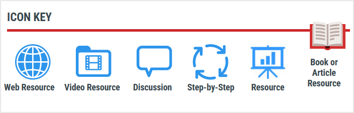
Links associated with icons throughout the textbook will not be repeated in the reference section.
- Web Resource icon indicates a resource on the web.
- Video Resource icon indicates that there are videos related to the topic that can be found on YouTube or other video platforms. Many of these YouTube videos were developed by the authors.
- Discussion icon indicates a rich discussion section that connects the theory to the application.
- Step-by-Step icon demonstrates a process to learn a key visualization technique. Some of the step-by-step demonstrations are also shown in YouTube videos.
- Resource icon indicates resources that accompany the book and can include presentation files.
- Book or Article Resource icon links to books, book chapters, and articles that are open and available as resources.
- Files icon indicates Excel, dataset, or PowerPoint files available.

Acknowledgments
Writing a book is both challenging and more rewarding than we expected. One person who made this easier was Anne Kolb. Both authors would like to acknowledge Anne Kolb for her editing, her work on the asset tracker, and her gracious suggestions.
