
2 What Is Data Visualization?
Good business leaders create a vision, articulate the vision, passionately own the vision, and relentlessly drive it to completion.
—Jack Welch, former CEO of General Electric
What Do You Think?
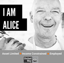
Callie Noble started working at the United Way in 2018, and her first assignment was building reports for Vigo County about ALICE families. ALICE is an acronym for Asset Limited, Income Constrained, Employed. Essentially, an ALICE family earns more than the federal poverty level but less than the basic cost of living in the county. Callie has lots of great data, and her team worked diligently to create reports but soon realized that they needed to visualize their data to connect with their social media–based audiences to increase awareness of this issue. Their first report shows 2016 data. The research center shows information for 2023 and a 2024 update.

ALICE in Vigo County (2016). United Way Agency. Link to report
Research Center—Indiana (2024). United for ALICE. Link to Research Center
The report has lots of charts but fails to tell a story that makes the information personal to the viewer. The team sits down to brainstorm how they might make their data visualizations more effective when presented to the community through social media. Imagine you are part of the brainstorming session as you visit both sites. What are your suggestions for the team? How do you tell the story of an ALICE family?
Introduction

According to Al Shalloway, CEO of Net Objectives, “[Data] visualizations act as a campfire around which we gather to tell stories” (Twitter, Feb 12, 2014). Probably not what you were expecting right? But you most likely have a vivid memory of a story you heard around a campfire. Does this memory trigger all kinds of senses that help you remember the story? According to statistics, 65% of the population consists of visual learners (Zopf et al., 2004).
The setting here is a campfire, but the real art comes in the storytelling: “Storytelling requires an understanding of your audience, your topic, and your goal” (Dale Carnegie, 2018, p. 6). Connecting your storytelling to your audience’s senses helps them remember it. In business, the real magic emerges when the user can interact with visuals, drilling deeper into the data, generating more insightful questions. Sometimes, you don’t know all the questions to ask until you start “playing and analyzing” the data. You can’t drill deeper if the data are presented in a static manner or have barriers that hinder access. Every organization wants data-driven decisions. However, the deluge of the information age inundates us with tweets, emails, texts, direct messages (DMs), memes, news, and other data streams. Data surround us, but few know how to tell an effective story with them. So where and how do we start?
Chapter 2 addresses the following learning objectives.
Learning Objectives
At the end of this chapter, students should be able to:
- LO 1: Evaluate a data storytelling project for effectiveness.
- LO 2: Differentiate between effective and ineffective data visualizations.
- LO 3: Apply design principles and use models (like CASS) to evaluate the infographic to ensure understanding of the information presented in charts and infographics.
- LO 4: Differentiate between static, interactive, and video infographics.
- LO 5: Design an effective infographic using a free application.
- LO 6: Recognize bias and unethical uses of data.
Key Terms: AI, call to action, Canva, CASS template, data smog, design thinking, Gapminder, Iliinsky’s four pillars of visualization, infobesity, infographic, infoxication, interactive infographic, relative frequency, Snapp, storytelling, Venngage
2.1 The Art of Storytelling When Data Are Complex
Every great design begins with an even better story.
—Lorinda Mamo, designer
We live in an era where an overwhelming amount of information surrounds us, creating a vast and constantly expanding sea of facts and figures. Decision-makers often find it challenging to navigate in this environment of excessive information, commonly referred to as “too much information” (TMI). The concept of information overload and the phrase “information explosion” gained recognition as early as the 1960s. Alvin Toffler, a renowned “futurist,” popularized these terms in his book Future Shock, published in 1970.
With the advancement of technology, particularly the rise of HTML and the internet in the 1980s and 1990s, the channels for accessing and sharing information multiplied. From RSS feeds and email to instant messaging, tweets, blogs, and social media platforms like Facebook, the ease of creating and disseminating information led to a sense of being overwhelmed. This abundance of information often leads to distraction and loss of focus.
To describe the challenges faced by decision-makers in this environment, several terms emerged. Infoxication, infobesity, data smog, and information anxiety are some of the terms used to denote the combination of TMI, duplication of data, misplacement of data, and the resulting anxiety and difficulty in staying focused.
In summary, the exponential growth of available information, coupled with technological advancements and the proliferation of communication channels, has created a scenario where decision-makers face challenges in effectively processing and making sense of the overwhelming amount of data surrounding them.
When Data Find Their Voice
We know complex data hold immense potential to generate efficiencies, expand markets, and empower discoveries—driving software developers to find new ways of making data visualization easier to create. For example, when you upload an Excel file into Power Business Intelligence (BI), you can quickly get insights on those data with a click of a button. However, don’t expect to throw lots of graphs on a slide deck and have the audience understand them as well as you do. The more complex a problem, the easier it is to leave your audience disengaged or yearning for clarity. It is at this juncture that the power of storytelling shines, offering a path through the tangle of complexity, transforming numbers and concepts into relatable “human” stories.
Effective storytelling requires the storyteller to unravel the intricacies and nuances of the data, but they must also possess the skill to distill the “complexity” into a narrative and visualization that resonates with the audience. The purposeful weaving of visualizations with effective storytelling creates the bridge to audience understanding, but more importantly, it sets the path so the audience is willing to take a journey of understanding and discovery. Cognitive psychologist Jerome Bruner suggests, “We are 22 times more likely to remember a fact when it has been wrapped in a story” (Harrison, 2015, para. 3). In the past two decades, organizations have embraced the importance of data visualization to the point where data visualization skills are required of all managers. Data are driving this change as decision-makers increasingly rely on data. Let’s look at an example of how design thinking has become a tool for innovation.

At Boeing, managers of the Osprey program needed to improve the aircraft’s takeoffs and landings, but every time the plane taxis off the runway or lands, the “sensors create a terabyte of data [and] ten takeoffs and landings produce as much data as is held in the Library of Congress” (Berinato, 2016, para 2). When Ryan Kiggins (2016) presented at the Global Product Data Interoperability Summit, he shared his role at Boeing, which included “design thinking trainer and facilitator” and why design thinking should become part of an organization’s culture and mindset. But why link data visualization to it?
Incorporating design thinking into data storytelling and data visualizations can lead to a user-centric, engaging, and memorable experience that enhances clarity, comprehension, and impact. Stories like this reinforce why storytelling is so important.
There are compelling reasons to combine storytelling with data visualization using design thinking. Design thinking, a concept introduced by Tim Brown (2008) in his Harvard Business Review article, has become a widely adopted approach in various organizations to gain a deeper understanding of the user, customer, or client needs. According to Esther Han (2022) of Harvard Business School Online, “Design thinking is a mindset and approach to problem-solving and innovation anchored around human-centered design” (para 5). It prioritizes understanding the needs and experiences of users or customers (Kitch, 2023). It puts user needs at the center and provides a way to help storytellers understand their audience. The fundamental nature of design thinking lies in its five-stage process, often associated with creating a product. The five-stage process is (1) empathize, (2) define, (3) ideate, (4) prototype, and (5) test.
One of the key contributions of design thinking is the cultivation of empathy. How do you create empathy in storytelling? It starts with knowing your audience through user research, persona development, storytelling from the user’s perspective, and incorporating elements that evoke emotional appeal.
Supporters of design thinking as part of the data visualization process are laser-focused on knowing the audience. One such supporter of design thinking is Google. According to Pferdt (2019), “At Google, design thinking helps us foster a culture of innovation, and lets our teams generate and test ideas creatively and effectively” (para. 3). Google storytellers use three principles of design thinking: (1) empathy: know your audience; (2) expansive thinking: consider different perspectives; and (3) experimentation: practice before an audience and be willing to embrace constructive criticism and/or feedback (Konrad, 2023). Essentially, using the three principles from Google’s design thinking allows you to prototype your presentation. And keep in mind, a story that works for one audience might not work for another! And what happens when the data has to speak for itself?
Data visualization is a process where complexity meets creativity, where data find their voice, and where storytelling becomes the compass.
Start with setting up the story so data can find their voice. In the realm of data visualization, the story lies in the weave of visual elements and words to form a cohesive narrative. The challenge lies in ensuring that our visualizations can still tell a compelling story even when we are not physically present to guide the audience. Data in their raw form seldom evoke emotions or captivate attention. Unlocking the power of visualization transcends numbers and statistics, giving data their own voice. The answer lies in carefully considering the elements that make up a compelling narrative. Design thinking encompasses design choices for a specific audience and thoughtful arrangement of visual elements to contribute to the story being told.
The following list conveys the compelling reasons to use design thinking when your main goal is to use data visualizations to tell a story, and you are not physically with the audience:
1. Contextualization
Example 1: The design must be relevant to the audience and include real-life examples and ministories that annotate the text. For example, using apps like ThingLink to pop up information. (Besides text, ThingLink can also pop up video or audio files.)
Example 2: Prerecorded video narrative to explain key insights, serve as a guide, and include a video description. For example, provide a link to a YouTube video to provide components of the story.
Example 3: Make sure the story arc takes your audience on an emotional journey. In Linda DeLuca’s (2018) article “How Story Arcs Help You Design a Better Presentation,” she presents six common story arcs. DeLuca doesn’t share these six as the only structures available; instead, she suggests, “It’s not as important to use a particular arc, but rather to understand that stories have shapes” (para. 12). So if you are not physically present for the storytelling, explore ways to shape the story arc. It might include background music, video, and short animated clips. A story arc structure connects to design thinking in the context but also in the retention and comprehension. In a story arc, the storyteller sets the context, establishes empathy, and connects with the audience. Think of the story arc as an overlay. It should create a foundation of understanding, just as design thinking emphasizes understanding the users and perspectives.
2. Engagement
Example 1: Interactive platforms that allow the audience to explore. For example, a dashboard that allows the user to interact and learn more.
Example 2: Interactive elements—tooltips, filters, and linked visualizations that provide additional information.
Example 3: Expansive thinking where you have existing Q&A prompts (essentially thinking of the questions the audience will ask) or have a platform like Power BI that has live query capability.
Example 4: Use foreshadowing to build anticipation and suspense by gradually revealing insights or trends in data. This aspect of engagement is somewhat game-like.
3. Emotional connection
Example 1: Use expansive thinking to embrace creativity and innovation by incorporating metaphors, analogies, or storytelling devices like anecdotes, personification of data, and symbolism (visual cues that make sense like stoplight colors or gauges).
Example 2: Use design thinking principles of prototyping. For example, finding data’s true voice may require multiple iterations and feedback loops, essentially testing different visualizations to refine and evolve the data’s voice to connect to the audience.
Example 3: Considering ethical and social implications. By integrating ethical considerations, the data’s voice can become more responsible, inclusive, and accountable.
4. Simplification and clarity (remove ambiguity)
Example 1: By fostering collaboration and diverse perspectives, design (expansive) thinking ensures a more comprehensive and better representation of the data’s voice. For example, a CPA can clearly understand all aspects of ratio analysis, but a nonaccountant might struggle with the interpretation. That’s why it’s important that an accountant creating a data visualization considers collaborating with nonaccountants, especially if the audience is mostly nonaccountants.
5. Guiding attention and focus
Example 1: Use design thinking to identify desired outcomes. For example, if the organization uses key performance indicators (KPIs) in current reports, use KPIs in visualizations. Use components your audience will recognize.
Example 2: Use design thinking to connect to feasibility by considering current goals and strategies.
6. Retention and comprehension
Example 1: Use design thinking to consider the personalization of the user’s experience. For example, a technique that uses personalization of data-driven storytelling is possible by responding to the user’s cues to guide the individual user through the narrative. This just means that the user makes a choice based on their preference and that decision drives the storytelling narrative. As a user, I gain comprehension of what I find important.
Example 2: Use design thinking to test your data visualization. For example, use a pilot audience to test your data visualization where you are not physically with the data visualization. Then use eye-tracking technology or analyze user interactions and engagement patterns. This can provide insights into where users focus their attention, how they navigate through content, and where they interact with elements.
Example 3: Use design thinking to test retention. For example, conduct a follow-up of your pilot audience with open-ended questions to gauge their recollection of key insights.
In data storytelling, the framework should start with a captivating introduction, a clear problem statement, a climax (like the most important findings or insights), supporting evidence, and a memorable conclusion that contextualizes the problem. The key thing to remember is that data storytelling is not the same thing as data visualization. Visuals are an element of the process.
Before we go further, let’s look at a simple example to define what is meant by data, information, and insights shown in Table 2.1.
Table 2.1: Examples of Drilling to Insights
|
Example of Data |
Example of Information |
Example of Insights |
|
Phoenix 97 7/1 |
On July 1st, the temperature will reach 97°F in Phoenix, Arizona |
It will reach 97°F in Phoenix, Arizona on July 1st, which is 10°F below average compared to prior years |
The main components of an engaging story include plot, characters, setting, theme, conflict, point of view, narrative style, conflict resolution, pacing, and dialogue. It is important to note that the framework you use to tell a story depends on the topic and the audience. At their basic core, stories have a beginning, middle, and end. This text will weave “telling stories” throughout each chapter as you learn to create dynamic data visualizations. It takes practice to be good at both and even more practice to integrate the two.
For more than two decades, data storytelling consultants have played a crucial role as intermediaries, bridging the gap between data and decision-makers. Their expertise lies in presenting the right information in a compelling manner. To gain insights into the possibilities of data storytelling, we can explore the examples shared by these consultants on their websites. Numerous consultants exist in the field, including Storytelling With Data, Duarte, and Juice Analytics.
Zach Gemignani (2023) of Juice Analytics showcases an intriguing blog topic titled “How to Summarize Data Using ChatGPT,” which demonstrates the incorporation of artificial intelligence (AI) in storytelling. This highlights the growing trend of consultants embracing AI technologies to enhance their data storytelling capabilities. AI can assist in data analysis, pattern recognition, and even generating narratives, thereby augmenting the storytelling process.
Furthermore, it is worth noting that some consultants have evolved their focus to emphasize using data for social good. Examples include Viz for Social Good and Periscopic: Do Good With Data, where consultants aim to apply data storytelling techniques to address social and environmental challenges.
Overall, these consultants offer a wealth of resources and workshops.
Viz for Social Good. (2022). Connecting data enthusiasts with mission-driven organizations. https://www.vizforsocialgood.com/. This is a not-for-profit organization; expect to see everything from static infographics to video infographics, as well as the datasets for each project.
Storytelling With Data. (2023). We help people and organizations create graphs that make sense and weave them into compelling, action-inspired stories. https://www.storytellingwithdata.com. This organization shares 100s of videos and podcasts.
If the data storytelling is designed so the user can interact with the data (like through a dashboard), the creator may employ data-driven animations to enhance the narrative. To see an example of this, review Neil Halloran’s interactive documentary, “The Fallen of World War II.” This type of storytelling is called narrative visualization.

Halloran, N. (2016, Oct 26). The Fallen of World War II: An Interactive documentary. http://www.fallen.io/ww2/
When to Not Use Data Storytelling
While visuals are an essential part of data storytelling, visuals are used to inform, explore, or analyze the data. For example, a weekly meeting that reports facts or a status report is most likely used to inform. Informative data are usually broad, while insightful data are deep. Some data communication doesn’t work well with data storytelling. For example, if your dashboard updates continuously or is automated frequently (like daily), it’s hard to tell a story because the data are changing. An interactive dashboard allows the user to explore and discover their own insights, and during this exploration stage, they don’t need a data storyteller. Let’s look at a comparison in Table 2.2 of when less storytelling is needed and when to use data storytelling.
Table 2.2: Is Storytelling Needed in Every Situation?
|
Less Storytelling Needed |
Use Data Storytelling |
|
|
|
|
|
|
|
|
|
|
|
|
Consider if your friend gave you the entire week’s forecast if you asked, “Should I bring an umbrella today?” So what is the difference between concrete and abstract data? A few definitions are in order to support Table 2.2.
Concrete data in data visualization refers to the actual dataset that is being visualized. It includes the raw data points, their attributes, and their values. For example, a dataset would contain concrete sales figures for different products over time. In the context of storytelling with data, concrete data refers to the specific facts, figures, and statistics that are present to support the narrative. As a rule of thumb, always compare with prior periods (month, quarter, year) to easily see growth or contraction. Revenue trends are considered concrete data.
Abstract data in data visualization refers to the high-level representation and organization of data for visualization purposes. Essentially it involves transforming concrete data into a visual form that can be easily understood and interpreted. It entails selecting the appropriate visualization technique—like a chart, graph, map, or infographic—to convey insight and patterns in the data. The abstract data capture the overall story or narrative that the visualization aims to communicate.
Data Storytelling Framework Templates
To assist with your storytelling skill, let’s look at a few data storytelling frameworks. Frameworks adopt a model of storytelling and how data can be integrated within the story. The acronyms define a key focus area, provide structure, and ensure a logical flow that engages your audience. Some models will fit your situation and data better than others. In the next section, we provide an example of a modified framework template (context, audience, story, and situation) and how to use it. You can also find it in the PowerPoint file that accompanies this chapter.
Table 2.3: Data Storytelling Framework Templates
|
Source |
Source Resource |
Model Acronym |
Model |
|
LucidChart Blog |
How to Tell a Story With Data |
CAST |
Context, Action, Subject, Takeaway Context |
|
The Analyst Academy |
PowerPoint Storytelling |
SCQA |
Situation, Complication, Question, Answer |
|
Microsoft |
What Is Data Storytelling and Data Storytelling Examples |
HERO |
Hypothesis, Evidence, Relevance, Outcome |
|
Storytelling With Data |
The Structure(s) of Story |
DATA |
Dramatic Arc, Tension, Alleviation |
|
SEO Analytics |
PICA Protocol: A Visualization Prescription for Impactful Data Storytelling |
PICA |
Purpose, Insight, Context, Aesthetics |
|
Sykes, Malik, West, & Malik |
Stories That Move Mountains: Storytelling and Visual Design for Persuasive Presentations |
CAST |
Content, Audience, Story, Tell |
|
Mitchell & Deckard |
Leveraging Visualization to Communicate Effectively |
CASS |
Context, Audience, Story, and Situation |
 Source: Sykes, M., Malik, A. N., West, M. D., & Malik, A. N. (2012). Stories that move mountains: Storytelling and visual design for persuasive presentations. John Wiley & Sons, Incorporated. ProQuest eBook Central Database.
A great resource or handout is available from the book, Stories that move mountains: Storytelling and visual design for persuasive presentations. Link: https://www.martinjsykes.com/storiesthatmovemountains
CASS: A Data Storytelling Framework Template
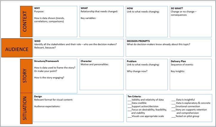
Review Figure 2.1 to see the modified (context, audience, story, and situation) CASS template. This framework combines several of the models and is a great template to evaluate existing data storytelling or build your own storytelling with data when you have a large dataset with several insights to share.
Context—Determines how the data will be shown (trends, correlations, comparisons), including variables, the need for variables to change, the “how” variables that need to change, and the “so what” (essentially, what are the consequences of change or no change?).
Audience—Who makes up the audience, and who are the decision-makers? How are the data relevant? What information do decision-makers already know about this topic?
Story—How are the data used to frame the story or make your point? How is the story engaging? What characters motivate the audience to make a change? How is the problem linked to changes, and why does it change now? What story structure sequences the events so the audience understands the key insights?
Situation—Is the design framed in a relevant format for the visual content, and does it meet the audience’s expectations? Does data transformation engage and motivate the audience? How does the story frame the data? This framework has 10 key criteria for the data storyteller to consider:
1. Are the data valid and relevant (for this situation)?
2. Are the data credible?
3. Do the data support an action or decision? (#3 and #4 work together)
4. Do the data support desirability, feasibility, and viability?
a. Desirability refers to the degree to which a data visualization or data storytelling approach meets the needs and expectations of its intended audience. It involves understanding the preferences, goals, and requirements of the users or audience.
b. Feasibility refers to the practicality and achievability of implementing a data visualization or data storytelling concept. It involves considering the available resources, technical capabilities, and constraints.
c. Viability refers to the sustainability and long-term success of a data visualization or data storytelling initiative. Viability considers factors such as the value proposition, potential impact, scalability, and alignment with the goals and objectives of the organization and its stakeholders.
5. Do all visuals use an appropriate scale (and avoid other manipulations)?
6. Are the data insightful? (Do they successfully transform concrete data into abstract visualizations?)
7. Are the data self-explanatory, and are there enough data to provide context?
8. Do the data support an emotional connection?
9. Does the story arc support retention and comprehension?
10. Was the data storytelling tested on a pilot group?
Figure 2.1—CASS: A Data Storytelling Framework Template
In order to see how this template can help you build your own or evaluate existing data storytelling with data visualizations, let’s use Wes O’Donnell’s Information Is Beautiful: How Data Visualization Will Save the World (2015) for an example. Please watch the video before you review the completed CASS template (Figure 2.2).
 A copy of the CASS template is available in the PowerPoint file that accompanies this chapter.
Wes O’Donnell, (2015), Information Is Beautiful: How Data Visualization Will Save the World. TEDx Muskegon (x = independently organized TED event) Length: 14:37 minutes
Figure 2.2—CASS Completed Template Using Information Is Beautiful: How Data Visualization Will Save the World
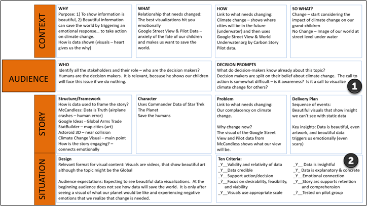
Note: This completed template is also available in the accompanying resources for Chapter 2.
1. You will notice a few items with questions in the CASS template. The first issue is in the audience section. Under the decision prompt, where or what is the call to action? Is the purpose to build an awareness of how climate change will impact our great-grandchildren?
2. The 10 criteria help determine the data validity, credibility, and so on. There are two areas where it is unclear. The first item still in question is “focus on desirability, feasibility, and viability,” which may be an issue because it is not clear whether a call to action is made or is not clearly stated. The second item is “tested on pilot group.” Wes O’Donnell’s presentation was made at an independent TED Talk in Muskegon; however, it’s unsure if he tested his presentation on a pilot group.
Fun Fact: If you recognize Wes O’Donnell’s name, he is an occasional TV cohost on Mysteries Decoded!
2.1 Exercise 1: Use the CASS Framework Template to Assess Data Storytelling
Learning Objective #1—Evaluate a data storytelling project for effectiveness
The following three examples are data storytelling projects that use big datasets. Choose one of the examples and assess it using the CASS data storytelling framework in Figure 2.1. There is a PowerPoint file to accompany this exercise (Link: “CASS Template—Case 2.1”).
 Example 1: Hans Rosling’s “200 Counties, 200 years in 4 Minutes—BBC News”
Example 2: UN Sustainable Development Report 2022: From Crisis to Sustainable Development: The SDGs as Roadmap to 2030 and Beyond—Choose Explore Data. Link: https://dashboards.sdgindex.org/
Example 3: Matthew Klein, Bloomberg View (2014) How Americans Die. Link: https://www.bloomberg.com/graphics/dataview/how-americans-die/
Post your CASS template to the discussion board and point out areas where you struggled to answer the template questions.
2.2 The Good, the Bad, and the Ugly of Data Visualizations
The purpose of visualization is insight, not pictures.
—Ben Shneiderman, American computer scientist
The purpose of this section is to compare the good, the bad, and the ugly of data visualizations, but let’s discuss and define the terms good, bad, and ugly in a data storytelling context.
Good data visualization represents projects that effectively communicate and clarify complex data. It avoids issues found in a bad data visualization or an ugly data visualization. Reviewing the CASS template in Figure 2.1, a good data visualization has these characteristics about data:
- data tell the truth, and visuals use appropriate scale;
- data are valid, accurate, relatable, and credible;
- data are insightful, explanatory, and concrete;
- data are transparent and supports the action or decision; and
- the consumer of the data is provided with relevant context that impacts the data (e.g., maps are representative of population density centers).
Bad data visualization represents projects that are incomplete or contain misleading information or incorrect conclusions. Data storytellers should never lie or misrepresent the data. In bad data visualizations, storytellers might exaggerate or downplay certain data points, distorting the story. Other characteristics of bad data visualization are when storytellers cherry-pick, manipulate (like compressing the scale), mislabel, or intentionally hide some data. Some bad data visualization projects cross the ethical line.
An ugly data visualization refers to a project that usually has overly cluttered charts, excessive labels, ambiguous color schemes, and crowded graphs. In some cases, it might have correct data, but the wrong type of chart was used. Some storytellers might be inconsistent without realizing it. If the inconsistency is intentional, it moves from ugly to bad.
A good data visualization storytelling project provides contextualization, engagement and an emotional connection, clarity to complex data, and guides attention and focus. In addition, the story should flow logically with a story arc structure and summarization that supports comprehension and retention. Every data visualization storytelling project should be designed to create a compelling and impactful narrative that effectively communicates data-driven insights to your audience. Data projects can be static and simple (like infographics) or complex with interactive elements.
Did You Unintentionally Mislead Your Audience?
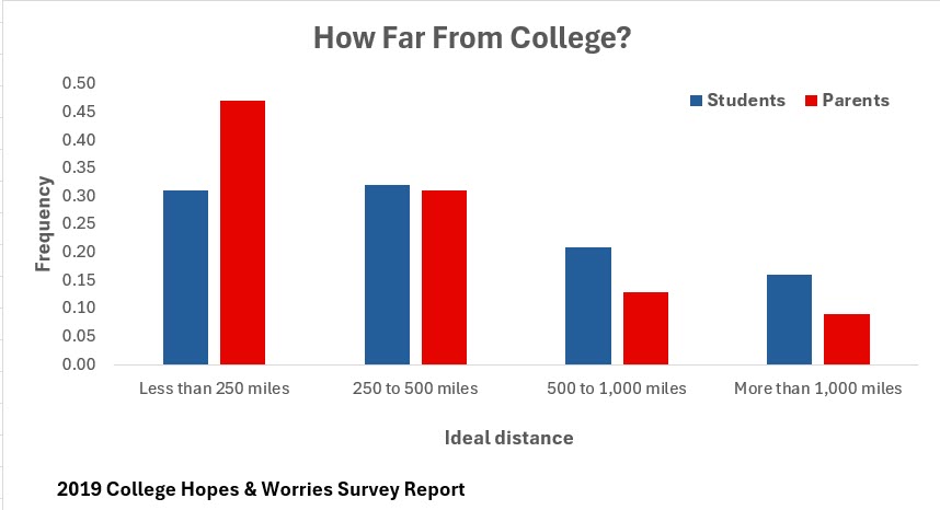
You work with charts every day, but did you realize you could mislead your viewer by using count instead of frequency? The best way to demonstrate this is to show you! Comparative bar charts provide a visual comparison of univariate, categorical data for two or more groups.
Each year the Princeton Review conducts a survey. One of the questions is asked to parents and students. It is, “Ideally, how far from home would you like the college you (your child) attend(s) to be?” As you might expect, parents and students do not agree. Let’s look at the frequency table along with the relative frequency table. Frequency measures how often a particular event occurs (essentially the count). In Figure 2.3, 2,878 students and 1,230 parents voted that an ideal college is less than 250 miles from home. Relative frequency indicates a proportion in relation to the total (shown as a percentage).
Figure 2.3—Showing Count and Frequency for Students and Parents
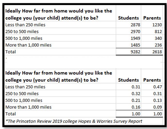
So 2,878/9,282 = .31 (or 31% of students voted for a college less than 250 miles from home).
And 1,230/2,618 = .47 (or 47% of parents voted for a college less than 250 miles from home).
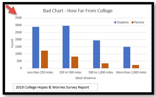
Now let’s look at the two charts. Both charts have a clear title, an appropriate legend, and appropriate labels, and the column colors make sense. But using count is inappropriate since the sample size is not the same.
Exhibit 2.1—Use a Relative Frequency Table for Intended Representation
|
Bad Chart—misleading information |
Good Chart |
 |
 |
|
This chart uses count and because the sample size is quite different, can lead the audience to a different conclusion. |
Use relative frequencies on the vertical axis instead of the frequency (count). The use of relative frequency helps make a more meaningful comparison when sample sizes are not the same. |
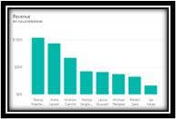
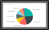
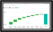
Next, let’s look at some charts that work with the same data but represent the good, the bad, and the ugly (Exhibit 2.2). These charts were created in Power BI and show the results of a year of revenue for eight salespeople. The key point here is that you can use very powerful software to create your dashboard and still have bad and ugly data visualizations if you don’t use the right charts, correct scales, or good design protocols.
Exhibit 2.2—The Good, the Bad, and the Ugly in Power BI Charts
|
The Good |
The Bad |
The Ugly |
 |
 |
 |
|
All bars are labeled and sorted properly. |
One salesperson’s name is not shown, no dollar amount. Too many slices—pie chart not the best option. |
This chart is best to show an increase and decrease and it does not work well for this kind of data. |
There is room for improvement in all the charts. For example, if this is a stand-alone chart on a slide, adding the year and company name would be appropriate. However, if the chart resides on a dashboard, the year and name can be at the top of the dashboard and the chart doesn’t need them.
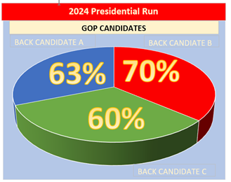
Does Your Pie Graph Add Up to 100%?
Figure 2.4 was modeled from a chart shown on a news broadcast in 2012. The names shown on the broadcast are removed. Although the intent was to show the closeness of the race, pie charts should always add up to 100%. Notice that this one does not. This one also falls under the category of bad and ugly: bad because the pie chart doesn’t add up to 100% and ugly because the colors might unintentionally sway the audience to think more positively of one candidate over another. The colors used here duplicate the chart shown during the news broadcast. Both pie charts and doughnut charts should be avoided. Your audience will struggle to estimate a quantity from angles, and matching labels to the slices can be especially difficult if you have small percentages—and that small percentage might be important!
Figure 2.4—Example of a Bad and Ugly Chart
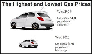
Did Your Image Size or Proportion Mislead Your Audience?
Figure 2.5 shows another misleading graphic where size matters. The news station misled the audience because the size was not depicted in actual proportions. The following was a graph showing gas prices with the highest price in California and the lowest in Mississippi. But notice the misuse of proportion.
Figure 2.5—Misuse of Proportion: Bad Chart
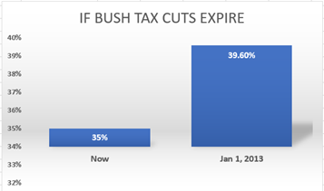
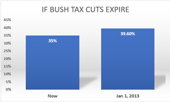
Did the Scale Used in the Graph Mislead Your Audience?
The same news channel produced a graph that did not have the scale set to zero. In Exhibit 2.3, the chart on the left shows the axis scale starting at 32% and the chart on the right shows the scale starting at 0.00%. I’m sure you can see that the chart on the left is misleading!
Exhibit 2.3—Example of Misleading Scale for a Tax Rate Increase
|
Bad Chart—Misleading |
Good Chart—Starts With 0.00 Scale |
 |
 |
Now that you have seen examples of good, bad, and ugly data visualizations, let’s see if you can differentiate them in the following exercise.
2.2 Exercise 1: Critical Evaluation of Good and Bad Data Visualizations
Learning Objective #2—Differentiate between effective and ineffective data visualizations
 Part 1: Find three examples of bad and/or ugly data visualizations (just type “bad data visualizations” in the search box of your browser to find examples). Screenshot the examples and indicate why they fit this category. What changes would you make to correct them?
Part 2: Type “bad visualization + Purdue Pharma” in the search box of your browser. Share your findings in a discussion. Did Purdue Pharma cross an ethical line?
2.3 The Four Pillars of Visualization Work Better With Context
Visualization and belief in a pattern of reality activates the creative power of realization.
—A. L. Linall Jr.
Now that you have seen how good, bad, and ugly data visualizations are prevalent, let’s take a step into becoming a data storyteller. If you’ve been creating PowerPoints at your organization, you have certainly told a story. But how well did you tell that story? Did you use the best visualization techniques to tell it? Creating your own infographic or data visualization may start with available templates (much like PowerPoint slide decks or infographic templates in an infographic app). Do you remember the first time you learned PowerPoint? Did you explore one PowerPoint theme design after another or have trouble modifying an existing slide deck to make it “fit” your purpose? When you start creating your own data visualizations, don’t be surprised at how often you need to fall back on good data visualization design techniques like those presented by Noah Iliinsky. Noah Iliinsky, a data visualization expert, cautions how quickly a presenter can get off track.
When Larry Swanson of Content Strategy Insights asked, “Are there benchmarks, or how do you know you’re on track?” Iliinsky answered, “It goes back to purpose, know your customer and what they care about” (Swanson, 2020, Podcast 89—24:32). You must start with the purpose and be able to check off the “why,” “who,” and “what does my audience need” to understand (What actions do you want to support? What is the most important takeaway message? How will it be consumed?). The more specifically you drill down to purpose, the better. As shown in Exhibit 2.4, before building an interactive data visualization, make sure to embrace Noah Iliinsky’s four pillars of visualization with an added component of context.
Exhibit 2.4—Iliinsky’s Four Pillars Plus Context
|
Iliinsky’s Four Pillars of Visualization |
Plus Context |
Equals |
Elevated Understanding |
|
|
•Purpose, •Content (what to visualize), •Structure (how to visualize it) •Format (appeal and focus). |
+ |
CONTEXT |
= |
The audience will understand better and remember longer. |
In this case, context means making the topic easier to understand by giving extra information about the time, place, situation, history, background, and so on. That’s part of the storytelling process! So how does storytelling relate to interactive data visualizations?
Iliinsky, N. (2018, Apr 12). Four Pillars of Visualization—English version. StarsConf. San Diego, USA. [Video]. YouTube.
Knaflic, C. (2015, Nov 2). Storytelling With Data: A Data Visualization Guide for Business Professionals. Wiley Publishing. ProQuest eBook Central Database.
Wexler, S., Shaffer, J., & Cotgreave, A. (2017). The big book of dashboards: Visualizing your data using real-world business scenarios. Wiley Publishing. ProQuest eBook Central Database.
Another data visualization expert is David McCandess. David McCandess, at his Information Is Beautiful website, shares a graphic that interacts when you roll your mouse over certain areas to give you more details. McCandess considers all the aspects of data visualization but includes more of the storytelling components than Noah Iliinsky.
McCandess, D. (2023). What Makes a Good Visualization? Information Is Beautiful. https://www.informationisbeautiful.net/visualizations/what-makes-a-good-data-visualization/
According to McCandess (2020), to have a successful visualization you need (1) good and accurate information, (2) the goal of visualization, (3) the story or concept that accompanies the visualization, and (4) the actual visual form that works best for the visualization.
2.1 Self-Assessment: Four Pillars of Visualization
Learning Objective #3—Apply design principles and use models (like CASS) to evaluate the infographic to ensure understanding of the information presented in charts and infographics
 Watch the YouTube video “Four Pillars of Visualization” by Noah Iliinsky.
2.3 Exercise 1: Using the Four Pillars to Help the United Way Team Explain ALICE
Learning Objective #3—Apply design principles and use models (like CASS) to evaluate the infographic to ensure understanding of the information presented in charts and infographics
In the “What Do You Think?” scenario beginning this chapter, a United Way team is brainstorming ways to present social media infographics that explain ALICE families and what that means. They also want a call to action to request donations.
How would you complete the four pillars + context (see Exhibit 2.4) to help the ALICE team present their data in a social media post?
2.4 Infographic Basics
The greatest value of a picture is when it forces us to notice what we never expected to see.
—John Wilder Tukey, American mathematician and statistician
To begin, let’s look at the simplest data visualization—an infographic. An infographic is a graphical representation intended to communicate information in a concise and meaningful way. Most infographics are “static,” but the trend is moving toward interactive infographics.
You have probably used infographics more than you think! According to an old study by Levie & Lentz (1982), people following directions with text and illustrations do 323% better than people following directions without illustrations (p. 195–232). Perhaps you’ve assembled something using diagrams—think about your experience if the instructions were all text describing what needed to be done. Did the visual help you understand each step?
You expect infographics to take visual form in social media, but don’t be surprised to see them in scientific communication to explore datasets and communicate findings on websites, theses, dissertations, and resumes (Jaleniauskiene & Kasperiuniene, 2023).
The designs of infographics range from very simple to complex, but all include content and visual elements. It takes practice before it becomes a basic digital skill. Studies across several disciplines (computer science, education, health sciences, digital marketing and media management, sociology, mathematics, ESL, and sports management) show that students who learned to create or analyze infographics “gained metacognitive strategies, better recall, enhanced depth of understanding, better communication skills, and saw the process as engaging and enjoyable” (Jaleniauskiene & Kasperiuniene, 2023, p. 200)!
According to Beegle (2013), the “best infographics build a narrative in much the same way a story does, starting with the premise and then revealing something new at each turn” (p. 65). In Figure 2.6, the infographic reveals layers of information about immigrants. The use of flags brings the user focus to the immigrant’s country of origin. There are charts to show the education attainment level and the percentage of immigrants who speak English proficiently. In addition, the infographic indicates how much immigrants contribute to Indiana’s economy through taxes paid. As you look at this chart, what other information would you consider including or would you want to know?
The Simplest Evaluation of an Infographic
The first step to creating an infographic and then evaluating it is a simple process of informing yourself using the 5 Ws (who, what, when, where, and why). Use the 5 Ws to help convey information in a relevant way. In this illustration (Figure 2.6), let’s go through the 5 Ws.
Figure 2.6—How to Use the 5 Ws to Review an Infographic
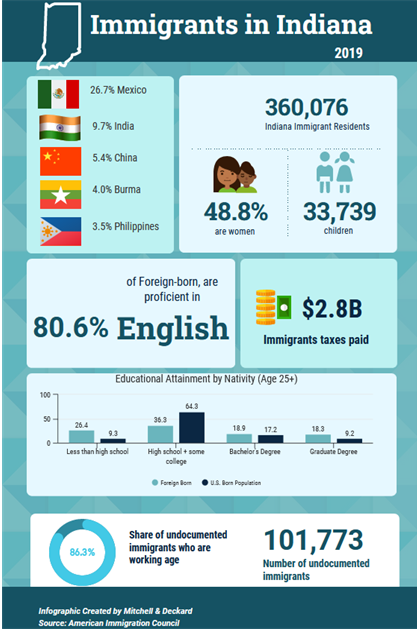
Who?—immigrants in Indiana
What?—raise awareness
When?—2019 data
Where?—Indiana
Why?—bring awareness of education levels and contribution to Indiana’s economy
This illustration was made in the app Venngage, using source information from the American Immigration Council. All infographic software has a variety of icons that are available for use, but it also includes great charting tools.
The next step is analyzing some existing infographics. Just doing a search on infographics will yield all kinds of ideas in both design and content. Notice the use of color, symbols, and images. Ignore interactive infographics for now.
Try to gain a sense of an infographic that tells a story that prompts emotional tension. As you search for an infographic you like, see if you can pick out the 5 Ws. If you find one that you don’t understand, see if you can do a little research to find the context. An infographic is not good if it doesn’t meet the definition (communicating information in a concise and meaningful way). It’s like hearing a story without knowing all the characters. And more importantly, infographics should contain a driver or “call to action.”
To illustrate the importance of context, look at Exhibit 2.5, where both infographics are from the Wabash Valley United Way’s Facebook presence. Are these graphics designed to raise awareness (educational) or do they call you to do something?
Exhibit 2.5—Do These Infographics Have a Call to Action?
|
United Way of the Wabash Valley Facebook post, August 31, 2018 |
United Way of the Wabash Valley Facebook post, November 11, 2018 |
 |
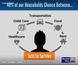 |
|
It took a minute to understand that ALICE = Asset Limited + Income Constrained + Employed |
This message is clear, and a good start to a call to action. |
|
This is the related message: Over 30,000 families in the Wabash Valley are ALICE or struggling working poor. Join the Fight to help us make a difference in the lives of ALICE! |
This is the related message: This isn’t just a household problem; it’s a community problem. How can our community thrive when over 40% of our households don’t earn enough to achieve a “survival budget” and must make tough choices on what to pay? Do they pay the electric bill, or do they pay the rent? |
Note that these infographics are specific to the Wabash Valley in Indiana; therefore, someone from a different state might not understand the context of ALICE since not all states have adopted the ALICE project. If you visit the United Way of the Wabash Valley, you will find reference to their bold goal—to move 10,000 families out of financial struggles and into stability along with a very visual strategic plan.
Strategic Plan. (2023). United Way of the Wabash Valley. Terre Haute, IN. https://uwwv.org/storage/2018/01/Strategic-Plan.pdf
Dozens of high-quality infographics help communicate the context of this report. The corresponding Facebook pages include a variety of infographics related to the strategies of the United Way.
Key Components to Evaluating an Infographic
Keep in mind that “80% of learning takes place visually; the average person retains only 20% of what is read when it’s delivered in text-only format; images on Facebook are liked 200% more than text [and perhaps most important for your organization]; websites register a 12% increase in traffic after publishing an infographic” (Beegel, 2014, p. 8–9). But perhaps the most important characteristic of an infographic is presenting complex information in a way that is easily understood.
The Encyclopedia of World Problems & Human Potential (UIA.org) identifies the proliferation of information using new terms like infoxication, infobesity, and data smog. Interestingly, the UIA connects this problem to the UN Sustainable Development Goal #12, Responsible Consumption and Production, and the UN Sustainable Development Goal #16, Peace, Justice, and Strong Institutions. So what do data smog, infoxication, and infobesity have to do with infographics?
All three terms describe information overload. An infographic can cut through information overload, separate the signal from the noise, and break down complex information into bite-sized chunks making it easier for your infographic audience to understand and retain key insights without feeling overwhelmed by the sheer volume of information available.
Infographic Basic Components
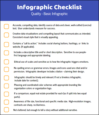
Regardless of the type of infographic, every infographic should have the same basic components or considerations, and Figure 2.7 provides a good checklist to assess a basic infographic. The checklist is a compilation of Beegle (2014) and Wallace (2015).
Figure 2.7—Infographic Quality Checklist for Basic Infographics
Infographic Components—Sound or Video
Other basic components will apply if you create an infographic with motion, sound, or interaction. If you move past the static infographic, consider these additional components as shown in Table 2.4.
Table 2.4: When to Add Sound or Video
|
Use sound or voice narration to . . . |
Use (or add) video to . . . . |
|
✓Establish a mood |
✓Keep the user on a linear path set by the designer. |
|
✓Create a sense of authority |
✓Explain more complex concepts (like the workings of a mechanical device) |
|
✓Connect to viewers |
✓Make it more personal |
|
✓Provide emotional depth |
✓Testimonial (like for branding) |
2.2 Self-Assessment 1: Basic Design
Learning Objective #3—Apply design principles and use models (like CASS) to evaluate the infographic to ensure understanding of the information presented in charts and infographics
You’ve been asked to compare the performance of two companies in the same sector.
2.4 Exercise 1: Apply the 5 Ws of an Infographic
Learning Objective #3—Apply design principles and use models (like CASS) to evaluate the infographic to ensure understanding of the information presented in charts and infographics
Find three infographics related to immigration in your state. See if you can answer the 5 Ws: who, what, when, where, and why. Share the image(s) and discuss the 5 Ws on the discussion board. Is there a call to action?
2.4 Exercise 2: Evaluate a Static Infographic
Learning Objective #3—Apply design principles and use models (like CASS) to evaluate the infographic to ensure understanding of the information presented in charts and infographics
Part 1: Find a static infographic from your organization. Use the basic design criteria listed in this section to evaluate it. Share the image and discuss what changes you would make to improve it. Part 2: Now use the CASS template to review the same infographic. What differences are observed?
Types of Infographics
There are a variety of infographics, and the type of infographic you build will be driven by what works best for your message. Let’s review a few of these with examples.
- Statistical infographics: This type of infographic uses charts, multiple types of graphs, and people icons representing numbers to present statistical data in a clear and concise manner. For example, assume you want to look at pay between men and women in the United States. Start with the Bureau of Labor Statistics data. The 2020 data show a gap in earnings where women earned 82.3% of men’s pay (Bureau of Labor Statistics, 2023). What other statistics might you want to highlight?
Earnings from Current Population Survey (CPS). Link to U.S. Bureau of Labor Statistics: https://www.bls.gov/cps/earnings.htm
Examples of statistical infographics will be shared in Chapter 3 of this textbook.
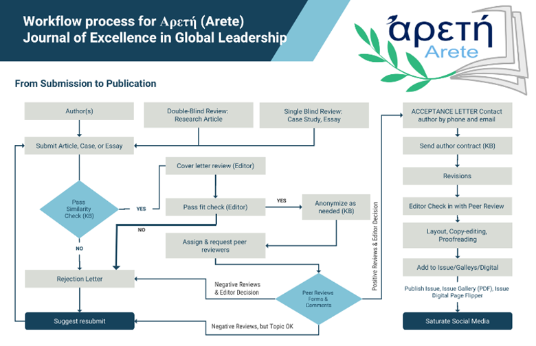
- Process infographics: This type of infographic shows a step-by-step visual guide to explain a process or instruction. So infographics that show a flowchart, a timeline, or step-by-step instructions would fit here. For example, the flowchart shown in Figure 2.8 shows the process for submission of an article to a journal and all the steps necessary for publication in a peer-reviewed journal.
Figure 2.8—Example Process Infographic
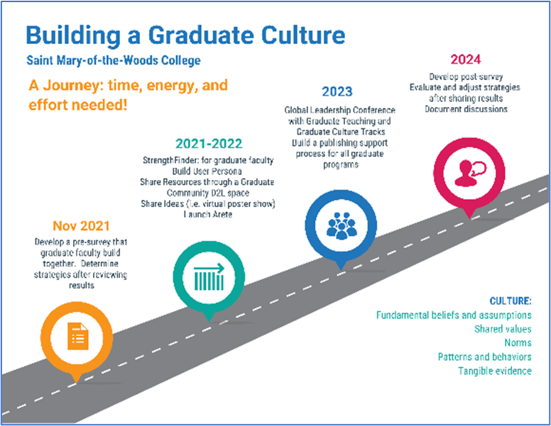
- Timeline infographics: These types of infographics have a chronological layout to represent historical events, and time-related information. They can also be interactive where the user sees additional details by hovering over some part of the timeline. For example, in Figure 2.9, hovering the mouse over the icon in 2021–2022 explains what faculty gain by understanding their top five strengths from taking Gallop’s Strength Finder test.
Figure 2.9—Example of Timeline Infographic
- Interactive infographics: These types of infographics are most often interactive allowing the user to interact and dive deeper into the information. Interactive infographics work well for large datasets (like census data).
An example of a simple interactive infographic starts with a basic infographic but adds interaction using an app called ThingLink. Essentially, when the user hovers over or clicks the icon, the user is given additional information. Figure 2.9 shows a static version of the infographic, but the pop-up links can provide additional information, even video!
ThingLink: An app-based program to engage and inform your audience. Link: http://www.thinglink.com
What is ThingLink? ThingLink is an app-based program for annotating digital items. You add an icon to tag your item and can incorporate rich media. The multimedia editor allows a user to quickly create interactive images, videos, and self-guided tours. A user can also create a branching scenario for training, and even develop augmented reality (AR)! ThingLink is a great app for creating road maps or walking tours to incorporate text, audio, and videos. Figure 2.10 shows a basic use of ThingLink.
Figure 2.10—Example of Interactive Infographic Using ThingLink

- Comparison infographics: These types of infographics compare two or more concepts side-by-side using visuals to highlight similarities and differences.
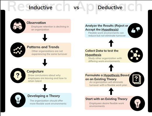
An example of this type of infographic might be management versus leadership skills, comparing two companies, or comparing two products. Some comparison infographics will include a Venn diagram, so the user sees the overlap between the two categories. Figure 2.11 compares inductive to deductive reasoning.
Figure 2.11—Example of a Comparison Infographic
Another good example of a comparison infographic is a SWOT (Strengths, Weaknesses, Opportunities, and Threats) or PESTLE (Political, Economic, Social, Technological, Legal, and Environmental). PESTLE is used to gain a macro picture of an industry. More about SWOT and PESTLE will be discussed in the next chapters.
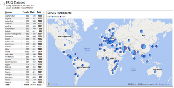
- Geographical infographics: These types of infographics use maps to visualize information. For example, the infographic in Figure 2.12 shows male and female participants by country. See how much easier it is to determine the information with a map instead of a table of numbers? This infographic was created in Power BI.
Caution: Most Excel dashboards use a type of filtering called “slicers.” The same application in Power BI is more powerful because everything serves as a filter. No matter where you click, you drill down into more information. As you build a dashboard in either Excel or Power BI, you may want to consider restricting some of the filtering that loses focus of the purpose. Restrictive filtering just means that you lock down certain features (or hide some filters) so the user doesn’t get lost or misinterpret the data.
Maps are powerful, and the more powerful the map, the greater the need to know the source, understand how the legend represents the information, and whether you have clusters or patterns of data that are obscured by the boundaries of the map (Buzzelli, 2020). For example, in using a traditional map (to show vote numbers), states are not uniform in population, so showing a state fully red or fully blue doesn’t show what might be happening in specific cities. This issue is called a “modified areal unit problem.” (Buzzelli, p. 171). This is why the popular vote seems to contradict the Electoral College winner. For this reason, some map creators transform a traditional map into a choropleth map where the “size of the states are rescaled according to their population” (Newman, 2016, para. 3).
Wiseman, A. (2015, Jun 25). When Maps Lie: Tips from a geographer on how to avoid being fooled. Bloomberg. https://www.bloomberg.com/news/articles/2015-06-25/how-to-avoid-being-fooled-by-bad-maps
In Figure 2.12, users can drill down by clicking on any circle in the country to find out even more detail on where the surveys originated (i.e., the state).
Figure 2.12—Example Showing Geographic Data in Power BI Infographic
Video Infographics Are Powerful
One of the most powerful ways to use infographics is to “show” your viewers rather than just narrate (tell) information. The “show approach” simplifies communication and avoids misunderstandings. And sometimes you need a video infographic rather than a static infographic.
One of the most powerful narratives, videos, and interactive infographics available is an animated data-driven documentary written and directed by Neil Halloran, called The Fallen of World War II. This documentary is deeply researched and has won several awards including 2016 Best American Infographics. This video infographic has been viewed over 9 million times.
Halloran, N. (2016, Oct 26) The Fallen of World War II: An Interactive documentary. http://www.fallen.io/ww2/
So now that you’ve watched this interactive documentary, what kind of tools do you need to create a video infographic?
Infographic Online Apps
Canva is located at www.canva.com (Great infographics, beautiful templates, and a limited free plan). To create an interactive infographic beyond hyperlinks, you will need to pair it with another app like ThingLink: www.thinglink.com
Venngage is located at www.venngage.com (Great infographics, a wide variety of templates). Venngage also has a getting started free plan that is limited. To create an interactive infographic beyond hyperlinks, use an app like ThingLink.
Other popular tools for creating infographics include Visme, Snappa, Piktochart, Renderforest (online infographic video maker), and for the Power BI users, PureViz Infographic. PureViz is PBI Certified and an add-in to Power BI, and it is powerful!
But don’t forget—there’s one product you might overlook, and that’s PowerPoint! Microsoft provides dozens of infographic templates, and PowerPoint slides can be saved as images of any size.
PowerPoint Presentations that include infographics. Link: https://create.microsoft.com/en-us/templates/infographics
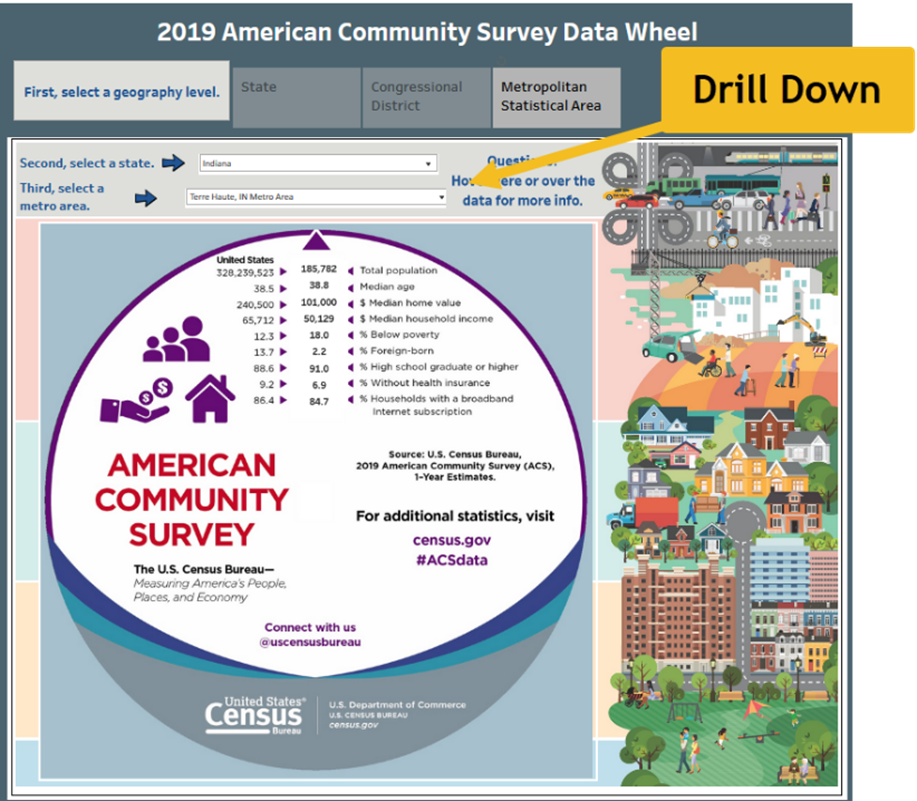
Complex Interactive Infographic Using Large Datasets
A complex interactive infographic is much more expensive to produce and requires some special skills if it draws data from a database. An example of an interactive infographic without all the bells and whistles can be found at Census.gov. The one pictured in Figure 2.13 pulls from 2019 census data. Essentially, a user selects a state, a congressional district, and a metro area. Only urban areas exceeding 50,000 in population are available. This interaction is on the low end of the scale and is more like an interactive “report” instead of an interactive infographic.
The dataset is from an American Community Survey sponsored by the U.S. Census Bureau from 2019, and it provides a comparison between the metro area (in this case Terre Haute, Indiana) and the United States. It provides the total population, median age, median home value, median household income, below-poverty percentage, foreign-born percentage, percent high school graduate or higher, percentage without health insurance, and percent of households with a broadband internet subscription.
United States Census Bureau (2020). 2019 American Community Survey Data Wheel. https://www.census.gov/library/visualizations/interactive/2019-acs-data-wheel.html
See if you can find your city or region!
Figure 2.13—Interactive Infographic Draws Data From a Database
When should you use an interactive infographic? See Table 2.5 for more information.
Table 2.5: When to Use an Interactive Infographic
|
Use an interactive infographic when . . . |
All interactive infographics should meet the following criteria . . . |
|
✓An abundance of data (more than 10,000 records) |
✓Be intuitive both in design and controls |
|
✓Complex processes |
✓Organized well |
|
✓Large, detailed maps |
✓Extensive user control |
|
✓Data impacts readers differently |
✓Drill down—multiple pages or view |
Use the Gapminder Tool
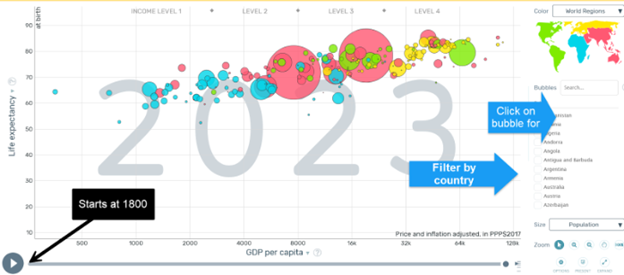
Does your organization need an interactive infographic? Consider checking out the interactive data map at Gapminder (www.gapminder.org). It is a complex set of data that looks at life expectancy versus income per person, GDP per capita in dollars per year, across years and countries. For example, in 2015, Afghanistan had a life expectancy of 53.8; whereas the United States had a life expectancy of 79.1 years. On this infographic (as shown in Figure 2.14), on the actual website you click the “play” button to see it populate the data from 1800 to 2022.
Figure 2.14—Gapminder Interactive (and Animated)
To find out more about Gapminder and the free tools available, visit and explore the sites listed.
Try the Gapminder tool with your own data (includes step-by-step tutorial). Tutorial Link: https://vizabi.org/tutorials/2017/04/03/show-your-data/
Motion Chart Gadget Link: https://www.gapminder.org/upload-data/motion-chart/
Link to Public Data at Google: https://www.google.com/publicdata/
According to Gapminder.org (2023), “Gapminder Tools is free and comes with built-in data. . . . The offline version also allows you to create your own animated bubble charts, line charts and so on. Also have a look at Google’s free Motion Chart Gadget and Public Data Explorer, where you can visualize your own data” (FAQ, para. 1).
Government Datasets and Infographics
There are several datasets from different states that are open and available to the public. For example, New York agencies publish open data weekly (opendata.cityofnewyork.us). New York features thousands of datasets ranging from restaurant inspections to Central Park’s squirrel census. Almost every state has some type of interactive data dashboard. For example, Arizona’s Judicial Branch leverages Power BI to show interactive dashboards on a variety of subjects.
Many foreign governments have interactive infographics that include a broad range of topics you would expect—unemployment rates, COVID, postsecondary education, education completion rates, and others. For example, Health Education England (HEE) has dozens of dashboards related to COVID, mental health, and many more. Many of these foreign government agencies use Power BI. And as certain issues reach global attention, expect to see dataset collaboration. For example, many countries are collaborating with the United Nations to contribute refugee information through an operational data portal.
Arizona Judicial Branch. (2023). Azcourts.gov. Statistics: Interactive Data Dashboards. https://www.azcourts.gov/statistics/Interactive-Data-Dashboards
Hoosier by the Numbers Located: www.hoosierdata.in.gov. Powered by STATS Indiana and hosted by the Indiana Department of Workforce Development
Operational Data Portal: Refugee Situations. (2023). The UN Refugee Agency (UNHCR). https://data2.unhcr.org/en/countries/
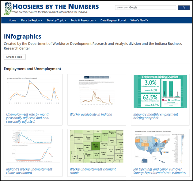
Almost every state and agency have similar infographic categories. Explore Indiana’s Hoosiers by the Numbers. Indiana generates dashboards based on search criteria and this site contains dozens of Indiana ready-made infographics. See Figure 2.15 for more details.
Hoosiers by the Numbers—NOTE: Choose the Tools and Resources at this site to find an entire section of ready-made infographics. Some of the infographics are pulled from several databases, including the U.S. Bureau of Labor Statistics; Indiana Business Research Center; Indiana Department of Workforce Development, Occupational Employment, and Wage Statistics; Indiana Postsecondary Education Data System (IPEDS); and several others.
Figure 2.15—Example of State Government
Federal Interactive Infographics
The federal government is rich in infographics. For example, the Federal Trade Commission has a Tableau Public account (essentially a third party makes the infographics but from the FTC’s data). The FTC affectionately calls these Vizzes, not just infographics. As you would expect, this site contains fraud statistics, ID theft maps, and imposters’ “do not call” complaints.
Federal Trade Commission. Link: https://www.ftc.gov/news-events/data-visualizations/explore-data
U.S. Government Accountability Office. Link to eight infographics of trends: https://www.gao.gov/infographic/infographics-eight-trends-affecting-government-and-society
This is only a sample of infographics and data visualizations available at government sites.
2.2 Self-Assessment 2: Compare Static and Interactive Infographics
Learning Objective #4—Differentiate between static, interactive, and video infographics
2.4 Exercise 3: Explore and Discuss an Interactive Infographic / Data Visualization
Learning Objective #4—Differentiate between static and interactive infographics
Find an interactive infographic or data visualization from this section. Take a screenshot of the interactive infographic / visualization and discuss how it is used. Also include the URL. What do you like, and what do you think needs improvement?
Discuss how an interactive infographic might be used (or possibly is already in use) at your organization. Use the basic design criteria listed in this section to evaluate it. If you already use an interactive infographic at your organization, share the URL.
2.4 Exercise 4: Interactive Infographic—How Would You. . . ?
Learning Objective #4—Differentiate between static and interactive infographics
What are five ways an infographic about cancer patients could allow a viewer to interact with it? How could the data be segmented to provide additional interactivity?
Hint: Global Cancer Observatory (GCO) has infographics. GCO is sponsored by the World Health Organization.
Infographics, PowerPoint, and AI
Early in 2023, Microsoft extended its partnership with OpenAI, the maker of the ChatGPT tool. This means some interesting tools will be integrated with all office products and some new tools will be introduced. For example, one tool is the Microsoft Designer tool, an AI-powered design app. Just describe the design and use the Generate button, then choose one you like and customize as needed. See Figure 2.16 for more information!
Figure 2.16—Illustration of Microsoft Designer
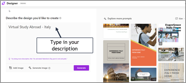
If you market using social media like Instagram or Facebook, this is well worth the exploration!
Microsoft Designer—Stunning designs in a flash. Link: https://designer.microsoft.com
Don’t settle for the basic PowerPoint themes and designs available when you select a new PowerPoint! Instead take a minute to explore the animated presentations and infographics available to you through templates at Microsoft, Canva, and Venngage. All three use a component of AI to help users find the perfect template for their topic!
Next, let’s browse for infographic templates at Microsoft.
 Step-by-Step Instructions for Finding Infographic Templates in PowerPoint
Note: Screenshots of PowerPoint interface © Microsoft Corporation, used with attribution for instructional and illustrative purposes. Annotations added by the author.
- In PowerPoint, click File and New.
- At the Search for online templates and themes, type infographics. You will have a wide variety of choices, but for now, choose Infographics as illustrated in Exhibit 2.6. (Keep in mind that your experience will be slightly different depending on the PowerPoints you have recently opened.)
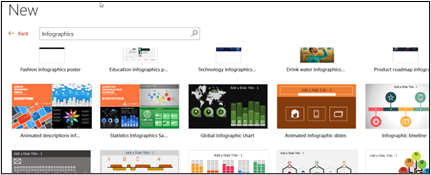
Exhibit 2.6—Example of Searching for PowerPoint Infographics - Scroll down until you find Animated scale graphic, and click it.
- Choose Create, and it will download to your PowerPoint. Open the slide in presentation mode to see the animation. Notice that the slide deck includes the animated scale slide and an additional slide that has instructions to edit the slide if you need them. As shown in Exhibit 2.7, Help is on the right.
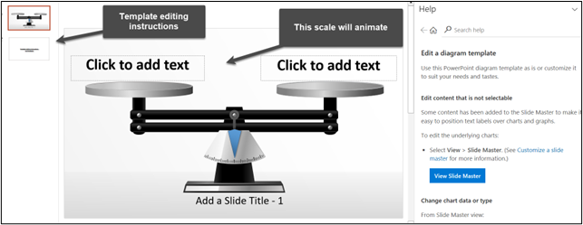
Exhibit 2.7—Example of Help for an Animated Slide From Microsoft - Remember to always look for templates at Microsoft first and then look in Canva or Venngage (they may call them presentations). Although there are other “free” sources available, when you do a search, these will usually cost you your email address.
Start Building Your Own Infographic
The real test of understanding an infographic is to create one of your own, but that means you need to pick an infographic app. A review of infographic software apps will yield a lot of results, so to save time, a comparison is made of three of the more popular infographic tools (Canva, Snappa, and Venngage). Use the tool that you like best!
Perhaps you are at a place in an organization where you would request someone else to design an infographic for you. Keep in mind that creating infographics is considered a basic digital skill, and graphic designers can create beautiful designs, but they won’t know the data as well—and it is your story to tell. So let’s explore how some of the infographic apps work!
Only “free” icons and “free” templates were used here. Notice that the designs are different, but the information is the same.
Steps to Creating an Infographic
The basic process for creating an infographic is as follows.
Step 1—Gather the data and/or conduct research
Step 2—Organize and conceptualize the data story (are you raising awareness or sounding a call to action?) Feel free to use the modified CASS template (Figure 2.1).
Step 3—Draft and revise the visualization.
Apply the general steps to the sample scenario.
Sample Scenario: Impact of Training Infographic
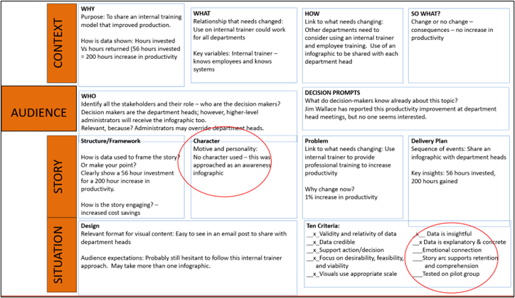
To build an infographic, let’s use the following scenario. Jim Wallace, a department head at NovaDrive Solutions, requested that Alicia, Donald, and Diana attend a meeting. Jim, the supervisor, challenged each of them to create an informational infographic that highlights how professional training can increase productivity. Jim’s goal is to enhance productivity across all departments by expanding the role of internal trainers. It’s important to note that Jim holds the same level of authority as other department heads.
After conducting extensive research on how professional development can improve productivity and retain employees, Jim decided to conduct his own informal study. Two years ago, Jim utilized his training budget to support internal professional development instead of hiring an expensive external trainer. He opted for internal trainers, who are current employees of the company. These internal trainers are responsible for onboarding new employees, introducing them to the manufacturing process, and conducting quality control. As a result, employees have a strong rapport with them.
Although Jim has shared this information in several department meetings, no other department has attempted the internal training model. He aims to showcase his success and convince his peers to follow suit. Therefore, he hopes that the infographic will finally persuade them. Jim has chosen not to share this report with the vice president yet, as he wants to gain support from other department heads first.
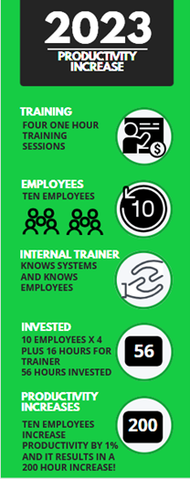
The results of Jim’s internal study, conducted in 2022, are as follows:
- The internal trainer provided four one-hour sessions to 10 employees over four months, totaling 40 hours of training invested.
- Each one-hour training session required three hours of preparation time for the internal trainer. Consequently, training 10 employees resulted in a total of 16 hours of preparation time.
- The evaluations from the 10 employees showed an overall rating of 4.8/5.0 and a confidence level of 5.0/5.0 that the training would enhance their productivity.
- In the subsequent year, these 10 employees worked a total of 20,000 hours. As a direct result of the training, their productivity increased by 1%, leading to a gain of 200 hours of work for the organization.
- Essentially, investing 56 hours in training resulted in 200 hours of increased productivity.
Jim asked Alicia, Donald, and Diana to create an infographic, even though Alicia expressed her concerns, saying, “You know we aren’t graphic designers, right?” Jim responded, “Well, you are familiar with design thinking here at Nova, and you are the best presenters in my department. I believe you can figure it out!”
The following illustrations (see Exhibit 2.8) show infographics built in three different infographic software apps by Alicia, Donald, and Diana. This is the first draft from each employee.
Exhibit 2.8—Three Different Infographic Designs for the Same Scenario
|
Canva Design by Alicia |
Snappa Design by Donald |
Venngage Design by Diana |
 |
 |
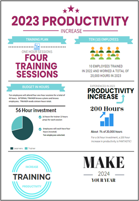 |
Compare the three designs. Which do you like from a first-glance perspective? The supervisor, Jim Wallace, reviewed the three designs and gave the following feedback.
I like the contrast between the green, white, and black, but I don’t see a call to action. The first one does not have a year or discuss the use of an internal trainer. The third one has a call to action, and I like the layout, but it lacks the same flow as the other two. Can the three of you work together and combine your work to make the best one?
Team Discussion: Alicia, Donald, and Diana
Jim’s quick feedback had the three employees wondering what they should do next. The group brought their lunch to the team office and decided to use the modified CASS framework (see Figure 2.1) to evaluate the process. They soon realized that none of the infographics had a character or emotional connection. Diana asked, “Can we turn it into a competition?” Donald wondered, “What would motivate the department heads?” Alicia added, “Is the 1% increase in productivity perceived as minimal and not worth a change?”
Figure 2.17—Use of CASS to Evaluate the Wallace Infographics
2.4 Exercise 5: Create Your First Infographic
Learning Objective #5—Design an effective infographic using a free application
You have been approached by Jim Wallace’s team: Alicia, Donald, and Diana to help revise the infographic.
- First, review the scenario, the CASS evaluation (Figure 2.17), the infographic quality checklist (Figure 2.7), and the team discussion. Review the directions for each infographic software.
- Second, create a free account at one or all three infographic apps (see Exhibit 2.8 for Canva, Snappa, or Venngage). Never give your credit card number for any reason; instead, choose the free option.
- Third, redesign one of the infographics or design a new infographic. Include an image of the infographic in the discussion board and discuss the changes and why you made them. Discuss how Jim Wallace should tell the story. Feel free to expand on some of the team’s comments.
- Respond to your classmates’ posts and provide constructive feedback.
Table 2.6: Comparison of Infographic Software Apps
|
App Name |
Description |
Price |
Tutorials |
|
Canva |
Canva Infographic Maker: Lots of free templates that you can modify. If a teacher or students, even more available for free. Lots of icons and available content |
Free to $12.99 per month OR Canva Pro $119.99/yr for one person Canva for Teams $149/yr. for 5 people |
Lots of free tutorials—video and text |
|
Snappa |
Snappa: For nondesigners. Drag-and-drop. Allows background images. Very easy to use. Great icons. |
Free to $10 per month Team is $20/mo. Limited number of free “saves” |
Video when you first log in |
|
Venngage |
Infographics, but also posters, flyers, beautiful templates—lots of business templates |
Free to $10 per month Premium |
Has you pick three templates from the start, Venngage Academy |
How to Create an Infographic in Canva
All infographic examples used free icons, free templates, and free images. For the “how to” section, find the following instructions for Canva.
Step-by-Step Approach to Use Canva
Note: Screenshots of Canva interface © Canva, https://www.canva.com/. Used with attribution for instructional and illustrative purposes. Annotations added by the author.
- Type www.canva.com in your browser.
- Note that to sign up, it has you choose your experience. It may show teams available at your organization (for now, skip this option).
- The pop-up will ask, “What will you be using Canva for?” Choices include teacher, student, small business, large company, nonprofit or charity, and personal. Choose the selection that relates to your organization. This question by Canva is their way of matching the templates that relate to you, but all the free templates are available to you regardless of how you answer this question.
- The next screen depends on how you answered question three. For example, if you select “teacher,” you will be asked “Where do you work?” with choices that range from elementary to higher education.
- The next screen shows a category of over 50,000 templates. Choose the template section that matches your organization.
- Once you are through the pop-ups and examples, you get to a section called, “What would you like to design?” as shown in Figure 2.18.
Figure 2.18—Canva Design Menu - It may also say “Design anything.” Take the time to explore this section—Canva does much more than just infographics. You can create designs for almost any reason, any event, or any platform. If you click in the search bar, type “business infographic + startup” to see the template design used by Alicia (one of the three employees charged with designing an infographic). If you scroll down several rows of infographics, you will find the one labeled Business Startup Costs.
- The Business Startup Costs template is 800 × 2000 pixels (not an ideal size for all social media platforms). Consider the best size to use for this situation. Canva will display lots of infographics in categories (i.e., business, education, charity, process, and timeline). Look for the ones marked free. Take time to explore. You do not have to use the exact template used in the comparison table.
- To demonstrate, click the Business Startup Costs template to customize it. The tour pop-ups will demonstrate helpful tips. Once you have the template in design mode you will see a side and top menu. Some of the key elements are shown in Figure 2.19. Many of the design features are free, but things like “Add your brand fonts” or clicking “Brand Hub” will prompt you to upgrade. You don’t need the upgrade to create an outstanding infographic. Choose only free options.
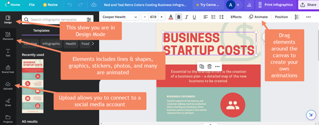
Figure 2.19—Canva Template in Edit Mode - As you explore the menu, note the resize button, the effects button, the animate button, and so on—click through them all so you know what they do.
- Click on an existing icon and then click elements. Use the search bar to search something like calendar as shown in Figure 2.20. The crowns represent upgraded content, so choose items that are free.
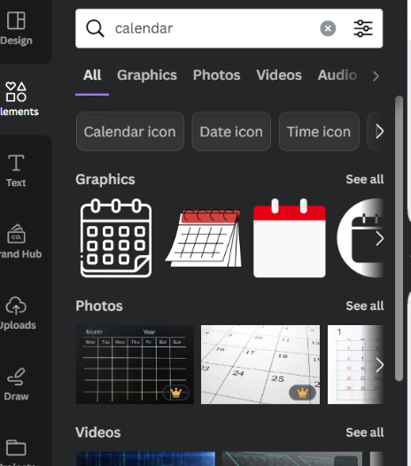
Figure 2.20—Icon Examples - Click on different parts of the template to change the text.
- Review, proofread, and conduct a quality check with the infographic quality checklist (see Figure 2.7).
- When you are done with your design, choose File and Download. It recommends a PDF format, but if you use the drop-down menu, you will see that you can download it in JPG, PNG, PDF standard, PDF print, SVG, MP4 video, and GIF formats.
Now that you have designed your first Canva, consider ways to make this Canva better by reviewing the checklist. How could you make it more concise?
Canva Design School—Courses are free. Link: www.canva.com/designschool/
Skills Factory. (Jan 2, 2023). Canva—Tutorial for Beginners in 13 minutes! 2023 Full Guide. [Video]. YouTube.
How to Create an Infographic in Snappa
All infographic examples used free icons, free templates, and free images. For the “how to” section, find the following instructions for Snappa.
Step-by-Step Approach to Using Snappa
Note: Screenshots of Snappa interface © Snappa, https://snappa.com/. Used with attribution for instructional and illustrative purposes. Annotations added by the author.
- Type https://snappa.com/ and set up your free account. You may see a “Get Started Free” button.
- To create a graphic, Snappa starts by having you set up your graphic size. A normal infographic is 800 pixels × 2000 pixels (see Figure 2.21).
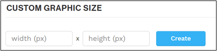
Figure 2.21—Snappa Creation Process Starts With Size - But if you use this option, it will create a blank infographic, so scroll down to Blogging and Infographics and select the infographic shown (don’t worry, you aren’t tied to this infographic). This opens to dozens of free templates (see Figures 2.22 and 2.23).
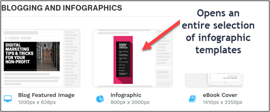
Figure 2.22—Choose Infographic to See Dozens of Free Templates 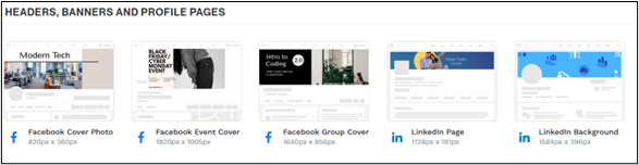
Figure 2.23—Headers, Banners, and Profile Pages - To use the template from Jim Wallace’s team, scroll down to the template labeled 2020 Most Valuable Brands (remember, you can use a different template if you prefer.). In Figure 2.24, notice a full menu that includes icons, vectors, photos, and uploads, a way to change the background, and easy replacement of text.
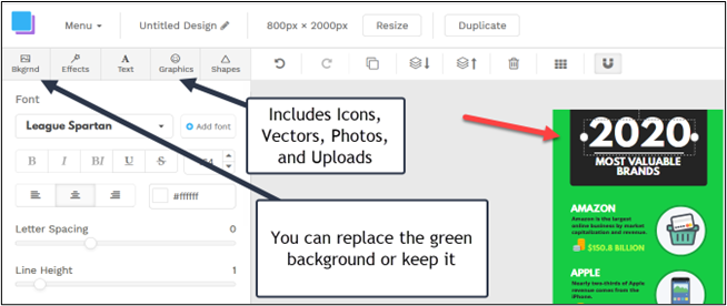
Figure 2.24—Snappa Design Menu - In the initial step, you saw sample templates with their sizes listed. For example, here are some featured designs and their size (this is only a fraction of what is listed at Snappa!).
a. Facebook post (1200px × 900px)
b. Instagram post (1080px × 1080px)
c. blog featured image (1200px × 628px)
d. LinkedIn post (1200px × 628px)
e. infographic (800px × 2000px)
f. ebook cover (1410px × 2250px)
g. Zoom background (1920px × 1080px) - Customize: apply color, style, and specific elements.
- Incorporate data visualizations through elements, charts, or graphs as needed. Is there a call to action?
- Review, proofread, and conduct a quality check with the infographic quality checklist (see Figure 2.7).
- Download and share as a PNG, JPEG, and so on.As you consider Jim Wallace’s team, part of your strategy is to pick the right medium (and best size media) to reach your audience. So what size would you pick?
Snappa Getting Started Videos. Snappa has both video and a knowledge base (help) that has a search feature. Link: https://kb.snappa.com/category/16-getting-started-videos
How to Make an Infographic in Venngage
All infographic examples used free icons, free templates, and free images. For the “how to” section, find the following instructions for Venngage.
Step-by-Step Approach to Use Venngage
- Type www.venngage.com and sign up for a free account.
- Once you log in, choose Templates.
- Next, choose the category, Infographics, and in the search bar, type achievement infographic (or feel free to choose any infographic template). Figure 2.25 illustrates all the ways to customize the template.
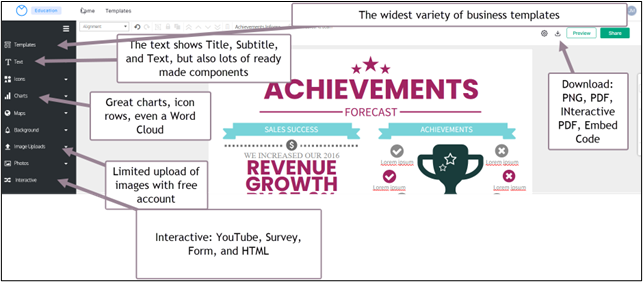
Figure 2.25—Edit Menu in Venngage
Source: Screenshot of Venngage Interface © Venngage, www.venngage.com. Author Annotations Added - Customize the template using the font, size, color, and alignment.
- Make sure the content is appropriate for your audience.
- Insert relevant icons or images.
- Incorporate data visualization to illustrate insight.
- Review infographic—Is there a call to action?
- Add finishing touches (watermark, branding, check colors used for the organization).
- Review and proofread, and use the quality checklist (Figure 2.7).
- Save, share, and download your infographic. Make sure the infographic has a meaningful name. Feel free to share as a PDF, PNG, and so on.
There are many other features that are not noted in Figure 2.25, so take time to explore. All three apps change layouts and offer new features. Venngage now has an AI Card Generator! Now let’s look at the next topic through the lens of artificial intelligence.
2.5 Leverage Visualizations With the Use of Artificial Intelligence
Visualizations can help us navigate a sea of data, making the complex simple and the abstract tangible.
—David McCandless
If you were a beta tester for OpenAI ChatGPT, you were probably amazed to ask the artificial intelligence bot a question and watched as the AI quickly provided a list of answer(s). Like any good researcher, you should use AI for the tool it is and confirm the accuracy of the information. It is not a source, but it can serve as a catalyst for the ideation process. The AI market is expected to grow exponentially and revolutionize every industry because of its ability to learn, recognize patterns, problem-solve, plan, and make decisions. It’s already built into several tools that you use regularly, though you may not know it. For example, Microsoft Word uses AI-powered features like grammar and style suggestions and intelligent proofreading. Google extensively leverages AI across its products with the end goal of enhancing user experience. Even the Hey Google? assistant employs AI to understand and respond to our requests. AI is integrated into Google Maps, Google Photos, and most of Google’s product lineup.
Infographic creators have discovered ChatGPT is great for ideation, writing listicles, and providing users with a starting place for innovation. For example, we asked ChatGPT to “Make a list of quotes that relate to data visualization,” and it gave us 15 quotes identified by the person who said them. And we could refine this list by asking more specific questions. See Figure 2.26 for a partial list.
Figure 2.26—Use of AI ChatGPT for Listicles
AI relies on complex algorithms that can process enormous amounts of data faster than humans, but it’s a “fuzzy front end of the innovation process that entails convergence-divergence dynamic that spans problems and solutions” (Kakatkar et al., 2020, p. 171).
You are exposed to more artificial intelligence than you realize. If you purchased a new automobile recently, it may have been equipped with an Advanced Drive Assistance System (ADAS). AI powers ADAS with a plethora of safety features including machine learning and computer vision to analyze sensor data from cameras, radar, lidar, and other sources all to make real-time decisions for the safety of the passengers. And the use of AI in cars continues to evolve.
Our journey in this chapter has focused on concepts that explain how data visualization can tell a story to connect with an audience. With AI playing a role in data visualization and storytelling, there are exciting possibilities in the future.
Here are just a few futuristic possibilities:
- Automated insights through analyzing patterns, correlations and outliers of large datasets that may have been overlooked.
- Dynamic and interactive visualizations since AI assists users in exploring data from different perspectives including customizations that appeal to the user. AI’s algorithms suggest appropriate visualization types based on the data and the story being told.
- Personalized storytelling to tailor narratives to specific audiences to enhance engagement and understanding.
- Real-time data visualizations allow users to monitor changing trends and patterns specifically helpful in fields like finance, social media analytics, and health care.
Automated data storytelling can’t be far behind. If AI can assist in finding insights today, how close are we to asking ChatGPT “What’s the story behind this data?”
ChatGPT-4 (the paid version) allows you to turn on Advanced Data Analysis and upload up to 10 different documents, and each document can be up to 500MB. It responds to your questions. To see more, feel free to watch the Flow State AI & Automation video.
Flow State AI & Automation. (2023, Oct 25). How to Use ChatGPT-4 Advanced Data Analysis—Analyze your Data with AI. [Video]. YouTube.
Microsoft’s AI—Copilot
Although ChatGPT is phenomenal, the free version was disconnected from the internet in 2022. Copilot is a great alternative. First of all, it is still connected to the internet. Secondly, it provides footnotes linked to sources of the information found. If you have explored ChatGPT, you will note that it sometimes just makes up things, and with no linked notes, it makes it difficult to find the sources to verify the information. Copilot also provides DALL-E 3 image generation for free. Here’s the same list in Copilot (see Figure 2.27).
Figure 2.27—Copilot Listicles
2.3 Self-Assessment: Bias and Unethical Use of Data
Learning Objective #6—Recognize bias and unethical use of data
2.5 Exercise 1: Use AI to Create a Listicle
Learning Objective #6—Recognize bias and unethical use of data
Step 1: Create an account at http://OpenAI.com/chatgpt.
Step 2: For practice, put this prompt in the “Send a message” box: Provide a list of free visuals that can be used for data visualization (depicted in Figure 2.28).
Source: Screenshot of ChatGPT Interface © OpenAI, https://chat.openai.com/. Author Annotations Added
Step 3: Ask ChatGPT to write a different type of list by using this prompt: Create a list of five arguments for using AI and five arguments for not using AI from an ethical standpoint.
Step 4: Discuss your findings either in class or on the discussion board as directed by your instructor.
Chapter 2 Summary
This chapter lays the groundwork for understanding the significance of impactful data visualizations combined with engaging storytelling. In today’s information-saturated world, persuading and captivating our audience becomes increasingly challenging. Data can truly speak when the data storyteller can unravel its complexities and weave a narrative that reveals insights. Design thinking, a human-centered approach that prioritizes the audience, becomes essential. Though what happens when you are not physically present to present your data visualization? Will the audience still hear the voice of the data? This chapter introduces design thinking for storytelling, highlighting contextualization, engagement, emotional connection, simplification and clarity, guiding attention and focus, and retention and comprehension as key strategies to employ when you are not in person as the storyteller.
Storytelling may not be necessary for every aspect of presenting data, but certain data holds vital insights, correlations, and outliers that demand a compelling story that engages the audience. It is crucial to approach both the story and the data visualizations with honesty, impartiality, and ethical considerations.
To evaluate your data storytelling, utilize one of the data storytelling framework templates. It’s important to note that a single framework cannot fit every situation, but observing the similarities among different models can enhance your ability to evaluate data storytelling. Consider models like the CASS template (context, audience, story, and situation) or the simplicity of the 5 Ws. Plan to use an infographic quality checklist for evaluation.
You will sharpen your ability to discern between good, bad, and ugly data visualizations through the practice of evaluating data visualization designs. Remember that poor data visualizations may indicate manipulation, cherry-picking, or mislabeling of data. There is often an intention on the part of the storyteller to exaggerate or downplay certain points. Bad data visualizations typically cross ethical boundaries. Ugly data visualizations involve cluttered charts, ambiguous color schemes, inconsistent design, or improper chart types. Inexperience often leads to ugly data visualizations. On the other hand, good data visualizations effectively communicate by contextualizing, engaging, and emotionally connecting with the audience, simplifying complex data, and guiding the audience’s attention to data insights.
In addition to Iliinsky’s four pillars of visualization (purpose, content, structure, and format), consider the context necessary for the audience to better understand and retain your data story. Remember to review and use all the tools available to determine the quality of your data visualization and the accompanying story.
This chapter introduces various types of infographics, including statistical, process, timeline, interactive, comparison, geographical, and video infographics. Take the time to explore examples of these infographic types and tools like Gapminder, which can tame large datasets and reveal unexpected insights. Furthermore, the chapter introduces three infographic software apps and provides step-by-step instructions for using each of the apps to create your first infographic. The final section of the chapter delves into the future of infographics, exploring the role of artificial intelligence in this field.
Chapter 2 Case: The Power of Infographics
 In this culminating project, apply the knowledge and skills acquired in this chapter to create an engaging and informative infographic that relates to your organization or a topic that interests you. Combine your understanding of design principles, data analysis, and storytelling techniques to showcase your understanding of how infographics can effectively convey complex information in a visually compelling way.
Case Objectives
- Evaluate a data storytelling project for effectiveness.
- Differentiate between effective and ineffective data visualizations.
- Apply design principles and use models (like CASS) to evaluate the infographic to ensure understanding of the information presented in charts and infographics.
- Analyze and interpret data to extract key insights and develop an effective narrative.
- Listen critically to identify powerful narratives and use effective storytelling to frame meaningful messages (Chapter 1, LO 4).
- Design an effective infographic using a free application.
Case Guidelines
- Topic selection: Choose from a topic of personal interest within your organization, or if you prefer, choose anything from environmental issues to historical events, scientific phenomena, social trends, and so on.
- Data gathering and analysis: Conduct research to collect the relevant data and information about your chosen topic. Feel free to speak to a coworker. Critically evaluate the data to ensure credibility and accuracy. Indicate the significant insight that can be highlighted in the infographic.
- Design and visual presentation: Create a visually appealing infographic using one of the digital tools (Canva, Snappa, or Venngage, or others approved by your instructor). Use good design to present a balanced infographic that enhances audience understanding.
- Self-assessment: Use one of the frameworks (like CASS) to evaluate your infographic. Proofread it, and use the infographic quality checklist.
- Storytelling and narrative: Create a compelling narrative that effectively communicates the information presented in the infographic. The narrative should engage the audience, capture their attention, and guide them to draw meaningful conclusions or insights. Incorporate at least two lessons from Chapter 1.
- Target audience: In a separate discussion, indicate the specific target audience your infographic was designed for and the audience’s level of knowledge and interest that influenced how you designed the infographic.
- Presentation, reflection, and feedback: Each student will present their infographic with a narrative/storytelling to the class. Then highlight the key insights and storytelling elements you used. Students should provide feedback to one another using the CASS template and the quality checklist as a guide. After the presentation and feedback, reflect on the design choice, data interpretation, and overall effectiveness.
Chapter 2 References
Beegle, J. (2014). Infographics for dummies. John Wiley & Sons, Inc. Publishing. ProQuest eBook Central Database.
Berinato, S. (2016). Visualizations that really work. Harvard Business Review (Magazine). Visualizations That Really Work (hbr.org)
Brown, T. (2008, June). Design thinking. Harvard Business Review (Magazine). https://hbr.org/2008/06/design-thinking
Buzzelli M. (2020). Modifiable Areal Unit Problem. International Encyclopedia of Human Geography, 169–173. https://doi.org/10.1016/B978-0-08-102295-5.10406-8
Dale Carnegie. (2018). The art of storytelling learning guide. Dale Carnegie eBooklet. http://www.dalecarnegie.com
DeLuca, L. (2018, June 6). How story arcs help you design a better presentation. Linda DeLuca Coaching. https://lindadeluca.net/how-story-arcs-help-you-design-a-better-presentation/
Gemignani, Z. (2023, April 7). How to summarize data using ChatGPT. JuiceAnaltyics. https://www.juiceanalytics.com/writing/how-to-summarize-data-using-chatgpt
Harrison, K. (2015, Jan 20). A good presentation is about data and story. Forbes. http://www.forbes.com
Jaleniauskiene, E., & Kasperiuniene, J. (2023). Infographics in higher education: A scoping review. E-Learning and Digital Media, 20(2), 191–206. https://doi.org/10.1177/20427530221107774
Kakatkar, C., Bilgram, V., & Füller, J. (2020). Innovation analytics: Leveraging artificial intelligence in the innovation process. Business Horizons 63 (2), 171–181. https://www.sciencedirect.com/science/article/abs/pii/S0007681319301533
Kiggins, R. (2016). Changing Boeing culture with design thinking: An interactive, empathic, human-centered approach to innovation. Global Product Data Interoperability Summit 2016. https://gpdisonline.com/event-history/
Kitch, B. (2023, June 28). A complete guide to the design thinking process. Mural-Blog. https://www.mural.co/blog/design-thinking
Konrad (2023). What is design thinking? Konrad Consulting. https://www.konrad.com/research/what-is-design-thinking
Levie, W. & Lentz, R. (1982). Effects of text illustrations: A review of research. ECTJ30, 195–232 https://doi.org/10.1007/BF02765184
Pferdt, F. (2019). Design thinking in 3 steps: How to build a culture of innovation. Future of Marketing. Think with Google. https://www.thinkwithgoogle.com/future-of-marketing/creativity/design-thinking-principles/
Princeton Review. (2019). The Princeton Review 2019 college hopes & worries survey reports on 11,900 students’ and Parents’ “dream” colleges and application perspectives. Cision PR Newswire. https://www.prnewswire.com
Shalloway, A. (2014, Feb 12). Data visualization acts as a campfire which we gather to tell stories. [Tweet]. Twitter. https://twitter.com/alshalloway
Stewart, C. (2019, Nov 5). The best infographic tools from around the web. Creative BloQ: Art and Design Inspiration. https://www.creativebloq.com/infographic/tools-2131971
Swanson, L. (Host). (2017—present). Noah Iliinsky: Data visualization and information design—episode 89. [Audio podcast]. EllessMedia—Content Strategy Insights. https://ellessmedia.com/csi/noah-iliinsky/
Toffler, A. (1984, June 1). Future Shock. (republished from 1970) Bantam Publishing.
UIA. (2022). The encyclopedia of world problems and human potential. Union of International Associations. https://uia.org/encyclopedia
United States Census Bureau. (2020, Sept 17). 2019 American community survey data wheel. United States Census Bureau. https://www.census.gov/library/visualizations/interactive/2019-acs-data-wheel.html
Wallace, D. (2015, March 3). The power & persuasion of infographics. SMX West 2015 Conference. https://www.bruceclay.com/blog/infographics-best-practices-smx/
Zopf, R., Giabbiconi, C. M., Gruber, T., & Müller, M. M. (2004). Attentional modulation of the human somatosensory evoked potential in a trial-by-trial spatial cueing and sustained spatial attention task measured with high density 128 channels EEG. Brain Res. Cogn. Brain Res. 20 491–509.
