
6 Visualize Data With Purpose
Stories change people while statistics give them something to argue about.
—Bernie Siegel, author and surgeon
What Do You Think?
Michelle Goodwin was the president and CEO of a drop-shipping company, named Bridges. The name “Bridges” fit since the software bridged a connection between vendor (seller) and buyer through their manufacturing plants. The company’s success hinged on her software app, but each new medium added to the catalog brought its own set of problems to the code. The company was expanding rapidly into various markets including jewelry, blankets, and acrylic and the manufacturing plants could provide any of the customized options and ship it out within 48 hours.
Michelle was at her limit. She understood coding but interpreting financial statements, financial reports, or general manufacturing reports now took up 80% of her time. She wanted to spend her time dreaming up the next medium for the catalog, not sifting through reports or asking questions that led to asking another and another. Each question left her feeling as if her executive team expected her to know the answer.
She cringed when she recalled her outburst at the last executive meeting. But could they blame her when the finance executive Thomas Perry announced a $40,000 penalty for late payments on the VAT? And what was VAT anyway?
Although the penalty was eventually waived, Michelle asked Thomas to discover how this happened. Thomas quickly answered, “I can tell you exactly why it happened. We have such a high turnover rate in my department; I’ve been using contract help. When we expanded our sales into Europe, none of my contractors had experience or even knew this was a ‘Europe’ thing. This value-added tax (VAT) is assessed at each production stage, and we just didn’t know about it.”
Michelle was good at reading body language and tried to keep her tone calm and friendly. She could tell that Thomas blamed himself for the problem. Michelle leaned in and placed her elbows on the table, “Thomas, I didn’t know your department was so shorthanded. What can we do to fix this and more importantly, how can we develop a reporting setup that alerts me to staffing issues?”
Michelle picked up the coffeepot and topped her cup, asking, “More coffee, Thomas?” Michelle could see that Thomas was giving this some thought. “Michelle, I’ve been giving you mostly raw reports with some graphs on the financial information. What if we brainstorm with the other executives and find out what issues should ‘hit’ our weekly reports?”
Michelle smiled, “Go on—what else?”
Thomas hesitated, “I know the manufacturing reports come in daily to you. Are you aware that the shipping is delayed, and most items aren’t shipped within the 24-hour guideline?”
“What? How is that possible?” Michelle squeaked and reached for the 25-page report and flipped to the last page. She knew the shipping data in hours was summarized there. As she examined it thoroughly, she realized it had the data of only one of the plants, and not all three.
Michelle could feel her face growing hot, but looked directly at Thomas, “It’s clear that we are growing so fast that we need to consider how we give proper oversight and make good decisions.”
“I agree, Michelle. We need to visualize the data with purpose and figure out a way to manage and not become overwhelmed. I think we almost need a retreat, but I don’t think we have time!”
Michelle laughed, “Let’s keep our retreats for the team-building events. How about we look through our current reports and see what has purpose and what is missing.”
Thomas, showing some excitement, turned his laptop so they could both see it, “I’ve been looking at a KPI dashboard in my own area. What if we modified your dashboard to the key pieces of information you need?”
Michelle started laughing, “This is why you were hired, Thomas—you have a knack for anticipating what I need. I think I needed the threat of a $40k penalty to make me realize the importance of purpose!”
Introduction
In the realm of data analysis, the ability to transform raw data into meaningful insights is a skill that sets apart the adept from the novice. In this chapter, we look at visualizing data with purpose, recognizing that the manner in which information is presented can profoundly influence our understanding of complex datasets. Effective data visualization goes beyond creating aesthetically pleasing charts; it is a strategic process that aligns with the specific nature and objective of the data at hand.
We already know the power of visualizations. For example, illustrations are 83% more effective than text for long-term memory and a study by the University of Minnesota indicated that the human brain processes visual information 60,000 times faster than text (Verma, 2023, para. 5, 7). The symbiotic relationship between data types and visualization techniques emphasizes the importance of tailoring visualization to the inherent characteristics of the dataset. Essentially, a line chart may not reveal the same insight as a bar chart. Or even worse—the presenter tries to show everything, and insight is lost in the clutter.
This chapter also looks at qualitative data visualizations and the pivotal role in uncovering patterns and trends from an academic setting. In previous chapters, the authors demonstrated outliers and correlations. This chapter looks at guidelines and standards, particularly those engaged in academic pursuits such as writing theses and dissertations, and how the APA 7th edition style guide is used. The chapter will cover best practices for incorporating visualizations into scholarly works, ensuring that the clarity and integrity of the data are preserved while meeting the stringent requirements of academic standards.
Purpose should drive the use of key performance indicators (KPI) for dashboards to provide a snapshot of the way things are now. An example of an operational KPI dashboard might be tracking severe weather and accidents to help local governments assign utility vehicles and first responders. In a corporate setting, KPIs should align with the organizational objectives and can include sales targets, production output, shipping goals, and more nonfinancial data like customer satisfaction scores, or employee turnover and/or overtime hours. And KPIs that are aligned with other frameworks like a Balanced Scorecard approach can be powerful in reaching strategic objectives.
This chapter serves as a comprehensive guide for anyone seeking to visualize data with purpose. Aligning visualization techniques with data types, unraveling qualitative intricacies, aligning strategies and KPIs, or navigating academic reporting, require a presenter to use the tools necessary to extract meaningful insight.
Chapter 6 addresses the following learning objectives.
Learning Objectives
At the end of this chapter, students should be able to:
- LO 1: Choose the appropriate infographic and chart based on data type.
- LO 2: Design appropriate visualizations for key performance indicators (KPIs).
- LO 3: Apply appropriate visualizations that meet academic standards and follow APA 7th edition.
Key Terms: APA 7th edition, categorical, continuous, data type, discrete, interval scales, key performance indicators (KPIs), nominal, normally distributed, ordinal, parametric test, Qlik, Qlik Sense, ratio scales, SMART goals, scale, skewed data, variables
Download Chapter 6 PowerPoint (8 MB)
Download Chapter 6 Student Files (<1 MB).
6.1 Best Graphical Visualizations Based on Data Type and Purpose
Often the most effective way to describe, explore, and summarize a set of numbers—even a very large set—is to look at pictures of those numbers.
—Edward Tufte, The Visual Display of Quantitative Information
Understanding your data type will help you choose a suitable graph or infographic, but understanding your purpose in conjunction with the data type helps you reach your audience and present your insights.
In any setting (but especially an academic setting), understanding your data types will help you choose a suitable summary statistic and analysis, and the best graph or data visualization. In an academic setting, students tend to leap to hypothesis testing. In a corporate setting, the typical KPIs are used, when it might be better to investigate the data with summary statistics and summary charts. Get in the habit of sorting your data with filters to determine issues like outliers, missing data, and trends. Use quick summary and aggregations like SUM, AVERAGE, and COUNT. With the growing application of artificial intelligence, upload data and ask the AI “What does this data tell me?” Remember, charts don’t need to be in statistical software (although they can). You can create most of the charts in Excel or a more advanced Power BI.
Perhaps you have seen these terms in an undergraduate statistics course, but how many of these types of data can you explain as listed in Exhibit 6.1?
Exhibit 6.1—Types of Data
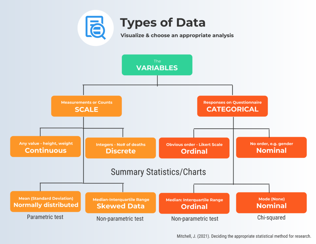
In the realm of data analysis, understanding the two primary types plays a crucial role: scale and categorical data. Scale data are also known as quantitative or numerical data whereas categorical data are often termed qualitative or nominal data representing distinct categories without inherent numerical significance. Scales can be either continuous or discrete and the types of summary statistics will depend on if the data are normally distributed or skewed. For categorical data type, you look at either ordinal or nominal. Make sure to look at the examples with each data type.
Now look at the ways to describe and visualize the data when we have nominal data, ordinal data, interval data, and ratio data.
Nominal scale describes the variable with categories. “If you were to assign a numerical value to a category; a higher score would not necessarily mean that there was more of some quality” (Adams & McGuire, 2022, p. 66)
Examples of nominal variables: zip code, eye color, political party, gender.
- Calculations: frequency distribution, percentages, mode, describing ranking
- Visualizations: bar charts, pie charts. Nominal data represents categories with no inherent order, so visual representations focus on the distribution of categories.
“Ordinal scales represent rankings that have magnitude, but we do not assume that the intervals between the rankings are equal. Because we do not assume equal intervals with ordinal data, we do not calculate the mean and standard deviation” (Adams & McGuire, 2022, p. 154).
Examples of ordinal variables: socioeconomic status (low, middle, and high income), survey responses like a satisfaction rating (extremely dislike, dislike, neutral, like, extremely like).
- Calculations: frequencies, percentages, median.
- Visualizations: bar charts, stacked bar charts, line charts. Since ordinal data has a meaningful order, display the rank order of categories.
“Interval scales are ratings in which we assume there are equal intervals between scores . . . , do not have a true zero” (Adams & McGuire, 2022, p. 154).
Examples of interval variables: SAT score (200–800), credit score (300–850).
- Calculations: frequencies, percentages (*mean if normally distributed, median if not), standard deviation.
- Visualizations: histograms, line charts, box plots. Interval data allows for meaningful differences between values, so you can use more advanced statistics like mean and standard deviation.
“Ratio scales measure quantity and have both equal intervals and a true zero” (Adams & McGuire, p. 154).
Examples of ratio variables: pulse, weight, dose amount, income, age.
- Calculations: frequencies, percentages, mean (if normally distributed), median (if not normally distributed), standard deviation, range.
- Visualizations: histograms, line charts, box plots, scatterplots. Ratio data, like interval data, allow for more advanced calculations. In addition to the mean and standard deviation, you can also calculate the range. Scatterplots are useful for exploring Power BI Desktop to Power BIing relationships between two ratio variables.
A word of caution: Specific analyses and graphs (or infographics) can vary depending on your purpose (like the research question), the characteristics of the data, and the audience you are communicating with. Always consider the context and purpose. And always see if your data are normally distributed. It will impact what statistic you report (mean or median) and will impact the type of statistical test (parametric or nonparametric).
* A big difference between the mean and the median indicates skewed data or influential outliers.
Table 6.1 presents a quick view of the type of graphical display that matches the variable type and data type and what purpose it can serve.
Table 6.1: Which Graphical Display Fits the Purpose?
|
Graphical Display |
Analysis Level |
Data Type |
Purpose |
Summary Statistic |
|
Bar chart |
Univariate for 2 or more groups |
Categorical: Nominal or Ordinal |
Compare frequencies or proportions |
Frequency, Percentage |
|
Comparative Bar Chart |
Univariate for 2 or more groups |
Categorical: Nominal or Ordinal |
Compare frequencies or values across categories |
Frequency, Percentage, mean |
|
Pie Chart |
Univariate |
Categorical: Nominal |
Show proportions of a whole |
Percentage |
|
Box plot |
Univariate for 2 or more groups |
Scale: Interval, or Ratio |
Show distribution and identify outliers |
Median, Quartiles, and IQR, and outliers |
|
Dot plot |
Univariate |
Both: Categorical or Scale |
Display individual data points |
Depends on the type of data |
|
Comparative dot plot |
Univariate for 2 or more groups |
Categorical: Nominal or Ordinal |
Compare individual data points across categories |
Depends on the type of data |
|
Stem-and-leaf display |
Univariate |
Interval, or Ratio |
Show distribution and individual data points |
Display counts |
|
Comparative stem-and-leaf display |
Univariate for 2 groups |
Interval, or Ratio |
Compare 2 or more groups of individual data points |
Display counts to compare |
|
Histogram |
Univariate |
Scale: Interval, or Ratio |
Display distribution of continuous data |
Mean, Median, Standard deviation |
|
Scatterplot |
Bivariate |
Scale: Interval, or Ratio |
Explore relationships between two variables |
Correlation coefficient |
|
Time series plot |
Univariate, collected over time |
Scale: Interval or Ratio |
Investigate trends over time |
Means by time point (if appropriate), Median, Time-related statistics |
|
Bubble Chart |
Bivariate |
Both: Categorical and Scale |
Display three dimensions of data with markers |
Depends on the type of data |
|
Heatmap |
Univariate or Bivariate |
Both: Categorical or Scale |
Visualize the magnitude of a phenomenon |
Mean, Median (if applicable) |
The purpose of most of these graphical displays is to understand the distribution—keep that thought in mind as we move through the examples.
Let’s review some of the terms. Here is a quick overview of some types of variables:
- univariate dataset: consists of observations on a single variable made on individuals in a sample (e.g., height).
- bivariate dataset: where two different characteristics are measured simultaneously (for example—swimming pool attendance and temperature). Usually, the researcher is trying to find out the relationship, causes and explanations. These variables are often plotted on x- and y-axes on various graphs. One variable is dependent, and one is independent.
- multivariate dataset: when the data involve three or more variables (e.g., a marketing researcher wants to compare three different social media ads using the click-through rate for both men and women).
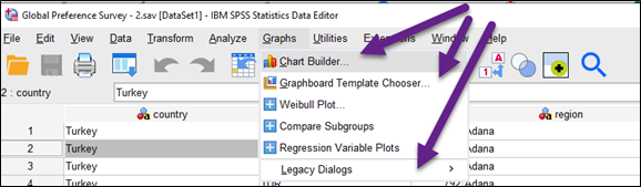
Graphs and Charts in Statistical Package for Social Sciences (SPSS)
Most researchers underestimate the possible graphics in statistical software programs like SPSS. You aren’t expected to create graphs and charts in SPSS (most of us prefer Excel); it is important to at least know what is available.
Let’s look at some of the features using a public dataset. SPSS offers chart builder, Graphboard template chooser, and legacy dialogues. Figure 6.1 shows the Chart Builder in SPSS.
Figure 6.1—SPSS Graph and Chart Capability
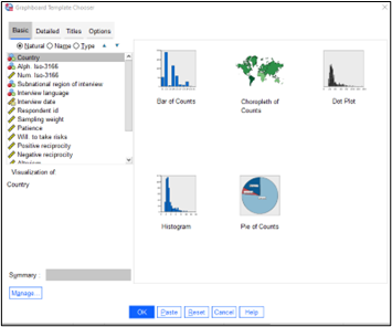
The Graphboard Template chooser (Figures 6.1 and 6.2) includes Basic, Detailed, Title, and Options. When you click on a nominal category (i.e., country), it will give you specific charts that are appropriate for the data, but a word of caution. Even if it shows an appropriate chart type for the data, make sure you think about what to expect. For example, if the dataset had 49 countries; imagine what a pie sliced 49 times would look like!
SPSS manages statistical procedures and graphical analysis in an integrated manner. But the biggest reason to use SPSS might be the preferences of the research community and the requirements of your discipline. But for most of us, we are much better working with Excel, because it is what we know. Although we don’t delve into all the capabilities of SPSS in this textbook, it is still a good idea to know what you can do in it.
There are some similarities—for example in the Graphboard template chooser, you see the type of charts SPSS recommends based on the data type (Figure 6.2).
Figure 6.2—Graphboard Template Chooser
All statistical software packages have graphing capability, and most are fairly intuitive. And Excel will meet most of your requirements. But let’s look at some of the known issues in Excel as well as some tips and tricks to help you tell your data story better.
Consider Purpose
Label data point or axis: Consider your purpose when deciding on either axis label or labeling the data points directly. For big picture trends, use the axis. If specific values are important, label the data point. So if you label the data point, eliminate the axis.
Font size and type: Another important aspect is font type and font size. Keep it simple and choose fonts that are easy to read. A study conducted by Song and Schwarz (2008) gave students instructions on exercising. Half the students were given written instructions in an easy-to-read Arial font. The other half were given instructions using a brushstroke font. The results? Students with the script font (brushstroke) expected the exercise routine to be difficult and indicated they were less likely to try it. So if your chart looks complicated, the message may get lost.
Default settings: Unfortunately, Excel’s default settings for graphs will include gridlines, two decimal places, tick marks, and its own interpretation for colors. Excel will also include a legend that you might not need as well as a poor title name and field buttons. Some experts refer to these as “visual noise.” If you have a specific chart style preference, the ideal step is to create a chart template, rather than customizing each chart.
Emphasize purpose: Many data storytellers use arrows to draw the audience’s attention. However, you can also use images with annotations. For example, assume you are looking at the history of online users from the time your organization launched their website until today. You noticed specific surges in online users as you look at the trendline. As you dive into the data, you discover that there was an increase in online users after your organization launched Facebook, and then another surge when you launched Twitter. Adding a graph with an explanation works well, but you could also use the Facebook logo and Twitter logo along with the text, like an annotation.
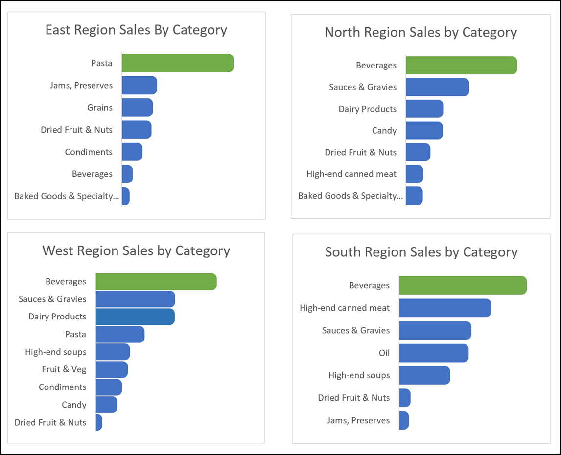
Prechunk: Most people can only process four to seven pieces of information, so it makes sense to evaluate the data and think of how best to show it. Suppose your main point is to show the largest sale category for each region with a sense of the variety of products sold. In Figure 6.3, you can figure it out with some effort, but you have lots of distractions or noise.
Figure 6.3—Showing Sales by Region and Category in One Chart
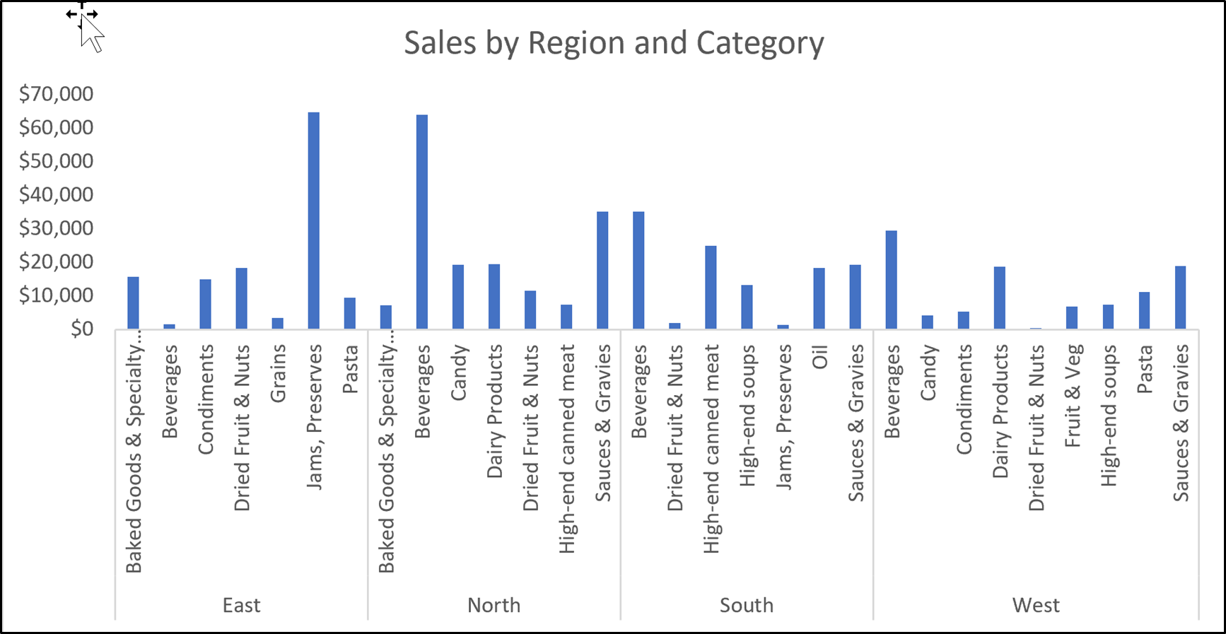
Instead of one large chart for XCaliber Foods, you can use multiple charts, one for each region, highlighting the largest category with a distinct color and use an overlay or animated text to show sale details in the East, West, North, and South areas of the United States.
In addition, annotating with text could show the percentage of the largest category to the overall category in the region as well as the percentage of this category overall. The annotations can be brought in as an overlay (like adding animation in a PowerPoint presentation). But let’s look at the insights (Figure 6.4) from this prechunk approach with no overlay.
Insight #1: In the multiple charts, it is obvious that three out of four regions have beverages as the largest sales category.
Insight #2: In multiple charts in the West region, the variety of products is larger than all other regions.
Insight #3: Pasta has the highest sales in the East, but pasta is barely represented in the other regions. What insight could a presenter bring for this finding?
Figure 6.4—Prechunk: Show Multiple Charts
Now let’s look at the steps to create custom templates in Excel, so it makes this process easier. Also, let’s work with a previous dataset, Campus Travel Ticket Sales, so the only new thing you are learning is saving a chart as a template.
 Step-by-Step Approach to Creating a Custom Template in Excel
1. Open the Excel file, “Campus Travel Ticket Sales.” (This is in Chapter 4 files.)
2. Create a chart using the column for salesperson and the column indicating the number of tickets sold. The default looks like the following (notice the gridlines, the axis, the large gaps, the color blue, and the visible field buttons).
3. Now customize the chart so it looks like the chart on the right.
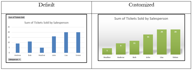
4. Right-click the customized chart and Save as Template, and for file name, use “Green_Dashboard.”
5. Now click in the raw data and insert a PivotTable. Pull destination to rows and tickets sold to values. It should look like Figure 6.6.
6. Now select a cell in the PivotTable and click Insert and then recommended charts.
7. Click the Templates folder and choose the customized “Green_Dashboard chart.” It should look like the following. Notice that the only thing you need to change is the title and that this format works with your other graph (see Figure 6.7).
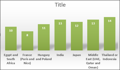
What action title should we use for the graphic? That would depend on the purpose and the insight you wished to share.
6.1 Self-Assessment: Choose Appropriate Infographics and Charts
Learning Objective #1—Choose the appropriate infographic and chart based on data type

6.2 Visualize Key Performance Indicators
If you can’t measure it, you can’t improve it.
—Peter Drucker
If you do a search in this textbook, you will discover that key performance indicators (KPIs) have been discussed in several chapters. This section is devoted to a unique use of KPIs. The application of KPIs in unconventional contexts reflects a paradigm shift in how we assess progress and tackle global challenges. The visualization of KPIs in these diverse settings goes beyond data representation; it serves as a catalyst for informed decision-making, public engagement, and the pursuit of a more sustainable and equitable future. Look at some of the unique ways KPIs are visualized.
European Commission Use Qlik and Narrate Storytelling to Show Progress
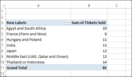
The European Union is the EU’s politically independent executive arm. It draws up proposals for new European legislation, helps shape the EU’s overall strategy and monitors the EU budget. KPIs play a pivotal role in tracking the progress of each goal, providing a quantifiable framework for assessing impact. “Since its launch in 2015, data.europa.eu has been the main point of access at the EU level to public sector information published across Europe . . . with aims to improve access to open data, as well as foster both high-quality open data publication and the reuse of open data to create impact” (Measuring Open Data Maturity, 2023, para 3). To that end, the European Commission supports Single Electronic Data Interchange Area (SEDIA) on their Horizon Dashboard. But even more interesting is the EC’s use of Qlik. The European Union uses Qlik to add a “Narrative Storytelling” feature (see Exhibit 6.2) so a user can take snapshots of current graphics and create their own story.
Exhibit 6.2—How a User Can Use Qlik With the EU SDGs
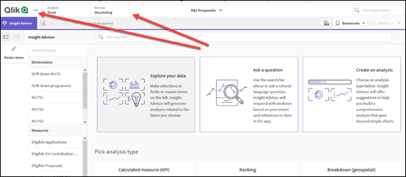
Essentially, you add the graphs that provide insight to the Qlik library and place them in the order that supports a good story with related insights. As you can see, Qlik allows a viewer to look at the R&I Proposals in European countries to narrate a story. To better understand this process, watch “Building Your Story,” which was produced in 2022 by Qlik Help.
This video is a little over six minutes long.
 Qlik Help. (2022, Apr 29). Building Your Story. [Video]. YouTube.
Keep in mind that Qlik (or Qlik Sense) is one of many business intelligence tools. Here is a list of other software apps that offer a similar product. The main reason to include so many on the list is the shift to public data.
- SAP Business Objects Business Intelligence
- Statistical Analysis Systems (SAS)
- Microsoft Power BI (this is covered in our next chapter!)
- Tableau (remember Tableau public is free)
- Zoho Analytics
- Oracle Business Intelligence
- Qlik Sense
United Nations and the 17 SDGs
The United Nations Sustainable Development Goals (SDGs) represent an ambitious agenda aimed at addressing global challenges, ranging from climate action to social equality. KPIs play a pivotal role in tracking the progress of each goal, providing a quantifiable framework for assessing impact. The point to make here is the use of icons that drive every report. This short video gives a quick introduction to the SDGs.
This video is a little over one minute long.
United Nations. (2018, Apr 20). Do you know all 17 SDGs? [Video]. YouTube.
Look at how thoroughly the United Nations carries out the icon and even the icon color. For example, Goal 1 is “No Poverty” with a bright red background. If you click on Goal 1 at https://sdgs.un.org/goals, and scroll down, the infographic is a white background with red lettering with the title “End poverty in all forms everywhere.” Try visiting the website to notice how well the United Nations uses color and icons to keep a wealth of data organized. Visualization of KPIs often takes the form of interactive dashboards, heatmaps, and thematic charts.
Key Performance Indicator—What Is Important?
Organizations will have different KPI visualizations depending on the purpose, the stakeholders, and the time available to look at them, but there are some specific components to consider when you are organizing the KPIs for your organization. According to Kerzner, there are six attributes to KPIs: predictive, measurable, actionable, relevant, automated, and few in number (2017, pp. 210–211).
Think about what we mean when using the words “key,” “performance,” and “indicator.”
- key = major contribution to success or failure
- performance = provides measurable, quantifiable, and controllable elements
- indicator = valid representation of present performance
If you start looking at KPIs for your organization type, you will find that many organizations have KPI creep. This may mean that stakeholders are asking for information that may not necessarily have a specific target. For example, University KPIs often have the location of students as part of their reporting and insights. Board of trustee members want to know where the students are coming from (which state), the international student’s location, and other interesting factors. Some organizations split up entire dashboards by an overall topic (not necessarily tied to KPIs). See the following example from the University of Tennessee. You will see several dashboards: Graduate Blueprint, Enrollment Management, Human Resource, Academic Unit Stats, Student Success, Academic Reporting Portal, Faculty Reporting Database, and others. Maine’s Public Universities provides a one-page summary with a three-year trend key letting you quickly see either meeting goal, neutral, or not meeting goal. (This site uses Tableau public.)
 The University of Tennessee: Data Central—Decision Support Resources for the UTK Community. (2023). https://data.utk.edu/executivedashboard/
Maine’s Public Universities. (2023). Board of Trustee Accountability Data. https://www.maine.edu/databook/ums-dashboard/
6.2 Self-Assessment: Key Performance Indicators
Learning Objective #2—Design appropriate visualizations for key performance indicators (KPIs)
6.2 Exercise 1: Key Performance Indicators
Learning Objective #2—Design appropriate visualizations for key performance indicators (KPIs)
 Outline the main KPIs for your organization. Next, determine how they follow what is called SMART goals (specific, measurable, achievable, relevant, and time-bound). Set it up as follows and show how the KPI meets the SMART goals:
a. Key performance indicator:
i. Specific
ii. Measurable
iii. Achievable
iv. Relevant
v. Time-bound
Discussion Question #1
Research your industry for common KPIs. Be ready to discuss how they contribute to the success of the organization.
Discussion Question #2
Examine the features of Qlik that make it a suitable platform for visualizing KPIs. How does Qlik (or Qlik Sense) enhance the presentation and interpretation of complex data, and what advantages does it offer compared to other data visualization tools?
6.3 Academic Reporting Standards to Accompany Visualizations
Clear thinking becomes clear writing; one can’t exist without the other.
—William Zinsser, Writing Well: The Classic Guide to Writing Nonfiction
Most graduate programs require a specific style and grammar guideline for all theses and dissertations, and the style guides can vary by discipline. This text will show examples following APA 7th edition for the more common statistical tests. Don’t worry if you struggle a little to understand the statistical terms. The point here is to become familiar with the type of standards required by APA 7th edition style guide.
Many students have questioned, “Why so strict?” The American Psychological Association (APA) publishes guidelines to ensure consistency and clarity in scholarly writing. They are standardized so readers can quickly locate and interpret information. The APA also wants consistency across publications, so it aligns with the formatting standards of a broader academic community. Part of the strict requirements is to ensure clarity and interpretability. While the guidelines may seem strict, they serve the broader goals of enhancing communication and maintaining a high professional standard in academic writing.
APA 7th Edition Format for Figures (Charts and Other Visuals)
The APA style guidelines consider graphs and other visuals as “figures.” There are specific guidelines for sample bar graphs, line graphs, flowcharts, sample maps, and a variety of infographics that clarify the text. In order to help with this, the APA Style website offers examples as well as a downloadable Word file.
APA 7th Edition Website. Link: https://apastyle.apa.org/style-grammar-guidelines/tables-figures/sample-figures
APA 7th Edition Table Format for t-test
For this example, let’s look at a subset from Larson & Morris’s (2008) study “Sex and Salary.” A survey of purchasing and supply professionals, answering the age-old question, “Are women still paid less than men for comparable work?”
The actual sample was large (over 300), but here is the subset of the data. The amounts are in the thousands, and there are 10 samples for each group:
Men: 81, 69, 81, 76, 76, 74, 69, 76, 79, 65
Women: 78, 60, 67, 61, 62, 73, 71, 58, 68, 48
Review the output illustration of the independent t-test. Be consistent throughout. A caution: Always review the latest APA updates. Requirements and suggestions change!
#1—Include the mean and standard deviation of both groups
#2—Include Levene’s test result
#3—Include the calculated t-value
#4—Include the degrees of freedom
#5—Include the significance (report p values less than .001 as p < .001)
#6—Include the effect size
Exhibit 6.3—Sample t-test Information—Are Women Paid Less?
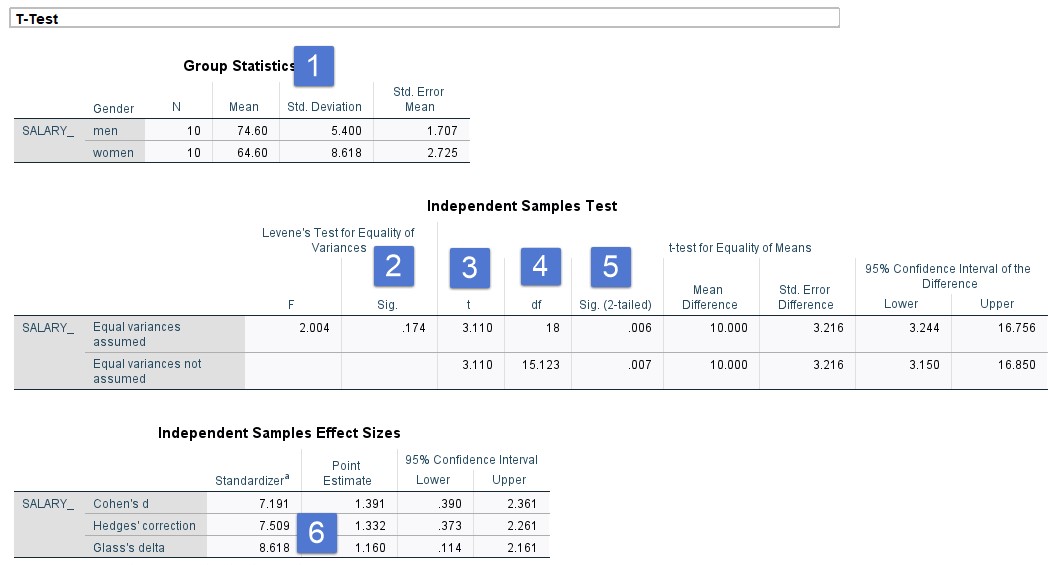
Please note that the APA 7th edition manual Section 6.36 suggests that standard deviations should be one decimal, but the APA Sample Tables show several t-test tables with three decimal places! So please be consistent as well as discuss this with your thesis or dissertation committee. Keep in mind that you could have a narrative or a table but not both.
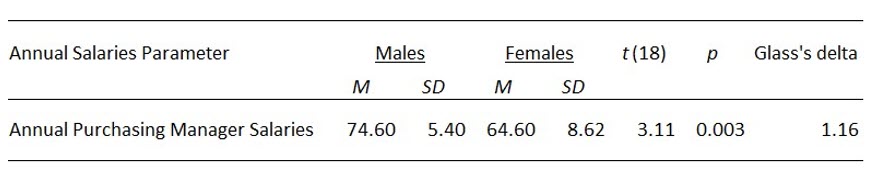
Independent t-test Sample Write-Up
An independent t-test sample was conducted to compare annual salaries for male purchasing managers and female purchasing managers. Levene’s Test for equality of variance (showed no violations, p = .174). Results indicate that males (M = 74.60, SD = 5.40) earned significantly more than females (M = 64.40 and SD = 8.618).
t (18) = 3.11, p < .001, Glass’s delta = 1.160
The effect size is high; the difference between the two means is more than one standard deviation.
Table 6.2: Independent t-test Sample Table
The APA manual has lots of help on sample tables. Bookmark the following reference.
American Psychological Association. (2023). APA Style—Sample Tables. Sample tables (apa.org) https://apastyle.apa.org/style-grammar-guidelines/tables-figures/sample-tables.
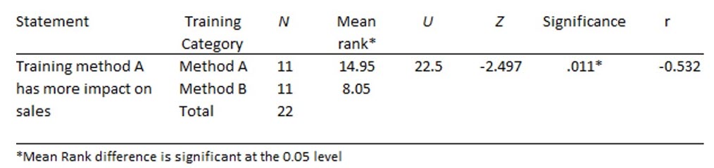
APA 7th Edition Table Format for Mann-Whitney U Test
The sample dataset is for two groups, training method A and training method B. Essentially, training method A is for group 1 and training method B is for group 2. There are 11 participants in each group. After the salesman training, a month of sales data was collected. Preliminary exploration determined that the data fit a nonparametric test (the Mann-Whitney U test). Although we don’t show you the SPSS results, the following requirements should be met:
#1—Include the median of both groups
#2—Include the U test results
#3—Include the sample size of each group
#4—Include the z score
#5—Include the significance (report p significance from Exact)
#6—Include the effect size
#7—Include the confidence interval
Figure 6.8—Mann-Whitney U Test: Training Methods (Excel, SPSS, and Online Z Calculator)
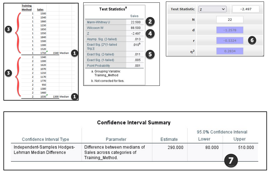
Mann-Whitney U Test Sample Write-Up
Training method A had sales of (Mdn = $1540, n = 11) and were higher than those in training method B (Mdn = $1300, n = 11). A Mann-Whitney test indicated that this difference was statistically significant, U = 22.5, Z = −2.497, p =.011, with a larger effect size, r = −.5324, 95% CI [80, 510].
Mann-Whitney U Test Sample Tables
In this section, let’s look at a couple of examples. The first example is set up for one test and it does not include the confidence interval.
Table 6.3: Example Mann-Whitney U Table
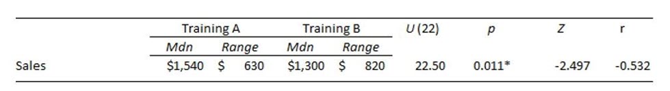
The second table assumes that you will add other statements. For example, you may have conducted a survey with the training that may be relevant. Again, the confidence interval would be placed in narrative if not included in the table.
Table 6.4: Mann-Whitney U Table With Additional Statements
APA 7th Edition Table Format for ANOVA
Sample study: Your company has timber yards in all four regions of the United States, and you’ve received complaints about your COVID-19 policies, but you don’t know if the complaints are mostly in one region or not. You randomly choose five stores in each region to collect the number of complaints (mainly guests who do not want to wear a mask) from their store in the last month. You want to see if there is a difference between regions before you make any changes to the COVID-19 policies. The raw data are shown in Figure 6.9.
Figure 6.9—Raw Data for ANOVA

The following requirements should be considered.
#1—Include the mean and standard deviation for all groups.
#2—Include the F test results with degrees of freedom.
#3—Include the sample size of each group.
#4—Include the significance.
#5—Include the effect size (and in the narrative indicate which one was used).
#6—Include the confidence interval (probably in a further discussion).
The order of the exhibits shown is not the actual order you would complete these in SPSS; however, it helps to see where each item is found.
Figure 6.10—ANOVA Post Hoc Test in SPSS
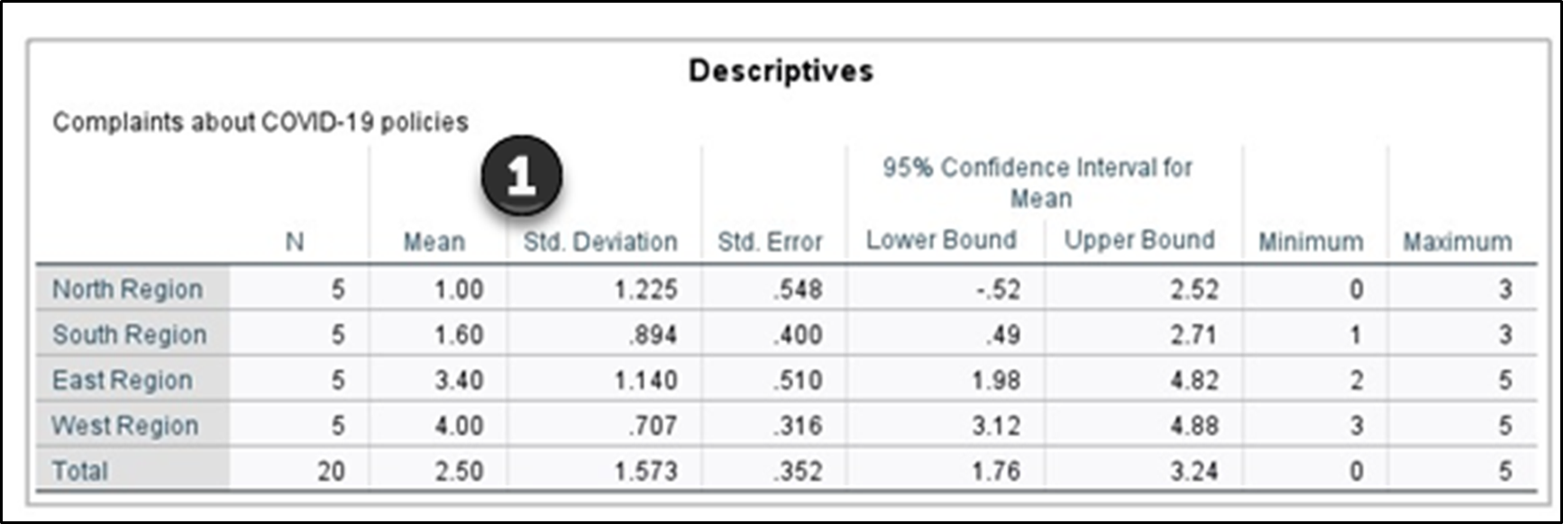
Figure 6.11—ANOVA Test in SPSS
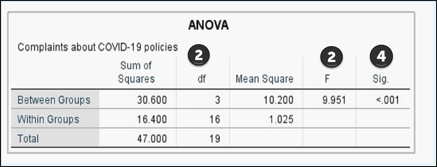
Figure 6.12—ANOVA Effect Size
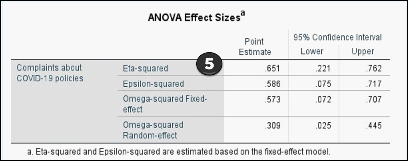
Keep in mind that you can have a narrative or a table but not both.
ANOVA Test Sample Write-Up
There was significant difference among the four regions on COVID-19 mask complaints, F(3, 16) = 9.951, p < .001, η2p = .65. Post hoc testing revealed significant differences between pairs of regions with North (M = 1.0, SD = 1.23) and South (M = 1.60, SD = .89) having fewer complaints than East (M = 3.40, SD = 1.14) and West (M = 4.00, SD = 0.71). These findings indicate that there are more complaints in the East and West regions.
Table 6.5: ANOVA Test Sample
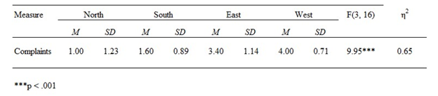
This table shows the significance overall, but you would not know the significance between each region from reviewing this table.
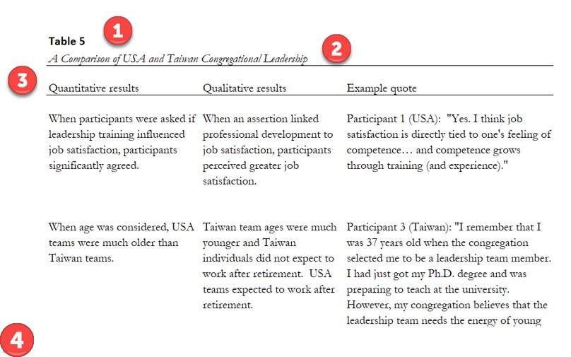
APA 7th Edition Table Format for Mixed Methods
Many researchers approach a question using two different methods (qualitative and quantitative), which is then called a mixed methods study. The two methods often entail a survey that has both qualitative open-ended questions and Likert scale questions about perceptions. This helps the research gain a deeper understanding of the issue as well as more confidence in the findings. This process is triangulation. Keep in mind that data collection could include interviews, surveys, focus group interviews, and data captured that is factual and related to the project.
Let’s look at the following example:
#1—The table is bold, no italics, no period ending.
#2—The title is in italics.
#3—The Mixed Methods table shows Quantitative results, Qualitative results, and Example quote. The actual APA manual shows a hanging indent, but most dissertations and theses appear to have no indents.
#4—It is possible to have notes if the table cannot be understood from the table title or the narrative.
Table 6.6: Example of a Mixed Methods Table
Please make sure to review the APA guidelines online for specific examples that resonate with you!
6.3 Self-Assessment: APA 7th Edition Format
Learning Objective #3—Apply appropriate visualizations that meet academic standards and follow APA 7th edition
Chapter 6 Summary
This chapter underscores the fundamental “purpose” behind visualizing data, elucidating how specific data types align more effectively with chart formats. Data types were presented to show that certain charts fit data better than others. “Exhibit 6.1—Types of Data” organized the different types of data into nominal, categorical, ordinal, interval, and ratio scales with example calculations and visualizations. “Table 6.1: Which Graphical Display Fits the Purpose?” takes the decision-making process to a more sophisticated level by amalgamating the intended purpose with the most suitable visualization type.
This chapter imparted insights on refining visualizations, encompassing techniques such as noise reduction and the significance of appropriate labeling, including font choices. Notably, default settings in Microsoft Excel lack alerts regarding the suitability of a chart for the given data. Consequently, the recommendation is to craft a personalized set of chart templates so your organization can ensure consistency in appearance. All of this section leads to the importance of chunking. An exploration of “chunking” considers the cognitive strategy that involves grouping pieces of information to enhance user retention and facilitate a comprehensive understanding of collective insights. Chunking is a method of grouping individual pieces of information, so the user remembers the point and sees the collective insight.
Key performance indicators were discussed in a new light to show how nonprofits and governmental units are engaging the public to choose insights that fit their story. Organizations like the European Commission are using tools like Qlik and Qlik Sense to support narrate storytelling with open data and data insights. A user can choose the data insights to support the story that has meaning to them. This is a powerful trend that supports transparency.
The subsequent section delves into academic reporting standards to accompany visualizations, underscoring the significance of adhering to style guidelines specific to one’s discipline. Many students in the early stages of writing a thesis or a dissertation may be unaware of guidelines dictating how data should be presented in tables or the appropriate format for charts like histograms. Statistical output was explored to determine the appropriate way to present that data according to APA 7th edition guidelines. It is not necessary to know how to use SPSS; instead, it is working with the output to recognize the patterns of how the data should be presented.
Chapter 6 Case: Create Appropriate Infographics and Charts
 You currently work as a data analyst for an online retailer (Walmart) in the United States and your boss just asked you to create charts to show the revenue and growth of Walmart, as well as highlight the fastest-growing market segmentation in the sector. Your boss gave you the sector market segmentation data (Table 6.7) and Walmart’s revenue from MarketLine (Table 6.8) to get you started. KPI Targets: Growth of 5% from 2021 to 2022 across all categories.
Table 6.7: United States Online Retail Sector Category Segmentation
|
Category |
2017 |
2018 |
2019 |
2020 |
2021 |
2022 |
2017–22 |
|
Electrical & Electronics Retail |
108,266.5 |
121,206.6 |
133,467.1 |
199,434.9 |
219,537.3 |
223,319.0 |
15.6 |
|
Home & Garden Products |
49,958.0 |
60,511.6 |
71,617.8 |
123,624.3 |
159,623.4 |
183,783.8 |
29.8 |
|
Apparel Retail |
69,598.4 |
78,565.5 |
87,333.5 |
107,835.0 |
125,301.6 |
137,103.4 |
14.5 |
|
Food & Grocery Retail |
30,022.8 |
37,292.0 |
46,793.1 |
83,380.6 |
102,019.4 |
119,645.1 |
31.9 |
|
Furniture & Floor Coverings |
22,653.4 |
26,281.9 |
29,444.9 |
42,514.1 |
47,046.2 |
50,835.5 |
17.5 |
|
Footwear |
12,766.9 |
15,105.7 |
17,462.3 |
21,920.2 |
24,924.7 |
26,643.4 |
15.9 |
|
TOTAL |
293,265.9 |
338963.3 |
386118.7 |
578709.1 |
678452.6 |
741330.2 |
|
The last column represents the growth for that category from 2017–2022.
NOTE: Use Table 6.8 to calculate growth. Do not mix Table 6.7 with this one. Table 6.7 only shows a segment of total U.S. revenue. The tables are separate.
Table 6.8: Walmart Revenue (you will need to calculate growth)
|
Year |
U.S. Revenue |
% Growth |
|
2018 |
500,343 |
|
|
2019 |
514,405 |
|
|
2020 |
523,964 |
|
|
2021 |
559,151 |
|
|
2022 |
572,754 |
|
Case Objectives
- Choose the appropriate infographic and chart based on data type.
- Design appropriate visualizations for key performance indicators (KPI).
Case Instructions
- Create graphs from both tables and embed them in two or three PowerPoint slides. Make sure to show good action titles (connect to KPIs that make sense). For Table 6.7, use sparklines to show trends. For Table 6.8, use columns and calculate the percent growth year to year.
a. Visuals feature revenue by year and percentage of growth.
b. Animation in a two-slide process or an animation using Flourish or PowerPoint’s animation. (If you recall, Flourish can be found in Canva or directly at Flourish.com.) - Research: Complete a couple of slides that provide insights about the online retail sector. This can be found in Marketline*.Be prepared to post your PowerPoint slides on the discussion board and discuss your action titles and the insights, as well as the rationale behind the charts created.
* Note to Instructor: Students need access to MarketLine in your virtual library for the research requirement.
 The dataset is found in the Chapter 6 files—“Ch 6 Case 6.1 Online Retail Analysis.”
Download Chapter 6 Student Files (<1 MB).
Chapter 6 References
Adams, K. & McGuire, E. (2022). Research methods, statistics, and applications (3rd ed.). Sage Publications, Inc.
European Union. (2023). Open data maturity European data. European Union. https://data.europa.eu/en/publications/open-data-maturity
Kerzner, H. (2017). Project management metrics, KPIs, and dashboards. Wiley & Sons Publishing—International Institute for Learning, Inc.
Larson, P. & Morris, M. (2008). Sex and salary: A survey of purchasing and supply professionals. Journal of Purchasing & Supply Management, 14, 112–124.
Qlik Help. (2022, Apr 29). Building your story [Video]. YouTube. https://www.youtube.com/watch?v=vRlBeOOFECA
United Nations. (2018, Apr 20). Do you know all 17 SDGs? [Video]. YouTube. https://youtu.be/0XTBYMfZyrM?si=XqUZ9hz0Eb24nsWm
Verma, N. (2023, April 25). Data visualization in education: 14 case studies and statistics. Axon Park. https://www.axonpark.com/data-visualization-in-education-14-case-studies-and-statistics/
