
7 The Power of Business Intelligence
You don’t need a title to be a leader!
—Mark Sanborn
What Do You Think?
John was just boarding a return flight from a conference and could not wait to share things he had learned while attending a three-hour session on Power BI storytelling. On his return plane trip, he outlined key points he had learned. As he scrutinized his session notes, he noticed his first note was “What is it?” and then he noticed that he had highlighted “your app” in his note. John was amazed that he had learned how to create a storytelling dashboard and an app.
He started pulling a list of questions from his notes.
- What type of account do we need, and do we already have Power BI with our Microsoft 365 account?
- How are we presenting quarterly sales now? How are we telling the story of our sales now?
- Can we create a dashboard that is interactive and uses visuals (like maps for geographical distribution of sales) and drill-down techniques?
- Who else in my department knows about Power BI?
Consider—What other questions should be part of the planning stage to launch the Power BI suite?
Introduction
In the era of data-driven decision-making, organizations are embracing robust tools to weave compelling narratives from raw data. Microsoft Power BI stands out as a game changer, offering a dynamic platform to transform raw data into actionable insights. This chapter serves as a gateway to a variety of topics ranging from when to use Power BI to applying techniques and features that support storytelling. Examples of how Power BI is used in different industries illustrate how diverse sectors leverage this tool to gain a competitive edge and drive innovation. Power BI building blocks, robust visualizations, and quick insights are some of the features covered in this chapter. When you complete this chapter, you will be able to create your own Power BI reports, and dashboards, and see how an app would benefit communication within your organization. The authors will also share the abundance of training resources available (for free!). Whether you are a novice or an experienced storyteller, the insights and knowledge gained in this chapter will lay the groundwork for a successful journey into the world of Power BI storytelling.
Before we get started, let’s determine the parts that are free. Power BI Desktop is free and users can develop dashboards, create apps, or use the “quick insight” feature. Power BI Desktop is a great place to clean data, analyze data, and create reports. However, Power BI Desktop does not work on a Mac. Power BI Services Online provides the ability to create dashboards (often from the reports created in Power BI Desktop), create apps, and share content. Power BI Services Online works on either Macs or PCs. It makes sense to learn both Power BI Desktop and Power BI Services (Online). Mac users are encouraged to follow the reading during the Power BI Desktop and apply what they learn from the Power BI Services (Online). In this chapter, both the Power BI Desktop and Power BI Services (Online) will be demonstrated.
“Power BI Desktop unifies the former Excel Power Tools (Power Pivot, Power Query and Power View) into one vastly improved, stand-alone, data discovery desktop application built on a modernized HTML5 visualization framework.”
—Edward Price, Applied Microsoft Power BI: Bring your data to life!
Chapter 7 addresses the following learning objectives.
Learning Objectives
At the end of this chapter, students should be able to:
- LO 1: Explain the differences between Power BI Desktop and Power BI Services Online.
- LO 2: Upload Excel files and/or sample files to Power BI Desktop to transform (clean) data.
- LO 3: Create a multipage report in Power BI Desktop with storytelling techniques.
- LO 4: Publish a Power BI Desktop File (or a .pbix file) to Power BI Services Online.
- LO 5: Generate quick insights in Power BI Services Online to analyze trends, outliers, and correlations.
- LO 6: Download available datasets using Power BI skills.
- LO 7: Apply appropriate visualizations for specific key performance indicators (KPIs).
Key Terms: Bookmark, business intelligence, dashboards, DAX expressions, Decomposition tree, modeling, metrics, My Workspace, One Lake Data Hub, Power BI, Power BI app, Power BI Desktop, Power BI Services Online, quick insights, reports, scorecard, semantic models, storytelling techniques, transform data, Workspace
Download Chapter 7 PowerPoint (11 MB)
Download Chapter 7 Student Files (15.6 MB).
7.1 Features of the Power BI Suite
Storytelling is our obligation to the next generation. If all we are doing is marketing, we are doing a disservice, and not only to our profession, but to our children, and their children. Give something of meaning to your audience by inspiring, engaging, and educating them with story. Stop marketing. Start storytelling.
—Laura Holloway, founder in chief of The Storyteller Agency
In the previous chapter, you created dashboards in Excel with slicers. For some of you, this may have been your first experience creating a dashboard. If so, keep in mind that old phrase from Bachman-Turner Overdrive, “You Ain’t Seen Nothing Yet!” If you are familiar with data from your organization, you can probably list the potential uses for building interactive dashboards and reports. But you haven’t encountered the “Quick Insights” available in Power BI Services (Online) or seen the ability to create an app for your organization.
Licensing:
Power BI Services (Online): There are three kinds of Power BI Services (Online) per-user licenses: Free, Pro, and Premium. Power BI in Microsoft Fabric is a free account, and no credit card is required to use it. Both PC and Mac users can use Power BI Services (Online). The online service is bundled with Microsoft 365 and is a free license. With a free license of Power BI Services Online, you can use it for personal data analysis and visualization in “My Workspace.” The Power BI Service Online is a cloud-based service where users view and interact with reports and dashboards. The Power BI Services (Online) Pro license has built-in collaboration capabilities and costs $10 per user/month. The Pro license opens a way to strategically communicate within your organization.
Power BI Desktop: Power BI Desktop can be downloaded from the Microsoft Store and is always free. Use the Microsoft store since Windows will automatically update your Power BI Desktop. You can download Power BI Desktop at Microsoft IF you have a PC. There is no Mac version at this time.
A Power BI Desktop license allows you to publish reports to My Workspace if you are using the free version of Power BI Online. If you have a Pro license in Power BI Services Online, you can also publish from the Power BI Desktop to Workspaces in Power BI Services Online. You need a Microsoft Power BI Services (Online) Pro to publish to the web from Workspaces. I know this sounds confusing, so please feel free to explore Publish to Web from Power BI or Power BI service per-user and capacity-based licenses from Microsoft Learn. The authors will show features of the Pro option, but any assignment expectations will use only the free license.
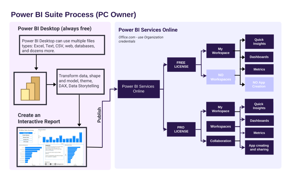
Please review the Power BI Suite Process shown in Exhibit 7.1, and notice the process is very similar whether you have a free license or a Pro license. The biggest difference is collaboration within the Workspace and the ability to create a Power BI app for consumer consumption. The Pro license unlocks more advanced AI capabilities as well (although we will not be working with AI in this context). The Power BI Desktop accepts hundreds of file types. Once you upload an Excel file to Power BI Desktop and save it, the new extension for the file is .pbix. Both Power BI Desktop and Power BI Services can upload and use .pbix files.
Exhibit 7.1—Power BI Suite Process
As a Student, Where Do I Find Power BI Services (Online)?
Note: Screenshots of Power BI interface © Microsoft Corporation. Used with attribution for instructional and illustrative purposes. Annotations added by the author.
1. Login to your Microsoft Office account provided to you at your university. Make sure to use your college credentials.
2. In the menu (located vertically on the left side), choose Apps.
3. Look in the “Explore by category” section for Power BI (Power BI is listed under several categories). Review Figure 7.1 to see the menu and Apps area.
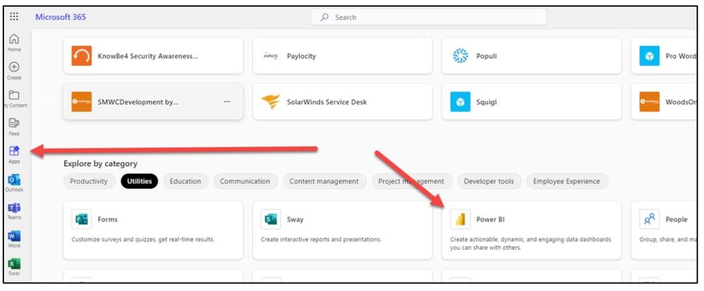
Note: Screenshot of Microsoft 365 Interface © Microsoft Corporation. Author Annotations Added.
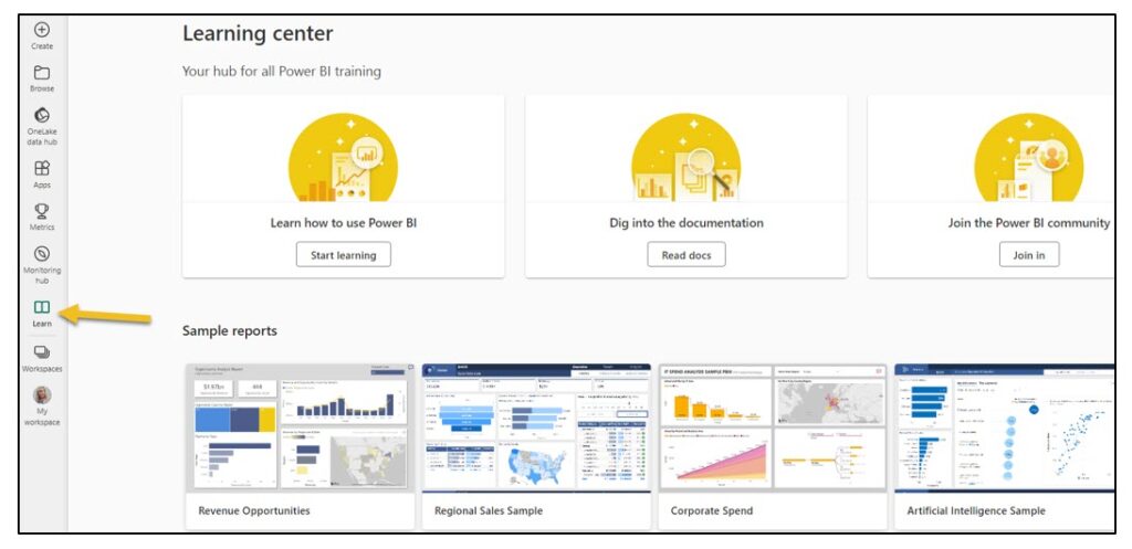
4. When you open Power BI Services (Online) the first time, you should see several tiles like, Getting Started with Power BI (see #1 in Figure 7.2), and several Explore this data story (see #2). If this is your first time working with Power BI Services Online, make sure to explore these. Keep in mind, your experience will be slightly different since the examples change. Also, you will not see anything in the My Workspace tile since you have not added anything to your My Workspace yet. But the most important component is Learn (see #3).
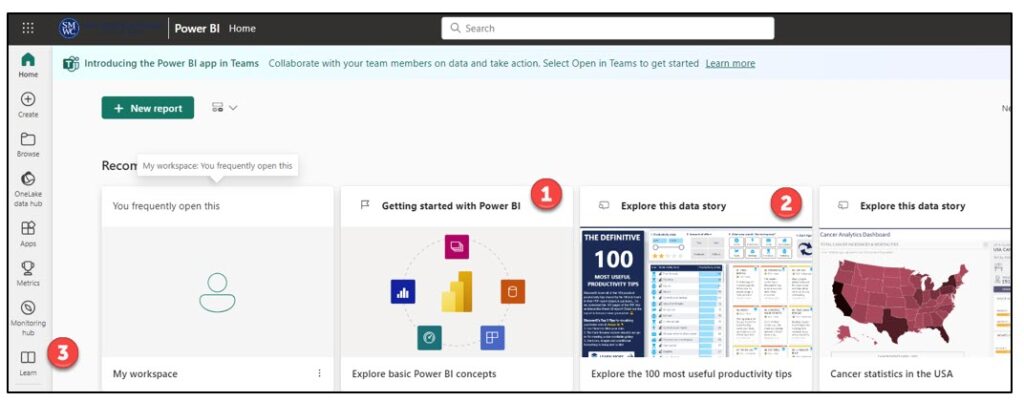
5. If you select Learn (#3), you will see the Learning Center provided by Microsoft, essentially the hub for all Power BI training. Figure 7.3 shows the variety of examples you can explore. Note the sample reports, information on the newest features, lots of potential training opportunities, and testimonials.
Before demonstrating how to upload files, let’s define some of the terms used by Power BI. Don’t worry; take one step at a time to understand how the suite of Power BI works together. This chapter will use Microsoft datasets and templates, public datasets, and the XCaliber Foods dataset to demonstrate many principles. So let’s start with the foundational components.
What Is Power BI?
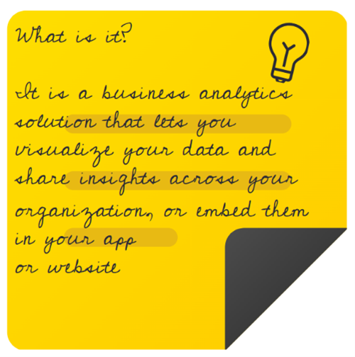
“Power BI is a collection of software services, apps, and connectors that work together to turn unrelated sources of data into coherent, visually immersive, and interactive insights” that can be shared (Microsoft—Power BI Introduction, 2023, para 1). You can upload an Excel file, a SalesForce file, a Mailchimp file, a web page, a database, and hundreds of other sources into Power BI Desktop. Multiple sources are possible. Just as a car is built of metal, fabric, glass, and rubber, a dataset potentially pulls from unrelated, even third-party sources.
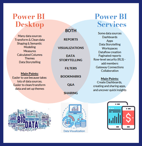
The best Power BI experience is on a PC. You can only use Power BI Desktop on a PC unless the Mac is running software to simulate the Windows experience. However, it is possible to do most of the same things in Power BI Services (Online). Let’s look at a comparison of Power BI Desktop and Power BI Services (Online). Make sure to notice the main points in the visual. There may be terms you don’t understand yet, and that’s OK. We will cover them shortly.
Exhibit 7.2—Comparison of Power BI Desktop and Power BI Services (Online)
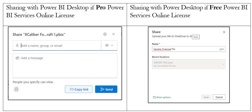
A note on sharing in Exhibit 7.2. When you use the share button in Power BI Desktop, it is a unique experience depending on whether you use the Pro or Free version of Power BI Services Online. Evidently, Power BI Desktop knows which version you have. Sharing in a Pro environment gives you a way to directly connect with others. Sharing in the Free version means the sharing comes about because you are saving it to a shared folder. Look at Figure 7.4 for some of the differences.
Figure 7.4—Pro Versus Free Sharing Feature
Compare Power BI Desktop to Power BI Services (Online)
The Power BI suite has two main components plus an App Creation Tool that work together to give your users the best experience. The first component is the Power BI Desktop.
Power BI Desktop
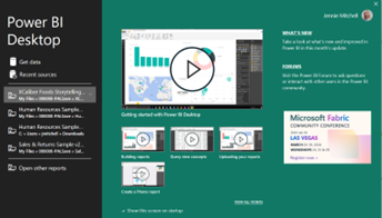
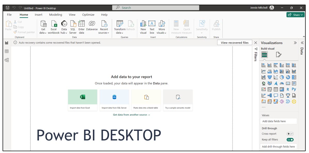
This is an app that you download to your computer (but it is only for PCs). You can download and install it for free. You can upload files from many different sources and connect them through modeling. You can design a report on the Power BI Desktop and publish it to Power BI Services Online. If you have the free version of Power BI Services Online, your only option in Power BI Desktop is to publish to My Workspace. As shown in Exhibit 7.3, when you first open the Power BI Desktop app, you see a pop-up window to get started with helpful videos to guide you.
Exhibit 7.3—Power BI Desktop App—Opening Screen
To close the pop-up window, just click the X in the upper right-hand corner. You will now see an Untitled—Power BI Desktop container. The main sections include the ribbon, the views, the filters, visualizations, and fields.
According to Devin Knight, a Microsoft Data Platform MVP and president of Pragmatic Works, there are four main steps to reach the report process: (1) data discovery/data shaping, (2) data modeling (like creating relationships, DAX: Data Analysis eXpression), (3) data visualization (building reports, custom visuals), and (4) data sharing—publishing the reports to Power BI Services Online to share with others (2023, 14:37–15:29). Does it surprise you that data visualization is the third step?
Figure 7.5—Main Sections of Navigation in Power BI Desktop
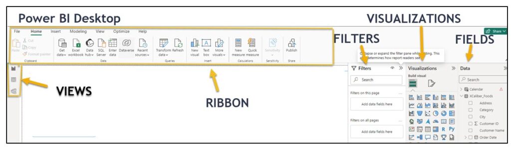
Ribbon—The ribbon has a similar look and feel to other Microsoft products. At this early stage, one of the key components is the Get Data or alternatively Excel Workbook. One of the key differences of Power BI Desktop when compared to Power BI Services (Online) is the ability to “get data” from multiple sources. Besides Excel, some of the file types accepted by Power BI Desktop include text/CSV, XML, and PDF, as well as several databases like SQL Server database. There are hundreds of other files that can be used with Power BI Desktop. This is a significant difference since Power BI Services Online accepts very few file types and Power BI Desktop accepts over a hundred file types. Also on the ribbon is the ability to transform data (essentially clean it up).
Note that Power BI Desktop has a Publish button on the ribbon. You can only publish to My Workspace (if free version of Power BI Services Online). If you are using a Pro version of Power BI Services Online, Power BI Desktop will publish to either My Workspace or Workspace. Power BI Desktop will know which version of Power BI Services Online that you have (free or pro).
Views—These three icons provide views: Report view, data view, or model view. The data view shows your dataset (like opening Excel). The report view shows the canvas and any visualizations you have started. The model view is where you can create relationships, build hierarchies, or perform calculations through DAX (Data Analysis eXpression). DAX is a formula expression language that allows users to create more complex measures, calculated columns, and tables. It is specifically tailored for business intelligence.
Filters—This is somewhat explanatory. You can add filters to “filter the data.” An example for using the filter could be if your company is dropping a service or product line and you want to filter it out from anything you create.
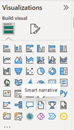
Visualizations—Although you see a robust number of visuals, if you click on the three dots (ellipsis) you can get more visuals. Exhibit 7.4 shows only the first page of visualizations. It might surprise you, but there are over 400 visuals available! As a word of caution, download visuals that have been tested and approved by Microsoft.
Data shows the tables and fields of the dataset.
Canvas is where you build the report with visualizations and context.
Exhibit 7.4—Example of Power BI Visualizations Available
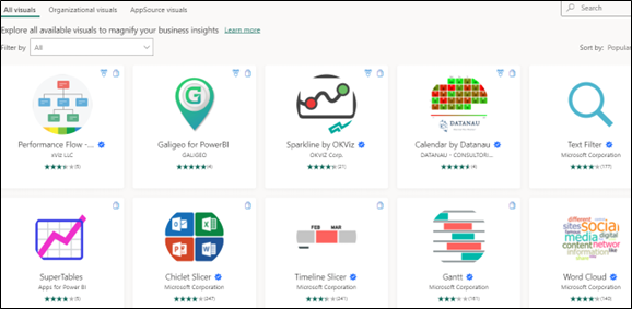
Figure 7.6—Power BI Desktop
Take a minute to explore the Power BI Desktop as shown in Figure 7.6. Try out the samples so you get a sense of what is available.
The next component of the Power BI suite is Power BI Services (Online). You can determine your license by selecting your avatar. The authors have a Power BI Services (Online) Pro license and a student account that has a Free license. We have tried to make sure to point out the differences.
Power BI Services (Online)
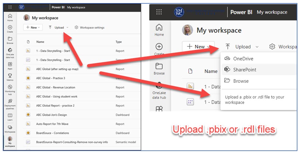
This is available by logging into Office.com using your organization’s credentials (shown in the next section). This Power BI Services Online works on either Mac or PC. Power BI services can Upload some data sources including .pbix files and Power BI Services Online is used to create dashboards and analyze the data through quick insights. If you have the Pro version, you can create and share a Power BI app. There’s much more, but let’s take it one step at a time. The report you build in Power BI Desktop is published to Power BI Services Online. If you have the free account, you can publish to “My Workspace,” or if you have a Pro license, you can publish to “My Workspace” and “Workspace” assuming you have first created a Workspace! In Figure 7.7, you should note the Upload feature. You can upload a .pbix or .rdl file here, but NOT an Excel file. Read on to discover how you can upload your Excel File to Power BI Services Online.
Figure 7.7—Power BI Services Online
Home, Create, Browse, and OneLake Data Hub in Power BI Services Online
![]()
Home is what you would expect—It shows your files based on how recently accessed. It also has a “New report” button that you can use to start creating reports.
Create allows you to add data to start building a report. You have a few choices—(a) Excel (Preview), which means you link your Excel file from OneDrive; (b) link a CSV file from OneDrive; (c) paste or manually enter data (looks like a spreadsheet); or (d) select a published semantic model. If you recall, “Power BI semantic models represent a source of data that’s ready for reporting and visualization” (Microsoft Learn, 2023, para 1).
Browse includes a list of files in order of the most recent use.
OneLake Data Hub is a centralized data hub for your entire organization. It allows members of the organization to use Fabric data items if they are given access. When you click on OneLake Data Hub, you will see a list of your data (My data). If you select, “Endorsed in your org,” you will see a list of datasets available to you from your organization. Since you are visiting this as a student, this selection will not show any files. You can learn more about this at Microsoft Learn: Discover data items in the OneLake data hub.
A Word to Mac Users
Although you can’t use Power BI Desktop to “get data,” you can still get your data into Power BI Services Online. Once you have the data in Power BI Services Online, you should be able to create dashboards and reports.
Here are two options:
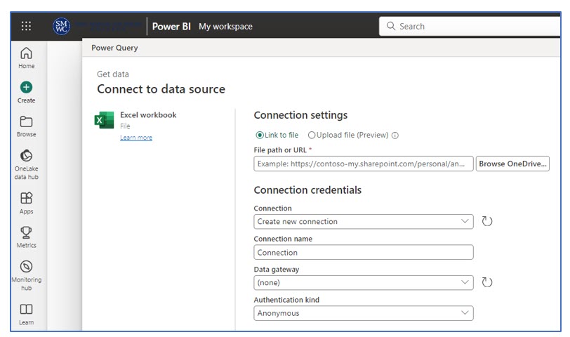
Option #1—Link an Excel File to Power BI Services Online
Mac users should be able to use Excel Preview to link their Excel file to Power BI Services Online. Two things are important.
- First: The Excel file must live in a OneDrive space. According to Microsoft (as of Sept 29, 2023), “Upload of local workbooks to Power BI Workspaces will no longer be allowed” (Microsoft Learn, 2023, para 2).
- Second: Use the link to file option, not the upload option. Start with Create, then Excel (Preview), and Link to the Excel file (as shown in Figure 7.8).
Figure 7.8—Link to Excel File
There is another way to get your Excel file to Power BI Services Online right from the Excel file itself.
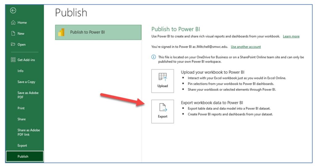
Option #2—Publish Excel File Power BI Services Online
Note: Screenshots of Excel interface © Microsoft Corporation. Used with attribution for instructional and illustrative purposes. Annotations added by the author.
- First, go to Office.com and log in. Find the apps, search for Power BI Services Online, and have it open.
- Second, open the Excel file you want to use. Make sure it is in table format.
- Third, go to File and scroll down to Publish. Select Publish, and a pop-up screen will show up. Choose Export (as seen in Figure 7.9) so you can create reports and dashboards.
Figure 7.9—Publish Excel File Directly to Power BI Services Online
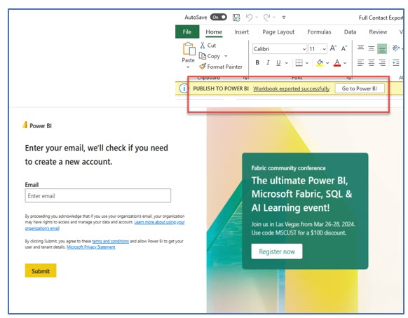
- Fourth, you will see a note that the workbook was exported successfully. Select the Go to Power BI button, and the following pop-up window will appear. Type in your email (use your college email account).
Figure 7.10—Select Button and Follow On-Screen Directions
Visit the Power BI Services Online, and the file you published should show Semantic Model as the type. This means you will be able to build reports and dashboards with this dataset!
Now that we have the Mac file issue solved, let’s review more of the Power BI Services Online features.
The section of interest is the Power BI components: Reports, Paginated Reports, Scorecards, and Dashboards. The other components (i.e., Data Factory, Data Science, Data Warehouse, and Real-Time Analytics) are beyond what the authors plan to cover.
In order to have a more logical understanding of how things work, let’s look at Workspaces and My Workspace next and come back to Apps and Metrics.
Workspaces in Power BI Services (Online)
Note: Screenshots of Power BI interface © Microsoft Corporation. Used with attribution for instructional and illustrative purposes. Annotations added by the author.
Power BI Services (Online) Pro version provides two workspace types (or containers) and an ability to construct an app. Everyone has “My Workspace,” but only Pro accounts will be able to use Workspaces. If you have the Pro version, you can have multiple Workspaces.
Workspaces are containers for dashboards, reports, and semantic models. Workspaces can provide a team environment to collaborate with your coworkers. You can add coworkers to your Workspace if they also have a Power BI Pro license and are part of your organization. If you only have a Free license, you will not be able to create a Workspace. And you can only create an app in a Workspace.
My Workspace is your personal space for content. Only you have access to your “My Workspace”; however, you can share individual dashboards and reports in the Pro version. If you have a Free license, plan to share from Power BI Desktop to a OneDrive shared folder. If you try sharing a file directly in Power BI Services Online, you will see a pop-up to upgrade your license.
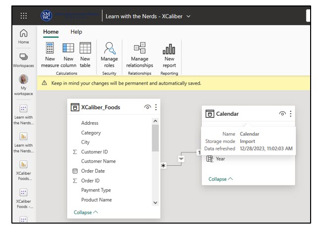
What Is a Semantic Model?
- In Power BI, a semantic model is a way to organize and represent the data; it’s like creating a common language for understanding. You can create semantic models to create relationships, create measures, build hierarchies, and create visualizations. For example, you might have a table on quality control and a table on product manufacturing codes. If you want to connect them, you create a relationship. For example, when creating measures, you may always want data shown a certain way (like year-to-date last year) compared to (year-to-date this year). Creating a model that has this measure can then be used by all. For now, it is enough for you to know what they are and their purpose.
- Semantic models are available in either Power BI Desktop or Power BI Services Online. Here is an example in Figure 7.11.
Figure 7.11—Semantic Model in Power BI Services Online
Workspace Options Seem Available
If you have a Free Power BI Services (Online) license, you will still see a button to create a Workspace. However, once you start setting up the Workspace, you won’t be able to move forward unless you update your account from Free to Pro or sign up for a free trial. The arrows in Figure 7.12 show this limitation.
Figure 7.12—Limitation of Power BI Services (Online) Free Account
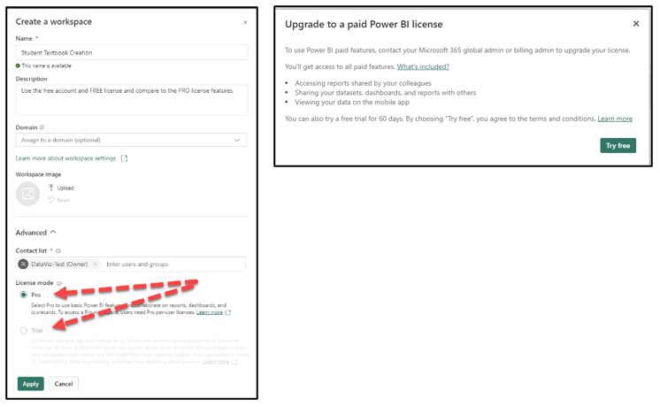
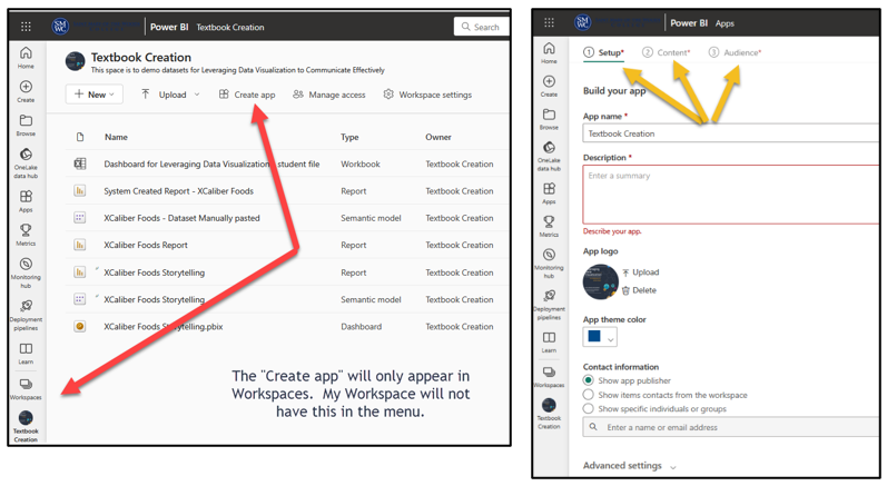
To see information about Power BI apps, let’s switch to a Pro license in Figure 7.12. In this illustration, the Workspace is named “Textbook Creation” since the dashboards, reports, and the app were created for this textbook. You can only create a Power BI app with a Pro license and only one app per Workspace. Creating an app is one of the more powerful aspects of Power BI Services Online.
So What’s a Power BI App and How Is It Used?
Workspaces are considered a staging area. You can create an “app” from the content. “An app is a collection of dashboards and reports built to deliver key metrics to the Power BI consumers in your organization. Apps are interactive, but consumers cannot edit them” (Microsoft, 2023, para 3).

Create an App. “In Power BI, you can create ‘official’ packaged content, then distribute it to a broad audience as an app” (Microsoft, 2023, para 1). Apps are created in Workspaces and not “My Workspace.” That might sound odd, but think of My Workspace as your personal space, whereas the intent of an app is to publish it for a large group of people. And note that free account users cannot create a Power BI app because they can’t create a Workspace!
As shown in Figure 7.13, there are four parts to creating an app: (1) setup, (2) content, (3) audiences, and (4) publishing the app. This means you can develop one app that will work for more than one audience. For example, the audience might be the entire organization, and the app would limit the content they would see. Through the app, managers might see most content; whereas VPs might see all reports and dashboards contained in the app. As a consumer, you can filter, highlight, and interact with the content on the app. For example, organization-wide users can’t modify the contents of the app. Licensing is important for how this works.
Figure 7.13—Power BI Services Online: Create an App in Workspace (Pro License)
See a Sample App If You Have Power BI Services Online—Pro Version
Microsoft created apps that contain Power BI content, dashboards, and reports. At the AppSource, search on Power BI to see this app and experience how it works.
Follow these steps.
- Exhibit 7.5 shows the AppSource. This is a place to explore. You can search at the AppSource Sales & Marketing or choose any example that interests you. (keep in mind that Microsoft changes out sample files frequently). Other examples are available at Get samples for Power BI – Power BI | Microsoft Learn.
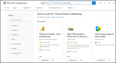
Exhibit 7.5—AppSource—Microsoft Sample—Sales & Marketing - The Microsoft AppSource will ask you to Sign in. If you don’t have an account, sign up for a free account.
- Complete the profile information, then select Continue.
- Select Install as shown in Exhibit 7.6.
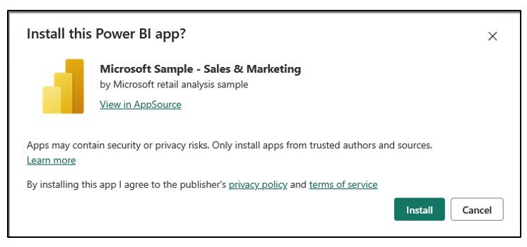
Exhibit 7.6—Install Power BI App - It will show up in the Apps section of your Power BI Services (Online) account.
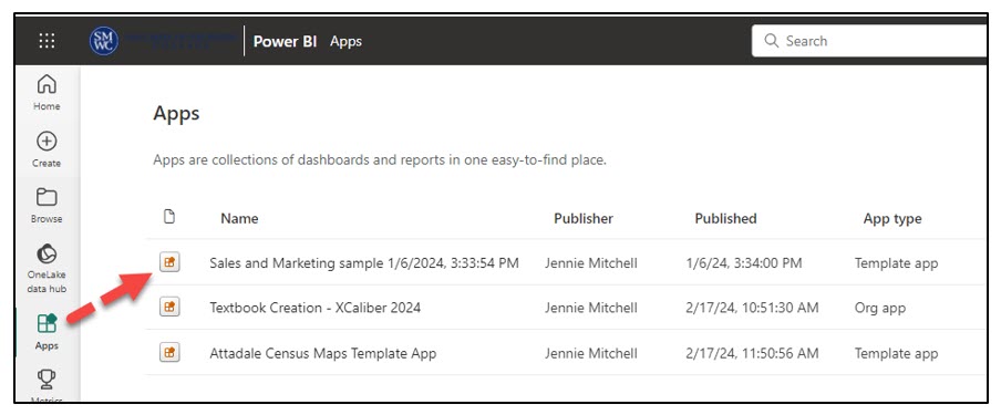
Figure 7.14—Power BI App Showing in Power BI Services (Online) - If you click on the Name: Sales and Marketing sample, it will open the app you can explore. You can interact with it, but you can’t edit it.
Later in this chapter, the authors will show you how to create an app with a Pro account using the XCaliber Food Distribution Company report built-in Power BI Desktop and published to the Workspace “Textbook Creation” in Power BI Services Online.
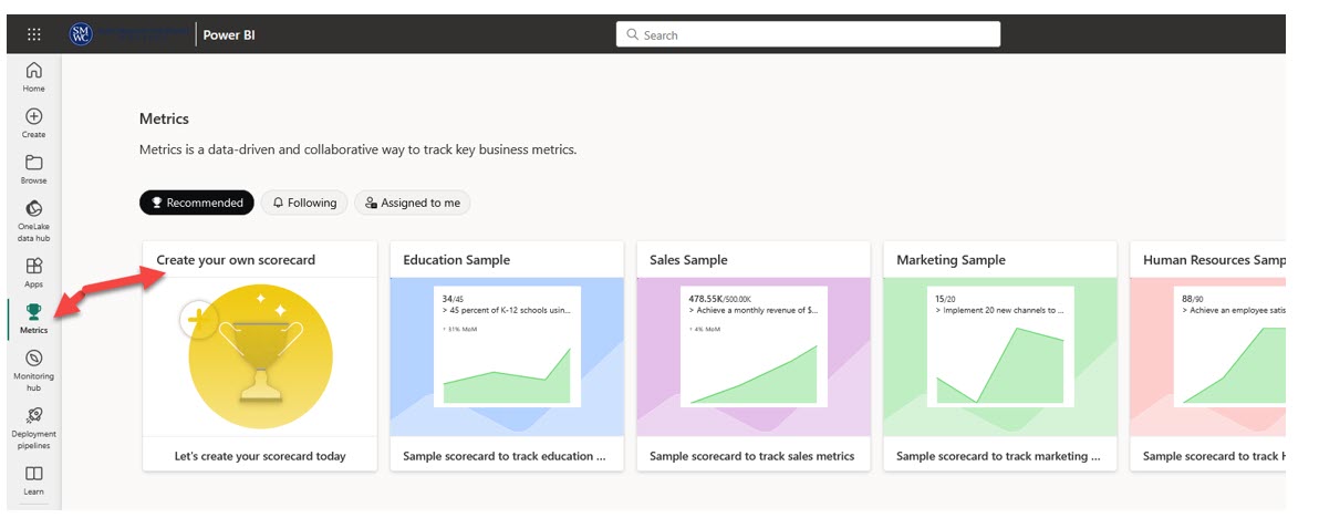
What Is Metrics?

In Power BI Services (Online) you have an option to build metrics to hold your organization accountable by tracking them against key business objectives. The fundamental value of the scorecard is that others in your organization are interested in the targets set. In earlier versions of Power BI Services (Online), this was called “Goals.”
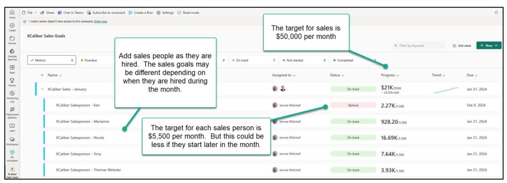
Metric Example Using XCaliber Food Distribution Company
As an illustration, XCaliber Foods opened its business in 2024 intending to sell $50,000 each month. XCaliber planned to hire nine salespeople, which meant that each salesperson would sell approximately $5,500 per month. Instead of waiting until year-end to see if you are on target, you may want to set up the scorecard so that it looks at a monthly target ($600k total sales divided by 12 = $50k per month). Targets for salespeople also make sense to set up monthly. Then if you don’t make a target, you can investigate why. More likely, you may want to set targets for products, targets for salespersons, and targets for cultivating new customers.
In Exhibit 7.7, the sales metric is set up for January (goal of $50,000) and individual salespeople have a monthly sales target of $5,500. Here is the preliminary metric setup.
Exhibit 7.7—Setting Up Metrics for XCaliber Foods for 2024 Goals
Metrics can be manual, use submetrics (like average and sum), or connect to data.
In a previous section, we discussed the Balanced Scorecard Framework. The following Balanced Scorecard Framework helps us see how metrics might be used to set it up. Some of the metrics would be set up manually, and some could connect to data. Metrics in Power BI Services (Online) would use both the measures (goals) and targets (like KPIs).
Balanced Scorecard Framework + Power BI Services (Online) Metrics
Financial: To succeed financially, how should we appear to our stakeholders?
Objectives: increase sales
Measures: KPIs for sales overall, KPIs for sales by salesperson,
Targets: sales = $600k or $50k per month, salesperson target = $5.5k per month, customer sales (since only 15 customers) = $40k per year
Initiatives: use drop-shipping software program
Customer: connect to vision—How should we appear to our customers?
Objectives: deliver products as promised (within 24 hours, or as we advertise, “same-day shipping”)
Measures: KPIs for average delivery time = 1 day from order-to-ship date
Targets: from order-to-ship date, 24 hours or less
Initiatives: complete customer satisfaction interviews by email/phone
Internal Business: To satisfy our stakeholders and customers, what business processes must we exceed at?
Objectives: cost control (use correct pricing), introduce new products, word of mouth marketing
Measures: KPIs for new products as % of sales, KPIs for new grocers
Targets: increase number of grocers to 25, Increase new products 15% per year
Initiatives: incentive program for grocers, Expand to more neighboring states.
Learning and Growth: To achieve our vision, how will we sustain our ability to change and improve?
Objectives: able to sell to new customers
Measures: KPIs for employee development and onboarding for upselling and consistent sales, KPIs for drop-shipping software exam score, customer satisfaction survey
Targets: survey score at four out of five, drop-shipping exam score 90%
Initiatives: buddy program, online training for remote salespeople, review and investigate customer surveys
To learn more about metrics, visit the Microsoft Learn site.
 Microsoft Learn: Get started with metrics in Power BI. Link: https://learn.microsoft.com/en-us/power-bi/create-reports/service-goals-introduction.
Create scorecards and manual metrics in Power BI. Link: https://learn.microsoft.com/en-us/power-bi/create-reports/service-goals-create#step-1-create-a-scorecard
To gain meaningful use for the scorecard system, users need Power BI Pro. As a student, you can still create scorecards; however, they won’t mean much if you can’t collaborate with a team. Still, it is worth looking at the examples provided in Figure 7.15.
Figure 7.15—Metrics in Power BI Services Online
What Is the Monitoring Hub in Power BI Services Online?

Monitoring hub won’t be too important to you as a new user, but as you add datasets and create more Power BI content, you will appreciate this feature. The monitoring hub enables you to monitor your Microsoft Fabric activities. If you have reports and dashboards connected to data that is being updated, you will want to see that the status shows “completed” and not “failed.” If you see “failed,” it normally means that there are connectivity issues!
What Is a Deployment Pipeline?

A deployment pipeline provides “content creators with a production environment where they can collaborate to manage the lifecycle of organizational content” (Microsoft Learn, 2023, para 1). By default, there are three typical stages: Development, Test, and Production. For example, software developers could use the process to write, build, test, and deploy code. You may not see the deployment pipelines icon in the menu. In My Workspace, click New, and More Options, to see the Data Pipeline in the Data Factory section. But how would you use it?
For an example that is easier to understand, let’s look at XCaliber Food Distribution Company. Assume that a small team is working on creating Power BI visualizations for sales data across different states and regions. The report undergoes many changes, including new visuals and calculations, and is reorganized to improve the user experience. During this stage, the team uses the deployment pipeline to work collaboratively in a Workspace called development-XCal. Once the development stage is complete, the team moves the report to the test stage. In this stage, the process allows the team to validate the report against test data. This Workspace is called test-XCal. Once the report passes the testing and validation process, the report is moved from the test environment to the production environment. In the production-XCal Workspace, the report is available for consumption by end-users.
You may be saying to yourself, “We can do all of this from the first Workspace, and you would be correct, so why use it?” This pipeline deployment process reduces manual work, which can contain errors. Also, organizations can build in validation that includes consistency and maintains content quality. The bad news is that you need to be a premium user!
Other Sharing Differences Between the “Free” License and the “Pro” License
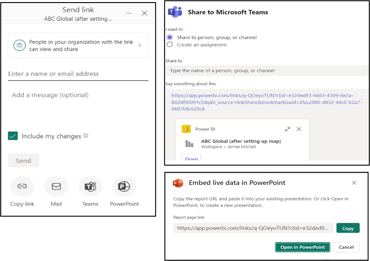
When teams work together in a Workspace, it helps if collaboration is easy and intuitive. Workspaces provide roles and allow co-ownership of content but there are some limitations. “You need a Power BI Pro license to share . . . and the people you share it with do too” (Microsoft Learn, 2024, para 6). One of the keyways to collaborate is to embed your Power BI report(s) in Microsoft Teams. You can use the tabs in Microsoft Teams for each Power BI report so that the chat conversation is tied to the report. Figure 7.14 shows several sharing options: share to email, Microsoft Teams, or PowerPoint. If you click the Teams file, you can share it with a person, group, or channel, or create an assignment. If you click the PowerPoint file, you will see that you can embed live data in PowerPoint.
Figure 7.16—Sharing Pro Version of Power BI Services Online
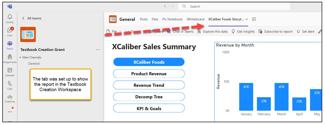
You can even add your report on a tab in your Team space as shown in Figure 7.17.
Figure 7.17—Showing Power BI Tab in Team Space
7.1 Self-Assessment: Power BI Suite
Learning Objective #1—Explain the differences between Power BI Desktop and Power BI Services (Online)
 Watch the Pragmatic Works YouTube video “Report or Dashboard in Power BI” and choose the sentences that are correct.
7.1 Exercise 1: Power BI and Artificial Intelligence (Advanced)
Learning Objective #1—Explain the differences between Power BI Desktop and Power BI Services (Online)
Learning Objective #2—Upload sample files (in this case .pbix)
Visit Microsoft Ignite at Artificial Intelligence sample for Power BI: Take a tour located at https://learn.microsoft.com/en-us/power-bi/create-reports/sample-artificial-intelligence.
Step 1: Download Power BI Desktop and install, then follow the page to download the Artificial Intelligence Sample Report and Dashboard (this is the .pbix file).
Step 2: Create a screencast of your experience exploring the three pages Key Influences, Decomposition Tree, and Anomaly Detection. Share at least two things you learned from this experience. Post the recording to the discussion board (or as suggested by your instructor).
7.2 Transform (Clean) Data in Power BI Desktop
But when is a given data set clean enough? Like a kitchen countertop, it can always be cleaner. We hit a point of diminishing returns in our preparation of any data set, though, where more elbow grease and scrubbing doesn’t yield sufficient incremental benefit to warrant the time and effort.
—Ben Jones, Avoiding Data Pitfalls
Data produced by systems can be inconsistent, creating challenges for the analyst. Inconsistent naming conventions, missing data points, human error at the data collection point, and the need to correct format (like a number instead of currency) are just a few of the challenges for analysis and visualization. Power BI Desktop has the best process for data transformation because it offers a variety of functionalities to streamline the process. This section will introduce students to basic cleaning of data, creating a calculated column and transforming the format to a number. This step should always be preceded by a thorough understanding of the data in table format. Every column should be investigated through filtering before you “Get data” in Power BI Desktop. By mastering data transformation (cleaning) in Power BI Desktop, you unlock the full potential of the data.
Know the Data
For this section, we will use the XCaliber Foods Excel file in Power BI Desktop and show you step-by-step how we work through this.
Screenshots of Power BI interface © Microsoft Corporation. Used with attribution for instructional and illustrative purposes. Annotations added by the author.
Step 1—Download the “XCaliber Foods 7.2” file. Review the XCaliber Foods Data. Don’t make any changes to the Excel file; instead, plan to do all cleaning work in Power BI Desktop. When you are done reviewing, close the Excel file.
Did you notice the following issues in “XCaliber Foods 7.2”?
- The column for Country has USA for every line of data.
- The payment type should include check, cash, or credit card, but there are several blanks. You may want to keep these until you investigate what happened. It could be an error in entering the data, bad checks, or potential fraud.
- There is a need to calculate delivery time. This can be done by looking at the difference between the order date and the ship date. This is important since XCaliber Food Distribution Company promotes same-day shipping.
Step 2—Open Power BI Desktop and Get Data
a. From the menu, choose Get data then Excel workbook. Find the XCaliber Foods 7.2 and choose Open.
Step 3—Clean Data
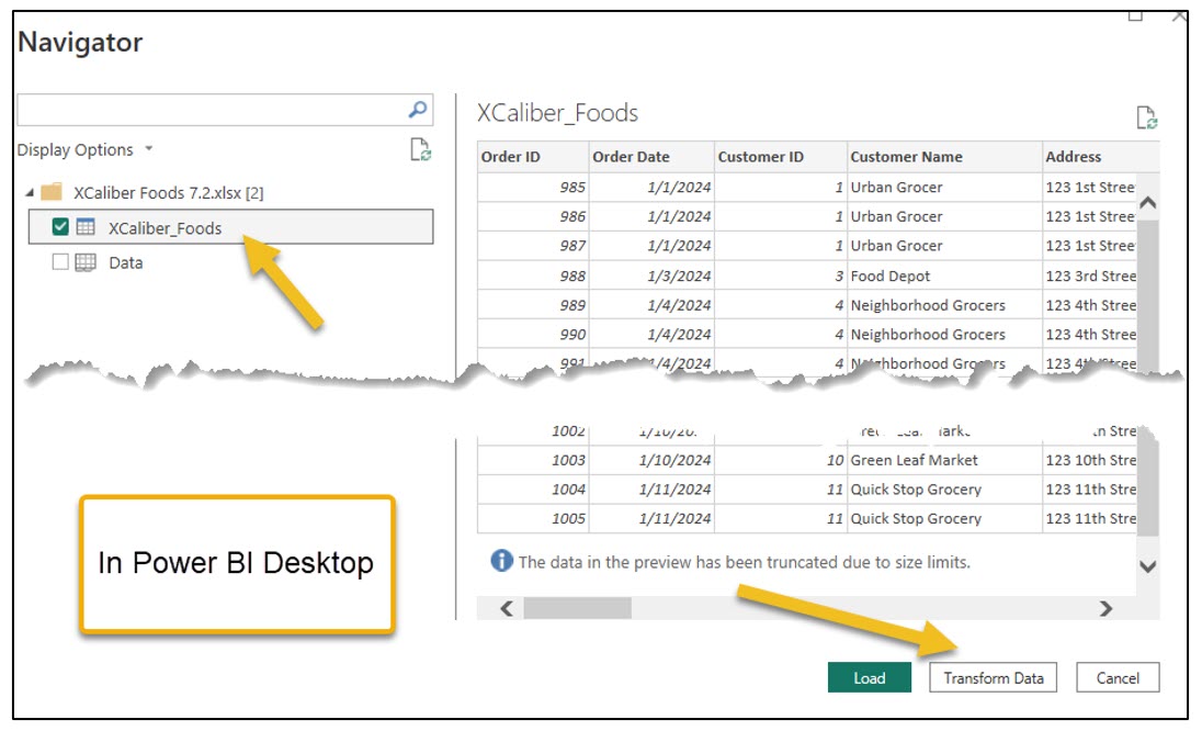
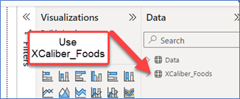
a. The Navigator pane will open and show two tables, one named XCaliber_Foods and one called Data. It shows this because it was already formatted as a table. Since the table XCaliber_Foods has everything, you can just check this one box. Then select Transform Data. See Figure 7.18 to see this step.
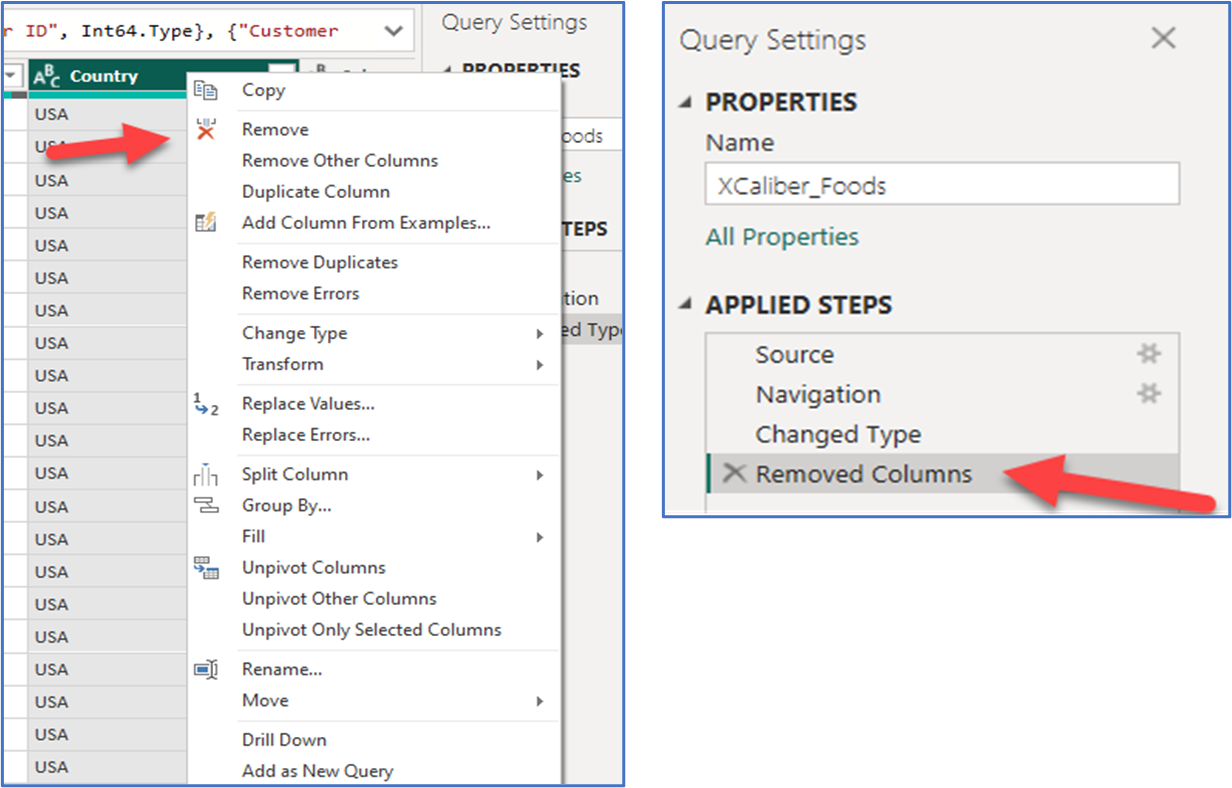
b. The Power Query Editor will pop up on the screen. Every step we take in this setting will show up in the Applied Steps box (see Figure 7.19). The first step is to remove the Country column. When you find it, highlight this column, right-click the column, and choose Remove. Notice that the Applied Steps shows this action and gives you the ability to cancel it.
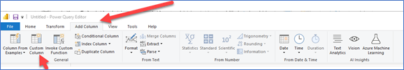
c. The next step is to click on the main menu to Add Column in the main menu and choose Custom Column as shown in Figure 7.20.
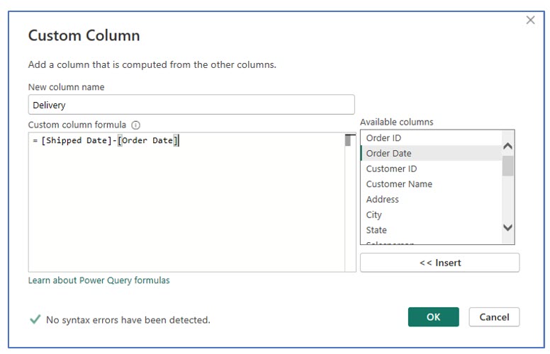
d. Fill out the pop-up according to Figure 7.21. The formula starts with an equal sign and double-click the available columns. Essentially the formula = Shipped Date minus the Order Date will tell you the length of time. That’s why the new column’s name is Delivery.
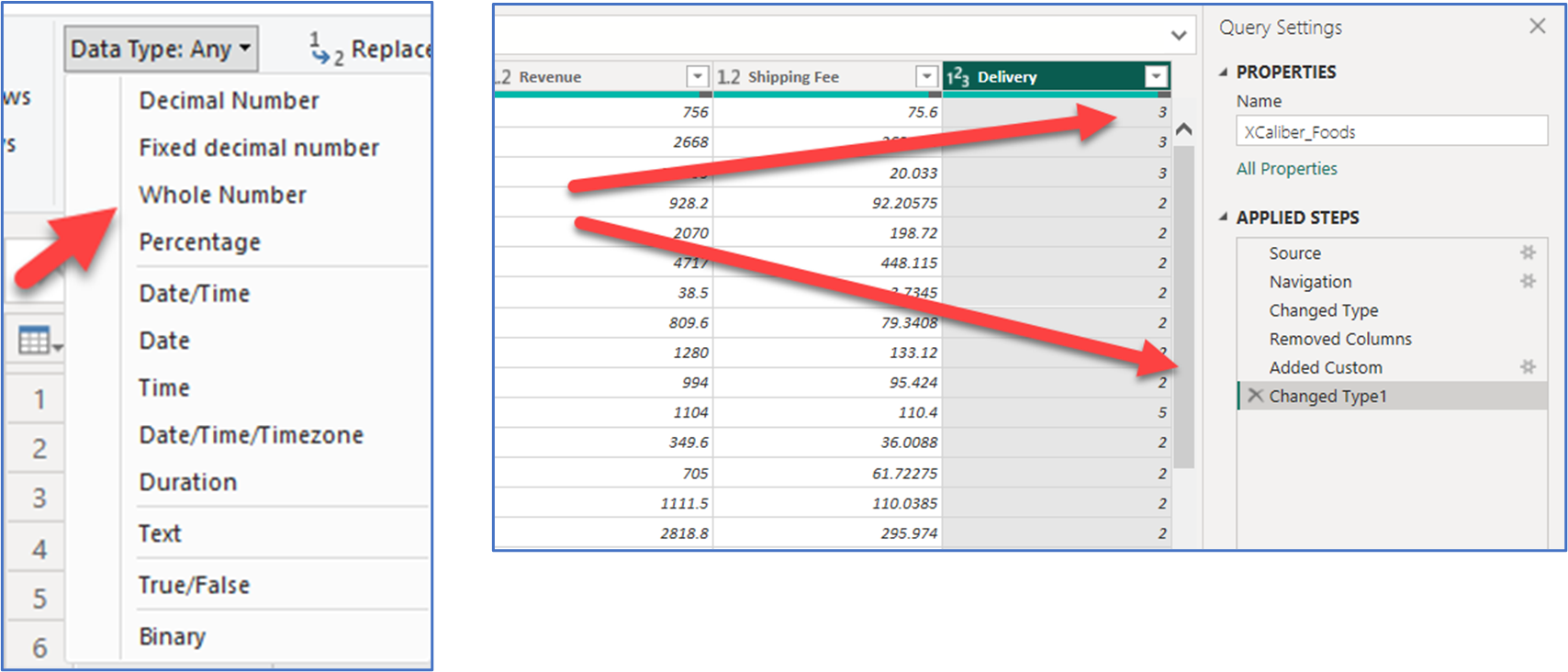
e. The format for the Delivery column needs to be formatted to a whole number. On the main menu, choose Transform, then choose Data Type and then Whole Number to show the number of days for the Delivery column. See Figure 7.22 for choosing the data type and the second image showing the final result.
f. Now on the main menu, choose File, then Close & Apply. Your changes are applied, and you have a trail of your steps. A pop-up should show that the file is applied. You should be back to the editing field in the Power BI Desktop.
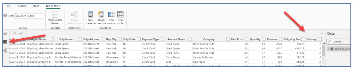
g. Check to see if the Delivery column is there by choosing the table view on the left (see Figure 7.23) and then scrolling over to see the new column. Congratulations! You have just cleaned the data!
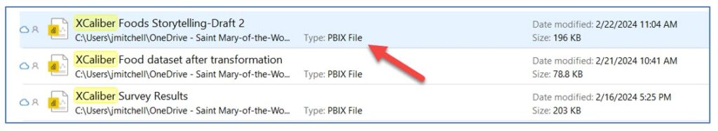
h. Save the file—we called ours XCaliber Foods Storytelling—Draft 2. But any name will work. Pay attention to where you saved it and notice that the extension is .pbix as shown in Exhibit 7.8. For best results, include the file in a OneDrive space.
This is all the transforming and cleaning that we will do with this file but note that it is possible to use the new measure tool located in the main menu of the Power BI Desktop. Just like with all Microsoft products, several different paths can lead to the same results. Now let’s move to the next important step—publish!
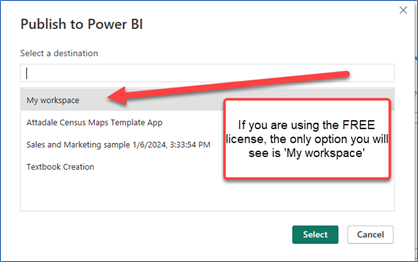
i. Choose Publish and the pop-up will show Publish to Power BI as seen in Figure 7.24. You will only have the “My Workspace” option if you have the Free license.
Remember, both Power BI Desktop and Power BI Services Online will accept files with the .pbix extension. This information is important for Mac users who can’t use Power BI Desktop but who can use Power BI Services Online. Please refer to the section called “A Word to Mac Users” to see two ways to use the dataset with Power BI Online Services.
If you want another example that covers not only cleaning and transforming but also shows how to merge cost information from another table into the original dataset.
 Ellis, G. (2023, April 4). PL 300 Clean, Transform, and Load Data in Power BI Power Query. ETL. [Video]. YouTube.
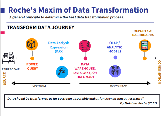
Let’s look at some examples of where you should transform data using a maxim (rule or principle) well accepted in Power BI circles, called Roche’s Maxim of Data Transformation.
What Is Roche’s Maxim of Data Transformation?
Matthew Roche is a member of Power BI Customer Advisory Team (CAT) at Microsoft and a frequent speaker. He has coined the phrase, “Data should be transformed as far upstream as possible and as far downstream as necessary” (Guy in a Cube, 2022, 1:42).
Scenario #1—Small Company Expanding Local Locations
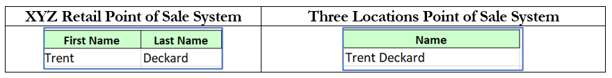
XYZ Rentals company purchased three retail locations that have a different point-of-sale (POS) system. XYZ’s point of sale collects data differently from the customer. XYZ’s data has a column for first name and a column for last name. The three retail locations use an older POS system that collects the entire name in one column. See Exhibit 7.9.
Exhibit 7.9—Naming Convention Between XYZ Rentals and New Locations
To get a full report, this inconsistency should be addressed, but where and how? According to Roche’s Maxim of Data Transformation, you should transform the data as close to the source as possible using Power Query (what was demonstrated in this section). According to Roche’s Maxim, you should implement the transformation (or calculation) in Power Query instead of DAX. According to Matthew Roche and Patrick (Guy in a Cube), this approach means that “calculations are applied universally, transformations remain even after a refresh of the data, refresh times are reduced, and the data model gets simplified” (Guy in a Cube, 2022, 2:50).
Exhibit 7.10—Roche’s Maxim of Data Transformation
But what happens if you have many more data components?
Scenario #2—Large Merger With up to 1,000 Locations Across the Americas
When thousands of datasets are coming in, it doesn’t make sense to change them in Power Query. Instead, clean the datasets in the data warehouse. It is less costly than transforming it for every report or app.
Scenario #3—Large Number of Locations (Like 5,000)
In this scenario, you have a large number of datasets coming in but because the point-of-sale systems are different, you need a solution. Although it could be handled in the data warehouse, some corporations will decide to replace the point-of-sale system so that every location uses the same system. And some companies will decide to replace the systems in all stores, an even costlier investment.
Want to learn more about this?
Guy in a Cube. (2022, Oct 5). Where do you add that new column in any analytics tool? [Video]. YouTube.
7.2 Self-Assessment: Transform and Clean Data
Learning Objective #2—Upload Excel files and/or sample files to Power BI Desktop to transform (clean) data
7.3 Create a Report in Power BI Desktop With Storytelling Techniques
Data storytelling is about connecting the dots between data and human emotions.
—Brent Dykes and Eric Schmidt, executive chairmen at Google
Storytelling techniques along with interactive visuals provide an environment to communicate data rather than just inform. Multipage reports allow the developer to break up content into smaller digestible insights. Although insights and change go together; not all audience members want change. Worse, if the visual is misunderstood or isn’t compelling, it can’t overcome resistance to change.
Some audience members may see insights as criticisms. For example, assume that the visuals include sales patterns, and managers notice a pattern they didn’t expect (i.e., inconsistent sales, no new products sold, and shipping delays). Depending on how the insights are shared, salespeople may feel criticized.
For the past few decades, “data has primarily been entrusted to only two privileged groups . . . an executive who required data to manage the business; [and] a data specialist . . . who gathered, analyzed and reported the numbers for management” (Dykes, 2019, p. 5). Data savviness is no longer confined to the privileged. Small organizations are taking advantage of intense data analysis and finding ways to use data to communicate additional services.
An Example: A Competitive Edge
An Indiana-based lawn care company arms their field employees with a full truck of products and wi-fi enabled and connected iPads, allowing them to do more than service the lawns. With the iPad connected to company software, field agents give estimates with a click of a button, share new procedures for a better lawn (upsell), and bill them electronically. The field agent can connect to the square footage data for any lawn (even neighbors) and immediately send an estimate to the homeowner’s email. If the neighbor wants the work completed, the field agent can immediately comply, and his schedule is adjusted automatically through the GPS on the truck. The owner receives live updates in a dashboard containing completed jobs, square footage, new estimates, new customers, and even a product usage report for all field agents. Compare this to an inefficient paper-based process where the lawn is serviced, but the field agent doesn’t interact with the homeowner, can’t give an immediate bill, can’t upsell existing customers with an estimate, or reach new customers (neighbors) with an estimate.
“In today’s dynamic, fast-paced business environment, limiting information to a narrow set of executives and data specialists no longer makes sense” (Dykes, 2022, p. 5).
So let’s talk about very specific storytelling techniques that can be used in a multipage report on Power BI Desktop.
What Is the Purpose of the Report?
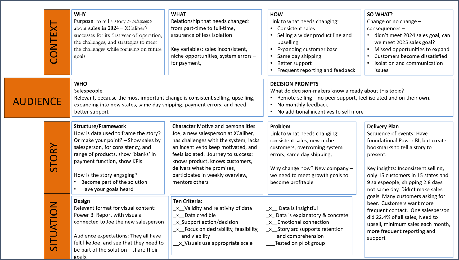
To Revisit XCaliber Foods and consider the purpose of a report and how it will be shared with the organization. XCaliber Food Distribution Company was first introduced in Chapter 4. For the initial Power BI Report, the specific purpose is to tell a story to salespeople about sales in 2024 including XCaliber’s successes and challenges for its first year of operation and strategies to meet the current challenges to focus on future goals. But how do we tell XCaliber employees (specifically the salespeople) a story to compel them to improve/change? Or should the story improve/change management communication and leadership? A compelling story connects the way we feel, the way we think, the way we act, and the way we behave (Gonzalez, 2023).
The story needs to engage the audience, and the key is to develop the story and visuals through the lens of the salespeople. Review what a good story can do to your brain. In general, good storytelling can do the following:
- enhance memory (dopamine),
- synchronize experience (mirroring),
- motivate the listener to turn the story into their own ideas (neural coupling),
- light up the brain (cortex activity), and
- engage the listener emotionally (narrative transport).
Use the CASS template to flush out the context. See Exhibit 7.11 for more details.
Question 1: What should the story accomplish?
Question 2: What do your salespeople need to know?
Question 3: What do you want your salespeople to do?
Question 4: What is the call to action?
Exhibit 7.11—CASS Template for XCaliber Food Distribution Company
When you have a specific purpose in mind, but the report or dashboard isn’t clear to the end user, you must add context! You especially need to provide context for areas that require user interaction. Adding context is a key component of data storytelling. Here is a partial list of data storytelling techniques. Look at Figure 7.25 to see the first page of the multipage report.
Note: Screenshots of Power BI interface © Microsoft Corporation. Used with attribution for instructional and illustrative purposes. Annotations added by the author.
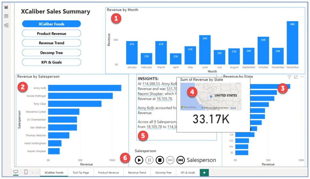
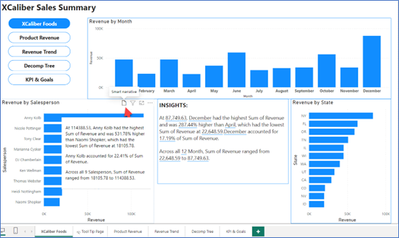
Figure 7.25—Page 1 of XCaliber Food Distributions Company Report
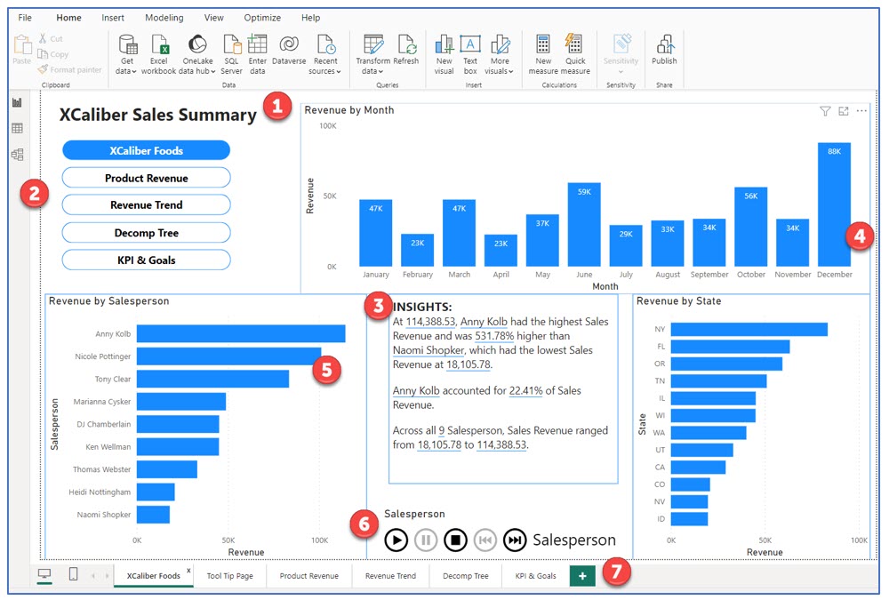
Note: The explanations below correspond to numbered examples in Figure 7.25.
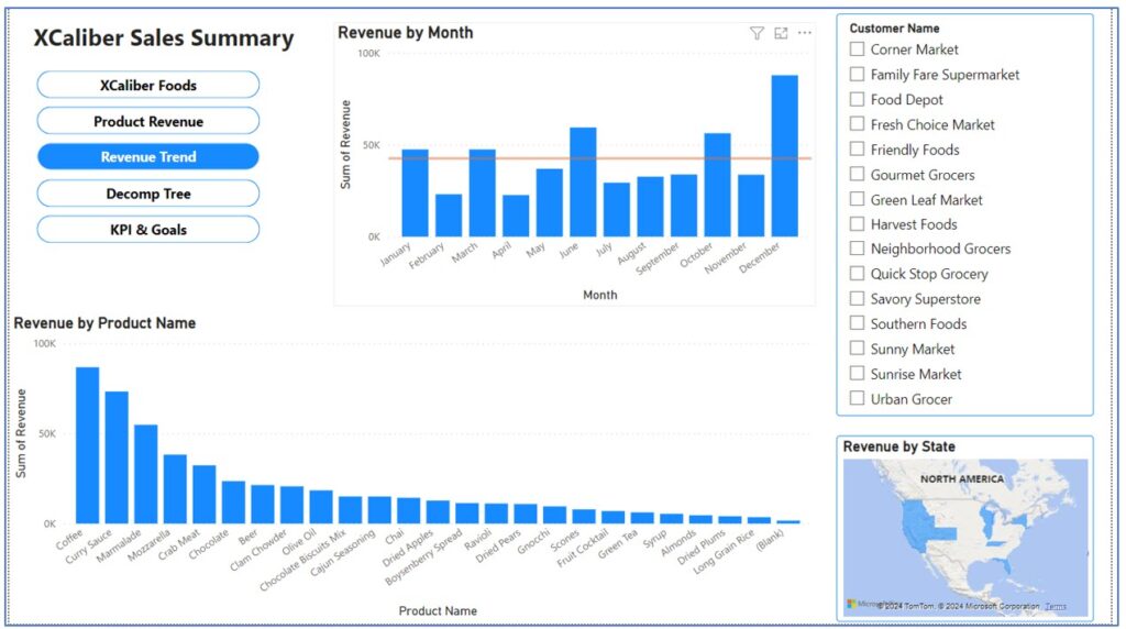
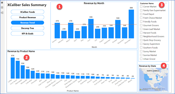
1. A clear title on each page that conveys the general purpose. The first page of the report is titled “XCaliber Sales Summary” since this page shows the revenue by month, revenue by salesperson, and revenue by state using a consistent theme.
2. Navigation can be in the form of buttons that represent page navigation or bookmark navigation. Bookmark navigation can show a certain view in Power BI and can be tied to images or buttons. But you can also use it like a bookmark slideshow.
3. High-level insights should be tied to what you want your users to focus on. In this case, the purpose is to reveal the highest sales by salesperson, so all the “insights” connect the salesperson to the level of sales. This step is completed through “smart narrative” or “narrative.” It is “smart” because as you use select bars of the chart, the narrative will change to match the displayed chart.
More about smart narrative: Smart narrative creates a block of text. You can choose the visual icon from the visualization pane, or you can right-click the visual and select “Summarize.” You can add static titles to this block of text. This is especially helpful to support the user’s understanding.
Customize the narrative: The visual will create its own narrative, but you can customize it as well. Type a statement in the text box, click “Add Value” and Power BI Desktop will suggest values. Management may appreciate the aesthetic value of good visualization but may prefer you just “get to the point” and that is what a smart narrative can do (especially when using KPIs).
Updates as data changes: Although focused on Power BI Desktop, the smart narrative reminds me of quick insights available in Power BI Services (Online). Smart narrative is dynamic; as your data updates, so does the narrative.
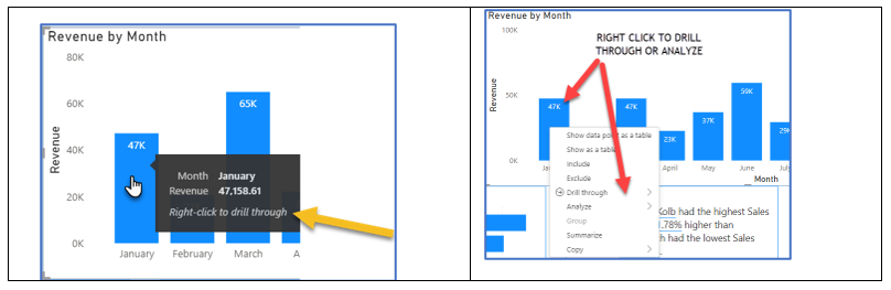
4. Drill through and analyze are great interactive tools for the user. The user is required to right-click on the visual to drill through or analyze the data as shown in Figure 7.26 and 7.27.
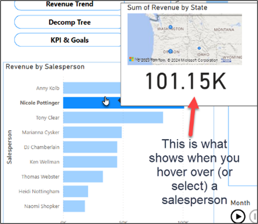
5. Customize Tooltips is a terrific way to provide additional information beyond the default tooltips. Look at a customized tooltip using XCaliber Foods. XCaliber Food’s Tooltip comes up when you hover over the revenue by salesperson or revenue by state. The tooltip shows the total, but also a map (city and state) of where the salesperson sold the product. As you can see in this pop-up tooltip, the salesperson Nicole Pottinger sold in three states: Washington, Oregon, and Idaho. Custom tooltips can even include drill-through options! Just keep in mind that you would not want a pop-up that covered the entire page!
6. Play axis is a dynamic slicer, animating other Power BI Visuals to show data or categories over time. The example shown on page 1 of the XCaliber Report is based on the salesperson as the driver, but shows the revenue, insights, and revenue by state over time by just clicking the Play button.

7. Multipage Report is a way to organize the information to support the story. Think of it as chunking the information into sections.
Organizing a Multipage Report in Power BI Desktop
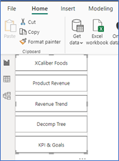
The preliminary report is organized into five pages: an overview, product revenue, revenue trend, decomp tree, and KPI and goals. The report is designed with key navigation so the storyteller can quickly move from one page to another.
Page 1—XCaliber Foods: Includes a sales summary and includes navigation, revenue by month, revenue by salespersons, revenue by state, smart narrative, and a play axis that animates all components through time dynamically. Figure 7.30 shows the tabs for each page.

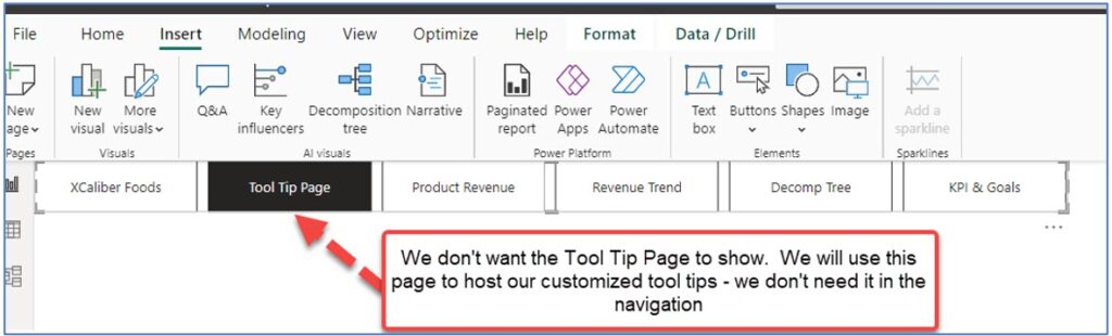
In Figure 7.30, you see the Tool Tip Page. This page is custom sized to provide a small pop-up effect. This page will only be seen in edit mode. Once an app is developed and you check the box to hide this page, the audience will not see it.
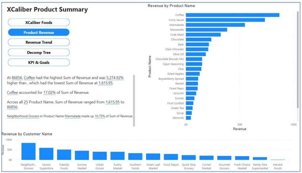
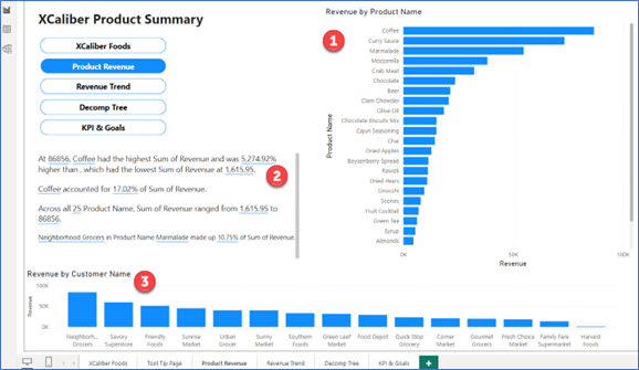
Page 2—Product Revenue: Includes navigation, revenue by product, revenue by customer, and smart narrative. As seen in Figure 7.31, the salespeople will quickly see the top products and the smart narrative will help put the information into perspective (for example, coffee accounts for 17.02% of sales revenue!). This allows the presenter to concentrate on popular products and to see what customers are purchasing.
Page 3—Revenue Trend: Includes navigation, includes a slicer by customer name to investigate revenue by month and revenue by state, with a map showing sales by state. As shown in Figure 7.32, the user can choose the slicer to see what products are popular as well as know what months they were sold in. This will allow the user to see the inconsistencies in sales. For example, if you select Corner Market in the slicer, you quickly see that although the average sales for Corner Market are $2k, sales fluctuate a lot.
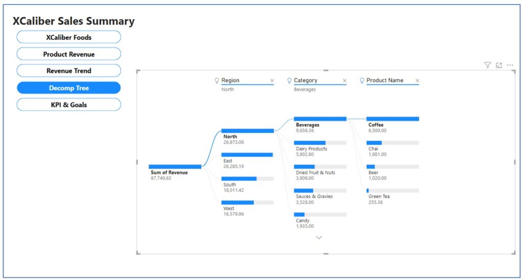
Page 4—Decomp tree includes navigation and a decomp example, from the North region, to the highest category (beverages), to the highest product within that category (coffee). As shown in Figure 7.33, users can investigate by changing the filters. Users can easily see the limited categories that are leading sales. The presenter can use the decomposition tree to break this into metrics. When the presenter is demonstrating the key metrics of sales, they can show dimensions through the region, product categories, product name, and even add salespeople to the mix. If the presenter wants to demonstrate supply chain data, the dimensions could be shippers, shipping methods, and delivery time (the time from order to shipped).
Page 5—KPI and goals: Includes navigation, a line chart of revenue by month, revenue by customer, KPI showing 2024 Goal per customer, 2024 revenue measured to the target ($510.33k to $600k), Revenue by payment type, and a tile card showing 2024 compared to target. In Figure 7.34, the KPIs are all from 2024 and no new goals were included. Another page could be added for 2025 goals, or the owner may wish to gain input from the current salespeople as to what the goal should be.
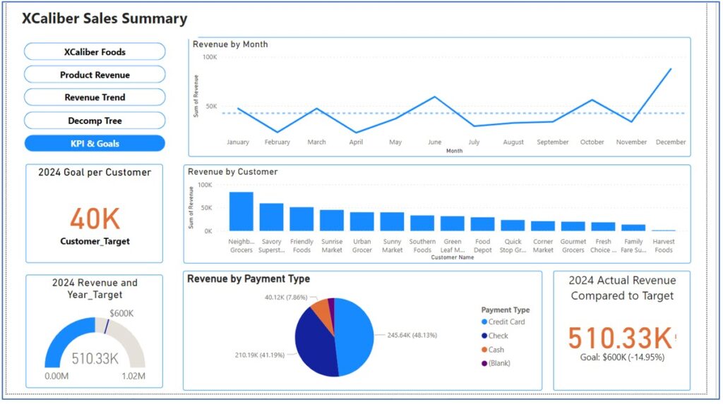
You may also note that no customer survey data are visualized here. Management decided to focus on 2024 and create a separate dashboard for survey data.
Connecting the Story to the Visuals and Data
If you go back to the CASS template (Exhibit 7.11), you will see that the main character in the story is Joe, a new salesperson at XCaliber. Joe’s early journey shows his struggle to learn the distribution software system, experiencing a lack of motivation even though he is on commission. The less motivated he feels, the more isolated he feels. Joe’s journey changes to success when he starts participating in the weekly discussions. Experienced salespeople attend the weekly meetings. Through these discussions, Joe learns how to sell products to his new customers. His confidence increases as he delivers sales orders on time. He listens to his customers, and he benefits from their growing trust. Joe bonds with his mentor and continues to participate in weekly discussions with all the salespeople. Joe feels comfortable contributing ideas to management and confident that they will be implemented. He is invested in XCaliber and wants to contribute to the overall goals of the company.
Now that we have started to see how to connect a story to the data, let’s take a step-by-step approach to building the report in Power BI Desktop.
Before we show the how, let’s talk about the “why” of navigation buttons in a Power BI Report (that we can ultimately publish from Power BI Desktop to Power BI Services [Online]). Navigation buttons work well for a presenter who wants to visit several pages (views) in a report and may want some flexibility in how it is presented.
Mac Users Can Create Their Report Using Power BI Services Online
If you recall, Power BI Desktop only works with PCs; however, Power BI Services Online works for either system, PC or Mac. Recently, Microsoft has added the ability to use the Data Model, which means Mac users (or even PC users) can create their reports directly in Power BI Services Online! The trick is to set up your Excel file within your OneDrive and link that file instead of uploading the file. Instead of linking, Mac users can publish the Excel file directly from Excel to Power BI. Both steps are in Section 7.1, A Word to Mac Users.
Reminder to Open Power BI Services Online: Go to http://office.com and log in. In the main Microsoft 365 page, choose Apps, and look for Power BI. Open it.
Next, make sure to have your Excel file in OneDrive regardless of which method you use: the Excel Publish method or the linking method.
The Excel Publish Method
Step 1—Open the Excel file. Use the Chapter 7 file, XCaliber Foods 7.3 Includes Delivery.
Step 2—In Excel, choose File, Publish, and Export workbook data to Power BI.
Step 3—Excel will show an active bar publishing. It will give a message at the top of the Excel menu that says “Workbook exported successfully.”
Step 4—Choose Go to Power BI.
Step 5—Type in your email address (the same one you use for your college credentials), and then click submit.
Step 6—In the My Workspace in Power BI Services Online, see if the file is there and that the type is Semantic Model. If you see this type as Semantic Model, you will be able to create reports and dashboards.
Note: If you do not see the type as Semantic Model, try the Linking Method.
Linking Method
Step 1—In Power BI Services Online, choose the Create button (under Home), and then select Excel (Preview). See Figure 7.35 for details.
Step 2—Choose Link to file and browse your OneDrive to find the Excel file. Use the Chapter 7 file, XCaliber Foods 7.3 Includes Delivery, and select Next.
Don’t be surprised if you are required to login (again) to Office.com.
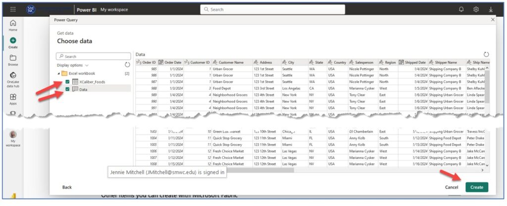
Step 3—A pop-up Power Query window (as seen in Figure 7.37) will appear. Under the Excel Workbook folder, make sure XCaliber_Foods and Data are both collected, and then choose Create.
You will see a screen that shows your data loading.
Step 4—You will now see the canvas area (Figure 7.38) where you can build your five-page report. You should see the Visualization pane and the Data pane. Use the XCaliber Foods (they both have the same data, but the data one contains meta data).
Now the good thing is this—the Step-by-Step instructions given next work for either the Power BI Services Online or the Desktop. Mac users should be able to create pages in the Power BI Services Online. As you work on adding information to the report. When saving the report, indicate in some way that it was created in Power BI Services Online. For example, we used XCaliber Using BIService as a name (see Figure 7.39).
 Step-by-Step to Add Navigation to a Power BI Desktop Report
Step 1—Open Power BI Desktop and Load File (Mac users: skip to Step 2)
a. Open the file you cleaned in Section 7.2. My file is called “XCaliber Foods Storytelling—Draft 2” (you may have given it a different name).
b. If you didn’t complete the cleaning in Section 7.2 follow these steps.
i. Choose File and New. You will see the Add data to your report as shown in Figure 7.40.
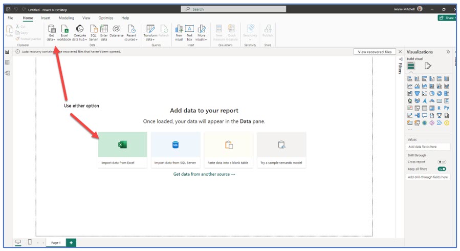
ii. Select Import data from Excel
iii. Choose the file called “XCaliber Foods 7.3 includes delivery.xlsx”
iv. Choose both tables (the red bubble number 1) as shown in Figure 7.41.
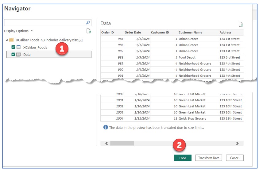
It may be confusing to see two tables when there is only one dataset from an Excel workbook that has one sheet. The second table is automatically generated by Power BI and represents the metadata associated with the Excel file.
v. Click Load as shown in Figure 7.42 (#2). You will now see the Data pane showing two tables. You can ignore the metadata table. The metadata table is the one called “Data” because it shows the worksheet name.
Step 2—Create pages. Make tabs.
a. At the bottom of the canvas, find the Page 1 tab. Double-click it and rename it as shown in Figure 7.43. Then click the + key to add a new page (tab).

b. Right-click the Tool Tip Page and choose Hide. You will see a crossed-out eye symbol.
Step 3—Create Navigation Buttons
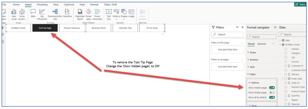
a. On the main menu, choose Insert, Buttons, Navigator, then Page navigator. Power BI Desktop by default shows all the pages, but we don’t want to show the Tool Tip Page. So we need to take an extra step. See Figure 7.44.
b. In the Format navigator pane, go to Pages. Toggle “Show hidden pages” to Off. See Figure 7.45 to see where the Format navigator pane is located.
c. The buttons are in a horizontal state (by default), and we want vertical buttons. In the Format navigator, choose Grid layout and change orientation to vertical. Don’t be alarmed when you see only slim bars with no text. With your mouse, click the handler (#1) around the buttons and resize. Push the right side (of the 4 bars; #2) to the left, and then pull the bars down (#3) until you see the text (see the next two figures).
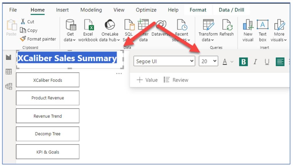
d. Now let’s add the title to this page, XCaliber Sales Summary as shown in Figure 7.48. Note, the font is Segoe UI, size is 20, bold, and left aligned. The buttons look generic, so let’s work on them next.
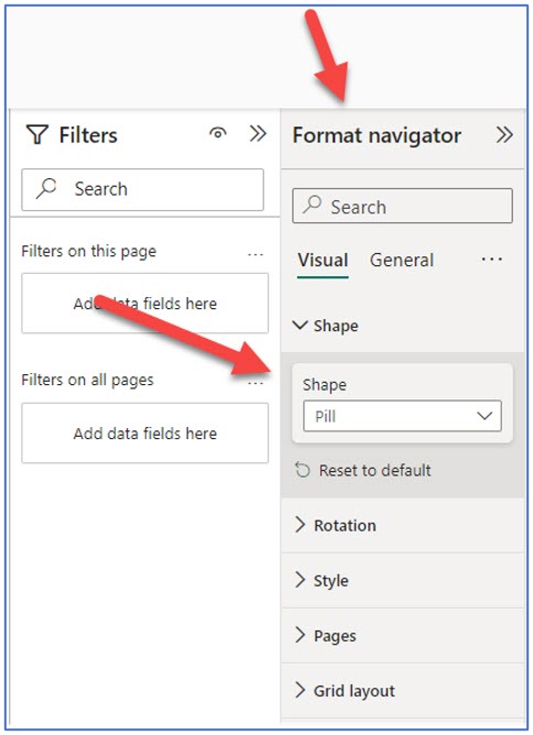
e. Users expect certain behaviors from buttons. If we get them designed on this page, we can copy them to the other pages. Buttons have four states: default, hover, press, and selected. It adds a lot to the report if the buttons work as expected by your users. There are dozens of designs that can be used for the shape of the button. For now, select the button set. The handlers will be around all five buttons. In Format Navigator, go to Shape, and change to Pill (see Figure 7.49).
f. To set the behavior of the buttons, we need to set the different states. Here are the states (default, hover, and selected) and what they will look like. You can change the “press” default; however, it is so quick that most users don’t notice any effect. See Figure 7.50.
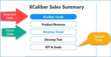
In the Format Navigator pane, do the Default state first. The items bolded in Table 7.1 represent subcategories under the main category Visual under the Format Navigator.
Apply all these settings to the buttons—you can do the entire button set at one time by reviewing the settings in Table 7.1.
Table 7.1: Applying Settings to the Buttons
|
Apply settings to the Default State |
Apply settings to the Hover State |
Apply settings to the Selected State |
|
Format Navigator, Visual, Style, Text, Bold, font size 12 Font color—Black Fill—Color white Border—Blue |
Format Navigator, Visual, Style, Text, Bold, font size 12 Font color—Blue Fill—Color white Border Blue |
Format Navigator, Visual, Style, Text, Bold, font size 12 Font color—white Fill—Blue Border—White |
g. Remember, Power BI shows the first button as selected as default. Now copy the button set to the Product Revenue page, the Revenue Trend page, the Decomp Tree page, and the KPI & Goals page. You do not want to copy it to the Tool Tip Page—we are using that page to house our pop-ups.
Don’t worry though—all the states are incorporated in this full set of buttons. If you add another page, the corresponding button will use the established settings.
h. Now that we have the navigation set, let’s start building the visuals and graphs for each page. It is also a suitable time to Save your work. Save it to your OneDrive space.
Bookmarks, Themes, and Mobile Layout Overview
Before we start the next section, review the difference between navigation buttons and bookmark navigators. A bookmark captures a specific state of a report page. Bookmarks save the current filters and slicers, cross-highlighted visuals, sort order, or my favorite bookmark, which clears all the filters so I’m back to my default dashboard. If you have a collection of bookmarks, you can even set up a slide show. There are all kinds of things you can do with bookmarks, including a visual table of contents, and bookmarks to turn on a color palette that works for people who are color-blind. You can even set up an overlay to add more commentary, although this is a more advanced skill. If your story needs commentary, try the overlay trick featured in the YouTube video from Sweatpants BI (2022).
Microsoft Learn. (2023, Dec 19). Create report bookmarks in Power BI to share insights and build stories. Microsoft. https://learn.microsoft.com/en-us/power-bi/create-reports/desktop-bookmarks?tabs=powerbi-desktop
Sweatpants BI. (2022, Nov 8). Overlaying commentary & highlights using Power BI bookmarks and Power Point. [Video]. YouTube.
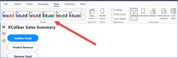
Please note that Power BI Desktop allows you to apply themes. This is not available in Power BI Services (Online), even though both products do similar things. In Figure 7.51, the default theme is the one on the far left. Note that the view shows a mobile layout. Essentially, in either Power BI Desktop or Power BI Services Online, you can design the report, so it works for a phone layout.
Figure 7.51—Themes in Power BI Desktop
Mac Users—Please note that you can follow the steps outlined in the Step-by-step instructions for building a report; however, the images shown here are taken from the Power BI Desktop.
Step-by-Step to Add Visuals to Page 1 of a Power BI Desktop Report
Step 1—Start with page one (see Figure 7.52 for the completed design). This page has six components: (1) Revenue by Month, (2) Revenue by Salesperson, (3) Revenue by State, (4) the pop-up that comes up when hovering over either Revenue by State or Revenue by Salesperson, (5) the Insights, and (6) the Play axis.
 Revenue by Month
a. Start by clicking in the middle of the canvas, and then the stacked column chart in the Visualizations pane. Reposition as necessary.
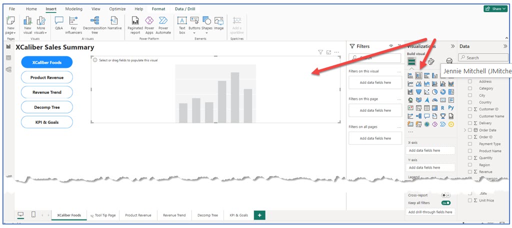
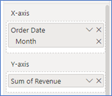
b. In the Data pane, drag the Order Date to the x-axis keeping only the Month. Then drag Revenue to the y-axis.
c. In the Visualization pane, choose Format (paint brush), then General, then Title. Remove “Sum of” so the title of the chart will be Revenue by Month.
d. Next, let’s format the y-axis. In the Visualization pane, choose Format (paint brush), then Visual, then choose the y-axis and expand it. Choose Title, and type in Revenue (you just type right over the “Auto” in the text box). Now the y-axis says Revenue and not Sum of Revenue. Make any other format changes you desire (bold, font size, etc.)
e. To add a blue border, in the Visualization pane, choose Format, General, and then Effects. Expand effects, and in Visual border, select On, then change the color to blue.
Make sure to click out of the chart before you select the next visualization.
 For the Revenue by Salesperson
a. Click on the blank canvas. In the Visualization pane, choose the stacked bar chart. Reposition as needed.
b. In the Data pane, choose Salesperson for the y-axis and Revenue for the x-axis.
c. Let’s remove “Sum of Revenue” in the X-Axis Title by turning off the Title, or you can just choose to say Revenue.
d. Instead of Sum of Revenue by Salesperson, let’s just use Revenue by Salesperson. In the Visualization pane, choose General, then Title and remove the “Sum of.”
e. To add a blue border, in the Visualization pane, choose Format, General, and then Effects. Expand effects, and in Visual border, select on, then change the color to blue.
 For the Revenue by State
a. Click on the blank canvas. In the visualization pane, choose the stacked bar chart. Reposition as needed but have it on the far right.
b. In the Data pane, choose State for the y-axis and Revenue for the x-axis.
c. Let’s remove “Sum of Revenue” in the X-Axis Title, by turning off the Title or you can just choose to say Revenue.
d. Instead of Sum of Revenue by Salesperson, let’s just use Revenue by Salesperson. In the Visualization pane, choose General, then Title and remove the “Sum of.”
e. To add a blue border, in the Visualization pane, choose Format, General, and then Effects. Expand effects, and in Visual border, select on, then change the color to blue.
 For the Pop-Up Custom Tool Tip
Power BI Desktop visualization has tool tips turned on by default; however, the default tool tips don’t add much value since they replicate the data. Custom tool tips can add value and context as well as support better storytelling.
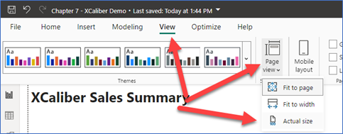
a. First of all, we already have a separate page in our report that we named Tool Tip Page, and we hid it from view. Go to this page. In the main menu, choose View, in Page View, choose Actual size.
b.  Next, in the Visualization pane, click the Format (paint brush). Expand the Page information. You should see “Tool Tip Page” since we have already named the page. Toggle the button to On for Allow use as tooltip (see below). Next, expand Canvas Settings, Choose Tooltip, and customize the height to 240 px and width to 320 px with vertical alignment set at top. Next, in the Visualization pane, with the tooltip already selected, choose a card visualization, and in the Data pane, choose Revenue. The card might be too large, so use the Format (paint brush), choose values, and adjust the size. Figure 7.56 shows the results. But we still need some additional features to add context.
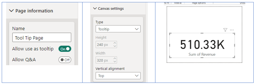
Figure 7.56—Showing Results of the Steps for a Custom Tool Tip
We have a way to go to make this worthy of being called customized!
c. Next, let’s remove the “Sum of Revenue.” Click on the handlers around the 510.33k and choose Format (paintbrush). Under Visual, turn the Category label Off.
d. Let’s add some context by adding a map. In the Visualization pane, choose the Filled Map, then on the Data pane, choose Revenue and State. You may need to adjust the map, so it shows only the United States. It should look like Figure 7.57.
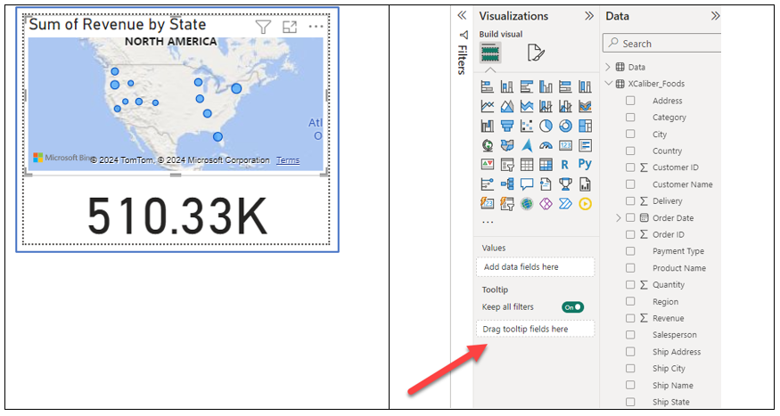
e. Click on the customized tool tip and in the Visualization pane, you will see Drag tooltip fields here. You can drag more than one. So drag the fields, State and Salesperson. Now a user can see where the salesmen sold products. And if you hover over Revenue by State bars, you will see which city and state. The dollar amount will automatically change too!
 Insights
Insights can be customized but it is a great feature using the default visualization.
a. Make sure you are in a blank spot on the canvas of the XCaliber Foods page. On the Visualization pane, select Smart narrative. The component may take up more space than you expected, but you can use the handlers to resize it. Just FYI, you can set up the smart narrative as a tool tip!
Once resized, add a title to the top. I called this INSIGHTS. The insights shown are based on the chart showing Revenue by Month. But we can add insights to Revenue by Salesperson. Feel free to add a border and change the size of the font.
b. Select the Revenue by Salesperson chart. Then in the Format (paintbrush), choose General, Header Icons, then expand Icons. In Icons, toggle the Smart narrative to On. You will now see a Smart Narrative icon in the top right of the chart (see the red arrow in Figure 7.58).
 Add a Play Axis for Time Series Analysis
A play axis is a fairly new visualization available in Power BI (at least new to me). It reminds me of audio controls.
a. Find a blank spot in the canvas, and in the Visualization pane, choose the Play Axis visualization. It will show up in an unexpected space ready for a field (shown in Figure 7.59). Drag it down to the spot we have under Insights and resize it as needed.
b. Next, it requires a field to make this work. In this case, drag the field Salesperson. You can add a border. Format (paintbrush), General, and then Effects. Expand effects, and in Visual border, select On, and change color to blue.
c. Try the speed—push the play button. To slow down the speed, Format (paintbrush), Visual, Animation Settings, and change the time to 2000 ms. (As an aside, we are not convinced that this is practical for every dashboard, but it might have a place if your eyes were focused on only one component.)
d. Make sure to Save your file. Always make sure to save your file to a OneDrive location. Now let’s move on to page 2 of the report.
Exhibit 7.12—Page One of Report Built in Power BI Services Online
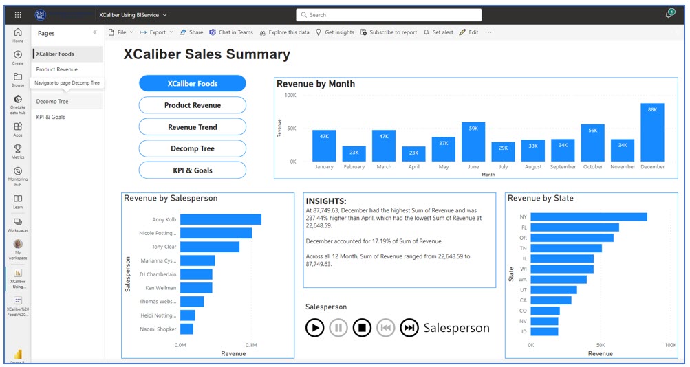
Mac Users: Exhibit 7.12 shows page one of the five-page report built in Power BI Services Online.
Step-by-Step to Add Visuals to Page 2 of a Power BI Desktop Report
Mac Users: Use these instructions in Power BI Services Online.
Step 1—Start with page two tabbed Product Revenue (see Figure 7.60 for the completed design). This page has three components: (1) Revenue by Product Name, (2) Smart Narrative based on Revenue by Product Name, and (3) Revenue by Customer Name.
Revenue by Product Name
a. Note, you should see the navigation buttons and the Product Revenue will be in the selected state.
b. Start by clicking in the middle of the canvas, and then the clustered bar chart in the Visualization pane. Reposition as necessary.
c. In the Data pane, drag the Product Name to the y-axis and drag the Revenue to the x-axis.
d. In the Visualization pane, choose Format (paintbrush), then General, then Title. Remove the “Sum of” so the title of the chart will be Revenue by Month.
e. Next, let’s format the x-axis. In the Visualization pane, choose Format (paintbrush), then Visual, then choose the X-Axis and expand it. Choose Title, and type in Revenue (you just type right over the “Auto” in the text box). Now the x-axis says Revenue and not Sum of Revenue. Make any other format changes you desire (bold, font size, etc.)
f. To add a blue border, in the Visualization pane, choose Format, General, and then Effects. Expand effects, and in Visual border, select On, then change the color to blue.
g. Add a title to this page, by adding a text box. We used the title: XCaliber Sales Summary, at 20-point font and bold. However, you might want to name this page XCaliber Product and Customers if it fits your storytelling better.
Make sure to click out of the chart before you select the next visualization.
Smart Narrative Based on Revenue by Product Name
Insights can be customized but we are demonstrating the default visualization.
a. Make sure you are in a blank spot on the canvas of Product Revenue page 2. On the Visualization pane, select Smart narrative. The component may take up more space than you expected, but you can use the handlers to resize it. Once resized, feel free to add a title to the top, like the word INSIGHTS. The insights shown are based on the chart showing Revenue by Product Name. Feel free to add a border and change the size of the font.
Revenue by Customer Name
a. Click on the blank canvas. In the Visualization pane, choose the stacked column chart. Reposition as needed.
b. In the Data pane, choose Customer Name for the x-axis and Revenue for the y-axis.
c. Let’s remove “Sum of Revenue” in the Y-Axis Title; by turning off the Title (we need the room, so removing the title is the best option).
d. Instead of “Sum of Revenue by Customer Name,” let’s just use “Revenue by Customer Name.” In the Visualization pane, choose General, then Title and remove the “Sum of.”
e. To add a blue border, in the Visualization pane, choose Format, General, and then Effects. Expand effects, and in Visual border, select On, then change the color to blue.
f. Make sure to save your file to your OneDrive location.
Step-by-Step to Add Visuals to Page 3 of a Power BI Desktop Report
Mac Users: Use these instructions in Power BI Services Online.
Step 1—Start with page three tabbed Revenue Trend (see Figure 7.61 for the completed design). This page has four components: (1) Revenue by Month with an average line, (2) Revenue by Product Name, (3) a slicer for XCaliber’s 15 customers, and (4) Revenue by State using a map.
Revenue by Month
This same graph is used on page 1—please review the steps—they are the same until we add the average goal line, center the graph heading, and add some data labels.
a. In the Visualization pane, right of the Format (paintbrush), choose the magnifying glass as seen in Figure 7.62.
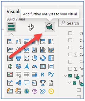
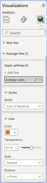
b. Once you select the magnifying glass, look for the average line. Note all the types of lines we could use here: constant line, min line, max line, average line, median line, percentile line, and error bars. Expand the average line and add a line. We named it Average Sales. Notice you can add multiple lines.
c. Next, change the color of the line. In the line feature, change the color to red.
d. Because it was somewhat crowded, we turned on data labels, turned off the y-axis title, and turned off values on the y-axis.
e. To make the data label stand out, under Value, change the font to size 10 and bold.
Just as a note: The average sales line is calculated as $42,527 ($510,326/12 months) and this line makes sense when your chart shows total sales. This line will not change even if you choose revenue by product name; however, it does reinforce the trend of inconsistent sales. It also gives the user some insight into the inconsistency of even the best sales product, coffee, as shown in Figure 7.64. Notice that it tells the user to “Right-click to drill through,” adding another layer of analysis.
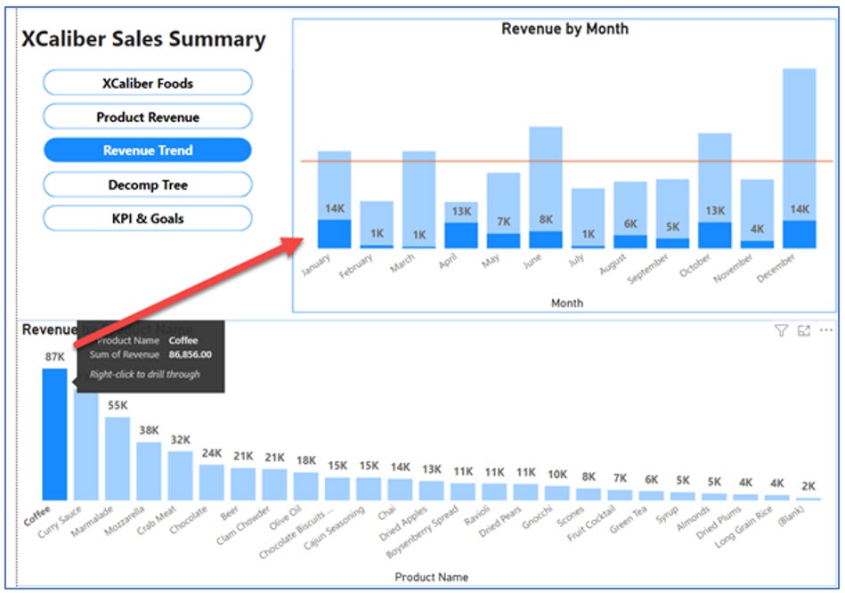
Revenue by Product Name
This is the exact same chart as the one shown on Product Revenue but using a stacked column chart instead of a clustered bar chart.
Other differences: added data label and made font large and bold. Turned off values for the y-axis and removed the title, Sum of Revenue, by toggling the Title to Off.
Slicer Based on Customer Name
The slicer is based on the15 customers. One of the goals of the owner is to expand the number of customers and expand the number of states where the product is shipped. This slicer makes it easy to see where the customer is located and one what product they are purchasing. The slicer can work for a single customer or multiple customers. Here is an example of how well you can get to know your customers.
a. Click in a blank space on the Canvas. Then in the Visualization pane, choose the Slicer and reposition the slicer to the right of the Revenue by Month chart.
b. Drag the Customer Name to the Slicer.
c. Resize so that all the customers show in the slicer. Add a blue visual border.
In Figure 7.65, the customer, Corner Market purchased three products: beer, fruit cocktail, and chocolate. If you look at the revenue by month the revenue by month is quite inconsistent. In fact, there are no sales in February.
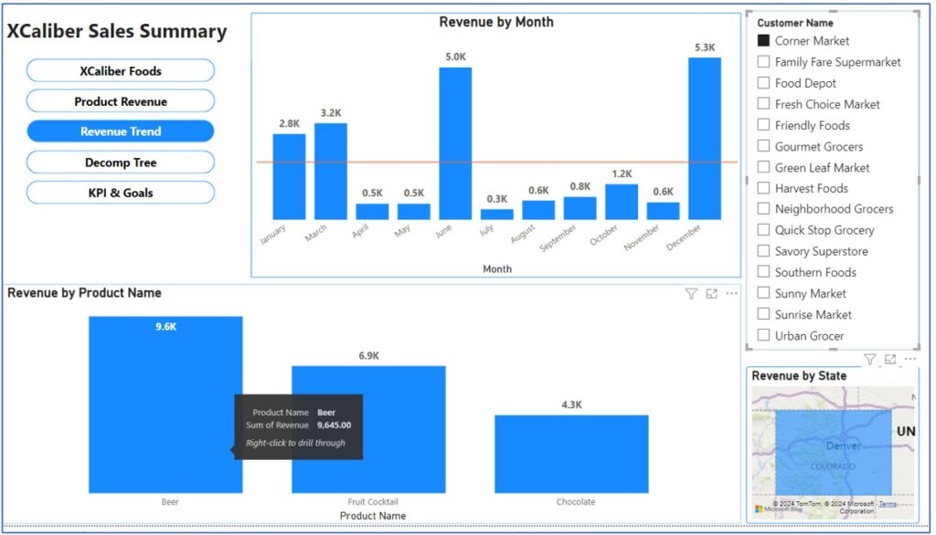
Revenue by State—Using a Map
a. Click in a blank space in the Canvas. In the Visualization pane, choose the Filled map. Move the map so it is mostly showing the United States.
b. Next, in the Data pane, choose State and Revenue.
c. Next, remove “Sum of” using the Format (paintbrush), General, and Title.
d. Add a visual border in Format (paintbrush), General, Effects, Visual Border toggled to On and choose a blue color.
Step-by-Step to Add Visuals to Page 4 of a Power BI Desktop Report
Mac Users: Use these instructions in Power BI Services Online.
Step 1—Start with page four tabbed Decomp Tree (see Figure 7.66 for the completed design). This page uses a Decomposition tree visual. This versatile tool adapts to your data to help uncover insights by drilling into dimensions. It’s like peeling a layer of an onion to reveal hidden patterns. Look at the completed design to see what it looks like and how to drill down to see patterns.
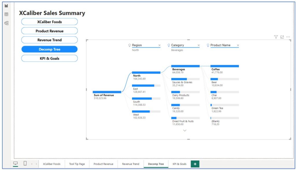
To interpret the Decomposition Tree, notice it shows the highest sales for the region (the North), shows the highest sales categories (beverages, sauces, dairy products, and so on), and the specific product names under the categories. If you click on the bar for the East region, you will see the highest sales categories and products.
Decomposition Tree
a. Note, you should see the navigation buttons, but you may need to add the title, XCaliber Sales Summary. If you need to add a title, click Insert, Text Box, and type the title with a 20 bold point font.
b. Next, click in the middle of the canvas, then choose Decomposition Tree in the Visualization pane.
c. Resize so the container takes up most of the space.
d. In the Data pane, select Revenue and Region. Note that a bar appears with a plus at the right side of the bar as shown in Figure 7.67. You have choices of high value, low value, category, or region.
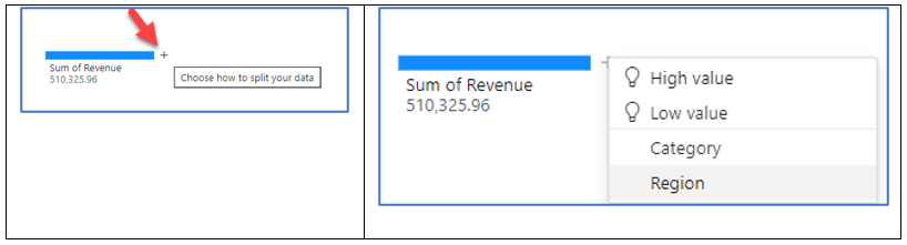
e. Since the storyteller wants to focus on expanding and growing in regions, choose Regions. Your page should look like Figure 7.68.
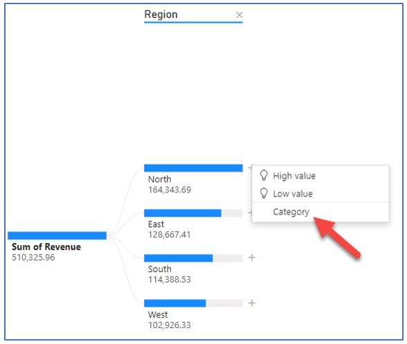
f. Click Category. You will see all the categories listed. To add Product names, on the Data pane, select Product Name.
g. The plus beside Beverages will show a choice of High value, Low value, and Product Name. Click the plus and choose Product Name.
Try exploring this Decomp Tree to see each region’s high-selling categories and products. For example, which region has the highest sales of jams and preserves? By clicking through the Decomp Tree, you will discover the answer is the East region.
Step-by-Step to Add Visuals to Page 5 of a Power BI Desktop Report
Mac Users: Use these instructions in Power BI Services Online.
Step 1—Start with page five tabbed KPI & Goals (see Figure 7.69 for the completed design). This page includes the following components: (1) Revenue by Month—Line chart with trend line, (2) Revenue by Customer, (3) Revenue by Payment type, (4) a KPI card showing 2024 Sales total compared to goal, (5) a KPI showing 2024 customer goal, and (6) a KPI card showing year revenue to target in a gauge graph.
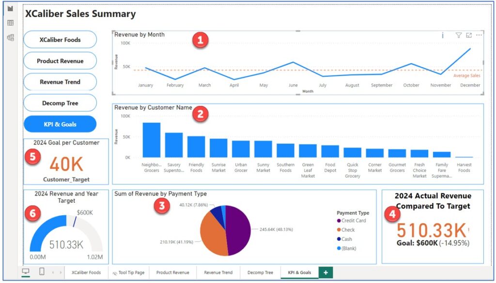
Revenue by Month
a. Start by clicking in the middle of the canvas, and then the line chart in the Visualization pane. Reposition as necessary.
b. In the Data pane, drag the Order Date to the x-axis keeping only the Month. Then drag Revenue to the y-axis.
c. In the Visualization pane, choose Format (paint brush), then General, then Title. Remove the “Sum of” so the title of the chart will be Revenue by Month. If you prefer, feel free to center the title.
d. Next, let’s format the y-axis. In the Visualization pane, choose Format (paint brush), then Visual, then choose the Y-Axis and expand it. Choose Title, and type in Revenue (you just type right over the “Auto” in the text box). Now the y-axis says Revenue and not Sum of Revenue. Make any other format changes you desire (bold, font size, etc.)
e. To add an average line, the Visualization pane, then the magnifying glass. Go to the Average line, add a line, and name it Average Sales. If you desire, choose Data label, turn it On, and Choose the name to show (you can show both the name and the amount). We chose a different color to represent the average sales as shown in Figure 7.70.
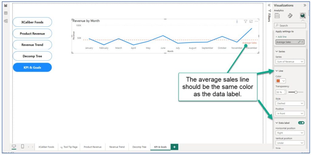
The average sales line is a good indicator for the food business. We expect revenue trends to be influenced by seasonality, economic conditions, and availability of fresh produce. An average line ($510,326/12 = $42,527) will directly show when sales are above or below average. In 2024, the sales goal was $600,000 for the year (or $50,000 per month). As you can see, XCaliber did not reach that goal in most months.
Some users will want to see a trend line, but not all charts will allow a trend line. If you don’t see a Trend line selection when you select the magnifying glass, it may be because you have the wrong chart, or you have your date hierarchy set up incorrectly.
f. To add a blue border, in the Visualization pane, choose Format, General, and then Effects. Expand effects, and in Visual border, select On, then change the color to blue.
g. While on this page, add the title, XCaliber Sales Summary. Or you may prefer a different title.
Make sure to click out of the chart before you select the next visualization.
Revenue by Customer
This same graph was used on page two, but we want to keep some of the axis titles.
a. Click on the blank canvas. In the Visualization pane, choose the stacked column chart. Reposition as needed.
b. In the Data pane, choose Customer Name for the x-axis and Revenue for the y-axis.
c. Let’s remove “Sum of Revenue” in the Y-Axis Title, by typing Revenue in the Title section.
d. Instead of Sum of Revenue by Customer Name, let’s just use Revenue by Customer Name. In the Visualization pane, choose General, then Title and remove the “Sum of.”
e. To add a blue border, in the Visualization pane, choose Format, General, and then Effects. Expand effects, and in Visual border, select On, then change the color to blue.
Make sure to click out of the chart before you select the next visualization.
Revenue by Payment Type
This chart shows how customers paid for their orders. What is interesting is that we have credit cards, checks, and cash, as expected. However, we also see a small portion of sales that don’t show payment of any kind—they are just blank. Are these uncollected, bad checks, or overlooked?
a. Click in a blank space on the canvas. Then in the Visualization pane, choose the pie chart. Resize as needed—this should fit nicely under the Revenue by Customer Name.
b. In the Data pane, choose Payment and Revenue.
c. The visual will show amounts and percentages. Feel free to adjust the colors.
d. To add a border, choose Format (paintbrush), General, Effects, toggle Visual Border on, and choose a blue color.
Make sure to click out of the chart before you select the next visualization.
KPI Card—Actual Revenue Compared to Target
a. Click on a blank space of the canvas. In the Visualization pane, choose the KPI card. Reposition so it is to the right of the Revenue by Payment Type.
b. Next, we will write a little DAX code. Don’t worry—we will take it step-by-step. In the main menu ribbon, go to the Home tab and choose New measure (see Figure 7.71).
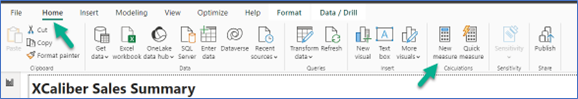
c. A pop-up (see Figure 7.72) will show a place to type. You will see 1 Measure = but type over the Measure and type Year_Target = 600000 and complete the format to currency. The Name should be Year_Target. The home table is XCaliber Foods.
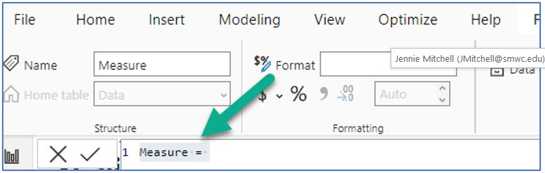
You are setting up your KPI to show the target sales for 2024, which were $600,000.
Once you are done, select the checkbox to commit to this expression. It should look like Figure 7.73.
You will now see the Year_Target measure in your Data pane.
d. In the Data pane, choose Year and Revenue, and Year_Target

e. Add a title: Choose Format (paintbrush), General, Title, and type this text: 2024 Actual Revenue Compared to Target. Make it a heading two and bold and change the font size to 16. This replaces “Sum of Revenue by Year.”
Figure 7.75 shows the default look. We want the title text to be on two lines, and the 510.33k to be in orange instead of red. Also, the colored block is distracting. Before we get rid of the red block, change the “bad color” to orange.
f. To do this, go to Format (paintbrush), Visual, and expand the Trend axis. Replace the current “bad color” of red with orange. This should change the text color to orange and even the color block has a paler color of orange.
g. Now toggle the Trend axis to Off. It will keep the orange text, but the color block is gone!
h. The Goal of $600k should be bold and larger. Go to Format (paintbrush), Visual expand Target Label, choose Values, and change the font size to 15, Bold.
i. The only thing left is to add a blue border. To do this Format (paintbrush), General, Effects, Visual Border, and change the color to blue.
Card—2024 Goal per Customer
a. Click on a blank space on the canvas. In the Visualization pane, choose the card (not the KPI card, just card). Reposition so it is under the navigation buttons.
b. Next, we will write a little DAX code. Don’t worry—we will take it step-by-step. We want a KPI that shows what the goal would be for 15 customers in order to reach $600k per year: ($600,000/15) = $40k. In the main menu ribbon, go to the Home tab and choose New measure.
c. In the pop-up menu, replace Measures with “Customer_Target = 40000”. It will look like Figure 7.76. Make sure you have Currency in the Format and that the Home table is XCaliber_Foods. Once you feel you have it completed, click the check mark to “commit.” Verify that you see it in your Data pane.
d. Make sure the KPI container is selected and in the Data pane, choose Customer_Target. It should look like Figure 7.77.
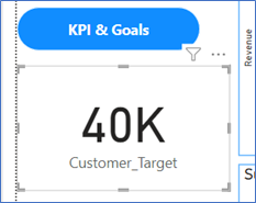
e. To turn the text color to orange, go to Format (paintbrush), Visual, and expand Callout Value. Change the color to orange. In the Category label, bold the text Customer_Target.
f. To add a title, Format (paintbrush), General, and Title. Toggle the Title to On. Expand the Title and type “2024 Goal per Customer.” Align the title for the center.
g. The only thing left is to add a blue border. To do this Format (paintbrush), General, Effects, Visual Border, and change the color to blue.
Gauge Visual of 2024 Sales Goal
This visual is somewhat of a duplicate of the 2024 target revenue of $600,000. It does give a slightly different perspective.
a. Click on a blank space on the Canvas. Then in the Visualization pane, choose the gauge visual. Reposition as needed.
b. In the Data pane, select Revenue for the Value and Year_Target (this is the DAX expression that you wrote earlier) as the Target Value. It should look like Figure 7.78.
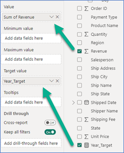
c. We have two things left to do on this visual. We want a title, 2024 Revenue and Year Target (remove Sum of) to be centered. Go to Format (paintbrush), General, expand Title. In the text box, type 2024 Revenue and Year Target, and center it.
d. We also want a blue border. To do this Format (paintbrush), General, Effects, Visual Border, and change the color to blue.
Now that you have KPI & Goals page completed, work to reposition the visuals to use the space well.
Note: If you have been working along with your Mac, you do not need to publish to Power BI Services Online (because you’ve been working live in it). Just make sure to save your report.
7.4 Publish to Power BI Services Online
Data is a tool for enhancing intuition.
—Hilary Mason, data scientist and founder of Fast Forward Labs
In the last section, you created a five-page report in Power BI Desktop. And it truly looks great! Mac users created their report directly in Power BI Services Online. Mac users can skip this part and go to the next section, Get Quick Insights. But how do PC users using Power BI Desktop get their report to Power BI Services Online? Some of what you can experience is limited if you have a free Power BI Services Online account and not a Pro account.
Power BI Services Online provides an array of features for data visualization, exploration, and collaboration. One particularly powerful feature is Quick Insights, which allows users to uncover hidden gems within their data effortlessly. By simply interacting with dashboard tiles, analysts can access automatic analyses that reveal correlations, outliers, trends, seasonality, change points, and major factors. Only Power BI Services Online has Quick Insights; Power BI Desktop does not.
Publish Your Power BI Desktop Report to Power BI Services Online
Note: Screenshots of Power BI interface © Microsoft Corporation. Used with attribution for instructional and illustrative purposes. Annotations added by the author.
If you have not opened Power BI Services Online, here are the steps to open assuming you are a student and have access to Microsoft Office 365 as part of your college account.
Step 1—Go to http://office.com and log in.
Step 2—In the main Microsoft 365 page, choose Apps, and look for Power BI (as shown in Exhibit 7.13).
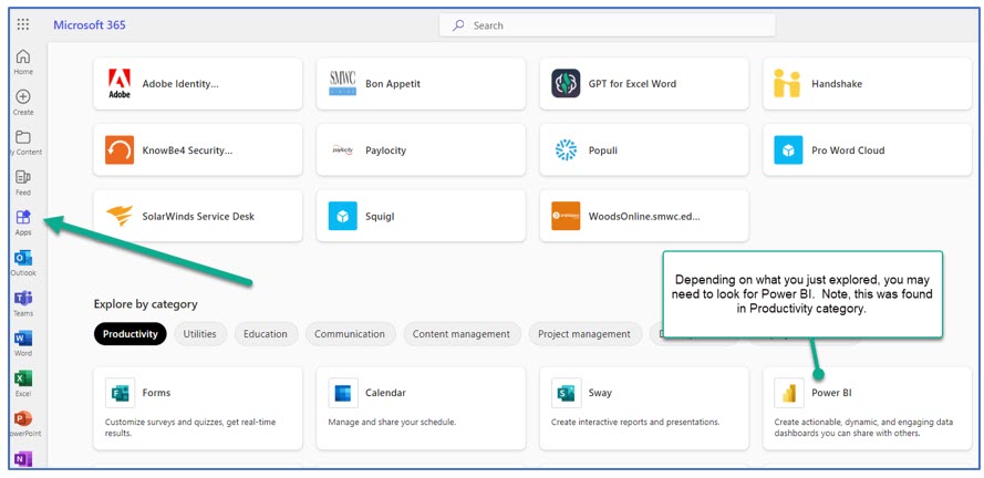
Source: Screenshot of Microsoft 365 Interface © Microsoft Corporation. Author Annotations Added
Step 3—Once logged in, click on your avatar (or picture) to determine your license. If you see “FREE,” that means that some of the extraordinary features will not be available. If you see “PRO,” you can create a Workspace and create an App.
Step 4—Open your Power BI Desktop to the five-page report. To publish your Power BI Desktop five-page report to Power BI Services (Online), just choose Publish. A pop-up screen will show My Workspace. The image shown in Figure 7.79 is different since I’ve been using this account and have set up Workspaces. If you don’t have a Pro account, you will not be able to set up additional Workspaces; however, you can still publish to your personal “My Workspace.”
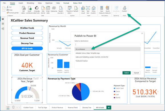
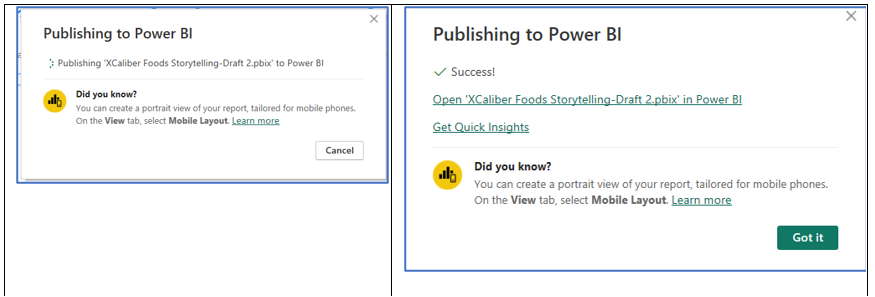
Notice that Power BI Services Online is already reminding you to Get Quick Insights!
Get Quick Insights
In My Workspace, two files are published from Power BI Desktop: a Report, and a Semantic model. If you click on the ellipses [the 3 dots] beside the name, lots of features are available. Note that one of the features is “Quick Insights.”
Figure 7.81—Published Five-Page Report and Quick Insights (PC Version)
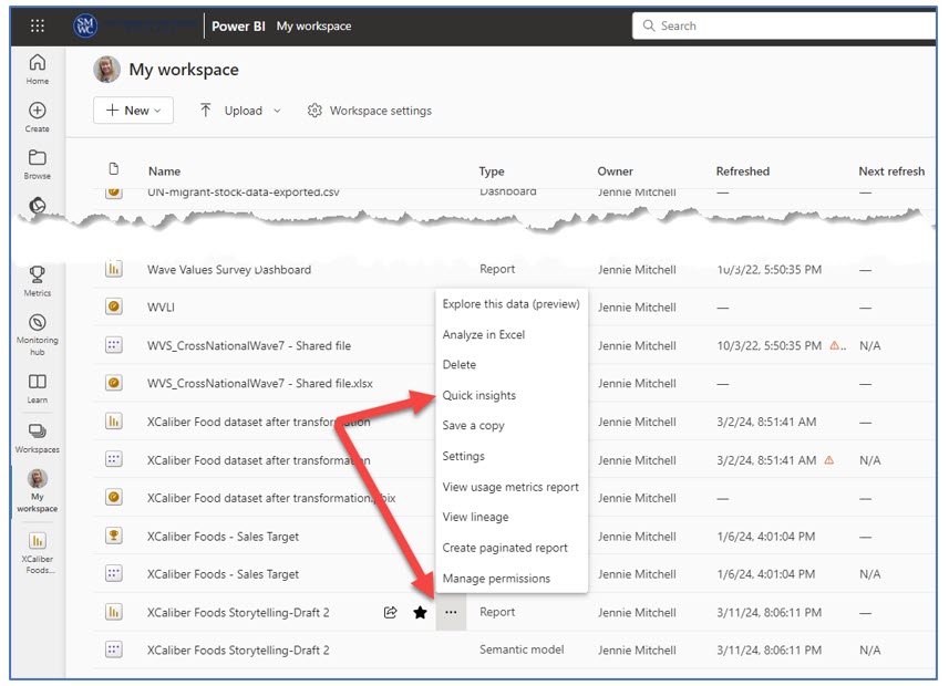
If you are a Mac user, we asked you to name the report in a way to identify it as created in Power BI Services Online. See Figure 7.82; notice the name “XCaliber Using BIService.”
Figure 7.82—Published Five-Page Report and Quick Insights (Mac Version)
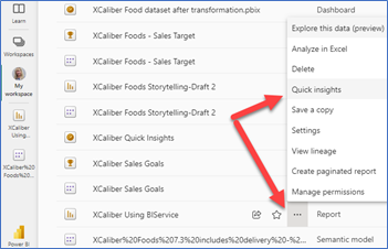
Once you select Quick Insights, you will see a pop-up screen as shown in Figure 7.83.
Figure 7.83—Pop-Up Screen for Choosing Quick Insights
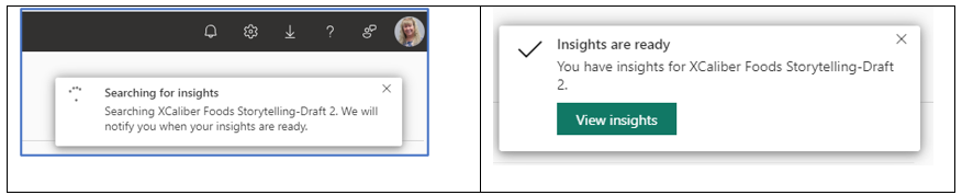
The quick insights come in the form of charts. Just for this assignment, Power BI Services (Online) generated over 40 charts. Let’s define some of the terms used, and then we will look at an example of different types of insights from the XCaliber Food Distribution Company dataset.
Some Quick Insights Categories:
Category outliers: “Highlights cases where one or two categories have larger values than other categories” (Microsoft Learn, 2024, para. 10).
Change points in a time series: “Highlights when there are significant changes in trends in a time series of data” (Microsoft Learn, 2024, para. 11).
Correlation: “Detects cases where multiple measures show a similar pattern or trend when plotted against a category or value in the semantic model” (Microsoft Learn, 2024, para. 12).
Low Variance: “Detects cases where data points for a dimension aren’t far from the mean, so the variance is low” (Microsoft, 2024, para. 13).
Majority (Major factors): “Finds cases where most of a total value can be attributed to a single factor when broken down by another” (Microsoft Learn, 2024, para. 14).
Outliers: “Outliers detect when there are specific categories with values significantly different than the other categories” (Microsoft Learn, 2024, para. 15).
Time Series (Overall trends or seasonality): These detect patterns in a time series.
We can also View insights on a single dashboard tile. But we first need to get you to create a dashboard!
Category Outlier: One of the quick insights (see Figure 7.84) shows the category “Beverages,” as the highest category sold in the North. Beverages count for the top selling category in the North Region ($65k), South Region ($35k), and West Region (30k). But beverages come in last in the East Region, selling only $2k total.
Figure 7.84—Category Outlier: From Quick Insights
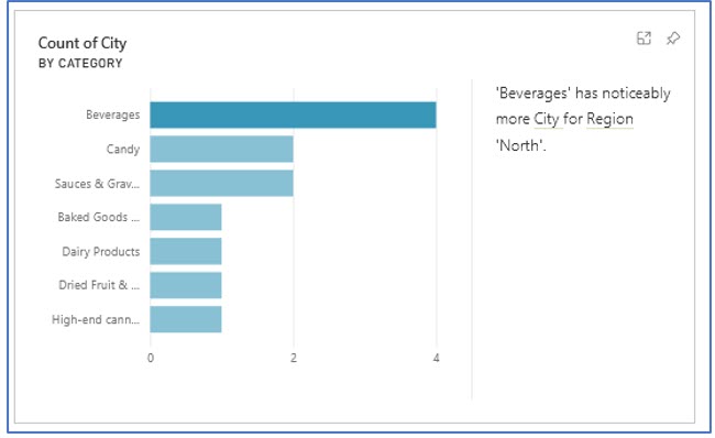
Correlation: Shows a similar pattern or trend.
Figure 7.85 shows that there is a correlation between average sales by customer for the product shipped to Milwaukee. In other words, the grocers tend to place the same order over and over with little to no fluctuation in unit price charged for the product.
Figure 7.85—Correlation: From Quick Insights
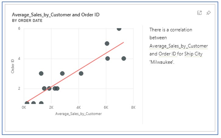
Low Variance: Detects when variance is low. But what does that mean? Look at an example. In Figure 7.86, we see that salespeople Thomas Webster, Naomi Shopker, and Nicole Pottinger use the same (or nearly the same) unit price for dairy products. This is a good thing as long as the unit price for the dairy reflects what it should be charged to customers. If XCaliber’s unit price for dairy went up, but the sales agents used an old price, it will impact XCaliber’s profits.
Figure 7.86—Low Variance: From Quick Insights
Majority: Provides insights that we might not even be looking for.
Figure 7.87 shows a majority from the XCaliber Food Distribution Company dataset. This chart tells us that the majority of shipping in the East region is done by shipper, Urban Grocer. Why is it important to know who is shipping your product? There can be several reasons to know members of your supply chain. Shipping Urban may be a consistent and reliable shipping company. They also might be a good place to see if they are delivering to other grocers to potentially recruit a new customer!
Figure 7.87—Majority: From Quick Insights
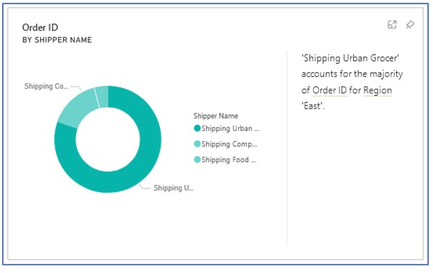
Outliers: What does it mean?
Figure 7.88 shows one of the outliers noted in quick insights. We can click on the orange dots (outliers) for more information. After digging into the orders on March 4, June 4, and December 4, we discover Tony Clear (ranked third in sales) is responsible for all three of these anomalies as seen in Figure 7.86. Tony sold some very expensive products, driving up the average unit sales for the order to his customer, Neighborhood Grocery. This is truly an example of upselling!
Figure 7.88—Outliers: From Quick Insights
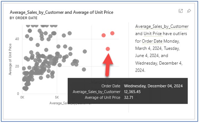
Pin Quick Insights to a Dashboard
If you look at the visuals shown here, notice that each one has a pushpin image in the upper right-hand corner. This is how you pin the visual to a dashboard. Let’s create a dashboard that shows only the quick insights and set up a few “tiles” to see if Power BI Services (Online) detects additional insights. So far, we have worked with a five-page report. A dashboard is a single page where we can pin items from our five-page report or pin items from the quick insights. Tiles refer to a single visualization snapshot of your data. Tiles can come from reports, but also the Q&A box. Dashboards can only be created in Power BI Services (Online) and not Power BI Desktop.
Step-by-Step to Pin Quick Insights to a Dashboard
Step 1—Open Power BI Services (Online) (as a reminder, go to Office.com and log in, choose apps, find Power BI)
Step 2—Get quick insights (go to your My Workspace), find the report and semantic model that you published to Power BI Services Online, click on the three dots (ellipses), and choose Quick insights.
Step 3—Find the category outlier shared earlier in Figure 7.86 and click the pushpin in the upper right-hand corner. In the pop-up, choose New dashboard, and name it XCaliber Quick Insights and then click Pin. The pop-up is shown in Figure 7.89.
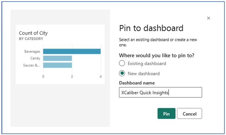
Step 4—Pin all five of the quick insights shown in this section. Instead of a new dashboard, choose the existing dashboard, and XCaliber Quick Insights. Figure 7.90 shows how this will look once you have an existing dashboard.
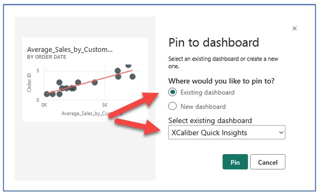
Step 5—Choose My Workspace and look for your dashboard, and then open it by selecting the name, XCaliber Quick Insights. Notice in the type, it indicates a “Dashboard.”
Step 6—When you open the dashboard, notice that the visuals are not organized well, with no context or title. You should also notice that by default, Power BI Services Online has added a Q&A component. This is what it should look like as shown in Figure 7.91. Note that you can edit the dashboard but let’s do some exploring.
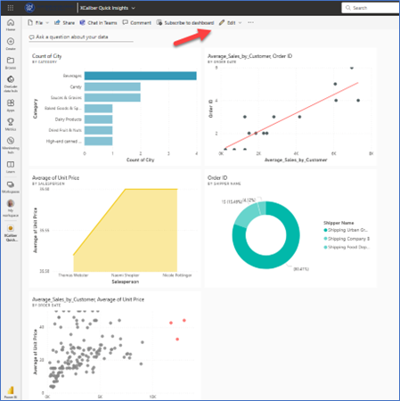
Step 7—Explore the Q&A by clicking “Ask a question about your data,” and Power BI Services Online will provide some examples to get started, or you can choose to type your own question. Note in Exhibit 7.14 that the textbox will try to anticipate your question.
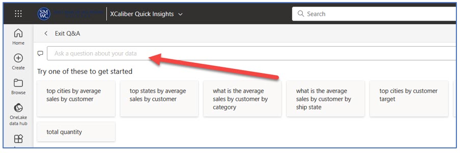
Step 8—Edit the Dashboard, by clicking the edit button. You have a choice of (1) Add a tile, (2) Create a dashboard theme, or (3) Develop a mobile layout.
a. Choose Dashboard Theme and choose Dark and then save. We want to make sure when we build a dashboard from our report, that we differentiate it from the quick insights. Figure 7.92 shows the Dark theme.
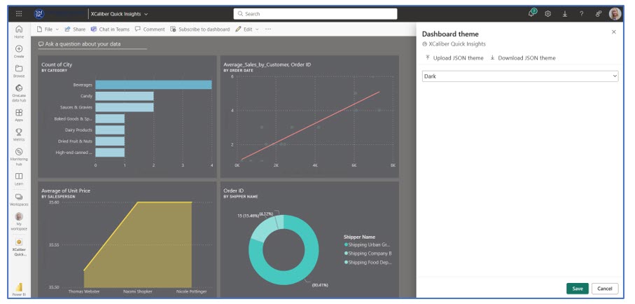
b. Next, choose Add a tile. You will see a choice of web content, Image, Text box, Video, or Real-time Data. Choose the Text box and click Next. A pop-up will collect Title, Subtitle, and content. Complete as shown, and then click Apply. You can move the tile to the top and rearrange the tiles.
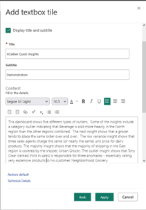
c. View the completed dashboard. Exhibit 7.15 shows only a portion of the dashboard.
Exhibit 7.15—Dashboard (Partial) Showing Quick Insights
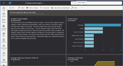
In Exhibit 7.16, note that there are several options available across the main menu.
- Allow recipients to share this dashboard. (If you have a Pro account, you can share with others in your organization.)
- Allow recipients to build content with the data associated with this dashboard. (This would not be appropriate for most situations unless you are collaborating on a project.)
- Send an email notification. (The email address will reflect someone’s email address from your organization.)
- In some cases, your Power BI administrator may have disabled shareable links.
Exhibit 7.16—Share Options for a Pro Account in My Workspace
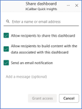
Those with a free account will see a pop-up to Upgrade to a Paid Power BI Account with an option for a 60-day trial, as viewed in Exhibit 7.17.
Exhibit 7.17—No Share Options for Free Account
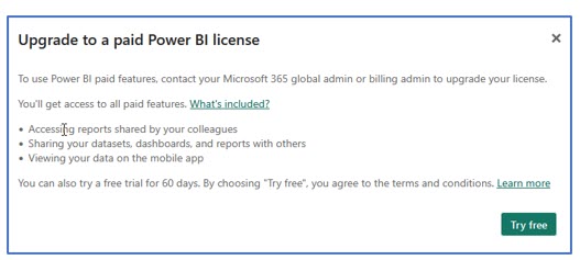
Next, we’ll highlight the difference between reports and dashboards.
7.5 Dashboards Versus Reports in Power BI Services Online
Dashboard: “A single page, sometimes referred to as a canvas, that tells a narrative using visuals. A well-designed dashboard simply includes the story’s highlights on one page so that readers may explore related reports for further information.”
—Microsoft, “A Power BI Dashboard—What Is It?”
Power BI Services Online can have both dashboards and reports. Power BI Desktop can only create reports. In January 2024, Microsoft added Copilot, a smart narrative feature that is Microsoft’s new Artificial Intelligence. To work, Copilot requires you to connect your Power BI Desktop to a live connection in Power BI Services and connect to a semantic model in Workspace. Those holding Free accounts or Pro accounts won’t be able to use Copilot (at least at this time).
If you plan to upgrade from a Free account to Premium, you may want to check this out. If you follow the steps to be able to use Copilot within Power BI Desktop, you will see something different when you choose Smart Narrative; you will see a button for Copilot and a pane that includes a place to chat. Based on your prompts, it can create a bulleted list of insights, summarize the visuals on the page, but my favorite is an executive summary of the report. Even more fascinating is that you can ask it to suggest content for the report. Although the following video is a sales pitch, it does show the Copilot potential (this video is less than two minutes in length).
Microsoft Power BI. (2023). Copilot in Power BI Overview. [Video]. YouTube.
Difference Between Dashboards and Reports
Note: Screenshots of Power BI interface © Microsoft Corporation. Used with attribution for instructional and illustrative purposes. Annotations added by the author.
There are fundamental differences between dashboards and reports as outlined in Table 7.2. Dashboards give an overview of key metrics for real-time (or nearly real-time) monitoring. Reports are comprehensive and support interactive analysis capabilities for exploration.
Both the story and the type of user drive whether you use a dashboard or a report. For example, the owner of XCaliber Food Distribution Company will want a report. The report will be much more effective for the owner because he is still struggling to know what questions he should ask. One analogy is this: A dashboard supplies a headline and key metrics to monitor. A report provides details with the ability to dive deeper into the data.
“The bigger the insight is, the more disruptive it will be to the status quo” (Dykes, 2020, p. 3). Apply the seven principles for better visual storytelling by asking yourself these questions.
- Is this the right data?
- Are these visuals the right ones?
- Are they visuals in the right configuration?
- Did you remove the noise or distraction?
- Does your design focus the audience’s attention?
- Does your design make it more approachable?
- Does your design instill trust? (Dykes, 2020)
If it helps, deconstruct your story and review the data storytelling arc. And remember to use what works well for you! So dashboard or report? Answer: It depends!
Table 7.2: Dashboard or Report?
|
Dashboards |
Reports |
|
Consolidated view (one single page) emphasizing key metrics and high-level insights. |
Comprehensive Analysis offering in-depth analysis and insights with multiple pages (remember the tabs?) |
|
Real-time or nearly real-time monitoring and limited interactivity |
Real-time interactivity with drill-through, filtering, and highlighting (through focus) |
|
Visuals are primarily charts, graphs, gauges, and cards. |
Visuals can include charts, graphs, gauges, and cards. Also, smart narrative, focus, and customized tooltips are used to bring context. |
|
High overview of business performance. |
Structured so the user can customize visualization and peel back layers of complexity. |
An XCaliber salesperson might prefer a dashboard that is focused on their sales (against goals), their products, customer trends, and delivery metrics. Let’s create a dashboard for Anny Kolb. Keep in mind that you can pin to this dashboard from more than one report as long as the reports are within the same Workspace. The Kolb dashboard as shown in Figure 7.94, has five components. Let’s look at what Anny Kolb, top salesperson for XCaliber Food Distribution Company will see.
The first chart is revenue by month for Anny Kolb, which includes Anny’s average sales line. Fluctuation is expected since produce availability can vary; however, the owner might want to see if all sales patterns vary in the same way.
The second tile is a map showing that Anny sells in Tennessee and Florida. If Anny is considering expanding to other states, it makes sense that she should recruit new customers from adjoining states.
The next chart features the products sold by Anny. Anny’s number one product is coffee, followed by crabmeat, and curry sauce. Interesting that we see a category called Blank. That might be a talking point with Anny.
![]() The fourth tiles are both gauges. One tile shows the overall sales for 2024 against the $600k goal. The second one shows Anny selling $114.39k in total. What target sales should we expect from Anny?
The fourth tiles are both gauges. One tile shows the overall sales for 2024 against the $600k goal. The second one shows Anny selling $114.39k in total. What target sales should we expect from Anny?
![]() The fifth set of tiles shows Anny’s three customers: Quick Stop Grocery, Friendly Foods, and Sunny Market. This is interesting that Anny sells to three customers since XCaliber only sells to 15 customers in total from nine sales agents. It is also interesting that Anny does not sell coffee to Sunny Market. That might be a second talking point with Anny.
The fifth set of tiles shows Anny’s three customers: Quick Stop Grocery, Friendly Foods, and Sunny Market. This is interesting that Anny sells to three customers since XCaliber only sells to 15 customers in total from nine sales agents. It is also interesting that Anny does not sell coffee to Sunny Market. That might be a second talking point with Anny.
Keep in mind that there are several other key components we might want to add. For example, what is her average delivery time between the order date and shipped date?
Figure 7.94—Anny Kolb Dashboard Draft
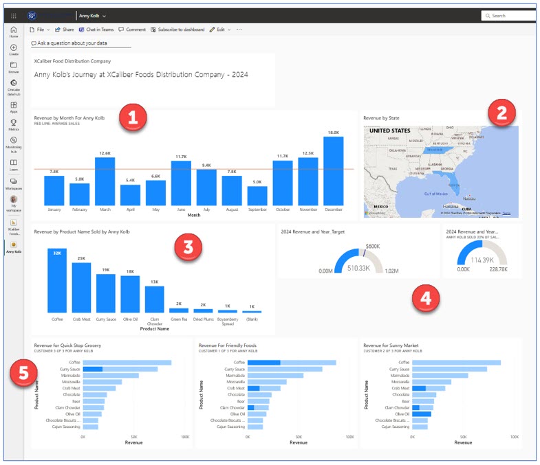
Step-by-Step to Create a Dashboard for a Sales Representative From XCaliber Reports
Once you create your report in Power BI Desktop and publish it to Power BI Services Online, you are ready to “pin” components to a dashboard for Anny. The same is true for Mac users who created the report directly in Power BI Services Online.
Step 1—Open the report that you published. My most recent one is called XCaliber Foods Storytelling—Draft 2 or if on a Mac, you may have saved the report as XCaliber Using BIService. You will notice that the report in Power BI Services Online has added the tabs to the left side or you can use the buttons you created to navigate.
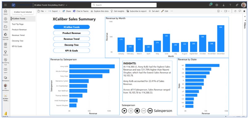
When you published the five-page report from Power BI Desktop to Power BI Services online, it created two files: the report and the semantic model. The XCaliber Foods Storytelling—Draft 2 was published from the Power BI Desktop. The XCaliber Using BIService was created directly in Power BI Services Online.
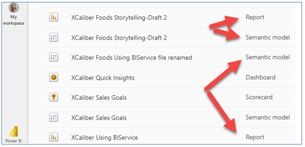
It’s important to know this because you may want to add a sixth page to your report that focuses more on salespeople. If you open the Semantic model, when you go to Edit, you will have access to the Visualization pane, and the Data pane, and you will be able to create new measures writing DAX. This means you can use Power BI Services Online much like you did Power BI Desktop. You can pin items from your report.
Step 2—Pin Information about Anny Kolb to a New Dashboard. In page one, click Anny Kolb in Revenue by Salesperson to filter so her sales show up in the Revenue by Month (as shown in Figure 7.96).
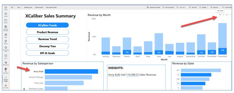
Step 3—In the Revenue by Month, click on the pushpin in the upper right-hand side of the graphic. A pop-up will ask you where you want to pin the visual. Create a new dashboard called Anny Kolb and choose Pin (see Figure 7.97).
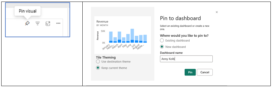
Step 4—Go to Revenue Trend tab, and in the Customer Name Slicer, choose Friendly Foods, Quick Stop Grocery, and Sunny Market (hold the control key down to choose multiple customers). These are Anny’s customers. Notice this Revenue by Month chart with the average sales line. Pin, Revenue by Month, Revenue by Product Name and Revenue by State once they are filtered with Anny’s customers. Don’t worry that we have already pinned a Revenue by Month. You can delete the one you don’t like.
Step 5—Go to Anny’s Dashboard in your MySpace and open it. Notice that you can move and resize the tiles.
Step 6—If you click on Edit, you can add a tile (web content, image, text box, or video, and real-time data streaming). You can change the dashboard theme. And you can see and modify the mobile layout.
Exhibit 7.19 shows the Anny Kolb Dashboard in mobile layout. You can edit the mobile layout by unpinning tiles, changing the order of the tiles, and resizing images.
Exhibit 7.19—Mobile Layout for Anny Kolb Dashboard
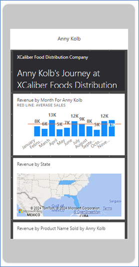
You have conquered Power BI! You are ready to try this whole process with another dataset!
7.6 Finding Datasets to Use in Power BI Desktop
There were 5 exabytes of information created between the dawn of civilization through 2003, but that much information is now created every two days.
—Eric Schmidt, executive chairman at Google
According to a report by Markets and Markets, the “big data market will be worth $229.4 billion in 2025” (PR Newswire, 2020, Mar 13, para 1). In addition to the market of data, we expect to see governments, nonprofits, NPOs, and for-profit institutions share a greater access to data especially in the health field. In Microsoft’s blog, A Cloud for Global Good, Microsoft recommends policy, noting a lack of international framework. Cross-border cooperation in the cloud is needed to protect public safety, yet a fine line exists between law enforcement and public trust. Part of the push for increased governmental public datasets is a push for transparency. As of Jan 2024, 280,601 datasets are available at Data.gov!
Download .pbix Files to Either Power BI Desktop or Power BI Services Online
Note: Screenshots of Power BI interface © Microsoft Corporation. Used with attribution for instructional and illustrative purposes. Annotations added by the author.
For learning, look at the Power BI sample datasets that are either web, .pbix files or Excel datasets. The file type (.pbix) can be used in either Power BI Desktop or Power BI Services (Online).

Microsoft offers dozens of sample files that are available through Learn in Power BI Services (Online). Exhibit 7.21 shows several sample reports: Revenue Operations, Regional Sales Sample, Corporate Spend, Artificial Intelligence Sample, and Employee Hiring and History. All files are .pbix, which means you can open them in either Power BI Desktop or Power BI Services (Online). Use the arrows to see more sample reports. If you open these reports, make sure to go to the corresponding “tour” (article) that corresponds to the report. The Microsoft Power BI blog is discussed in the next few paragraphs.
Exhibit 7.20—Sample Reports Available in Learn in Power BI Services (Online)
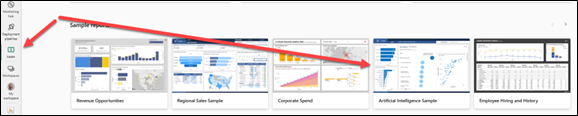
Microsoft. (2023, June 29). Get samples for Power BI. Link: https://learn.microsoft.com/en-us/power-bi/create-reports/sample-datasets#sales–returns-sample-pbix-file
The Sample files are accompanied by a tour (an article that indicates what features are used). For example, choose the Sales & Returns sample .pbix file, to show images of the file as well as demonstrating new features. The Sales & Returns report uses buttons, drill-through, conditional formatting, what-if, and customized tooltips. The tours (articles) are posted on the Microsoft Power BI Blog. By the way, the Sales & Returns sample.pbix file was created by Miguel Myers and Chris Hamill. Miguel has a design background and Chris has an accounting background. I wanted to point this out because you never know how your career path can change by knowing Power BI!
Hurr, T. (2019, Dec 16). Take a Tour of the New Sales & Returns Sample Report. Microsoft Power BI Blog. https://powerbi.microsoft.com/en-us/blog/take_a_tour_of_the_new_sales_returns_sample_report/
The APP
Remember, there are three major components: Power BI Desktop, Power BI Services (Online) and the app. To see an example app follow these steps:
Here is a partial list of public datasets:
- Amazon Web Services Public Datasets: https://registry.opendata.aws/usage-examples/
- Governmental Datasets (all incorporated in https://data.gov)
- Bureau of Justice Statistics: https://bjs.ojp.gov/data-collections/search?ty=dca
- Centers for Disease Control and Prevention: https://www.cdc.gov/brfss/annual_data/annual_data.htm
- U.S. Bureau of Labor Statistics: https://www.bls.gov/cex/
- Healthdata.gov: https://www.healthdata.gov/
- U.S. Census Data: https://www.census.gov/
- National Center for Education Statistics: https://nces.ed.gov/
- Gapminder.org: https://www.gapminder.org/data/
- World Health Organization: https://www.who.int/data/gho
- Google provides a separate dataset search: https://datasetsearch.research.google.com/
- Microsoft Azure Data Markets: https://learn.microsoft.com/en-us/azure/azure-sql/public-data-sets?view=azuresql
- World Bank—Open Data: https://data.worldbank.org/
- World Values Survey: https://www.worldvaluessurvey.org/wvs.jsp
7.6 Exercise 1: Downloading and Exploring a Dataset
Learning Objective #6—Download available datasets using Power BI skills
Use one of the links in the list of public datasets to find a dataset of interest, use your own dataset from your organization, or use a sample file like Store Sales Sample (https://learn.microsoft.com/en-us/power-bi/create-reports/sample-store-sales)
Step 2: Create a screencast of your experience exploring the dataset or sample file. Create at least three graphs of good quality and discuss your findings.
Chapter 7 Summary
This chapter explored the dynamic landscape of data visualizations and analysis through the lens of Power BI Suite (both Power BI Desktop and Power BI Services Online). The chapter begins by outlining the key features offered through the Power BI Suite by transforming raw data into insightful visualizations that use data storytelling techniques to support informed decision-making.
This chapter included the process of downloading Power BI Desktop for PC users, and alternative instructions for Mac users. Power BI Desktop serves as a central hub for data transformation and visualization; however, Mac users can get a similar experience working with the Power BI Services Online. Care was taken to show the examples as seen by readers who only have a free license option, with additional demonstrations for readers who have the Pro license In Power BI Services online, Workspaces and the personal workspace (My Workspace) were introduced and explained. Central to the Power BI experience is the comprehension of semantic models, which establish the framework for organizing and understanding data relationships.
The chapter demonstrated a step-by-step development of a five-page report, showcasing techniques for seamless navigation and the integration of storytelling elements. From interactive visuals to smart narratives, readers learn how to leverage a variety of tools including decomp trees, slicers, and quick insights.
In the realm of dashboard creation, the distinction between a report and a dashboard was introduced along with how key metrics can be included to support decision-making. Users are directed to pin charts and visuals to dashboards and to personalize the display tailored to specific audiences. Through comprehensive exploration and hands-on practice, readers are equipped with the knowledge and tools needed to harness the full potential of Power BI in their data-driven endeavors.
 This chapter has several Excel worksheets and Power BI Desktop files (.pbix).
Download Chapter 7 Student Files (15.6 MB).
Chapter 7 Case: Power BI Report and Dashboards
 XCaliber Foods was established late in 2023 although the business started in 2024. The company distributes food items to 12 states. In 2024, the company sold $510,326 worth of products (if you recall, you used XCaliber Foods in Chapter 4 working with Excel Dashboards).
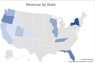
Use the following Excel file: “XCaliber Foods 7.3 includes delivery.xlsx”
XCaliber Food Distribution company includes the following key points:
- all employees are remote
- nine salespeople
- operated in 12 states
- actual sales were $510,326, and the sales goal for 2024 was $600,000
- goal for 2025 is $720,000 (or $60k per month)
- 15 customers in 2024; need more customers to succeed
- issues with delivery (should be 24 hours or less between order placed and order sent to shipping)
- 14 categories of product (24 total products)
- top five products: coffee, curry sauce, marmalade, mozzarella, and crabmeat
- top three salespeople: Anny Kolb, Nicole Pottinger, and Tony Clear
- There is a concern that not all items were paid for (review revenue by payment type and you will see products not paid—it shows blank).
- A survey was conducted that showed customers wanted more frequent contact, adherence to delivery promise of one-day order to shipping, and an expanded product line, specifically more craft beer.
Case Objectives
- LO 3: Create a multipage report in Power BI Desktop with storytelling techniques.
- LO 4: Publish a Power BI Desktop File (or a .pbix file) to Power BI Services Online.
- LO 5: Generate quick insights in Power BI Services Online to analyze trends, outliers, and correlations.
- LO 7: Apply appropriate visualizations for specific KPIs.
Case Guidelines
This case may be completed by an individual or a team of students as directed by your instructor.
Case Instructions
1. Add navigation and set the foundation for a five-page report.
2. Create a five-page report following the model in Section 7.3.
Page 1 includes (1) Revenue by Month, (2) Revenue by Salesperson, (3) Revenue by State, (4) the pop-up that comes up when hovering over either Revenue by State or Revenue by Salesperson, (5) the Insights, and (6) the play axis.
Page 2 includes (1) Revenue by Product Name, (2) Revenue by Customer Name, and (3) Smart Narrative based on Revenue by Product Name.
Page 3 includes (1) Revenue by Month with an average line, (2) Revenue by Product Name, (3) Revenue by State using a map, and (4) a slicer for XCaliber’s 15 customers.
Page 4 includes a decomp tree organized by revenue: region, category, and product name.
Page 5 includes (1) Revenue by Month—Line chart with trend line, (2) Revenue by Customer, (3) Revenue by Payment type, (4) a KPI card showing 2024 Sales total compared to goal, (5) a KPI showing 2024 customer goal, and (6) a KPI card showing year revenue to target in a gauge graph.
3. Publish the report to Power BI Services Online.
4. Explore quick insights.
5. Create a dashboard that includes quick insights.
6. Create a second dashboard that highlights one salesperson’s performance.
7. Create a screencast (Screenpal has a limit of 15 minutes, but you can record two screencasts if necessary). In the screencast
i. Demonstrate one item from each page in Power BI Services Online.
ii. Demonstrate quick insights and explain two examples.
iii. Demonstrate the dashboards and indicate how you would unfold the story.
iv. Make sure to demonstrate the Q&A on the dashboard.
8. Include the .pbix file as part of your submission.
Chapter 7 References
Dykes, B. (2020). Effective data storytelling: How to drive change with data, narrative, and visuals (1st ed.). Wiley & Sons, Inc.
Ellis, G. (2023, Apr 4). PL 300 clean, transform, and load data in Power BI Power Query. ETL [Video]. YouTube. https://youtu.be/nEcet3nalCg?si=kszEpWQsqDgBregV
Gonzalez, A. (2023, Mar 8). Data storytelling with Power BI [Full Course]. Pragmatic Works [Video]. YouTube. https://www.youtube.com/live/SvVucB-oISo?si=vNBUXeuhNA9f9sVx
Guy in a Cube. (2022, Oct 5). Where do you add that new column in any analytics tool? [Video]. YouTube. https://youtu.be/OAlys79j81Q?si=dqXEH0DL1k9v3Nj1
Knight, D. (2023, Feb 9). Hands-On Power BI tutorial beginner to pro 2023 Edition (Full Course). Pragmatic Works [Video]. YouTube. https://www.youtube.com/live/77jIzgvCIYY?si=rvmmqHfRI73mpbs2
Mayor, T. (2021, Mar 9). 15 quotes and stats to help boost your data and analytics savvy. MIT Management—Sloan School. https://mitsloan.mit.edu/ideas-made-to-matter
Microsoft Learn. (2023, Dec 19). Create report bookmarks in Power BI to share insights and build stories. Microsoft. https://learn.microsoft.com/en-us/power-bi/create-reports/desktop-bookmarks?tabs=powerbi-desktop
Microsoft Power BI. (2023). Copilot in Power BI overview [Video]. YouTube. https://youtu.be/Pmt9TyvNsQM?si=W8br4HMurrwRNgTJ
Moche, M. (2021, May 31). Roche’s Maxim of data transformation. BI Polar. https://ssbipolar.com/2021/05/31/roches-maxim/
PR Newswire. (2020, Mar 13). Big data markets worth $229.4 billion by 2025. Markets and Markets. https://www.prnewswire.com/news-releases/big-data-market-worth-229-4-billion-by-2025–exclusive-report-by-marketsandmarkets-301022839.html
Sweatpants BI. (2022, Nov 8). Overlaying commentary & highlights using Power BI bookmarks and Power Point. [Video]. YouTube. https://www.youtube.com/watch?v=uPPdtPIl92Y
