
5 More Than Charts!
The whole is something else than the sum of its parts.
—Kurt Koffkea, German Gestalt psychologist
What Do You Think?
Kristen found the perfect position (data visualization software specialist) listed on LinkedIn but was surprised to see several tests for applicants who passed the first phone round. The tests were both virtual and face-to-face. After reading through some comments, she realized that the virtual test was based on Gestalt Principles. The face-to-face test included putting together a jigsaw puzzle and one was called the coffee cup challenge.
Kristen called her friend in Zoom and immediately asked, “Diana, I am considering applying for a job posted on LinkedIn, but I will be required to take a few tests—one virtually and two on their campus. Do you know what the Gestalt principal test might include?”
Diana quickly performs a search and finds an article (also on LinkedIn), by Vikas Joshi called, Gestalt Principles in Software Testing. Diana responds excitedly, “I found something. I’m texting the link to an article about Gestalt Principles. It looks like you need to apply Gestalt Principles to recognize patterns and organize visual information.”
Kristen reviews the article, and says to Diana, “It makes sense based on some of the job duties for this position. It even makes sense for completing a jigsaw puzzle. I think they want to see if I can recognize patterns. But I have no idea what the coffee cup challenge is for.”
Diana leans in on their Zoom call, “I know that one, or at least I think I do. I saw it in someone’s post. The company will offer you a drink like coffee from their conference kitchen and when you are done with the interview, they hope you will wash and put away your coffee cup (or glass)!”
Kristen starts laughing, “Glad you told me this. I might have asked if I could keep the cup as a souvenir!”
Diana joins Kristen in laughing and holds up her coffee cup. “Well, I’m keeping an eye on my coffee cups next time you are at my house! But seriously Kristen, you better get busy and do more research on Gestalt Principles!”
———
Question to the readers: Do you know any Gestalt Principles?
Introduction
To harness the full potential of data visualization, it is crucial to understand not only the technical aspects of chart selection and design but also the fundamental cognitive principles that underpin human perception and memory retention.
This chapter delves deep into the world of data visualization, exploring the Gestalt Principles that underlie our perceptual processes, reviewing the best charts suited for specific data types, and dissecting the mechanisms of attentive and preattentive attribute processing. The pivotal roles of color, text, chunking, and images can enhance short-term memory retention. But the journey doesn’t end there. Strategies that optimize long-term memory encoding and retrieval will help make your data-driven insights stand the test of time.
In the pages that follow, you continue your journey on a comprehensive exploration of the interplay between human cognition and data visualization by unlocking the strategies for effective communication and memory preservation. Whether you are a data analyst, a designer, or a decision-maker seeking to extract meaningful and insightful knowledge from a plethora of data, this chapter will equip you with the tools and knowledge to create a visualization that leaves a lasting imprint on the minds of your audience.
Chapter 5 addresses the following learning objectives.
Learning Objectives
At the end of this chapter, students should be able to:
- LO 1: Apply Gestalt Principles to convey meaningful information.
- LO 2: Discern how the brain remembers information (iconic memory, strategies for short-term and long-term memory).
- LO 3: Analyze and develop annual reports by leveraging tools like the CASS template, Gestalt Principles, and best practices.
Key Terms: annual reports, attentive processing and preattentive attribute processing, flipbook annual reports, iconic memory, living annual reports, snapshot or impact annual reports
Gestalt principles of proximity, similarity, enclosure, connection, enclosure, symmetry, and figure/ground
Download Chapter 5 PowerPoint (9 MB)
Download Chapter 5 Student Files (<1 MB).
5.1 Gestalt Principles
The storyteller doesn’t decide which chart type to use. The data decides.
—Sejal Vora
Before you continue designing data visualizations, you need to learn about Gestalt Principles. The authors are not designers of art, but visualizing data will require you to consider some artistic principles of how the brain processes visual clues. Gestalt is German and stands for a pattern, figure, form, or structure that is unified. You may have heard marketing or web developers talk about the Gestalt Principles when they were designing logos or social media components. You may have experienced them when you’ve looked at a design or visualization and said, “Something doesn’t look right but I can’t tell you exactly why I don’t like it.” Or maybe you were frustrated because there was a blue line under some text, but it was not a link like you expected. Understanding Gestalt Principles helps you understand why certain data visualization techniques work better than others. Understanding pattern perceptions helps you understand how the brain functions to support memory.
Puzzle this: What do you see when you look at the image in Exhibit 5.1? Do you see a triangle? Or do you see three Pac-Men?
Exhibit 5.1—Triangle or Pac-Men?

This is because our brains take ambiguous visual information and organize it into something that makes sense—“something familiar, orderly, symmetrical and that we understand” (User Testing, 2020, para. 12).
Gestalt principles will help you understand how our brains process data visualizations. The principles include proximity, similarity, enclosure, connection, continuation, closure, symmetry, and figure/ground. Look at the principles and see how we can apply these to data visualization and communication.
Gestalt Principle of Proximity
We can leverage the way people see table design simply by using careful spacing. Notice in the first arrangement of Exhibit 5.2, your eyes are drawn down the columns and across the rows in the second case. We see column groups and row groups (Chang, Nesbitt, & Wilkins, 2007). In dashboards, placing the visuals together helps the user group them together. You just need the white space to do it.
Exhibit 5.2—Example of Gestalt Principle of Proximity

Your dashboard may pull from multiple datasets, so for example, you might group customer demographics, and the nearer the objects are to each other, the more logically these objects belong in the same group.
In the realm of data dashboard design, it’s crucial to acknowledge that a common region is a more robust organizing principle than simple proximity. This concept is powerfully exemplified by Venn-Euler diagrams because they intuitively convey the interrelation or intersection. In a sales dashboard, using Venn diagrams to illustrate customer demographics overlapping product categories instantly shows which products are popular among specific customer segments. If you have used a Venn-Euler diagram, you will see that it is a good visualization for displaying associations among datasets.
Gestalt Principle of Similarity
Objects similar in color, shape, size, or orientation are perceived as related or belonging to the same group. Your eye is drawn vertically in Exhibit 5.3 because you see two groups—circles and squares. Color is the strongest way to suggest relationships, but even in this black-and-white illustration, you see the groups.
By leveraging this principle, data visualization can effectively convey relationships or categories. For instance, in a scatterplot displaying customer data, you can use the similarity principle to group customers who share common characteristics, such as high-value customers marked with circles and low-value customers marked with squares. The visual grouping aids in identifying clusters and patterns and makes it easier for the audience to understand the significance of these distinctions. When you think about this principle and the use of color, note that some assumptions already exist in the business world—red for loss, green for profit, yellow for caution. Remember, this principle can manifest itself using color or shape, and that brings us to some recent literature on how dissimilarity can be used.
Exhibit 5.3—Gestalt Principle of Similarity

If one circle is shown as dissimilar (as shown in Exhibit 5.4), what does it mean? Is this customer the lowest of all high-end values? According to Pinna et al. (2022), “Limits and incompleteness of the similarity principle have suggested the basic, more general and stronger role of dissimilarity in perceptual grouping under a large variety of conditions” (p. 39). Although these authors used the basis of dissimilarity, make sure to review the Gestalt Principle of figure/ground (which seems to format the same thing).
Exhibit 5.4—Gestalt Principle of Dissimilarity

Gestalt Principle of Enclosure
When we see objects that are physically enclosed together, we see them as belonging to the same group. This principle shows that objects within boundaries are perceived as a unified whole and can significantly enhance data visualization and data storytelling. Enclosure can be employed through framing within boxes, and within shading (as shown in Exhibit 5.5). This aids in highlighting relationships and patterns so the viewer grasps the message and contributes to a more intuitive and compelling data storytelling experience. A key component of a dashboard is to be consistent in color representation of a category, with the approach that green represents revenue across various graphs that are related (order count, invoice size, etc.)
Exhibit 5.5—Example of Gestalt Principle of Enclosure

Imagine you are tasked with visualizing the performance of a company’s various product lines over the past year. Think of the circles as data points. To apply the Gestalt Principle of enclosure, you could create a bar chart with each product category that is visually enclosed within a distinct rectangular boundary. Separate enclosures visually separate the data and emphasize the individual performance of each product line. The audience will immediately discern how different product categories are performing in relation to one another and will simplify the interpretation as well as enhance the data storytelling impact.
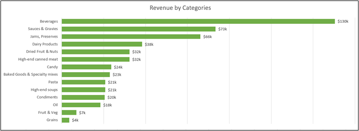
Exhibit 5.6—Revenue by Categories—XCaliber Foods 2024
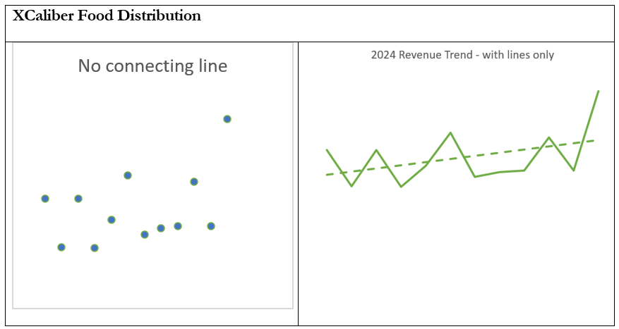
The Gestalt Principle of connection is an asset in the realm of data visualization and data storytelling. Elements connected by lines, parts, or other visual links are perceived as related or forming a coherent whole. Adding lines to data points is a great way to understand this principle (as illustrated in Exhibit 5.7). Without the lines to help us, we would not realize that we should see these data points in a trend line.
Exhibit 5.7—Example of Gestalt Principle of Connection
Besides representing revenue data points, this same principle supports flowcharts, network diagrams, and sequential timelines that visually link data points or events. An example of this would be a project connecting tasks in a Gantt chart as seen in Exhibit 5.8. This approach helps the audience understand the logical progression of the project and how each task relates to the overall project timeline. This adds clarity to the data storytelling.
Exhibit 5.8—Example Gantt Chart
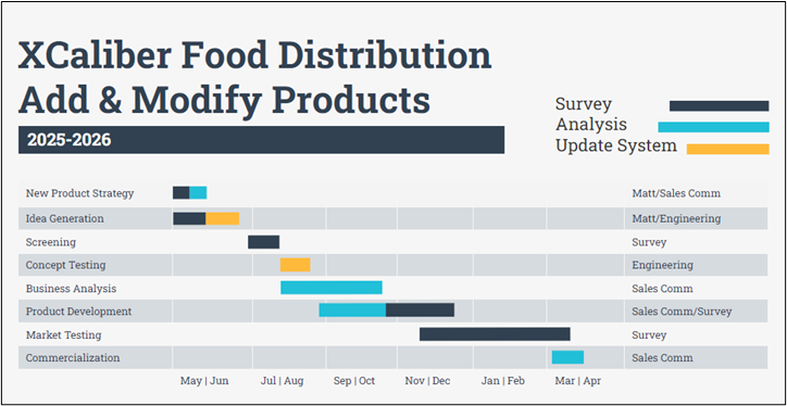
The example Gantt chart shows the use of color representing tasks associated with specific categories, under assigned teams. It shows connection, and this is nonquantitative data!
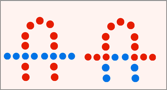
Gestalt Principle of Continuation
The Gestalt Principle of continuation shows an intersection between two or more objects where a viewer tends to perceive a continuous flow or connection. We tend to perceive each line as a single uninterrupted line (or object) so in Exhibit 5.9, our eyes on the left illustration would follow the blue circles and on the right illustration, our eyes will follow the red circles. Our eyes will instinctively follow the path of least resistance.
Exhibit 5.9—Gestalt Principle of Continuation
Gestalt Principle of Closure
In Microsoft Excel, we can produce a line graph complete with background, data points, and chart borders. But a viewer only needs an idea that this is a graph, and they will still clearly see the trend. The Gestalt Principle of closure suggests that when viewers are presented with fragmented elements, they tend to mentally complete the missing parts to perceive a recognizable shape. In Exhibit 5.10, we might need to add the context, but the viewer can clearly see an increase! You could strip everything away, except the line, and the viewer would understand. Exhibit 11 shows a bear head, but one of the most famous examples of Gestalt’s principle of closure is the World Wildlife Fund Logo (the Panda).
Exhibit 5.10—Gestalt Principle of Closure—Just a Trend

Exhibit 5.11—Example of Gestalt Principle of Closure

In data visualization, closure can be employed to engage the audience’s problem-solving abilities and create a more memorable impact. For instance, a word cloud that visualizes the most frequently mentioned words in customer feedback might use the principle of closure to transform disconnected text fragments into a cohesive representation. Keep in mind, the viewer’s mind naturally connects the fragments to form complete words or concepts, supporting quick comprehension and making the data’s storytelling experience more interactive and engaging. Even more compelling is when you see an animated gif that uses the Gestalt Principle of closure. Exhibit 5.12 is a simple design with no outline, but everyone would know what it is.
Exhibit 5.12—Example of Gestalt Principle of Closure


The walking dog image is from an article published by Gizmodo, Why Your Brain Thinks These Dots are a Dog. It is very compelling. The dog’s ears are flapping, and the tail is wagging as the dalmatian quickly walks along. This animated gif uses the Gestalt Principle of closure. https://par.nellruby.agnesscott.org/teaching/gestalt/
Gestalt Principle of Symmetry
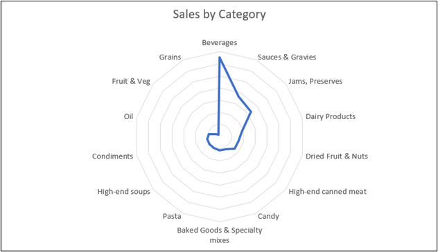
In this case, the object appears symmetrical and forms around the center. The Gestalt Principle of symmetry plays a valuable role because it fosters balance and order. You have seen examples of symmetry everywhere. It’s in the golden arches of McDonald’s logo. It’s interesting that we associate symmetric objects with stability, consistency, and harmony while asymmetric objects are associated with negative feelings or impressions (Califf et al., 2012). In data visualization, symmetry can be utilized to emphasize the relationship between two or more components or datasets. For example, using XCaliber Foods, create a radar chart to compare the performance of different departments in an organization, using symmetrical axes and lines to draw the viewer’s attention to the equanimity of performance across various aspects. Or create a radar chart to show which categories have the best performance (beverages, sauces, jams, dairy products, high-end canned meat, candy, baked goods, pasta, high-end soups, condiments, oil, fruit and vegetables, and grains). As seen in Exhibit 5.13, beverages are a clear winner!
Exhibit 5.13—XCaliber Foods—Sales by Category
Gestalt Law of Prägnanz
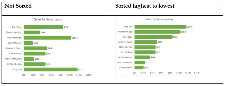
Prägnanz is a German word that means “pithiness.” When we combine this concept with the idea of data visualization, your brain loves simplicity and tends to process simple patterns. As an example, in the previous chapter, we learned how important it is to sort the graph’s information from highest to lowest sales (see Exhibit 5.14).
As an aside, Western culture looks for the most important piece of information in the top left corner or centered in the middle of the dashboard. That is because Western cultures read from left to right and top to bottom. But what is important to one audience might not be as important to a different audience—so make sure to take that into account.
Exhibit 5.14—Example of Gestalt Law of Prägnanz
Gestalt Principle of Figure/Ground (and Other Principles)
This illustration (Exhibit 5.15) uses similarity, continuation, closure, proximity, and figure/ground. The orange figure represents the figure/ground because our eye differentiates this object from the surrounding area. The mind must decide which elements to focus on. As you can see, color in the design in Exhibit 5.15 was used well.
Exhibit 5.15—Example of Gestalt Principle of Figure/Ground (and Others)

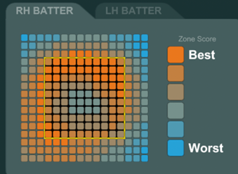
Another example of how the Gestalt Principle of figure-ground can enhance data visualization is in the context of heatmaps (Wagemans, 2012). In a heatmap representing website traffic patterns, the data points indicating high user engagement can be considered the “figures,” while the less active ones are the “ground.” By utilizing color gradients, these figures can be made to stand out prominently. Heatmaps were discussed earlier to show a correlation between CEOs (administrators) and staff on where they align in answering the survey questions. Heatmaps are more powerful if you can display the information within context. Assume you are a pitcher for your college baseball team, and you want to improve your throw. Several companies now offer a special system with membership. Once you set up a membership, you receive a baseball wired internally with Bluetooth, download the app, pair the ball with the app, and start throwing. As you throw the ball, the app will map out a heat map of your throws.
“Although pitchLogic can provide many numerical metrics, our users tell us they get a big benefit from visual feedback. A graphic like the Heat Map gives a coach or a pitcher an immediate intuitive feel for the data, which allows them to take action without spending as much time on analysis” (S. Cukiemik, personal communication, June 10, 2025).
Exhibit 5.16 shows an example of a right-handed batter.
Exhibit 5.16—Heat Maps—from pitchLogic, a product of F5 Sports, Inc.
Now let’s look at two designs to see how well you can identify elements that have the appropriate visual signals (the information we want to communicate), which are noise (clutter), and which items violate Gestalt Principles. The survey data in Figure 5.1 is fictional.
Figure 5.1—Poor Design: What Needs to Be Changed?
This design is NOT horrible—the graph is ordered from largest to smallest. The two key observations are tied visually (through a line) to what you are meant to observe (the hypothesis). But that’s where the good stuff ends.
Here are the issues:
- The title is too large—some of the information could be included in the introduction to the graph.
- Several things are repeated—the percentage at the end of the bar and in the axis, the choice of three options.
- Lines go through the percentages or lines don’t connect.
- Grid lines are used and are not needed.
- The legend isn’t informative, it’s not needed.
- No date found—when was this survey completed?
- Clutter and key observations overwhelm the graph.
- The format with borders is somewhat distracting.
These eight items don’t even consider the Gestalt Principles!
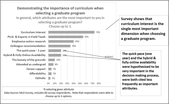
How could we revise this visual? Let’s look at the revised illustration in Figure 5.2 while taking into consideration the Gestalt Principles included in the new design.
Figure 5.2—Revised Visual Curriculum Interest Is the Most Important Consideration When Selecting a College
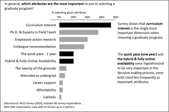
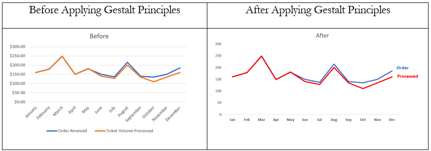
Compared to the original visualization, this illustration follows a cleaner design, better alignment, conscious use of white space, and removal of repetitive or unnecessary items. It uses some of the Gestalt Principles too. Even if you aren’t quite sure about your comfort level with the Gestalt Principles, you should find the second illustration more appealing. In retrospect, the second paragraph could be written, “Administrators thought students would pick quick pace and hybrid/online program availability as most important.” Adding this sentence would clarify that administrators had predicted a different outcome. Now compare the two images in Figure 5.3 and see if you can name all the changes and the corresponding Gestalt Principles.
Figure 5.3—Example Before and After
As mentioned in previous chapters, understanding the data types will help you choose a suitable graphical display. This will be discussed in a later chapter in greater detail, but let’s consider the charts we’ve used.
Show Relationship
If you want to show a relationship between two variables—choose a scatterplot chart or review Exhibit 5.17 where there is a positive relationship between tannin and perceived astringency. By adding a trendline, we enhance the ability for a user to see a better sense of relationship.
This is called the Gestalt Principles of Common Fate. This principle is normally explained using a flock of birds as an example. If a viewer sees the birds flying in the same direction, we assume they belong to the same group. Exhibit 5.18 shows a positive relationship.
When elements are commonly seen together (flags and countries, capitals and states), the audience will expect these to be included in one group. This is referred to as the Gestalt Law of Past Experience. In Exhibit 5.17, a wine connoisseur or sommelier would expect tannin and astringency to go together; however, to those of us less-refined wine experts, not so much! Keep this in mind when using this principle.
Exhibit 5.17—Positive Relationship Between Tannin (x) and Astringency (y)
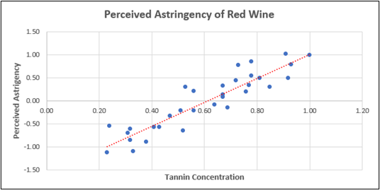
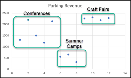
Exhibit 5.18 shows two variables (events and revenue) in a scatterplot, but it is when you add closure (using Gestalt Principles) that you start to make sense of the data. Each type of event clusters together, so the relationship is conveyed more clearly using the Gestalt Principle of closure. This requires setting up the scatterplot in Microsoft Excel but then using a graphing program to add the closures. We used scatterplots to show the visuals of Ashcombe’s quartet, and several other situations. The main point is you may need to do additional refinement to clarify the story.
Exhibit 5.18—Charts to Show Relationships
5.1 Self-Assessment: Gestalt Principles
Learning Objective #1—Apply Gestalt Principles to convey meaningful information

5.1 Exercise 1: The Gestalt Principle
Learning Objective #1—Apply Gestalt Principles to convey meaningful information
Watch: DataTalks #21—Effective Data Visualization—with Valentina D’Efilippo.
Watch: D’Efilippo, V. (2021, Apr 29). Effective data visualization—with Valentina D’Efilippo. The Royal Institution. [Video]. YouTube.
Please be prepared to answer the following questions:
- Name three types of graphs and infographics used in this presentation and how Gestalt principles were used.
- Name 10 key points from this video that you can apply to your past visualizations.
5.2 The Brain and How It Remembers Information
We see with our brains, not with our eyes.
—Norman Doidge, The Brain That Changes Itself
During a thesis presentation, a graduate student provided a complete introduction to memory theory. In her career, she has trained thousands of trainers. Essentially, her point was “If you understand how memory theory works, you can leverage this understanding to make training more effective” (Emily Phelps, MLD’18).
So let’s start with the basics of memory. There are three types of memory we need to understand before designing visualizations.
Iconic Memory

Iconic memory is fast and deeply rooted in survival mechanisms. Think of a near-miss car accident where quick thinking on your part prevented a catastrophe! Your quick response to the situation seemed to happen almost without thought. That’s why iconic memory is often tied to preattentive attributes. Preattentive attributes are visual properties that we notice without using conscious effort to do so. “It takes less than 500 milliseconds for the eye and the brain to process a preattentive property of any image” (Interaction Design Foundation, 2019, para. 4). Four of the preattentive visual properties include: color, form, movement, and spatial positioning.
Let’s look at attentive processing versus preattentive processing. Cover up the preattentive processing in Figure 5.5. Now look at Figure 5.4—How many 5s do you see? Then look at Exhibit 5.5. Notice how quickly your eyes were drawn to the 5s almost without thought. See how this connects to the Gestalt Principles?
Figure 5.4—Attentive Processing: How Many 5s?
996331110310745679702836710983444897123468912871236987411122896633177489675447897126234896489712378877812344899622741251178974186394182379461322747896117894623141479964235987349790271231329636148791030070809141251100
Figure 5.5—Preattentive Attribute Processing: How Many 5s?
996331110310745679702836710983444897123468912871236987411122896633177489675447897126234896489712378877812344899622741251178974186394182379461322747896117894623141479964235987349790271231329636148791030070809141251100
Knaflic says it best: “If we use preattentive attributes strategically, they can help us enable our audience to see what we want them to see before they even know they’re seeing it” (Knaflic, 2015, p. 99).
Demonstration of Preattentive Attributes
Let’s assume that you want to show a very small graph for the statistic: Less than 5% of adults exercise 30 minutes a day (HHS: President’s Council on Sports, Fitness & Nutrition, 2020). BTW, this statistic is sad but true!
Let’s look at some of the examples and how you might use preattentive attributes in Figure 5.6.
Figure 5.6—Six Visuals With Preattentive Attributes
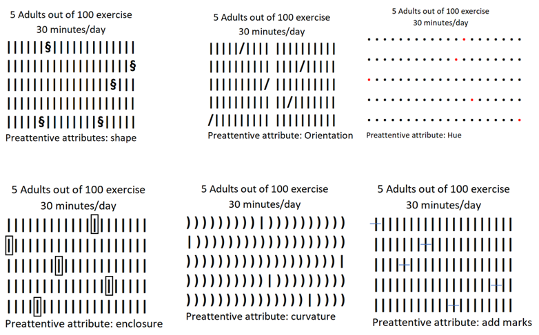
There are several other preattentive attributes but they didn’t work for this information. They include (1) line length, (2) line width, (3) intensity (we could have done this one but felt hue was better), (4) spatial position, and (5) motion. Of the six shown, it appears “enclosure” is the easiest to see, because it appears to “pop out,” but all illustrations show 5 adults out of 100.
Text Preattentive Attributes
You can also use the concept of preattentive attributes in text. We used them in this book:
- bold, italics, color, size
- separate spatially (like extra space around one sentence)
- underlines
-
outline or enclosure (like textboxes)
Understanding preattentive attributes is very important if we want to create visual hierarchy. If you violate the rules (like typing an entire text in bold), you could easily lose your audience’s attention because nothing stands out.
Members of the Audience Who Are Color-Blind
One other point should be made: Design with color-blindness in mind. About 8% of males are color-blind versus less than 0.5% of females (Colour Blind Awareness, 2020). The general rule is to avoid using shades of red and shades of green. (That’s scary when you think about the traffic light metaphor, right?)
Some strategies to ensure inclusivity in your visualizations include the following:
- Use high contrast.
- Clearly label data points, lines, or sections (like bars).
- Rely on other strategies—in addition to color, use patterns or textures.
- Use color-blind friendly colors.
- Use a tool that will simulate what a color-blind individual will see BEFORE you present. (This is discussed in Chapter 8, including several resources.)
If you are presenting to an international audience, you may want to review a book written by David McCandless where he considers the importance of colors in other cultures. For example, western cultures associate white with purity, cleanliness, and innocence (e.g., at a wedding, where brides commonly wear white dresses). In contrast, eastern cultures often associate white with death and funerals. Understanding these nuances is important when creating content that resonates appropriately with a diverse audience.
Title: Colours in Culture—at the Information Is Beautiful site. Make sure to review if you are presenting to an international audience! By: David McCandless. Link: https://informationisbeautiful.net/visualizations/colours-in-cultures/
 Something to think about: According to Knaflic, “We have about 3–8 seconds with our audience, during which they decide to continue to look at what we’ve put in front of them or direct their attention to something else” (2015, p. 102).
At least if we’ve leveraged preattentive attributes well, we’ve given a signal of what is most important. In order to make the leap from theory to practice, we first need to look at other memory types.
Short-Term Memory
This one is important for graph visualizers! People can only keep about four chunks of visual information in their short-term memory at a time. So in Figure 5.7, we’re making our audience go from legend, to component, to comparison of the different bands of color. In doing so, we are straining our audience by giving them a cognitive burden and we risk them giving up.
Figure 5.7—Too Many Chunks for an Audience to Process
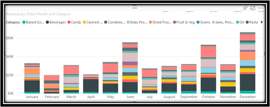
In this particular situation, the solution was to add two slicers, which limited the information to one salesperson and one category. That made the graph more manageable—but using slicers is not the answer for large room presentations. It’s more useful for small team meetings where you are investigating by using a multiple number of slicers to “slice and dice” the data.
Power BI lets you slice everything. Click on a chart of any kind and it filters data for all other visuals! And the great thing about Power BI is that most corporations with a subscription to Office 365 already have Power BI. “Power BI is a cloud-based suite of business analytics tools that lets everyone connect to visualize, and analyze data with greater speed, efficiency, and understanding” (Microsoft, 2020). Power BI is covered in chapter seven. It is worth discussing it in this section, especially if you face questions in a meeting that require you to go back to the data to find answers.
The point here is that we should show limited chunks of visual information. As a presenter, if your presentation only contains four chunks of visual information, you have to provide “triggers” to connect them. And this works both ways. Triggers help the presenter remember too.
Train Your Brain—Move From Short-Term to Long-Term Memory
As a presenter, the transformative potential of repetition in converting short-term memories into lasting impressions is found in the words of Squire et al. (2015), who posit, “Short-term memory can become a long-term memory through repetition” (para 14). This simple yet powerful concept not only holds relevance for the audience but also serves as a strategic tool for presenters aiming to enhance memory retention. The triggers work for both you and the audience. As a presenter, repeat the “trigger phrase” several different ways to increase memory retention (Squire et al., 2015). Write notes when you practice and work from your outline (even add trigger phrases to your PowerPoint outline).
Example of a Trigger and Repetition
Sunshine, Inc. has experienced some difficulty launching a new line of acrylics due to limited creation idea development for the users of acrylics. This has undermined a potential healthy profit. Additionally, since the line has limited products, production line issues in combination with slow delivery issues have plagued the product. The CEO announced in frustration, “The profit of our new acrylic product line hinges on a team approach during its creation, production, and delivery.” What can the CEO do to get his company back on track? Let’s explore a potential presentation.
Example trigger phrase: “Synergizing for Success”
How can we seamlessly integrate and emphasize this trigger throughout a presentation?
- Emphasizing for repetition: “Profitability isn’t just about the product; it’s about how we synergize as a team for success.”
- Analogical variation: “Think of it as a winning sports team. Each player contributes uniquely, but it’s the synergy, the ‘Synergizing for Success’ that leads to victory.”
- Illustration: “Consider our recent product launch. The numbers speak for themselves, highlighting the direct impact of Synergizing for Success on our profit margins.”
- Audience engagement: “Pause and reflect on your own experiences. When have you witnessed the power of teamwork contributing to success? That is the essence of ‘Synergizing for Success.’”
By weaving the trigger phrase into various aspects of the presentation, the CEO reinforces the importance of teamwork in product profitability, and engages the audience in a way that enhances comprehension and retention. These repetitions would be paired with specific data visualizations for a cohesive and impactful delivery.
How Long Should You Practice an Important Presentation?
One of the most effective ways to rehearse is by recording yourself. Watch the video to judge your memory and improve your presentation. And by the way, practicing the night before you present doesn’t work. You need time to develop your tone and body language.
Although Dr. Jill Bolte-Taylor practiced her TED Talk 200 times, the normal rule of thumb is to practice 10 times. Other presentation gurus suggest that a 15-minute presentation should be practiced for 15 hours. According to Gallo’s (2019) article, Why You Should Practice Your Presentation 10 Times Before Taking the Stage, you need time to develop your tone and body language. And that means, you need to have your presentation memorized, so you can concentrate on good body language. Different venues will require different skills. A virtual presentation is different from a face-to-face presentation.
If you are presenting, you should practice recording your presentation using a tool like ScreenPal. This allows you to record yourself using your webcam and see the slides within the presentation. As long as your presentation is less than 15 minutes, it is free—both to record and to store in the cloud. Although this type of practice allows you to critique yourself quickly, remember that with ScreenPal, you are sitting before a computer and without a crowd.
ScreenPal: Formerly Screencast-o-matic. Link: https://screenpal.com. This app records both your webcam and your screen (you can have your PowerPoint on the screen). The free version allows 15 minutes of recording and a place to store it in the cloud.
Long-Term Memory
Does our audience leave with our main points lodged in long-term memory, or does our presentation get dumped out of short-term memory to oblivion? According to Vora (2019), “Information processed through visuals and images is believed to enter the brain’s long-term memory . . . thus increasing the brain’s power to recall and retain information that was absorbed through visuals” (p. 150).

According to Knaflic (2015), “Long-term memory is the aggregate of visual and verbal memory, which act differently. Verbal memory is accessed by a neural net, where the path becomes important for being able to recognize recall. Visual memory, on the other hand, functions with specialized structures” (p. 97). It’s all about the triggers.
For example, one of the authors took a wonderful trip to France and Italy in 2019. If you were presenting and you included a picture of the Eiffel Tower, author Mitchell would be flooded with feelings, and get the concept of how the lighting of the tower at night makes it magical. So as a presenter, you’ve combined visual and verbal cues, and this combination will trigger the formation of long-term memories.
At this point, you may be struggling and asking—which visual should I use? Vora (2019) states, “The storyteller doesn’t decide which chart type to use . . . the data decides” (p. 152). And this doesn’t just apply to charts. It applies to any type of visual we use. Which visual tells the story the best?
 Visme. (2019, May 7). Five Data Storytelling Tips to Improve Your Charts and Graphs. [Video]. YouTube
Chibana, N. (2018, Aug 13). Data Storytelling: 5 Tips for Creating Effective Charts and Graphs. Visme. https://visme.co/blog/data-storytelling-tips/
5.2 Self-Assessment: Memory
Learning Objective #2—Discern how the brain remembers information (iconic memory, strategies for short-term and long-term memory)
5.2 Exercise 1: Memory
Learning Objective #2—Discern how the brain remembers information (iconic memory, strategies for short-term and long-term memory)
Instructions:
- Create a rubric that considers iconic memory when creating a presentation using good data visualizations.
- Find a recent PowerPoint and use the rubric to assess it.
- Share the rubric’s assessment and the PowerPoint on the discussion board.
- Be prepared to discuss in class.
5.3 Infographics Used in Annual Reports
The stronger your annual report, the more you can increase your visibility with the community who supports you.
—Katy French, Column Five
In the contemporary landscape of corporate communication and stakeholder engagement, the role of annual reports extends beyond traditional financial disclosure to embrace dynamic visual storytelling. The utilization of infographics has emerged as a powerful tool for conveying key messages with clarity and impact. This is true for both for-profit and not-for-profit entities, where the annual report serves as a crucial vehicle for transparent communication, fostering investor confidence, and demonstrating accountability.
In this section, we review annual reports, dissecting their effectiveness in enhancing comprehension and engagement across different organizational sectors. Students will learn to recognize the nuances and unique considerations that shape the use of infographics within diverse industries.
For-profit organizations use the annual report to articulate the company’s value proposition and market positioning, and they lay a strategic direction. These organizations integrate infographics to distill complex financial data into visually digestible formats, providing stakeholders with a comprehensive understanding of the company’s performance. In addition, infographics can be tailored to highlight key performance indicators, market trends, and competitive advantages.
Conversely, not-for-profit organizations face a unique set of challenges in annual reporting since their objectives center on social impact and community engagement rather than profit margins. In this context, infographics can illustrate the organization’s mission, showcase tangible outcomes, and convey the value generated for the community. Visual representation of impact metrics, program outcomes, and success stories (video infographics) can effectively communicate the not-for-profit’s achievements and foster donor trust. Charity Watchdog (charitywatch.org) goes so far as to tell charities to rebrand their annual report as “Impact” reports (Styron, 2022).
Annual Report for For-Profit Organizations
All public U.S. companies must file regular financial reports to the Securities Exchange Commission (SEC). These reports include the annual report (i.e., the 10-K), quarterly reports (10-Q), and several other reports. The data are filed in the SEC’s Electronic Data Gathering, Analysis, and Retrieval system, affectionately known as EDGAR. Other countries have similar processes. In the past few years, stakeholders have wanted more than just the annual report with financial information and performance. Specifically, investors want a report that encompasses environmental, social, and governance reporting. The expanse of stakeholders includes investors, creditors, regulators, government (compliance), customers, suppliers, and so on. The components of corporate reporting have grown because the technology is available to support it.
Let’s look at some of the components in a for-profit annual report as filed through a 10-K:
- Letter from chief executive: Expect to see a letter from the President or Chief Executive Officer (CEO). This letter provides insight from upper management on major issues and directions of the company.
- Investor relations section: Expect to see forward-looking information in the investor relations section. (Sometimes the environmental, social, and governance impacts [ESG reports] are included in the investor relations section.)
- Financial information: This section is driven as a requirement for public companies (public companies just means that they are listed on the stock exchange). This includes interim financial reports (usually quarterly) but also the annual financial statements. Note that with the support of technology, interim reporting takes less time and is more up to date.
- Performance measures: Useful measures like earnings per share but note that an increasing number of companies are listing earnings before interest and taxes (EBIT) and other measures that do not meet generally accepted accounting principles (GAAP).
- Management discussion and analysis reports (MD&A): This section includes an extensive narrative of the management’s analysis of the company’s performance. It normally includes a discussion of core businesses, objectives and strategies, capability, compliance, performance, risks, and outlook.
- ESG reports: These reports include a discussion of the environmental footprint, but can also include talent management, product safety, data security, and even matters like board diversity, executive pay, and business ethics.
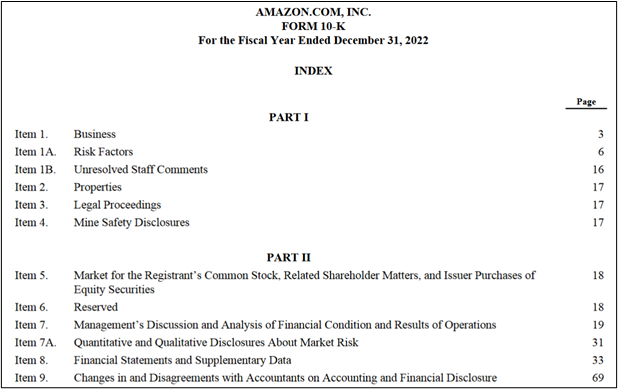
This next fact may surprise you. Reports are voluminous, and reports like the 10-K and 10-Q are not user-friendly. They lack graphics, pictures, and do not easily tell a story. For example, Amazon.com, Inc’s Form 10-K for the fiscal year that ended on December 31, 2022, is 88 pages long. It includes a table of contents (partial image shown in Exhibit 5.19).
Exhibit 5.19—Amazon.com, Inc., Form 10-K
In the 10-K report, the Amazon shareholder letter from Andy Jassy, President and Chief Executive Officer of Amazon is seven pages long and what is interesting is that the 2020 Annual report includes a shareholder letter reprinted from the 1997 annual report; intentionally telling shareholders what was true in 1997 is still true in 2022.
As you can imagine, companies have faced regulatory overload and duplication until XBRL (Extensible Business Reporting Language) was required by the SEC and other major regulators around the world. This is because XBRL can be read by any recipient regardless of the system they are using. XBRL did not reduce the size of annual reports. So while XBRL reduced regulatory overload, the increased size of reports has led to information overload.
If you look at the investor relations (IR) section of the Amazon website, you will find the same 10-K report, but many more items, including innovation, job creation and investment, our communities, supporting small business, and working at Amazon.
Amazon’s IR website has more of a barebones approach but look at some examples of top-rated IR websites. One such example is Zurich Insurance Group. Zurich’s 2022 annual report is 392 pages long and full of images. Use Exhibit 5.20 -Example of Table of Contents for an Annual Report.
Exhibit 5.20—Example of Table of Contents for an Annual Report
Even the half-year report for Zurich is full of images, charts, and good use of color. Overall, the Zurich Insurance Group site provides a vast array of useful information for shareholders and investors.
Zurich Insurance Group Investor Relations Website. Scroll to Annual Report, and choose 2022. Link: https://www.zurich.com/investor-relations
Let’s look at another investor relation website for a different insurance company named AXA (this is not an acronym). At the investor section of the website, you will find an Annual Report, an Integrated Report, an Impact Report, and a Climate and Biodiversity Report.
AXA Investor Relations Website. Scroll to Annual Report, Integrated Report, Impact Report or Climate and Biodiversity Report. Link: https://www.axa.com/en/investor
The 2022 annual report has 530 pages full of images, infographics, and charts. The 2022 integrated report is 31 pages long and includes images, infographics, with lots of narrative about their actions throughout the world. The 2022 impact report is 10 pages long and includes the Bloomberg Gender Equality Index, the ESG Risk rating, and the highest level of AXA’s strategic plan. The climate and biodiversity report is 85 pages long and includes images, infographics, performance metrics, organizational structure, and a variety of context boxes.
AXA 2022 Annual Report. Link: https://www.axa.com/en/press/publications/2022-annual-report
AXA 2022 Impact Report. Link: https://www.axa.com/en/press/publications/2022-impact-report
AXA 2022 Integrated Report. Link: https://www.axa.com/en/press/publications/2022-integrated-report
AXA 2022 Climate and Biodiversity Report. Link: https://www.axa.com/en/press/publications/2022-climate-report
A New Trend in Virtual Conferences for Investors
Besides the use of digital reports, a growing trend is the hosting of a virtual conference for analysts and investors. For example, BASF (a German company with a portfolio of chemicals, plastics, to oil and gas) has an annual report that is 296 pages long and is full of images, infographics, graphs, and key performance indicators (KPIs) in relation to the UN’s Sustainable Development Goals (SDGs). But BASF also held a virtual conference on February 24, 2023, to explain the impact of rising uncertainties, rising energy prices, and inflation with widespread economic distortions. BASF is the second largest chemical producer in the world, so it is strongly impacted by world events like the Russian invasion of Ukraine. No wonder that BASF wanted to use a virtual conference in addition to a PDF report to explain the impact.
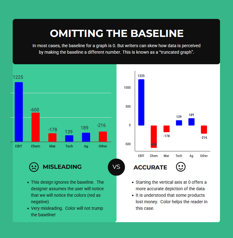
BASF used a graph during the virtual conference to explain that five of the nine divisions had a loss in 2022. However, it did not show a common axis—you must notice the negative numbers to realize there was a loss. At least least they were shown in red!
Make sure to investigate the different aspects of the virtual conference presentation!
BASF Global Investors. Scroll to FY 2022 Reporting and Investor Update. Includes presentation, but choose more information. Link: https://www.basf.com/global/en/investors.html
Figure 5.8 illustrates how omitting the baseline is misleading. What Gestalt Principle is violated?
Figure 5.8—Example of Misuse of Baseline
Drilling Down Into the Data
One of the newer trends is the interaction available for users to drill down into data. One such example (shown in Exhibit 5.21) is by Repligen, a company involved in the bioprocessing and production of biologic drugs.
Exhibit 5.21—Repligen Interactive Analyst Center

What is interesting is that it includes images, infographics, and charts in front of the standard 10-K structure, so you might not realize how much Repligen has done in other areas. In addition to the interactive analyst center, there are other interactive components available to the investor.
Repligen—Interactive Analyst Center. Link to Investor Relations for Repligen: https://www.repligen.com/company/Investors/investors-overview
Repligen—Link to Interactive Analyst Center: https://apps.indigotools.com/IR/IAC/?Ticker=RGEN&Exchange=NASDAQGS
The Use of Social Media to Push Annual Report Information
According to Jung et al. (2018) in the article “Do Firms Strategically Disseminate?—Evidence from Corporate Use of Social Media,” the most frequently adopted social media platforms by S&P 1500 companies was Twitter and then Facebook (p. 229). The types of announcements include everything from earnings, executive turnover, to new customers.
In a separate article, “Corporate Use of Social Media,” the authors found “companies are less likely to disseminate earnings news through Twitter when the earnings miss the consensus forecast and the magnitude of the miss is larger” (Tonello, 2016, para 13). This same bias might be a potential issue for annual reports in general.
What Are Investor Relations (IR)?
Investor relations is the effective two-way communication to provide relevant and necessary information between the issuer and the financial markets. The IR team aims to provide information that is sufficient and timely. It is not public relations, but they do share similar aspects.
Shareholders do not take an active part in the day-to-day management of the company; however, they want to know the issues, objectives, strategies, operating environment, and financial information to ensure that their investment is healthy and growing. A growing number of investors are expressing interest in nonfinancial factors like ESG, diversity, equity, and inclusion (DEI), sustainability, and other nonfinancial factors, but may still impact the bottom line.
Nonprofit Annual Reports
Annual reports for nonprofits highlight the mission and vision statement, the community impact, financial statements, and most importantly, a “thank you” to donors. They can contain more depending on the size and goals of the nonprofit. Nonprofit annual reports are typically smaller than their for-profit counterparts (average of 15–30 pages, but larger nonprofits can be 200 pages). It really depends on the audience, the stakeholders, and the story you need to tell.
An overall guide to the number of pages for a full annual report and the broader work include:
- letter from executive/leader: 1 page
- mission and metrics: 2–4 pages
- program overview: 4 + pages
- impact story: 2 pages
- financials: 2 pages
- testimonial: 1+ pages
- leadership: 1–2 pages
- recognition of donors: 1–6 pages
- looking forward to: 1 page
Keep in mind that the purpose should drive the report—some nonprofits do a full annual report but use a one-page “snapshot” for social media sharing, while some nonprofits build their annual report on their website.
Many nonprofit organizations publish their annual reports, which includes financials, at the same time they file their Form 990, since a Form 990 contains the financial information of the nonprofit. Nonprofits do not have an oversight regulator like the SEC requiring that specific items be included in an annual report.
There is no corresponding 10-K for nonprofits, but many nonprofits consider an annual report as part of the transparency requirement for charity watchdog organizations. Nonprofit annual reports are full of infographics, images, and stories that relate to community impact. Let’s look at some of the best practices for nonprofit annual reports.
Best Practices to Communicate to Donors and Stakeholders
There are several fundraising and donor management tools that can be used to discover information about a nonprofit’s donors. The annual report gives an organization an opportunity to understand their own organization better. What questions do you need answered about your donors, about your programs, and what questions come from your community? Understanding donors is crucial to the success of a nonprofit organization and foundational to how you should build your annual report.
By gathering information about your donors, you can significantly enhance the nonprofit organization’s annual report. With this insight the annual report becomes more than a “report.”
The Annual Report From a Donor’s Perspective
- Personalization of messaging—How do your donors prefer to be recognized?
Incorporate personalized recognition in the annual report based on donors’ preferences (i.e., acknowledgment of their preferred causes or programs).- Draft a letter from a board member or leadership to set the tone and introduce the annual report.
- Share strategic goals for the future of the nonprofit.
- Tailoring content—What do your donors want to see about your programs?
Highlight specific initiatives or projects within the annual report that align with donors’ interest, demonstrating the direct impact of their contributions.- Clearly articulate the organization’s mission and show how activities align with core values.
- Emphasize the impact.
- If the report is built for donors, determine if they would prefer printed, infographic, living report, animated, snapshot, PDF, or flipbook. (This will be discussed in the next section.)
- Thank you can be said in multiple ways. For example, “This was only possible. . . .”
- If your annual report is large, include a table of contents.
- Highlighting impact—What motivates your donors to give? What are your accomplishments?
Share compelling stories and testimonials that highlight your accomplishments and resonate with donor’s motivations for supporting the organization. Make their donation tangible.- Weave a compelling narrative that combines quantitative data with qualitative stories.
- Utilize visualizations to illustrate the nonprofit’s achievements, measurable outcomes, and program effectiveness.
- Incorporate infographics, charts, and graphs in people-first language.
- Consider a separate summarized page with infographics that you can send to board members only (not all of them will read a full report).
- Use social media to announce the annual report. Divide up some content to spread out announcements.
- It is easier to tell a story about one person than a group. Choose a beneficiary whose life has changed because of your work (or a story of an inspired volunteer).
- Consider video or use quotes and first-person narratives.
- Use the CASS template (Context, Audience, Story, and Situation) to assess the storytelling. This framework combines several of the models and is a great template to evaluate existing data storytelling or build your own storytelling with data when you have a large dataset with several insights to share. This template was introduced in Chapter 2. Use the 10 key criteria to assess this section.
- Encourage engagement—What influences your donors to volunteer or take part in events?
Showcase future opportunities for involvement and events and encourage donors to engage with the organization beyond their financial contribution. Showcase past successful events and activities and emphasize the types of events that resonate with donors.- Weave compelling images of the events and show how the activities impact the program(s).
- Include a call to action.
- Recognition and gratitude—How do donors wish to be recognized?
Express gratitude in the annual report in a manner that aligns with donors’ preferences for recognition. Donors need to feel sincerely appreciated. Invite feedback from your donors.- The annual report is only in one place. Make sure to incorporate your annual report into a larger strategy. Donors, corporate partners, and volunteers should be thanked more than once per year. However, make sure you have permission to post your donor’s names!
- Think of your board members—how do you recognize them in your annual report?
- Building relationships—Will your donors help you expand your network? Does your organization support matching donations or sponsor volunteers for the nonprofit organization?
Leverage donor networks by strategically highlighting connections and donor testimonials and/or joint testimonials with a recipient and donor/volunteer. Leverage information about donors’ affiliations and networks.- Request permission to share logos of corporate sponsors and ask for quotes that can be highlighted.
- Build a virtual donor recognition wall.
- Use well-designed, compelling videos.
- Stewardship strategies—What do donors wish to see about financials?
Donors wish to see how their contribution impacted the programs and that nonprofit financials show good steward practices. Many donors want to see how much of a dollar contributed goes directly to support programs. If there are concerns, demonstrate the organization’s commitment to transparency and responsiveness. If the nonprofit has long-range planning (bequests, estates, etc.), share the plan.- Your annual report can include traditional financial statements, or you can use infographics and charts to tell your financial story. If you choose the latter option, make sure to include the traditional financials on your website and indicate they are available.
- Use data visualization and data storytelling techniques to meet the needs of your annual report reader.
- Consider charity watchdog ratings and consider posting your Form 990 at the same time you post your annual report.
- Consider creating a dashboard for project-based fundraisers and share the link in the report (and your website), so donors can track your progress and feel included.
- Grants—How will donors want to see grant income?
Many nonprofits rely heavily on grants for program services. Grants should not drive your programming; instead, they should support your mission. Donors do not appreciate mission creep.- Use infographics to show how grant income supports the mission.
Use design principles (remember Gestalt!) that keep it simple and design with a theme (like colored circles that tie the entire report together). Emphasize people using rich images or videos that focus on people. All design apps that aid in creating infographics will have annual report templates. This following video is a great common-sensical video especially if this is your first time developing a nonprofit annual report.
- Use infographics to show how grant income supports the mission.
Miller, N. & Miller, E. (2023, Jan 10). Your Giving Story, Told Better: A Nonprofit’s Guide to Compelling Annual Reports.
5.3 Self-Assessment: Infographics Used in Annual Reports
Learning Objective # 3—Analyze and develop annual reports by leveraging the CASS template, Gestalt Principles, and best practices
5.3 Exercise 1: Compare and Contrast Annual Reports
Learning Objective # 3—Analyze and develop annual reports by leveraging the CASS template, Gestalt Principles, and best practices
Instructions:
- Find a 2023 annual report for a for-profit company and a 2023 annual report for a nonprofit annual report. Compare and contrast the two reports. Share at least two similarities and five differences.
- Post this to the discussion board making sure to include the links to the reports. Write in third person and use proper APA for citations and references.
5.4 Technology Available for Annual Reports
The biggest mistake nonprofits make is that they don’t see their report as an opportunity for engagement.
—Jitasa: Numbers for Good (2023)
In the realm of nonprofit communication, the annual report serves as a vital tool for showcasing achievements, impact, and transparency. As organizations strive to present their stories in innovative and engaging ways, the traditional static format of printed annual reports has been replaced by digital reports in a variety of formats. Anything from creating a living annual report, an animated annual report, a flipbook annual report, an impact snapshot annual report, or an infographic annual report is possible. There are various technologies and tools that support this change. Here’s an overview for each type.
Living Annual Report
A living annual report is where the organization shares an up-to-date report. Tableau Foundation has created such a report where data are updated weekly. Tableau Public allows an organization to use the Tableau Public software for free. This is not a scaled-down version of the software, but the catch is that anything you create is public. Make sure to visit the Tableau Living Annual Report to see how you can interact with the data.
Tableau Foundation Living Annual Report. Link: https://www.tableau.com/foundation#content-210555
Exhibit 5.22—Tableau Foundation—A Living Annual Report
To learn more about a living annual report, please watch this video.
Tableau Foundation. (2019, Jan 14). Moving beyond the annual report. Tableau Conference. [Video]. YouTube.
This video is 57 minutes long, but it is worth it. Just make sure you get past the “cheesy introduction” (their words!).
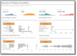
Another product that has the same capability to produce a living annual report, is Power Business Intelligence (BI) from Microsoft. Power BI’s tutorials and videos mostly use examples from a for-profit organization, called Contoso. However, you can find a nonprofit dataset for Power BI using Contoso for Good (see Power BI Data Visualization for Nonprofits from Microsoft).
Microsoft—Power BI Data Visualization for Nonprofits. Link: https://www.microsoft.com/en-us/nonprofits/power-bi. Scroll down to find Nonprofit Templates for Power BI
Microsoft Power BI—Power BI 101—Learn the Basics Provided by TechSoup. Link: https://techsoup.course.tc/catalog/power-bi-101. [Four course track, BI101, BI102, BI201, and BI202]
The image shown in Figure 5.9, is an example dashboard that is built on Contoso for Good. This page is about the availability of Volunteers, but the nonprofit template has a page for Case Management, Case Management: Wellness Survey, Deployed Field Resources, and Donation Management. The image in Figure 5.9 shows Power BI in edit mode—see the visualizations and the data columns on the right. However, if your organization holds the right type of license, you could publish the data so that your users could interact with it on your website. Although this is not an example of a living annual report, it does show some of the benefits of information organized in a dashboard.
Figure 5.9—Contoso for Good Example of Power BI for Nonprofits
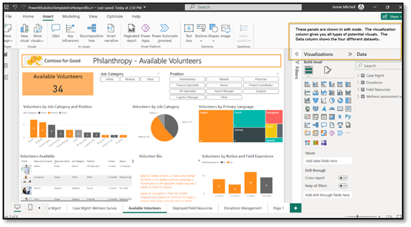
One of the key features of a Power BI dashboard is that every chart works as a “slicer” allowing the user to drill down into the data. This dashboard would not be a public facing dashboard but would serve a great function internally to the nonprofit executive team and board members. Please review Section 3.9 to find other products that can provide data visualizations for the living annual report.
Animated Annual Report
Nonprofits are seeking innovative ways to engage their stakeholders and convey the impact of their work effectively. One such method gaining popularity is the integration of animated gifs in nonprofit annual reports. Animated gifs are visually compelling and engage the audience. The question arises—is an animated report the right mode of communication for an annual report. It all goes back to meeting the needs of your stakeholders (audience). An animated report can be built online by multiple types of hosting platforms (including Word Press). It only requires the user to scroll down, and various infographics will show animation. Here are a couple examples:
Girls Who Code. Link for 2021 Report: https://girlswhocode.com/2022report/. Link for 2022 Report: https://girlswhocode.com/2023report/
DANA: Delaware Alliance for Nonprofit Advancement. Link: https://delawarenonprofit2022.org/
Flipbook Annual Report
Nonprofit organizations strive to present their stories in innovative and engaging ways. One such trend is the adoption of digital flipbooks that offer a dynamic and interactive platform. A flipbook recreates the experience of flipping through pages, akin to a traditional printed report. However, it can go much further since some platforms allow multimedia elements and interactive features. Before your nonprofit uses this feature, you have to be prepared to pay an annual fee to gain the URL that houses your flipbook. But the good news is that this fee is reasonable.
Features Needed to Create a Flipbook
- flipbook software that supports HTML5; older tools that use Adobe Flash won’t work well with iPhones and iPads, since they don’t support Flash
- ability to remove advertising
- ability to offer searches on keywords
- ability to allow embedded videos
Examples of Flipbook Software
- ISSUU—ISSUU is easy to use, full-featured, and the purchased version allows the ability to remove ads and customize embedment. It is a hosted web service from $0 to $299/month. ISSUU has Canva and InDesign integration.
Sample Use of ISSUU:
2022 UNICEF: https://www.unicef.org/reports/unicef-annual-report-2022
- Flipping Book—Flipping Book creates HTML5 interactive documents that can be hosted on your own platform from $44 to $179/month.
Sample Uses Flipping Book:
Multiple examples: https://flippingbook.com/presentation-examples
- Instant Flipbook—Instant Flipbook works for organizations who have technical support. It offers search, videos, and is priced by book: $77 for the first book with standard features, with discounts after one book. At 20 books, the cost is $47 per flipbook.
More flipbook comparisons are available through Source Forge:
Source Forge—Nonprofit Flipbook Software. Link: https://sourceforge.net/software/flipbook/for-nonprofit/
Regardless of which flipping book software you use, make sure it fits what you need and is within your budget.
An Impact Snapshot or an Infographic Snapshot Annual Report
Organizations may want to share key performance metrics as a snapshot in time that will highlight the impact that the nonprofit can share with donors or stakeholders. Snapshot Annual reports can be digital, print, or both. The goal is to showcase the organization’s successes, challenges, and strategic adaptations. It tells a compelling story, but with more focus on the organization’s journey. It can be a snapshot of infographics with images. Review the following examples to see potential snapshot designs.
MANP: Maine Association of Nonprofits. Link to Financials and Annual Reports: https://www.nonprofitmaine.org/financials–annual-reportsMANP: Look Back & Launch Forward—Impact Snapshot 2020–2022. Link to Impact Snapshot Report: MANP_2020-2022_ImpactSnapshot-64712f37.pdf
Impact Snapshot reports include lots of graphics and large font numbers, and some snapshots are videos. The nonprofit Repair the World (2022) created a video (a little over a minute long) that is a “2021–2022 Annual Report Snapshot.” The report looks something like a slide show, but with music and data. For example, the first slide has a great image with the text, “95% of volunteers said serving with Repair the World made them feel a sense of purpose” (Repair the World, 2022, para 1). Take the minute and watch this short YouTube video.
Repair the World. (2022, Nov 1). What a year it’s been! 2021–2022 Annual Report Snapshot. [Video]. YouTube.
What Apps Are Available for Video Creation and Editing?
In the contemporary landscape of snapshot annual reports, the integration of multimedia elements has become a dynamic way to convey impactful narratives. Selecting the right video software becomes a critical decision in the annual report process. The good news!—there is a plethora of free video editing apps, and most phones can generate fabulous video. Let’s look at a few video editing contenders that include a free version.
ScreenPal (Formerly Screencast-o-matic)
Strengths: Simple to use screen recording tool to capture screen (like PowerPoint slides) to later add music.
Weaknesses: Although ScreenPal has basic editing features, it does not have extensive transitions or effects when compared to its competitors.
Capcut (Developed by Bytedance)
Strengths: User-friendly interface. Very intuitive—drag and drop. Easy to cut, trim and add music.
Weaknesses: Lacks some advanced features. Bytedance is the creator of TikTok and banned in some countries.
Canva
Strengths: Versatile graph design platform and many users will recognize the interface. Lots of potential templates. Several add-ins can be used to tell good data stories (like Flourish).
Weaknesses: Lacks depth of video editing features. Better suited to simple edits.
DaVinci Resolve
Strengths: Multitrack editing, professional grade color correction, audio postproduction capabilities, and many advanced features. This app makes both the free lists and the purchased list. It is also used by Hollywood!
Weaknesses: May overwhelm beginners and it requires a robust computer with a good video card. Older computers won’t be able to perform well.
Camtasia (Paid Version)
Strengths: Comprehensive screen recording and video editing software. Multitrack editing, animations, royalty-free assets with more available by a year subscription. Fairly intuitive.
Weaknesses: There is a cost (although educators and students get a steep price break) and the free version has limitations.
Other Resources
If you consider a narrated video for your annual report, make sure to write a script that matches your images. All video editing software has a way to add an audio track (and even edit it and change effects). However, it might be difficult to capture a board member’s remarks. One way to remove this obstacle is to send your board member to Online Voice Recorder at 123Apps. Just click the button to start and follow the on-screen directions. The software saves the file as an MP3 file, and you can add it into your video editing mix.
Online Voice-Recorder at 123Apps. This is a free app! Link: https://online-voice-recorder.com/
Chapter 5 Summary
In summary, this chapter explored the Gestalt Principles and the intricacies of how the human brain remembers information. The art and science behind effective communication was taken into a new realm of annual reports for both for-profit companies and nonprofits. Different purposes drive how the data are presented but both types of organizations realize the importance of conveying complex data in a way that connects with the stakeholder.
As technology continues its rapid evolution, the landscape of annual reporting has expanded into the digital realm. The emergence of digital annual reports, nonprofit living annual reports, interactive flipbooks, and potential reports built on Tableau or Power BI represents a paradigm shift in how organizations share their narratives. Living annual reports leverage innovative technologies and give the nonprofit an ability to create a dynamic, engaging, and real-time experience that captivates stakeholders and fosters a deeper connection with their mission.
In fact, video is transforming the nonprofit sector’s annual reporting endeavors and can be used to share impact with stakeholders in a way that transcends traditional storytelling. The visual and emotional depth conveyed through video has the power to immerse audiences in the mission and impact of nonprofits, providing a visceral and authentic experience and many video editing software programs have a reasonable cost. Imagine testimonials that accompany documentation of a mission project and leave a lasting impression.
In this chapter, you were introduced to the evolution of annual reports from static printed documents to dynamic immersive experiences. The fusion of Gestalt Principles, cognitive science, innovative technology, and reasonable costs for multimedia development software are all fundamental in forging lasting connections with stakeholders. Every organization should see the value in creating a dynamic annual report.
Chapter 5 Case: The Power of Annual Reports
 In this culminating project, apply the knowledge and skills acquired in this chapter to compare several nonprofits that provide the same services. Assume you are a member of the board for a nonprofit and want to compare your organization to other similar-sized nonprofits. For this case, assume that you are looking at four symphony orchestras.
Case Objectives
Learning Objective #1—Apply Gestalt Principles to convey meaningful information
Learning Objective #3—Analyze and develop annual reports by leveraging the CASS template, Gestalt Principles, and best practices
Instructions: Form a Team and Create a Comparison Report
Plan to compare the Terre Haute Symphony Orchestra in Terre Haute, Indiana to the Chicago Symphony Orchestra, Detroit Symphony Orchestra and one other orchestra of your choice.
- Summarize the posted information from the charity watchdogs (both Guidestar and Charity Navigator) for all four organizations.
- Did the organization earn at least gold on Guidestar and 4 stars on Charity Navigator?
- What do these rating systems mean?
- Are there areas that need to be completed, updated, or revised?
- Explain why charity watchdog criteria should be used for annual report best practices.
- Find the most recent Form 990 (found in Guidestar), but make sure to identify years and use the same years to compare organizations.
- What was the total revenue from the previous year to the current year?
- What is the executive director’s salary? This is found on page 7 of Form 990—Part VII.
- What similarities do you find in the organization’s mission? (p. 2, Form 990—Part III)
- What infographics could you use to explain the financial statements? Share some examples.
- Summarize websites for transparency.
- Does the organization post their Form 990 on their website?
- Does the organization have an annual report linked on the website?
- Why is this important for donors and stakeholders?
- Review the annual reports.
- What type of annual report is used for each organization? (PDF, flipbook, interactive, etc.)
- Compare the similarities and differences of each annual report.
- If an organization does not have an annual report, what strategies would you recommend to them for developing their own annual report? What key pieces of information should be included?
- Use the CASS template to improve storytelling for one of the organizations that had an annual report.
- Review potential templates available for annual reports in Venngage or Canva.
As a team, post this “comparison report” to the discussion board making sure to include the links to the reports. Write in the third person and use proper APA for citations and references. Be prepared to discuss this in class.
Chapter 5 References
Califf, C., Lin, X. & Sarker, S. (2012). Understanding energy informatics: A Gestalt-fit perspective, 6. 4353–4365.
Chang, D., Nesbitt, K. & Wilkins, K. (2007). The Gestalt Principle of Continuation applies to both the Haptic and Visual Grouping of elements. Second Joint Euro Haptics Conference and Symposium on Haptic Interfaces for Virtual Environment and Teleoperator Systems (WHC’07), Tsukuba, Japan. pp. 15–20, https://doi.org/10.1109/WHC.2007.113.
Chibana, N. (2018, Aug 13). Data storytelling: 5 tips for creating effective charts and graphs. Visme. https://visme.co/blog/data-storytelling-tips/
Colour Blind Awareness. (2024). About colour blindness. Colour Blind Awareness. https://www.colourblindawareness.org/colour-blindness/
D’Efilippo, V. (2021, Apr 29). Effective data visualization—with Valentina D’Efilippo. The Royal Institution [Video]. YouTube. https://youtu.be/MIZXqC1-VLc?si=p-WWwevimJUnfFoR
Gallo, C. (2019b). Why you should practice your presentation 10 times before taking the stage. Inc. https://www.inc.com/carmine-gallo/why-you-should-practice-your-presentation-10-times-before-taking-stage.html
Interaction Design Foundation. (2019). Preattentive visual properties and how to use them in information visualization. Interactive Design Foundation. https://www.interaction-design.org/literature/article/preattentive-visual-properties-and-how-to-use-them-in-information-visualization
Jung, Michael J., Naughton, J. P., Tahoun, A. & Wang, C. (2018, July). Do Firms Strategically Disseminate? Evidence from Corporate Use of Social Media. The Accounting Review, 93(4), 225–252. https://ssrn.com/abstract=3009374
Knaflic, C. (2015). Storytelling with data: A data visualization guide for business professionals (1st ed.). John Wiley Publishing.
McCandless, D. (2024). Colours in culture. Information Is Beautiful. https://informationisbeautiful.net/visualizations/colours-in-cultures/
Miller, N. & Miller, E. (2023, Jan 10). Your giving story, told better: A nonprofit’s guide to compelling annual reports [Video]. YouTube. https://youtu.be/MElQLsQEp_Q?si=W0nCbngZduruYujY
National Council of Nonprofits. (2023). Nonprofit annual reports. National Council of Nonprofits. https://www.councilofnonprofits.org/running-nonprofit/fundraising-and-resource-development/nonprofit-annual-reports
Nonprofit Hub. (2023). Nonprofit annual report guide. Nonprofit Hub. https://nonprofithub.org/nonprofit-annual-report-guide/
Pinna, B., Porcheddu, D., & Skilters, J. (2022, June 15). Similarity and dissimilarity in perceptual organization: On the complexity of the Gestalt Principle of similarity. Vision. 6(3), 39.
Squire, L. R., Genzel, L., Wixted, J. T., & Morris, R. G. (2015). Memory consolidation. Cold Spring Harbor perspectives in biology, 7(8), a021766. https://doi.org/10.1101/cshperspect.a021766
Strongitharm, J. (2022, Aug 10). 12+ customizable nonprofit annual report examples & templates. Venngage. https://venngage.com/blog/nonprofit-annual-report-examples/
Styron, L. (2022, Aug 17). Charity annual reports rebranded as “impact” reports. CharityWatch. https://www.charitywatch.org/charity-donating-articles/the-difference-between-a-charitys-annual-report-and-impact-report
Tableau Foundation. (2019, Jan 14). Moving beyond the annual report. Tableau Conference [Video]. YouTube. https://youtu.be/JXU-6SE6Xbs?si=md3EWk760BqhdxlG
Tonello, M. (2016, May 17). Corporate use of social media. Conference Board, Inc. Harvard Law School Forum on Corporate Governance. https://corpgov.law.harvard.edu/2016/05/17/corporate-use-of-social-media-2/
Trites, G. (2021). Twenty-first century corporate reporting: Effective use of technology and the internet. Business Expert Press.
UserTesting. (2019). 7 Gestalt principles of visual perception: Cognitive psychology for UX. User Testing Blog. https://www.usertesting.com/blog/gestalt-principles
Wagemans, J., Elder, J. H., Kubovy, M., Palmer, S. E., Peterson, M. A., Singh, M., von der Heydt, R. (2012, Nov). A century of Gestalt psychology in visual perception: I. Perceptual grouping and figure-ground organization. Psychol Bull, 138(6), 1172–217 https://doi.org/10.1037/a0029333.
