
8 Leveraging Data Visualization to Communicate Across Gaps
One of the criticisms I’ve faced over the years is that I’m not aggressive enough or assertive enough or maybe somehow, because I’m empathetic, it means I’m weak. I totally rebel against that. I refuse to believe that you cannot be both compassionate and strong.
—Jacinda Ardern, prime minister of New Zealand
What Do You Think?
Emilee just joined the conference session entitled A Trio of Perspectives in Data Visualization. She was surprised when the presenter announced that the first task was to join her assigned team based on a preconference survey. As Emilee found her team, the conference presenter gave them additional instructions—to share how their organizations publish information about diversity, equity, and inclusion along with other related issues.
Emilee joined her assigned teammates, Barbara and Tonya. After introducing herself, she discovered that Barbara works at a multinational corporation with a diverse workforce spanning multiple continents. Barbara, beaming with pride, said, “My organization creates visually stunning dashboards showcasing our diversity metrics to represent a comprehensive snapshot of my organization’s demographics to especially highlight and promote gender and ethnic diversity.” As Barbara opens her laptop to share the website, Tonya offers, “I’m not sure I’m in the right team! I’m in sports.”
Tonya works for a sports consulting corporation where she works with different organizations to increase their fan base by reaching diverse cultures, generations, and gender. Tonya offered, “The world of sports faces unique challenges in conveying their commitment to diversity and inclusion. They request specific data visualizations that convey unity and empowerment. I do my best work where I can feature individual stories and collective triumphs.”
Emilee looks at Barbara’s laptop and compliments the aesthetics of her organization’s dashboard. Emilee feels somewhat intimidated. Taking a breath, she says, “I work for a nonprofit and we operate on a shoestring budget. We rely on simple impactful visuals that convey the lived experiences of the communities we serve. We don’t have a metric of our organization; in fact, we only have 12 employees. Instead, our metric is based on the number of clients we help. Most of our clients are from marginalized groups. We provide free-legal counsel.”
Barbara looks perplexed and asks, “What kind of cases?”
Emilee is quick to respond, “Well things like gender pay gap, diversity issues, and inclusion issues. We use minimalist, community-centric visuals. Nothing as fancy as Barbara’s organization!”
Discussion: What do you think?
Introduction
In the era of an increasingly interconnected world, diversity reigns as both a challenge and an opportunity. Effective communication bridges the gaps among diverse populations to foster collaboration, understanding, and progress. Hiring a diversity, equity, and inclusion (DEI) officer can be a significant step for any organization, but thinking about the scenario in the “What Do You Think?” section, how would a nonprofit that has 12 employees justify this action?
One topic DEI officers address is the gender wage gap. According to Elise Gould at the Economic Policy Institute, the gender wage gap in the United States still persists across all levels (low, middle, and high income) and women are paid less than men at every education level (2024). In 2023, “women were paid 21.8% less on average than men in 2023, after controlling for race and ethnicity, education, age, and geographic division” (Gouse, 2024, para. 1). It’s an even bleaker picture if you dive into the data on Black and Hispanic women.
At its core, this chapter focuses on communication for diverse audiences. Topics to consider for diverse populations include gender, culture, generation, equity, and inclusion. This chapter includes DEI best practices including people-first labeling, purposeful order labels, consideration of missing groups, awareness of stereotyping, and mindful use of icons and shapes. It also includes leadership and communication strategies in relation to the relative burnout that marginalized populations are facing.
As you embark on this journey, it is imperative to recognize that effective communication is not a one-size-fits-all endeavor. It requires an understanding of audience dynamics, cultural nuances, and cognitive biases. It is hoped that this chapter will equip you to harness the power of data visualizations as a catalyst for change, driving meaningful dialogue, and fostering a more inclusive society.
Chapter 8 addresses the following learning objectives.
Learning Objectives
At the end of this chapter, students should be able to:
- LO 1: Share strategies that address gender communication issues.
- LO 2: Identify competing ways to influence within the global organization.
- LO 3: Share strategies that address multigenerational communication issues.
- LO 4: Identify data visualization techniques and strategies to address gender, cultural, and multigenerational issues.
- LO 5: Identify how poor visualizations impact diversity, equity, and inclusion.
- LO 6: Apply leadership strategies when your team is burned out (especially from virtual meetings).
- LO 7: Demonstrate best practices of communication for Global Leaders.
Key Terms: Audience and audience perceptions, Brain dominance, Cognitive preference, Conflict, credibility, gender tendencies, gender motivation theory, global leader communication, interruptions, motivation, nonverbal cues, PechaKucha, PESTLE, power through character strengths, presentation designs, remote engagement, remote presenting, SWOT
8.1 Gender Communication Issues
The hope is that laying out what we understand about essential differences in the minds of men and women may lead to greater acceptance and respect of differences.
—Simon Baren-Cohen
Gender communication issues are a complex phenomenon that reaches various aspects of society, from workforce dynamics to decades of gender disparity and stereotyping. To begin, let’s look at gender tendencies. Gender tendencies refer to a pattern or inclination commonly associated with a particular gender based on social norms, cultural expectations, and stereotypes. Examples of gender tendencies include (a) communication style, (b) occupational choices, (c) emotional expression, and (d) leadership style. A critical examination of gender tendencies can help challenge stereotypes and foster a greater understanding of inclusivity across diverse gender identities. It is important to note that gender tendencies are not a fixed characteristic of individuals; instead, they are socially constructed and can vary across different cultures and contexts.
So What Are Gender Tendencies?

Before we start, we must deal with an important caveat. The communication expectations are based on the tendencies of men and women as a group. Individuals may exhibit any combination of “male” and “female” behaviors. For example, when I am in a meeting, I tend to nest and take up a lot of room. I have my laptop and iPad, my notebook always turned to a new blank page, a few mechanical pencils, a couple of pens, and always a cup of coffee. Women normally take less room at a conference table, even pulling in their elbows. Not me. I’m crowding my neighbors and that is a typical male tendency. So let’s look at these male and female tendencies to understand the environment and the audience. Remember, understanding your environment and your audience is the first step to successful communication.
Let’s start with a comparison of tendencies: According to Winstok et al. (2018), “according to gender motivation theory, men are driven by a desire to enhance their status; whereas women are motivated by a desire to reduce risk” (p. 276). Leonard, Beauvais, and Scholls (1999) introduced sources of motivation from three attributes: traits (“repeated behavioral patterns”), competencies (“skills, abilities, talents, knowledge”), and values (“beliefs about desirable outcomes”) (pp. 974–975). Just as one has a dominant hand (either left-handed or right-handed), individuals have a dominant source of motivation. But how did we develop these tendencies through motivation and conflict? And what does that have to do with communication?
Gender Tendency #1–Motivation and Conflict
Male: Childhood games taught him that competition is fun, winning is good, performing aggressively is acceptable, and boasting of your success is normal (Shaffer, D. & Kipp, K., 2013). And these social cues learned in childhood are the foundation of why a male views conflict as impersonal. He may even consider conflict a necessary part of a working relationship!
Female: Childhood games taught her to compromise and collaborate. She competes primarily with herself and tends to be modest about accomplishments. She is motivated by connections and causes. She takes conflict personally (Doyle, 2022).
In a study by Eagly et al. (1994) the Miner Sentence Completion Scale (MSCS) showed that men scored higher than women on competitive games, competitive situations, assertive roles, imposing issues and standing out from the group. Women scored higher on authority figures and routine administrative functions. It is no surprise that male managers are often perceived as autocratic leaders. However, a newer study, using the same MSCS, discovered there was no significant difference between men and women for “competitive situations” or “standing out in a group” (Thorton et al., 1997).
The most common workforce conflicts include employment conditions, supervisor decisions, personality conflicts, and uncivil behavior. According to Van Gramberg et al. (2020), only 21% of conflicts are fully resolved. No wonder organizations are experiencing high turnover!
As an aside, conflict resolution in the workplace must start with both parties recognizing that a problem exists with the intent of reaching a mutual agreement. Changes in attitudes or behaviors can lessen negative feelings. However, understanding what triggers the episodes of conflict can often lead to someone saying, “I didn’t know that bothered you.” Using “active listening” is a communication technique for conflict resolution. It requires the listener to restate or paraphrase what they just heard to confirm their understanding. Instead of mentally preparing a response, listen to points being made (Chastain, 2013)!
What Data Visualization Strategies Help With Communicating?
Effective data visualization strategies that cater to different genders should aim to be inclusive, engaging, and relatable. Let’s look through some of these strategies.
- Use gender-neutral language, imagery, and color. Create data visualizations that use language and imagery that are inclusive and gender neutral. Avoid stereotypes. If you know you have a diverse audience, opt for visuals and language that resonates with all members of the audience.
- Example #1: Avoid using pink for girls and blue for boys as part of the color palette.
- Example #2: In a survey, several participants did not answer the gender question (male or female). As a visualization designer, do not introduce the gender synthetically. Instead, just indicate “identity not listed” instead of “other.” To most, other feels like a catchall category.
- Balance visuals and textual information to tell a story: Strive for a balance between visual elements and textual annotations in your data visualizations. Provide clear, concise explanations alongside visual representations to ensure comprehension.
- Example #1: Use people-first language. So “people with disabilities” or “communities of color.”
 Shonk, K. (2024, April 18). Conflict Styles and Bargaining Styles. Daily Blog—Program on Negotiation—Harvard Law School. https://www.pon.harvard.edu/daily/conflict-resolution/conflict-styles-and-bargaining-styles/
 Kahane, A. (2017). Collaborating with the Enemy: How to Work with People You Don’t Agree with or Like or Trust. Berrett-Koehler Publishers, Inc.
Gender Tendency #2—“I” Versus “We”
Male: Males have traditionally been afforded attention-getting roles and have no trouble using the word I. According to Sarah Carmichael (2014) in The Perils of Self-Promotion, a routine use of “I did this” or “I did that” is a symptom of self-promotion. And this tendency is tied to what males typically value: power, ability, and achievement. Carmichael shares, “People do not value confidence unless it is accompanied by competence” (para 8).
Female: Females have traditionally been afforded attention-giving roles attached to an affiliation or the wider needs of a corporate community. She uses the word we. She is impressed by personal transparency and professional courage.
Teddy Roosevelt was often teased at his overuse of “I.” In fact, the “New York World put a running score on its front page that year at 563,877,207 to record the number of times Roosevelt used ‘I’ in his public addresses” (Dalton, 2007, p. 361). TR was quite the character; we especially enjoyed his attempt to legislate a change in the spelling of 300 words. He failed then, but now we use them (check instead of cheque, or color instead of colour, etc.).
Currently, most leadership programs talk about the use of “We” instead of “me.” A Harvard Business Review article, “If You Want to be the Boss, Say ‘We’ Not ‘I,’” has some relevant insight. Changing to “we” language can help “shift your perspective from self-focused to others-focused, make you more aware of the needs of others . . . [and] make you a better leader” (Burkus, D., 2015, para. 8). It is worth fighting the tendency to say “I” if you wish to lead a team!
What Examples of Using “We” Can Help With Data Storytelling?
- Use inclusive framing through shared goals and experiences using “we/us” to emphasize common goals and a common purpose.
- Example #1: Use phrases like “Together, we can address this challenge.”
- Use collaboration techniques. Engage the audience to contribute problem-solving strategies.
- Example #1: Use phrasing like, “Let’s work together to find innovative solutions to this problem.”
- Share power techniques. Empowerment grows exponentially when you build your narrative around shared values and aspirations.
- Example #1: Use phrasing like, “Together, we have the power to make a difference in our communities.”
- Example #2: When you need the audience to share responsibility and accountability and to take ownership of the issue, you can use phrasing like, “It’s up to all of us to ensure we . . .”
Gender Tendency #3—Cognitive Preference Instead of Brain Dominance
Male: Early literature associated males with left-brain orientation, which “produces problem-solving skills that are logical, analytical, factual, and hierarchical” (American Management Association International Presentation Skills Workshop, 2015, p. 131).
Females: Early literature associated females with right-brain orientation, which “produces problem-solving skills that are creative, sensitive, and nonhierarchical” (American Management Association International Presentation Skills Workshop, 2015, p. 132).
Females are great creative problem-solvers, but you find this same ability in males. A study conducted by Hardy & Gibson discovered that there was a gender difference in the approach to problem-solving in two of four samples, so the results are somewhat inconclusive. However, this same study indicated, “on average, females were found to produce higher quality creative problem solutions in all four samples” (Hardy & Gibson, 2015, p. 101). Creative problem-solving is defined as the production of elegant solutions in response to complex, novel, and ill-defined problems (Hardy & Gibson, 2015).
The dialogue surrounding left-brain versus right-brain orientation has taken place over the last decade. It’s almost like comparing left-handed and right-handed people. Over 85% of the population is right-handed. Which hand you use does not cause much of an impact (except the early stigma several decades ago where children were forced to write with their right hand). Mostly, you hear about left-handed people when you watch baseball (or bowling!). So the left-brain versus right-brain arguments sound familiar. That’s why the “whole brain thinking” introduced by Herrmann is so interesting.
According to the Herrmann Brain Dominance Instrument, a four-quadrant model of cognitive preferences is more applicable. Herrmann’s theory was for either gender to develop “whole brain thinking” to lead to creative problem-solving (Faust, 2019, para. 20). The quadrant reminds us of Myers-Briggs Type Indicator (MBTI), and you can find research that makes a comparison. But for now, let’s look at the Herrmann model. As you review Table 8.1 keep in mind that this is a framework for understanding cognitive preferences. Each person’s brain operates across these dimensions and individual strengths can exceed specific quadrants. According to LEADx, the organization that carries on the work of Herrmann, the Herrmann Brain Dominance Instrument helps you determine your dominance in how you think. But even more interesting is the ability to recognize your team’s quadrants.
Table 8.1: Four Quadrants of Brain Dominance
|
Quadrant |
Keywords to describe |
Preferred Activities |
|
Quadrant A—Left cerebral hemisphere—analytical |
Logical, factual, critical, technical, and quantitative. |
Collecting data, listening to informational lectures, reading textbooks. Judging ideas based on facts, criteria and logical reasoning. |
|
Quadrant B—Left limbic system—sequential |
Conservative, structured, organized, detailed, and planned |
Following directions, repetitive detailed problems, time management and schedules. Known as organizers. |
|
Quadrant C—Right limbic system—interpersonal |
Kinesthetic, emotional, spiritual, sensory, feeling |
Listening to and sharing ideas, looking for personal meaning, sensory input, and group study. Sometimes called humanitarians. |
|
Quadrant D-Right cerebral hemisphere—imaginative |
Visual, holistic, intuitive, innovative, and conceptual |
Looking at the big picture, taking initiative, simulations (what if questions), visual aids. Appreciate the beauty of a problem, brainstorming. Innovators fall in this category. |
What Examples of Leveraging Our Understanding of Brain Dominance Can Help With Data Storytelling?
- When presenting: Make sure you provide data visualizations or narrative that resonates with each quadrant.
- Example #1: Quadrant A will want to see facts. Quadrant B will want to see an organized approach, Quadrant C will want to see the value of solving the issue, Quadrant D will want to see how the solution fits in the big picture.
A great resource for “whole brain thinking” can be found at the Herrmann website. Essentially, the free resources “help decode and harness your cognitive diversity to achieve better management results” (Herrmann, 2020). Link: https://www.thinkherrmann.com/resources. Link to Herrmann Example Report
As you can tell from Table 8.1, you don’t see gender in the mix, but you may recognize the quadrant you resonate with just by looking at the preferred activities. Let’s look at nonverbal cues next.
Gender Tendency #4—Nonverbal Cues
Male: Males are likely to hear your literal words and miss your underlying emotion or see your nonverbal cues. He is “not likely to express his feelings through facial expressions” (American Management Association International Presentation Skills Workshop, 2015, p. 131).
Female: Females are very proficient at decoding nonverbal meaning and “nonverbal messages carry over four times the weight of verbal messages” (National Alliance for Partnerships in Equity, 2020, p. 2). Additionally, females are likely to display feelings through facial expression or body language. But males are likely to miss it!
As an aside, in most “two-person conversations, nonverbal messages convey more than 65% of meaning” (National Alliance for Partnerships in Equity, 2020, p. 2). That’s no surprise when you realize our “faces can demonstrate more than 10,000 facial expressions!” (Point Park University—Online, 2017).
Even more interesting is the 7-38-55 rule by Mehrabian, Wiener, & Ferris (1967) that shared this formula but with some caution. The rule states that 7% of meaning is communicated through spoken word, 38% through tone of voice, and 55% through body language. The authors urge caution because the formula does not apply to every situation. Note that 55% is nonverbal! Even the way you stand can have an influence on your audience and impact you as well.
For example, because someone crosses their arms over their chest doesn’t always mean they are closed to your presentation; it may just mean they are cold!
Just remember, nonverbal cues can contradict or negate verbal messages. An interaction where words say one thing and nonverbal cues say another is called a double message, and everyone finds this confusing.
What Examples of Leveraging Our Understanding of Our Audience and Looking for Nonverbal Cues Can Help With Data Storytelling?
- When presenting: Make sure you pay particular attention to your nonverbal cues.
- Example #1: If you stand with your hands clasped down low in front of you, it may look like you are trying to make yourself small. Audiences won’t react to that as well (Weiss, 2015).
- Example #2: Know your audience. In the book Presentation Skills: Educate, Inspire, and Engage Your Audience (2015), Michael Weiss points out four personalities that should influence how you present (pp. 46–56). These four personalities are the Driver, the Amiable, the Analytical, and the Expressive, and each type has preferences in how you present to them.
- Presenting to the Driver: Use brief, short-term options, and keep things focused on the present. Let the driver take control if they request it. The best data visualization is a dashboard to provide options, which should be up to date. Nonverbal cues of the Driver include leaning forward, putting elbows on the table, and giving a firm handshake.
- Presenting to the Amiable: The presentation should be traditional and inclusive of the entire team. Personal sharing is OK; the Amiable appreciates a safe, comfortable environment and doesn’t like to feel rushed or confronted. They will get back to you. If Drivers are in the same room, emphasize “This is a safe environment.” Nonverbal cues of the Amiable include palms open and welcoming, great eye contact, and animated hands, face, and eyes.
- Presenting to the Analytical: The Analytical wants all data (past, present, and future). They are detail oriented, want to see the plan, need time to verify data analysis, and have an obsession with being right. Nonverbal cues of the Analytical include the following: sits up very straight, is somewhat rigid but tends to lean back, and gives limited eye contact.
- Presenting to the Expressive: The Expressive wants to hear how the story will end. Painting a picture with your narrative will engage the Expressive. The Expressive wants to be asked what they think, appreciates compliments, and feels comfortable and engaged if they can contribute their ideas and tell their stories. Nonverbal cues of the Expressive include leaning forward to make eye contact and being animated in posture (restless).
If you are interested in learning more about presenting, please feel free to read this book by Michael Weiss. It is especially helpful if you struggle with getting nervous before a presentation!
Weiss, M. (2015). Presentation Skills: Educate, Inspire, and Engage Your Audience. Business Expert Press. ProQuest EBook Central Database.
NAPE. (2023). Gender Communication Quiz. National Alliance for Partnerships in Equity. https://napequity.org/pipe-training/r1e-gender-communications-quiz/
Gender Tendency #5—Interruptions
Male: Males are more likely to interrupt women than interrupt other men and they mean nothing personal by the interruption. “According to world-renowned gender communication expert Deborah Tannen, men speak to determine and achieve power and status. Women talk to determine and achieve connection” (Ibarra, Tannen, Williams, & Hewlett, 2019, p. 80).
Given that in American society speaking is perceived as a power position, it is no wonder that men interrupt to take the floor more often. “In using conversation to enhance connection, women are much less likely to interrupt, as it is seen as disrespectful” (Shore, 2017, p. 37)
Female: Females are less likely to interrupt men, but when females are interrupted by men, they tend to take it personally.
Figure 8.1—Interruptions and How to Handle It
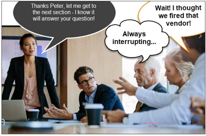
What Strategies Can We Use When a Presentation Gets Interrupted?
- When your presentation is interrupted, determine the reason first.
- Example #1—Is the interruption for clarity? There are strategies for deflecting interruptions (for any reason other than clarity). For example, you can ask, “There are a few more essential points I’d like to make. Can you delay a moment?”
- Example #2—Is the interruption because they want to support your position? This can happen when men feel motivated to support based on your language and word choice. Instead of words like “believe,” use “know” or instead of “might” use “will.” (Shore, 2017, p. 37) and don’t use phrases like “I just” or “I think” because these phrases limit your authority and conviction.
- Another strategy is to notice body language. When you see men lean away or look away from you, they may be ready to interrupt, so “look them in the eye, lean in and take yourself seriously if you want to be heard” (Shore, 2017, p. 35).
Reflective listening: If you face interruptions from your team, ask your team to practice a version of “reflective listening.” “Anyone interrupting repeats or paraphrases what the speaker was saying and then explains the connection to the new thought. This prompts teams to be more aware of when and who they’re interrupting. This won’t work for every meeting because it slows the pace, though it is a good exercise to default to when excessive interruptions re-emerge” (Dotter, 2019, para 5).
Gender Tendency #6—Defining a Problem and Situation
Male: Men tend to define a situation in terms of outcome. Males will assume that your presentation of a problem (even a hypothetical problem used for illustration) is a direct request for a solution.
Female: Females tend to define the same issue in terms of the people affected by it. Other females will respond to your presentation of a problem with support and reassurance with a willingness to collaborate, to share experiences, and to jointly discuss solutions. “Successful collaboration requires a cooperative spirit and mutual respect” (Doyle, Careers, 2020, para. 15). A good collaborator can analyze the problem without assigning blame and women are better at this than men.
These observations highlight the different perspectives. While men lean toward analytical solutions, women often consider the human aspect. These tendencies are generalizations and don’t apply to all. Individual variations exist; expect a blend.
What Strategies Can We Use When Presenting a Problem to a Mixed Audience?
- When you present to a mixed audience, plan to appeal to both genders.
- Example #1—If you are presenting to a mixed audience, what can you do? The strategy is to define the problem in a manner that appeals to both genders. Defining the problem is key—paint the picture, show the impact, the consequences, and the emotions the problem is creating for those involved (Cooper, 2014). You already consider the decision-makers in your audience; this is just considering the additional issues based on “gender.”
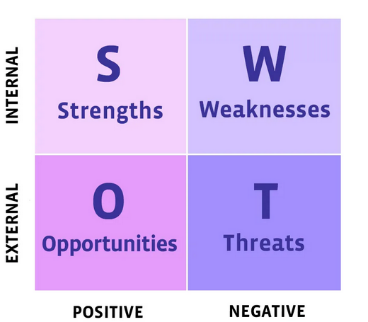
-
- Example #2—Use analytical tools like PESTLE (political, economic, social, technological, legal, and environmental) or SWOT (strengths, weaknesses, opportunities, and threats) so males can focus on the specific industry competition in related industries or organizations. Be direct and show results-oriented impact on the organization’s bottom line. These tools were demonstrated in previous chapters.
-
- Example #3—Share the most important information first. One of our favorite quotes made in Storytelling With Data is “If you only had a limited amount of time or a single sentence to tell your audience what they need to know, what would you say?” (Knaflic, 2015, p. 39).

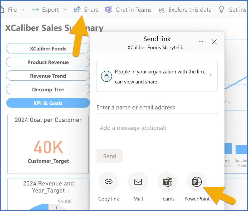
Note: Author Illustration (2025) - Example #4—Most presenters use PowerPoint but if you want to show an interactive report from PowerPoint, make sure to install the Power BI add-in in PowerPoint. Let’s look at the step-by-step section to see how this might be used.
- Example #3—Share the most important information first. One of our favorite quotes made in Storytelling With Data is “If you only had a limited amount of time or a single sentence to tell your audience what they need to know, what would you say?” (Knaflic, 2015, p. 39).
 Step-by-Step to Bring Power BI Into PowerPoint
Screenshots of PowerPoint Interface © Microsoft Corporation. Author Annotations Added.
This application would be for fairly sophisticated audiences where your audience might be asking questions and asking for on-the-spot analysis.
Step 1—Open Power BI Services (Online)
Step 2—Open a report found in My Workspace. I opened XCaliber Foods Storytelling-Draft 2.
Step 3—Click the share button and choose PowerPoint as you see in Figure 8.2.
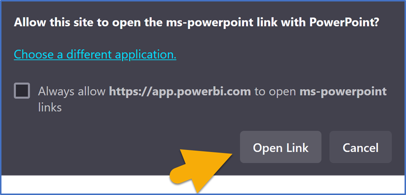
Step 4—When you see the pop-up (Figure 8.3), choose Open in PowerPoint
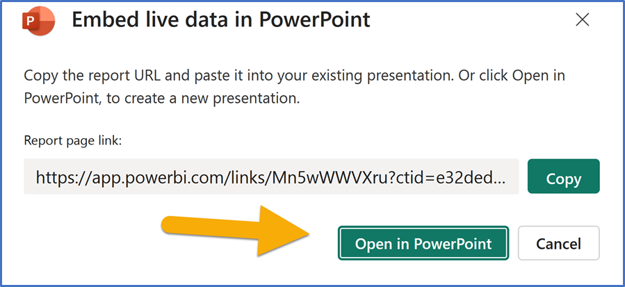
Step 5—In the next pop-up, choose open the link (Figure 8.4) so PowerPoint will connect to it.
Step 6—Customize the Power BI Report in PowerPoint as shown in Figure 8.5.
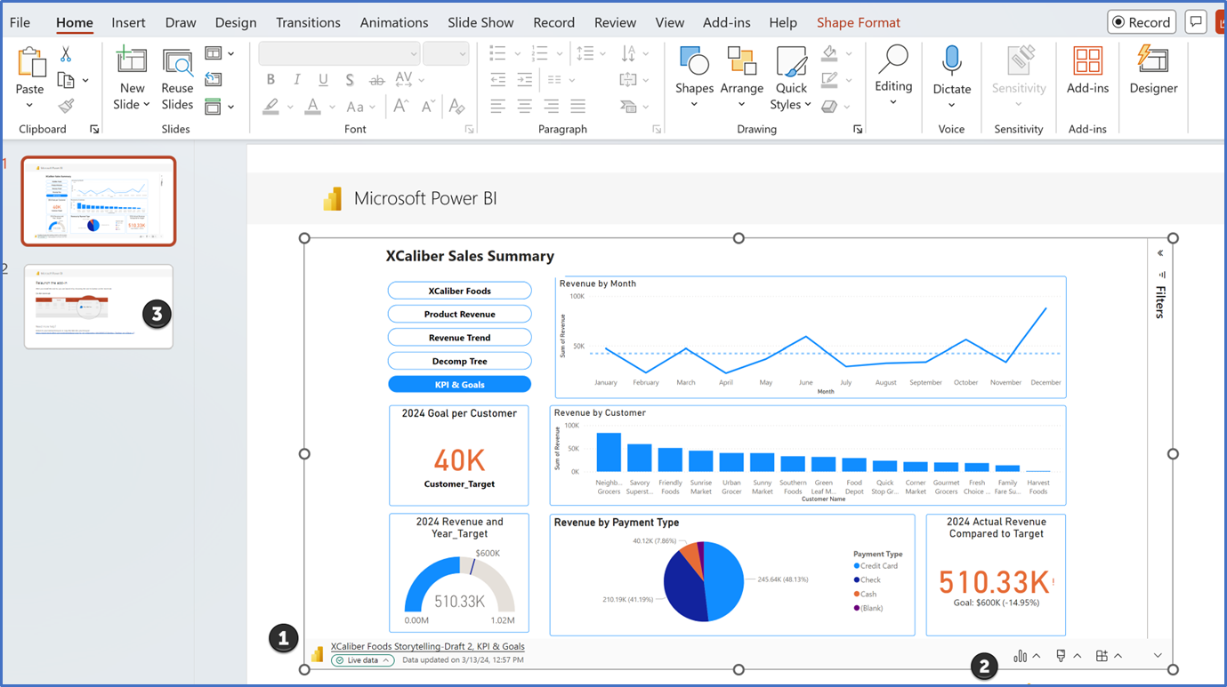
 In this step, please note the information on the lower left (Live data) of the PowerPoint (see Figure 8.5). It should identify the name of the Power BI Report (in this case XCaliber Foods Storytelling—Draft 2, KPI & Goals), along with the date updated.
 In the lower right of PowerPoint, you will notice several icons. The first icon looks like a three-column chart. When you click on it, you see the options filter, data insights, refresh, and reset, as shown in Figure 8.6[1]. Data Insights is like what you would expect from Power BI. If you have trouble loading Data Insights, troubleshoot the Power BI add-in for PowerPoint. In Figure 8.6, we demonstrate the data insight feature by using the Revenue Trend section of the report. Notice, you can paste on a slide or copy to the clipboard.
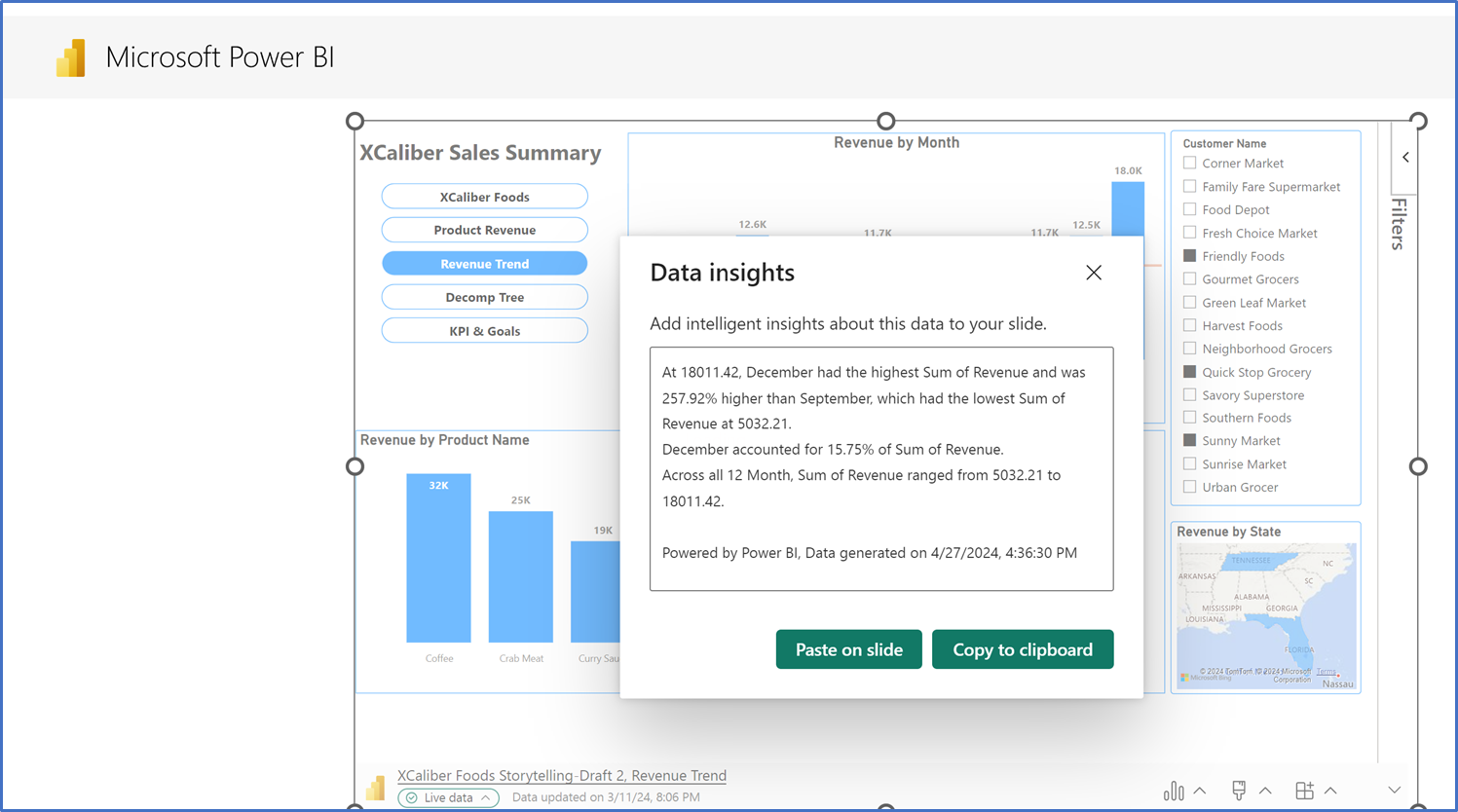
The second icon in the lower right allows you to add style to your Power BI Report—you can add an outline. The last icon allows you to clear data, set slide show settings, and Learn.
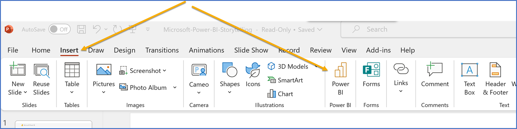
 When you share the report to PowerPoint, it creates two slides—one that is from XCaliber Foods, but the other is an instruction about using the add-in feature in PowerPoint to launch the report. The Power BI button shows up on the ribbon.
 Recall your best and your worst presentation. What strategies would you apply to your worst presentation?
8.1 Self-Assessment: Gender Communication Issues
Learning Objective #1—Share strategies that address gender communication issues

8.1 Exercise 1: What Do You Think?
Learning Objective #1—Share strategies that address gender communication issues
Learning Objective #5—Identify how poor visualizations impact diversity, equity, and inclusion
 Instructions: Go to the “What Do You Think?” section at the beginning of the chapter and answer the following questions.
- Compare and contrast the three organizations in leveraging data visualizations to promote diversity, inclusion, gender equity, and so on. What are the common themes that emerge and what unique insights can each organization offer?
- How does the context of sports influence the effectiveness of data visualization in promoting diversity and inclusion? Are there unique opportunities or limitations inherent in this domain compared to the corporate and nonprofit sectors?
- Consider the role of leadership in shaping the narrative around diversity and inclusion. How might the leadership styles be different?
- Is one approach more effective than another?
- Reflect on your own experiences with data visualization. Have you encountered a visualization that resonated deeply, and how did it contribute to your understanding of a particular issue?
Post to the discussion board, or be prepared to discuss in class.
8.2 Cultural Communication Issues
Different does not mean deficient, it simply means different.
—Tatiana Kolovou, teaching professor of management
Making Sense of Cultural Differences in a Communicative World
The rapid rise of global business, combined with the challenges brought on by the pandemic, has made cross-cultural considerations and planning an urgent priority for even the most indifferent organizational communicators. During the difficult days of the pandemic, nearly the entire world was forced to remote work, requiring immediate connection with colleagues across various parts of the globe. In Upwork’s Future Workforce Survey, 1,000 U.S. hiring managers were asked, “Has responding to the pandemic forced you to make changes to the following management practice areas that will stay with you in the long-run?” (Ozimek, 2021, para. 15). The survey results indicated over 60% changed management practices for team meetings (structure and cadence) and over 55% indicated changed management practices for employee/internal communication.
At any given moment, countless individuals are connecting instantly with their organization’s global offices. This shift has brought together a diverse array of cross-cultural communicators, who collaborate virtually to solve problems, present proposals, and engage in meaningful exchanges through numerous virtual platforms. Despite this reality, not all participants have received training on the nuances of cross-cultural communication.
This section seeks to address that gap by discussing key considerations for effectively engaging with diverse audiences and making compelling pitches in our increasingly globalized communication landscape.
Cultural Context Matters
Each culture presents differences, and as highlighted in the quote at the start of this section, these differences should be celebrated for the diversity they bring rather than viewed as deficiencies. Culture encompasses the customs, arts, social institutions, and traditions of a particular nation, people, or other social group. Extensive research has been conducted on the differences between cultures, and while entire books could be written on this topic, this section aims to introduce a few key resources that we believe will be particularly helpful to you.
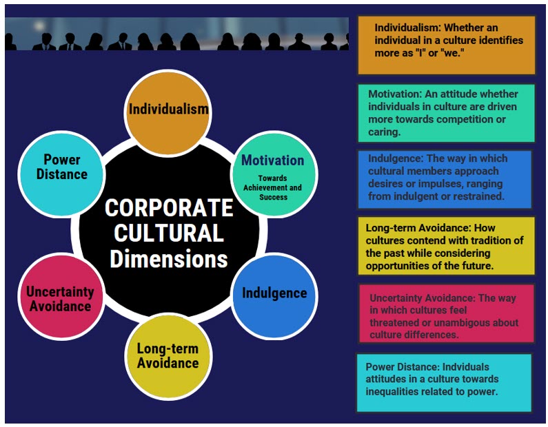
Researchers like Geert Hofstede leveraged his practical experience at IBM to develop a framework of six cultural dimensions that encapsulate common experiences across cultures. These dimensions—power distance, individualism, motivation toward achievement and success, uncertainty avoidance, long-term orientation, and indulgence continue to guide leaders and scholars. Organizations like the Culture Factor Group assist individuals seeking to understand these cultural differences by providing country comparison tools to help guide those who seek to understand and appreciate cultural diversity.
Figure 8.8—Six Cultural Dimensions
Try the country comparison tool offered by The Culture Factor Group. Begin by selecting countries that you seek to compare. Once your selection has been made, visit the country comparison tool. Culture Factor Group. (2023). The Country Comparison Tool. https://www.hofstede-insights.com/country-comparison-tool
The Culture Map
Erin Meyer, author of the Culture Map, helped to further Hofstede’s cross-cultural considerations by offering an eight-scale dimension to guide audiences. These dimensions help global audiences better identify cultural differences from a highly practical approach. The cultural dimensions of communicating, evaluating, persuading, leading, deciding, trusting, confronting, and scheduling help explain the various approaches that guide leaders as they interact with another culture. Table 8.2 explains the dimensions while the subsequent illustrations suggest how the dimensions may play out, interaction by interaction.
Table 8.2: Dimensions, Scale and Differences Explained
|
Dimension |
Scale |
Differences Explained |
|
Communicating |
Low to high context |
Low context speakers offer all details to others, being very specific and looking for the same from others. High context speakers let audiences read between the lines to get meaning and be surprised by low context details. |
|
Evaluating |
Direct to indirect negative feedback |
Those giving direct negative feedback are explicit and clear while those providing indirect negative feedback leave much unsaid or offer their reaction subtly. |
|
Persuading |
Principal-first to Application-first |
Principal-first communicators offer a theory or complex concept before presenting a fact, statement, or opinion. Application-first communicators lead with a fact, statement, or opinion. |
|
Leading |
Egalitarian to hierarchical |
Egalitarian leadership preferences desire group decision-making and may be comfortable with such a system or outcomes. Hierarchical preferences look to a top-down structure for such decisions. |
|
Deciding |
Consensual deciding to top-down decision-making |
Similarly, consensual decision-makers look to the group to have sign-off while top-down decision-making provides such an answer for everyone to then follow. |
|
Trusting |
Task-based to relationship-based |
Task-based orientations see interactions to be largely centered on getting to work around a project or goal and if it goes well, trust is established. Relationship-based preferences like to know those they are working with before getting down to pursuing projects or goals. |
|
Disagreeing |
Confrontational to avoid confrontation |
Those that prefer confrontation to work through differences will be different from those communicators who avoid confrontation at all costs while not seeing it useful. |
|
Scheduling |
Linear to flexible time |
Linear time schedulers see meetings, appointments, and deadlines as a precise thing to be followed. They may see arriving early as actually being on time. Those in flexible time cultures tend to be approximate on start times, not seeing the need to rush from their timelier counterparts. |
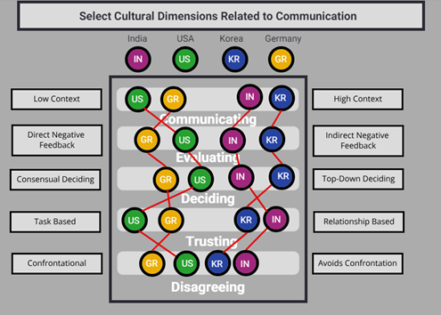
Figure 8.9 illustrates how select dimensions relate to how communication may differ, culture-by-culture, in four specific countries. While audience members are never monolithic, leaders and communicators would be wise to heed these general parameters to better understand their audiences when approaching communication in such situations.
Understanding these cultural differences is just a starting point to recognize the ways in which different people connect. The next key step for any communicator is to identify specific actions to effectively communicate. First, listen to and observe your surroundings. Even when you are with a familiar work group, observe what they do daily. What are the spoken and unspoken patterns you observe? How do individuals interact and behave with each other? What is known by the in-groups, those that regularly work and interact in these spaces versus the out-group, those who do not. These key observations can begin to help you understand and see the differences.
Figure 8.9—Select Cultural Dimensions Related to Communication
Keeping in mind that differences do not mean deficiencies, a potential next step would be for a group to read resources like the Culture Map or take the online Cultural Profile available from Harvard Business Review in the next web resource offered in this chapter. So often, understanding diverse audiences begins by understanding ourselves and this important resource may help to illustrate key differences between you and other audience members from different cultures.
Finally, when comfortable, your working group should openly discuss and manage cultural differences. Sometimes this means acknowledging the cultural differences in daily actions. For instance, a low-context team member may acknowledge that the follow-up email they send after every meeting is simply a product of their cultural experience and not an assertion that other team members are disorganized, lazy, or not doing their work. Discussing this openly can prevent hours of unproductive soul-searching and bruised egos every time such a communication occurs. Similarly, the entire group can better understand that the manager providing very direct feedback may be operating from a cultural dimension to which they are very accustomed, rather than choosing to be critical. While that understanding alone may not help the team as they absorb the feedback, it can help everyone understand that the feedback is not personal but simply the way that manager communicates.
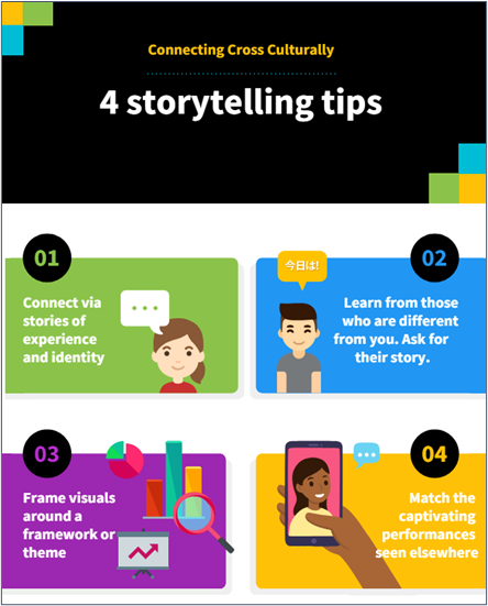
Considering cross-cultural communication also means examining the ways in which individuals connect routinely and a reminder of the importance of storytelling. Historical experience has taught us that individuals connect around needs, experiences, and hopes, which are often shared through story or narrative. Very often, these important discussions take place when one member connects with another via narrative and shared understanding. Storytelling is a phenomenon that exists beyond cultural dimensions and as a result, may be the precise way to connect with others via some tried and true practices depicted in Figure 8.10.
Figure 8.10—Tips for Connecting Cross Culturally
The Culture Map: The Future of Management. You can see the origins of the eight dimensions from Erin Meyer herself as well as hear this groundbreaking author comment on the future of management in the global organization based on her very important research.
 Meyer, E. (2014). The Culture Map: The Future of Management. [Video]. YouTube.
What’s Your Cultural Profile? This great resource from Erin Meyer and available via Harvard Business Review will allow you to take your own cultural profile and learn more about audience identity in your global organization. As you do, think about what surprises you. What was confirmed from your understanding of your own culture?
Meyer, E. (2014). What’s Your Cultural Profile? Harvard Business Review: Business communication. https://hbr.org/2014/08/whats-your-cultural-profile
One additional consideration is the ways in which persuasion may be different by culture. You will recall discussion in chapter one about the need in some cultures, like the United States, to be more upfront with an argument while following a “cut to the chase” or “time is money” philosophy. This contrasts with other cultures, such as those in China, who may be more indirect with a persuasive argument. For such speakers, it may be important to pay particular attention to how they begin their argument, make their points, and reach a decision with audience members. Table 8.3 offers important considerations for such speakers to consider, depending on the audience.
Table 8.3: Persuasive Style on How Some Cultures Communicate
|
Persuasive Style |
Key Components |
Countries Practiced |
|
Application-first |
✓Individuals begin with a fact, statement, or the idea being proposed before outlining why and how it will be implemented ✓Visuals lead with little background, often getting right to the point |
✓Australia ✓Canada ✓United States |
|
Principles-first |
✓Individuals begin with theoretical considerations, background, or other details before offering a possible solution or decision-point. ✓Visuals present this information for audiences to consider |
✓France ✓Germany ✓Russia |
8.2 Exercise 1: Considering Culture and Persuasion
Learning Objective #2—Identify competing ways to influence a global organization
Please read the case and identify the elements of cross-cultural communication that may assist you in developing responses to the case:
Yuri, a Russian partner in a global company, listened to his American counterpart, Michael, as he presented his idea at a pitch session. Yuri found the message from Michael a little off-putting. Michael had come in and before barely sharing his slide deck, offered that the entire East European division should be melded into Yuri’s portfolio for Central Asia.
While the idea made good sense and was somewhat expected, Yuri was very surprised that Michael quickly came to this conclusion without any reasoning or evidence. Yuri would have preferred to see data, consider its merits, and then revisit after careful thought. It’s not that he objected to the idea entirely. Truthfully, he would likely agree, but it was the way Michael said it. Outside of this interaction, Yuri generally liked Michael. The two connected very well after discussing their families, experiences in the workforce, and common visions they had for the company’s future. While Michael continued talking, Yuri wondered if there had not been a better way to handle all of this . . .
- In reaching each other on this important message related to the company, what did Yuri, Michael, or both do wrong in connecting cross culturally?
- What strategies, if any, could have been used by Michael to reach Yuri on this decision?
- In handling this for future situations, do you have a recommendation for the company going forward?
8.3 Multigenerational Communication Issues
If you get the culture right, most of the other stuff, like great customer service, or passionate employees and customers, will happen on its own naturally.
—Tony Hsieh, former Zappos CEO
Company Culture and Multigenerational Communication Issues
Company culture plays out differently for large companies compared to small companies. In a large company, all leaders at the executive level are likely from the baby boomer generation. In fact, “roughly 80% of S&P 500 companies have baby boomer CEOs and approximately one-third of that group is 65 or older” (Potter, 2018, para. 4). As of 2016, the Pew Research Center indicated that millennials became the largest percentage of the workforce at 35%, and by 2025, 75% of the global workforce will be millennials (Fry, 2018).
In small start-up organizations, the owner influences the company culture and Millennials and Gen Z are more likely to start their own businesses. In a nonprofit, both the director and the executive board or board of trustees influence the organization’s culture. On the board, expect a mix of all generations, but directors and staff are normally not Baby Boomers. Wong and Main (2023) explained that “company culture is about the shared norms, values, attitudes, and practices that form the collective identity of your company [shaping] how things are done within your organization” (para. 6). The return on investment (ROI) is long-term. If you’ve ever worked in a toxic culture where generations don’t hold the same values, you can expect these symptoms: low employee engagement, high turnover, the blaming of politics, frequent use of the phrase “That’s not my job,” lack of trust, and high absenteeism.
Adding to the communication complexity of company culture is the multigenerational workforce. A leader’s role is essential in shaping the culture that bridges a multigenerational workforce. Different generations prefer different communication styles, may have biases (negative stereotypes), and hold different expectations for their employment. Although you may be well aware of the different generations, let’s review them.
The Five Generations of the Workforce
The following information is based on the Pew Research Center.
- Traditionalists or Silent (1925–1945)
- Traits: Dependable, straightforward, tactful, and loyal
- Communication style: personal, handwritten notes, not a fan of email, top-down approach
- Pew Research Center: Less than 2% of workforce and 9.8% of the population
- Baby Boomers (1946–1964)
- Traits: Optimistic, competitive, workaholic, team-oriented
- Communication style: Prioritize personal and formal communication. They appreciate phone calls, meetings, and memos. They may print out emails.
- Survey: Close to half (49%) of Baby Boomers are expected to or already are working past the age of 70 (Hicks, 2023).
- Generation X (1965–1980)
- Traits: Flexible, informal, skeptical, independent
- Communication style: prefer communication that is efficient, can easily adapt to digital, work hard play hard
- As of 2021, 35% of those employed include Generation X (Kuligowski, 2021).
- Millennials (1981–1996*)
- Traits: Competitive, civic and open-minded, achievement-oriented, well educated
- Communication style: Digitally adept, which shapes their communication preference, IMs, texts, specific internal platforms like Slack, want ample feedback and recognition.
- Less likely to remain at one organization. By 2025, 75% of the global workforce will be millennials (Fry, 2020).
- Generation Z (1997–2012*)
- Traits: Global, entrepreneurial, progressive, less focused
- Communication style: Digital natives, tech-savvy, quick learners, expect instant communication, but also IMs, social media, texts, like self-direction.
- Seek organizations that align with their values, will self-identify as digital addicts.
* Using the new definition period for each generation from the Pew Research Center. These classifications are globally understood and recognized. More information is coming for Gen Z as they come of age.
Let’s explore the number one issue of low employee engagement—knowing what is expected.
Low employee engagement: The value of engaged employees is their entrepreneurial spirit. They own their work. And as owners, they are motivated to drive change and contribute to innovation. Disengaged workers are less productive, more stressed, and less secure. Gallup’s 2023 U.S. survey indicates that 33% of employees were engaged in 2023, which means that 67% of employees are not engaged. Actively disengaged employees, or loud quitters, are at 16%, which is down from 2022 (Harter, 2024). “The most fundamental engagement element is knowing what is expected of you,” and the fallout of COVID-19 is that “70% of managers report to Gallup that they have no formal training in how to lead a hybrid team” (Harter, 2024, para 10).
If your work involves teams, consider using the CliftonStrengths Assessment from Gallop. This assessment measures your unique talents and categorizes them into 34 Clifton Strength themes. Knowing your strengths can help you leverage them, especially in a team setting. According to CliftonStrengths, it is important to discover the collective talents of your team. “To successfully manage or lead others, you must individualize your approach. You must understand what makes each of your team members unique. And you must lead meaningful conversations about performance that focus on what each person naturally does best” (Gallup, 2024). There is more about CliftonStrengths in Section 8.6. As a reminder of the 7Cs of communication, good communicators should be clear, concrete, concise, complete, courteous, and coherent.
Leaders are expected to be good communicators, so how can we leverage data visualization or communication tools to support better communication?
Key Strategies for Communicating Across Generations
Balanced Hybrid Work Model: Bridging cross-generational communication gaps can be done through a balanced hybrid work model. Everyone has experienced COVID-19, and it certainly changed how we communicated during the pandemic’s rage across the globe. The lessons we learned impact communication in the present. A Forbes expert panel recommends a blend of face-to-face meetings and virtual meetings (Uzialko, 2024). Training should be delivered across all generations to make sure everyone can use the communication and collaboration tools effectively.
Multichannel approach: Leaders need to utilize a diverse range of communication channels. This need is why you see so many communication channels: Slack, Google Chat and Google Meet, Chanty, Microsoft Teams, Basecamp, Zoho Cliq, and dozens more. The point is that leaders need to provide a multichannel approach, perhaps an email to the Traditionalists and Boomers and an instant message (through Slack or an alternative) to other generations.
Tone, jargon-free, inclusive language: Consider the seven Cs of communication: clear, concise, concrete, correct, coherent, complete, and courteous. Tailor messages to have the right tone and free of jargon. Stay central to the topic. If your team has global members, communicate to them in their preferred language, avoid slang and colloquialisms, be conscious of time zones, and be careful of humor.
Role of AI and automation: AI-powered tools can help with internal communication (personalizing communication), predict communication patterns to help you anticipate communication needs. For example, have you ever come into a meeting late and felt like saying, “What did I miss?” Leveraging AI means that now you can ask the AI questions like this and even a question like “Did my name come up for any projects?”
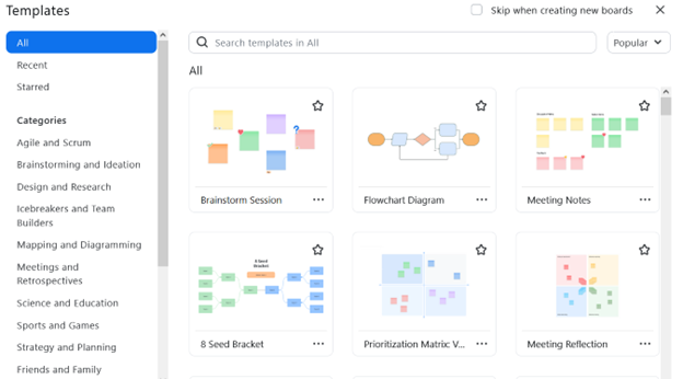
Embracing remote communication methods: Use Zoom/Teams/Slack or other virtual meeting software features to their fullest by adopting interest-based conversations instead of position-based conversations. Choose the whiteboard before the meeting. Set up your polls (for feedback) before you meet. All virtual meeting software has a long list of whiteboards. In Exhibit 8.1, Zoom has templates ranging from strategy to planning, brainstorming to ideation, mapping, diagramming, meetings, and retrospectives.
Exhibit 8.1—Templates in Zoom
Remote Meeting Strategies
Additionally, the whiteboards are visual cues to the members of your team. They will retain important facts like deadlines better when they work on it visually in collaboration with the team.
- For multigenerational teams pair partners within the team (one techy and one not) so participants who have fewer technology skills (normally Baby Boomers) can participate comfortably.
- For all team members, request a page summary to send out to the team.
- For all team members, record the meeting.
- For all team members, set up a poll using feedback questions to make sure everyone has the opportunity to contribute.
- For all meetings, identify trends across the generations and support a balance of several communication styles.
- For all meetings, adapt a policy of camera on, so you can facilitate verbal and nonverbal communication.
- For all meetings, work from an agenda, and set a time limit. The majority of employees struggle to get work done because of the sheer number of communications they receive.
- For all meetings, meet regularly and ask team members to display availability. Different organizations will have different needs, but every organization should have communication guidelines.
- For meeting follow-up, have periodic check-ins (either daily or weekly). A list of check-in questions can help you determine progress, employee focus, employee concerns, and so on. You can even do a periodic emotional check-in to see if your team members are feeling stressed.
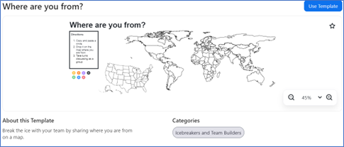
- For all meetings, cultivate culture. Share core values and the company’s mission and/or visions. Recognize employees publicly. Plan team bonding and networking—remote coffee breaks, achievements like employee-of-the-week, and use icebreakers to start a meeting. A good icebreaker for building relationships with a global team is using a map where individuals can pin their location to answer the question, “where are you from?” This template is shown in Exhibit 8.2. Just seeing where your team calls in from can help others understand the challenge of time zones, especially if you include that information as part of pinning where you are located!
Exhibit 8.2—Zoom Whiteboard: Where Are You From?
8.3 Exercise 1: Evaluate a Recent Meeting
Learning Objective #3—Share strategies for multigenerational communication issues
Part 1: Investigate Zoom or Teams and discuss the potential whiteboards that you could use at your organization to help improve efficiency, brainstorming, or collaboration.
Part 2: Discuss a recent meeting (either remote or face-to-face) that had some challenges. Discuss one of the challenges. What strategies were used to resolve the communication issue or what strategy should have been used to resolve the communication issue?
Part 3: Considering the diverse communication preferences and technological proficiencies across different generations in the workplace, how can leaders effectively leverage data visualization or communication tools to support better communication in a balanced hybrid work model?
8.4 Data Visualization Techniques to Fill the Gaps
Everybody needs data literacy, because data is everywhere. It’s the new currency, it’s the language of the business. We need to be able to speak it.
—Piyanka Jain, speaking with MIT Sloan
It is no surprise that organizations face a rapidly changing landscape of contemporary issues. Effective communication has emerged as a cornerstone for success, partially in the realm of data-driven decision-making. “In a recent survey of analytics leaders, 67% said organizational culture is the biggest barrier to becoming a data-oriented company” (Mayor, 2021, para 8). A data-oriented organization makes strategic decisions based on data; however, “only 20% of analytics insights will deliver business outcomes through 2022 according to Gartner research” (Mayor, 2021, para 3). As organizations strive to capture the power of data to drive innovation and communicate through storytelling, the audience is becoming increasingly diverse. This section delves into the intersection of data visualization and storytelling techniques as dynamic tools for communication, with a focus on the needs of the diverse composition of modern teams.
As workplaces become increasingly diverse in terms of gender, culture, and generational backgrounds, the challenge of effectively communicating data insights to a broad spectrum of team members has become more challenging. Added to this mix is the necessary recommendation for how data are visualized from a DEI point of view. DEI is discussed more thoroughly in Section 8.5. This section explores strategies for crafting visual narratives that resonate with multiple genders, considers cultural barriers, and engages multigenerational cohorts. The point here is to cultivate a climate of technical data analysis, human-centric storytelling, and collaborative decision-making processes that harness the collective intelligence of a diverse team.
Design choice that considers the science behind visual perceptions and cognition is important to communicate effectively. Drawing upon insights from psychology, sociology, and communication theory, this section adopts a user-centric approach to data visualization and narrative construction.
Before starting this section, review some of the current population statistics:
- As of 2020, Baby Boomers are at 18.6%, Generation X is at 34.8%, Millennials are at 38.6%, Generation Z is at 6.1%, and the traditionalist or silent generation is at 2% (Purdue Global, 2020).
- “As of February 2023, women 16 years and over make up 55.4% of all U.S. employees” and “women’s wages equal 83.6 percent of men’s wages” (Reiners, 2024, para. 15–17).
- The 2015 census data show 56% of Millennials are white, whereas 75% of Baby Boomers are white.
- “Diverse companies have 2.5 times higher cash flow per employee” (Reiners, 2024, para 22).
- Companies that are diverse (gender, race, and culture) are more profitable (Reiners, 2024).
Design Strategies
The following strategies are based on working with a diverse team or presenting to a diverse audience.
Strategy #1—PechaKucha: Plan a Beginning, Middle, and End in 7 Minutes
Emphasize the personal benefit in the introduction concisely so you can quickly get to the major point. Plan to reestablish said personal benefit in the conclusion (McMahon, 2016). Just as important, you need to develop techniques, so the presentation does not drag. A Japanese management style called PechaKucha is an approach where you have 20 slides timed at 20 seconds each. The slides automatically advance giving you less than seven minutes to tell your story, and most slides should complement the speaker when vocalizing (Eckfeldt, 2019). Data Visualizations that use charts and graphs need to focus—so automatic zooming or animation might be required.
To effectively connect using the PechaKucha, use these techniques:
- Personalized introduction: Begin with a brief but impactful introduction. Tailor this introduction to resonate with diverse audiences. The introduction does not mean you are introducing yourself. Introduction means sharing personal anecdotes, sharing experiences, using images that make sense to your audience, and using metaphors that fit your audience. All audiences prefer a visualization in context. Test it out before presenting.
- Utilize structured storytelling: Ensure each segment flows seamlessly into the next. Use the CASS framework and keep your storytelling framework universal in design. Be careful with humor. Illustrate the main point clearly. Always show impact on the bottom line.
- Visual technique: Use techniques that resonate, such as (a) simple and clear charts, (b) color considerations, (c) iconography and symbols, (d) infographics, and (e) interactive visualizations for your tech-savvy audience members.
- Cultural context in imagery: Incorporate culturally relevant imagery and references—that is, if you use images, make sure they include diverse backgrounds. Avoid macho sports metaphors.
- Accessible design: Alt tags, color contrast adjustments
- Do NOTs: On occasion, you might be tempted to use a data visualization that makes you look like a technology wizard. Fight this! The sole purpose for data visualizations is to “help you tell stories by curating data into a form easier to understand, highlighting the trends and outliers,” . . . and that means . . . “removing the noise from data and highlighting the useful information” (Tableau, 2020, para. 8).
Title: PechaKucha: Visual Storytelling That Celebrates Humanity. Link: https://www.pechakucha.com/
Strategy #2—Get to the Point!
One of my favorite quotes made in the Storytelling With Data book is “If you only had a limited amount of time or a single sentence to tell your audience what they need to know, what would you say?” (Knaflic, 2015, p. 39). Mitchell and Deckard have reviewed thesis and final projects for over a decade. Imagine a presenter receives instructions to present for 15–20 minutes. The student has great visuals sharing the background and challenge or issue at an organization. If you are sitting in the audience still waiting on the recommendation and the presenter is already fifteen minutes into the presentation, you may be so frustrated that you stop listening. And you may be thinking, “Get to the point!” Even visuals can suffer from “getting to the point.”
Which is better when you review Figure 8.11? The graphic on the right has a “get-to-the-point” component since the focus is on 24% in 2022.
Figure 8.11—Graphic Design Makes a Difference
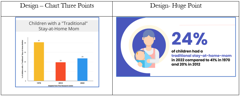
Regardless of gender, cultural, or generational preferences, everyone prefers clear and concise key points. Now look at specific data visualizations.
Strategy #3—Use the Appropriate Data Visualizations
Here are some other key points experienced by the authors. These guidelines apply to presenting to either gender. Consider this section the basics of data visualization techniques using Excel and a few references to Power BI. Keep in mind that previous chapters shared other types of data visualizations (word clouds, infographics, maps, etc.).
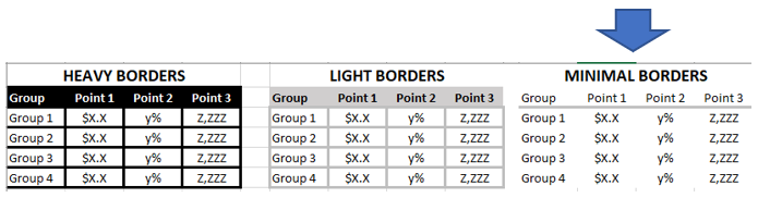
1. Tables: Do not use tables in a presentation unless you have no choice. If you must use a table, get rid of the borders and grid lines or the audience will focus on the borders and gridlines! The best visual in a large room presentation has minimal borders. See Figure 8.12.
Figure 8.12—Minimal Borders Best for Large Venue
2. Heatmaps: Heatmaps were discussed in earlier chapters but let’s consider why this is a good choice for a diverse audience. The appeal of heat maps can vary based on individual preferences, demographics, and cultural backgrounds. In terms of gender, research suggests that males and females may have different cognitive preferences and visual processing styles, which could impact how they perceive and interpret heat maps.
Generational differences: Baby Boomers, who grew up in a different technological era, may have different levels of familiarity and comfort with data visualization techniques like heat maps compared to millennials, who are often more digitally savvy. Again, individual preferences are most likely to drive their understanding of a heat map. A heat map can be produced in Excel using conditional formatting. Creating a correlation matrix is available in Data Analysis (an add-in to Excel) for the Data table. Then you can set up conditional formatting. Refer back to Chapter 3 (Table 3.16: Heatmap Shows That Board Members and CEOs Are Not on the Same Page) to see the benefits and how easy it is to see patterns.
3. Scatterplots: Scatterplots are great for showing the relationship between two things, but they aren’t used as much in business, mostly because perhaps folks are not as familiar with them. Scatterplots are much easier to understand if you show the average or modify the chart with a band of color (this is shown in Section 3.7). Another way to show a relationship is with maps (see Section 3.7). Individual preferences and experiences play a significant role in determining which generations in the workforce prefer scatterplots.
Generational differences: Younger generations may be more receptive to scatterplots, but factors such as job role, industry, and personal interests, may play a part in how well younger generations understand them. You would expect the traditionalist generation to be less familiar with scatterplots, but scatterplots with average and customized bands of color can add value for all generations.
4. Line graphs: Line graphs are used to plot continuous data. Adding an average to a graph adds value. Line charts are great for long-term trends.
Generational differences: All generations understand a line graph, but not all line graphs are equal. For example, you can create an animated line graph using Flourish. This will appeal to the tech-savvy generations, more specifically the Gen X, Millennials and Gen Z cohort.
5. Slope graphs: A slope graph, introduced by Edward Tufte in 1983, is useful when you have two points of comparison, and you want to quickly show increases and decreases. An example would be an annual employee satisfaction survey, and the analyzers want to display the changes quickly between 2023 and 2024.
Generational differences: Traditionalist and Baby Boomers will like slope graphs because it is an easy way to measure change. The tech-savvy cohorts will appreciate the ease of identifying patterns but may feel just as comfortable looking for a pattern in a sparkline in Excel.
Title: Excel Slope graph. By: Online Training Hub. Template Link: https://www.myonlinetraininghub.com/excel-slopegraphs
6. Bar Charts: A bar chart is familiar to your audience. The audience can easily see the biggest and smallest. There is one rule you should never break. Bar charts must have a zero baseline. Although this is discussed in previous chapters, we want to emphasize the importance of using a zero baseline. If you don’t use a zero baseline, you misrepresent the data by exaggerating differences and losing the trust of your audience. It violates a visualization principle. If you want to revisit this, see the figures in Chapter 2.
Generational differences: Violation of the zero-baseline principle can end up breaking the trust you work so hard to build with your audience. This is true regardless of the generation. Use a zero baseline. Otherwise, you can introduce significant issues that compromise integrity and effectiveness. Don’t lose your credibility!
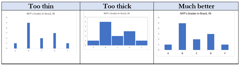
7. Column Bar Charts: The column bar (also vertical bar chart) can contain multiple columns, but consider your audience and what you want them to compare. Too many data series (columns), and it becomes difficult for your audience to visualize and connect to the “insight” you are trying to convey. Use your spacing appropriately. Figure 8.13 is a grading of nonprofits in Brazil, Indiana (this is just for illustration purposes). Besides the spacing, the gridlines were removed, and in the third illustration, the text was increased in size and made bold.
Figure 8.13—Column Bar Chart Comparison
Generational differences: Both Baby Boomers and traditionalists may have been exposed to traditional forms of data presentation (printed!) and have seen column bar charts frequently. Tech-savvy cohorts are used to the column bar charts and find them intuitive.
Is there a better chart? As you review your charts, consider changing the vertical bar chart to a horizontal bar chart because horizontal bar charts are easy to read. Baby Boomers are more accustomed to viewing information in a left-to-right format, making horizontal bar charts more intuitive. Think about how you read—starting at the top left and moving across the screen—this means the eyes can read the category names before the data in a natural process similar to reading.
8. Horizontal Bar Charts: As mentioned earlier, a horizontal bar chart is familiar to your audience because the data are organized from the far left corner and across—very similar to the way we read. Horizontal bar charts can have single series or multiple series. They are especially good when the information labels are too long to appear clearly on the x-axis of a vertical bar chart. A second thought is to consider if organizing the chart from biggest category to least category will help your audience get the big picture. The reader will see the top horizontal bar first, so this makes sense. However, if your categories are grouped by age, or donation size, or letter grades, keep the categories in order! Otherwise, as shown in Figure 8.14, the audience may struggle to make sense of it. So the natural order is best.
Figure 8.14—Horizontal Bar Chart: When Sorting Causes Confusion
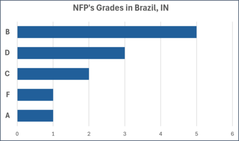
Figure 8.15—Horizontal Bar Chart: Correct Order
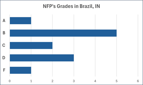
Generational difference: Baby Boomers and Traditionalists are accustomed to this format and find it easy to read (not Figure 8.14 though!). Individual preferences can vary within each generational cohort. What is most important is selecting the appropriate chart type for effective communication.
9. Multiple Series—Column Bar Charts: Bar charts with multiple series can become crowded. The chart in Figure 8.16 shows an example of a survey where administrators and board members rated the staff and the staff rated themselves. The survey has eight groupings of three variables each. The ideal number of groupings is a total of 12 bars (or in this case four groupings) for a presentation, so pick the groupings that are significantly different. For example, there is a big difference between how the administrators and boards saw the staff’s patience compared to how the staff see themselves. There is an effective use of colors that is consistent across all groupings. The survey ratings are 0–10, and no distortion or exaggeration is apparent.
Figure 8.16—Multiple Series Column Bar Chart
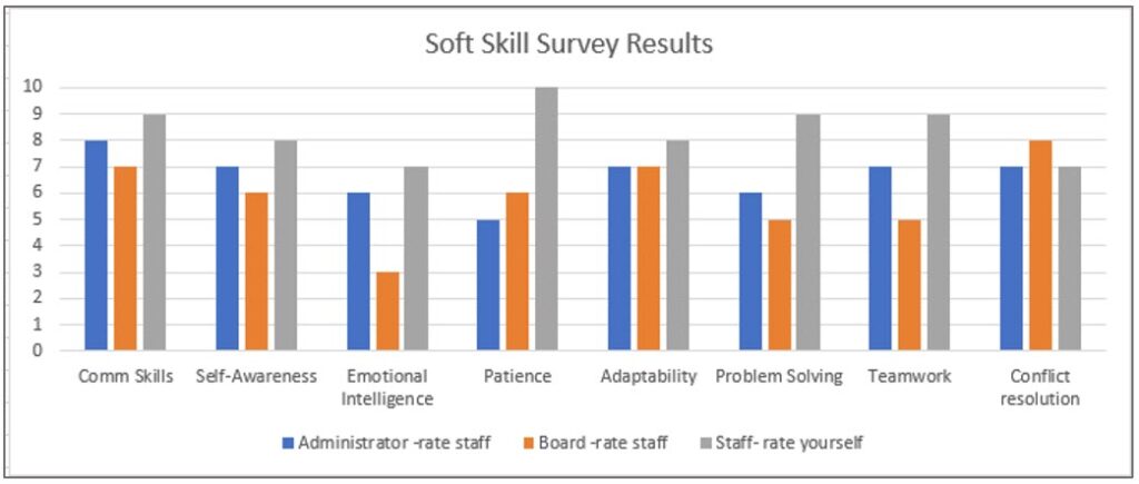
The Soft Skills Survey Results chart could be better though. It could contain a more descriptive title and a date.
Generation difference: When you start including multiple series of data, Millennials and Generation Z often prefer interactive visualizations. For example, this could be designed so you could compare various combinations of the survey. So comparing administrators to staff might be more important than including the board. In this chart, administrators and board members rated the staff and the staff rated themselves.
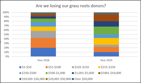
10. Stacked Vertical Bar Charts: Stacked bar charts are used to show quantity, dollars, or a percentage that adds up to 100%. The illustration shown here is from a not-for-profit and they’ve grouped their donations by the size of the donations. Although they raised a similar amount of money in 2018 and 2019, the makeup of donors has changed. When you look at this chart, do you think a change in marketing is needed? And when you view Figure 8.17, do you agree with the question, “are we losing our grass roots donors?”
This chart has almost too many categories. According to Vora (2019), the maximum number of bars to show trends or relationships is 12 bars (12 categories). This chart has 11, but you can answer the question by reviewing the chart.
Figure 8.17—Stacked Vertical Bar Charts: Too Many Categories
Microsoft Power Business Intelligence (BI), suggests using stacked bar charts if you use slicers. Slicers are a type of visual filter. Once you see the charts, you will understand why! Figure 8.18 does not have a slicer, and these data are very difficult to understand. But if you select an item from the legend (e.g., Candy), it will show the revenue for that item for each month. You can also select multiple products by using the control key to select two or more categories. However, this may not be intuitive to a new user of Power BI.
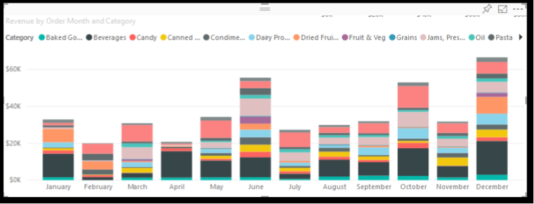
Figure 8.18—Power BI Stacked Bar Chart, Where Every Category Can Be a Slicer
The next two charts show how adding slicers makes it easier to understand. This is the same dataset as seen in Figure 8.18, but the slicer allows us to filter on the salesperson (in this case, Nancy), and on the category of goods. Slicers are a wonderful tool for helping understand complex data, and showing them with the charts means even novice users of Power BI will know what to do to trigger a filter.
Figure 8.19—Power BI With Salesperson Slicer Selected
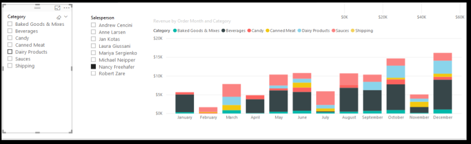
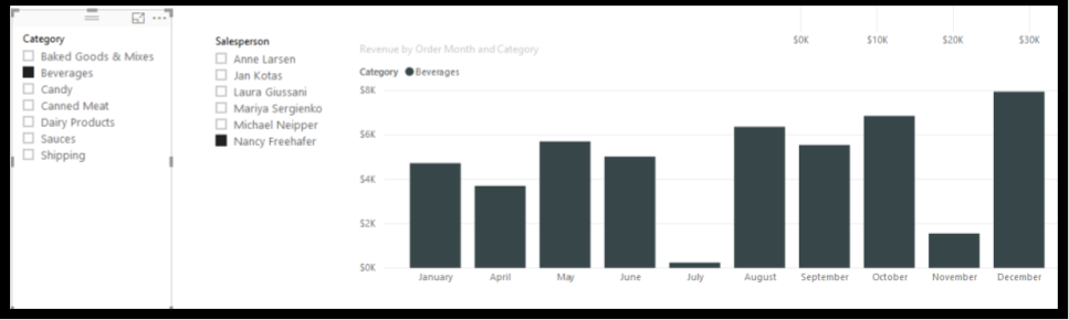
Figure 8.20 shows two slicers in play. The slicer for the salesperson (Nancy) and the corresponding dollar in sales of beverages she has sold each month.
Figure 8.20—Power BI With Two Slicers Selected: Salesperson and Beverages
Although this section has introduced several charts and the generational preferences, keep in mind that the data and the story are the key factors when choosing the correct chart. In the Infogram resource (2024), they feature a chart starter with a central question, “What Would You Like to Show?” (para 5). From this central question, are you trying to show a relationship, a comparison, a distribution, or a composition that relates to one time period or a composition that displays the changes over time?
Infogram. (2024). How to choose the right chart for your data. Infogram Blog. https://infogram.com/blog/choose-the-right-chart/
8.2 Self-Assessment: Data Visualization Techniques
Learning Objective #4—Identify data visualization techniques and strategies to address gender, cultural, and multigenerational issues
8.5 Why Is It Important to Consider DEI When Developing Data Visualizations?
An editorial approach to visualization design requires us to take responsibility to filter out the noise from the signals, by identifying the most valuable, most striking or most relevant dimensions of the subject matter in question.
—Andy Kirk, CoreSignal
In an ever-evolving landscape of data-driven decision-making, one crucial aspect often overlooked is the integration of DEI principles in data visualizations. As global companies strive to harness the power of data to drive innovation and support strategic decisions, it becomes essential to ensure that data visualizations are not only accurate and insightful but also inclusive and representative of diverse perspectives.
The significance of considering DEI can’t be overstated. Data visualizations serve as powerful tools for communication. Data visualizations combined with storytelling techniques can influence perceptions, shape narratives, and drive actions. However, without careful consideration of DEI principles, data visualizations risk perpetuating biases, reinforcing stereotypes, and excluding marginalized voices.
This section will focus on best practices for diversity, equity, and inclusion in data visualizations. Although not a complete list, examples concerning DEI principles include people-first labeling, order labels purposefully, how to treat datasets that have missing groups, and care in using icons and shapes.
Best Practice #1—Know Your Biases
Preventing bias creep starts with understanding our own biases. First, critically examine where your data come from, how they were collected, and who benefits / who could potentially be harmed?
Color-Blindness: For example—audience members who are color-blind might not see the insight in the data visualizations because they can’t see any difference in the two colors (red and green) you are sharing! To understand deuteranopia, try taking the Ishihara test. The test consists of 38 plates with different patterns, and your score depends on how well you detect a pattern.
Take the Free Color-Blind Test from ColorMax.org. The test is based on the Ishihara Color Plate Test. Link: Color Blind Test | Test Your Color Vision | Ishihara Test for Color Blindness (colormax.org)
If you know you have individuals in the audience who struggle with color-blindness, avoid the following color combinations since someone with color-blindness will see them as the same color!
- red and green
- green and brown
- green and blue
- blue and gray
- blue and purple
- green and gray
- green and black
Unconscious Biases: There are several unconscious biases that you may experience.
Unconscious Bias #1: Ageism. In this case, younger employees could consider a person’s abilities related to age. An older generation can make assumptions about a younger generation’s work habits.
How to avoid: Ask older and younger employees to interact, mentor, and develop positive relationships. Some examples include a younger person mentoring an older employee that struggles with technology. The older employee reciprocates with global experiences related to the organization.
Unconscious Bias #2: Affinity Bias. One example is common during interviews since there is a tendency to hire candidates like you. This unconscious bias can lead to a less diverse workforce.
How to avoid: Adopt clear policies of inclusion with goals for the hiring process.
Unconscious Bias #3: Weight Bias. Weight bias impacts people of all backgrounds. Fellow coworkers may think they work less or assume they are lazy.
How to avoid: Stress the importance of a person’s work ability and how well they contribute to the team.
Unconscious Bias #4: Name Bias. Name bias happens when a person forms a perception based on the person’s name. For example, an employee in HR may be more willing to interview someone with a name like Thomas Webster than someone named Chung Jen Sheum.
How to avoid: If this is something happening in the HR process, redact the name on the application.
Unconscious Bias #5: People with disabilities. According to the U.S. Bureau of Labor Statistics (2024), 22.5% of people with disabilities were employed (which means 77.5% were not employed). This is an improvement from 2022.
How to avoid: Train your employees about disability bias and if you haven’t hired people with disabilities, revise the HR process.
Best Practice #2—Know Your Data Demographics
If your data have marginalized populations, there are several strategies that are considered best practices for DEI data visualizations.
- Use people-first language.
This could mean “people with disabilities” instead of “disabled people” (Schwabish & Feng, 2021, p. 41).
- Label people, not skin color.
Use the phrase “black people” instead of “Blacks” (Schwabish & Feng, 2021, p. 41).
- Consider missing groups.
What groups are not included? Consider adding an explanation and indicate if the data are not representative. Be careful when sorting to see if bias has a way to creep in or cause the audience to interpret a certain way. For example, a well-made infographic developed by Eleonora Nazander showed COVID-19 deaths in the United States among African Americans. It showed that 12.9% of the population was made up of black people; however, 25% of the black people contracted COVID. Although the infographic included facts, it didn’t include any language that explained why. This infographic doesn’t use people-first language either. It does show that the death rate among African Americans is about two times higher compared with that of the overall population in the United States, but audience members might be asking “Why?”
Nazander, E. (2022). Yes. Tableau Public. http://tiny.cc/ywx2yz
- Consider colors carefully.
In the United States, red and blue represent two political parties. In another country those colors could mean something else.
You are reinforcing stereotypes when you don’t consider skin tones. For example, the habit of using baby pink for “girl” and baby blue for “boy” (Schwabish & Feng, 2021, p. 41).
Avoid using incremental color palettes (light to dark) to represent different demographic groups (Schwabish & Feng, 2021, p. 14).
- Don’t use “other” as a catchall category.
Recently, a thesis student conducted a survey where a substantial number of participants left a category blank. The student came up with a potential category called “preferred not to answer” as well as “identity not listed in the survey.” These are both good examples to use instead of “Other” (Schwabish & Feng, 2021).
- Icons and shapes
Your audience will appreciate icons and shapes to help emphasize the data, but use them with caution. Avoid icons that are stereotypical or discriminatory.
For more information, consider reading the following 44-page report written by Schwabish & Feng (2021). The authors discuss various ways to be more equitable and inclusive with data visualizations. It also includes racial equity in data visualization checklist, and dozens of resources.
Schwabish, J. & Feng, A. (2021). Do No Harm Guide: Applying Equity Awareness in Data Visualization. Urban Institute. do-no-harm-guide.pdf (urban.org)
8.5 Exercise 1: Evaluate DEI Violations
Learning Objective #5—Identify how poor visualizations impact diversity, equity, and inclusion
Part 1: Evaluate a current data visualization on Tableau Public for violations of DEI. Take a screenshot of the data visualization and include it with your discussion of any issues you find. Respond to others in class or on the discussion board.
Part 2: Download the Do No Harm Guide funded by the Urban Institute. Explore one of the resources and discuss the strategies to prevent DEI violations. The link to the guide: do-no-harm-guide.pdf (urban.org)
8.6 Remote Burnout—I’m Zoomed Out!
On a video call the only way to show we’re paying attention is to look at the camera. But, in real life, how often do you stand within three feet of a colleague and stare at their face? Probably never.
—L. Fosslien and M. Duffy, How to Combat Zoom Fatigue
The best way to approach this section is to look at the growing number of hours spent in virtual meetings after COVID-19 and what kind of strategies can help make the meeting more productive and engaging. While remote meetings offer flexibility and convenience, they present unique challenges that lead to burnout. The novelty wore off years ago; now, 86% of remote full-time employees report burnout. According to Dr. Gleb Tsipursky (2023), “The fundamental root cause of work from home (WFH) burnout stems from organizations adapting their existing ways of interacting in ‘office culture’ to remote work” (para. 1). Dr. Tsipursky lists 12 reasons for WFH burnout.
- Deprivation of our basic human need for meaning and purpose,
- Deprivation of our basic human need for connection,
- Deprivation of building trust,
- Deprivation of mentoring and informal professional development,
- It’s not simply “Zoom fatigue,”
- Replacing office culture with activities that don’t work well (Zoom happy hours, Virtual water cooler),
- Lack of virtual technology skills,
- Lack of skills in effective virtual communication,
- Lack of skills in effective virtual collaboration,
- Lack of accountability,
- Poor work-from-home environments,
- Poor work/life boundaries.
When organizations faced the emergency of COVID, transferring your work model made sense, but now it’s time to discuss the strategies and cultural change needed to make the WFH model work long-term.
Strategy #1—Help Your Team Find Meaning, Purpose, and Connection
It is expected that by 2025, 32.6 million Americans will work from home, “which equates to about 22% of the workforce” (Haan, 2023, para. 5). Traditional workspaces must be shaped to support WFH employees. Organizations should be willing to provide the necessary equipment, WIFI support, remote helpdesk support, and organizational strategies for document sharing. As a leader of a virtual team, you should “establish a new norm for how you will work together virtually” (American Management Association, 2020, para. 7). There is no one-size-fits-all approach to motivating productive team interaction. What is (or was) successful for a face-to-face team meeting doesn’t always translate well to a virtual meeting. Most organizations used the sink-or-swim model during the COVID-19 pandemic; now it’s time to be intentional in your leadership.
Job Craft: According to Amy Wrzesniewski (2020), when employees lost their traditional work experience, they lost their interdependence with others and the relationships that grow as a result of working toward a common purpose. WFH employees often don’t feel they belong as part of a collective. Wrzesniewski did an in-depth study of hospital custodians to uncover how the happiest staff were also the most effective custodians. She coined the term job crafting to describe how custodial workers would “create the work they wanted to do out of the work they’d been assigned” (Coleman, 2017, para. 6). Wrzesniewski shared several examples of job crafting. One custodian rearranged artwork for the comatose patient’s brain; another custodian researched the chemicals used to clean and figured out which chemicals caused the least irritation to the patient’s condition. Neither of these things were part of the job assignment; instead, the employees job-crafted their work to find meaning.
As a virtual team leader, meet individually with your team members and help them to job-craft. Ask questions like:
✓What do you miss about working at the office?
✓Do you have a workspace at home that is only for work?
✓Do you have a morning ritual that you used to enjoy at work (for example, some individuals would gather at the coffeepot in an informal setting upon arrival at work). For example, did you listen to an audiobook on your commute, or listen to a podcast?
✓Do you have a routine that differentiates “work” and “not at work”?
✓What part of your work gives you joy or helps you find meaning?
Connecting: Fostering connections requires routines to support them when you move from an office that you commute to compared to an office at home. Although we laughed at some of the virtual meeting gaffs (getting caught wearing pajama bottoms, being told you’re on mute, children, cats and animals stealing the camera), as leaders we need to find a new norm for the WFH employee. Employees forge connections often cultivating an informal sounding board for ideas during breaks from a face-to-face meeting. How can individuals grow that connection in a virtual meeting?
As a virtual team leader, meet individually with your team members and help them find ways to connect. Ask questions like these:
✓What connections do you miss in your WFH office?
✓What were the informal communications you enjoyed when you worked at the corporate office?
✓Have you kept in communication with another team member?
✓Do you connect better in small groups (like breakout rooms)?
✓Do you need social interactions before, during or after the meeting?
Strategy #2—Building Trust
Building trust in a virtual setting is more difficult but it is worth it. According to a study in Harvard Business Review, high-trust companies report “74% less stress, 106% more energy at work, 50% higher productivity, 13% few sick days, 76% more engagement, 29% more satisfaction with their lives, and 40% less burnout” (Zak, 2017, para 2). “Studies have shown linkages between trust and positive outcomes such as employee satisfaction, performance, collaboration, knowledge sharing, successful negotiation, postmerger integration, and favorable joint venture outcomes” (Mansour & Zeheer, 2021, p. 2).
Interpersonal trust and trustworthiness are founded on three key characteristics: ability, benevolence, and integrity. For example, “Leaders who are perceived to be competent are generally viewed as trustworthy” (Mansour & Zeheer, 2021, p. 3). Trust is much more difficult to foster in virtual settings when you collaborate with people (or cultures) you don’t know as well. If you are assigned to work together on a project, you assume you can “trust” your team to fully contribute.
Trust is a foundational building block to a successful team and is measured differently in different cultures. A measurement of trust is one of the outcomes of the World Values Survey. This survey is conducted in waves (the seventh wave ended in 2022) and includes 90 countries. The following map is from the seventh wave, and answers the question from the survey, “Generally speaking, would you say that most people in your country can be trusted or that you need to be very careful in dealing with people?” (Haerpfer et al., 2020, Dataset WVS Wave).
In the Our World in Data organization’s website, you can find dozens of charts and maps that relate to trust. And the best part? Since this is a longitudinal study, you can see the change from 1984 to 2022 with a click of a button.
Exhibit 8.3—Most People Can Be Trusted
Our World in Data. (2024). Link: https://ourworldindata.org. Use this resource to see all the charts on trust that can be filtered to compare trust. All charts are open access under CC BY license.
In Exhibit 8.3, one of the examples of a change in trust was in Norway. In 1984, Norwegian citizens who participated in the study agreed 55.5% with the statement “Most people can be trusted,” but by 2022, Norway agreed with this statement 72.1%. Virtual teams are becoming more global and although that brings a richer perspective, it can also create new challenges related to culture.
According to Javidan & Zaheer (2021), it is easier to trust others who share commonalities, are from similar cultural and ethnic backgrounds, and share common values and beliefs. These authors built a 3D Trust Building Process that has three steps:
- Discovering the national cultural approaches to trust;
- Discussing similarities and differences in trust building approaches, and
- Developing a team-based protocol for trust building.
The entire 3D Trust Building Process takes about three hours to complete with your team. The kinds of questions (all from the 3D Trust Building Process) include the following:
Discovery:
✓How trusting is my national culture?
✓What criteria do managers in my culture typically use when deciding whether or not to trust a colleague?
✓As an individual, how close am I in my personal approach to trust versus my cultural approach to trust?
Discuss similarities and differences:
✓What are the major similarities and differences among members’ national cultural approaches?
✓What are the big surprises?
✓What are the key learnings?
Develop a team-based protocol:
✓Develop a trust etiquette (protocol).
✓Consider actions that either enhance or violate trust.
✓If trust is violated, what is the path to rebuild trust (Javidan & Zaheer, 2021, p. 5)?
Strategy #3—Professional Development: Skills for Effective Communication
Set the right tone for professional development for teams and leaders. Invest in professional development training that helps the team perform better with higher levels of productivity. If the team suffers from a lack of trust, start with the 3D Trust Building Process.
How you as a leader can build trust. It starts with a safe environment where your team can express themselves and take risks. Encourage open communication with anonymous surveys. Leaders should establish clear expectations, be open, authentic, and transparent. Leaders should provide regular feedback individually. Be constructive and follow through. The purpose of building trust is for team members to develop tools to prevent premature judgment, miscommunication, and trust-damaging behaviors.
“Honesty is paramount!” Have you ever had a leader say “I’ll send a follow-up email” but you’re still waiting for the follow-up a week later? Or has your team leader promised a short meeting that goes beyond the planned time? As a leader, if you don’t honor your commitments, you lose trust.
There is no such thing as overcommunicating. Choose your medium carefully. Sometimes a phone call works better than an email. Watch your tone and make sure your message matches how you say it. A psychology professor, Albert Mehrabian introduced the 7-38-55 rule where 7% of meaning comes from the spoken word, 38% from voice, and 55% through body language. In a virtual environment, set your tone to match your facial features to send a consistent message. Consider these factors to set the tone—word and sentence stress, the right pace, pauses, pitch, intonation. Additionally, foster a culture of communication with regular updates and check-ins. Remove ambiguity and outline what kind of messages should be sent through which mediums.
Don’t multitask. When attending meetings, the sound of somebody’s keyboard clicking can be disruptive. When you see an email pop up on your screen, fight the desire to answer it immediately. Instead turn off email pop-ups and set your phone to silent.
Know the technology. Know the technology and make sure any documents are shared appropriately. Learn tips on the technology you are using. For example, Zoom has an AI component that will gather a summary of the meeting. Always activate closed captioning. For members of your team—provide professional development to learn how to use the technology. Don’t leave them struggling.
Keep it professional. Work from an agenda. Ask team members to always start with their name with each comment. Wear professional clothes and keep good posture (no slouching). Avoid the emoji and funny gifs in your instant messaging platform. Ensure accountability. What is professional for one team may be different for another team.
Use prereadings and prerecorded videos. If team members are international, what fatigue busting strategies could be used? Include prereadings or even prerecorded video sections by the team leads that can be disseminated prior to the meetings to help keep the message on track, and time spent in the meeting “familiarizing” the team with the material to keep the meetings shorter. For international team members, sharing information to review prior will help those who need more time to digest the information.
Strategy #4—Collaboration and Accountability
No one likes to work on a team where the leader does not consider time zone differences, address language barriers, or face tardy or absent team members because they were confused on the time. Policies that indicate the common language, the use of translators and closed captioning, and clear guidelines for scheduled meetings are necessary. Provide tools like a time zone converter and use meeting reminders. Both collaboration and accountability are necessary for a productive and engaged team. And teams work better if each individual team member leverages their strengths and knows they will be held accountable.
Collaboration benefits from knowing your strengths: One of the ways to increase collaboration is to provide professional development using CliftonStrengths Assessment to discover individual team member’s strengths. The assessment takes about 45 minutes and has 177 questions in English (you only have 20 seconds to answer each question). If your proficiency in English is a barrier, you can contact Gallup, and they will turn the timer off. After taking the assessment, Gallop provides a Strengths Insight Guide report. As you review the report, highlight the statements that seem to describe you.
The assessment can be followed up by watching the CliftonStrengths Theme Descriptions on YouTube to get a short (under 2 minutes) message about each strength. For example, assume your top strength is Achiever. What does that mean for your team? “Having someone with dominant Achiever on your team means you have a natural pacesetter. They derive joy in doing and can help other people accomplish more” (Clifton Strengths Theme Description—Achiever Strength, 2020, Video 1). Achievers also like visualization for keeping track of progress. Learning the strengths of your team is just as important as learning your own strengths. Leveraging your top strength(s) makes you more productive and you will feel more accomplished.
Gallop. (2020, Aug 20). CliftonStrengths Theme Descriptions—34 Videos (one for each strength). [Video]. YouTube. https://www.youtube.com/playlist?list=PLxDaK7wIyw950tOSJwr0LWc3MkUkBSaiA
Accountability: Accountability needs defined for your team. Start by identifying the specific metrics you want to track. For example, missed deadlines, project completion rates, new products launched, might be some of the areas that you develop key performance indicators (KPIs). Create SMART goals (specific, measurable, achievable, relevant, and time-bound) first for your team and then individually for the members of the team.
Examples of SMART goals for a Dev Opps team could be:
✓The team will develop the code to support 10 new products this quarter.
✓The team will clear up 50% of the work request (helpdesk) tickets this quarter.
✓The team will explore at least two potential partnerships (outlets) to determine if their production facility could be used for our company’s order overload.
Now create clear and achievable goals for each employee. A big part of assigning tasks in this case will depend on coding skills. It will be up to the leader to regularly assess progress toward the goals to gauge individual accountability. Holding your team accountable should also include regular performance reviews to discuss achievements, challenges, and areas that need improvement.
Strategy #5—Overcome Zoom Fatigue
Zoom fatigue is a real concern. Before the COVID-19 pandemic, researchers indicated that intense computer usage was not healthy for employees. Zoom (or any virtual platform) adds a new layer to the complexity.
Plain Backgrounds: What’s the correct number of virtual meetings for you and your team(s) to have each week? An excess number of virtual team meetings and expect your team to start zoning out. As you meet with a team of 10, it’s like meeting in 10 rooms at once. Your eyes see the furniture, plants, collection of comic books, collection of historical figures, and so on. The brain has to process all these cues at once. There are a couple suggestions: (a) turn off the camera unless you are speaking, and (b) ask everyone to use a plain background.
Frequent Breaks and length of meeting: Consider shorter meetings and frequent minibreaks with some scheduled blocks of time between meetings. Require teams to stand up, get a cup of coffee, or cold drink.
Social Virtual Meetings should be optional: Not all team members will want to socialize virtually after a long day of required virtual meetings. Keep social meetings optional and feature your best facilitators. A poorly run “gather around the virtual cooler” doesn’t work.
If you have a budget, try one of these:
❖Send your team a s’mores kit (a tea candle, a toothpick, graham crackers, chocolate, and marshmallows) by mail and have your best facilitator organize some virtual campfire activities.
❖Do a pet event. Send a goodie bag to the pet and pet owners.
❖Participate in online games like remote work bingo, a virtual escape room, or web games.
❖Learn skills together. Do a creative writing workshop, cooking lesson, coding bootcamp, or even self-defense class. You can all become part of a class at Udemy, or find other online classes.
❖If your team appreciates music, host a virtual jam session and invite your team members to bring their instruments. If you have singers, try a karaoke song or two that everyone knows the chorus to (e.g., “I Will Survive” by Gloria Gaynor, “Respect” by Aretha Franklin, “Total Eclipse of the Heart” by Bonnie Tyler).
Strategy #6—Visualization Tips for Presenting in Zoom
Part of Zoom burnout can be the distraction of this medium. There are several visualization tips for Zoom that can reduce Zoom fatigue as well as connect with your audience. Use PowerPoint slides to articulate your insight with a headline. Use color as a technique so a specific color follows an insight throughout the presentation. Limit the number of colors so your audience can follow the visual cue. If you want to use images, select images that match your audience’s expertise and set the story’s tone. A more technical audience can handle complex visualizations and drilling (or filtering). A general audience will appreciate simple bar graphs. Even if you meet daily, remember that data without a story lack impact. And if you are creating the visuals for the Zoom meeting, don’t try to show ALL of it.
Follow these three tips before you even start visualizing the data:
- Purpose: What am I trying to achieve with the data? Do the data I’ve chosen move the story forward?
- Expectations: Who is my audience, and what level of data detail will they expect?
- Takeaway: What is the key takeaway for my audience? If you had to pick one data point, what would it be?
Follow these Zoom tips to reduce distraction:
- Have you ever said, “You’re muted” in a Zoom meeting? Use the space bar to mute and unmute your microphone.
- Have you struggled using breakout rooms? Use the answer to a poll question to organize the breakout rooms.
- Have you wished for an organized summary of the meeting? Try Zoom’s new AI Summary feature. You can set it so that only meeting hosts receive a summary. Or if you prefer, try the note feature, which can be shared with other collaborators while in a meeting.
8.7 Leadership and Communication
Great leaders communicate and great communicators lead.
—Simon Sinek, English American author and inspirational speaker
Putting It All Together Through the Lens of Leadership
This text has thrown a lot your way in the way of data visualization and storytelling. These are powerful communication tools that help you reach your audience. Remember that reaching the audience with your information, data, pitches, and ideas remains largely our chief goal as communicators and leaders. To that pursuit, we’ve given you tips and techniques designed to offer everything from powerful storytelling narratives noted by Christopher Booker to instructions on Power BI, the powerful tool designed to foster better interaction with data visualization. We’ve given you a lot.
It would be fair to admit at this point that you may be tired and struggling a bit to determine how specifically all these things fit together for your individual or organizational needs. We’ve discussed information overload in Chapter 1, and you may be feeling a bit of that, just as charting next steps and pathways seems out of reach. Despite this feeling, good leadership often means a bit of fatigue as you strategically make decisions about what to include or not include in your communication, data visualization, and storytelling. It will be up to you to plot the next steps to help your group or organization. This section is designed to get you thinking about items we’ve discussed in the text while also helping you to plot a path forward.
Leadership in Data Visualization Projects
Leaders make complex decisions based on data. Those data can include considerations for what choices are affordable, available, efficient, or prioritized. If you ask any leader what choices are off the table, very often they will rely on both data and experience to narrow available choices. Similarly, leaders make choices about communication within data visualization based on what they know regarding their team. That said, there are expectations of the team for their leaders. What does your team expect from you, the leader? Does your team know you well enough, that they model the storytelling and data visualizations you expect to make decisions?
Below is a leadership in data visualization checklist for leaders to consider:
1. Leadership is responsible for setting the vision and goals for the data visualization project. This involves defining what insights the organization aims to gain from the data and how visualization can help achieve those objectives. How is your data visualization displaying your vision and goals?
Hint: If you struggle to identify the vision and goals from your own knowledge or data visualization, it is likely an ideal time to clarify the message.
2. Leaders deal with resource allocation, including budget, time, and personnel, to ensure the success of the project. They make strategic decisions about which tools, technologies, and talents are needed for effective data visualization. What does your project require among resources? What is already available and what is feasible for you to manage?
Hint: This could be a great opportunity to gather the team and think exhaustively about which resources are needed or could be used. This may expose you to resources you’ve overlooked or not often considered. Also, we wrote this text to be accessible for teams just like yours. Feel free to distribute and share the wealth of the resources discussed.
3. Leadership coordinates the efforts of a multitude of teams involved in data visualization projects including authors, data analysts, designers, and domain experts. Effective leadership ensures clear communication, collaboration, and alignment of efforts toward project goals. What strategic steps have been taken to align the team?
Hint: Many teams consider a team or project charter for these kinds of opportunities. These charters often discuss project scope, objectives, stakeholders, roles and responsibilities by name, timelines and milestones, budget, resources, risks and assumptions, communication plans, quality standards, and approval.
Note: Leaders determine who in the information flow will receive what information/visuals. In a heavily matrixed organization, at times, data can be micromanaged to the point where some roles are excluded from the flow of critical data.
4. Leaders engage with audiences across the organization, including executives, managers, and end-users, to understand their requirements, gather feedback, and ensure that the visualizations meet their needs. When necessary, leaders help adjust the content to be even more pertinent based on any feedback.
Hint: While many authors may contribute to a message, a strong leader doing quality control with their feedback can see a general picture that other contributors may ignore. Even when such duties have been delegated, leaders are responsible for the final product.
5. Leadership identifies and mitigates risks associated with data visualization projects, such as data quality issues, technical challenges, or resistance to change. They develop contingency plans and navigate obstacles to keep the project on track.
Hint: Does identifying and mitigating risks sound familiar? You likely noticed that the last two items in the checklist seemed quite similar. Many leadership roles are repetitive. Even with all that duplication, mistakes still happen.
6. Leaders make informed decisions based on data insights derived from visualizations. They use visualizations to gain actionable intelligence, drive strategic initiatives, and solve business problems effectively.
Hint: This entire book has been devoted to making choices, data, and ideas clearer in communication. As a leader considering your data visualization, consider whether you find it clear enough to decide from your perspective. If you did not have your existing knowledge about the project, would you still understand it? Not sure? Go for a second opinion and be sure to listen carefully.
7. Leadership facilitates change management efforts associated with adopting data-driven decision-making processes enabled by visualization. They promote a culture of data literacy, encourage adoption of visualization tools, and champion best practices across the organization.
Hint: If you are not leaning into making data-driven decisions, why should anyone else? Always remember that the culture you are creating and supporting with your decision-making will be modeled on by your team. If you utilize strong data visualization in your ideas and decision-making, so will they.
8. Leaders ensure the quality and accuracy of visualizations by establishing standards, conducting reviews, and providing guidance to the team. They enforce best practices in data visualization design and storytelling to enhance comprehension and usability.
Hint: A little quality and accuracy assurance can go a long way to ensure the kind of audience-centered deliverables that are key to your work.
9. Leadership fosters a culture of continuous improvement and flexibility by monitoring key performance indicators (KPIs), soliciting feedback, and iterating on visualizations based on user experiences and evolving business needs.
Hint: If you display an attitude that is unwilling to change, it will permeate your organizational culture and not assist you in reaching goals. Keep in mind, data visualization trends today will continue to evolve as practice is influenced by audience and market needs. How will you monitor those trends, make space for learning new best practices, and continuously evolve?
This is not a one-and-done process. Instead, key parts of the checklist for leading with data visualization may overlap, be taken out of sequence, or simply exist in whole or part while complementing one another.
Leading teams. In this video, Simon Sinek discusses the traits of successful team members. He also offers some key insight into traditional leadership positions that don’t hold up in tough situations. As you evaluate, consider how these observations intersect with your own experiences.
Sinek, S. (2020). What Makes the Highest Performing Teams in the World. [Video]. YouTube.
Reinforcing a Data-Driven Culture
Managing a data-driven culture involves fostering an environment where data are valued, accessible, and utilized effectively to drive decision-making and innovation. Leadership must champion the importance of data-driven decision-making, particularly as evidenced in the steps outlined in the leading with data visualization checklist. This involves not only advocating for the use of data but also demonstrating their value through actions and decisions. It also involves clearly defining the objectives of becoming data-driven to answer the “So what?” questions that often come from organizational members. What specific goals do you want to achieve? This could include improving operational efficiency, enhancing customer satisfaction, or driving innovation.
The growth in available data has certainly not been matched by our ability to consume this information. This is why it is important to create key internal policies to help govern decision-making. Establish data governance policies and procedures to ensure data quality, security, and compliance. This involves defining roles and responsibilities, data standards, and protocols for data collection, storage, and usage. It also helps to limit constant data pursuits that can sometimes replace organizational decision-making with a cycle of analysis paralysis. More than once, we’ve all been in a meeting that seeks to replace actual decisions with a desire to collect just a bit more data. Remember that leadership means understanding decision-making opportunities and reacting appropriately when prompted, even if not all the available data have been collected. None of these situations are top-down or embody a one-size fits all approach, but rather exist in a way that requires key decision-making as appropriate.
Additionally, to support a data-driven culture, it is important to invest in the necessary infrastructure and technologies. This may include data warehouses, analytics tools, and data visualization platforms, such as much of the software and tools we’ve discussed in this text. It is important to ensure that these tools are accessible and user-friendly for organizational members at all levels. It may also involve asking for expertise from among those who are knowledgeable about such things. It may also mean investing in data literacy and other forms of training. This includes teaching employees how to interpret and analyze data, as well as how to use data tools effectively in their roles. A good leader will encourage collaboration between data specialists and other teams within the organization. Data-driven decision-making is not just the responsibility of the data team; it should involve input from stakeholders across the organization.
Reinforcing a data-driven culture. This helpful article from B Eye at LinkedIn further discusses how to support data-driven cultures in organizations. It also notes some key metrics happening in the organizational marketplace that make supporting data-driven cultures so important.
B Eye: Pulse (2023, Aug 14). How to Build a Data-Driven Culture in Your Organization. LinkedIn. How to Build a Data-Driven Culture in Your Organization (linkedin.com)
Ethical Considerations While Leading With Data Visualization
As a leader managing data, it is very important to remember that behind every data visualization are humans receiving information or being represented in the findings. There is much to consider when it comes to managing ethics and data visualization, including data privacy, precision, diversity, and transparency. Figure 8.21 highlights some of those key considerations that leaders should consider, and Section 8.5 can be reviewed for DEI best practices.
Figure 8.21—Ethical Considerations in Data Visualization
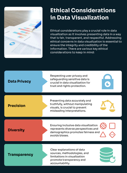
As a leader, it may be helpful to empower a team to regularly evaluate these ethical dimensions. Such teams can meet periodically and answer key questions:
-
-
- How is data privacy being protected?
- Are data being portrayed accurately and truthfully?
- Are messages inclusive and appropriate for the audience?
- Are clear explanations available on where data are sourced? Can most audience members locate this key information?
-
The answers to these questions may not be readily available or easy to identify. Still, the fact that you are thinking through these possibilities demonstrates ethical leadership in data visualization and that further supports your overall credibility.
Communication Action Plans as Part of Your Strategy
Now that you have thought about your leadership and communication overall, along with considering the many tools within this text, you may find it helpful to develop a strategy in which you seek to put these good ideas and tools to work. A Communication Action Plan (CAP) is an effective way to do just that. We’ve seen many communicators implement real change in their leadership styles by adopting this strategy to implement change.
A CAP serves as a written plan for an individual, a team, or an organization. CAPs do this by adopting SMART goals. SMART identifies goals that are strategic, measurable, attainable, relevant, and time-bound. Using these SMART goals through such a strategy as the CAP allows the user to identify potential change, consider how best to implement, and then hold the process accountable.
Exhibit 8.4—Communication Action Plan (CAP)
Using a CAP is not exclusive to just a one-time implementation. CAPs should be built into your schedule and allow you to regularly assess how change can be made. If you consider exhaustively the tools in this book, you could go chapter by chapter and assess what new tools or techniques are most helpful and set several CAPs to commence in the coming days and months. This regular process of deep consideration for what works well aligns with the checklist of leadership components discussed at the start of this chapter. It also demonstrates an easy way for leaders to do the heavy lifting of making change in their individual and organizational communication.
Another technique is to set aside an hour each week for your team to explore new software (or the nuances of existing software), new techniques, or research. This type of practice moves you toward a learning culture, which is given credit for increased employee engagement, setting a foundation for a growth mindset, improving creativity and motivation, and cultivating leadership and emotional intelligence. Just keeping pace with rapidly changing technology is a challenge.
Max Roser (2023) shared the change in technology, from the distant past, and into the distant future at Our World in Data. According to Roser, “In addition to this trend towards increasingly rapid innovation, . . . technology has become increasingly powerful. While our ancestors wielded stone tools, we are building globe-spanning AI systems and technologies that can edit our genes” (para. 20). Follow the link connected to Figure 8.22 to see details of just how much has changed!
Figure 8.22—A Long-Term Timeline of Technology
8.7 Exercise 1: Identifying Leadership Steps for Data Visualization
Learning Objective #1—Identify competing ways to influence the global organization
Please read the case and identify the elements of leadership and communication that may assist you in developing responses.
Bryan leads a team, and he feels like he is not getting results. New to the organization and this particular team, he repeatedly feels disappointed; the meetings appear less than productive, even to him and his usual laid-back ways. As he often tells anyone who will listen, the previous organization he led operated very differently with productive close-knit meetings. With this current team, Bryan observes disengaged team members, decisions driven by anecdotes or opinions, and lots of directionless discussions. In the last three meetings alone, not one single person had presented any sort of evidence to support the arguments they were making, although opinions ran high.
The start of the meetings usually involves more than a few minutes trying to figure out who set up the Zoom link, who will be joining remotely, and where to position the monitor for those in the virtual room to be able to see their hybrid teammates. Several accompanying technology issues usually contribute to this process. Repeatedly team members complain that they’d like to better understand new technology and software but are not sure where to turn next. No training or development dollars have been allocated for such a purpose, and in a recent data download, it was revealed that the team had no way to analyze the information they had received in a key business quarter. After a frustrating period of outsourcing the information with key customer data, the group finally gave up hope of understanding any of it and returned to the default decision-making of anecdote and opinion, to which they were most accustomed.
- What is Bryan and his team doing wrong, if anything?
- What initial steps, based on this chapter or the text, do you think assist them in addressing their management of data?
- How much responsibility does Bryan have for the present situation faced by the team? What should he be doing, specifically?
Chapter 8 Summary
This chapter delves into the multifaceted nature of communication issues, exploring them through the lenses of gender, culture, multigenerational dynamics, and DEI topics. It underscores the importance of adopting best practices such as people-first labeling, purposeful ordering of labels, considering missing groups, avoiding stereotyping, and using appropriate icons and shapes. The authors highlight strategies used by global leaders to foster effective communication across these diverse groups, emphasizing the role of leadership in mitigating burnout especially in a virtual meeting.
Effective communication requires a nuanced understanding of audience dynamics, cultural subtleties, and cognitive biases. By equipping readers with these insights, the authors aim to enable the use of data visualizations as powerful tools for driving meaningful dialogue and fostering inclusivity.
Gender communication issues are complex and deeply ingrained in societal norms, influencing aspects like communication styles, occupational choices, emotional expression, and leadership styles. Understanding and challenging these gender tendencies can dismantle stereotypes and promote inclusivity. These tendencies are not fixed, are socially constructed, and vary across cultures.
The rise of global business and the pandemic-induced shift to remote work have heightened the need for cross-cultural communication. Upwork’s survey of U.S. hiring managers reveals significant changes in management practices due to the pandemic, particularly in team meetings and internal communication. This shift underscores the importance of training in cross-cultural communication to navigate the diverse and globalized work environment effectively.
Company culture varies significantly between large corporations and smaller organizations. In large established companies, leadership is held by the Baby Boomer generation, whereas Millennials and Gen Z are more prominent in start-ups. Nonprofits typically feature a mix of generations in their leadership. The authors note that a toxic company culture, characterized by low engagement and high turnover, often arises when generational values clash. Multigenerational workforces add another layer of complexity to organizational communication.
This chapter also explores the challenges and strategies of communicating data insights to a diverse audience. Effective data visualization and storytelling are crucial in a data-driven organization, but organizational culture often impedes the full utilization of analytics. The integration of DEI principles in data visualization is essential to avoid perpetuating biases and to ensure that all voices are represented. Key factors that contribute to burnout stemming from remote working from home (WFH) are discussed and strategies to address them are provided.
The authors conclude both the chapter and the textbook by emphasizing the importance of data visualization and storytelling as communication tools. The authors acknowledge the potential for information overload and encourage readers to strategically integrate the discussed techniques to enhance your own communication and leadership efforts.
Chapter 8 Case: Cross-Cultural Leadership and Communication in a Global Tech Firm
Introduction
 You are Maria, a senior project manager at Global Tech Options (GTO), a leading technology firm with offices in North America, Europe, Asia, and Africa. GTO has recently embarked on a major initiative to develop a new AI-driven data analytics platform. This project involves collaboration across multiple departments and geographic locations, making effective communication and leadership crucial to its success. As the project leader, you must navigate gender, cultural, and generational differences while integrating principles of DEI into your communication strategies.
GTO has always prided itself on innovation and inclusivity. However, recent employee feedback highlighted several communication challenges, particularly related to cross-cultural and multigenerational interactions. These challenges include misunderstandings during virtual meetings, stereotyping, and a lack of engagement from younger employees. There is a growing concern about burnout from work-from-home (WFH) remote workers, especially those from marginalized groups. WFH workers have expressed concerns that work at the office employees don’t seem to trust WFH workers to complete their work.
To address these issues, the company’s executive board has tasked you with developing a comprehensive communication strategy that incorporates best practices for gender, cultural, and generational inclusivity. Your strategy should also include data visualization techniques to enhance understanding and engagement during presentations. They also want you to research Our World in Data to see if there is a difference in trust as part of a culture from the four locations. They also want you to create a table using The Culture Factor Group’s Country Comparison Tool. Use the Countries tab to select North America, Europe, Asia, and Africa. Look for Cultural Dimensions Related to Communication for the four countries.
Country Comparison Tool website. Link: https://www.theculturefactor.com/country-comparison-tool
- Step 1 – Go to link provided: https://www.theculturefactor.com/country-comparison-tool
- Step 2 – Select ‘Resources’ in the main menu
- Step 3 – Choose Country Comparison Tool
- Step 4 – Put in the countries at the drop down menu, following the steps online.
Personal Observations
❖You notice that male team members tend to dominate discussions, often interrupting their female colleagues.
❖All meetings are set to accommodate time zones in Indianapolis.
❖Your team includes Baby Boomers, Gen X, Millennials, and Gen Z employees. Millennials and Gen Z employees embrace Slack. Baby Boomers don’t quite get how it helps, and Gen X employees feel Gen Z makes it too social.
❖The data visualizations being used at meetings are based on the premise of red=warning, yellow=monitor, and green=no issue. Several visualizations don’t use people’s first language.
❖The employee turnover is twice as high for WFH remote employees than for work from office employees.
❖Several employees complain about difficulty understanding their Asian and African counterparts in virtual meetings even though all meetings are conducted in English. Other issues include lack of focus, stereotyping, and lack of engagement from Asian and African counterparts.
❖Presentations seem too long, are hard to follow, and the data visualizations are static and disengaging. One Gen Z employee was overheard saying, “one of the old geezers must have created that slide deck!”
Case Objectives
- LO 1: Share strategies that address gender communication issues.
- LO 2: Identify competing ways to influence within the global organization.
- LO 3: Share strategies that address multigenerational communication issues.
- LO 4: Identify data visualization techniques and strategies to address gender, cultural, and multigenerational issues.
- LO 5: Identify how poor visualizations impact diversity, equity, and inclusion.
- LO 6: Apply leadership strategies when your team is burned out (especially from virtual meetings).
- LO 7: Demonstrate best practices of communication for Global Leaders.
- Integrate storytelling techniques into data presentations to enhance engagement and understanding using best practices for visualizations (Chapters 1–8).
Case Instructions
- Go to Our World in Data (Our World in Data) and type “trust” in the search bar. Find the chart that shows the details of the statement—Most people can be trusted. See if the trust has changed by looking at the 1984 data and the 2022 data for the four countries. Create a line chart showing the change of the four countries.
- Go to The Culture Factor Country Comparison Tool: Country comparison tool (hofstede-insights.com) and set up the dimensions for the four countries.
- Conduct research on the profitability of organizations that embrace better communication and DEI principles. Include this research and especially data visualizations to support a better bottom line.
- Analyze the information from steps one and two and conduct any other research to create a communication plan that addresses all the issues. Include specific strategies.
- Suggest a formal policy/protocol that is based on research. Include how to best share company related virtual meeting protocols.
- Create a presentation that incorporates great data visualizations and an engaging narrative (storytelling).
Chapter 8 References
American Management Association. (2020). 9 best practices to lead and manage your virtual team. American Management Association®. BestPracticestoLeadManageYourVirtualTeam_AMA Spring2020.pdf
Burkus, D. (2015). If you want to be the boss, say “we” not “I.” Harvard Business Review. https://hbr.org/2015/03/if-you-want-to-be-the-boss-say-we-not-i
Butler, R. (2019). Gender, motivation, and society: New and continuing challenges. In E. N. Gonida & M. S. Lemos (Eds.), Motivation in education at a time of global change: Theory, research, and implications for practice (pp. 129–149). Emerald Publishing. https://doi.org/10.1108/S0749-742320190000020007
Carmichael, S. (2014). The perils of self-promotion. Harvard Business Review. https://hbr.org/2014/01/the-perils-of-self-promotion
Chastain, A. (2013). Use active listening skills to effectively deal with conflict. Michigan State University Extension. https://www.canr.msu.edu/news/use_active_listening_skills_to_effectively_deal_with_conflict
Coleman, J. (2017). To find meaning in your work, change how you think about it. Harvard Business Review. https://www.johnwilliamcoleman.com/to-find-meaning/
Culture Factor Group (2023, Oct. 16). Country comparison tool. Culture Factor Group. https://www.hofstede-insights.com/country-comparison-tool
Dalton, K. (2004). Theodore Roosevelt: A strenuous life. Vintage.
Dimock, M. (2019). Defining generations: Where Millennials end and Generation Z begins. Pew Research Center. https://www.pewresearch.org/short-reads/2019/01/17/where-millennials-end-and-generation-z-begins/
Dotter, M. (2019, Jul 30). Presenting while female: Proven tips for women and men to make the most of meetings + give a killer presentation. Medium. https://medium.com/@meghan_d/presenting-while-female-proven-tips-for-women-and-men-to-make-the-most-of-meetings-give-a-6b6fe177bbdf
Doyle, A. (2022, October 14). What are conflict resolution skills? The Balance. https://www.thebalancemoney.com/conflict-resolutions-skills-2063739
Eagly, A., Karau, S., Miner, J. & Johnson, B. (1994). Gender and motivation to manage in hierarchic organizations: A meta-analysis. Leadership Quarterly, 5(2), 135–159.
Eckfeldt, B. (2019). Do your presentations drag on? Here is 1 simple technique to keep them pointed and concise. Inc. https://www.inc.com/gabrielle-bienasz/raising-canes-ceo-foregoes-salary.html
Faust, K. (2019). Herrmann Brain Dominance Instrument® Overview—whole brain thinking. LEADx. https://leadx.org/articles/hbdi-herrmann-brain-dominance-instrument/
Fry, R. (2020). Millennials overtake Baby Boomers as America’s largest generation. Pew Research Center. https://www.pewresearch.org/short-reads/2020/04/28/millennials-overtake-baby-boomers-as-americas-largest-generation/
Gallop. (2024). An introduction to the Communication CliftonStrengths theme. Gallop. https://www.gallup.com/cliftonstrengths/en/252185/communication-theme.aspx
Gallop. (2020, Aug 20). CliftonStrengths Theme Descriptions—34 Videos (one for each strength). [Video]. YouTube. https://www.youtube.com/playlist?list=PLxDaK7wIyw950tOSJwr0LWc3MkUkBSaiA
Haan, K. (2023). Remote work statistics and trends in 2024. Forbes Advisor. https://www.forbes.com/advisor/business/remote-work-statistics/
Haerpfer, C., Inglehart, R., Moreno, A., Welzel, C., Kizilova, K., Diez-Medrano J., M. Lagos, P. Norris, E. Ponarin & B. Puranen et al. (eds.). (2020). World Values Survey: Round seven—Country-Pooled datafile. Madrid, Spain & Vienna, Austria. JD Systems Institute & WVSA Secretariat. https://doi.org/10.14281/18241.1
Hardy, J. & Gibson, C. (2015). Gender differences in the measurement of creative problem-solving. The Journal of Creative Behavior, 51(2). 153–162. https://doi.org/10.1002/jocb.92.
Harter, J. (2024, Jan 23). In new workplace, U.S. employee engagement stagnates. Gallup. https://www.gallup.com/workplace/608675/new-workplace-employee-engagement-stagnates.aspx
Herrmann. (2024). Herrmann Brain Dominance Instrument. Think Herrmann. https://www.thinkherrmann.com/hbdi
Hicks, D. (2023). Transamerica examines retirement security across generations. NRMLA. https://www.nrmlaonline.org/2023/08/31/transamerica-examines-retirement-security-across-generations
Ibarra, H., Tannen, D., Williams, J. & Hewlett, S (2019). HBR’s women at work collection. Harvard Business Review Press.
Infogram. (2024). How to choose the right chart for your data. Infogram Blog. https://infogram.com/blog/choose-the-right-chart/
Javidan, Mansour J. & Zaheer, A. (2021) The geography of trust: Building trust in global teams. Organizational Dynamics, 50(2). https://doi.org/10.1016/j.orgdyn.2020.100781
Kahane, A. (2017). Collaborating with the enemy: How to work with people you don’t agree with or like or trust. Berrett-Koehler Publishers, Inc.
Knaflic, C. (2015, Nov 2). Storytelling with data: A data visualization guide for business professionals. Wiley Publishing. ProQuest eBook Central Database.
Kuligowski, K. (2020). How to work with Generation X. Business News Daily. https://www.businessnewsdaily.com/15950-who-is-gen-x.html.
Leonard, N., Beauvais, L., Scholl, R. (1999) Work motivation: The incorporation of self-concept-based processes. Human Relations, 52(8), 969–995.
McMahon, G. (2022). Story structure—the hidden framework that hangs your story together. Guru. https://www.presentation-guru.com/on-structure-the-hidden-framework-that-hangs-your-story-together/
Mehrabian, A., & Ferris, S. R. (1967). Inference of attitudes from nonverbal communication in two channels. Journal of Consulting Psychology, 31(3), 248–252. https://doi.org/10.1037/h0024648
Meyer, E. (2014). The culture map: Breaking through the invisible boundaries of global business (1st ed.). New York: Public Affairs.
Meyer, E. (2014). The culture map: The future of management [Video]. YouTube. https://www.youtube.com/watch?v=qf1ZI-O_9tU
Morris, R. (2006). Left brain, right brain, whole brain? An examination into the theory of brain lateralization, learning styles and the implications for education. SingSurf. https://singsurf.org/brain/rightbrain.php
NAPE. (2023). Gender communication quiz. National Alliance for Partnerships in Equity. https://napequity.org/pipe-training/r1e-gender-communications-quiz/
Nazander, E. (2022). Color of COVID-19. Tableau Public. http://tiny.cc/ywx2yz
Ozimek, A. (2021). Future workforce report 2021: How remote work is changing businesses forever: Upwork’s future workforce survey. Upwork. https://www.upwork.com/research/future-workforce-report
Pew Research Center. (2020). The whys and hows of generations research. Pew Research Center—U.S. Politics & Policy. https://www.pewresearch.org/politics/2015/09/03/the-whys-and-hows-of-generations-research/
Potter, S. (2018). What would a transfer of power from Baby Boomers to Generation X look like? FactSet. https://insight.factset.com/what-would-a-transfer-of-power-from-baby-boomers-to-generation-x-look-like
Purdue Global. (2020). Generational differences in the workplace [Infographic]. Purdue Global. https://www.purdueglobal.edu/education-partnerships/generational-workforce-differences-infographic/
Reiners, B. (2024). 46 diversity in the workplace statistics to know. BuiltIn. http://builtin.com/diversity-inclusion/diversity-in-the-workplace-statistics
Sarfraz, M., Bhutta, M. K., & Ivascu, L. (2024). Leadership in cross-cultural contexts: Strategies for global success. International Journal of Organizational Leadership, 13 (1st ed., Special Issue Editorial), 1–5. https://doi.org/10.33844/ijol.2024.60410
Schwabish, J. & Feng, A. (2021). Do no harm guide: Applying equity awareness in data visualization. Urban Institute. do-no-harm-guide.pdf (urban.org)
Shaffer, D. & Kipp, K. (2013). Developmental Psychology: Childhood and adolescence (9th ed.). Wadsworth—Cengage Learning.
Shonk, K. (2024, April 18). Conflict styles and bargaining styles: Program on negotiation [Daily Blog]. Harvard Law School. https://www.pon.harvard.edu/daily/conflict-resolution/conflict-styles-and-bargaining-styles/
Shore, L. (2017). Gal interrupted, why men interrupt women and how to avert this in the workplace. Forbes. https://www.forbes.com/sites/womensmedia/2017/01/03/gal-interrupted-why-men-interrupt-women-and-how-to-avert-this-in-the-workplace/?sh=5978b8f117c3
Sinek, S. (2020, June 26). What makes the highest performing teams in the world? [Video]. YouTube. https://www.youtube.com/watch?v=zP9jpxitfb4
Thornton, G., Hollenshead, J. & Larsh, S. (1997). Comparison of two measures of motivation to manage: Ethnic and gender differences. Educational and Psychological Measurement, 57(2), 241–253.
Tsipursky, G. (2023). Work-from-home burnout and Zoom fatigue is a lot more complex than you think. Forbes.
Uzialko, A. (2024). Bridge the gap: Communicating with a multigenerational workforce. Business News Daily. https://www.businessnewsdaily.com/9708-multigenerational-workforce-communication.html
Van Gramberg, B., Teicher, J., Bamber, G. J., & Cooper, B. (2020). Employee voice, intention to quit, and conflict resolution: Evidence from Australia. ILR Review, 73(2), 393–410. https://doi.org/10.1177/0019793919876643.
Weiss, M. (2015). Presentation skills: Educate, inspire, and engage your audience. Business Expert Press. ProQuest EBook Central Database.
Winstok Z, Smadar-Dror R, Weinberg M. (2018 May). Gender differences in intimate-conflict initiation and escalation tendencies. Aggress Behav. 44(3), 276–284. doi: 10.1002/ab.21750.
Wrzesniewski, A. (2020). How to keep your sense of purpose while working remotely. Yale Insights. How to Keep Your Sense of Purpose While Working Remotely | Yale Insights
Zak, P. (2017). The neuroscience of trust. Harvard Business Review. https://hbr.org/2017/01/the-neuroscience-of-trust.
- Screenshots of Power BI Interface © Microsoft Corporation. Author Annotations Added. ↵
