
4 Interactive Dashboards
Numbers have an important story to tell. They rely on you to give them a clear and convincing voice.
—Stephen Few
What Do You Think?
Matthew (Matt) mentioned he was competent using Excel to his boss. Matt works at XCaliber Food Distribution in the Midwest and has just been asked to provide data analytics to the owner. XCaliber Food Distribution celebrated its first year in 2024 with mixed results. Today, Matt received an exported file from the accounting software and wants to do a full analysis of last year’s sales. The email from the owner indicated that the files were CSV files and represented a data dump of revenue information for the last year. Matt knew that CSV meant comma-separated values file and that he could open the file in Excel. Matt considers his Excel skills to be fairly good, but the owner asked several questions in an email that showed he wanted to move beyond a report. Instead, the owner wanted to interact with the information in a dashboard.
Matt reviewed the email and made notes. Here is the list:
- I want to know how well my salespeople are doing. Which salespeople are selling the most; in what city, state, and region; and what are they selling? Are there two or three salespeople who could conduct the training (with pay)?
- Are there products that should be dropped?
- I want to know if using the summer intern in June and July was worth the cost (about $4,000).
- Is every salesperson collecting from their customer by check, cash, or credit?
- What is the range of invoices by customer, and who are our best customers? Are there opportunities for upselling?
- Are we shipping out within the same day on a consistent basis?
- Do we have regional overlap? Are two salespeople selling to the same customer?
- I want to increase revenue to $60,000/month in 2025. Can you do some sort of analysis to see the best way to reach this goal—perhaps using a gap analysis or something like that?
- I want to be able to ask a question and get the answer instantaneously. I heard it is called a dashboard. Can you set up a dashboard that allows me to analyze the data right along with you?
- What do you think a survey of our customers will tell us?
Based on this list of questions, where would you start?
Introduction
This chapter delves into the intricacies of constructing informative and engaging dashboards, designed to communicate insights effectively to diverse audiences. We cover a spectrum of topics that includes the art of storytelling with slicers, the nuances of reports versus dashboards, techniques for creating impactful visualization, and foundational rules of dashboard design across various fields. Data no longer resides in static spreadsheets; it breathes and evolves as users explore, analyze, and draw conclusions, effortlessly.
We plan to illustrate the application of these concepts along with ways to tell the story better. By the time you conclude this chapter, you will possess the knowledge and expertise to construct interactive dashboards that transcend mere data presentations. You will have the tools you need to weave compelling stories with data, unlock the insights within your datasets, and be well versed in the art of data-driven communications.
Chapter 4 addresses the following learning objectives.
Learning Objectives
At the end of this chapter, students should be able to:
- LO 1: Review various dashboards and evaluate best practices.
- LO 2: Understand how to clean data.
- LO 3: Apply the appropriate data visualization: report versus dashboard.
- LO 4: Build visuals and dashboard to structure storytelling.
- LO 5: Use a dashboard for gap analysis to support decision-making.
Key Terms: cortex activity, dashboard, data cleaning, data model, dopamine, gap analysis, mirroring, neural coupling, PivotCharts, PivotTables, slicer, storytelling
4.1 Report Versus Dashboard
Data visualization must communicate answers and provide business outcomes. If the data feeding an analytics dashboard is not trusted, the results are meaningless. If the visualizations do not answer important business questions, the visualizations are not actionable.
—Katie Horvath, CoreSignal
What is a dashboard? A dashboard is NOT a report. Reports are the most common way to communicate business intelligence: “The key attribute of a report is that it doesn’t lead a reader to a predefined conclusion. Although a report can include analysis, aggregations, calculations, and event charts, reports often require the reader to apply his own judgment and analysis to the data” (Alexander & Walkenbach, 2013, p. 12). A dashboard displays data visually and draws focus to key trends, comparisons, and exceptions. Focus is the keyword here—having only relevant data is the goal. Most dashboards have a technique for the user to interact with the data. In the simplest Excel dashboard, adding a slicer can allow the user to answer additional questions, show new trends, and drill down into the data. A slicer in a dashboard is a user interface element that provides an interactive way to filter and analyze data displayed in various visuals or charts. Before we go much further, look at the difference between a dashboard and a report. Dashboards and reports are quite different in Microsoft’s Power BI. For the purposes of this chapter, a dashboard provides quick insights and a consolidated view of key metrics to answer questions from the user. Users will often request a way to interact with the dashboard (i.e., a slicer). Dashboards can provide real-time monitoring whereas reports are more historical. We will start with a very simple example scenario.
Campus Travel Scenario: Report Versus Dashboard
The college just started a Campus Travel program run by interns majoring in travel and event management. The program started in January 2024 and ran through April 25, 2024. All interns worked approximately the same number of hours per week but on different days. Occasionally, there was some overlap with other interns. Campus Travel was open 4 hours a day, every day of the week except for normal campus holidays or breaks. Scheduling the interns to work around their classes was particularly difficult. At the end of the semester, the interns worked collaboratively to create a report for their advisor.
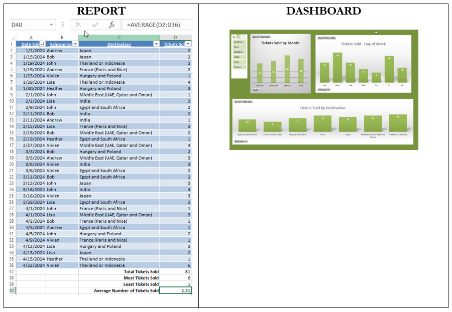
The data had the following categories: (1) date tickets were sold, (2) salesperson (intern), (3) travel destination, and (4) number of tickets sold. The dataset consisted of 35 ticket sale transactions. For the report, the interns used the following calculations: (a) total tickets sold (81), (b) most tickets sold by intern (6), (c) least tickets sold by intern (1), and (d) average number of tickets sold (2.31). You see these calculations in D37:D40.
The interns used formulas in Excel (sum, max, min, and average) as part of the report. However, the static report was not what the advisor expected. The advisor wanted visuals, and he wanted to be able to interact with the data. The interns were stuck in a basic report mode, assuming that a few calculations and an ability to sort and count the data manually would work; however, the advisor expected an interactive dashboard!
The advisor wanted to see the number of tickets for each destination and the number of tickets sold by month and by day both as a group and for each intern. Why? Because he wanted to assess the success of the program and determine what standards should be set for the repeat of the program in 2025. So the advisor might be asking these kinds of questions:
- Did all interns sell tickets to each destination? If not, why? Was it just a chance of scheduling, or were interns unfamiliar with the destination process?
- Is there a day of the week that Campus Travel could be closed? Scheduling is a nightmare for the advisor and interns, and both deserve one day off each week.
- Are there interns who sell more tickets and/or travel destinations and could help train new interns?
- Should interns be required to sell a minimum number of tickets?
According to Alexander & Walkenbach (2013), “When gathering the measures required for the dashboard . . . write out a sentence to describe the measures needed” and determine the types of techniques that will allow the user to interact with the data (p. 15).
There was a gap in communication. Let’s compare the report and dashboard. Notice the dashboard in Figure 4.1 is driven by a “slicer.” A slicer allows the user to manipulate all the graphs. The slicer provides the interaction and allows the advisor to look at each intern’s progress by selecting their name on the slicer.
Figure 4.1—Report Versus Dashboard for Campus Travel.
Campus Travel also conducts a posttrip survey that asks three questions. Although the information is easy to read in the table, what technique would make it easier to see insights and trends?
What Is a Data Model?
Let’s work through the step-by-step process of creating a Microsoft Excel dashboard and the use of a data model. A data model allows you to integrate data from multiple tables and multiple sources! This is a good skill to know since most situations require you to pull data in from different sources. For example, in Campus Travel, the interns keep track of their schedules and about how long it takes to sell a destination package. The advisor might want to consider this use of time—especially if the intern doesn’t actually make the sale but has spent hours of time working with the potential customer.
 Step-by-Step to Create a Simple Dashboard in Microsoft Excel
Note: Screenshots of Excel interface © Microsoft Corporation. Used with attribution for instructional and illustrative purposes. Annotations added by the author.
The first step is to explore an existing dashboard that uses two table ranges. The “4.1 Campus Travel Ticket Sales Student File” is in the Chapter 4 Excel files.
- Open Microsoft Excel and open the file “Campus Travel Ticket Sales with dashboards.”
- Explore the data.
Look at the Raw Data file. Notice that it is a table. You can tell it is a table because it allows you to sort using the drop-down arrows shown in the header row. Notice the total number of tickets sold and the other calculations used at the bottom of the table. The table extends from A1 to D36 with a header row that shows Date Sold, Salesperson, Destination, and Tickets Sold. Do not include the calculations.
Click inside the table, and you will notice a new tab on the ribbon called Table Design. Select the Table Design. You should also notice that the table name shows as “Data.”
Click the Home tab on the ribbon and locate the “Format as Table” within the Styles group. Look through the data and notice that you see the date sold but not the day of the week.
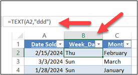
Select the Calendar tab. The calendar tab was created so that the date the tickets were sold could be attached to the day of the week. The day of the week formula (shown in Figure 4.2) is =TEXT(A2,“ddd”). If you add an extra “d” into the formula, the entire day will be the result. The month formula is =TEXT(A2, “mmmm”) to show the entire month spelled out with no abbreviation.
Next, select the dashboard tab. This is a completed dashboard for you to explore. If you click on any of the chart areas, you will see the PivotChart Fields pop-up. Try interacting with the chart by selecting the name Andrew in the slicer. You should see all three charts change.
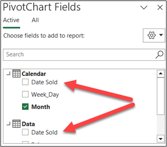
In addition, click on one of the PivotTables and notice the PivotChart Fields that pop up. It shows both Calendar and Data tables. Note that the Calendar table has “Date Sold” and the Data table has “Date Sold.” There must be a common point between the two tables you want to use. In this case, “Date Sold” is that connection (see Figure 4.3).
A data model allows the user to integrate multiple tables.
Next, we will take you through the steps to build the data model.
- Select the raw data file and click one of the cells within the data table. It can be any cell within A2 to D36.
- Click Insert and look for PivotChart & PivotTable (like Figure 4.4).
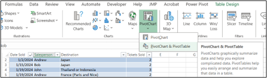
Figure 4.4—PivotChart Icon - A pop-up screen should show a table range for the data and a new worksheet. Notice that the data itself will be surrounded by a moving dotted line. Always verify that you have selected the correct data range. In this case, you should make sure it has selected A1 through D36. You do NOT want any row after 36 even though it has calculations.
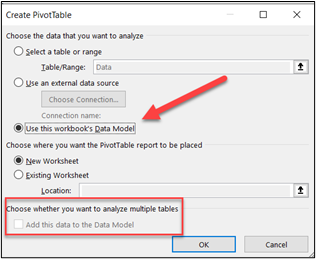
Figure 4.5—Use the Data Model - Notice the pop-up has a checkbox for analyzing multiple tables. One of the powerful features of Excel is to bring together multiple related tables to analyze data. Since we have already done this step earlier, choose “Use this workbook’s Data Model” as in Figure 4.5. (Note that if we had not set this up already, you would choose the checkbox shown in the red square to “Add this data to the data model.”).Once you have verified the correct data, choose OK. You will know it worked if you see both Calendar and Data in the PivotChart Fields.If we had not already set up the data model, you would be prompted to connect the relationship between the two tables (as shown in Figure 4.6).You will know if you are working with data that do not have this relationship because your graphs will show the same data for each person.
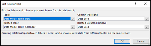
Figure 4.6—Set Up Relationship Between Tables - In the PivotTable fields, choose All. This will show you both Calendar and Data.
- Now the fun part! Drag the Week_day to the rows section and the tickets sold to the values section. You will notice both a PivotChart and a PivotTable show on the worksheet. By default, it shows blue columns and total for both a title and a legend. Additionally, the days of the week are not in order. At this point, we have some work to do on this chart and the PivotTable. For example, in Figure 4.7, you see a “Total” legend that is not needed because it doesn’t add any value.
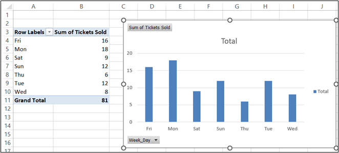
Figure 4.7—Default PivotChart - Start by changing the title to “Tickets Sold—Day of Week” and delete the legend (we don’t need it). This design still needs work. Notice that the days of the week are not in order, and we have field buttons. To remove the field buttons, choose PivotChart Analyze, click the Field button, and choose Hide All. Now follow the next four steps to clean up the chart.
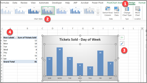
Figure 4.8—Customizing the Default PivotChart Use the numbers in Figure 4.8 for the explanation and process.
Part 1—Click on Design.Part 2—Choose the design with blue columns and gray background.
Part 3—Remove the grid lines (by clicking on just the lines and delete). If you delete something you didn’t intend to delete, use Control + z or Undo.
Part 4—Click on the Row Labels above the days of the week and sort A to Z to arrange the days of the week in order.
- Next, name the tab “Charts step-by-step.” You may choose a different chart design, but just make sure all charts have the same color palette. Add branding if applicable. The PivotChart tools (analyze, design, and format) will show above the menu ribbon. Select Design and choose a design you like. I chose a design that removed the grid lines and featured the number of tickets in each column, as shown in Figure 4.9. Choose any color that matches your brand colors. The one thing I may still change is the text indicating the number of tickets for each day of the week. Notice how difficult it is to read “Wednesday.” But for now, move on.
- Next, highlight the PivotTable only to copy. Copy it within the same worksheet that you named “Charts step-by-step.” It looks like Figure 4.9.
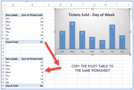
Figure 4.9—Copying the PivotTable - Make sure you have only selected a single cell within the second PivotTable, which starts on cell A16 in the illustration. The PivotTable fields pane will pop-up. You may need to use the drop-down to see all the fields under each table. Uncheck the Week_Day and check the Month. See Figure 4.10 for both a Month PivotTable and a Destination PivotTable.
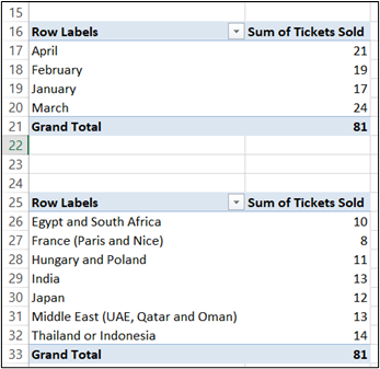
Figure 4.10—Copied PivotTables - Make sure you have selected a cell within the third PivotTable (that starts on cell A25 in the illustration). In the PivotTables Fields pane, uncheck the Week_Day and check the Destinations (or you can use drag and drop). We don’t have charts yet for PivotTables 2 and 3.
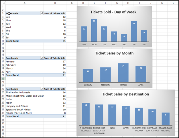
- Select a cell within the second PivotTable (the month one) and notice the PivotTable Tools above the ribbon. It shows Analyze and Design. Choose Analyze in the expanded ribbon and choose PivotChart. Choose the first column chart. As you can see, the default will need a title change, removal of the legend, removal of field buttons, and a new design to match the first one. Don’t forget to sort the months!
- Next, select a cell within the third PivotTable (the destination one) and notice the PivotTable Tools above the ribbon. Once again, choose the PivotChart Analyze and choose PivotChart. Choose the first column chart and change the design to match the two previous charts. You may want to sort the destinations by selecting the Sum of Tickets Sold and sorting from highest to lowest.
This is a screenshot (Figure 4.11) of the results of steps 11–15. Notice all the charts have a similar look.
- Next, add a sheet and name it Dashboard. You may want to organize the tabs.
a. Put in a light gray background by clicking on the triangle between Column A and Row 1 and choosing a color for the background from the paint bucket (this is in the font group).
b.Copy the three charts and arrange it like the following, leaving a spot for the slicer.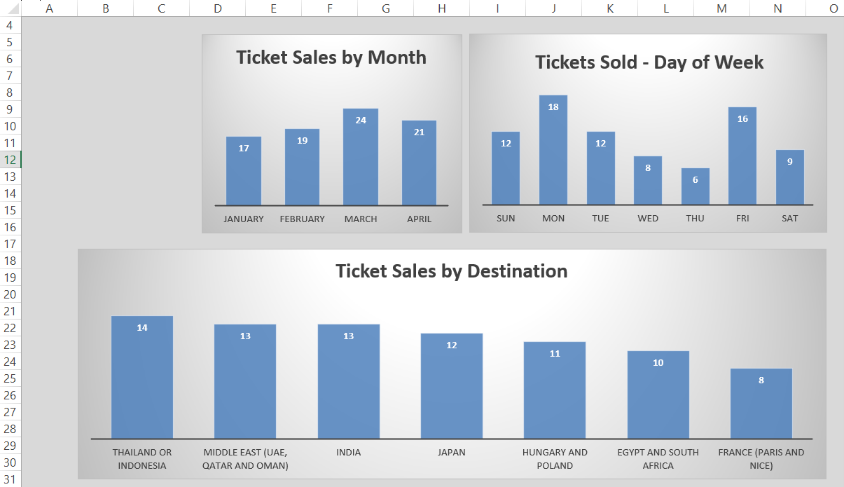
Figure 4.12—Partially Completed Dashboard - Next, we are going to insert a slicer. Remember a slicer will provide interaction and allow the user to see ticket sales by day, month, and destination for each salesperson. First select the first chart. At the insert tab on the ribbon, select Slicer. A pop-up menu will show your table data. Select Salesperson (see Figure 4.13).
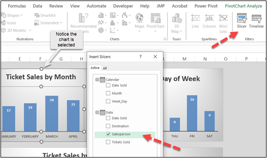
Figure 4.13—Insert a Slicer A slicer tool will appear so that you can format the slicer to match the chart colors. Since the default is blue, it matches the PivotCharts. If you chose a different color for PivotCharts, change the slicer color to match. You may want to narrow the size of the slicer.
You will notice that if you try the slicer, you will see only the first chart change. Slicers should drive or connect to all the PivotCharts.
- With the slicer selected, you will see Slicer above the ribbon and only one choice—Options. Look through the Options menu for Report Connections. Select Report Connections. Choose this and a pop-up will show all the existing connections. Just make sure they are all checked in your Dashboard. Now try your slicer. All charts and PivotTables should change when you select a name. If anything looks off, check the tab called just “Dashboard” to make sure that the slicer is not filtering; otherwise, you can have some strange results.
Exhibit 4.1—Completed Dashboard
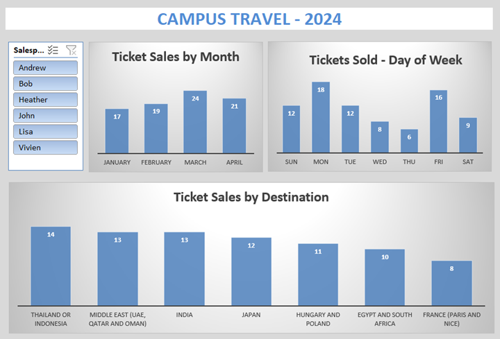
Using the dashboard, see if you can answer the questions considered by the advisor by using the slicer. The last question, “Should interns be required to sell a minimum number of tickets?” will take more research to determine if this requirement would help meet the learning outcomes of the program. Dashboards can’t answer every question!
Are you more of a visual learner? Try watching the following 20-minute video.
 Mitchell, J. & Deckard, T. (2024, Jan 18). Campus Travel Video-Case Study. [Video]. YouTube.
 Need to see the finished dashboard? See “4.1 Campus Travel Ticket Sales Completed” in the Chapter 4 files.
Now that you have created your first interactive dashboard, let’s move to how you can use the slicer and the interactive feature in PowerPoint using Slide Zoom to tell the story and answer the questions.
4.1 Self-Assessment: Dashboards Versus Reports
Learning Objective #3—Apply the appropriate data visualization: report versus dashboard

4.1 Exercise 1: Interacting With Slicers
Learning Objective #3—Apply the appropriate visualization: report versus dashboard
 In the dashboard for this section, use the slicer that you built (or the one provided) to answer the following questions. Be ready to discuss this in class or on the online discussion board (check with instructor).
- Interns earn college credit for their internship through the Career Development Office (CDO). Interns are expected to do journalling and write papers about their experience. As a teacher in the CDO, you’ve noticed that several mention the difficulty in selling the France (Paris and Nice) destination since it has so few interactions with locals. Did all interns sell tickets to all destinations?
- Scheduling is a nightmare for the advisor and interns, and both deserve one day off each week. Is there a day of the week that Campus Travel could be closed?
- Are there interns who sold more tickets and/or travel destinations and could help train new interns?
- Should interns be required to sell a minimum number of tickets?
- Discuss the data model process. Are there other file types you can use besides tables? Why do you need a common field?
4.2 Simple Techniques to Visualize and Tell a Story
We’re born problem solvers. We’re compelled to deduce and to deduct because that’s what we do in real life. It’s this well-organized absence of information that draws us in. . . . Make the audience put things together. Don’t give them four, give them two plus two. The elements you provide and the order you place them in is crucial to whether you succeed or fail at engaging the audience.
—Andrew Stanton, writer and director
Congratulations! You’ve taken raw data and created your first simple dashboard with a slicer. Now it’s time to look at some simple visualizations and focus on a few indispensable tools: databars and icon sets. These unassuming techniques wield remarkable power when harnessed by skilled presenters. By delving into real-world scenarios, we uncover how storytellers can paint vivid narratives that captivate our audience.
What Are Databars?
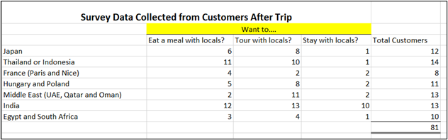
Databars are miniature bar charts that provide an intuitive way to represent data within the confines of a single cell but are different from sparklines. The easiest way to understand how databars can be used is to look at a scenario. In the previous section, you were introduced to a dashboard created for Campus Travel. Campus Travel interns do follow-up calls with the advisor to find out if customers were satisfied with three potential areas of their trip. This is especially important since Campus Travel tries to package these trips with special amenities. The after-trip surveys ask three questions. “Reflecting on your trip, which would you want more of: (1) eat a meal with locals, (2) tour with locals, or (3) stay with locals?” Exhibit 4.2 shows the data collected from the 2024 trips.
Exhibit 4.2—Survey Data Collected (No Visualization)
Simple Techniques for Understanding Data
We’ve talked about conditional formatting in an earlier chapter, but let’s look at a conditional format feature known as databars for the survey data.
Conditional formatting is used to visualize data through databars, color scales, and icon sets. Introduced originally in Excel 2007, it was extended to integrate with PivotTables a few years later.
The survey with databars is shown in Exhibit 4.3. Clearly, customers who purchased tickets with India as their destination wanted much more interaction with the locals! But are there other insights we should notice? Or is there a different way we should show the data?
Exhibit 4.3—Survey Data With Databars: Count of Tickets
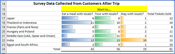
Caution! Does this really represent the whole picture? No. To explain, let’s look at an example. Six ticket holders from Japan want to eat a meal with locals. However, six ticket holders only represent 50% of those who traveled to Japan. Now look at India. In this case, 12 ticket holders out of a total of 13 want to eat a meal with locals. Twelve ticket holders represent 92% of those who traveled to India. The “Total Tickets Sold” is a great column to have, but what might work better would be turning the data into percentages.
Exhibit 4.4—Survey Data With Databars: Percentage of Tickets
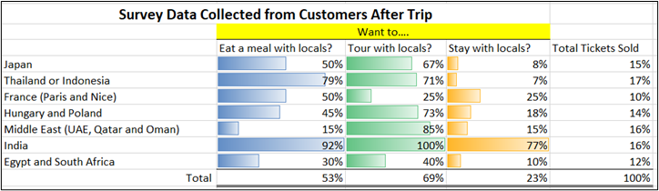
As you review the data, note the following:
- 53% of all ticket holders want to eat a meal with the locals,
- 69% want to tour with locals, and
- only 23% want to stay with locals.
But this data does bring up some questions. Why do only 25% of France ticket holders want to tour with locals? And notice that the number of tickets for France is only 10% and represents the smallest number of ticket sales. The advisor needs to add some open-ended questions about France’s travel arrangements!
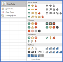
Another aspect of conditional formatting includes specific criteria (greater than, equal to, and less than) and icon sets. Icon sets, like those in Figure 4.14, often use color associations like a stoplight with red for warning, yellow for caution, and green for normal, but there are many shapes beyond using a stoplight design.
Figure 4.14—Icon Sets Available in Excel
Revisit Icon Sets
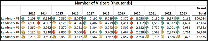
Icon sets are specifically helpful when you are comparing lots of data and need a visual to quickly see issues. In Figure 4.15, you only see information for five landmarks, but what if you had over a thousand landmarks to review? The 2019 and 2020 years show a loss of visitors, but this is probably because of COVID-19. There was a pattern of concern for landmark #4 before the COVID-19 years, but it appears to have improved.
Figure 4.15—Icon Set Used for Conditional Format (Applied by Row)
Along with icon sets, don’t forget to consider sparklines! As a reminder, sparklines are best used for trends, seasonal increases or decreases, cyclical data, and highlighting minimum and maximum values.
Now assume that the advisor has asked all the interns to work together to present their insights and findings. Let’s start with the storytelling basics.
The Art of Storytelling When the Room Is Overwhelming
FEAR: Something that happens between the time you are planning for a presentation and the actual presentation. If you have a fear of public speaking (glossophobia), it may be something that you have fought since childhood. Sweaty palms, faster heart rate, and memories of prior poor performances or presentations may get in the way of connecting with the audience. About the only thing that will help with prepresentation fear is practice, practice, practice. Try out your storytelling with a pilot audience (family, friends, and coworkers are supportive and good critics). Get organized and make sure the technology works, internet is available, and the space works. There is nothing worse than presenting when the display unit is too small for the room. If you know this ahead of time, you can request a second display, encourage the audience to move forward, or even rearrange the chairs.

Imagine you will be presenting in the room pictured here and need to keep your audience engaged even though there are potential distractions. Do you need a wireless microphone? Do you have a wireless presentation clicker to advance the slides? Oh, wait! Where do the slides show? If someone asks a question, will you hear them? Or do you need to set up a way for the audience to send questions through a phone app? Are you being asked to present both physically and virtually? If so, that brings another set of challenges.
Be prepared—know your presenting territory, and have water available, take deep breaths, and focus on the material.
CRUTCH: Most presenters use PowerPoint, but when you use it like a crutch, it breaks the connection with your audience. Symptoms of a PowerPoint crutch include reading the slides, presenting with your back to the audience to see where you are in your slides, fumbling to remember what is next even with the slide up, and excessive “ums” and other filler words. And please, if you notice a spelling error or typo, don’t point it out to the audience! Another thing we use as a crutch is index cards. Most audience members cringe at the sight of index cards, especially when the presenter is flipping them and shuffling them.
Basic Rules of Presenting With PowerPoint
So, storytellers, let’s look at some basic rules and guidelines for presentations.
Example Case 1: Report, Inform, Explain, Announce
This type of PowerPoint has lots of facts that you need your audience to understand. Facts can be dry. So here are some tips to help with this type of presentation.
- Determine ways to add visuals. Don’t use clip art or cheesy stock imagery. Choose pictures that directly illustrate or match the tone of the slide. Use pictures of your organization if you can.
- Start with a story or an activity that makes your point. Even if you are delivering several slides of facts, use a story to give the audience a way to understand the underlying meaning.
- Connect story to summary. If you can’t summarize your presentation topic in 10–15 words, then your audience will not “get” what you are trying to convey.
- Avoid too much text. If you need to show financials and they don’t fit well on a slide there are a couple of options: (a) Use a handout on the key concept or fact that you want the audience to understand, or (b) learn to use the Zoom function in PowerPoint to zoom into a magnified section.
- Follow the 10-20-30 rule: 10 slides for 20 minutes with a font size of at least 30. Stay on time.
- If you want to show charts to represent data, make sure it is the right type of chart and easily understandable. If you want to show a dashboard, switch to that app instead of trying to use a dashboard app in PowerPoint.
- Look for customized templates instead of starting with a blank PowerPoint, but don’t overuse animations. Use animations if they further your story. For example, the app Flourish is great to analyze key components that have changed over time.
- Review the slides and use the slide sorter to see if it fits the overall story. Remember, most audiences want a simple structure: frame the issue, present the challenge, and explain how to solve the problem.
Example Case 2: Collaborative Presentation
Collaborating can happen in either a virtual meeting or a physical meeting, and sometimes it involves both. There are some simple guidelines and etiquette. When you are a single presenter, it is possible to start with the story and only introduce yourself after connecting to the audience with your story—but teams are different. Introduce everyone on the stage.
- Introduction: Consider a team leader introducing or facilitating the team, giving them a section of the story. It can even be the 5 Ws. For example, “Let me introduce Jim Smith. Jim will share the first of the 5 Ws.” Jim might hold up a small sign with the word WHO. When Jim shares his section, he can prop up the sign—and everything he presents should fall under the WHO. Using something like the 5 Ws does not mean you have to go in a certain order. You could start with WHY. The crucial point is that you speak with one voice and have a unified message. Consistent language, tone, and style are key.
- Handoff: Consider how you will hand off the PowerPoint to the next presenter. Use a phrase like “The next presenter, Jim Smith, will share the WHO—in this case, who we consider our competitors. Jim?” And Jim may say something like, “Thank you, Sharon” and proceed with his section. It is also possible to have some mixed interaction where two people are prompting each other, but this takes lots of practice. The point is that the transitions should be seamless.
- Audience engagement: One of the advantages of a team is that you can use them to field questions and leverage team dynamics to facilitate discussions or breakout sessions. Every team member should maintain eye contact or, if not presenting, listen to the presenter. As a team, scope out the room and make sure you know the audience. The audience will give you cues; don’t ignore them.
- Schedule: When a team presents collaboratively, it is a nightmare if one of the members doesn’t keep to the schedule. So keep to a schedule, and have one person who is comfortable interrupting the presentation to keep it moving. Assume you will have technical issues, and have a backup plan.
- Good ending: You need a strong conclusion that summarizes key points. End the presentation with a memorable and compelling closing quote, statement, or fact. Don’t read your slides, but if you need notes, use the Notes feature in PowerPoint so you see the notes, but the audience sees the main slide content.
- Annoying habits: Try to avoid annoying habits like clearing your throat, saying OK and using Ums. Body language should be natural. Project your voice so it is heard at the back of the room. If you are required to use a microphone, hold it a few centimeters away from your mouth and speak across the top of the microphone and not directly into it.
- Q&A: Always leave time for a Q&A. This is harder when you have made a collaborative presentation because you may not be sure if you should answer a question if you didn’t cover that section in the slide. You may want to consider the kind of questions you anticipate during your practice session and determine who will answer the questions.
- Gather feedback, debrief/reflect: You should solicit feedback through a short survey. In addition, hold a postpresentation debriefing session to determine areas for improvement. Reflect on both individual and team performance.
Example Case 3: Persuade, Inspire, Sell
This type of PowerPoint needs to raise the energy in the room. And the most inspirational presentations are needed when you have a disengaged audience, one that you need to sway, or one whose support you need to gain for a tough decision. This type of presentation requires exceptional storytellers, empathy, and a deep understanding of your audience’s motivation. And it is certainly not easy to do unless you practice a lot. Here are some tips to help with this kind of presentation.
- Know the arguments: Spend some time researching. Know both sides of an argument and consider the audience’s perspective. The main goal is to convince the audience that you know what you are talking about and that you can be trusted to tell the truth. Acknowledge potential objections or skepticism, and address them proactively. Great speakers tap into one or more of three approaches: ethos (ethical appeal), logos (logical appeal), or pathos (emotional appeal).Conduct thorough audience research. Know the audience’s demographics, interests, and pain points. An example of a pain point: If you are speaking to a group of employees about a merger between two hospitals, acknowledge the challenges they’ve faced and how the change will impact them.
- Start with an attention-grabbing opening: Begin the presentation with a powerful and dynamic opening. It could be an anecdote, a surprising statistic or fact, or a compelling question. Another way to interact with an audience is simple—ask your audience a great question at the beginning. An example here might be, “Did you know that by the end of the presentation, you’ll discover how a change in perspective can lead to unprecedented success in your career?”One of the best attention-grabbing openings I’ve seen was done by Steve Jobs. Steve only had a few slides, but I still recall the text running across the screen behind him, how it changed to a bouncing ball, and how it looked like he caught it. Perhaps, you didn’t realize this, but his average text size on slides was 190-point text, and he practiced for weeks (Gallo, 2019). It seemed as if the slide was alive and interacting with him!
- Tell a compelling story: Craft a narrative that draws and resonates on a deeper level.—Connect with them emotionally. Use visuals that support your message. If the message is complex, provide timeline or milestone visuals. The story is the cue to set the hook. Instead of presenting data about declining sales, tell the story of a struggling entrepreneur who turned their business around using the strategies you are about to share.Out of all the tips listed here, this may be the most important. Tell a story that gives the audience an “aha” moment. Stories can add spice and provide your audience a chance to relate to a point you are trying to make. In a TED Talk by Elizabeth Lyle, she starts by talking about her bad habit of leaving a sink full of dirty dishes. At face value, you might not expect it to tie into her talk, How to Break Bad Management Habits Before They Reach the Next Generation of Leaders, but you would be surprised at how she used the story of a bad habit to stress her point.Share an inspiring example and use persuasive language such as rhetorical questions, powerful metaphors, and compelling language.
- Get the audience involved: There are tons of apps that work with the user’s phone. To get the audience involved, consider polling apps, word cloud apps, and Q&A. Polling apps like Poll for All, Poll Everywhere, Mentimeter, Slido, and others allow the presenter to add interactive polling. The audience can respond to the poll using their phone by visiting the voting page. The voting page (tied to your PowerPoint) collects the votes and shows the results. This is not difficult, but most presenters avoid it unless they have a budget to cover the cost (the basic free package is generous and should be researched). If done correctly it can engage a large audience!
- Credibility: Credibility is on two levels: credibility of the presenter and credibility of the data. Without it, the audience doesn’t connect, because they don’t have trust in the narrative. It is important to choose the chart type that tells the story in a context the audience understands. Don’t present charts they can’t see, remove clutter, and keep your branding colors. Remember, your color choice and labels should be sensitive. Cite your sources. As a presenter, establish your expertise. Your experience, relevant qualifications, and achievements are foundational to credibility.
- Maintain engaging delivery: Use varied vocal tones, gestures, props, and movement to keep the audience’s attention. Physically move around the stage (another Steve Jobs characteristic). Use props. If presenting a new product, give a hands-on demonstration. Use “trigger words” as landmarks in your demonstration to stay on track.
- Create a vision and a call to action: Paint a vivid picture of the future. Help the audience see the value of their contribution. Conclude with a clear and actionable message to encourage your audience to take the next step. Inspiring an audience requires authenticity, passion, and a genuine desire to connect with your listeners.
- Practice, practice, practice: Practice until you are comfortable in your own skin! A presenter should practice one hour for every minute of a presentation. A 15-minute presentation should be practiced for at least 15 hours. Record yourself and watch your presentation. According to Janice Tomich (2023), a presentation coach, “Issac Lidsky practiced his speech . . . over 1000 times. That’s roughly 191 hours of practice for this 11.5-minute speech” (para. 3).
Lidsky, I. (2016). What reality are you creating for yourself? [Video]. YouTube.
Littlefield, C. (2022). 7 Ways to Interact With Audience in an In-Person Presentation. [Video]. YouTube.
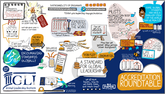
Example Case 4: Entertain, Divert, Relax, Set a Mood
This type of PowerPoint will not require presenters. For example, this could be a self-running slide show of audience pictures, cartoons, quotes, news, conference pictures, and even speed painting to music. Another interesting aspect of a virtual meeting can be the use of a sketch artist who draws and takes notes during a presentation. The example shown in Exhibit 4.5 is from a Global Leadership Institute conference in 2023, and the speakers discussed standards for global leadership.
Exhibit 4.5—Example of a Sketch Artist Taking Notes Live During a Conference Speaker
4.2 Exercise 1: Databars and Icon Sets
Learning Objective #4—Build visuals and dashboards to structure storytelling
The following information is available for your top 10 salespeople. Please use your skills with databars and icons to show this information. Post your result to the discussion board. Be prepared to demonstrate your skills or, if at the direction of the instructor, record a screencast demonstration. What are some key insights you would share from the Table 4.1 information?
Table 4.1: Top Sales by Rank
|
Top 10 Sales People |
Sales |
Rank this month |
Rank last month |
|---|---|---|---|
|
FULLER, NANCY |
$137,707 |
1 |
1 |
|
CLABBER, JIM |
$111,682 |
2 |
3 |
|
MCDONALD, DAN |
$106,299 |
3 |
5 |
|
KNOTT, RITA |
$102,240 |
4 |
9 |
|
BREMS, NOBLE |
$83,526 |
5 |
2 |
|
WELLMAN, BUTLER |
$78,824 |
6 |
11 |
|
PANITE, JANE |
$77,452 |
7 |
6 |
|
STANLEY, PATTY |
$76,790 |
8 |
7 |
|
SHEUM, CJ |
$76,685 |
9 |
8 |
|
TANG, TERESA |
$76,532 |
10 |
4 |
Please see Chapter 4 files, “4.2 Exercise 1—Databars and Icons” to get started.
4.3 How Storytelling Connects to the Brain
The act of sharing a story is powerful. So much so that it synchronizes the brain activity of the teller and listener.
—Calli McMurray, Why the Brain Loves Stories
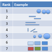
Visually, our eyes can see trends, gaps, outliers, alignment, and/or position. In 1985, Cleveland & McGill ranked the visual attributes by measuring which visualizations are seen best. It is easier to show you. (Yes, visualize it!) As you can see in Figure 4.16, ranked first is position along a common scale; ranked second is position along nonaligned scales; ranked third is length; ranked fourth are angle and slope; ranked fifth is area; ranked sixth are volume, density, and color saturation; and ranked seventh is color hue. Perhaps you are surprised by the ranking. But there’s more . . . !
Figure 4.16—How Your Brain Measures Visuals
Nonverbal Cues
Stories impact people differently, and nonverbal cues can influence your audience. In most “two-person conversations, nonverbal messages convey more than 65% of meaning” (National Alliance for Partnerships in Equity, 2020, p. 2). That’s no surprise when you realize our faces have 43 different muscles that can be activated around the eyes, nose, mouth, jaw, chin, and brow (Anwar, 2020, para 16).
Even more interesting is the 7-38-55 rule by Mehrabian, Wiener, & Ferris (1967), who shared this formula with some caution. The rule states that 7% of meaning is communicated through spoken word, 38% through tone of voice, and 55% through body language. The authors urge caution because the formula does not apply to every situation. For example, because someone crosses their arms over their chest doesn’t always mean they are closed off to your presentation; it may just mean they are cold!
Just remember, nonverbal cues can contradict or negate verbal messages. An interaction where words say one thing and nonverbal cues say another is called a double message, and everyone finds this confusing.
Planning a Beginning, Middle, and End in 7 Minutes
Figure 4.17—Plan a Beginning, Middle, and End
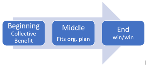
The main components of a story are the beginning, middle, and end. A strategy for storytelling practice is to use PechaKucha. PechaKucha is a Japanese management style where you have 20 slides timed at 20 seconds each. The slides automatically advance, giving you less than seven minutes to tell your story, and most slides should complement the speaker when vocalized. The PechaKucha website offers a free online and offline global storytelling platform in over 140 countries. We searched big data and data visualization and found 100s of presentations from all over the country (many in other languages). You can set up a presentation on the PechaKucha website, in Google Slides, or in PowerPoint. When you sign up for PechaKucha, you choose areas of interest, but don’t be surprised if you get pulled into something different. We watched the “Presentation of the Day,” and it was on Frank Lloyd Wright, which had nothing to do with data visuals.
 Title: PechaKucha: Visual Storytelling That Celebrates Humanity. You will find lots of sample presentations to give you ideas. Link: https://www.pechakucha.com/
Lasseter’s Lab. (2021, Jan 29). How to make a PechaKucha presentation for class (for all students). [Video]. YouTube.
As we embark on a journey through the realms of psychology, neurobiology, and cognitive science we discover the profound ways in which stories captivate, influence, and shape our minds. The key question is “What is it about storytelling that strikes a chord enabling narratives to connect with our brains in a manner that few other forms of communication can?”
Our Brain When Listening to a Good Story
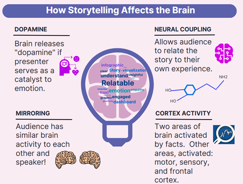
If we add context to the mix, our stories affect the brain, and this is a good thing! In general, good storytelling can do the following (as seen in Figure 4.18 and listed here).
- dopamine: enhances memory
- mirroring: experience similar brain experience as the speaker (we synchronize!)
- neural coupling: listener turns the story into their own ideas
- cortex activity: Lights up more of the brain
- narrative transport: engage emotionally—and if you engage emotionally, you increase trust, empathy, and generosity
Figure 4.18—How Storytelling Affects the Brain
In this chapter, you are learning some amazing things. It’s easy to get all wrapped up in the technology. Just remember, if you start with technology, you can lose the connection to the audience. Start with the purpose and check off the why, who, and what your audience needs to understand. What actions do you want to support? What is the most important takeaway message? How will it be consumed? The more specifically we drill down for our purpose, the better.
Then make sure you accompany the visualization with context. In this case, “context” means making the topic easier to understand by giving extra information about the time, place, situation, history, background, and so on. That’s part of the storytelling process!
4.3 Exercise 1: Storytelling Impacts Your Brain
Learning Objective #4—Build visuals and dashboards to structure storytelling
Watch the TEDx Talk video, Why storytelling is more trustworthy than presenting data
Eber, K. (2020, Apr 13). Why storytelling is more trustworthy than presenting data. TEDx Talks (TEDxPurdueU). [Video]. YouTube.
Then watch the video, Steve Jobs Introduces the iPhone
Schroter, J. (2011, Oct 8). Steve Jobs Introduces iPhone in 2007. [Video]. YouTube.
After watching the video, explain how your brain was impacted by storytelling. Write 10 characteristics of telling a dynamic story that Steve Jobs used. What data visualization did he use? Post these on the discussion board or be ready to discuss them in class.
4.3 Exercise 2: Chart Practice
Learning Objective #4—Build visuals and dashboards to structure storytelling
IFS Telecom Services shared their 2025 forecast for sales in all four regions. They have asked you to build several charts so they can see which ones work best for their budget presentation. They have asked for a combo chart, databars, two pie graphs—one for revenue and one for orders—and a clustered bar chart. The budget manager has asked you to demonstrate in a video how these were made (mostly so he understands how you created them). Table 4.2 has the information.
Table 4.2: Information About IFS Telecom Services 2025
|
Region |
Total Sales |
Percent |
No. of Orders |
Percent |
Revenue divided by Orders |
|---|---|---|---|---|---|
|
North |
$ 8,819,623 |
19% |
3,981 |
20% |
$ 2,215.43 |
|
South |
$ 11,008,539 |
24% |
2,532 |
13% |
$ 4,347.76 |
|
East |
$ 9,414,701 |
21% |
6,484 |
33% |
$ 1,451.99 |
|
West |
$ 16,428,769 |
36% |
6,596 |
34% |
$ 2,490.72 |
|
Total |
$ 45,671,632 |
100% |
19,593 |
100% |
$ 2,331.02 |
Post your video to the discussion board and provide feedback to your classmates.
Refer to Chapter 4 files, “4.3 Exercise 2—Create and Interpret Charts” to get started.
4.4 Dashboard Cleaning and Presentation Advice
Hammers and nails. If you are good with a tool, you may want to use it too often. If you have analyzed a problem in depth, you can end up exaggerating the importance of that problem or your solution. Remember that no one tool is good for everything. If your favorite idea is a hammer, look for colleagues with screwdrivers, wrenches, and tape measures. Be open to ideas from other fields.
—Hans Rosling
Cleaning data is an essential first step in the journey toward creating a data dashboard. Just as an artist meticulously prepares their canvas before creating a work of art, data cleaning serves as a foundational step before building a dashboard. Raw data often contain duplicates, inconsistencies, errors, unexpected blanks, and unneeded data (noise). By removing noise, correcting inaccuracies, standardizing formats, and fixing format issues, we start with a “clean” dataset ready to provide an accurate and reliable dashboard.
When cleaning data, it is important to keep in mind that a combination of data may still have importance. Seemingly inconsequential data that seem unimportant to the story may become important when paired with other information. Power BI, which is discussed later in the textbook, is very adept at combining data in different ways to tell multiple stories easily. So let’s review all the things that you need to clean up (with examples).
Step one is always to make a backup copy of the raw data file so you can always revert to the original data file if needed.
Cleaning Sample #1—Noise (Before)
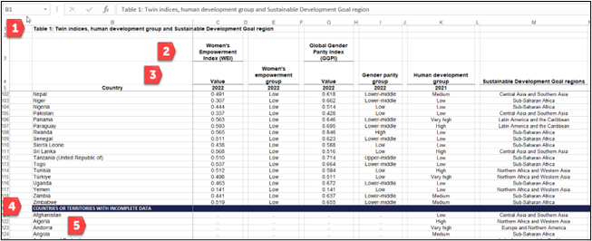
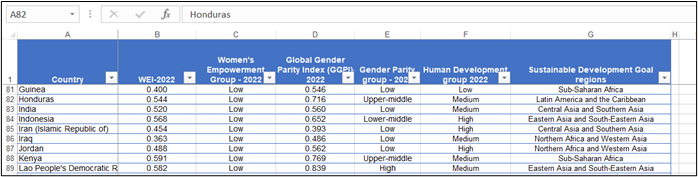
The United Nations Human Development Report provides an Excel file with twin indices on women’s empowerment and gender equality. However, there is “cleaning” work to do if we want to use this file in any way. Remember, our data needs to be turned into a table before we can start analyzing it. However, we have lots of extra rows of reference materials that would need to be deleted. Follow the notations 1–5 in Figure 4.19 to clean up the “noise.”
For notation 1 and notation 2, note rows that need to be removed. The notation for Row 3 indicates a suggestion to revise the heading. For example, you can only have one row of headings. Then in Row 5, we would need to rename the header row. For example, C5 is “2022,” but it should really be “Women’s Empowerment Index—2022.” Notations 4 and 5 show that columns have missing data, so be aware that some countries had incomplete data. As an analyzer, you would want to remove the row with the text pointing this out as well as the countries with incomplete data. Also, please note that there are empty columns like A, D, H, J, and L that need to be removed.
Figure 4.19—Noise (Before)
Look at Figure 4.20 to see the same data after some cleaning was done: columns removed, blank data (countries without data) removed, extra rows removed, and header rows renamed.
Figure 4.20—After Noise Is Cleaned (Only Partial Table Shown)
If you wish to download this Excel sheet, feel free to visit the United Nations Human Development Report at https://hdr.undp.org/content/paths-equal, or if you prefer, see it as an interactive chart in Datawrapper at https://www.datawrapper.de/_/C1aHL/. If you recall, Datawrapper is one of the top 10 visualization tools shared in the previous chapter.
Cleaning Sample #2—Unneeded Data
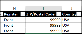
Lots of accounting software will provide some default information that may not add any value to the dataset. You will recognize this as an issue because you see duplicate information. In Figure 4.21, the dataset shows every customer with the same front register, zip code, and country. Create a copy of the sheet in its original format and a copy of the data to clean. In this case, you can delete columns H, I, and J.
Figure 4.21—Remove Columns That Add No Value
Cleaning Sample #3—Inconsistencies and Proper Naming Conventions
Inconsistencies happen when someone uses an override on the system. For example, they might type “Beverage” when they meant “Beverages.” Remember, the dashboard will see these as two different things, so you would need to standardize these values. Use the Filter option in the data that you have formatted as a table.
Cleaning Sample #4—Correct Data Types
Sometimes the data type is corrupted or incorrect. For example, a date for an order needs to be formatted as a number. Another example is when three decimal places are shown for sales (and currency is only acceptable at two decimal places). You will recognize it when it happens.
Cleaning Sample #5—Blanks Seen on Charts
If you notice a “blank” category showing up on your charts, that means you need to go back to the data and review that column using a filter. Using the filter for the Payment type shows blanks. It is possible that a salesperson didn’t post it in the accounting system, but this would be something to investigate. Figure 4.22 shows blanks.
Figure 4.22—PivotChart Shows Blanks
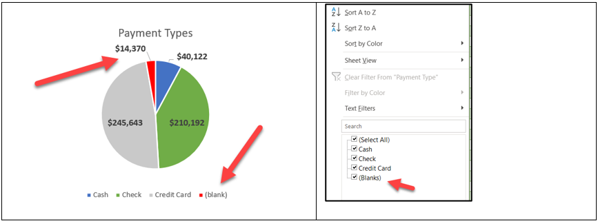
Note that you can sort to decipher which customers, and which salespeople, did not record a correct payment type into the system.
In summary, explore the raw data file for duplicates, inconsistencies, errors, unexpected blanks, and unneeded data (noise).
Dashboard Presentation Rules
Most of us will become so familiar with our well-designed dashboard that we assume everyone is following and understanding the presentation. In reality, our audience will be quite overwhelmed if we bring up our dashboard at the beginning of the presentation. Start with a simple presentation—presenting to your team with the goal of finding insights and helping develop a story.
Presenting and Interacting in a Virtual Team
Remote Team Scenario: Prior to COVID-19, you met your team in a great space that felt like your own. It had a coffee center, and the administrative staff always brought in fresh snacks and arranged lunch. During COVID-19, many employees worked from home—a pattern that continues, although not all employees are working from home full time. In many cases, team meetings are still held remotely. Those on site tend to go to the conference room for the meetings. So there is a mix of those on site and those attending remotely. Assume you need to meet with your team to review the dashboard, do further analysis, and look for insights. How does today’s meeting compare with past face-to-face meetings?
The impact of COVID-19 created some challenges related to gender and cultural differences. According to Mansplaining and Interruptions: Online Meetings Exacerbate Gender Inequalities in the Workplace, women are “experiencing a unique side effect of coronavirus; their voices being drowned out” (Priore, 2020, para. 1). Mansplaining “describes a man oversimplifying common concepts to women in a degrading or condescending tone . . . as much as six times a week at work . . .’ and ‘Zoom conferencing’ . . . make mansplaining and male conversation domination worse!” (Priore, 2020, para 6). As a team leader, you may not have noticed that men talk more or louder, but you may have noticed that those who are physically in the conference room tend to talk over teammates who are attending remotely, and they tend to have side conversations with those in the conference room.
Assume you are responsible for your virtual team’s performance and how they will discuss the insights you want to present to a larger audience; you may want to try some strategies for a more productive and successful virtual team meeting. Besides the gender differences, there are cultural differences to consider. As organizations expand globally, what are the shared practices, beliefs, and expectations that will support successful business practices worldwide?
Remote meetings offer a positive aspect. Most organizations expect teams to be formed based on strength and not by geographical location. In fact, across 90 countries, “89 percent of white-collar workers ‘at least occasionally’ complete projects in global virtual teams (GVTs)” (Taras et al., 2021). In a study conducted by Taras et al., virtual teams had the best success when team managers considered personal diversity and contextual diversity. Personal diversity includes personal characteristics—age, gender, language, skills, and values. Contextual diversity refers to the team member’s environment of economic development, types of institutions, and political systems. The study showed that personal diversity can negatively affect a team, and yet contextual diversity can positively affect a task and especially aid creativity and problem-solving at an unconventional level (2021).
According to Melissa Lamson (2018), there are three tactics for managing virtual teams. Let’s look at those three tactics in light of the Taras et al. study.
Tactic 1: Create the right context for your team. Context helps teammates see commonality. Make sure they understand the who, what, and why (Lamson, 2018). Does the project require creative and unconventional thinking? If so, form your team with contextual diversity in mind. If the project is more routine and you need efficiency, then form your team around personal diversity.
- Strategy to create the right context: Sending the meeting link to the dashboard before the meeting is helpful, especially if you provide some guidance by assigning an element for exploration. Setting clear goals and expectations is beneficial. To analyze and provide insights, this team should be formed with contextual diversity in mind.
- Strategy to add clarity to context: Most teams who moved to a virtual meeting space asked for clarity, for a plan, to be listened to, and for the freedom to innovate. A good strategy for clarity is to assign action items and follow up after the meeting. For example, use a simple summary tool like “muddiest point.” The muddiest point allows each person to indicate what point is unclear. It may only take 3–5 minutes but can be quite insightful. Everyone should be asked to participate. You won’t have all the verbal cues of a face-to-face meeting, but if you sense something is off with one of the team members, take the extra time to reach out and listen.
Tactic 2: Build a sense of community within your group. “Statistics show that meeting face-to-face during a project will increase productivity by 50 percent” (Lamson, 2018, para. 11). So cameras on! Introduce new members. Consider activities that provide some interaction (like posting insights or phrases to create a word cloud). Follow up after each meeting with a brief status update.
- Strategy to build community: Leverage technology to create interactivity and build a sense of community. If your team used a whiteboard to generate ideas, use the whiteboard available in the virtual meeting software. Virtual whiteboards are not just white squares; most of the virtual meetings have a variety of templates as illustrated in Exhibits 4.6–4.7.
Exhibit 4.6—Whiteboards Available in Zoom (2023)
Exhibit 4.7—Whiteboards Available in Microsoft Teams
Microsoft Teams has over 60 templates. You can add “Whiteboard” as a tab for easy access.
Explore additional add-ins for your virtual meeting: Grain, Slack, Miro, and others. Grain creates a full transcript of AI-generated notes in a shared workspace. Slack sets up a place to consistently communicate with the rest of the team. Although most virtual meeting apps have a whiteboard, Miro has very modern templates that make the experience more interesting. Warmly is a personalized virtual business card to provide friendly context.
Tactic 3: Coshare leadership. This is one of the best strategies to involve team members because it invites buy-in. When placed in a leadership role, your team member feels more responsible for outcomes and ownership of a successful project.
- Strategy for sharing leadership: There are various ways to share leadership including, collaborating on a meeting agenda, distributing roles to a member to conduct team rituals or social connection, or asking for a verbal round-robin on decision-making.
Virtual Meeting Space—What’s It Like in the Future?
Just as “Google it” has become a verb, one has to wonder what effect the introduction of AI will have on virtual meeting spaces. Zoom and Microsoft Teams already have AI that can assist with meeting notes. But even more astonishing is the real-time translation service for up to 40 spoken languages.
Virtual meetings have been around longer than you might think. In 2005, I had an avatar that I used in my virtual meeting with three other colleagues. Our purpose was to write a conference paper, but the technology was new and quirky, and I never grew tired of telling my colleagues to quit walking into the wall. See Exhibit 4.8 and consider that this technology is over 20 years old!
Exhibit 4.8—A Virtual Meeting Room in 2005 That Used Avatars
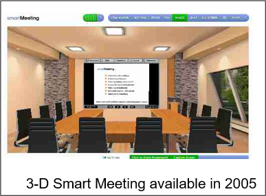
This type of meeting room didn’t appeal to corporate America in 2005, but avatars became a common word, and there always seems to be some company trying to improve avatars so they look more like their human counterparts!
Why show 3D rooms? New technology (or reuse of old technology) will emerge from the growth of telecommuting. Educators talk about the flipped classroom. Karan Mehandru (2019), a frequent contributor for Forbes, predicted a flipped workplace model where “physical in-person meetings take place only rarely and as needed” (para. 8). Who knew this prediction would come about so quickly—by 2025, 70% of the workforce would work remotely five or more days per month!
Mootup offers 3D virtual rooms. Link to www.mootup.com
How to Design a Winning Presentation to a Large Audience
Presentation content, style, theme, media, and animations should depend on the type of audience. For example, a presentation to a group of young children will have a vastly different mix of components. For a conference, we will work toward designing the best presentation using the following parameters:
- audience—adult professionals
- collaborative (team) presentation
- length of time—20 to 30 minutes
- need to persuade the audience (may include a call to action)
- structured with three goals: frame the issue with a story, present the challenge, and explain how to solve the problem
Knowing your audience is critical for giving an effective presentation. If you don’t know your audience, here are some strategies: review past events, research the group you’re presenting to, engage in prepresentation conversation, ask event organizers, browse LinkedIn, review social media, and even conduct interactive polling.
Collaborative (team) presentations need to send a clear and consistent message. Every member of the team should be on the same page with the same message and contribute their strength to the storytelling. Although this is an assumption, every member should use consistent fonts, color palettes, and branding, even in the way they dress. Storytelling should include real-world examples that connect through data visualizations. Collaborative presenters can work well with interactivity if they each know their role. As a team, make sure to use consistent terminology with appropriate data sources/references. It is essential that the team has practiced and rehearsed and can present within the time frame. And always have a backup plan. Make sure to gather feedback from the audience and provide handouts to support the data insights.
Length of time should be determined by the need to convey information clearly. It’s important to provide context and key insights. Keep in mind—don’t overwhelm the audience with unnecessary details. If your normal presentation is 20 minutes, use the extra time for questions and answers.
Persuading the audience and including a call to action comes after knowing your audience. In order to persuade and have them answer your call to action, your team needs to know the audience’s needs, desires, concerns, and motivations. Your message needs to align with their interests. Every detail counts. Choose words that evoke emotions. Create a sense of urgency, and appeal to emotions. And stay credible by providing evidence to back up your claim. Three primary goals serve as cornerstones for effective communication. Begin with a story to capture the audience’s attention and humanize the data, making them relatable and engaging. The story should set the stage and offer context and emotional resonance that draws the audience into the narrative. Following this, the presentation of the challenge is essential—it’s the moment when data are introduced to highlight the problem or an opportunity at hand. The data become the protagonists, shedding light on the issue with clarity and precision. Finally, explain how to solve the problem to bridge the beginning to the end. The data will emerge as a powerful tool for decision-making and, even better, become the actionable insights that move the audience toward an informed solution. These three goals woven together inspire meaningful action and change. The audience should answer the call.
Some Technology to Help With Presentations
Note: Screenshots of PowerPoint interface © Microsoft Corporation. Used with attribution for instructional and illustrative purposes. Annotations added by the author.
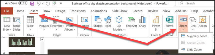
As early as 2016, the Zoom feature was available in PowerPoint. Essentially, Zoom allows flexibility in the order you present slides and ways to anchor to a summary slide. If you don’t see this feature and you present a lot, you might invest in a newer version of the software. You can determine if you have this Zoom feature by going to Insert in the main menu, as illustrated in Figure 4.23.
Figure 4.23—The Zoom Feature in PowerPoint
Zoom features are a way to organize your PowerPoint. Have you ever been in the audience and asked a question and the presenter spent several minutes finding the slide you had a question about? Well, this feature will help with that and a lot more.
Currently, there are three Zoom options:
- Summary Zoom: Summary Zoom populates a new slide with thumbnails. This works well when you have several topics with a few slides that relate to a topic. This option will add a thumbnail for the first slide in each section. Perhaps you have not used sections. Sections are found in the Home tab. For both Summary Zoom and Section Zoom, you need sections first.
- Section Zoom: Section Zoom adds links to sections on the current slide. You just click the thumbnail to jump to that section. This option will not work if your presentation does not have sections.
- Slide Zoom: Slide Zoom creates a link to any slide on the current slide. This is a feature that is better understood when you see it happen, but the following scenario might help you understand how this works. If you have ever used Prezi, you might see some similarities.
When might you use Slide Zoom? Look at a scenario that fits Slide Zoom and see if you can relate!
Slide Zoom Scenario
The product development team at Mitchell & Company has been asked by their director to present the estimated revenue stream for a new software product. The product works in conjunction with smartphones and requires 5G networks. They are working with several countries in Europe and have hired engineers from Greece to test the pilot launch, which was highly successful. The first preorder sales came from Greece and Germany. The team has previous experience with this director, and they know she will ask additional questions beyond the revenue stream predictions, so they always prepare every aspect they can.
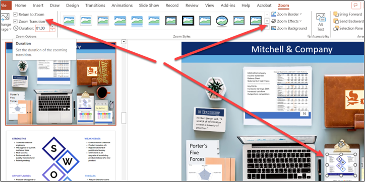
The team has produced five components to present if needed. Each of these components shows up on an image of a desk. Think of the desk as a landing page for all the information. From the landing page, clicking on an image will zoom to a new slide, and clicking again takes you back to the landing page. The following key corresponds to images within the landing page, which can be explored visually in Figure 4.24.
- Estimated financial section (which includes the revenue stream predictions). This is the only section requested by the director; but you know other questions will arise if past meetings are any indication. Once you click the financials, it includes charts of pro-forma revenue, animated pilot testing charts.
- PESTLE for Greece with key financial points (this is on the clipboard image).
- SWOT to show strengths, weaknesses, opportunities, and threats.
- Example social media marketing materials using the SMART model.
- Porter’s Five Forces analysis.
- A complete business plan (the leather case).
The team created one slide with images that resemble what you might see on a desk. Consider this the “landing page” for navigation. As the team assembled the information for the PowerPoint, they considered what they wanted to link from this navigation page. (Figure 4.24 is an edit section; the directions show navigation when presenting.)
Figure 4.24—Using Zoom in PowerPoint to Communicate More Effectively
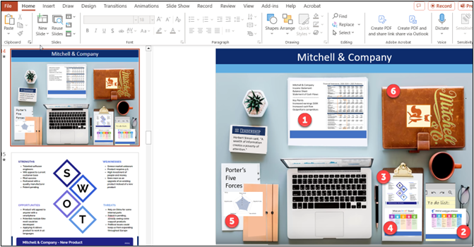
So if the director wanted to only look at the revenue stream predictions, that would be fine. But if the director asked to see their business plan, PESTLE, SWOT, or Porter’s Five Forces analysis, it would be easy to navigate from the main page. The director sees a zoomed-in section by clicking on the financial image, and a second click takes the team back to the landing page.
The arrow shown from the edit mode of Zoom is setting up the Zoom effect. Therefore, if the presenter clicks on the SWOT on the landing page, the presentation will zoom to the actual SWOT slide that shows full size to the director. As shown in Figure 4.25, check the box return to Zoom, and the presenter will be taken back to the landing page (the desk).
Figure 4.25—Showing How to Return to the Zoom Landing Page
I think the more you work with sections and zooming, the more you will like it.
The video shows some very practical techniques to animate and show charts in the best light for data storytelling.
Tracy, S. (2023, Feb 27). Animating Charts in PowerPoint for Better Data Storytelling. [Video]. YouTube.
The Report That Accompanies the Presentation
Before we get into the details, revisit a critical thinking model, Elements of Thought. This model contains eight components that lend well to designing a report to accompany your presentation:
- question at issue
- information
- interpretation and inference
- concepts
- assumptions
- implications and consequences
- point of view
- purpose
Foundation for Critical Thinking. (2007). Online Model for learning the Elements and Standards of Critical Thinking. Interactive Model Location: https://www.criticalthinking.org/ctmodel/logic-model1.htm
Report Templates in Venngage and Canva
If you are unsure of what a report might look like, make sure to visit Venngage. Venngage has over 300 report templates, and Canva lists over 2,200 report templates.
4.4 Exercise 1: Understand Clean Data
Learning Objective #2—Understand how to clean data
Cloudingo is a company that was founded on providing a service to clean data. On their home page, they state, “Find out how customers leverage Cloudingo to clean their Salesforce data and reach their goals.” There are nine companies that share their story with the public. The link to this website is https://cloudingo.com/case-studies/#
Use these instructions, and answer the questions that follow:
- Read two of the public stories.
- Discuss the two stories.
- What type of issues did the companies face? Exactly what led to the need to hire a company to help them clean their data?
- What software generated the “unclean” data?
- Which other companies clean data? (This may be listed under data quality solutions.)
- What is the ultimate outcome for the two companies?
- How can AI be used to help with data quality solutions? (Hint: Ask ChatGPT!)
- Share your experiences with poor-quality data at your own organization.
4.5 Advanced Excel Dashboard and Analyzing Insights
A wealth of information creates a poverty of attention.
—Herbert A. Simon, economist and political scientist
This chapter has already introduced you to creating a simple dashboard with a slicer. This section will introduce more of the basic building blocks of a dashboard with some advanced techniques in PivotTables, PivotCharts, and simple formulas to add value to the data and provide deeper insights. This dataset is provided to you with the Chapter 4 Excel files, and you will use the same dataset when you learn Power BI in a later chapter. This scenario may be familiar since it was introduced in the “What Do You Think?” section of this chapter!
XCaliber Food Distribution Company
Figure 4.26—XCaliber Sales by State
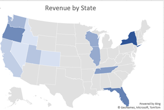
XCaliber Food Distribution was established late in 2023, although the business started in 2024. The company distributes food items to 12 states. It has nine salespeople, though Naomi Shopker was an intern and only worked in June and July. In 2024, the company sold $510,326 worth of products.
XCaliber Food Distribution Company is located in Indianapolis, Indiana. The location is inconsequential since no product is housed at their location. XCaliber Foods fills a niche of distributing excess products to small grocery stores. All salespeople work from home and use a tech-powered distribution system. The manufacturing companies, farmers, and others post products as available, and XCaliber Foods salespeople arrange drop-shipping to their customers. One of the salespeople calls it a matchmaking game, and most agree. Salespeople work on commission, and the system logs the number of employee hours as well as sales in the system. Although the sales were good for the first year, the owner wants you to work up a dashboard and provide insights for every business aspect (people, categories of product, customer concentration, and payment). The owner of XCaliber asked for help from Matt, an employee who built the company’s website and helped customize the tech-powered distribution system. The owner sent Matt an email with a list of concerns and wants Matt to provide some insight. The email list is provided in the “What Do You Think?” section at the beginning of this chapter. It’s repeated here for your convenience.
Matt reviewed the email and made notes. Here is the list:
- I want to know how well my salespeople are doing. Which salespeople are selling the most; in what city, state, and region; and what are they selling? Are there two or three salespeople who could conduct the training (with pay)?
- Are there products that should be dropped?
- I want to know if using the summer intern in June and July was worth the cost (about $4,000).
- Is every salesperson collecting from their customer by check, cash, or credit?
- What is the range of invoices by customer, and who are our best customers? Are there opportunities for upselling?
- Are we shipping out within the same day on a consistent basis?
- Do we have regional overlap? Are two salespeople selling to the same customer?
- I want to increase revenue to $60,000/month in 2025. Can you do some sort of analysis to see the best way to reach this goal—perhaps using a gap analysis or something like that?
- I want to be able to ask a question and get the answer instantaneously. I think I heard it is called a dashboard. Can you set up a dashboard that allows me to analyze the data right along with you?
- What do you think a survey of our customers will tell us?
In addition, the owner conducted a survey of the grocers (all 15 customers) to see if they are happy with XCaliber Food Distribution’s services. More about the survey results will be shared later.
Dataset: “Ch 4—Original Dataset—XCaliber Foods with delivery time.”
Format: Formatted as a table. The table is named XCaliber_Foods and ranges from A1: W400. Use this file to complete all steps.
Dataset: “Ch 4—XCaliber Customer Satisfaction Survey Form” (this file has been updated to include green, red, and yellow icons).
Step 1: Make a Backup of the Raw Data
- This should always be your first step when working with any dataset.
Step 2: Get to Know the Data
- How many customers?
- How many salespeople?
- To how many cities does XCaliber distribute food? How many states?
- How many payment types and what are they? What do you think of a blank payment type?
- How many products?
- Filter on the product called Blank. What product do you think it should be? And what do you base this on?
- What range do you see in the unit price?
- What is the range for the quantity?
- What is the range for revenue?
- What is the range for shipping fees?
- How many countries?
- How would you go about checking to see if orders are shipped the same day?
Step 3: Clean the Data
Note: Screenshots of Excel interface © Microsoft Corporation. Used with attribution for instructional and illustrative purposes. Annotations added by the author.
- Explore: Are there any categories that do not add value?
- Answer: Yes, Column H has USA for all 399 entries.
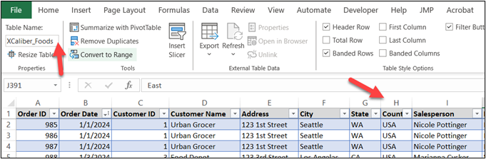
Figure 4.27—Exploring the Table - Explore: Are there blanks in the Product name?
- Answer: Yes, the files show blanks under the filter of Product name. Sort for blanks on product name. Then add “Green Tea” to the product name that has blanks. Check to see if the blanks are gone.
- Explore: Are there blanks in the payment types?
- Answer: Yes, however these should not be modified; the owner may want to investigate them to make sure payment was made. It is possible the customer did not pay for the delivery!
Step 4: Add a Sales Trend Graph With a Trend Line to the Dashboard
a. Click within the data field (I clicked on J20).
b. Click Insert, then PivotChart, then PivotChart & PivotTable (see Figure 4.28).
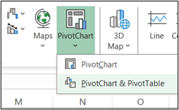
c. Choose a New Worksheet and select OK.
d. In the PivotChart Fields, click Order Date (it should automatically organize the order date by months).
e. Click Revenue (Revenue should be Sum of Revenue). The three components should look like the following. We have work to do before it is acceptable (see Figure 4.29).
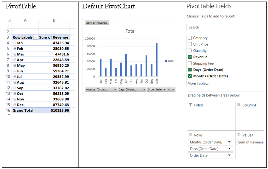
f. Right-click in Grand Total in the PivotTable (B16), then choose Value Field Settings, then click Number Format, select Custom ($0,“k”), and click OK (see Figure 4.30). Now the PivotTable shows all values with the “k,” so January shows $47k, February shows $23k, and so on.
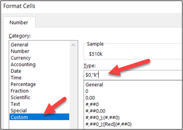
g. Next, select the PivotChart, then click Design in the top menu, Change Chart Type, and choose Line, then OK.
h. Click in the chart, and on the plus, check the Data Labels, uncheck the Gridlines and Legend, and add a Trendline by checking the box. In the chart title, type “2024 XCaliber Food Distribution Sales.” Feel free to increase the font size. After adding the trendline, you may want to move the amounts that are below the trendline. Just click on them and move them and drag.
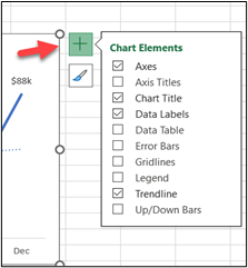
i. Next, let’s get rid of all the field buttons. Click in the chart, and then PivotChartAnalyze. In the Field Buttons drop-down menu, choose Hide All.
j. Other items to consider: The default color is blue. When you build a dashboard, you want consistency with colors, fonts, and format of the charts. Other items include (1) change the trendline so it is more of a dash, (2) increase the font size of the data labels to 10 points, increase y-axis to 10 points, and (3) increase the x-axis to 10 points and bold. This dashboard will be in blue tones (see Figure 4.32).
k. Name the tab “Trend Line.”
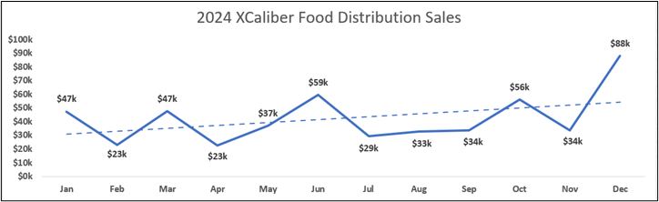
Now let’s consider the next item that we want on the dashboard, salespeople.
Step 5: Add a Clustered Bar Chart for Salesperson, Sorted From Largest to Smallest
a. Copy the PivotTable to a new worksheet since the dollar amount is already formatted.
b. Click in the PivotTable and in the PivotChart Fields, put Salesperson in the rows and Sum of Revenue in the Values.
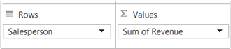
c. Click in the PivotTable, click Insert, PivotChart, and choose a clustered bar chart, and OK. The default chart needs work, but first click back in the PivotTable, make sure you are on a cell in the Sum of Revenue column, right-click, and sort from largest to smallest so the best selling salesperson is on top.
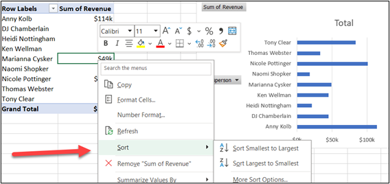
d. The default chart has a legend we do not need. So remove the legend and gridlines, widen the columns, check the box, show data labels at the end, and remove the field buttons. Refer to the directions for Figure 4.29 to help. Want to have wider columns? Use the gap adjustment found in the Format Chart area. Rename the tab of the worksheet “Salespeople.”
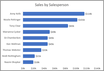
Step 6: Add Number of Days for Shipping
One of the goals mentioned by the owner was to ship out the product on the same day it was ordered. There are many ways you can approach this, but the easiest is to add to the table “XCaliber_Foods.”
a. Open the data file and select an empty cell at the right of the column named “Shipping Fee.” This should be Column W in Row 1.
b. Type “Order-to-Ship” (this represents the days it takes between order and shipping to the customer). If you cleaned the Excel sheet properly, you should be in Column W. As soon as you enter the column heading, you will see the banding that indicates you have added to the table.
c. In Column W and Row 2, type =J2-B2 and select enter. Essentially you are taking the shipping date minus the order date. You will see 3 show up; copy this formula all the way down to Row 400. One thing you will notice: XCaliber Foods is not shipping goods on the same day the order is placed!
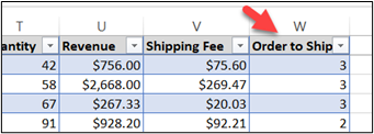
d. You may want to “refresh all”—to do this, go to Data on the ribbon in Excel, and select the Refresh All button. This is just good practice!
e. Create a PivotTable with Average of Order-to-Ship in days (you will notice the average of all salespeople is 2.8 with a range of 2.3 to 3.9). Feel free to create a clearer header. A good title is “Average Days Order-to-Ship.”
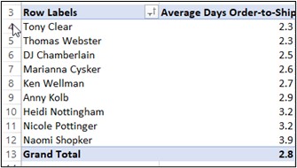
Clearly, the salespeople are not adhering to the goal of same-day shipping. You may want to create another PivotTable so you can see the depth of the problem. Copy the PivotTable you created in part d down to Row 17 on the same sheet. Set up your PivotChart Fields like the ones you see in Figure 4.38.
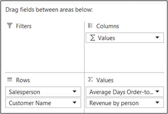
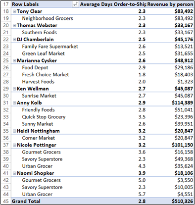
f. What insights would you want to add to the story? Remember, Naomi was an intern in June and July. Also, these are averages. If you go back to the data what is the maximum number of days between the order date and the ship date?
Surprising, right? The data shown here in this exhibit would work well as a combo chart.
g. Name the tab “Order-to-Ship” We may come back to this information to create a graph for the dashboard.
Step 7: Add a Bar Chart Comparing the Size of Invoices
One of the features of selling is to upsell or persuade a customer to buy something additional. A review of the invoices will give an indication of the normal invoice amount. When you use the filter on the data, you will notice lots of transactions that show less than $500 in sales. While a customer is already purchasing from you, why not try upselling to increase the sales?
a. Click into your data file and insert a PivotTable.
b. In the PivotChart Fields, drag Revenue to Row and drag Revenue to Values as Count of Revenue.
c. In the PivotTable, right–click in the row label and select grouping. Start at zero, end at 3000 by 500, then select OK as illustrated in Figure 4.39. You can try different groupings to see the main invoice patterns. Remember, there are 399 rows of data.
d. Create a bar chart, remove the legend, add a chart title, add a data label, and reduce the gap between columns. When you get done it should look similar to Exhibit 4.10. As you review the chart, note that you have 117 invoices with sales less than $500.
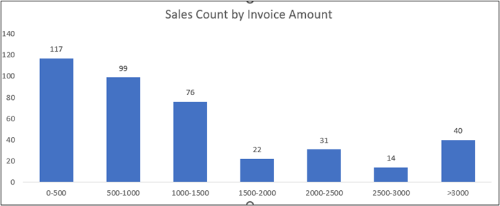
e. For additional insights, add a slicer (salesperson) to see what salesperson is selling at a higher invoice amount. What products are bought in larger quantities?
f. Name the tab on the worksheet “By Invoice”
Step 8: Add a Bar Chart for Top Five Customers
In 2024, XCaliber Foods sold to 15 customers ranging from a high of $83,492 sold to Neighborhood Grocers to a low of $1,323 sold to Harvest Foods. Four of the salespeople sell to one customer (Tony Clear sells $83,492 to his only customer, Neighborhood Grocers).
a. Create a PivotTable with Customer Name in rows and Sum of Revenue in values.
b. In the PivotTable, click on the drop-down arrow in the Row Labels.
c. Look for Value Filters and choose the Top 5. It should look like Figure 4.40.
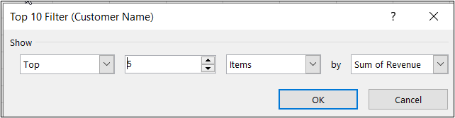
d. Next, create the chart, add data labels, remove the legend, get rid of the x-axis information, add a chart title, and lessen the gap between columns. It should look like Exhibit 4.11.
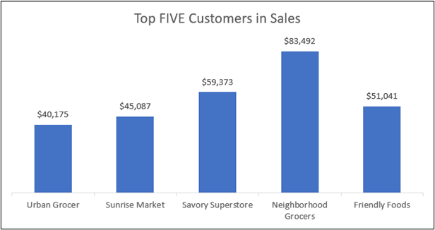
e. Name the worksheet tab “Top 5 Customers”
Other potential charts that you should be able to complete if you mastered the Campus Ticket Sale dashboard include Sales by Region, Revenue by Categories, Revenue by Payment Type, and Top 10 Revenue by Product. It depends on what you want to share as insight as to what you have on the dashboard. And remember as you build a dashboard, every slicer must be connected to every PivotChart. Exhibit 4.12 shows one example of this dashboard that is too busy.
There are several ways you can tell a dashboard is too busy—for example,
- if your audience would feel overwhelmed,
- if too many tool tips pop up,
- if you need to explain why you need a secondary axis, and/or
- if you include confusing labels.
The owner wanted every insight, but perhaps this owner needs to see the important causes and effects. Or perhaps the answer is two dashboards. The “too busy” dashboard includes survey data as a word cloud, but will the owner notice the “Not same day” phrase? The survey does show some interesting trends, but there may be a better way to show it (perhaps as its own dashboard).
Exhibit 4.12—Example of Dashboard That Is Too Busy
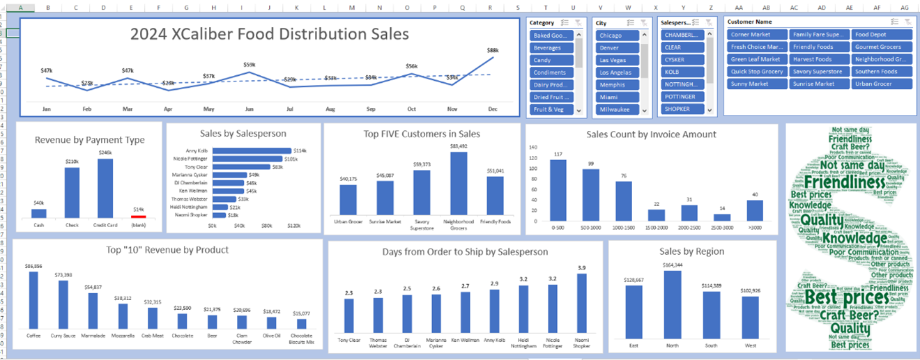
Step 9: Review and Revise the Dashboard
- The first step is to set the purpose for the dashboard(s).
- Organize the questions by salespeople, product, customer, process (like payment methods), and future goals. These are the questions listed in Matt’s email from the owner of XCaliber Food Distribution Company:
- salespeople: Questions 1, 3, 7, and 10—Survey
- product: Questions 2
- customer: Questions 5
- process: Questions 4, 6, and 10—Survey
- future: Question 8
Use this file to see if you have done the steps correctly. Remember, the Dashboard provided here is too busy. How would you revise it? (See “Ch 4—XCaliber_Foods_2024_Dataset_Solution.”)
Step 10: Gap Analysis
Stakeholders want to know the “why” behind not reaching goals or targets. Most companies will want a full report outlining what happened. A gap analysis is the best approach to answering all the questions that bubble to the surface when goals aren’t reached.
What Is a Gap Analysis?
A gap analysis measures actual results against expected results and answers the question “Why did we miss our expected estimate?” There are several reasons a company misses its target, including missing strategies, poor processes, inconsistent or out-of-date technologies, absent employee skills, poor management/leadership, and faulty risk assessment.
When the owner was setting up XCaliber Food Distribution Company in 2023, he estimated that the company would have $50,000 in sales per month. XCaliber Foods sold $510k in products, almost $90k short of his estimate. Was his analysis of the market share incorrect? How would you explain this shortfall? A gap analysis can be market driven.
Here are some approaches to a market gap analysis:
- Investigate geographic sales. For example, XCaliber sells products in only 12 states but could ultimately sell to anyone in the lower 48 states.
- Investigate product base. For example, the survey indicates that several grocers would purchase beer, but salespeople didn’t offer it.
- Investigate customer needs. For example, the customer survey indicates that several grocers want the merchandise as promised, and not several days after the order date.
- Investigate customer satisfaction. A question on the XCaliber Foods customer survey asked if they would be willing to recommend them to another grocer. Why not capitalize on that?
The owner of XCaliber Foods provided a list of questions that can be organized by salespeople, product, customer, process (like payment methods), and future goals.
In general, performing a gap analysis at the business level has these basic steps:
Step 1—Identify the Goals to Be Accomplished and the Areas to Be Analyzed
The owner may want you to figure out why the targets have not been met, and more importantly, a recommendation on how to meet the target.
Step 2—Analyze the Current State
Include the market gap analysis here because XCaliber Food Distribution Company is new to this market. What causes contributed to missing the target? Were workers trained well? Did the late delivery of products contribute to poor produce and loss of sales? Did salespeople sell products consistently?
Step 3—Establish the Goal and Future Goal
The owner had expected $50,000 sales revenue each month in 2024. Now in 2025, he expects $60,000 per month in revenue.
Step 4—Compare the Current State to the Goal (or Ideal State)
What is the difference? Do you see any patterns? What processes contributed to the gap? XCaliber Foods expected to hire nine salespeople, but they didn’t have nine hired as of January 1, 2024.
Step 5—Describe the Gap and Show the Differences in Percentages
What recommendations do you have to make sure the target is met?
Step 6—Organize the Recommendations and Create a Plan to Bridge the Gaps
Summarize recommendations, strategies, and ideas. A great framework for goal setting is called SMART: S = goal is specific, M = goal is measurable, A = goal is achievable, R = goal is relevant, and T = goal fits the time (time-bound). For XCaliber, show support with graphs from your dashboard.
Other frameworks for gap analysis include Ishikawa (fish diagram), SWOT, PESTLE, McKinsey 7S Framework, Balanced Scorecard, and the Nadler-Tushman Model. For this textbook, concentrate on using SWOT, PESTLE, and the Balanced Scorecard framework.
Expert Program Management (EPM). (2017, Oct 17). How to Do a Gap Analysis. [Video]. YouTube.
4.6 Example Dashboards and Reports
In my view, one of the primary functions of a data story is to drive action. Without action, we can’t generate value with our insights.
—Brent Dykes, author of Effective Data Storytelling
One way to grow your skills is to review dashboards and reports. Dashboards serve as a vital interface through which organizations, institutions, health care facilities and even sport franchises make sense of the vast landscape of data. One thing to remember: There are external (public) dashboards and reports, and there are internal dashboards (behind a company login). This section of the chapter shows dashboards and reports from nonprofits, corporations, education, health care and sports. By examining the application of these data visualization tools in various contexts, we gain a comprehensive understanding of their versatility and impact. As you explore, look for common threads that connect these fields. In this age of information overload, the ability to transform data into actionable intelligence is a competitive advantage. Note how these interactive dashboards (and reports) support better decision-making, more efficient operation, and especially for not-for-profits, greater transparency.
Example of a Report in Education
An example report can be found at many educational institutions under the heading of “Enrollment Summary.” For example, in Exhibit 4.13, Indiana State University provides an enrollment report branded with their sycamore leaf and using the shades of blue color palette.
Exhibit 4.13—Example of a Static Report in Education
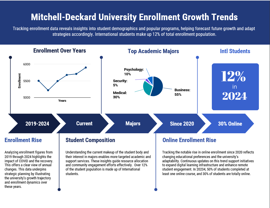
Example of an Interactive Dashboard in Education
Many institutional research departments develop a public interactive dashboard experience. For example, Florida State University provides an interactive report. You can tell it is interactive because of the drop-down arrows shown in the illustration (which should remind you of slicers!). Similar reports will have a “Read Me” section to support user interaction. Most include a video that introduces you to the dashboard as well. The reports in Exhibit 4.14 were created using Power BI.
Exhibit 4.14—Interactive Dashboard
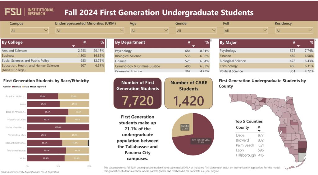
Florida State University Institutional Research Fall 2024 First Generation Undergraduate Students. https://www.ir.fsu.edu/infographics/infofirstgen_2024.aspx.
Enrollment Trends (2023, September 14) Indiana University—Enrollment Summary Tool. Link: https://iuia.iu.edu/finding-data/enrollment/index.html. NOTE: Choose the public report images to activate the enrollment information reports for the public.
Purdue University. (2024). International Enrollment and Statistical Report, Office of International Students and Scholars. https://www.purdue.edu/gpp/iss/_documents/EnrollmentReport/iss_statisticalreportfall24.pdf
Dashboards in Health Care
It is interesting to see the dozens of companies who wish to support dashboards in health care settings. In Helminski et al.’s (2022) article “Dashboards in Health Care Settings: Protocol for a Scoping Review,” a team of researchers searched through peer-reviewed literature to discover “the development, implementation, or evaluation of a dashboard that was successfully used in routine workflow” (para. 3). The researchers discovered that there is a need for the development of a taxonomy that identifies relevant design elements that each type of dashboard should include. These authors did not think dashboards were part of the accepted routine workflow and believed they should be.
The pandemic generated lots of data and some of the datasets ended up in dashboards. Tableau Public has hundreds of public dashboards ranging from COVID-19 vaccinations to health care data breaches. Health care needs to leverage the analysis of their data to address challenges like staffing shortages, retention, effectively planning for the future, and managing patient care. Most of the software available to the health care industry has built-in dashboard capability. Instead of featuring one dashboard, feel free to use the following links to explore.
Tableau Public. (2023). Welcome to Tableau Public. https://public.tableau.com
AHRQ. (2023) Agency for Healthcare Research and Quality—NPSD Dashboards. https://www.ahrq.gov/npsd/data/dashboard/index.html
Practical Data Solutions (2023, Jan 30). Healthcare Analytics Trends for 2023. [Video]. YouTube. Available:
Interactive Dashboards in Nonprofits
Nonprofit dashboards are built around mission and desired outcomes. Nonprofits’ focus will often be on funders and other stakeholders to show transparency in reaching desired goals. Transparency is a key issue raised by charity watchdogs. There are lots of organizations that provide help to smaller nonprofits in this area.
Polanco, H & Walker, S. (2019, Dec 18). Models and Components of a Great Nonprofit Dashboard. Nonprofit Quarterly (NPQ). https://nonprofitquarterly.org/financial-management-models-of-a-great-nonprofit-dashboard/
Nonprofit Dashboards—Resources List. (2023). Nonprofit Financial Commons. https://nonprofitfinancials.org/resources/nonprofit-dashboards-resources-list/
Interactive Dashboards in Government
Interactive dashboards in a government setting have revolutionized the way data are managed, analyzed, and communicated. In state government, interactive dashboards are commonly employed to share data related to public health statistics, economic indicators, education outcomes and many other areas. The ability to interact with the data enhances the feeling of transparency and accountability.
From the Office of the Chief Equity, Inclusion, and Opportunity Officer in Indiana, you can find interactive dashboards on five broad categories (health, public safety, social services, education, and workforce). For example, in the health category, a user can interact with data from COVID-19, infant mortality, births, preterm births, and prenatal care.
Exhibit 4.15—Example of an Interactive Dashboard in Indiana

Another trend in the United States is for each state to build a health value dashboard for their state. The Health Policy Institute of Ohio built a dashboard-like report (which is in PDF format).
Ohio Health Policy Institute: https://www.healthpolicyohio.org/wp-content/uploads/2023/04/2023HealthValueDashboard_Final.pdf
Chapter 4 Summary
In this chapter, readers are guided through the intricacies of data modeling and visualization, exploring the creation of impactful dashboards. The chapter unfolds with a dashboard that brings in two worksheets using a data model, laying the foundation for effective information representation.
Step-by-step instructions are provided for building both simple and complex dashboards, ensuring that readers can navigate the process seamlessly. It also includes techniques on ways to incorporate databars, and icon sets to enhance visual clarity. The art of storytelling is weaved throughout the various visualizations with an emphasis on the importance of crafting compelling narratives. Insights are given into how storytelling connects to the brain, illuminating the cognitive aspects that make data more relatable and memorable.
This chapter concludes with a comprehensive gap analysis, offering a strategic perspective on identifying and addressing gaps in data representations. Readers are equipped with the tools to not only present data effectively but also act collaboratively in virtual teams, leveraging data storytelling as a powerful communication tool in the dynamic world of information.
This chapter has over a dozen Excel worksheets, providing step-by-step guidance on creating graphs and data visualizations. This comprehensive resource serves as a valuable toolkit for leveraging advanced data visualization in both strategic decision-making and statistical analysis.
Download Chapter 4 Student Files (<1 MB).
Chapter 4 Case: The Power of Dashboards and Gap Analysis
 XCaliber Foods was established late in 2023, although the business started in 2024. The company distributes food items to 12 states. It has nine salespeople, though Naomi Shopker was an intern and only worked in June and July. In 2024, the company sold $510,326 worth of products.
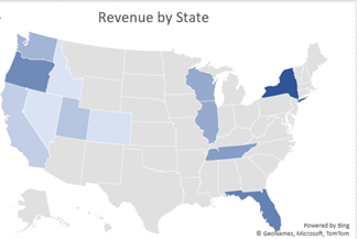
XCaliber Food Distribution company is located in Indianapolis, Indiana. The location is inconsequential since no product is housed at their location. XCaliber Foods fills a niche of distributing excess products to small grocery stores. All salespeople work from home and use a tech-powered distribution system. The manufacturing companies, farmers, and others post products as available, and XCaliber Foods salespeople arrange drop-shipping to their customers. One of the salespeople calls it a matchmaking game, and most agree. Salespeople work on commission and the system logs the number of employee hours as well as sales in the system.
Although the sales were considered good for the first year, the owner wants you to work up a dashboard and provide insights for every business aspect (people, categories of product, customer concentration, and payment). The owner of XCaliber asked for help from Matt, an employee who built the company’s website and helped customize the tech-powered distribution system. The owner sent Matt an email with a list of concerns and wants Matt to provide some insight.
In this culminating project, apply the knowledge and skills acquired in this chapter and Chapter 3. Combine your understanding of design principles, data analysis, and storytelling techniques to showcase your understanding of leveraging data visualizations to effectively convey complex information in a visually compelling way. Review the presentation guidelines.
Case Objectives
- Understand how to clean data by removing irrelevant columns, being aware of blanks, and so on.
- Build visuals and dashboards to structure storytelling.
- Able to analyze and interpret data to extract key insights and develop a narrative.
- Use a dashboard for gap analysis, to support decision-making (specifically, make recommendations using SMART to assess goals).
- Ables to use decision-making and benchmarking tools (see Chapter 3, LO 6).
Case Guidelines
This case may be completed by an individual or a team of students as directed by your instructor.
- Complete the XCaliber Foods Distribution Company Dashboard(s). Multiple dashboards are suggested.
- Incorporate a word cloud from survey comments and incorporate the survey into the dashboard.
- Develop a gap analysis report and a professional presentation (with webcam).
- Upload Excel files: dashboard(s) and gap analysis report.
- Record a presentation that incorporates techniques to visualize and tell a story. Your recording could include presenting the report and showing the dashboard(s). Include the link to the recording.
Goals
These are the goals set by the owner for 2024 and 2025. Are there other goals that should be considered?
- Goal 1: revenue in 2024—$50,000/month. Revenue in 2025—$60,000/month
- Goal 2: reach six more cities in 2025; use benchmarking and decision-making tools (see Chapter 3)
- Goal 3: set a minimum sales “target” for salespeople in 2025
Questions From the Owner
The owner expects answers to the questions he sent to Matt, but you may form additional questions that he should have asked.
- I want to know how well my salespeople are doing. Which salespeople are selling the most; in what city, state, and region; and what are they selling? Are there two or three salespeople who could conduct the training (with pay)?
- Are there products that should be dropped?
- I want to know if using the summer intern in June and July was worth the cost (about $4,000).
- Is every salesperson collecting from their customer by check, cash, or credit?
- What is the range of invoices by customer, and who are our best customers? Are there opportunities for upselling?
- Are we shipping out within the same day on a consistent basis?
- Do we have regional overlap? Are two salespeople selling to the same customer?
- I want to increase revenue to $60,000/month in 2025. Can you do some sort of analysis to see the best way to reach this goal—perhaps using a gap analysis or something like that?
- I want to be able to ask a question and get the answer instantaneously. I think I heard it is called a dashboard. Can you set up a dashboard that allows me to analyze the data right along with you?
- What do you think a survey of our customers will tell us?
SMART, Benchmarks, and Decision-Making Tools
- What specific actions and strategies do you suggest (remember to use the tools you’ve learned [e.g., SWOT, Ishikawa])?
- Use benchmarking tools (like PESTLE) to explore and expand into four new areas.
General Guidelines
- Write a professional report (between 3,500 and 5,000 words) that addresses potential solutions for the gap between goals for 2024, and goals for 2025. Use a professional report template from Canva or Venngage.
- Assume you are presenting to the owner of the company, virtually.
- Feel free to include research to support strategies. Make sure that you use APA and cite everything.
- Graphs from your dashboard should be included in the report—because that’s the way the owner likes it (he is a little old school).
- Infographics like SWOT, PESTLE, and so on are expected.
- Accompany the gap report with a recording that demonstrates your findings as if you were presenting it to management (the owner); please use your webcam.
- Feel free to use your dashboard(s), your report, and/or a PowerPoint to help your presentation.
- If you are completing this as a team assignment, follow the guidelines discussed in Chapter 4 for presenting as a team.
- Recording is limited to 20 minutes.
- The gap report should include in-text citations, correctly labeled figures, and a reference list of your research.
Data files available:
“Chapter 4—Original Dataset—XCaliber with delivery time”
“Chapter 4—Customer Satisfaction Survey Form”
Feel free to also use the “Ch 4—XCaliber_Foods_2024_Dataset Solutions” (although remember the dashboard was “too busy” to be used).
Download Chapter 4 Student Files (<1 MB).
Chapter 4 References
Agency for Healthcare Research and Quality (2023). NPSD dashboards. Agency for Healthcare Research and Quality. https://www.ahrq.gov/npsd/data/dashboard/index.html
Alexander, M. & Walkenbach, J. (2013). Excel dashboards and reports (2nd ed.). John Wiley & Sons.
Anwar, Y. (2020, December 17). The 16 facial expressions most common to emotional situations worldwide. University of California. https://www.universityofcalifornia.edu/news/16-facial-expressions-most-common-emotional-situations-worldwide
Cleveland, W. & McGill, R. (1984). Graphical perception and graphical methods for analyzing scientific data. Journal of the American Statistical Association, 79(387), 531–544.
Eber, K. (2020, Apr 13). Why storytelling is more trustworthy than presenting data. TEDxTalks (TEDxPurdueU) [Video]. YouTube. https://youtu.be/Ez5yS4Q5ASA?si=hcDLVsxpgognB1pq
Expert Program Management (EPM). (2017, October 17). How to do a Gap Analysis [Video]. YouTube. https://youtu.be/AGQyaGtrTUc
Gallo, C. (2019). Guy Kawasaki Explains Why Steve Jobs Used 190-Point Text on Presentation Slides. Inc.
Harrison, K. (2015, Jan 20). A good presentation is about data and story. Forbes. https://www.forbes.com/sites/kateharrison/2015/01/20/a-good-presentation-is-about-data-and-story/?sh=2fb9b0fb450f
Helminski, D., Kurlander, J. E., Renji, A. D., Sussman, J. B., Pfeiffer, P. N., Conte, M. L., Gadabu, O. J., Kokaly, A. N., Goldberg, R., Ranusch, A., Damschroder, L. J., & Landis-Lewis, Z. (2022, March 2). Dashboards in health care settings: Protocol for a scoping review. JMIR Res Protoc. 11(3):e34894. doi: 10.2196/34894.
Lamson, M. (2018, July 25). How to manage gender and culture in virtual teams. Inc. Magazine. https://www.inc.com/melissa-lamson/5-tips-for-managing-gender-culture-in-virtual-teams.html
Lasseter’s Lab. (2021, Jan 29). How to make a PechaKucha presentation for class (for all students) [Video]. YouTube. https://www.youtube.com/watch?v=hC86_sVwkhE&t=484s
Lidsky, I. (2016). What reality are you creating for yourself? [Video]. YouTube. https://www.ted.com/talks/isaac_lidsky_what_reality_are_you_creating_for_yourself
Littlefield, C. (2022). 7 ways to interact with audience in an in-person presentation [Video]. YouTube. https://www.youtube.com/watch?v=IWLd_-tRWNk
Mehandru, K. (2019). Slack and Zoom have proven that the future of work is agile. Forbes. https://www.forbes.com/sites/karanmehandru/2019/10/22/slack-and-zoom-prove-the-future-of-work-is-agile/?sh=44ad0fc95c46
Mehrabian, A., & Ferris, S. R. (1967). Inference of attitudes from nonverbal communication in two channels. Journal of Consulting Psychology, 31(3), 248–252. https://doi.org/10.1037/h0024648
Mendenhall, M., Walker, J., & Cassell, D. (2023, April 21). Standards in Global Leadership Education. 2023 Conference—Leading Global Innovation During Crisis. [Roundtable Discussion-Captured Live by Big Paper Strategy]. Global Leadership Institute. Saint Mary-of-the Woods, IN, United States.
Mitchell, J. & Deckard, T. (2024, Jan 18). Campus Travel Video-Case Study [Video]. YouTube. https://youtu.be/NFAI2nEYsqY?si=WJZW52sF590_r_U8
NAPE. (2020). Gender Communication Quiz. National Alliance for Partnerships in Equity. https://napequity.org/pipe-training/r1f-gender_quiz_2002/
Nonprofit Financial Commons. (2023). Dashboards—resources list. Nonprofit Financial Commons. https://nonprofitfinancials.org/resources/nonprofit-dashboards-resources-list/
Point Park University—Online. (2017, December 12). Gender differences in communication styles. Point Park University—Online. https://online.pointpark.edu/public-relations-and-advertising/gender-differences-communication-styles/
Polanco, H & Walker, S. (2019, Dec 18). Models and components of a great nonprofit dashboard. Nonprofit Quarterly (NPQ). https://nonprofitquarterly.org/financial-management-models-of-a-great-nonprofit-dashboard/
Practical Data Solutions (2023, Jan 30). Healthcare analytics trends for 2023 [Video]. YouTube. https://youtu.be/McCqovEDrCI?si=_HOdISaQvPZVeHhW
Priore, A. (2020). Mansplaining and interruptions: Online meetings exacerbate gender inequities in the workplace. Ms. Magazine. https://msmagazine.com/2020/04/22/mansplaining-and-interruptions-online-meetings-exacerbate-gender-inequities-in-the-workplace/
Schroter, J. (2011, Oct 8). Steve Jobs introduces iPhone in 2007 [Video]. YouTube. https://youtu.be/MnrJzXM7a6o?si=o8Y8MRW4Jif83qFf
Tableau Public. (2023). Welcome to Tableau Public. Tableau Public. https://public.tableau.com
Taras, V., Baack, D., Caprar, D., Jimenez, A., & Froese, F. (2021, June 09). Research: How cultural differences can impact global teams. Harvard Business Review. https://hbr.org/2021/06/research-how-cultural-differences-can-impact-global-teams
Tomich, J. (2023). Here’s what other communication coaches won’t tell you. Janice Tomich. https://janicetomich.com/communication-coach/
Tracy, S. (2023, Feb 27). Animating charts in PowerPoint for better data storytelling [Video]. YouTube. https://www.youtube.com/watch?v=mpjQGgrsT88
